The Number Input element is a basic input element that allows users to enter numeric values within the application. It supports different data types such as integers, decimal values, and negative numbers, catering to a wide range of usage scenarios. Its structure, which controls numerical entries, increases data accuracy and helps prevent incorrect entries.
The Number Input element is supported in both web and mobile applications.
1.1. Common Use Cases
Fields requiring quantity, amount, or number input
Age, score, rating, or evaluation fields
Percentage, ratio, or coefficient entries
Form fields with minimum–maximum value ranges
Numeric entries that may contain negative values (e.g., difference, change rate)
Numeric range entries for filtering and reporting purposes
2. Key Features
Integer and decimal support: Depending on the use case, only integer or decimal entries may be allowed.
Negative value input support: Negative number inputs can be enabled or disabled as needed.
Minimum and maximum value restrictions: Numeric values that can be entered can be restricted to a specific range. This prevents invalid or illogical entries.
Numeric data validation: Automatically prevents letters, special characters, and invalid entries.
Compatible with forms and actions: Number Input works seamlessly in form submission, state update, calculation, and validation scenarios.
2.1. Number Input Element Properties
You can configure the following settings from the Properties panel:
Value: The number that will be displayed by default in the numerical input field. It can be a static or dynamic value.
Decimal Separator: The character used to separate the decimal part (e.g., period “.” or comma “,”).
Decimal Scale: Determines the number of digits to display in the decimal part of the number (e.g., when set to 2, the 0.00 format is used).
Placeholder: The placeholder text displayed when the field is empty.
Fixed Decimal Scale: Ensures that the decimal part of the number is always displayed with a specific number of digits.
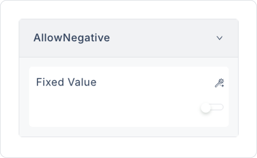
Allow Negative: Allows users to enter negative numbers.
Allow Empty Formatting: Allows users to leave the field blank.
Format: Determines the format in which the number will be displayed (e.g., currency or percentage).
Mask: Used to ensure data entry in a specific format (e.g., “XXX-XXX-XXXX” phone number format).
Thousand Separator: The character used to separate thousands (e.g., 1,000 or 1.000).
Max: The highest number the user can enter.
Min: The lowest number the user can enter.
By following this guide, you can effectively use the Number Input element in your application.
2.2. Actions That Can Be Added to Elements
The Number Input element allows event-based actions to be defined based on user interactions. Actions are not linked to the element itself, but to events triggered when specific user behaviors occur.
Actions for the Number Input element can be added via the Properties > Add Action area using the following events.
Supported Action Triggers
onChange: Triggered whenever the user changes the value in the Number Input field.
Uses:
Performing instant calculations based on the entered value
Updating state or variables
Dynamically changing the values of other fields
Displaying live validation or warning messages
Example scenario: When the user changes the quantity information, the total amount is automatically recalculated.
onPressEnter: Triggered when the user presses the Enter key while in the Number Input field.
Uses:
Initiate the form submit process
Proceed to the next step
Execute a navigation action
Trigger saving or confirmation processes
Example scenario: When the user enters their age and presses Enter, the form is submitted.
onBlur: Triggered when the user leaves the Number Input field (when they exit the input field).
Purpose:
Run validation after input is complete
Perform minimum–maximum value checks
Update calculations or state when leaving the field
Example scenario: When the user leaves the field, the entered value is checked to see if it is within the allowed range.
Basic Principles Regarding Actions
The Number Input element works event-based; actions are triggered only when the defined event occurs.
Multiple actions can be defined for the same event.
Many action types are supported, such as Navigation, State Update, API Call, and Workflow triggering.
In performance-critical scenarios, it is recommended to use onBlur or onPressEnter instead of onChange.
The Number Input element offers a powerful and flexible structure when used with actions, especially in calculation, validation, and form-based scenarios.
3. How to Use the Number Input Element?
In this section, we will cover the end-to-end use of the Number Input element through a product addition screen.
Scenario: Product Order Entry
In an order or inventory management application, users must enter the quantity of a product they wish to order accurately and in a controlled manner. Using free text fields can lead to data errors due to letters, special characters, or invalid values being entered.
In this scenario, the order quantity is entered using the Number Input element. This ensures that users can only enter numerical values, and non-system inputs are automatically blocked.
In the scenario:
The order quantity is obtained from the user via Number Input.
Letter and special character entries are blocked.
Decimal and negative value entries are not allowed.
Control is ensured by defining minimum and maximum value limits.
Step 1 - Creating the Data Source
Creating a table in the DataSources module:
Go to the Datasources module.
Then go to the Tables tab.
Create a new table named “UserContacts”.
The table structure to be set up is as follows:
Important Field names:
ProductName: Holds the name of the product added to the order and represents the product displayed to the user.
Quantity: Holds the order quantity information entered via the Number Input element and only accepts integer values.
Step 2 – Adding Elements to the Main Page
Open the UI Design module.
Drag and drop the Elements > Display > Label element onto the page.
Update the text inside the Label to Label > Properties > Values > “Product Name”.
To enter the product name under the Label element, drag and drop the Elements > Text Input > TextInput element.
Drag and drop the Elements > Display > Label element onto the page below the Text Input element.
Update the text inside the Label to Label > Properties > Values > “Product Quantity”.
Drag and drop the Elements > Numeric Input > NumberInput element onto the page.
Update the predefined quantity to NumberInput > Properties > Value > 1.
Update the placeholder text to NumberInput > Properties > Placeholder > “1”.
Set the scale to NumberInput > Properties > DecimalScale > 0.
To prevent negative number input, set NumberInput > Properties > AllowNegative > Off.
To prevent separation in the net amount, set NumberInput > Properties > ThousandSeparator > Off.
Set the maximum amount to NumberInput > Properties > Max > 50. This way, when a value greater than 50 is entered, the maximum value is automatically added.
To save the price to the page, drag and drop the Elements > Navigation > Button element.
Set the button text to Button > Properties > Label > Fixed Value > “Add Product”.
Add an action to the button element. Add the Add Action > onClick > Managed DB > Save Record action.
Set the table selection in the action to OrderItems and select all columns in the opened columns field.
Set the CreatedDate field to Default > Now.
Define the ProductName field as Components > TextInput > value.
Quantity field definition: Components > NumberInput > value.
Id field definition: Default > New Guid.
Preview
When the application is tested, a simple form screen with the Product Name and Product Quantity fields is presented to the user for product addition operations. The Product Quantity field is configured with the Numeric Input element.
When the form first opens, the Product Quantity field defaults to 1. The user can only enter numerical values in this field. Negative numbers and decimal values are not allowed. Additionally, an input limit of 50 has been defined for the product quantity.
After the user enters the product name and quantity information and clicks the Add Product button, the entered information is processed by the system and added to the product order list. The same product can be added again with different quantity values, and the Numeric Input rules continue to apply with each addition.
4. Common Properties
Some fields on the Number Input element are common to all UI elements. Therefore, detailed descriptions of the following properties are provided in the relevant general guide pages:
Define minimum and maximum value limits. Add min–max validations to prevent illogical or invalid value entries.
Use the onChange Event carefully in terms of performance. Actions triggered with every keystroke may not be suitable for intensive operations. In such scenarios, onBlur or onPressEnter should be preferred.
Use descriptive placeholders and labels. It should be clear to the user what type of numerical value they need to enter.
6. Limitations
The Number Input element is designed only for numerical value input; it does not support textual or complex formatted inputs.
Currency symbols or monetary formatting (₺, $, €, thousand separators, etc.) are not provided by Number Input. The Currency element should be used for such scenarios.
Actions can only be triggered via the onChange, onPressEnter, and onBlur events.


