Kuika's Collapse element is an interactive interface element that allows you to present content in a more organized and compact structure. Users can expand or collapse content by clicking on the header area, preventing unnecessary clutter on the page. It can be used to ensure that content such as long explanations, multi-step processes, technical information, or frequently asked questions (FAQs) is only visible when needed.
The Collapse element is only supported in web applications.
1.1. Common Use Cases
Frequently Asked Questions (FAQ) sections: Allows users to view only the answer to the question they are interested in. This prevents long texts from appearing scattered on the page.
Long explanations and informational texts: Long content such as technical explanations, usage details, or legal texts can be kept closed by default.
Form descriptions and help texts: Additional explanations or tips related to form fields can be displayed when requested by the user.
Step-by-step process descriptions: Setup steps, application processes, or workflows can be presented under separate Collapse areas for each step.
Settings and configuration screens: Advanced or rarely used settings can be hidden within Collapse to simplify the interface.
Training and documentation pages: Opening and closing detailed content under topic headings makes the learning process more manageable.
2. Key Features
Collapsible content structure: The Collapse element allows content to be expanded or collapsed by clicking on the header field. This structure ensures that only the necessary information is displayed on the page.
Space-saving design: Long texts or detailed content can be kept closed by default. This keeps the interface cleaner and more readable.
Heading-based content organization: Each Collapse area is structured under a heading. Users can click on the heading they are interested in to view only that content.
Working with multiple Collapse areas: Multiple Collapse elements can be used on the same screen. This allows content to be divided into categories or topic headings.
Nested element support: Many UI elements such as Text, Label, Image, Button, and Form elements can be used within Collapse content.
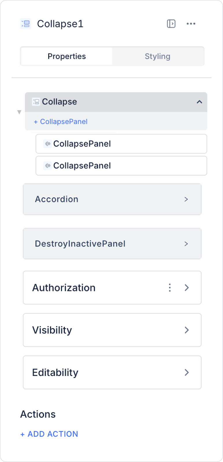
2.1. Collapse Element Properties
You can configure the properties of the Collapse element from the Properties panel on the right side.
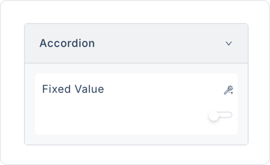
Accordion: When a panel is opened, it automatically collapses the other open panels. This feature helps the content look more organized.
Destroy Inactive Panel: Allows the user to keep only one panel open. When a panel is opened, other open panels automatically close.
2.1.1. Collapse Panel Properties
Default Open: Determines whether the panel opens by default or is closed.
Header: Refers to the panel's header area; the header content and appearance are controlled through this area.
Show Arrow: Determines the visibility of the arrow icon indicating that the panel can be expanded or collapsed.
Title Bg Color: Sets the background color of the panel’s header area.
Title Font Color: Sets the text color of the panel’s header text.
The Collapse element allows users to see only the information they need and prevents unnecessary clutter in the interface.
2.2. Actions That Can Be Added to the Collapse Element (onChange)
The Collapse element allows actions to be triggered when panel states change. In this context, the onChange event is supported.
onChange is triggered when a user opens or closes a Collapse panel. Thanks to this trigger, panel state-dependent operations can be performed automatically.
The usage scenarios for the onChange trigger are as follows:
Loading data related to the content when the user opens a panel
Changing the visibility of other UI elements (Label, Button, Form, etc.) based on the panel state
Filtering list, table, or chart data based on the opened panel
Running analytics or log actions based on panel changes
Automatically updating a different panel or element when a panel is opened
When the Collapse element is selected, the desired actions can be linked by following the Properties panel → ADD ACTION → onChange step. The onChange event works based on the open/close status of the panel, not the Collapse content itself.
3. How to Use the Collapse Element?
In this section, we will cover the end-to-end use of the Collapse element through example scenarios.
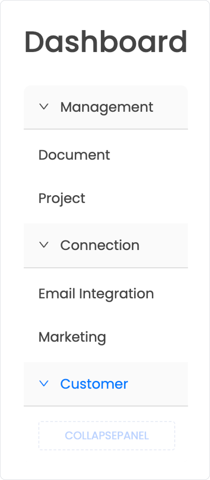
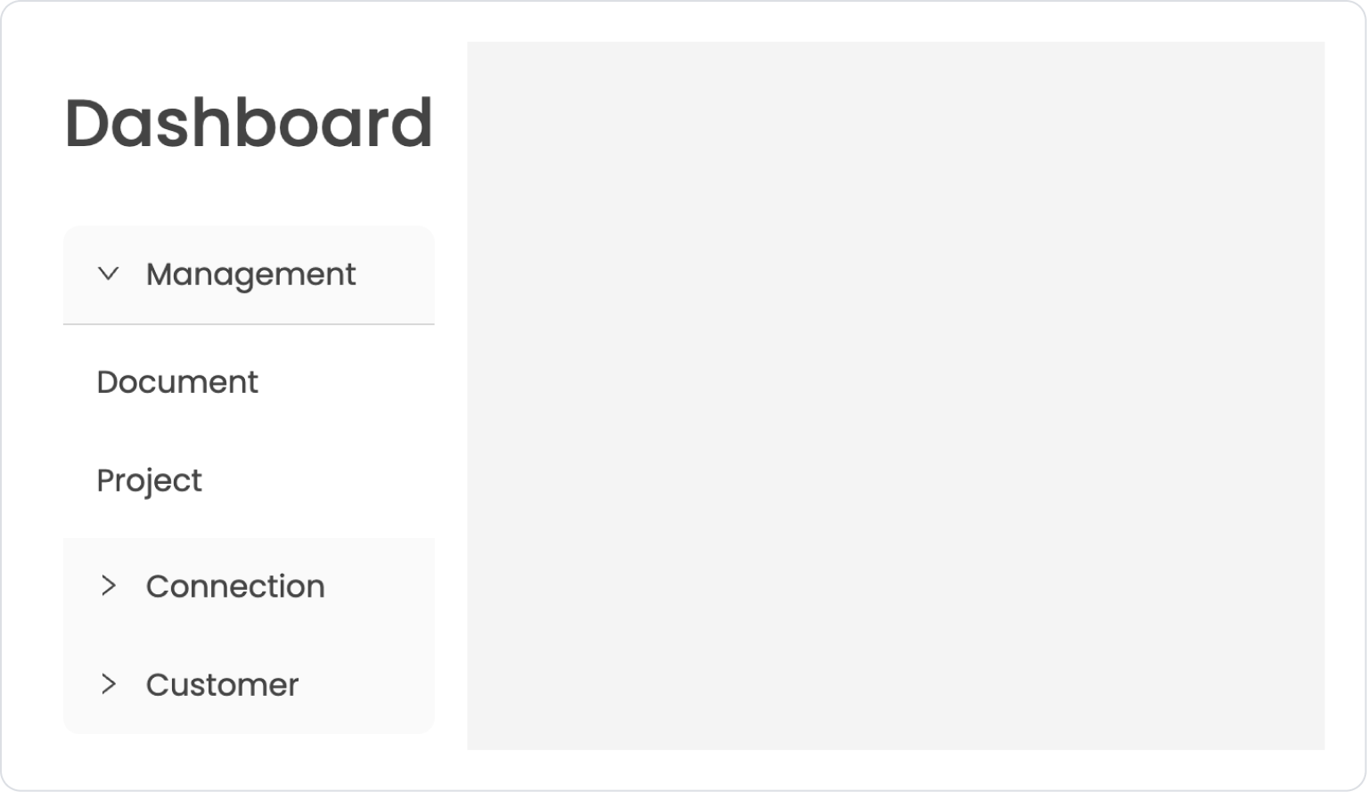
Scenario: Master Screen Collapse Menu Structure (Side Menu)
In a business management or enterprise application, a Collapse-supported side menu (sidebar) structure positioned on the Master Screen is used to allow users to access main and sub-screens within the application through an organized and simple structure. This structure reduces menu clutter while providing users with quick access to the areas they need.
In the scenario:
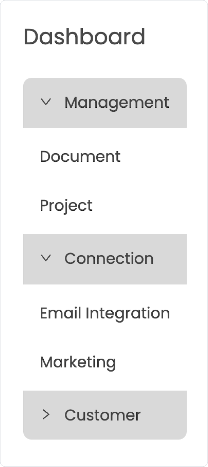
A fixed sidebar menu is located on the left side of the application. Access to the Home Page screen is provided via the Dashboard Label.
The Management, Connection, and Customer headings are configured as Collapse menus that group subpages and open and close only with user interaction.
When the user selects a submenu item, the relevant screen opens in the main content area, providing a simple, controlled navigation experience.
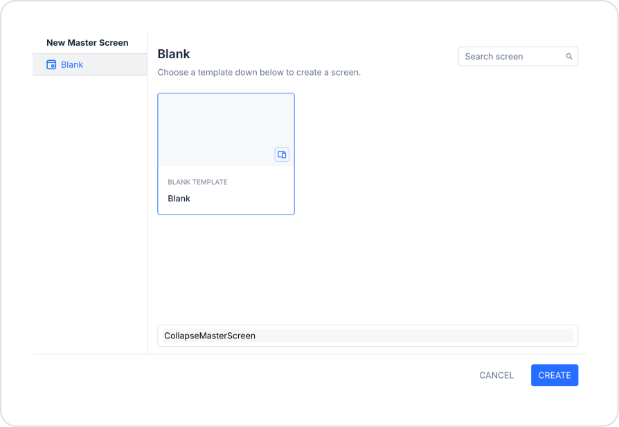
Step 1 - Creating a Master Screen and Adding Elements
Add a new Master Screen from the Master Screen section in the Screens area on the left side panel.
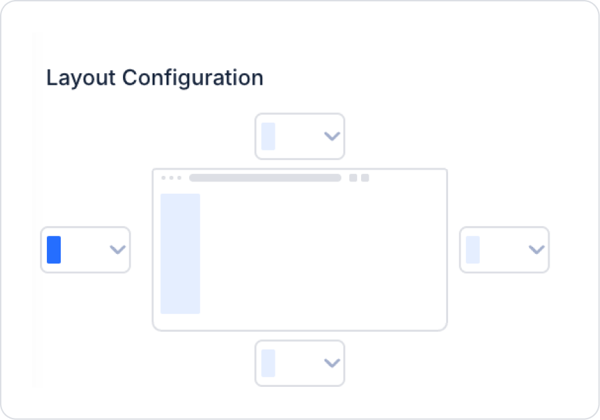
In the Properties area on the screen, close all areas except the left side within Layout Configuration.
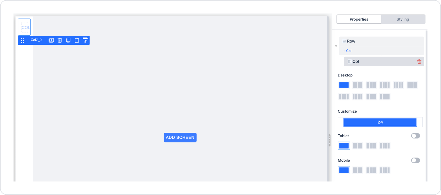
Drag and drop the Elements > Container > Row element into the left side area and set it to a single column in the Row > Properties area.
Add the Elements > Container > VerticalStack element inside Col.
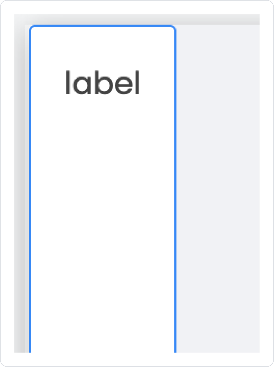
Add the Elements > Display > Label element inside Vertical Stack.
Update the text to Label > Properties > Value > “Dashboard”.
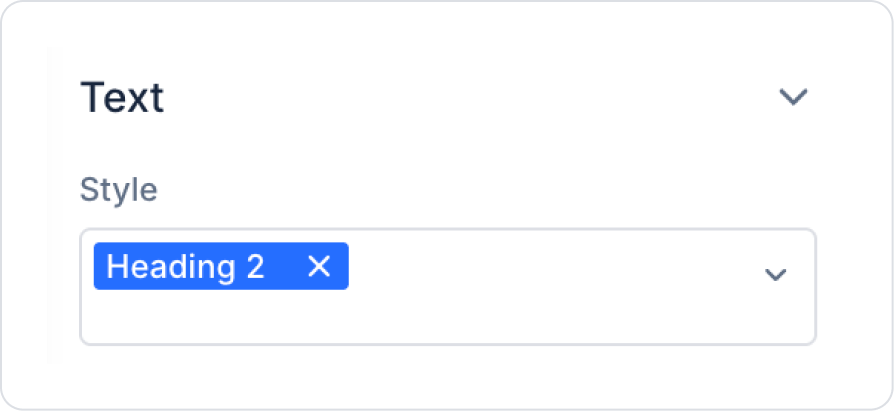
Set the Label element style to Label > Styling > Text > Style > Heading 2.
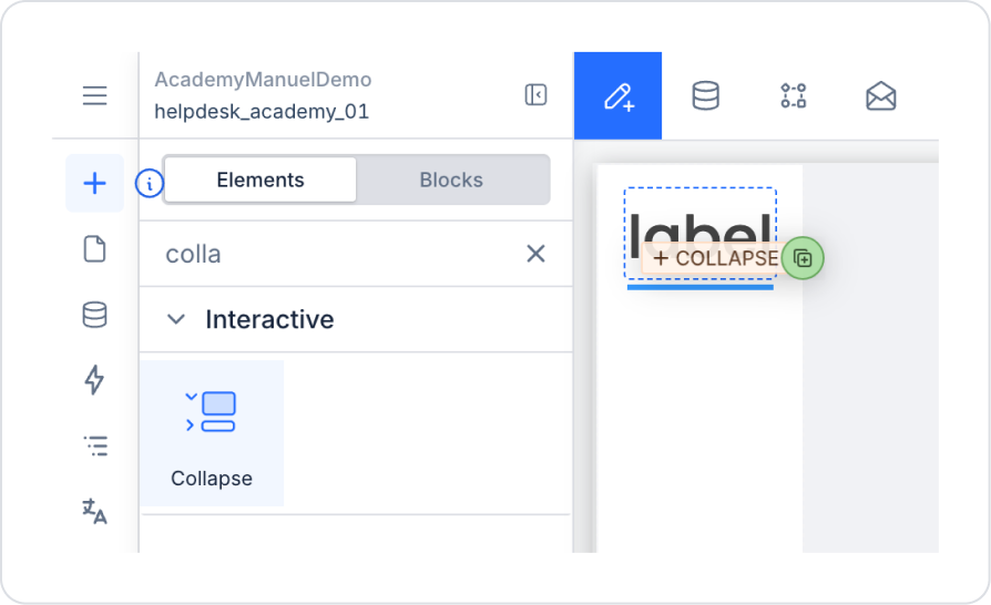
Drag and drop the Elements > Interactive > Collapse element into the vertical stack below the Label element.
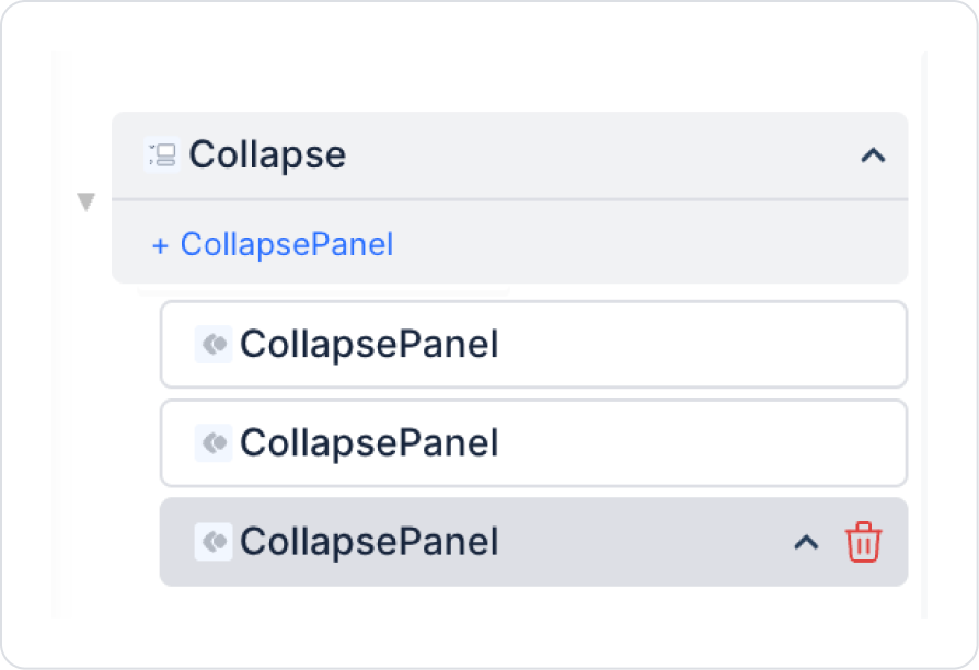
To create another menu, click the Collapse > Properties > +CollapsePanel option within the Collapse menu.
Click on the Collapse text and set it to Accordion > Closed so that multiple menus can be opened.
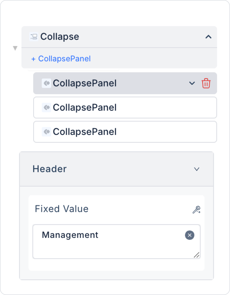
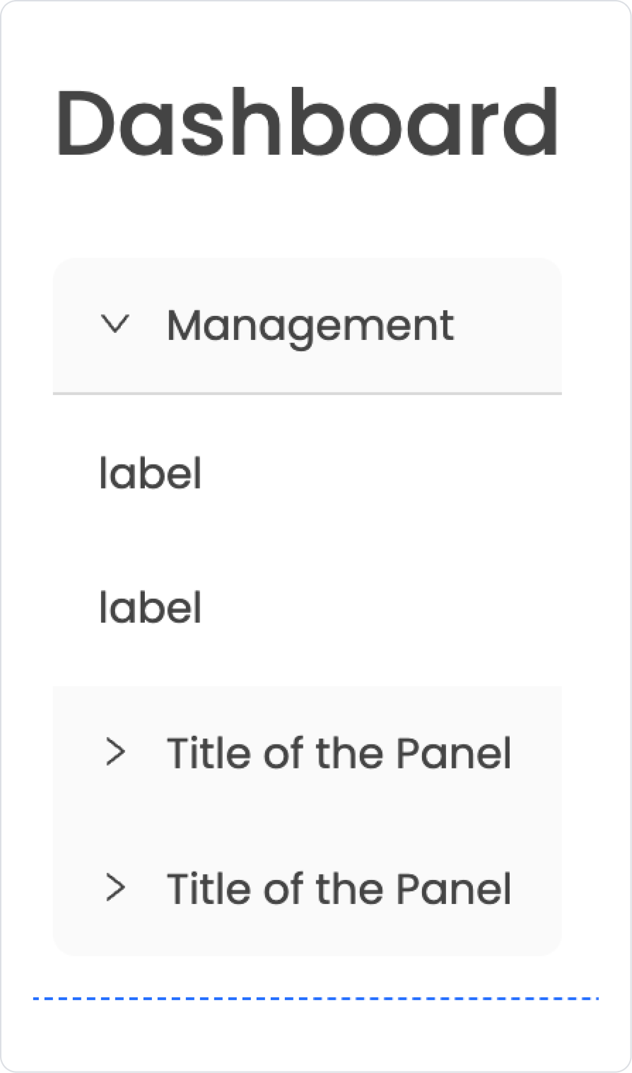
Click on the first CollapsePanel content and set it to Header > “Management”.
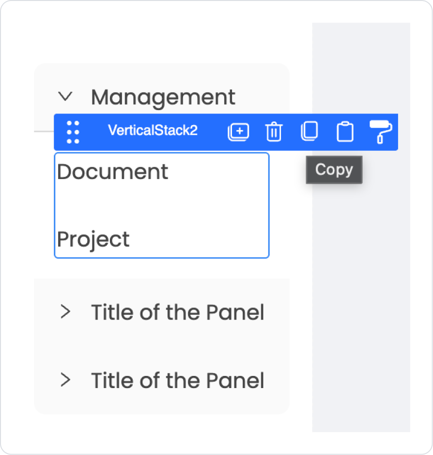
Add Elements > Container > VerticalStack to the CollapsePanel.
Add two new Elements > Display > Label elements to the Vertical Stack.
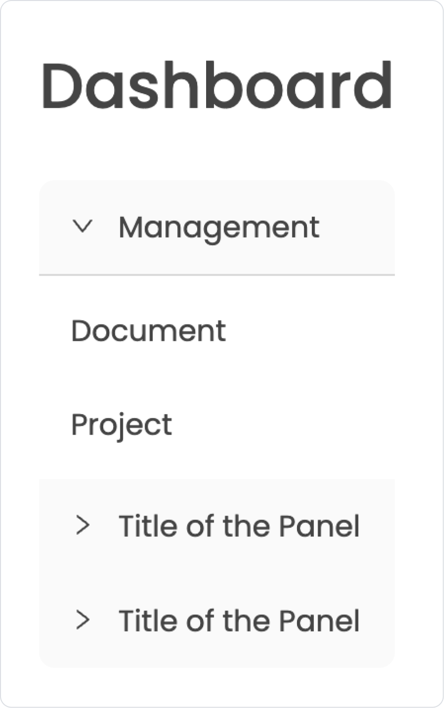
Update the Label values to “Document” and “Project” respectively from the Label > Properties > Value field.
Select the Vertical Stack element containing the labels and press the third option, Copy.
Click inside the other Title of the Panel, click inside the CollapsePanel, and press the fourth option, Paste.
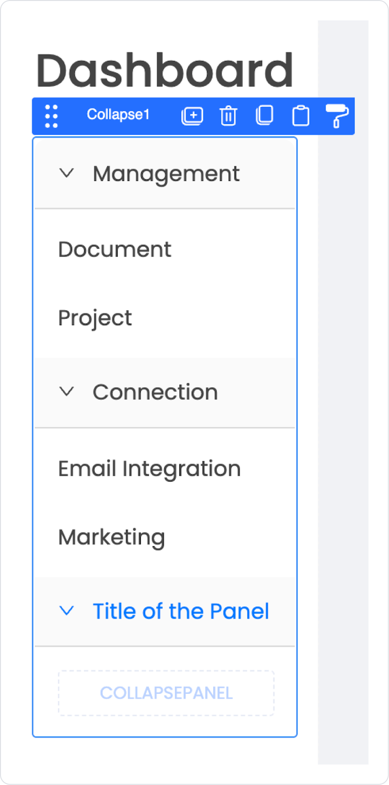
With the Collapse element selected, click on the second CollapsePanel in the Properties field and update it to Header > “Connection”.
Update the Label > Properties > Value fields inside it to “Email Integration” and “Marketing” respectively.
Update the last menu name to the third CollapsePanel > Header > “Customer”.
You can leave the relevant field blank to observe the empty state.
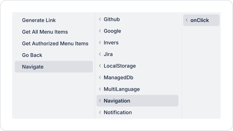
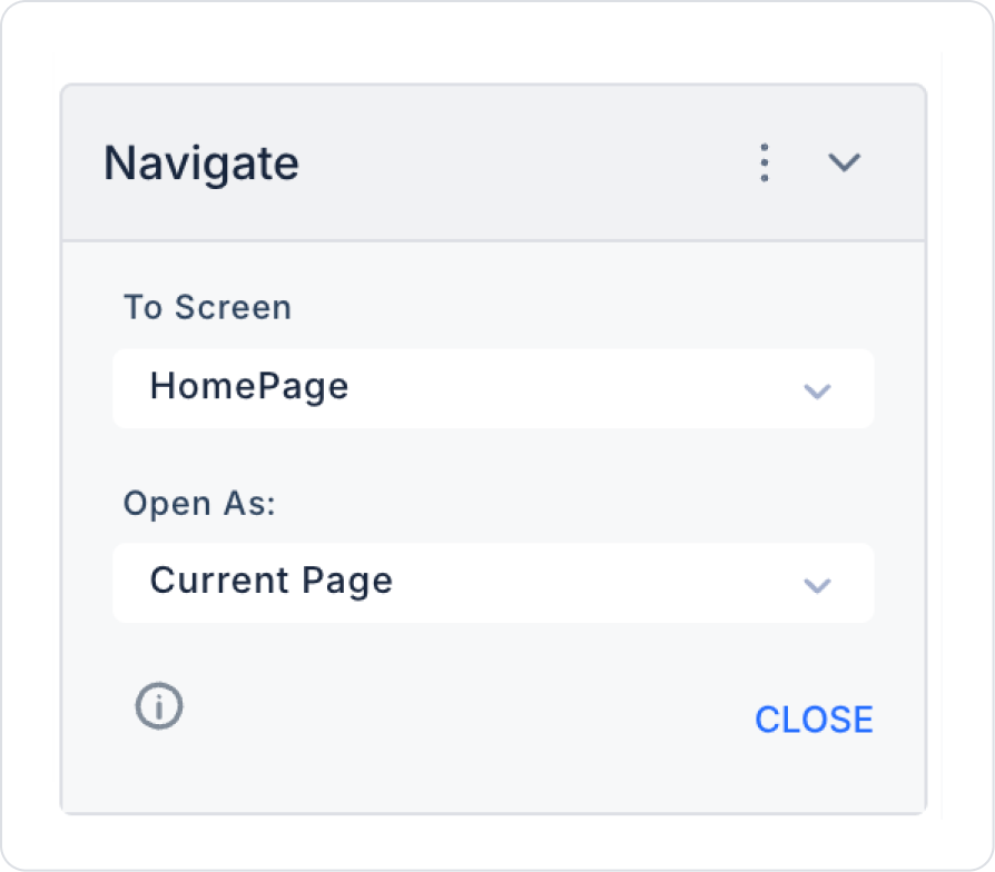
To navigate to the relevant pages, click on the Label where the page name is written, for example, Document. Then add the Add Action > onClick > Navigation > Navigate action to the Document Label.
Similarly, you can add the Navigate action to the Dashboard Label to navigate to the home page.
Define the navigate action for the remaining pages in a similar way.
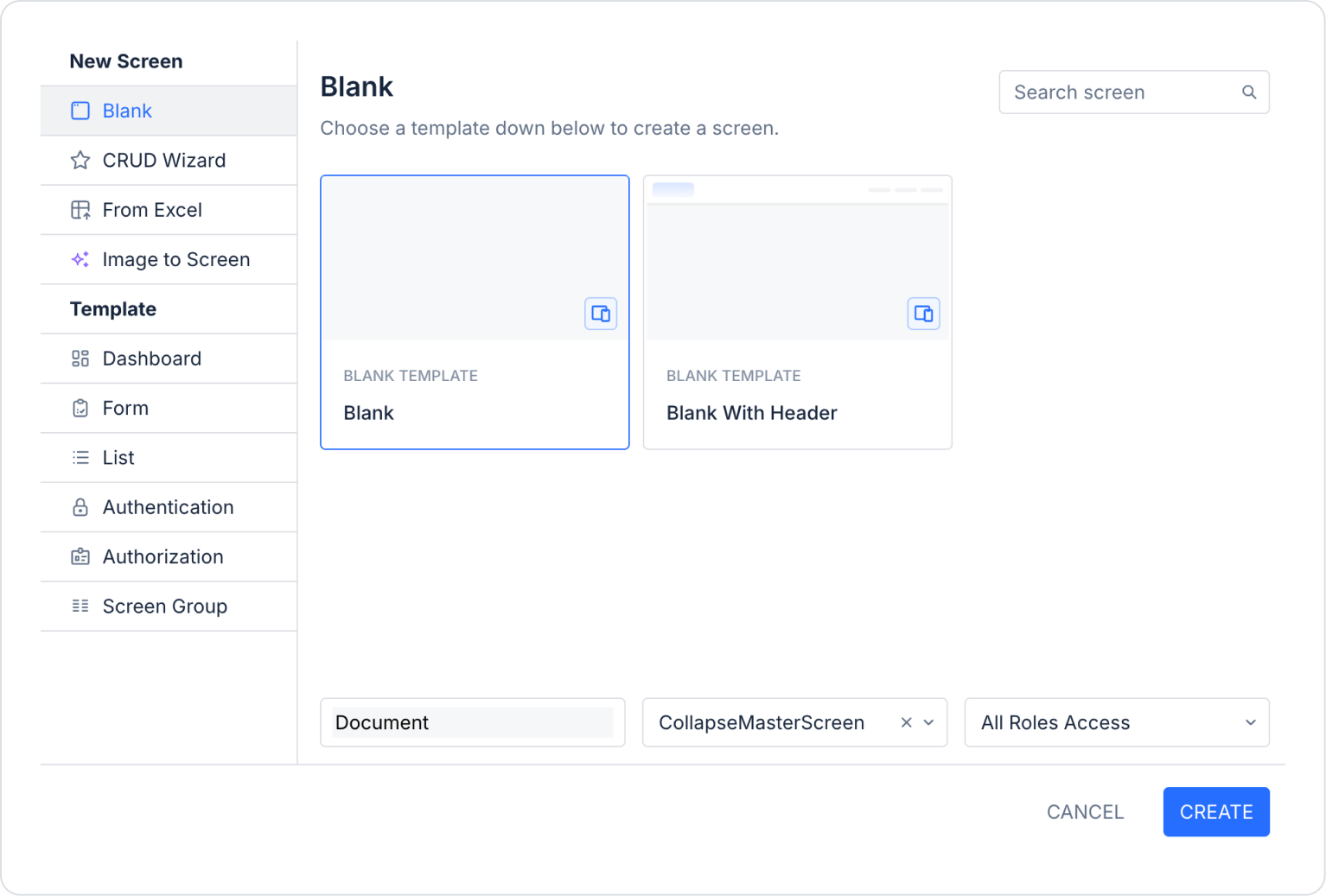
Step 2 - Creating Pages
Open the UI Design module:
In the left side panel, under the Screens section, create new pages named “Document,” “Project,” “Email Integration”, and “Marketing.”
For example, you can create the selected CollapseMasterScreen page for Document as shown below.
You do not need to define roles for the remaining “Project,” “Email Integration,” and “Marketing” pages. Simply create the pages as described in Step 1.2.
Preview
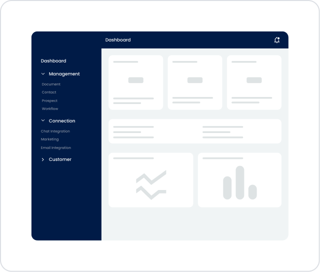
When the application is tested, you can see that it is easy to navigate between screens using the Dashboard side menu, which is fixed on the left side. The Management, Connection, and Customer headings are organized with the Collapse structure, allowing users to quickly access subpages such as Document and Project by opening only the menus they need. This structure provides a simple, controlled, and understandable navigation experience within the application.
4. Common Properties
Some fields on the Collapse element are used commonly in all UI elements. Therefore, detailed descriptions of the following features are available in the relevant general guide pages:
Use the Accordion structure to ensure that only one panel remains open at a time. This approach keeps users focused on a single piece of content and reduces information overload.
Use the onChange trigger only in necessary scenarios. Performing heavy actions (SQL, API calls, etc.) every time a panel opens can lead to performance issues.
Keep panel titles short, clear, and action-oriented. Users should understand what content they will see before opening the panel.
Keep the panel hierarchy simple when using nested Collapse elements. Multi-layered structures can negatively impact the user experience.
6. Limitations
The Collapse element is only supported in web applications. It is not supported for use in mobile applications.
Collapse panels do not connect directly to a data source. Content is managed through other UI elements added to the panel.
The onChange trigger only works when the panel is opening or closing; it does not cover interactions with elements inside the panel.
Keeping too many panels open at the same time can reduce page performance, especially with long content. Therefore, the Accordion or Destroy Inactive Panel options are recommended.


