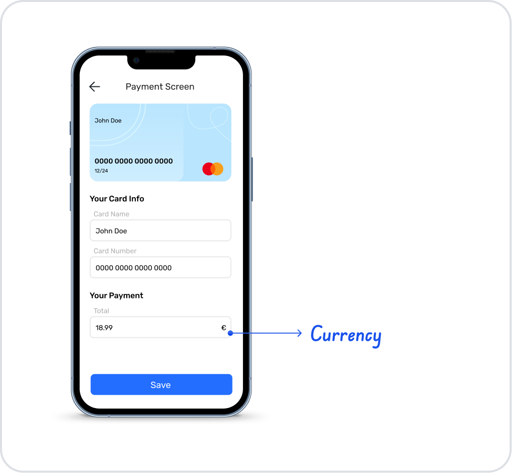
The currency element is an input element that allows users to enter values in currency format in your application. The currency element is used in all scenarios where numerical monetary data, such as price, budget, payment, salary, order amount, and campaign discount, must be entered and displayed in the correct format.
The Currency element can only be used in web applications.
1.1. Common Use Cases
Product/service price entry (e.g., $12.50)
Order total, cart total, payment amount fields
Budget, expense, income, quote amount entries
Monetary calculation fields such as discount, commission, tax amount
Amount filters for reporting purposes in management panels (such as min–max amount)
Forms where the user enters an “amount” (donation, deposit, refund amount, etc.)
2. Key Features
Decimal Scale: The number of decimal places to be entered can be limited. This ensures standardized amount entries, especially in financial transactions.
Numeric Data Validation: Prevents the entry of letters, special characters, or invalid formats, ensuring that only valid monetary values are entered.
Compatible with form and data processing: The Currency element works seamlessly with form submit operations, state updates, calculation actions, and backend integrations.
Consistent behavior with other input elements: Supports common properties such as Visibility, Authorization, and Editability, providing a standard usage across the application.
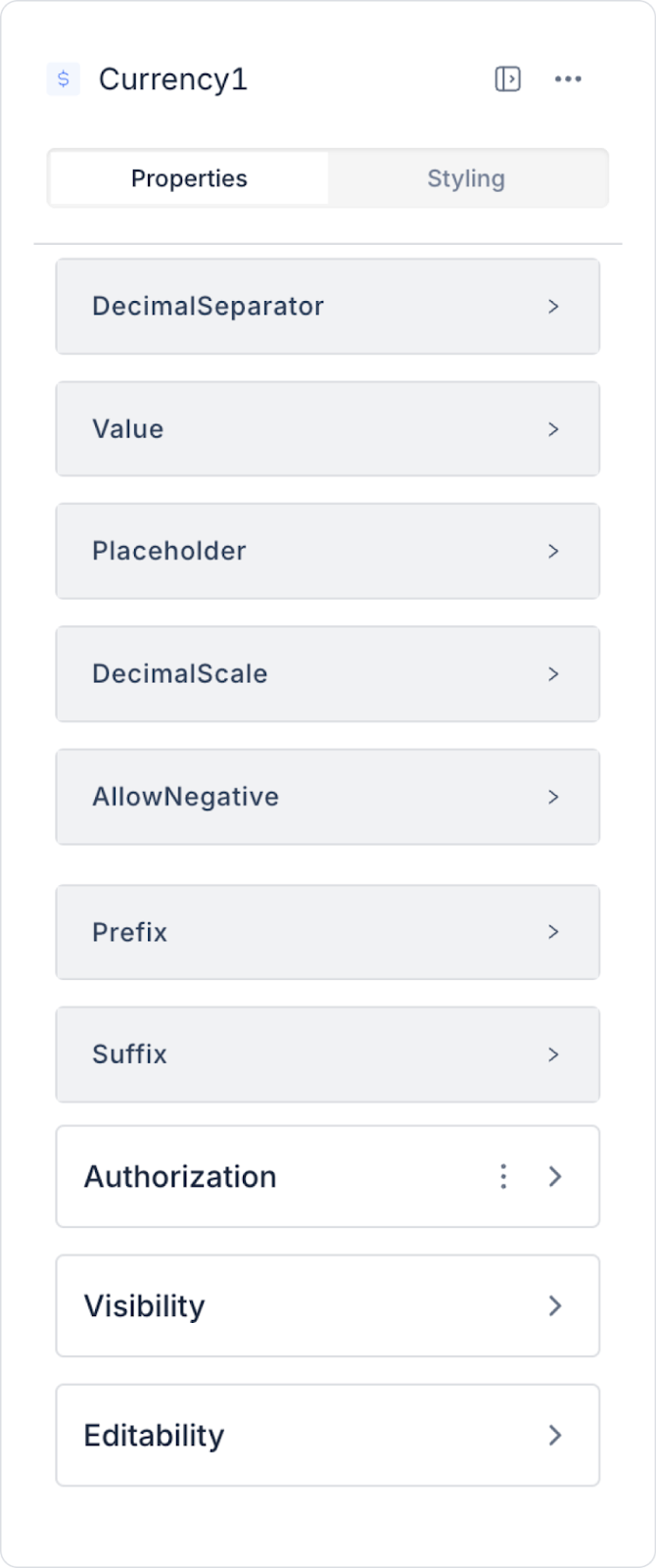
2.1. Currency Element Properties
You can configure the following settings from the Properties panel:
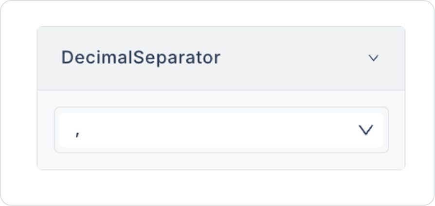
Decimal Separator: The character used to separate the decimal part (e.g., 1,234.56 or 1.234,56).
Value: The value that will be displayed by default in the currency element. It can be a static value or determined dynamically.
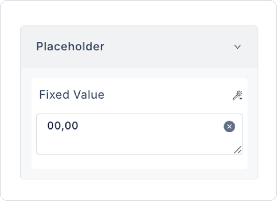
Placeholder: The placeholder text displayed when no value is entered.
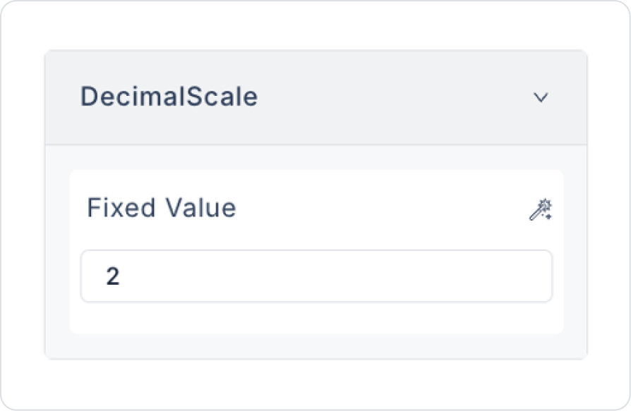
Decimal Scale: Determines the number of digits to be displayed in the decimal part (e.g., when set to 2, it will be displayed as 123.45).
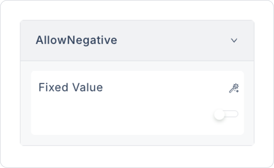
Allow Negative: Determines whether users are allowed to enter negative values.
Prefix: Defines the text to be displayed before the value (e.g., “$” or “€”).
Suffix: Defines the text to be displayed after the value (e.g., “ USD” or “ EUR”).
By following this guide, you can effectively use the Currency element in your application.
2.2. Actions That Can Be Added to Elements
Since the Currency element is an input element that allows monetary value input from the user, it supports triggering actions through specific user interactions. Actions are defined based on events, not on the element itself.
Actions for the Currency element can be linked to the following events via the Properties > Add Action area in the right panel.
Supported Action Triggers
onChange: Triggered whenever the user changes the value in the Currency field.
Uses:
Performing instant calculations based on the entered amount (e.g., adding VAT, calculating discounts)
Updating state or variables
Dynamically changing the values of other fields
Displaying live validation or warning messages
Example scenario: When the user enters an amount, the total price is automatically calculated and displayed in another field.
onPressEnter: Triggered when the user presses the Enter key while in the Currency field.
Uses:
Form submission (submit)
Proceeding to the next step
Executing a navigation action
Initiating save or confirmation actions
Example scenario: When the user enters the amount and presses Enter, they are directed to the payment step.
Basic Rules Regarding Actions
The Currency element cannot trigger actions directly; actions only work through the onChange and onPressEnter events.
Added actions only work when the relevant event is triggered.
Multiple actions can be defined for the same event.
The Currency element offers a powerful and flexible structure when used with actions, especially in calculation, data processing, and form scenarios.
3. How to Use the Currency Element?
In this section, we will cover the end-to-end use of the Currency element through an e-commerce product pricing scenario.
Scenario: Entering Product Price with the Currency Element
In an e-commerce or product management application, administrators need to enter product prices in a correct and consistent format. Free text fields can lead to incorrect formatting and erroneous entries.
In this scenario, the product price is entered using the Currency element. The entered value is automatically formatted according to the selected currency and made ready for saving.
In the scenario:
The product price is obtained from the user using the Currency element.
The entered value is automatically converted to the currency format.
Negative values are not allowed.
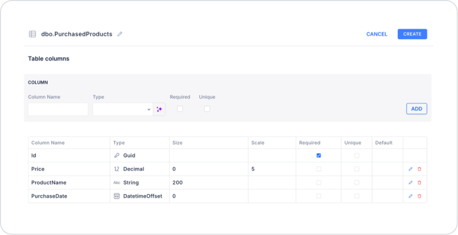
Step 1 - Creating a Data Source
Creating a table in the DataSources module:
Go to the Datasources module.
Then go to the Tables tab.
Create a new table named “PurchasedProducts”.
The table structure to be set up is as follows:
Important Field names:
ProductName: Holds the name of the purchased product. It is the main text field entered by the user on the form.
Price: Represents the purchase price of the product. It is a numeric data type and is used in amount-based calculations.
PurchaseDate: Stores the date and time the product was purchased. Used in time-based filtering and reporting scenarios.
Step 2 – Adding Elements to the Main Page
Open the UI Design module.
Drag and drop the Elements > Display > Label element onto the page.
Update the text inside the Label to Label > Properties > Values > “Product Name”.
To enter the product name below the Label element, drag and drop the Elements > Text Input > TextInput element.
Drag and drop the Elements > Display > Label element onto the page below the Text Input element.
Update the text inside the Label to Label > Properties > Values > “Product Price”.
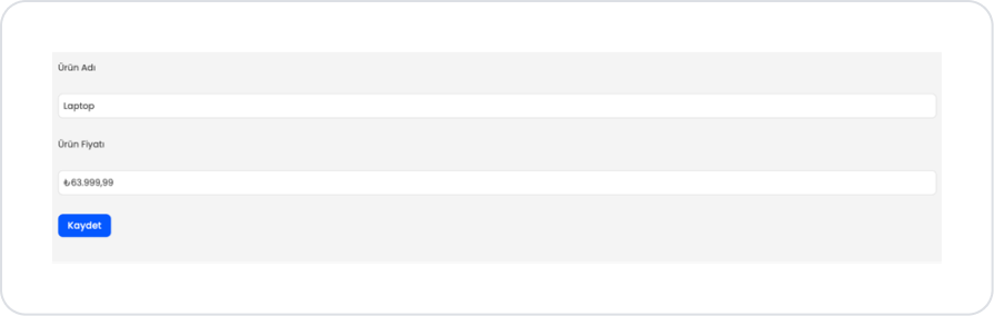
Drag and drop the Elements > Numeric Input > Currency element onto the page.
Set the separator type to Currency > Properties > DecimalSeparator > “,”.
In the scenario where prices will be displayed, you can create dynamic price displays from the Currency > Properties > Value > Action Results field.
Update the pre-price as Currency > Properties > Placeholder > 00.00.
Set the scale to Currency > Properties > DecimalScale > 2.
To prevent negative number input, set Currency > Properties > AllowNegative > Closed.
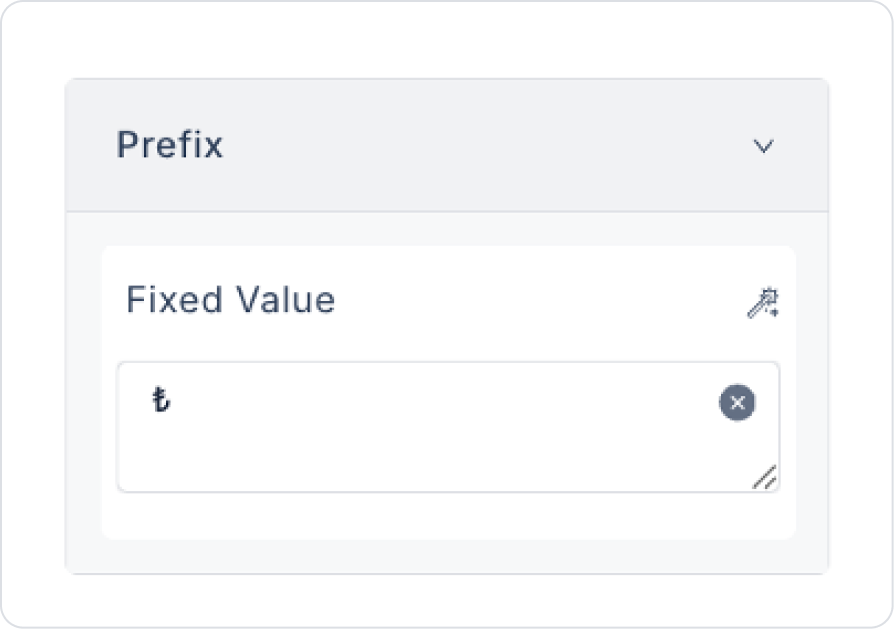
Add the price unit Currency > Properties > Prefix > Fixed Value > ₺.
You can also define your price units dynamically via SelectBox or Table.
To save the price to the page, drag and drop the Elements > Navigation > Button element.
Set the button text to Button > Properties > Label > Fixed Value > “Save”.
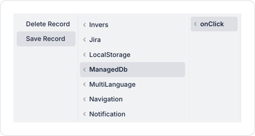
Add an action to the Button element. Add the Add Action > onClick > Managed DB > Save Record action.
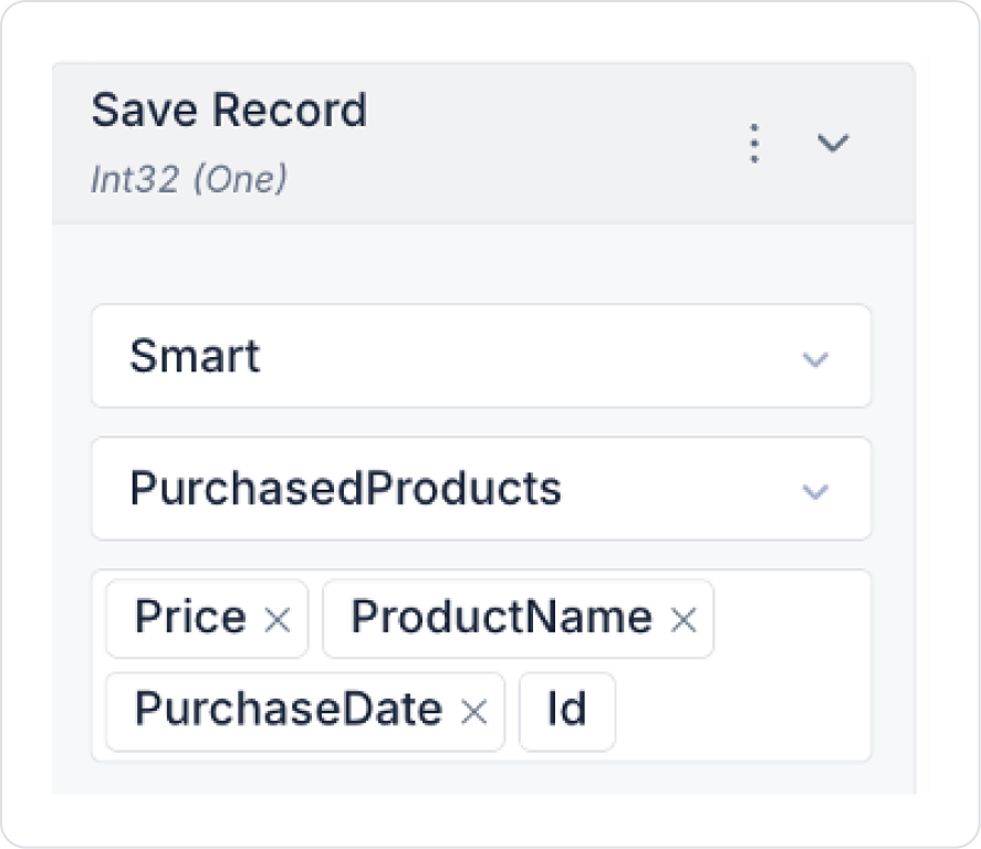
Set the table selection in the action to PurchaseProducts and select all columns in the opened columns field.
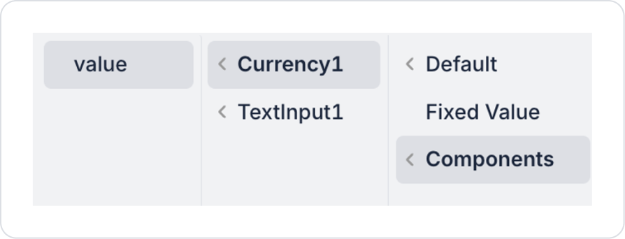
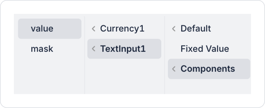
Define the Price field as Components > Currency > value.
Define the ProductName field as Components > TextInput > value.
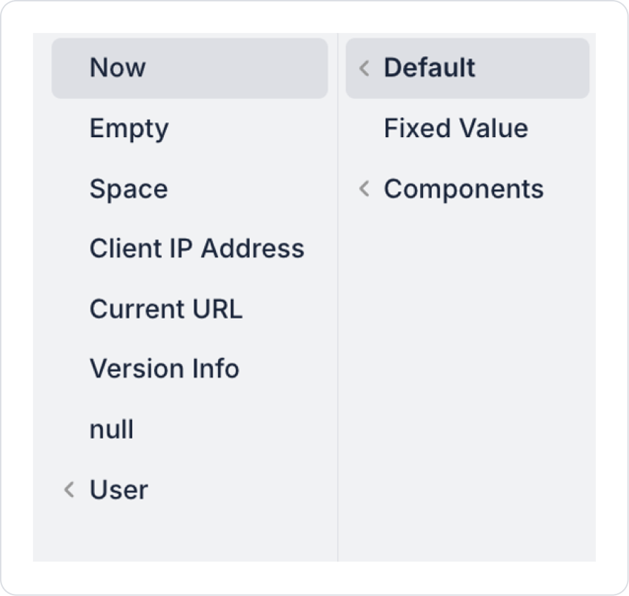
Set the PurchaseDate field to Default > Now.
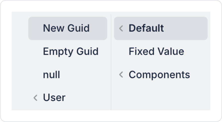
Set the Id field to Default > New Guid.
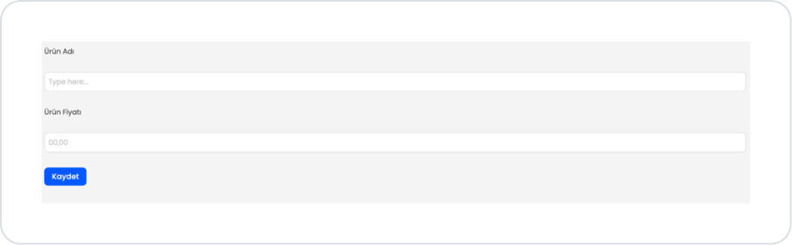
Preview
When the application is tested, a simple and user-friendly form screen is displayed for adding and editing products. The screen contains the Product Name and Product Price fields.
When the form first opens, the fields are empty. The Product Name field is ready for text input, while the Product Price field is displayed in the default format, ready for numerical value input. The user fills out the form by entering the product information into these fields. If you press “. ” or “, ” for decimal values, it will use the “, ” separator we defined.
After the user enters the required information and clicks the Save button, the form data is processed by the system and the product information is saved.
4. Common Properties
Some fields on the Currency element are used in common across all UI elements. Therefore, detailed explanations of the following properties can be found in the relevant general guide pages:
Set the DecimalScale value according to the scenario. Two decimal places are usually sufficient for price and payment fields. You can prevent unnecessary entries by using 0 in cases where decimal precision is not required.
Use the correct decimal separator. Selecting the separator (. or ,) that your target audience is accustomed to reduces input errors.
Guide the user with placeholders. Descriptive placeholders such as 0.00 or Enter amount ensure that the expected format is understood.
Consciously manage the use of negative values. AllowNegative should only be enabled in scenarios such as debt, refund, or loss. It is recommended to keep it disabled for prices and sales amounts.
6. Restrictions
There is no separate selection field for the currency symbol (₺, $, € etc.); the element only provides numeric monetary formatting.
Actions can only be triggered via the onChange and onPressEnter events.


