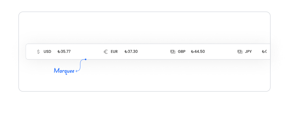
The marquee element is an effective visual element used in your application to draw users' attention by scrolling text horizontally. Thanks to its animated structure, it can be used to highlight announcements, campaigns, messages, or prominent information. It prevents important content from being overlooked by providing users with a constantly visible information area.
Marquee can smoothly scroll content such as text, short descriptions, or warnings from left to right or right to left. It also easily adapts to the design of the application with speed, direction, and style customizations.
The marquee element is supported in web and mobile applications.
1.1. Common Use Cases
Highlight announcement texts. It can be used to display important notifications, system messages, or short alerts in a moving manner so that users do not overlook them.
Display campaign or promotion information. Discount announcements, campaign codes, or seasonal offers can be presented in an eye-catching way in the marquee area.
Promoting featured content. It can be used for text that needs to attract attention, such as news headlines, recently added content, or new product announcements.
Displaying system messages or status updates. Stream announcements, planned outage notifications, or live system messages can be continuously visible in the marquee area.
Create dynamic emphasis on dashboards or app home pages. KPIs, notifications, or short descriptions that users need to notice quickly can be supported with animated text.
Present event announcements. Webinar, seminar, meeting, or event dates can be listed smoothly in the marquee area.
2. Key Features
Infinite Loop Logic. Marquee content repeats continuously unless the user stops it.
Speed Control. You can adjust the scrolling speed of the text to make the content appear more distinct or smoother.
Hover Support for Stopping. Scrolling can be stopped when the user hovers the cursor over the text (optional).
Mobile and Web Compatible Structure. Provides a smooth scrolling experience on all devices.
2.1. Marquee Element Properties
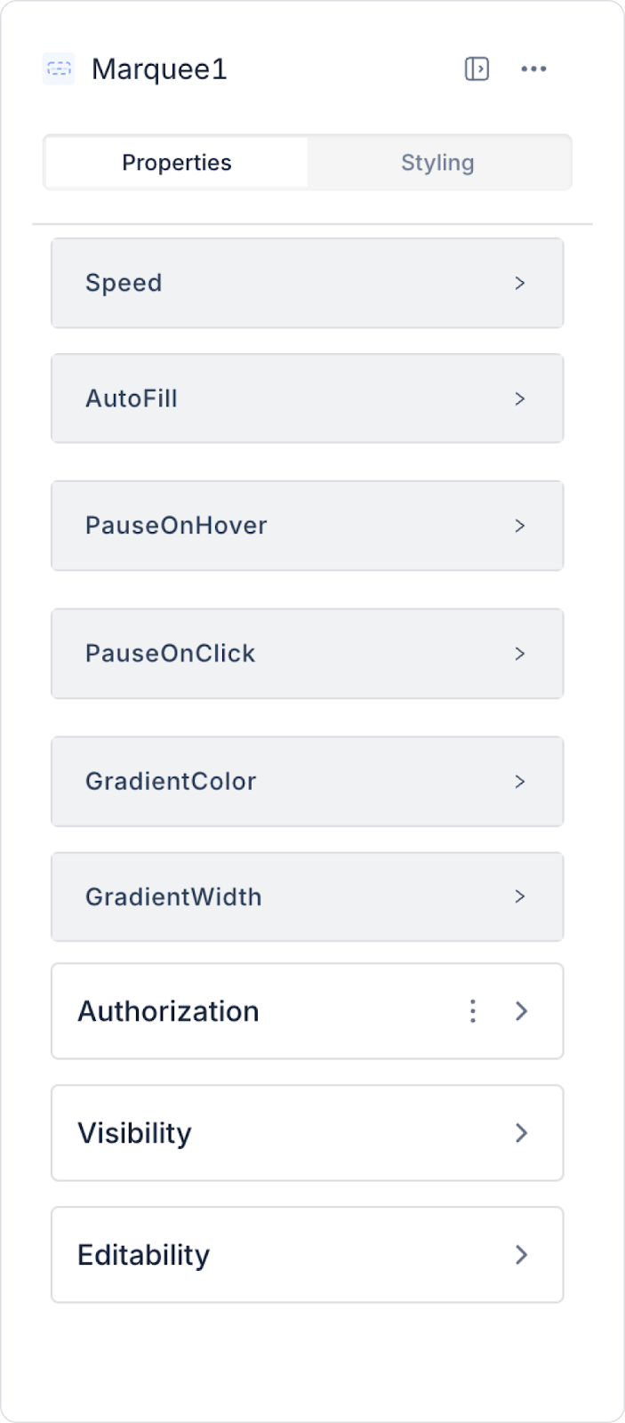
When you select the marquee element, you can configure the scrolling speed, direction, user interaction-based pause settings, and visual effects of the text in detail via the Properties panel on the right. All of the following settings are explained point by point.
Speed: Adjusts the scrolling speed of the text. As the value increases, the content moves faster. The speed can be increased for content that needs to be emphasized, such as announcements or warnings.
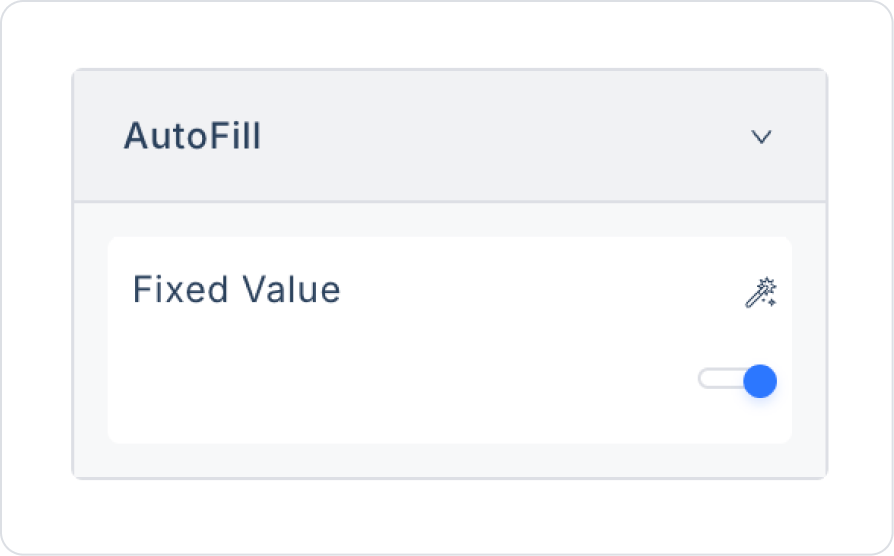
Auto Fill: Ensures that the text in the marquee is displayed continuously, filling the space without leaving any gaps. It is used to achieve a smooth appearance in long texts.
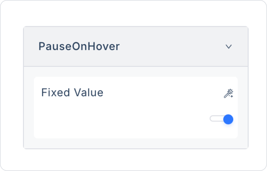
Pause On Hover: Stops the scrolling motion when the user hovers over the marquee. This feature is especially preferred for long texts that need to be read.
Pause On Click: Stops the scrolling motion when the user clicks on the marquee area. It provides control for users who want to review the content.
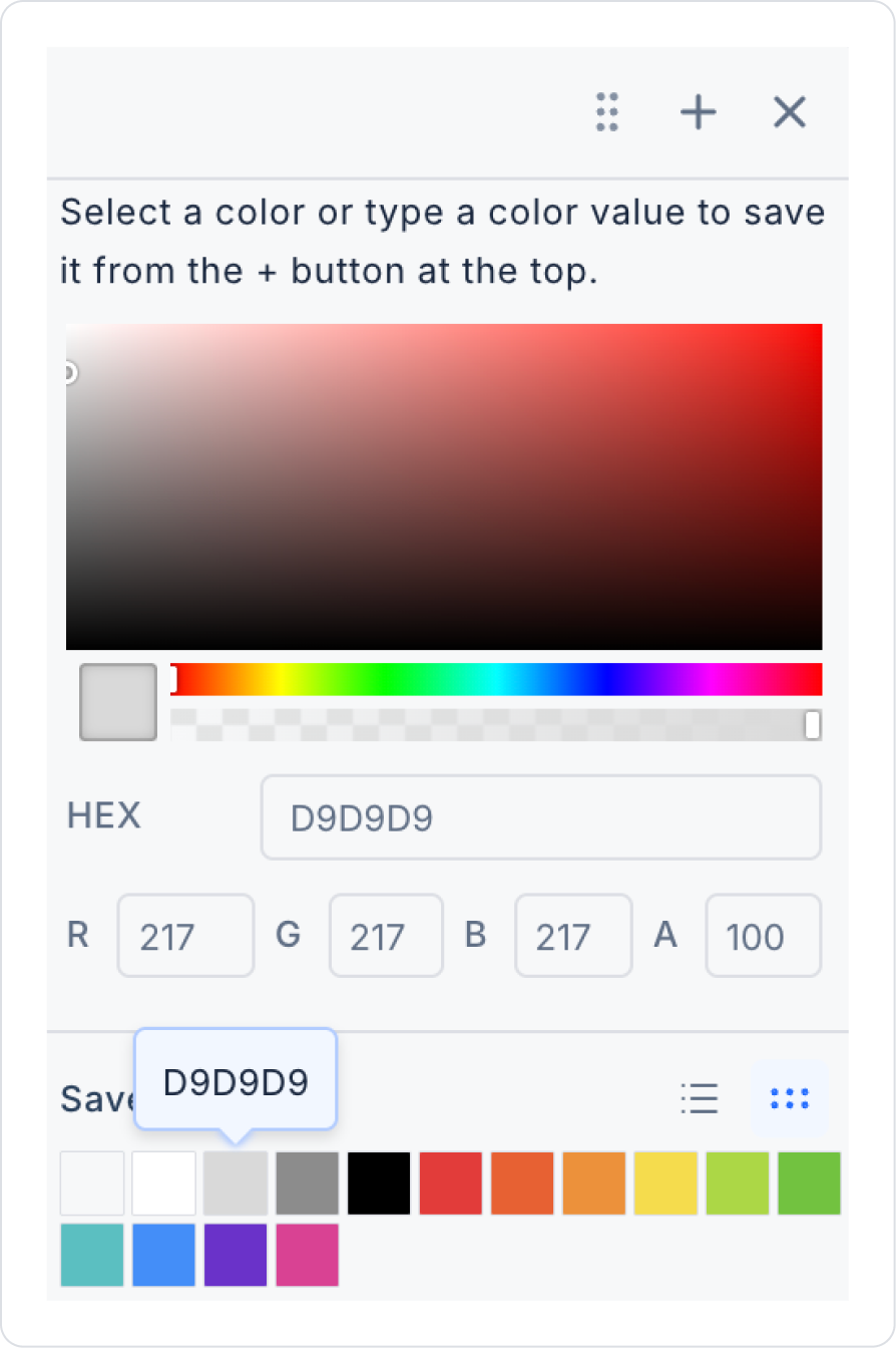
Gradient Color: Determines the color of the shadow effect visible on the right and left edges of the marquee area. This effect creates the impression that the scrolling text is fading away at the edges.
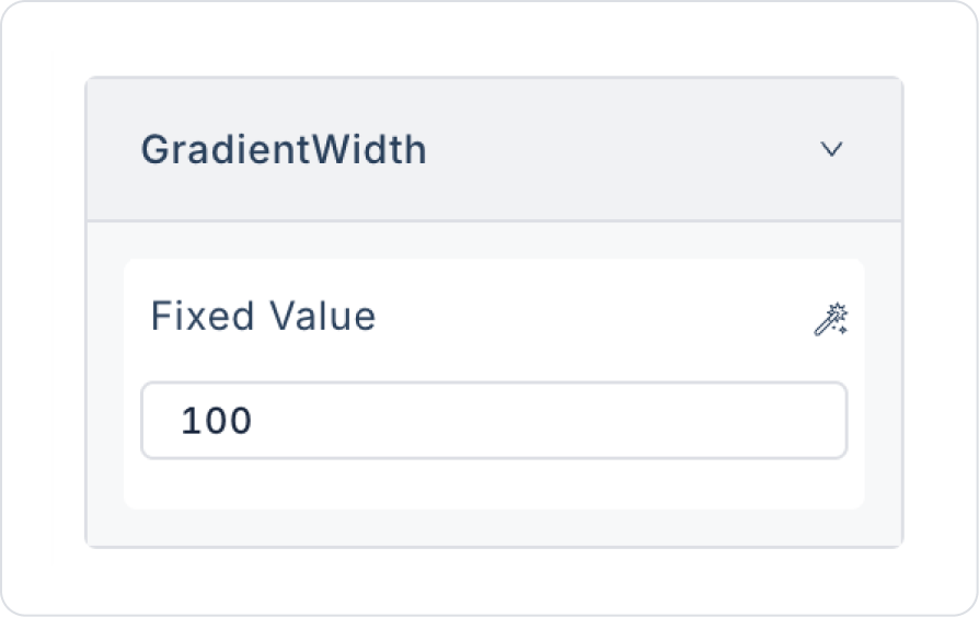
Gradient Width: Adjusts the width (thickness) of the shadow to be displayed at the edges. A wider value ensures that the text appears with a smooth transition.
2.2. Actions That Can Be Added to the Marquee Element
Since the marquee element is a passive structure focused on scrolling text horizontally, it does not support actions triggered directly by user interaction. Therefore, when the element is selected, the ADD ACTION button is not visible, and no trigger specific to the marquee element can be added.
The following points explain the action structure of the Marquee element:
Marquee does not execute actions on interactions such as user clicks, hovering over text, or scrolling.
All user behaviors on Marquee (e.g., stopping with hover) are managed through the behavior settings in the Properties panel and cannot be defined as actions.
When the text content needs to be updated or changed, this is done by triggering the data source linked to the Marquee externally.
For scenarios requiring user interaction (e.g., “Update the Marquee text when the user clicks the button”), actions must be triggered via buttons, switches, radio groups, or other control elements.
The Marquee only displays the text given to it by scrolling; it cannot initiate any actions on its own.
No actions can be defined on the Marquee element; all changes to the scrolling content are managed by external elements or page actions.
3. How to Use the Marquee Element?
In this section, we will cover the end-to-end use of the Marquee element through example scenarios.
Scenario: Scrolling Currency Exchange Rate Information Area
In this scenario, the application uses the Marquee element to present users with the current currency exchange rate data published by the Central Bank of the Republic of Turkey (CBRT) in a scrolling format. Exchange rate information obtained from the CBRT source at specific intervals or upon user request is processed to create a continuously scrolling information area on the screen.
Users can continuously track the buying and selling values of major currencies such as the dollar and euro on a single line. This structure allows current financial data to be obtained from a reliable source and presented to users in a simple, understandable, and eye-catching way.
In the scenario:
When the application is opened, the current exchange rates published by the Central Bank are displayed on the screen in a sliding format within the Marquee element.
Users can continuously track the buying and selling values of major currencies such as the dollar and euro on a single line.
Exchange rate information is presented in a simple and readable scrolling text structure, providing information without taking up space on the screen.
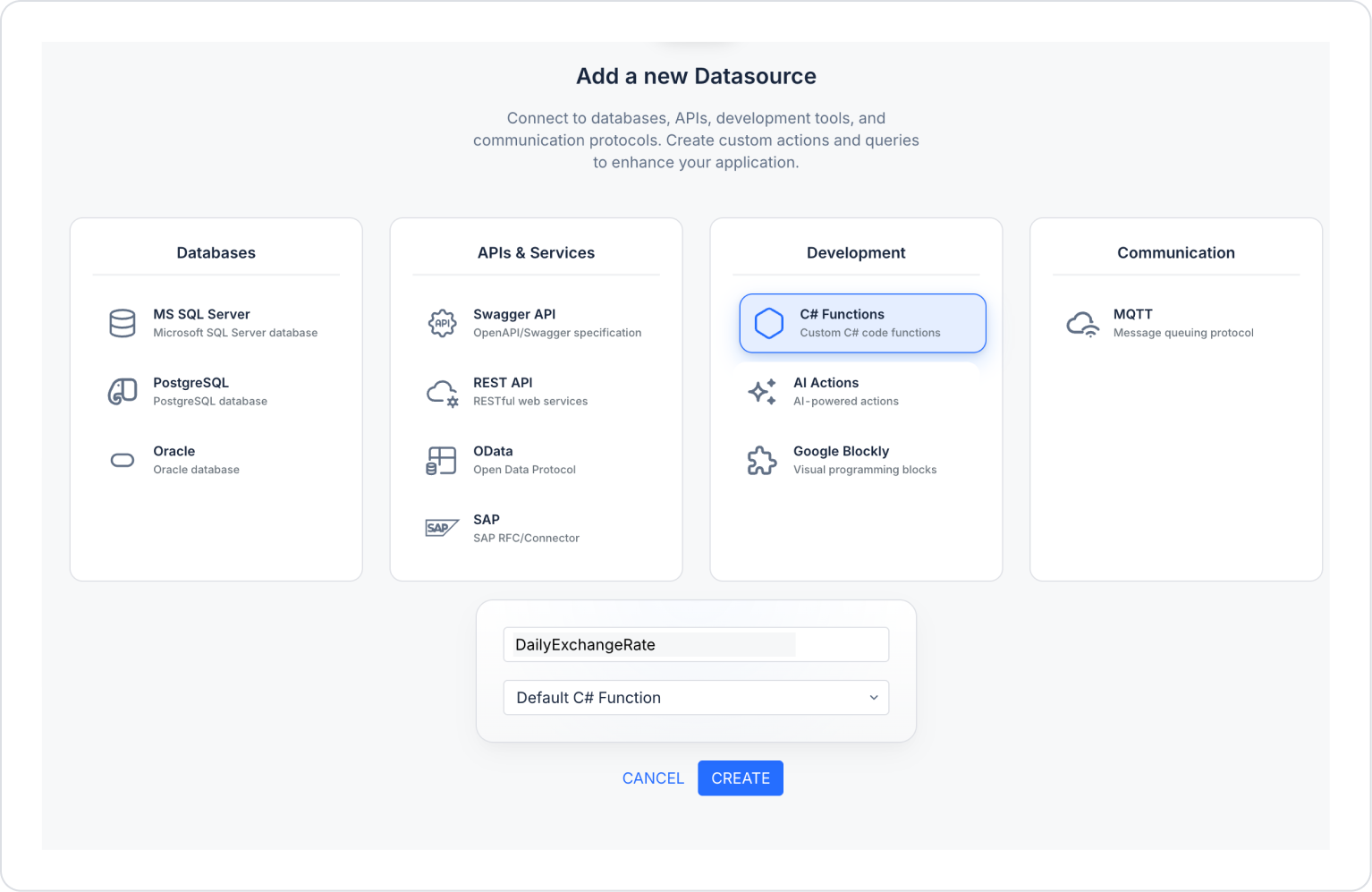
Step 1 - Creating the Data Source
Add a new C# function in the DataSources module:
Go to the Datasources module.
Then click the add icon next to Sources.
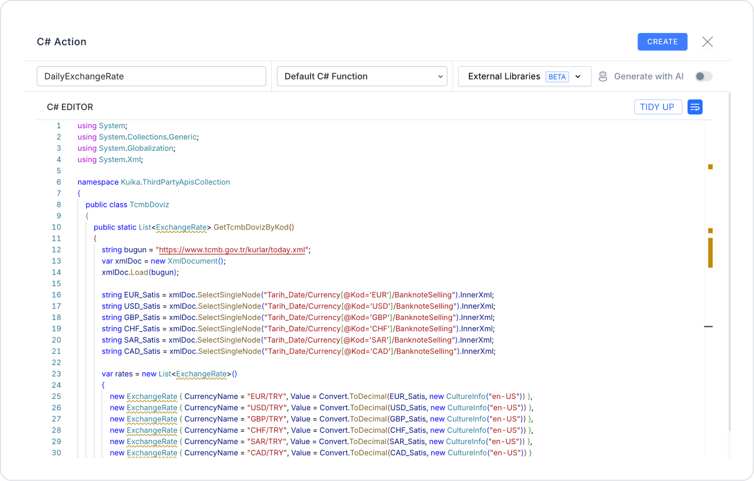
On the page that opens, select the C# Functions field and create one named ‘DailyExchangeRate’:
Delete the code in the newly opened field and add the following C# code instead, then press the CREATE button in the upper right corner.
using System;
using System.Collections.Generic;
using System.Globalization;
using System.Xml;
namespace Kuika.ThirdPartyApisCollection
{
public classTcmbDoviz{
public static List<ExchangeRate> GetTcmbDovizByKod(){
string bugun = “https://www.tcmb.gov.tr/kurlar/today.xml”;var xmlDoc = new XmlDocument();
xmlDoc.Load(bugun);
string EUR_Satis = xmlDoc.SelectSingleNode(“Tarih_Date/Currency[@Kod=‘EUR’]/BanknoteSelling”).InnerXml;
string USD_Selling = xmlDoc.SelectSingleNode(“Tarih_Date/Currency[@Kod=‘USD’]/BanknoteSelling”).InnerXml;
string GBP_Selling = xmlDoc.SelectSingleNode(“Tarih_Date/Currency[@Kod=‘GBP’]/BanknoteSelling”).InnerXml;
string CHF_Sales = xmlDoc.SelectSingleNode(“Date/Currency[@Code=‘CHF’]/BanknoteSelling”).InnerXml;
string SAR_Sales = xmlDoc.SelectSingleNode(“Date/Currency[@Code=‘SAR’]/BanknoteSelling”).InnerXml;
string CAD_Sales = xmlDoc.SelectSingleNode(“Date/Currency[@Code=‘CAD’]/BanknoteSelling”).InnerXml;
var rates = new List<ExchangeRate>()
{
new ExchangeRate { CurrencyName = “EUR/TRY”, Value = Convert.ToDecimal(EUR_Satis, new CultureInfo(“en-US”)) },
new ExchangeRate { CurrencyName = “USD/TRY”, Value = Convert.ToDecimal(USD_Satis, new CultureInfo(“en-US”)) },
new ExchangeRate { CurrencyName = “GBP/TRY”, Value = Convert.ToDecimal(GBP_Satis, new CultureInfo(“en-US”)) },
new ExchangeRate { CurrencyName = “CHF/TRY”, Value = Convert.ToDecimal(CHF_Satis, new CultureInfo(“en-US”)) },
new ExchangeRate { CurrencyName = “SAR/TRY”, Value = Convert.ToDecimal(SAR_Satis, new CultureInfo(“en-US”)) },
new ExchangeRate { CurrencyName = “CAD/TRY”, Value = Convert.ToDecimal(CAD_Satis, new CultureInfo(“en-US”)) }
};
return rates;
}
}
public classExchangeRate{
public string CurrencyName { get; set; }
public decimal Value { get; set; }
}
}
Step 2 - Add Action
Initially:
Open the UI Design module.
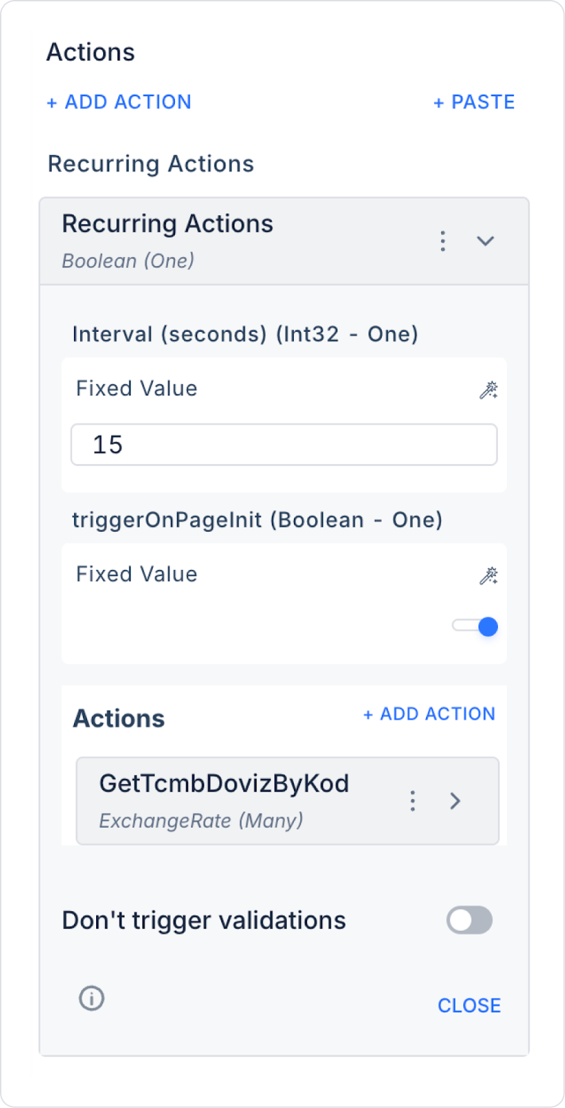
Add the Add Action > Recurring Action action to the page.
Set the refresh value to 15 seconds within the action.
Set the triggerOnPageInit field to open so that it runs at the start of the page.
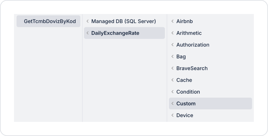
In the Actions field, define Add Actions > Custom > DailyExchangeRate > GetTcmbDovizByKod.
Step 3 - Adding Elements and Editing Styles
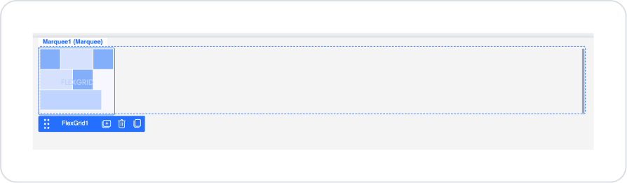
Drag and drop the Elements > Data > Marquee element onto the page from the left side panel.
To fill in the spaces in the Marquee element, set Marquee > Properties > Autofill > On.
To pause the flow when hovered over, set Marquee > Properties > PauseOnHover > On.
To give the edges a transition color, set Marquee > Properties > GradientColor > HEX > D9D9D9.
Set the width to Marquee > Properties > GradientWidth > 100.
Drag and drop the Elements > Data > FlexGrid element into the Marquee element.
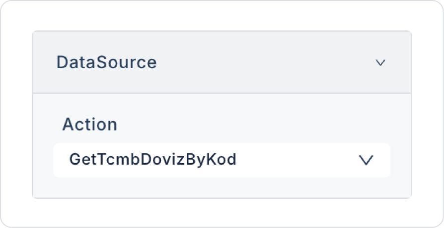
In the FlexGrid element, connect the GetTcmbDovizByKod action to the FlexGrid > Properties > DataSource field.
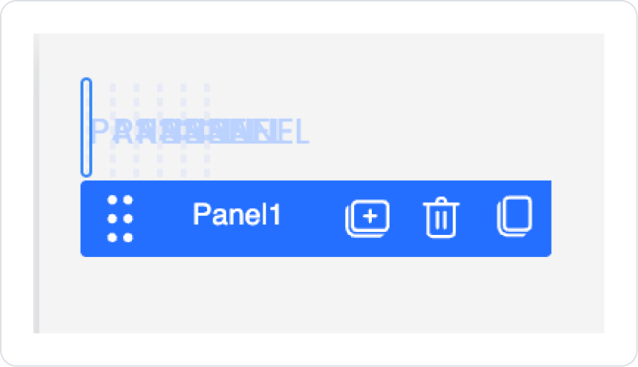
Drag and drop the Elements > Display > Panel element into the FlexGrid.
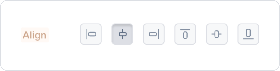
In the Panel element, select horizontal center alignment in the Panel > Styling > Layout > Align field.
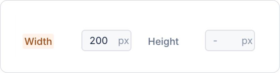
Set the Panel element size to Panel > Styling > Layout > Width > 200 px.
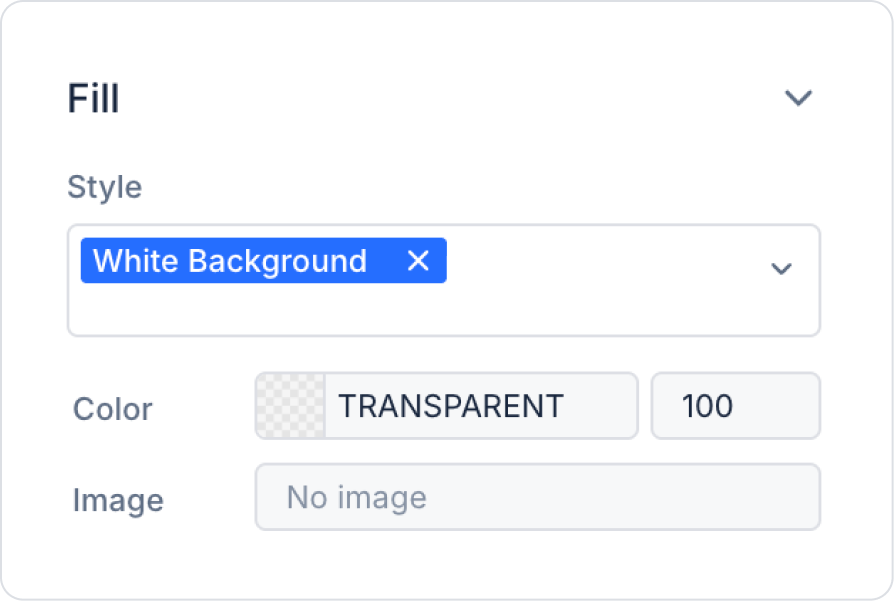
Set the background color to Panel > Styling > Fill > Style > White Background.
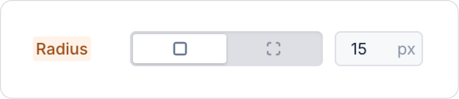
Set the borders to Panel > Styling > Border > Radius > 15 px.
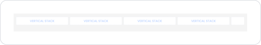
Drag and drop the Elements > Container > VerticalStack element into the Panel element.
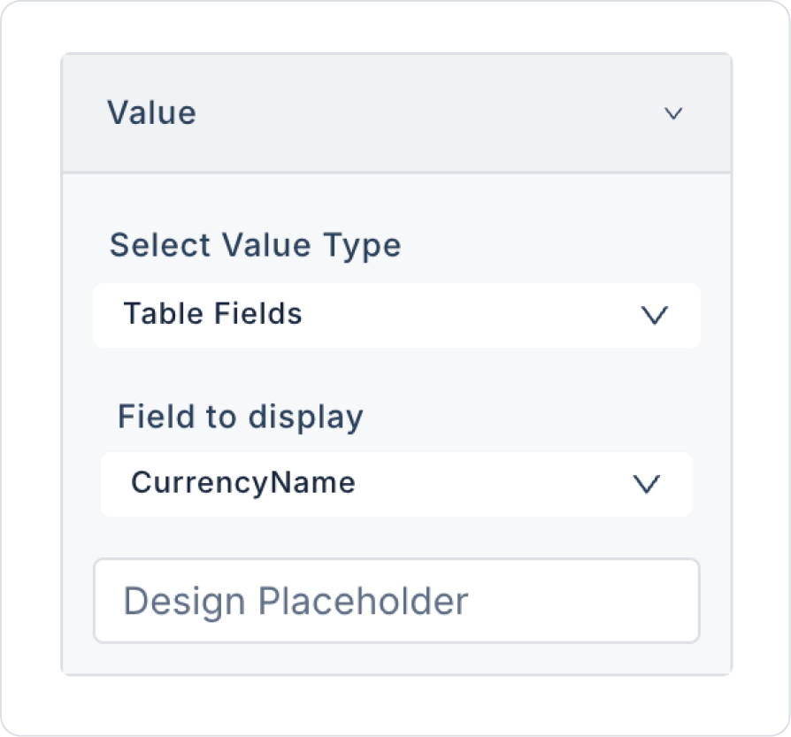
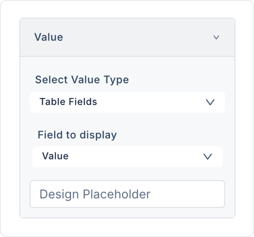
Drag and drop the Elements > Display > Label element into the VerticalStack element.
Drag and drop another Elements > Display > Label element below the Label element.
Define the first Label element as Label > Properties > Value > Field to display > CurrencyName.
Define the second Label element as Label > Properties > Value > Field to display > Value
Preview:
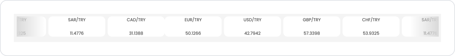
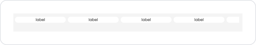
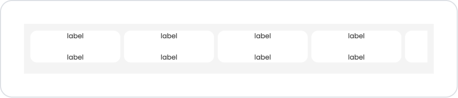
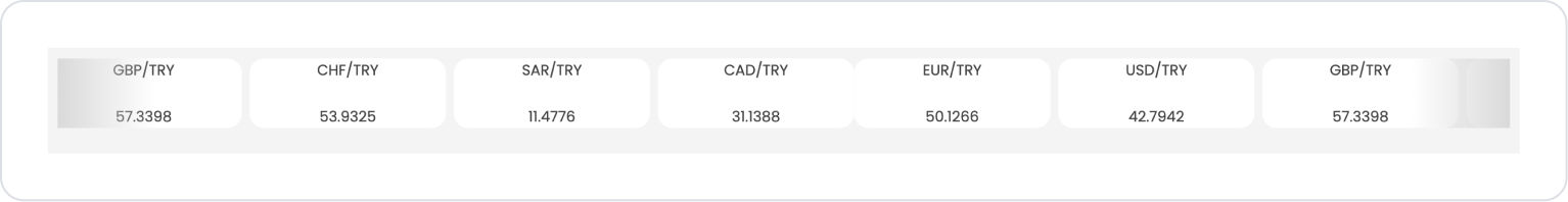
When the application is tested, the current exchange rates published by the Central Bank are displayed side by side in a horizontal scrolling (marquee) card structure. The upper section of each card displays the relevant currency pair (GBP/TRY, CHF/TRY, SAR/TRY, CAD/TRY, EUR/TRY, USD/TRY), while the lower section shows the corresponding current exchange rate value in a clear and readable format.
This structure allows users to smoothly track different exchange rates on a single line; they can quickly compare rates and easily access current information with a simple and organized view.
4. Common Properties
Some fields on the marquee element are used across all UI elements. Therefore, detailed explanations of the following properties can be found in the relevant general guide pages:
Use short and clear text. Since the marquee is a constantly moving element, long text can be difficult for users to perceive. Important messages should be short and emphatic.
Optimize the speed setting for readability. Scrolling too fast can reduce the user experience; messages should be at a speed that can be easily followed.
Actively use the Pause features. Enabling the “Pause On Hover” or “Pause On Click” settings allows the user to pause and review the text.
Choose eye-catching colors for important announcements. You can make the message more visible with the Gradient Color and Gradient Width settings.
6. Limitations
Action cannot be added. The Marquee element is a passive component designed solely to scroll text; therefore, the ADD ACTION button is not supported.
User interaction is limited. All behaviors on the Marquee are limited to the settings in the Properties panel; actions cannot be initiated based on clicks or selections.
Only horizontal scrolling is supported. Marquee does not have a vertical scrolling mode.


