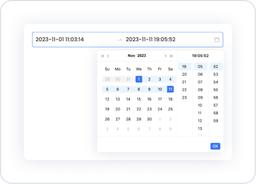
Kuika's Date Time Range element is an advanced input element that allows users to select a time range that includes both date and time. Users can manually enter start and end date-time values or easily select them using the date-time picker.
This element can be used for all workflows that require reservation systems, appointment scheduling, shift tracking, event management, duration calculations, and time range validation.
The Date Time Range element ensures logical accuracy between start and end times. For example, the end time cannot be selected before the start time, thus preventing incorrect data entry and improving the user experience.
The Date Time Range element is supported in web and mobile applications.
1.1. Common Use Cases
Reservation processes: Selecting the start–end time range for hotel, vehicle, room, or resource reservations.
Appointment scheduling: Clinic appointments, service requests, training or meeting time slots.
Shift and working hours management: Determining the start and end times of staff working hours.
Event duration definition: Selecting the start and end times of an event, seminar, webinar or organization.
Time-based reporting filters: Filtering lists, tables, or graphs according to a specific date-time range.
Monitoring user activities: Analyzing log records, transactions, or movements according to a time range.
Duration calculation scenarios: Calculating working time or total elapsed time from start-end values.
Delivery and service scheduling: Selecting the appropriate delivery time range for cargo or service providers.
2. Key Features
Select start and end date-time information through a single component. Instead of using two separate Date Time pickers, users can specify the range more quickly and consistently with a single Date Time Range element.
Use with manual entry or date-time picker. Users can either type the range directly or easily select it using the visual date-time picker, providing more flexible usage.
Ability to customize the date and time format. Different format options such as YYYY/MM/DD HH:mm or DD/MM/YYYY HH:mm can be used to match the overall time structure of the application.
Clear support. With the Allow Clear feature, users can clear their selected start and end values with a single click.
2.1.Date Time Range Element Properties
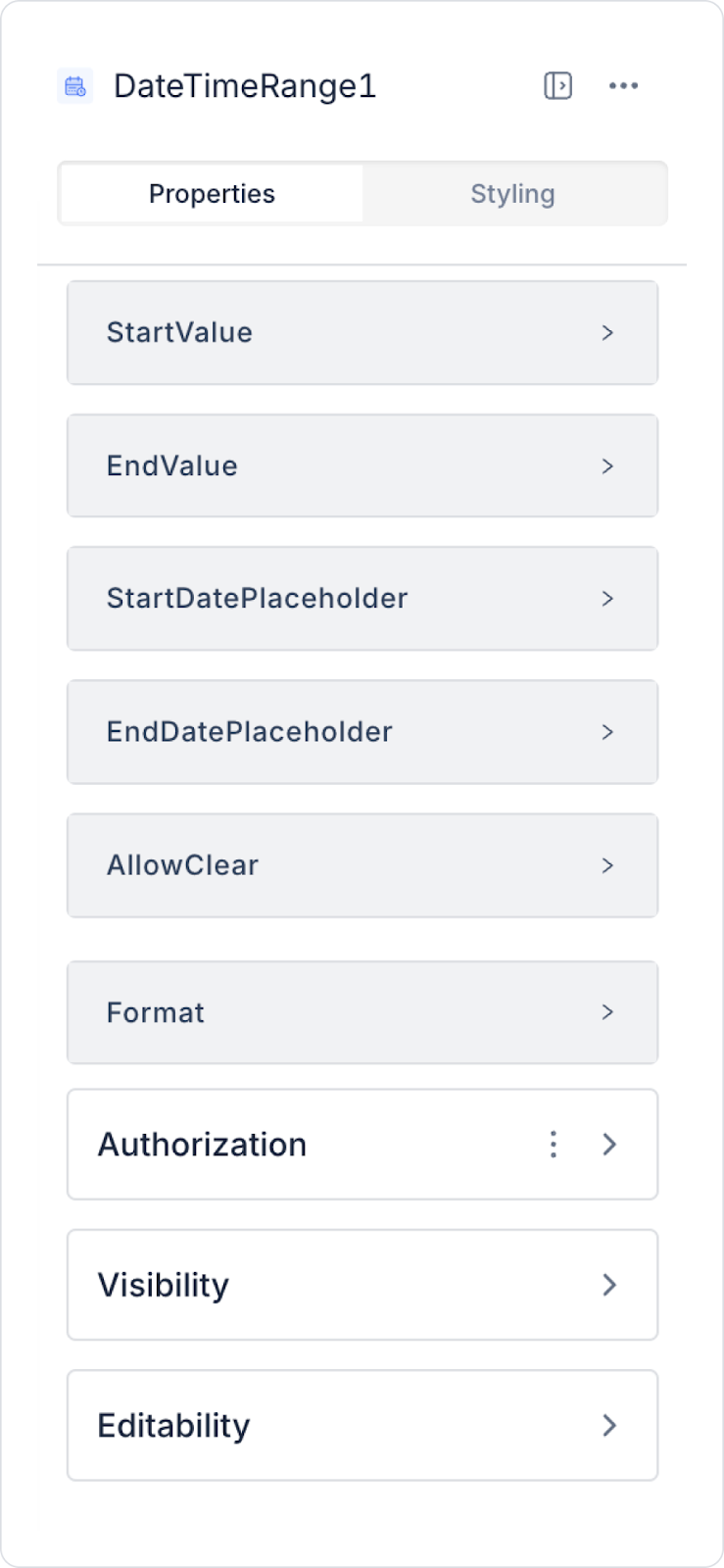
You can configure the properties of the Date Time Range element from the Properties panel on the right.
Start Value: Specifies the start value of the date and time range. You can enter a static date-time value or select a dynamic value using the Symbol Picker.
End Value: Determines the end value of the date and time range. You can enter a static value or select a dynamic value using the Symbol Picker.
Start Date Placeholder: Provides information to the user about the field where they must enter the start date. For example, you can add text such as “Select Start Date”.
End Date Placeholder: Provides information to the user about the field where they must enter the end date. For example, you can add text such as “Select End Date”.
Allow Clear: Allows users to clear the date and time range with a single click. Entries can be reset using the Delete (X) icon that appears in the right corner.
Format: Determines how the date and time range is displayed. The format offers different options for the user to enter or view date and time values. For example, it can be set to display only the date portion (day, month, year) or to include the full date and time (hour, minute, second). If the seconds part is not desired, this feature allows only the date and time parts to be displayed.
2.2. Actions That Can Be Added to Elements
The Date Time Range element supports a single event to trigger an action when the user changes the date–time range:
onChange
Triggered when the user makes a change in the start or end date–time field. In the application, data updates or operations related to the time range are managed through this event.
Possible usage scenarios:
Table or list filtering based on the selected date-time range
Triggering form validation processes
Dynamically changing the date range to be displayed in the report
Querying new data via API
Transferring the time range selected by the user to other elements
Calculation operations (e.g., total time = End – Start)
3. How to Use the Date Time Range Element?
In this section, we will cover the end-to-end use of the Date Time Range element through example scenarios.
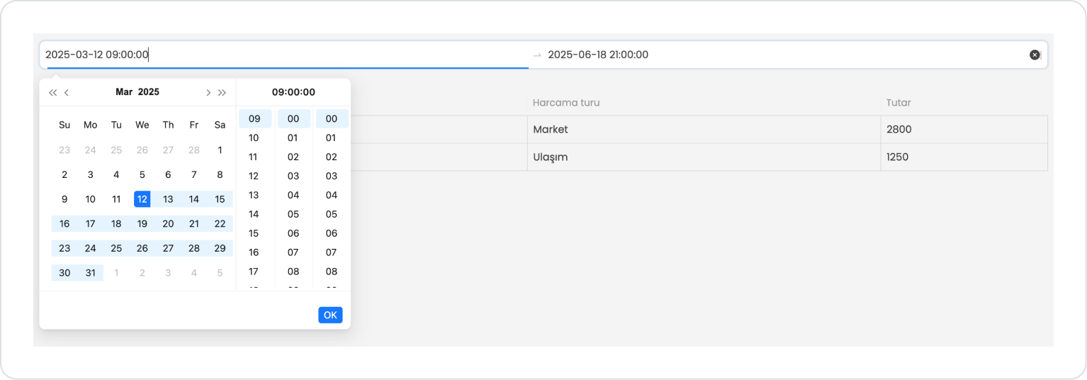
Scenario: Displaying Expenses Between Specific Dates and Times
In a personal finance or expense tracking application, users want to view their expenses for a specific date and time range on a single screen. The Date Range element is used in this scenario to select which date and time range data will be listed.
In the scenario:
The user can filter expenses for the relevant period by specifying the start and end date and time.
For the selected date range, the expense type, amount, and expense date information are listed in a table.
The Date Range element allows date selection to be performed in a flexible, understandable, and controlled manner.
Both date and time range selection and listing operations on a single page provide a practical user experience.
Step 1 - Creating a Data Source
Creating a table in the DataSources module:
Go to the Datasources module.
Then go to the Tables tab.
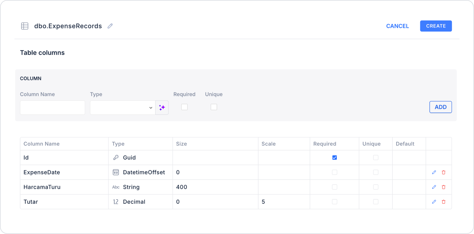
Create a new table named “ExpenseRecords”.
The table structure to be set up is as follows:
Important Field Names:
ExpenseDate: Stores the date the expense occurred. This field is used for filtering and period-based reporting.
ExpenseType: Indicates the category of the expense (e.g., Rent, Groceries, Transportation, Bills). Used in charts, summary tables, and category-based analysis.
Amount: Specifies the monetary value of the expense. This is the main field used to calculate totals, averages, and comparative financial analyses.
Step 2 - Define the Necessary Actions
To display and save data in the interface:
Two actions will be used in this scenario.
Add a new action from the Actions > New SQL Action tab in the Datasources module.
Action Adding Sample Data (InsertExpenseRecords): To test the application with sample data, add the following SQL action and press the TEST button.
INSERT INTO ExpenseRecords (Id, ExpenseDate, ExpenseType, Amount)
-- MARCH 2025SELECT NEWID(), CAST(‘2025-03-0509:15:30’ AS datetime), N'Rent', 8200 UNION ALL
SELECT NEWID(), CAST(‘2025-03-1218:45:10’ AS datetime), N'Groceries', 2800 UNION ALL
-- JUNE 2025SELECT NEWID(), CAST(‘2025-06-1008:30:00’ AS datetime), N'Transportation', 1250 UNION ALL
SELECT NEWID(), CAST(‘2025-06-1821:10:45’ AS datetime), N'Invoice', 2100 UNION ALL
-- 2025 SEPTEMBER
SELECT NEWID(), CAST(‘2025-09-0707:55:20’ AS datetime), N'Rent', 9000 UNION ALL
SELECT NEWID(), CAST(‘2025-09-2223:20:55’ AS datetime), N'Entertainment',1800;
When applying, delete the ExpenseRecords part, rewrite ExpenseRecords, and press enter. This will add the correct schema name before the table name.
Action that Filters and Provides Data (GetExpensesByDateRange):
SELECT * FROM ExpenseRecords
WHERE ExpenseDate >= @StartDate
AND ExpenseDate <= @EndDate
ORDER BY ExpenseDate;
When applying, delete the ExpenseRecords section, rewrite ExpenseRecords, and press enter. This will add the correct schema name in front of the table name.
Step 3 - Adding Elements and Actions
Drag and drop the Elements > Date and Time Input > DateTimeRange element onto the page.
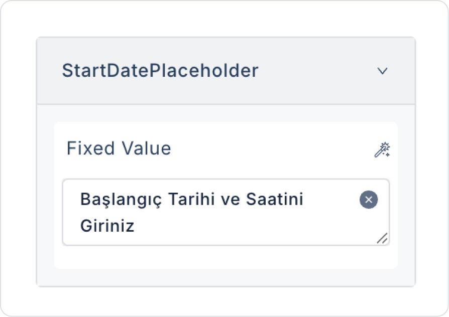
In the Date Time Range element, add the text DateTimeRange > Properties > StartDatePlaceholder > “Enter Start Date and Time” to the field.
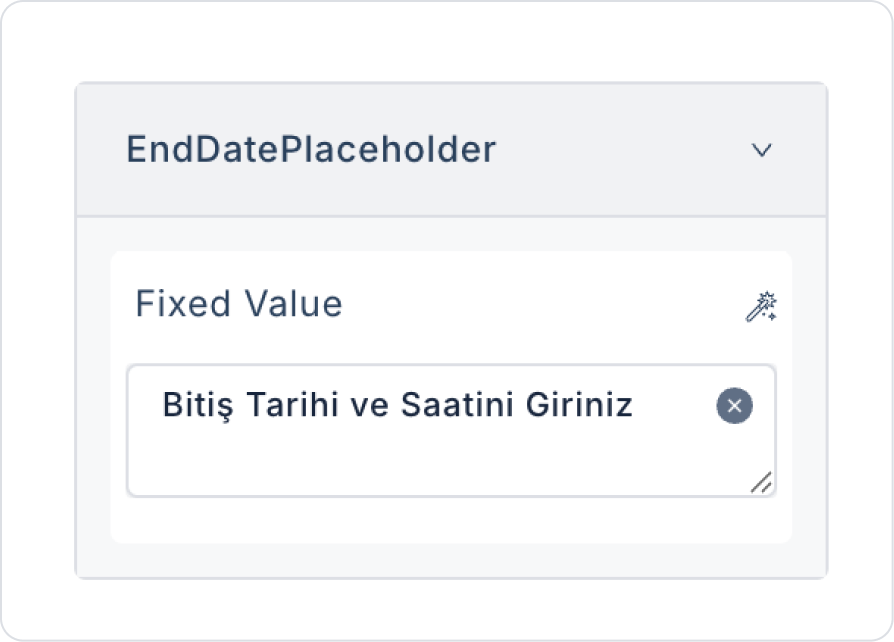
In the Date Time Range element, add the text DateTimeRange > Properties > EndDatePlaceholder > “Enter End Date and Time” to the field.
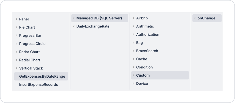
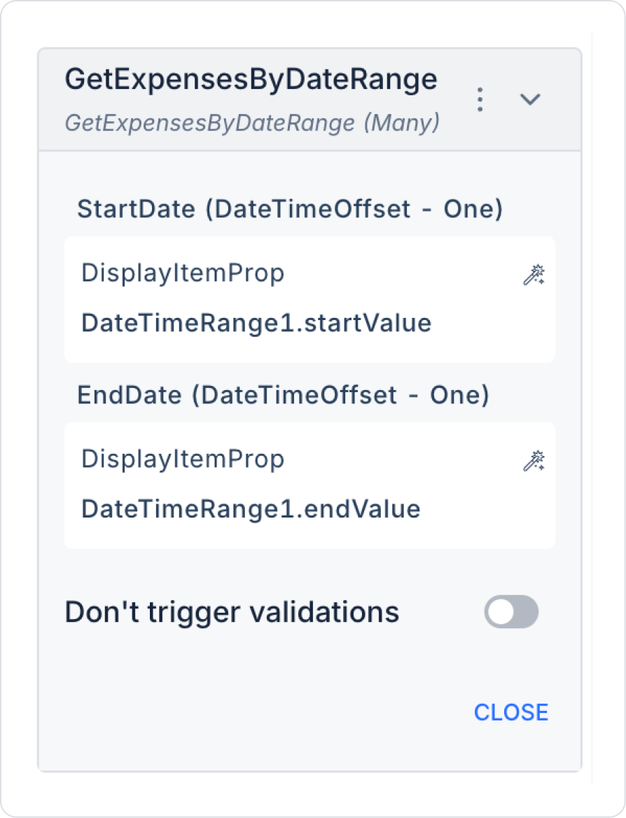
Add an action while the Date Time Range element is selected to retrieve the list after selecting the dates. Add the DateTimeRange > Add Action > onChange > Custom > Managed DB > GetExpensesByDateRange action.,
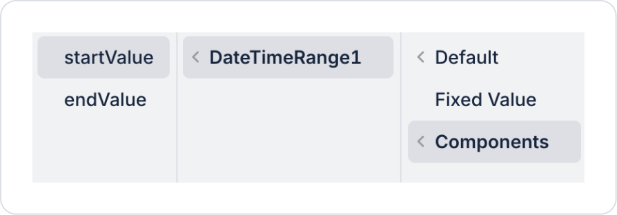
Define the start date parameter in the action as GetExpensesByDateRange > Components > DateTimeRange > startValue.
Define the end value for the start date parameter in the action as GetExpensesByDateRange > Components > DateTimeRange > endValue.
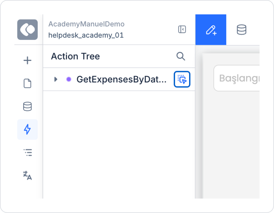
To use the action directly as a ready-made table, navigate to the ActionTree area in the left side panel and drag the nearby blue icon of the GetExpensesByDateRange action onto the page.
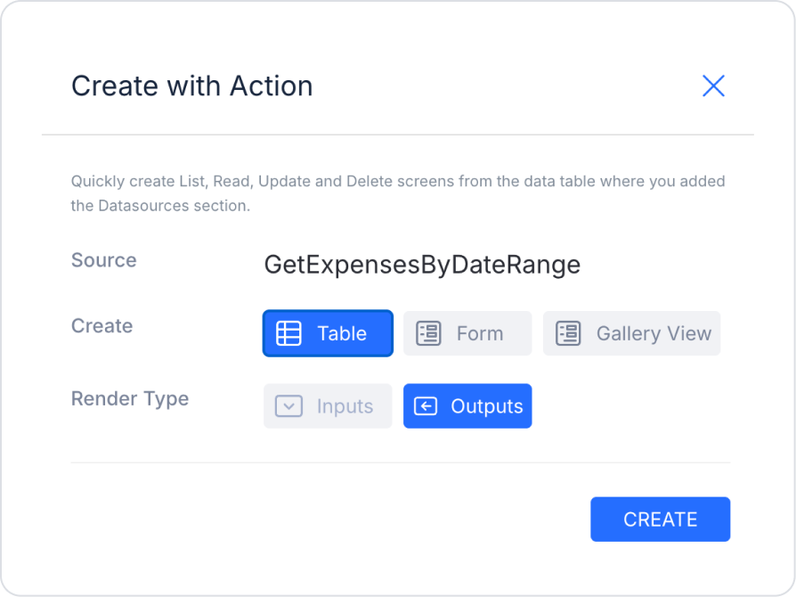
On the screen that opens, select the Table and Outputs fields and press Create.
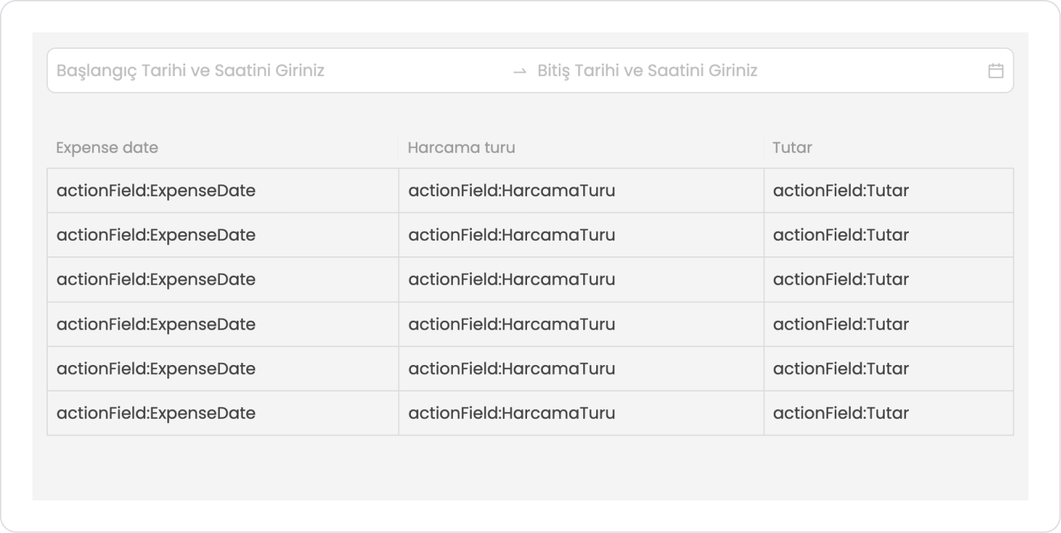
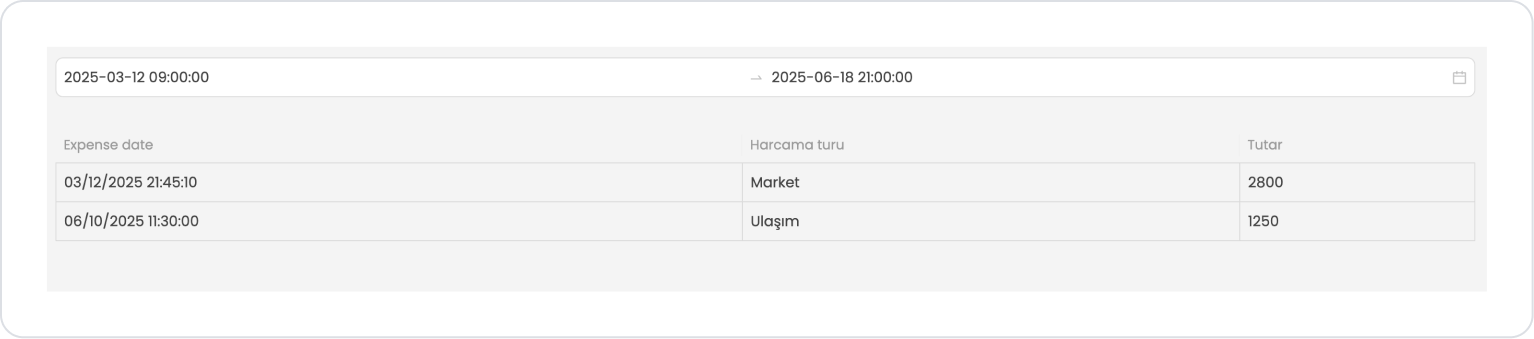
The screen content should look like the following.
Preview:
When the application first opens, the Date Time Range (start–end date and time) field at the top is displayed empty, and the user is expected to select the date range for which they want to filter expenses. In this case, the table is displayed empty or with sample fields to indicate that it is waiting for data.
When the user specifies a date range, the expense type, amount, and expense date information for the selected start and end dates and times are automatically listed in the table. This allows the user to review all expenses for a specific period in a single screen in an organized and understandable manner.
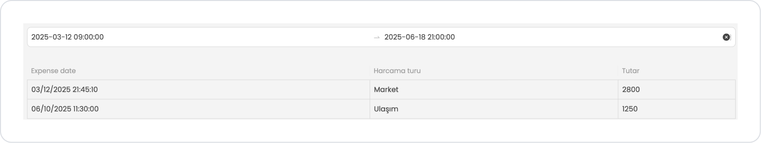
When hovering over the Date Time Range element, the selected date range can be easily cleared by clicking on the cross icon on its right side.
4. Common Properties
Some fields on the Date Time Range element are commonly used in all UI elements. Therefore, detailed descriptions of the following properties are available in the relevant general guide pages:
Optimize the actions to be performed when the time range changes. Prevent unnecessary actions by using the onChange trigger only when necessary.
Write clear and instructive Start and End placeholder texts to enhance the user experience.
Define the date-time format consistently across the entire application. Mixed formats can lead to user errors and data inconsistencies.
For intensive data operations such as reporting or list filtering, you can improve query performance by reducing the time range.
6. Limitations
The Date Time Range element only supports dual selection in the form of start and end; it is not suitable for single date-time selection.
Date-time validation may not work when API or database results are sent in the wrong format. In particular, the datetime format must be complete and consistent.
Web-specific advanced settings such as Return Display Value are not supported on mobile.


