The Micro App element is a modular UI element that enables the execution of independent, small-scale functions within the main application. This structure, which encompasses a single screen or a limited function, offers more flexible and manageable solutions within large applications.
Micro Apps are designed to perform specific tasks without disrupting the main application flow and are typically used in short interactive scenarios.
The Micro App element is supported only in web applications.
1.1. Common Use Cases
Surveys and feedback forms
Newsletter or email sign-up screens
Simple calculation and simulation tools
Short data collection or verification steps
Mini-functions embedded within the main application
2. Key Features
Independent operational structure: Each Micro App performs its function as a separate entity and can be configured independently of the main application.
Embedded use within the main application: Micro Apps operate within the current screen without redirecting the user to a different application.
Support for modular application architecture: Enables functions in large applications to be broken down into more manageable parts.
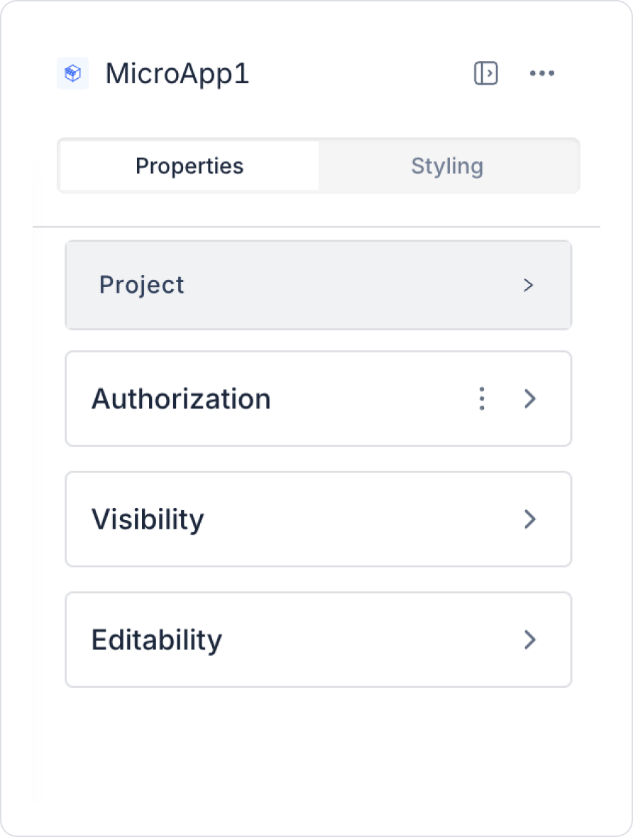
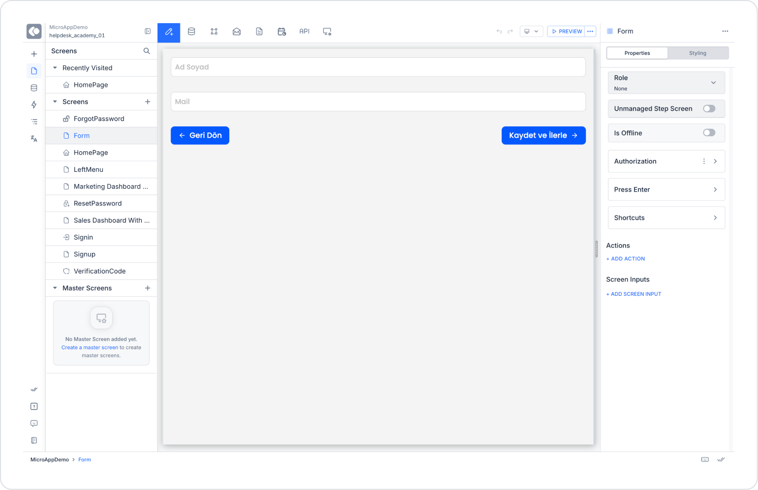
2.1. Micro App Element Properties
You can configure the properties of the Micro App element from the Properties panel on the right.
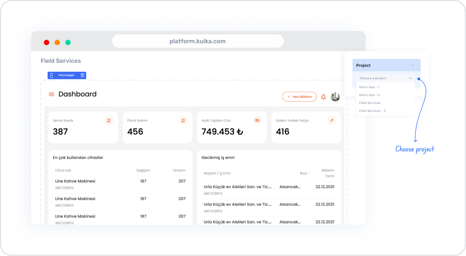
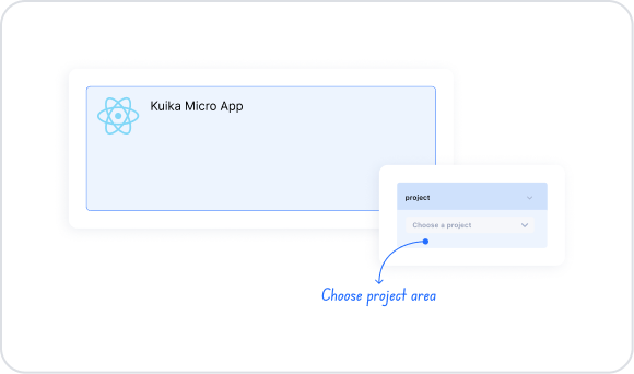
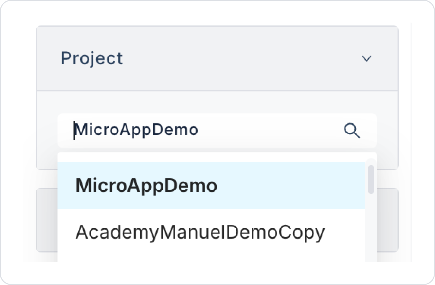
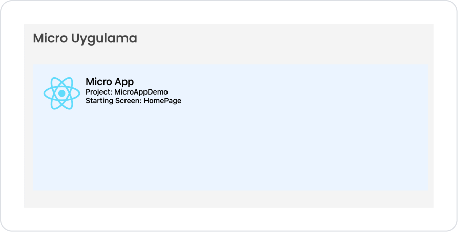
Project: Using the Selectbox in this area, you can list the projects in your Kuika account. From the list, you can select the project you want to run within the Micro App.
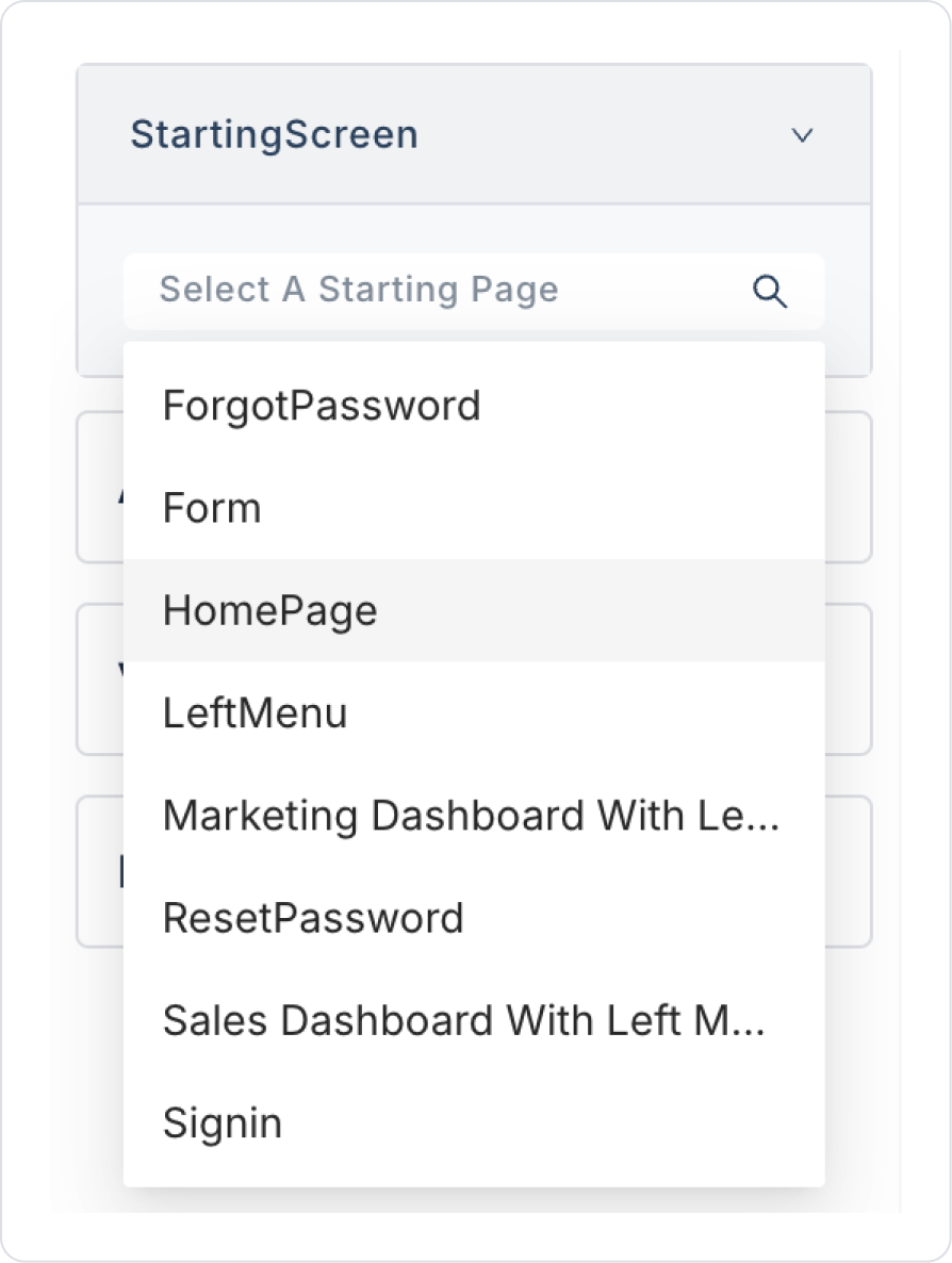
Starting Screen: Allows you to specify which screen, from among those in the selected project, will be displayed first when the Micro App opens.
The Micro App element enhances the user experience by providing additional functionality within your application.
3. How to Use the Micro App Element?
In this section, we will cover the end-to-end usage of the Micro App element using an example scenario.
Scenario: Using an Application on the Same Page with Micro App
In applications developed within an organization, the Micro App element is used to enable applications with different functionalities to be used together on a single screen.
In this scenario, a page within the main application displays content from the main application while also integrating another application—developed within the same workspace—into the page via the Micro App element. This allows the user to use the micro-application on the same screen without leaving the page.
In the scenario:
Top section: Main application content (redirect to the “User Comments” section)
Bottom section: Independent application running within the Micro App element
Both applications:
Developed separately
Dependent on their own database schemas
Operate independently of each other
The user logs into the main application
On the main page:
Sees the “User Comments” section
The Micro App area is located within the same page
Without leaving the page:
The user can view operations within the main application
The user can directly use the application within the Micro App area
Within the Micro App:
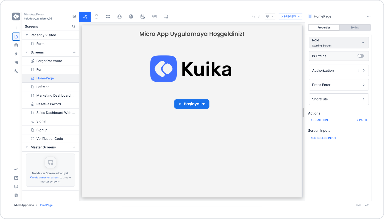
The independent application interface loads
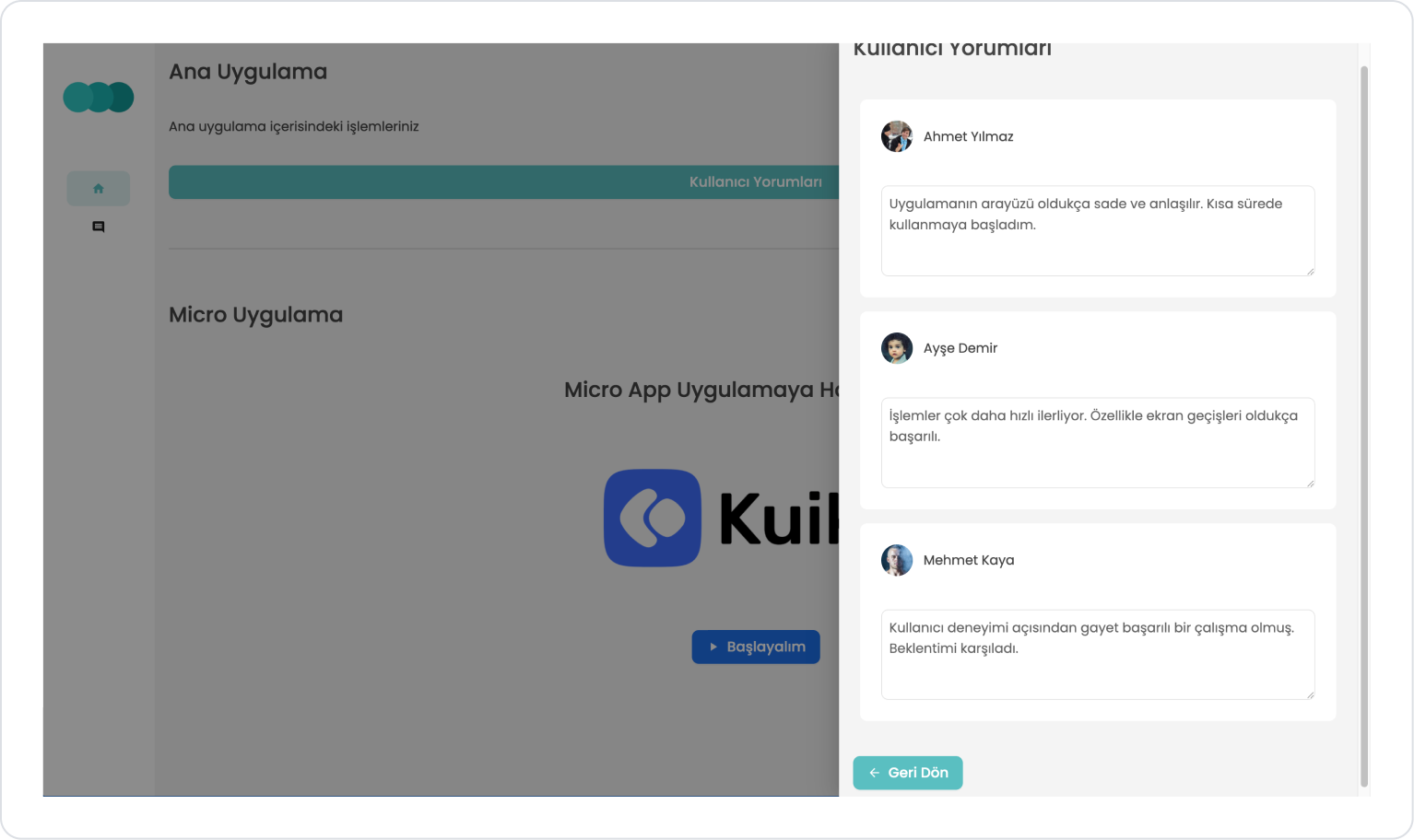
A startup screen such as “Let’s Get Started” or relevant content is displayed
Step 1 - Preparing the Micro App
Initially, in the Micro App:
Develop your application to align with your goals. Create screen designs, configure data tables, and define the necessary actions.
Once the application is complete, you can click the Preview button in the top panel to make your application ready for use as a Micro App and view its preview.
Step 2 - Adding a Micro App to the Main Application
In the Main Application:
To use another application located in the same workspace within the application you developed, drag and drop the Elements > Special > Micro App element into the relevant area on the page.
To select the application to be added from among the applications in the workspace, use the Micro App > Properties > Project > “Your Application Name” field.
The selected Micro App and the main application are connected via independent database schemas. Each application is defined with its own schema upon creation, and all data tables operate under this schema. Therefore, the data structures used within the Micro App are managed completely in isolation from the main application and are not shared directly.
To specify the screen where the selected application will launch, use the Micro App > Properties > Starting Screen > “Your Screen Name” field.
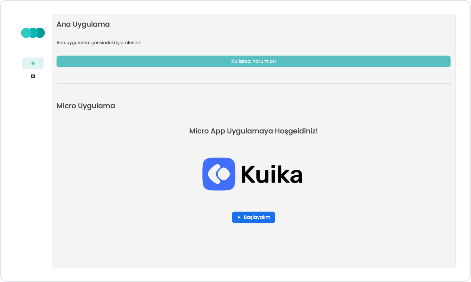
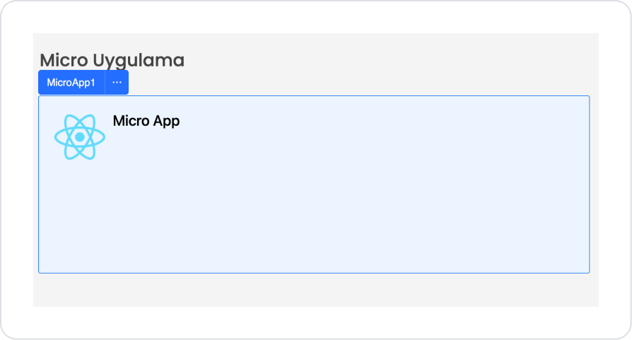
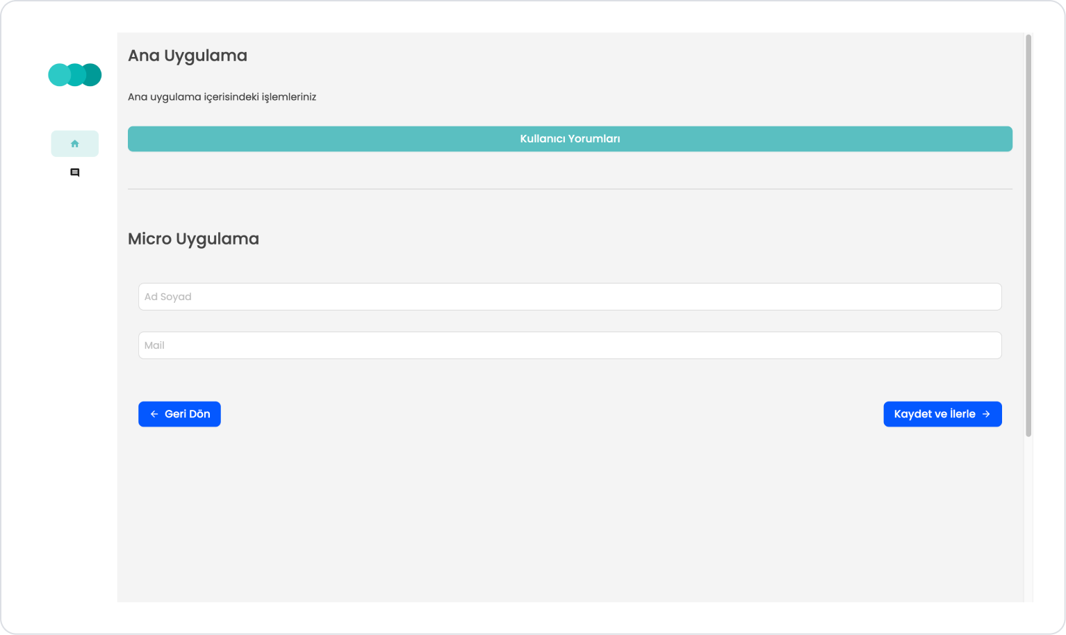
After configuration, the Micro App element should appear as follows.
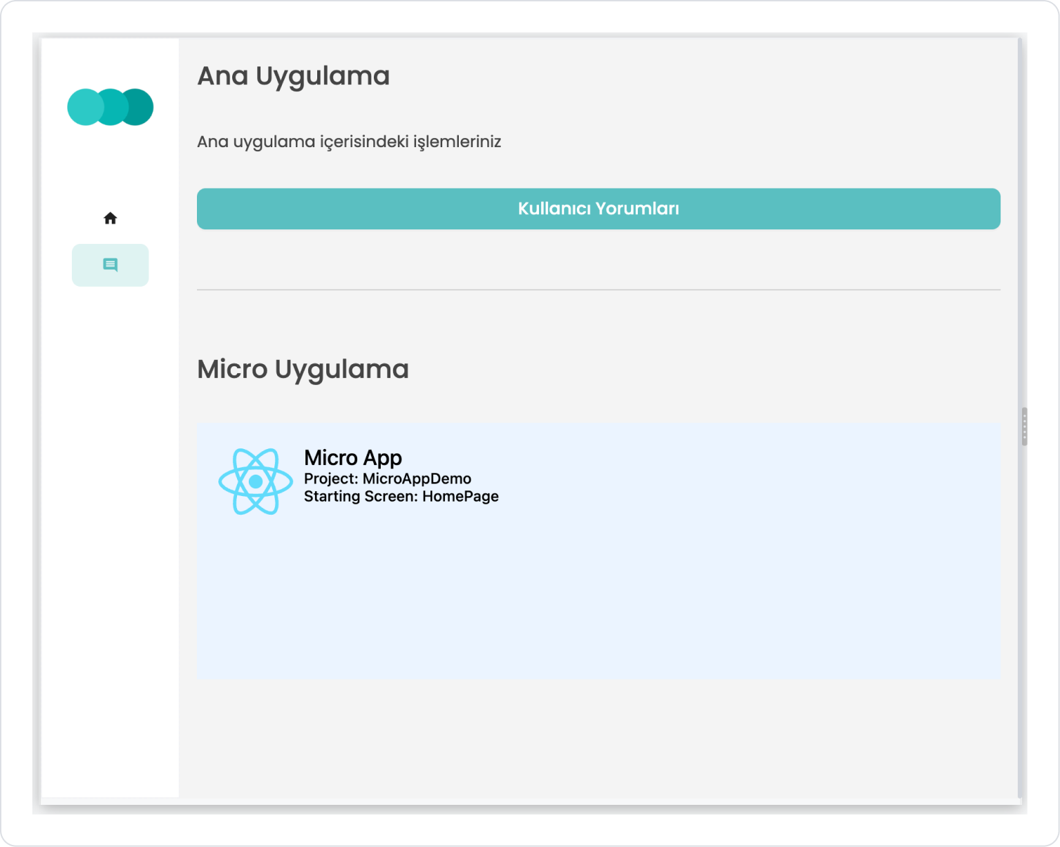
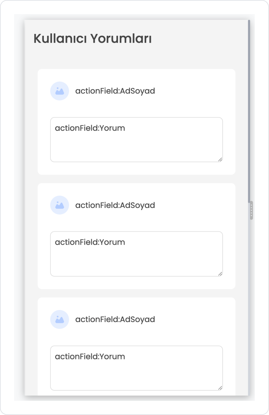
User reviews are displayed within the main application. In the Micro App area, a separate application consisting of a startup screen and form screens is running.
Main Application screens:
Micro App screens:
Preview:
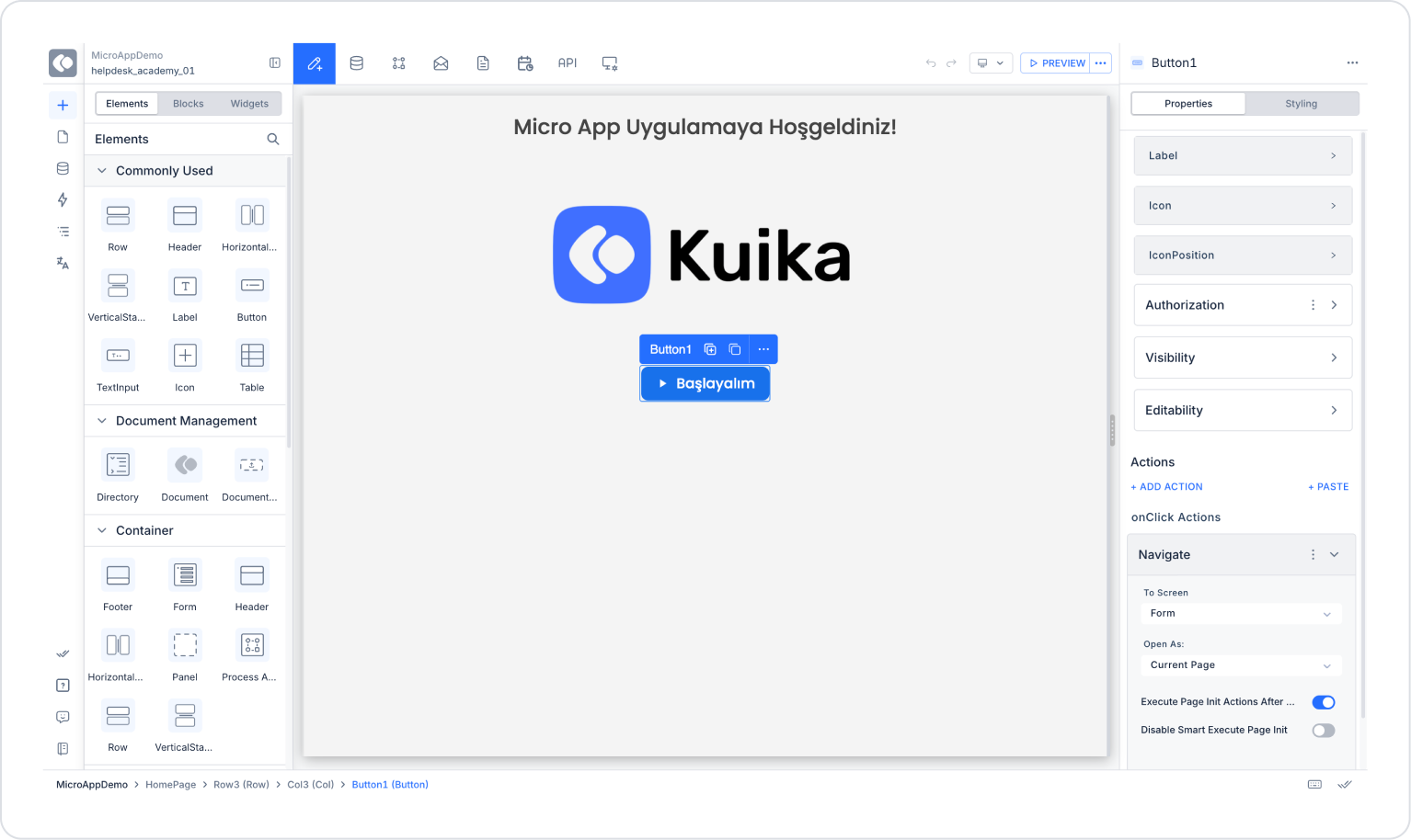
In the Micro App area, the start and form screens of an independent application are displayed directly from within the main application. The user can launch the application using the “Let’s Start” button and perform their tasks through the relevant form fields. Thanks to this structure, the workflow within the Micro App continues to operate independently of the main application.
On the main application side, clicking the “User Comments” button opens a separate section listing existing comments. Users can view previously added comments in this section and access different content within the main application’s workflow. This allows the user to experience both the main application and Micro App content together from a single screen.
4. Common Properties
Some fields on the Micro App element are shared across all UI elements. Therefore, detailed descriptions of the following properties are available on the relevant general guide pages:


