The Maps element is a UI element that enables the visual presentation of geographic data on a map within the application. Users can view locations on the map, zoom in and out, and examine specific areas in detail.
The Maps element provides a more organized map view by automatically grouping pins that are very close to each other (clustering). This feature improves the map’s readability in areas with dense locations and enhances the user experience.
1.1. Common Use Cases
Displaying store, office, or branch locations
Location-based service and information screens
Exploring and navigating specific points on the map
Visual presentation of dense location data
2. Key Features
Map-based visual presentation: Locations are visually displayed on the map via pins.
Zoom in and out support: Users can examine details on the map or view the overall layout.
Pin (Marker) display: Single or multiple locations can be marked on the map.
Automatic pin grouping (Clustering): Locations close to each other are automatically grouped to provide a cleaner and more readable map view.
Working with dynamic data: Location data can be defined statically or dynamically linked via data sources or action outputs.
Interactive map experience: Users can navigate the map to explore different regions.
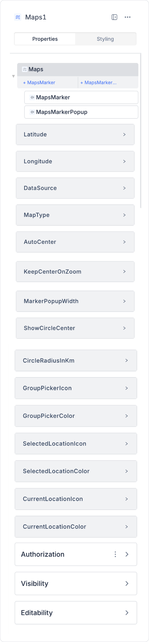
2.1. Maps Element Properties
Datasource: Specifies the data source for the locations to be displayed on the map. Sources such as REST API and SQL Actions are supported.
Latitude: The latitude value the map will focus on upon initial opening. It can be assigned statically or dynamically.
Longitude: The longitude value the map will focus on upon initial opening.
Circle Radius in Km: Highlights a specific area on the map within a circular boundary.
Auto Center: Determines how the map will be positioned upon opening.
True: The map automatically centers to cover all locations in the data source and determines the appropriate zoom level itself. It positions itself to include all markers.
False: The map does not perform any automatic centering. The opening position is set based on the values specified in the Latitude and Longitude fields. If these fields are empty, the map opens at the default starting position.
When Auto Center = True, the Latitude and Longitude values are not used.
Group Picker Icon: Groups nearby locations under a single icon during zoom-out.
Current Location Icon: Displays the user’s current location.
Selected Location Icon: Marks the location selected by the user.
Keep Center On Zoom: The map center remains fixed during zooming.
Map Type: Determines the map’s display style. Supported map types are as follows:
Roadmap: A standard road map. Highways, streets, and city details are clearly displayed.
Terrain: A map type that displays elevation differences and natural terrain features. Mountains, hills, and valleys become prominent.
Satellite: Displays the map using satellite imagery to show real-world visuals. Buildings, natural areas, and water bodies are clearly visible.
Hybrid: A map mode that combines satellite imagery with road and settlement data. It provides a more comprehensive view by overlaying road and city names onto the satellite imagery.
HideTrafficLayer: Controls whether the traffic density layer (road congestion status) is displayed on the map. The default value is false.
HideTransitLayer: Controls whether public transit routes (trains, subways, trams, etc.) are displayed on the map. The default value is false.
Waypoints: Enables automatic route calculation from the user’s current location to entered locations.
FullScreenControl: Controls whether the map can be switched to full-screen mode.
StreetViewControl (Web): Enables switching to Street View.
ScaleControl (Web): Determines whether the distance scale is displayed on the map.
Zoom: Determines the zoom level at which the map opens when first loaded.
The map is rendered based on this value when the screen first opens.
The user can zoom in or out later; this setting affects only the initial view.
Valid value range:
0: Farthest view
22: Closest view
Selecting a zoom value that is too low or too high may make it difficult for the user to understand the map upon first opening.
ZoomControl (Web): Determines whether the map zoom in and out buttons are displayed.
CameraControl (Web): Allows you to control the map perspective and camera angle.
EnableLocationTracking: Enables real-time tracking of the user’s current location on the map.
Latitude and Longitude values must be in “Decimal” format.
The Maps element opens the map view and displays other locations even if the latitude and longitude values are Null (empty).
Retrieving Location
To obtain the latitude and longitude values of a location via Google Maps, right-click on the map and copy the coordinates from the context menu. Add these values to the Latitude and Longitude fields of the Maps element.
Events
On Location Click: Triggers when the user clicks on a location on the map.
On Map Load: Runs when the map loads.
On Zoom Change: Activates when the user zooms in or out.
The Maps element dynamically displays information from various data sources on the map. This allows your application to provide location-based services in a more user-friendly and interactive way.
2.2. Actions That Can Be Added to the Element
The Maps element supports triggering actions based on changes in location or view on the map. Actions are not tied to the element itself but to the event triggered by map interaction.
Actions for the Maps element can be defined via the following event in the Properties > Add Action section.
onChange: Triggers when the selected location, pin, or view state on the map changes.
Use cases:
Save the selected location information to a state or variable
Updating list or detail fields based on map interaction
Performing filtering or data refresh operations when the location changes
Example scenario: When the user moves to a different location on the map, stores in that area are automatically listed.
3. How to Use the Maps Element?
In this section, we will cover the end-to-end usage of the Maps element through an example scenario.
Scenario: Displaying Branch and Location Points on the Map
In this example, a simple map screen has been created using the Maps element to display specific location points on the map. The user can view the defined points as markers on the map and explore the relevant locations directly on the map.
In the scenario:
The display of location points on the map is provided via the Latitude and Longitude fields.
The LocationName field is used as the marker label, and the Tooltip field is used as the short description of the location.
When a marker is selected, information about the corresponding location is displayed.
Step 1 - Defining the Required Action
To display data on the interface:
You need to define an example action.
Add a new action from the Actions > New SQL Action tab within the Datasources module.
Action to Retrieve Locations (MapDataSource):
SELECT
1 AS Sequence,
N'Karşıyaka' AS LocationName,
38.457500 AS Latitude,
27.116700 AS Longitude,
N'Starting point' AS Tooltip
UNION ALL
SELECT
2,
N'Alsancak',
38.432000,
27.140000,
N'City Center'UNION ALL
SELECT
3,
N'Konak',
38.419200,
27.128700,
N'Central Square'UNION ALL
SELECT
4,
N'Balçova',
38.390000,
27.050000,
N'Residential Area'UNION ALL
SELECT
5,
N'Narlıdere',
38.390800,
26.980000,
N'Endpoint'
Location data for the scenario has been prepared using a SELECT query—without using a table—to return the Latitude, Longitude, LocationName, and Tooltip fields.
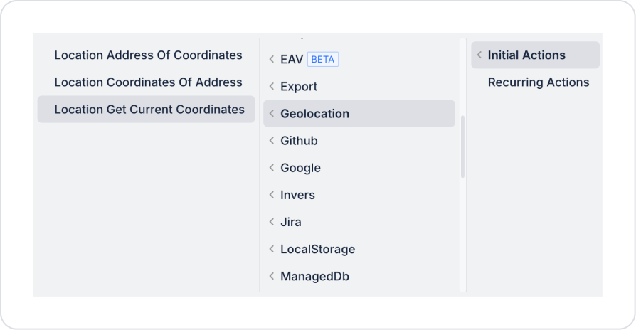
Step 2 - Adding an Initial Action
Initially on the homepage:
To display locations on the map, add the Add Action > Initial Action > Custom > Managed DB > MapDataSource action.
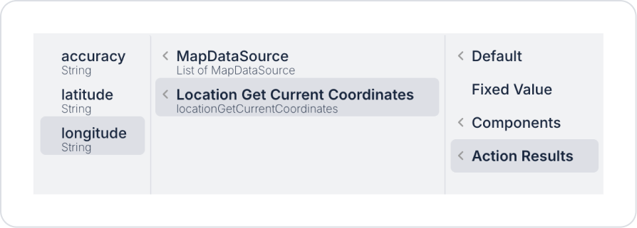
To initialize the map area using the user’s current location data upon screen opening, add the Add Action > Initial Action > Geolocation > Location Get Current Coordinates action.
Step 3 - Adding the Maps Element and Defining Actions
On the home page:
Drag and drop the Elements > Special > Maps element from the left sidebar onto the page.
For the starting coordinates, configure Maps > Properties > Latitude > Action Results > Location Get Current Coordinates > latitude.
For the longitude coordinate, configure Maps > Properties > Longitude > Action Results > Location Get Current Coordinates > longitude.
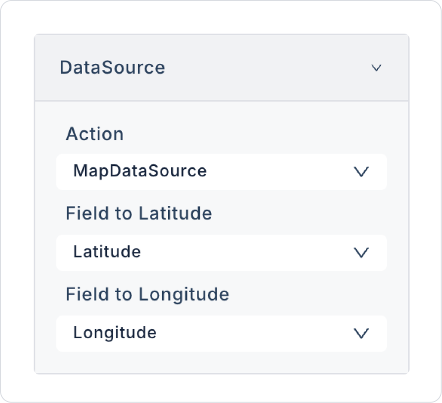
To connect the data source, configure Maps > Properties > DataSource > Action > MapDataSource and enter the following configuration in the fields that appear.
To allow the user to select the map type, configure Maps > Properties > MapType > User Select.
To track your current location, set Maps > Properties > EnableLocationTracking > On.
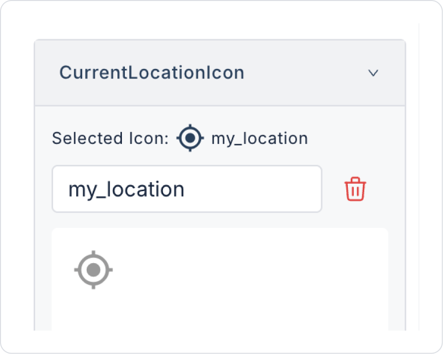
Set the icon that will display your current location to Maps > Properties > CurrentLocationIcon > “my_location”.
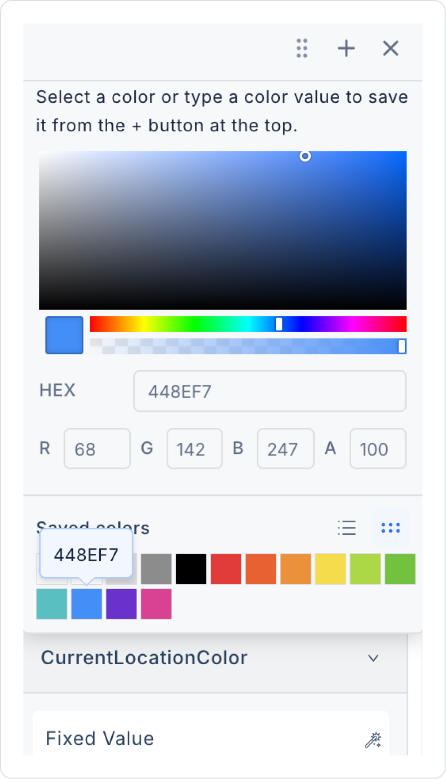
Set the color of the current location icon to Maps > Properties > CurrentLocationColor > blue.
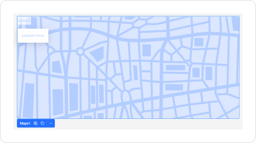
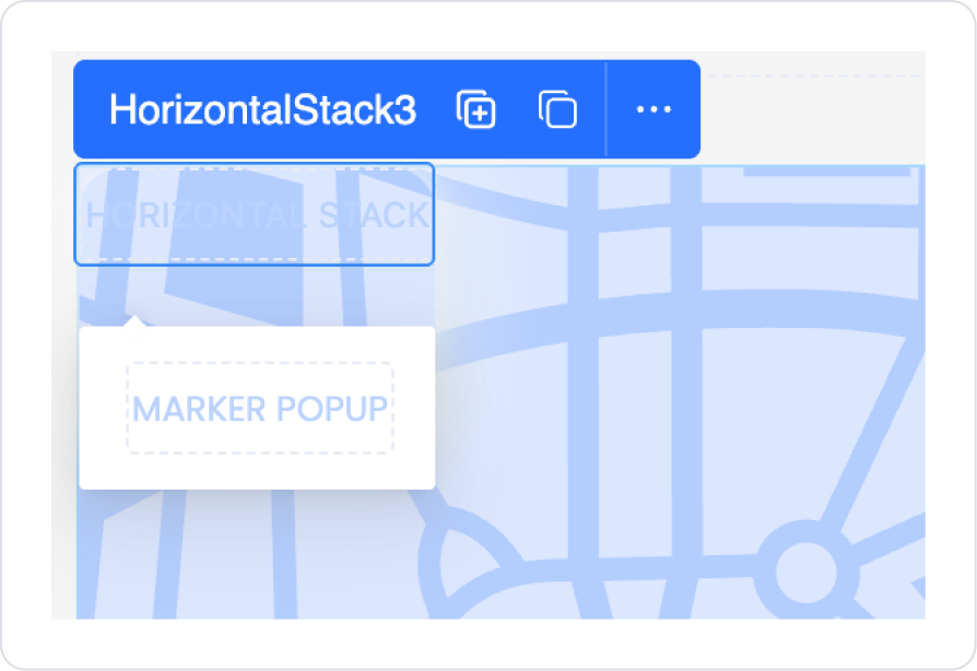
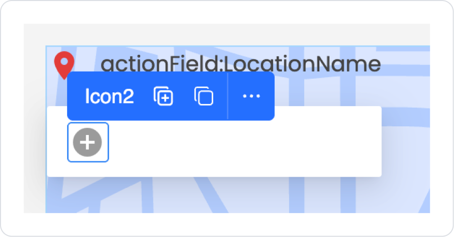
To display locations within the Maps element, drag and drop the Elements > Container > HorizontalStack element into the Marker area.
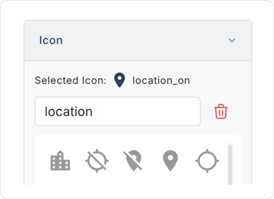
Add the Elements > Display > Icon element to the Horizontal Stack element.
Set the icon selection to Icon > Properties > Icon > “location_on”.
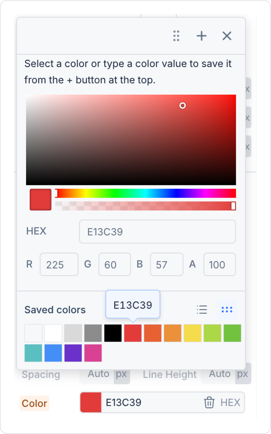
Set the icon color to Icon > Styling > Text > Color > Red.
Next to the icon, drag and drop the Elements > Display > Label element into the Horizontal Stack element.
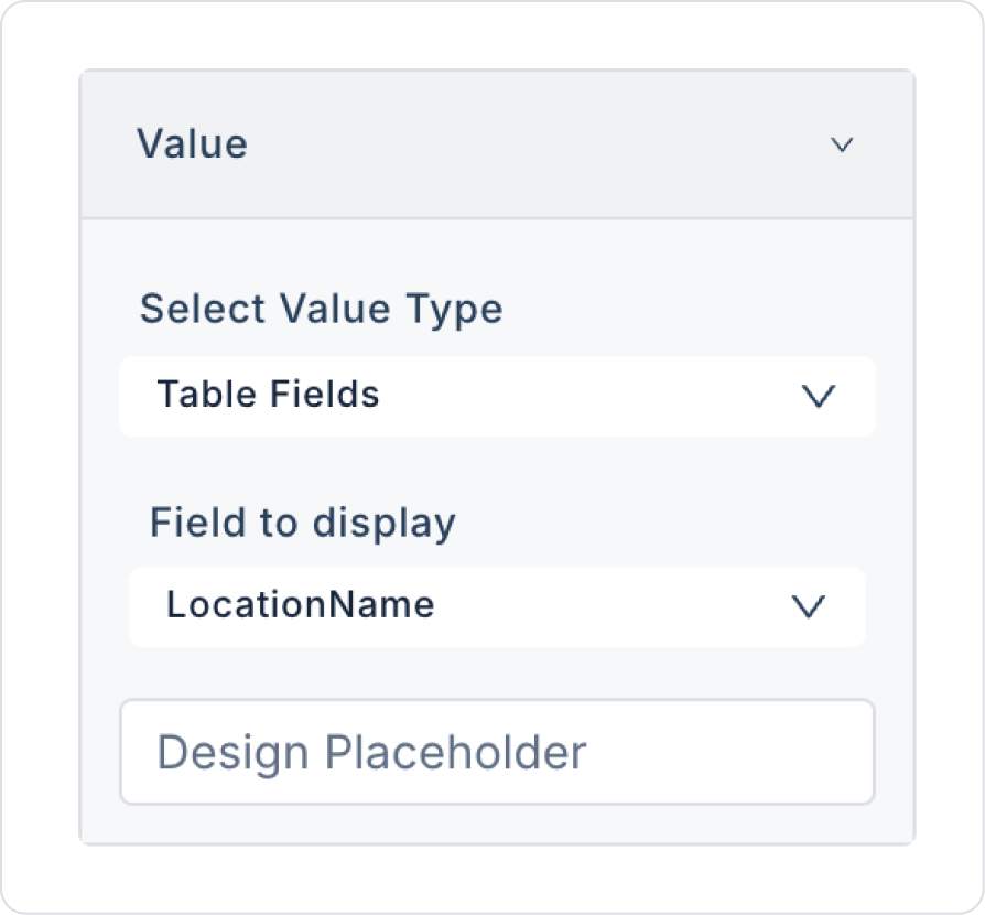
Set the text of the Label element to Label > Properties > Value > Field to display > LocationName.
Since the Label is added inside the Horizontal Stack, it will have a 100 pxdefault width. To remove this width, clear the Label > Styling > Layout > Width field.
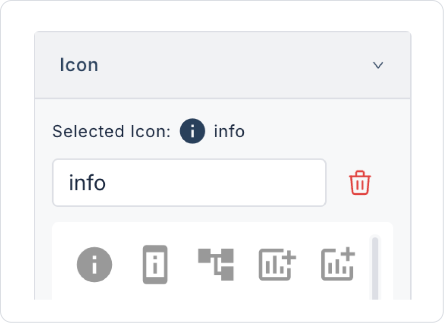
Drag and drop the Elements > Container > HorizontalStack element into the Marker Popup area that will appear when the location is clicked.
Add the Elements > Display > Icon element inside the Horizontal Stack element.
Set the icon selection to Icon > Properties > Icon > “info”.
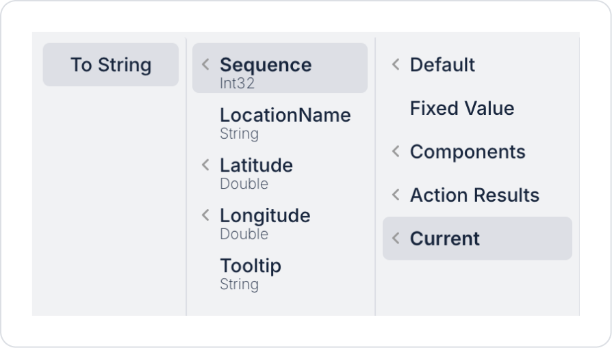
To display the sequence number of the relevant location when hovering over the Icon element, set it to Icon > Properties > Tooltip > Current > Sequence > To String.
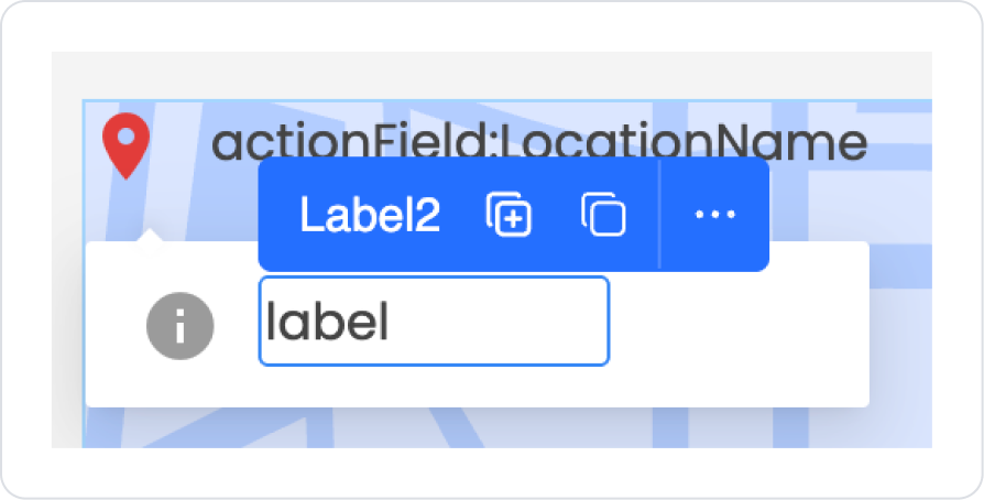
Drag and drop the Elements > Display > Label element into the Horizontal Stack element next to the Icon.
Set the text of the Label element to Label > Properties > Value > Field to display > Tooltip.
Since the Label is added inside the Horizontal Stack, it will have a 100 pxdefault width. To remove this width, clear the Label > Styling > Layout > Width field.
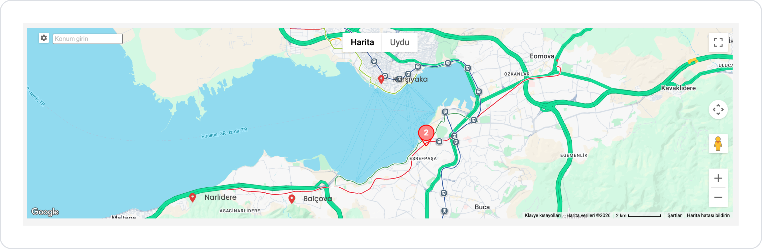
Preview:
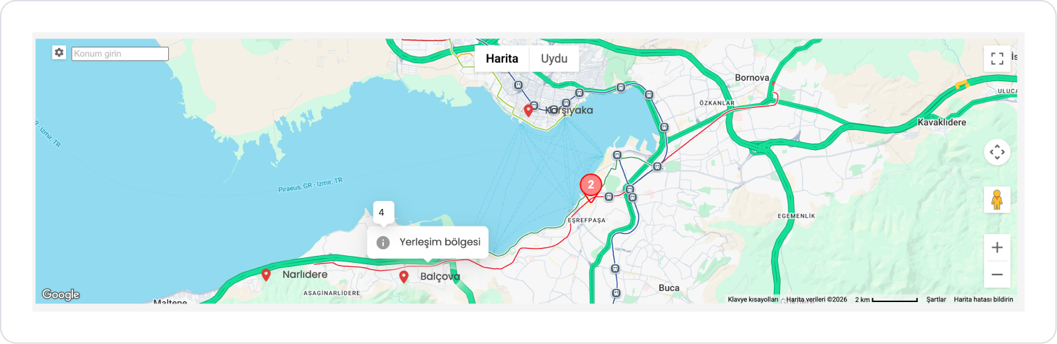
When the Maps element is opened, defined locations appear as markers on the map. Controls such as Street View, zoom, and full screen are enabled by default in the element properties area and can be configured as needed. The map launches with the user’s current location at the center via a system action, allowing the user to explore locations in their area.
When a marker on the map is clicked, detailed information about the corresponding location is displayed in a popup. When the mouse hovers over the marker icon, a tooltip displays the location’s ranking in the list. This allows the user to quickly access both location information and ranking details.
Depending on the zoom level, markers in close proximity are grouped and displayed as a single unit (for example, a group marker labeled “2”). When a grouped marker is clicked, descriptions of the associated locations are displayed in a list format within a drawer. This structure ensures that dense location data is presented in a more organized and user-friendly manner.
4. Common Properties
Some fields on the Maps element are shared across all UI elements. Therefore, detailed descriptions of the following properties can be found in the relevant general guide pages:


