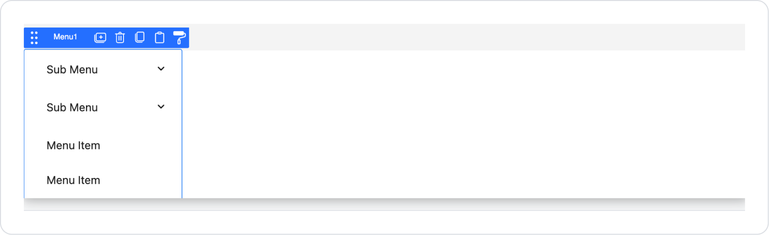
Kuika's Menu element is used to organize in-app navigation and enable users to quickly access different pages or functions. You can create single-level or multi-level (nested) menu structures, presenting the application's information architecture in a user-friendly manner.
The Menu element provides a consistent navigation experience on both desktop and mobile interfaces, allowing users to progress through the application without getting lost.
The Menu element is supported in both web and mobile applications.
1.1. Common Use Cases
Creating a main navigation menu across the application
Enabling users to quickly switch between different pages
Module, screen, or feature-based menuing in administration panels
Creating multi-level (main menu – submenu) navigation structures
Using side menus (drawers) or hamburger menus in mobile applications
Displaying different menu content based on user role
Dynamically changing menu titles based on language in multilingual applications
Grouping frequently used actions or pages under a single menu
2. Key Features
Multi-level menu structure support. Organizes complex navigation scenarios by creating main menus and submenus.
Page redirection support. Users can navigate to different screens or URLs via menu items.
Menu creation with dynamic data. Menu titles and targets can be defined statically or fed dynamically from data sources.
Role-based visibility. Menu items can be shown or hidden based on the user's permissions or role.
Icon-supported menu items. Icons can be added to menu titles to provide more visually understandable navigation.
Expandable and collapsible structure. Submenus can be opened and closed based on user interaction.
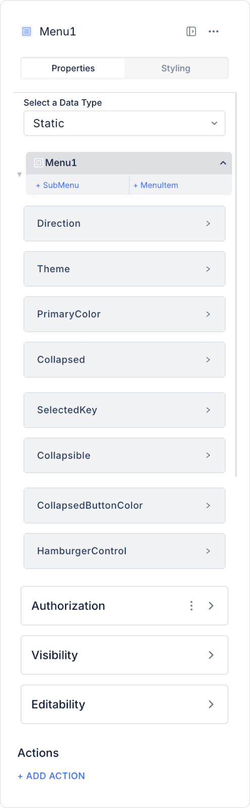
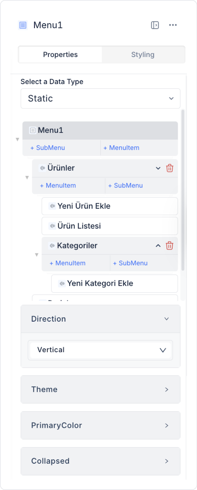
2.1. Menu Element Properties
You can configure the following settings from the Properties panel:
Select a Data Type: You can configure menu data as Static or Dynamic.
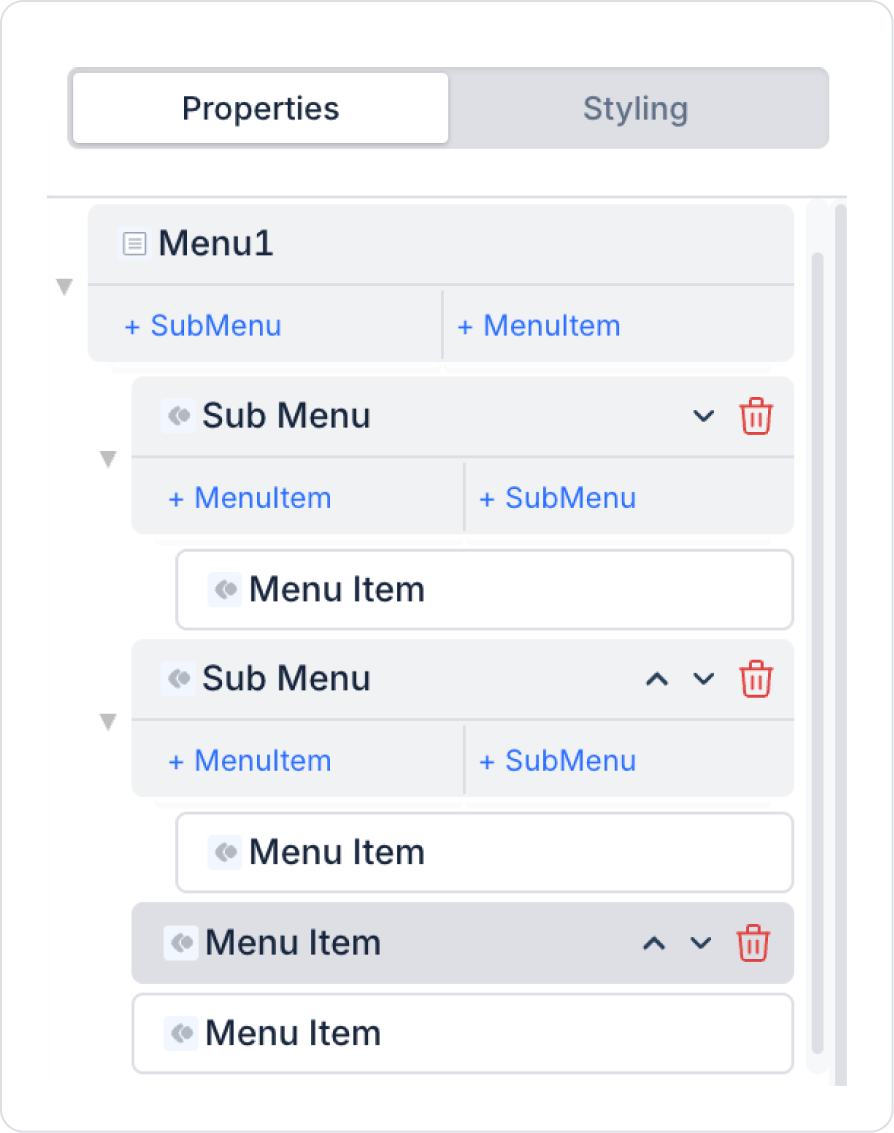
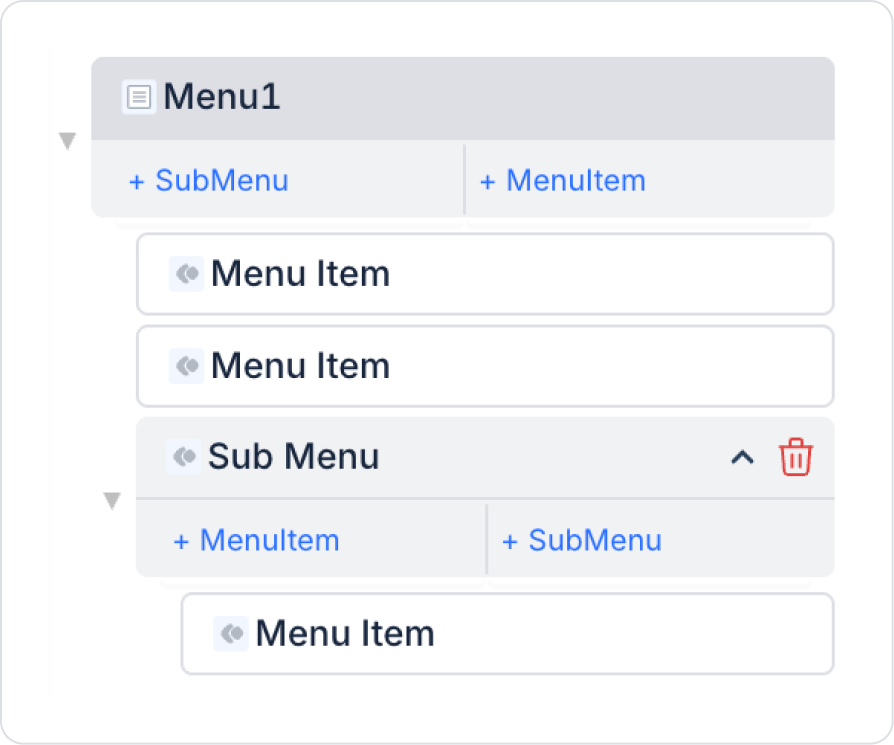
Static: You can add menu items manually. You can add submenus with + Sub Menu and single-level menu items with + Menu Item.
Dynamic: Menu items are retrieved from a data source. You can select the specific action for the data source from the Options field.
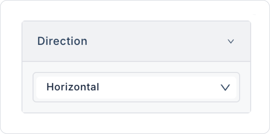
Direction: Allows menu items to be displayed horizontally or vertically.
Theme: You can select the menu theme as Light or Dark.
Primary Color: You can set the color of the selected menu item.
Collapsed: The menu is displayed in a collapsed state. When no menu icon is defined, the first letter of the items is visible.
Selected Key: Indicates which screen the user has selected in the menu.
Collapsible: Adds an expand/collapse button to the menu.
Collapsed Button Color: Sets the color of the expand/collapse button.
Hamburger Control: A control element that collapses the menu item into an icon (three-line icon) and opens the menu when clicked.
closeSiblingSubmenusOnOpen: When a submenu is opened, it automatically closes other submenus at the same level.
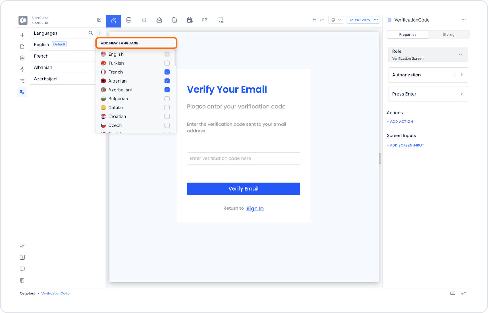
2.1.1. Providing Multi-Language Support
Open the application to which you added the menu.
Go to the Languages panel on the left panel.
Click the “+” icon next to the Languages heading.
In the New Language window that opens, select the language you want to add and name it.
Click the CREATE button to complete the process.
The texts in the Menu element are automatically added to the translation window in each language you add. You can enable multilingual support for your application by adding translations.
By following this guide, you can effectively use the Menu element in your application.
2.1.2. Opening and Closing Submenus and Arranging Them in Columns
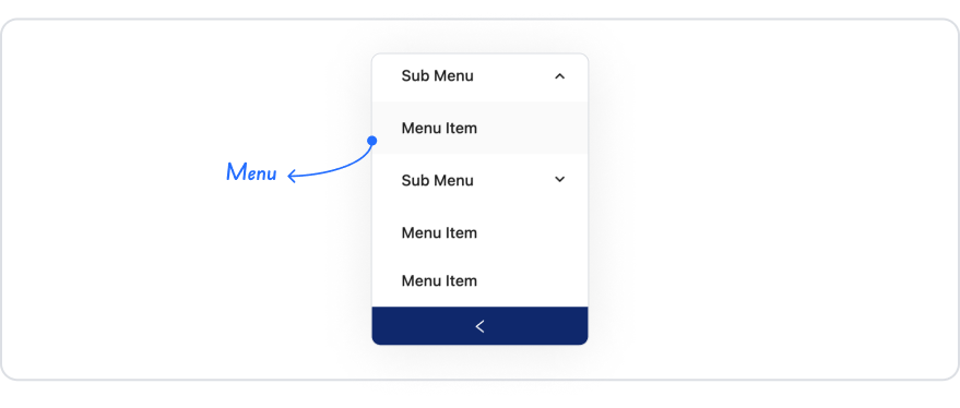
The Kuika Menu element allows you to create multi-level menu structures thanks to the Sub Menu feature. This allows users to view or hide submenu options by clicking on a main menu heading. This structure both makes it easier for the user to navigate within the application and organizes complex menus into a simple layout.
Creating a Sub Menu Structure
Select Menu Type: Select Static as the data type for the Menu element. This allows you to create the menu structure manually.
Add a Sub Menu: In the Properties panel, click the + Sub Menu button to add a main menu heading. This element acts as the heading to which the sub menus will be linked.
Add Sub Menu Items: Click the + Menu Item button under the Sub Menu you added to create one or more sub menu items. Each Menu Item can direct the user to a different screen or transaction page.
Automatic Transition Behavior: The Kuika platform automatically opens sub menus when menu headings are clicked and closes them when clicked again. No additional configuration is required for this transition.
Vertical Alignment (Displaying Like Columns One Below the Other)
Set the Menu Direction: Set the Direction parameter of the Menu element to Vertical. This places both the main menu headings and submenu items vertically one below the other in a hierarchy.
Column Structure: Submenu items are listed in a column view immediately below the heading they are associated with. This structure provides the user with a folder-like navigation experience, especially when used in left-side menus.
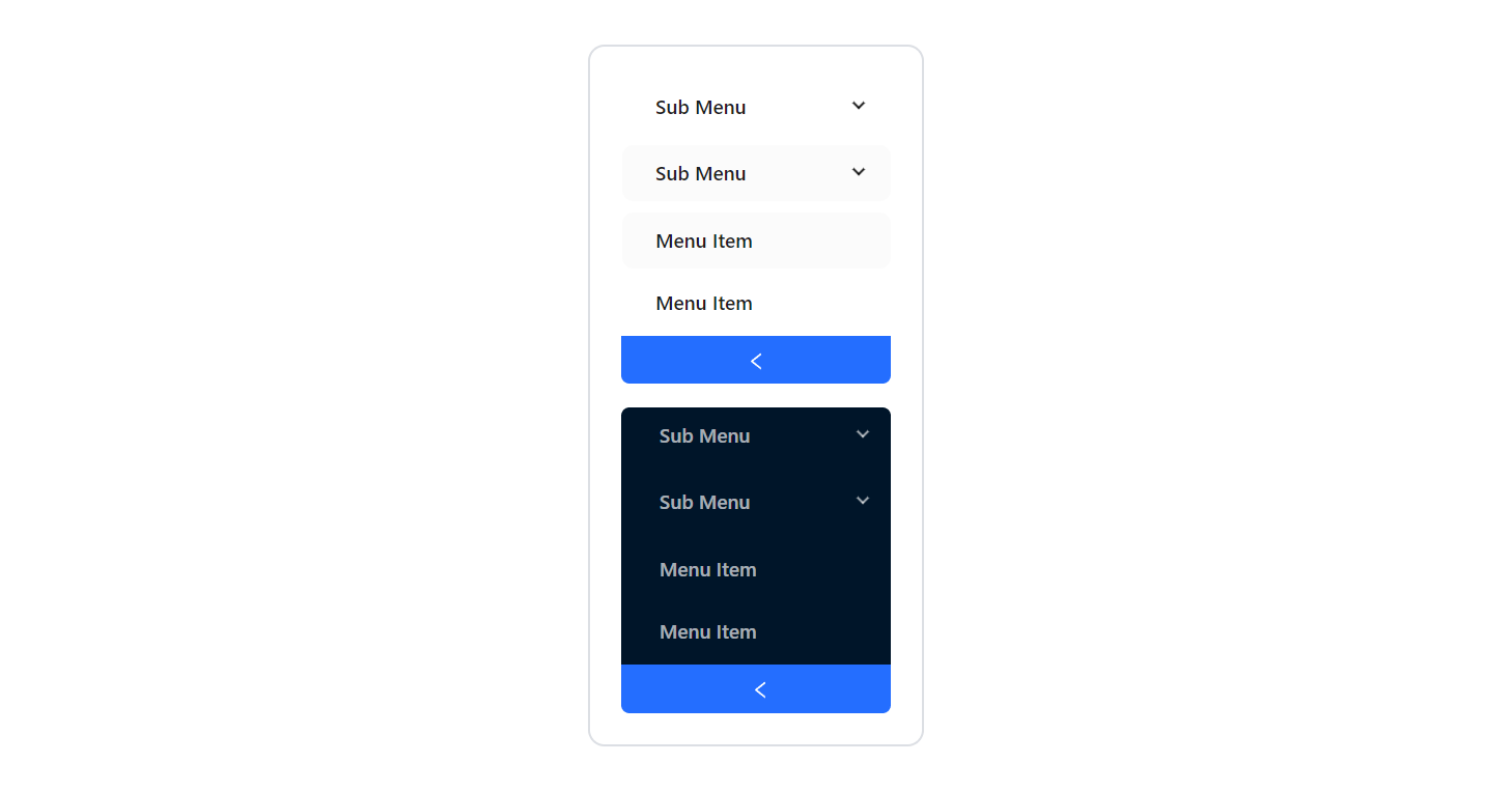
Responsive Adaptation: The menu structure works in a responsive manner according to the screen width. Submenus are displayed in a collapsible format on mobile devices, while they can be presented in an open or fixed state on wide screens.
Menu Collapse and Expansion
When the Collapsed property is enabled in the menu element, the collapsed menu displays only icons or the initial letters of the items.
When the user clicks on an icon in the collapsed menu, the menu expands to reveal the submenus.
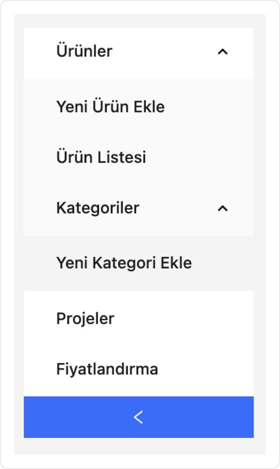
Example Usage Scenario
For example:
You can create a Sub Menu called “Products”.
Subheadings such as “Add New Product”, “Product List”, “Categories” can be added under this heading with + Menu Item.
When the user clicks on “Products,” these subheadings open in a column. When switching to another heading (e.g., ‘Orders’), the behavior can be defined so that the “Products” subheadings close if desired.
2.2. Actions That Can Be Added to Elements (onChange)
The menu element can be associated with actions through the onChange event, which is triggered when the user selects a different item in the menu. This trigger is used to manage navigation and screen-based flows.
onChange: Triggered when the user clicks on a different menu item or changes their selection in the menu.
Actions can be executed based on the menu selection. For example:
Redirecting to a different page based on the selected menu item
Reloading the data of the relevant screen
Filtering or updating the state based on the selected menu value
The onChange trigger is typically used in the following scenarios:
Navigating between screens via the sidebar or top menu
Dynamically changing the content area based on the menu selection
Storing the user's active menu information in global state or a variable
There is no separate trigger such as onClick on the Menu element; user interactions are managed only through onChange. This allows the menu selection to be used as a central control point in the application flow.
3. How to Use the Menu Element?
Web Application Example
In this section, we will cover the end-to-end use of the Menu element through example scenarios.
Scenario: Footer Menu Structure
In a business management or accounting application, a menu structure located in the footer area is used to allow users to quickly access key pages within the application. This menu supports the user experience by presenting the main functions of the application in a simple and accessible way.
Each menu item in the footer menu is configured to direct the user to the relevant page. Users can access essential screens such as the invoice list, create new invoices, and generate reports with a single tap via the footer area.
In the scenario:
The footer menu is permanently positioned at the bottom of the application.
Icons and text that link to the main pages are used together in the menu.
Each menu item is associated with a link action to the relevant page.
This structure allows the user to navigate between pages quickly and conveniently within the application.
Step 1 - Creating Pages
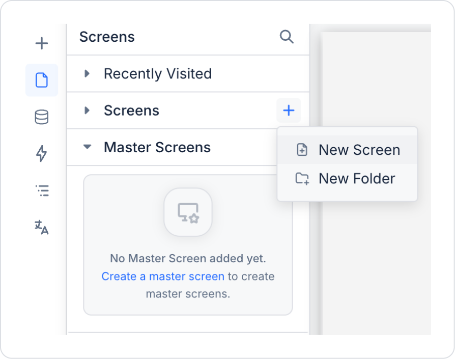
Open the UI Design module:
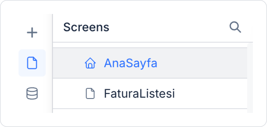
In the left side panel, create new pages named “HomePage”, “InvoiceList”, and “UnpaidInvoices” from the Screens section.
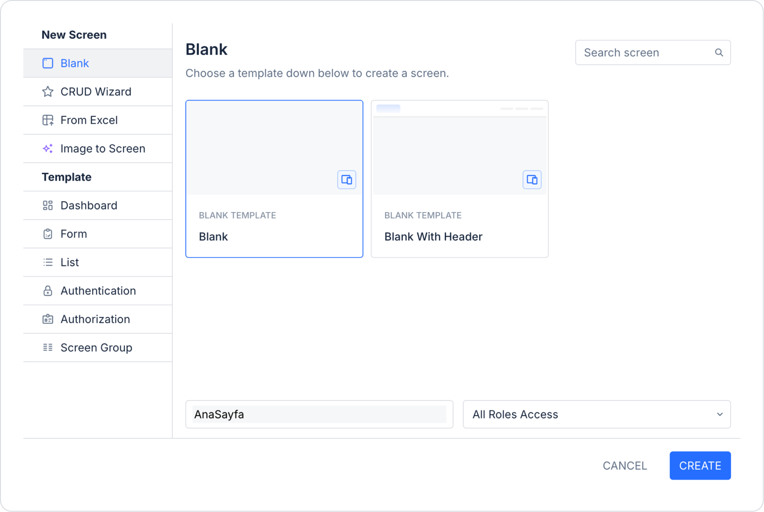
For example, you can create the Home Page as follows.
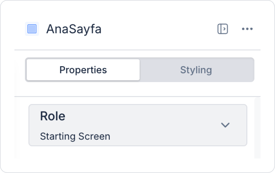
After creating the page for the Home Page, set the “Role” field in the right side panel to Page > Properties >Role > Starting Screen.
You do not need to define a Role for the remaining “InvoiceList” and “UnpaidInvoices” pages. Simply create the pages in a similar manner to Step 1.2.
Step 2 - Adding Elements to the Home Page
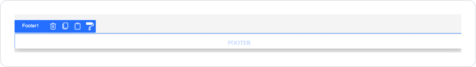
Click on the Elements > Container > Footer element in the left side panel. The elements will be automatically added to the page.
Drag and drop the Elements > Navigation > Menu element into the Footer.
To align the menu horizontally, set Menu > Properties > Direction > Horizontal.
Since the Menu element is used horizontally within the Footer, there is no need to activate the Collapsed (only the first letter of menu items is visible) and Collapsible (expand/collapse menu button) settings.
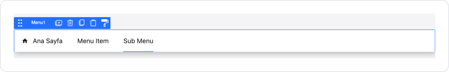
Click on the Menu element. Go to the Menu > Properties area in the left side panel, click on the Menu Items in order, and use the up arrow button to move the menu items to the top.
The data type comes as Static by default. In the current scenario, Static has been preferred for better understanding of the process. The Dynamic option can also be used depending on the need.
The expected order is as follows.
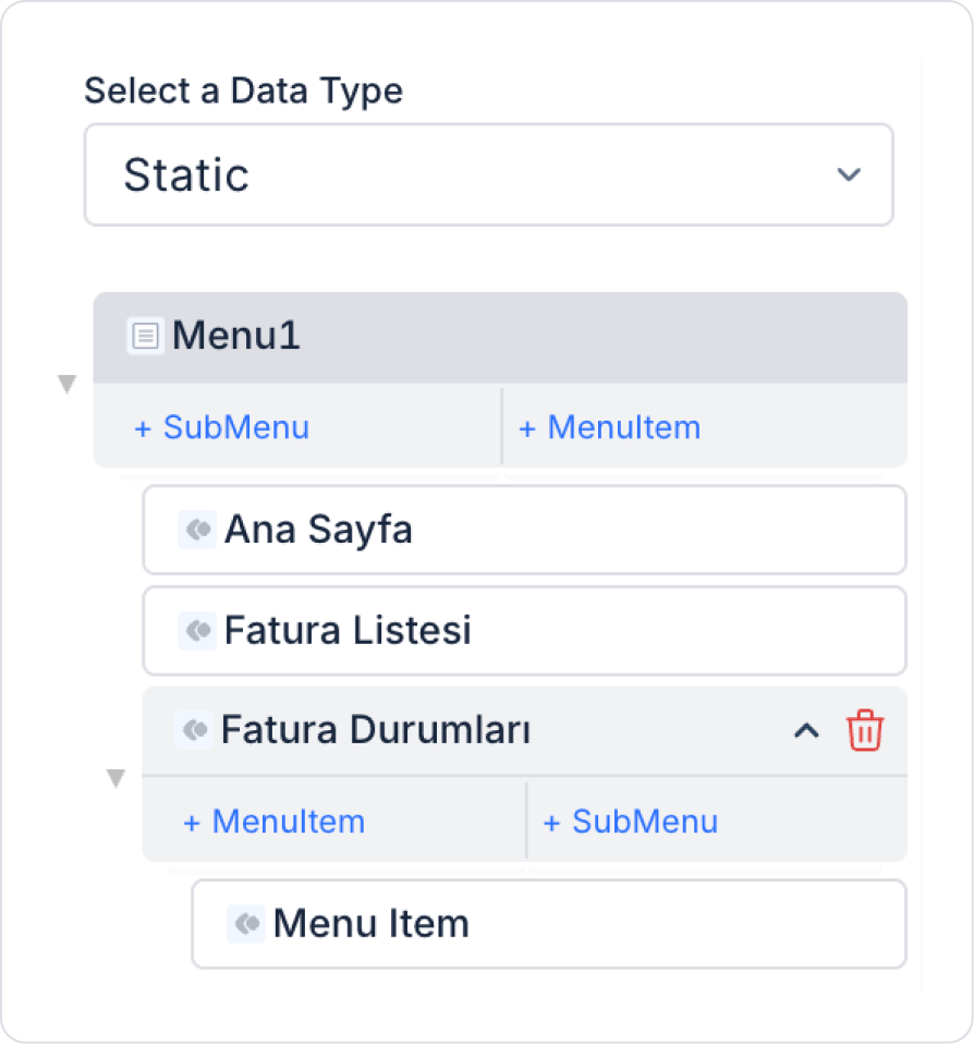
Remove the Sub Menu at the bottom using the delete button next to it.
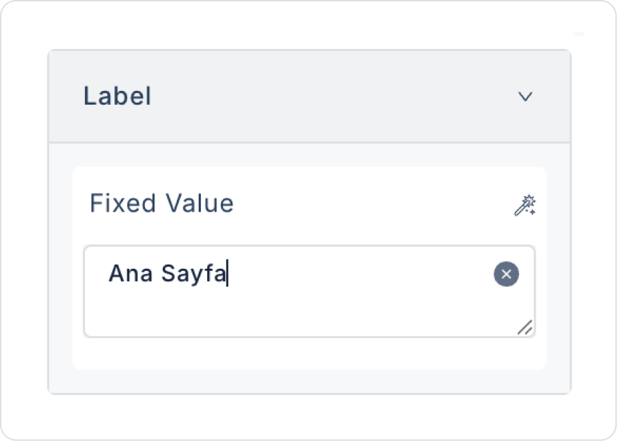
Click on the first Menu Item. Add the text MenuItem > Label > “Home Page”.
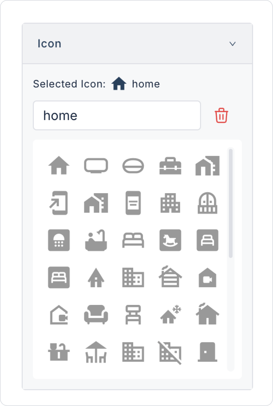
For the Home Page symbol display, select the MenuItem > Icon > home icon.
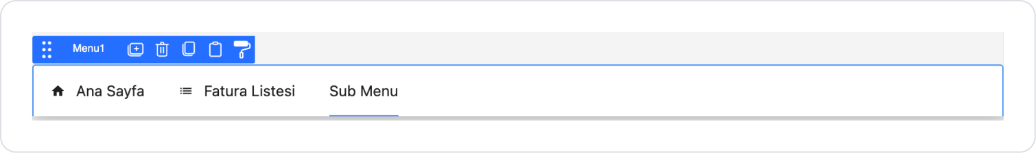
After editing, the first Menu Item should look like this.
Click on the second Menu Item. Add the text MenuItem > Label > “Invoice List”.
For the Invoice List symbol display, select the MenuItem > Icon > list icon.
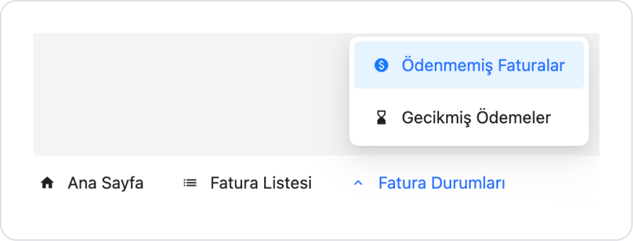
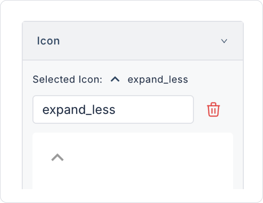
Click on the next Sub Menu. Add the text SubMenu > Label > “Invoice Statuses”.
For the Invoice Statuses drop-down menu, select the SubMenu > Icon > expand_less icon for the symbol display.
After these steps, the Menu content should look like this.
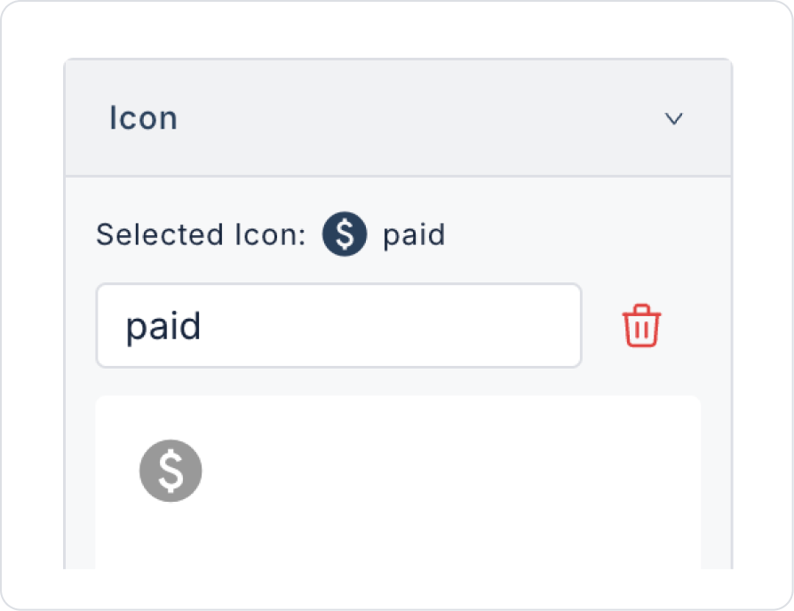
Click on the Menu Item within Invoice Statuses. Add the text MenuItem > Label > Unpaid Invoices.
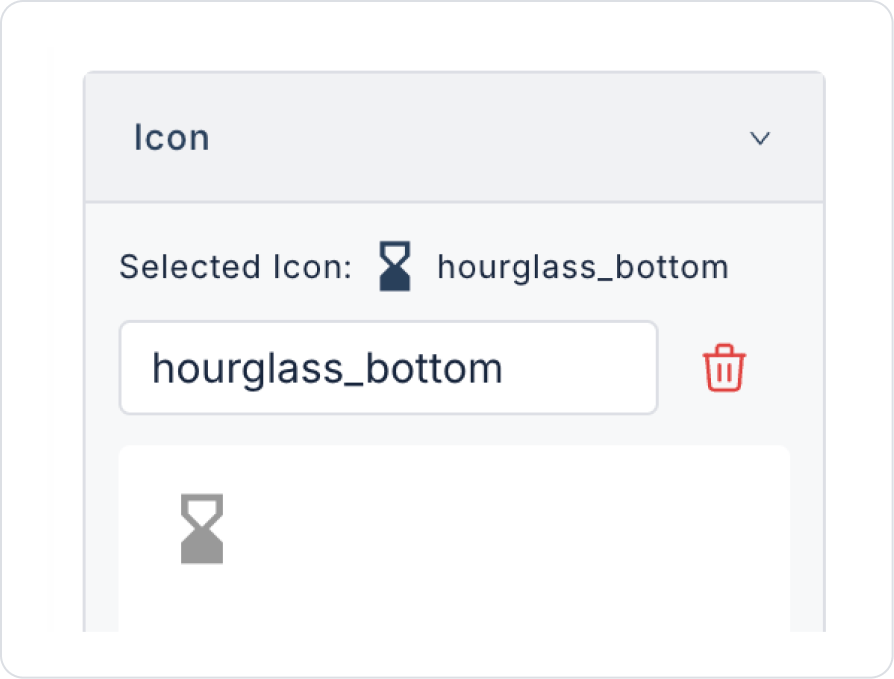
For the symbol display, select the MenuItem > Icon > paid icon.
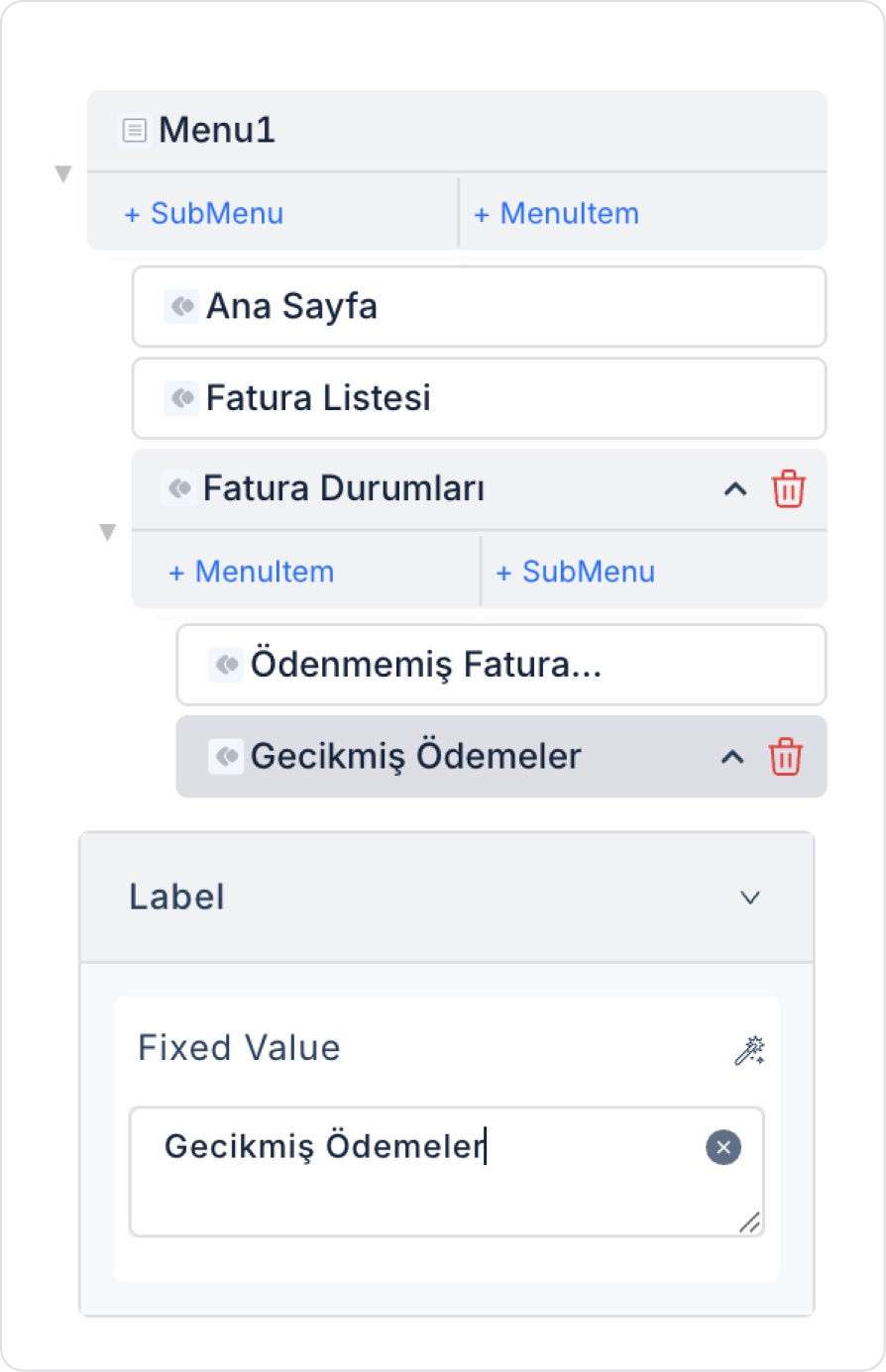
Add another Menu Item under Invoice Status. Set its name to MenuItem > Label > Overdue Payments.
For the Overdue Payments symbol display, select the MenuItem > Icon > hourglass_bottom icon.
Step 3 - Adding an Action to the Home Page Menu
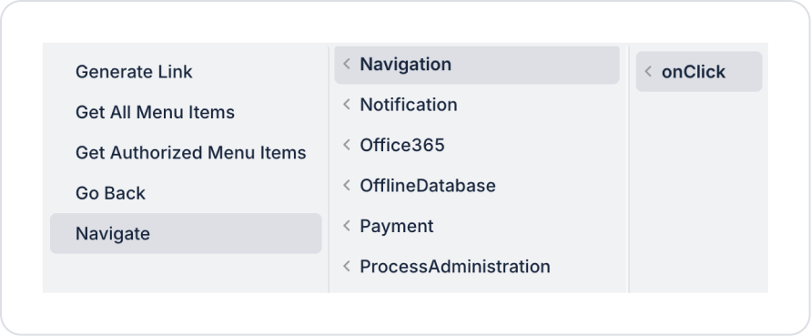
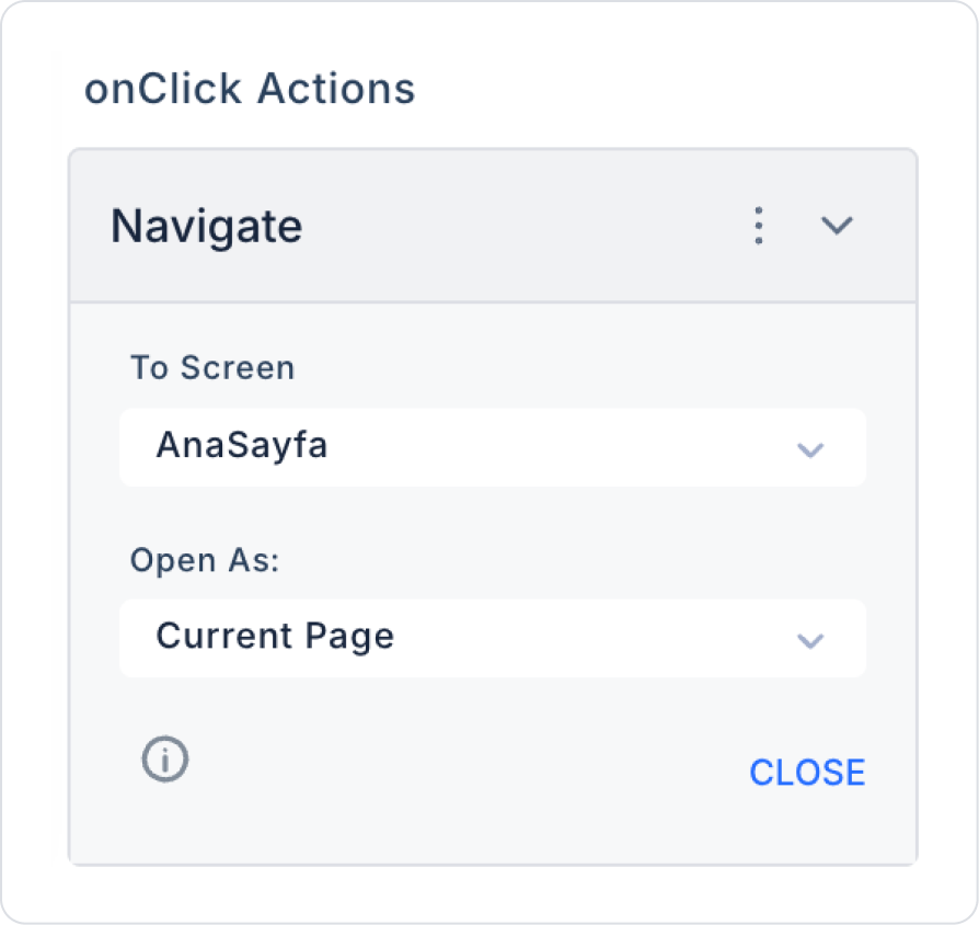
Click on the Home Page in the Menu. With Home Page selected, add the MenuItem > Add Action > onClick > Navigation > Navigate action.
In the To Screen field within the Navigate action, select HomePage.
Click on the Invoice List in the Menu. With Invoice List selected, add the MenuItem > Add Action > onClick > Navigation > Navigate action.
In the To Screen field within the Navigate action, select the InvoiceList page.
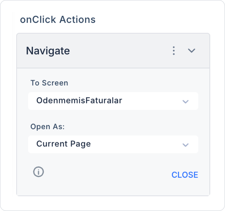
Click on Unpaid Invoices in the Invoice Statuses submenu.
With Unpaid Invoices selected, add the MenuItem > Add Action > onClick > Navigation > Navigate action. In the Navigate action, select the UnpaidInvoices page in the To Screen field.
The last remaining Overdue Payments Menu Item has been added as an example of submenu usage. No configuration is required.
Step 4 - Copying Actions from the Home Page to Other Pages
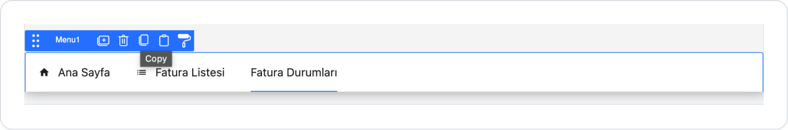
Click on the Menu element on the Home Page. From the options that appear, click on the third option, “Copy”.
Go to the InvoiceList page you created from the Screens panel on the left.
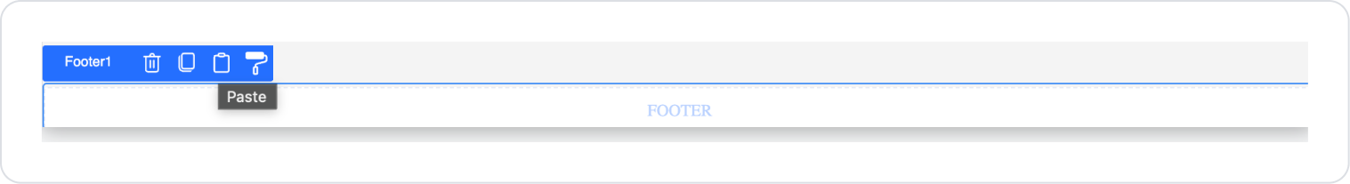
Add the Elements > Container > Footer element to the page.
Click on the Footer element. Press the third option, “Paste,” from the options that appear.
For the added Menu element, apply the steps performed in Step 2 in the same order on the InvoiceList page. All steps will be the same.
Finally, apply the steps in Step 3 on the UnpaidInvoices page.
Preview
When the application is tested, the Invoice Status menu item on the Home Page and Invoice List page is used as a common submenu structure for the relevant pages. When this menu is clicked, the Unpaid Invoices and Late Payments submenus are displayed, each providing a redirect to its own page.
When the user clicks on the selected submenu item, they are redirected to the page for the relevant invoice status and only see invoices for the selected status. This structure allows the user to access invoice statuses quickly and consistently from different pages.
Mobile Application Example
In this section, we will discuss the end-to-end use of the Menu element through example scenarios.
Scenario: Footer Menu Structure
In a business management or accounting application, a menu structure located in the footer area is used to allow users to quickly access basic pages within the application. This menu supports the user experience by presenting the main functions of the application in a simple and accessible way.
Each menu item in the footer menu is configured to direct the user to the relevant page. Users can access essential screens such as invoice lists, creating new invoices, and reporting with a single tap via the footer area.
In the scenario:
The footer menu is permanently positioned at the bottom of the application.
Icons and text directing to the main pages are used together in the menu.
Each menu item is associated with a redirection action to the relevant page.
This structure allows the user to navigate between pages quickly and conveniently within the application.
Step 1 - Creating an Action for Dynamic Use
Open the DataSources module:
Click Add New SQL Action.
Add the following SQL code in the editor that opens and name the created action PageNavigationHierarchy.
DECLARE @MainPageId UNIQUEIDENTIFIER = NEWID();
DECLARE @InvoiceListId UNIQUEIDENTIFIER = NEWID();
DECLARE @InvoiceStatus UNIQUEIDENTIFIER = NEWID();
DECLARE @UnpaidInvoices UNIQUEIDENTIFIER = NEWID();
SELECT @MainPageId AS Id, NULL AS ParentId, N'Main Page' AS PageName, ‘home’ AS IconName, ‘HomePage’ AS LinkName, 1 AS OrderNo
UNION ALL
SELECT @InvoiceListId, NULL, N'Invoice List', ‘list’, ‘InvoiceList’, 2UNION ALL
SELECT @InvoiceStatuses, NULL, N'Invoice Statuses', ‘expand_less’, ‘’, 3UNION ALL
SELECT @UnpaidInvoices, @InvoiceStatuses ,N'Unpaid Invoices', ‘paid’, ‘UnpaidInvoices’, 4
Step 2 - Creating Pages
Open the UI Design module:
In the left side panel, under the Screens section, create new pages named “InvoiceList” and “UnpaidInvoices”.
For example, you can create the Invoice List page as follows.
Step 3 - Adding Main Page Elements
Add a pageInit Action to the page. Add the Add Action > Initial Action > Custom > Managed DB > PageNavigationHierarchy action.
Click on the Elements > Container > Footer element in the left side panel. Elements will be automatically added to the page.
Drag and drop the Elements > Navigation > Menu element into the Footer.
Select the menu data type as Select a Data Type > Dynamic on the web platform.
To align the menu horizontally, set Menu > Properties > Direction > Horizontal.
Define the Menu > Properties > Options > Action > PageNavigationHierarchy action for page names and other details. Apply the necessary definitions to the fields as follows.
Step 4 - Copying Actions from the Home Page to Other Pages
Add the pageInit Action to the page. Add the Add Action > Initial Action > Custom > Managed DB > PageNavigationHierarchy action.
Click on the Menu element on the Home Page. Click on the third option, “Copy,” from the options that appear.
Go to the InvoiceList page you created from the Screens panel on the left.
Add the Elements > Container > Footer element to the page.
Click on the Footer element. Press the third option, “Paste,” from the options that appear.
Preview
When the application is tested, the Invoice Statuses menu item on the Home Page and Invoice List pages is used as a common submenu structure for the relevant pages. When this menu is clicked, the Unpaid Invoices and Overdue Payments submenus are displayed, each providing a redirect to its own page.
When the user clicks on the selected submenu item, they are redirected to the page for the relevant invoice status and only see invoices for the selected status. This structure allows the user to quickly and consistently access invoice statuses from different pages.
4. Common Properties
Some fields on the Menu element are used in common across all UI elements. Therefore, detailed descriptions of the following properties are provided in the relevant general guide pages:
Design the menu structure to be simple and hierarchical. Using too many menus and submenus can make it difficult for users to find the content they are looking for.
Keep menu titles short and clear. Users should be able to clearly understand which screen they will go to when looking at the menu.
Use the onChange trigger with caution. Running unnecessary actions or repeated data calls when the menu changes can negatively impact performance.
Test the menu layout for mobile use. Long menus or too many sub-levels on mobile can reduce accessibility.
Use menu items in conjunction with authorization rules to ensure that users only see screens they have permission to access.
6. Restrictions
The menu element does not perform data listing or filtering within itself; it is used solely for navigation and selection purposes.
Separate actions cannot be defined on menu items. All user interactions are managed through the onChange event.


