Kuika's Barcode Input element allows users to quickly and accurately enter data by scanning barcodes. Barcodes are detected via the device camera or connected barcode readers and automatically transferred to the input field. This reduces the need for manual data entry, shortens processing time, and increases data accuracy.
The Barcode Input element is widely used in barcode-based workflows such as inventory management, product acceptance, inventory counting, and sales processes.
The Barcode Input element is supported in both web and mobile applications.
1.1. Common Use Cases
Stock and inventory management: Quickly adding or updating products to the system by scanning their barcodes
Sales and cash register screens: Automatically filling in product information and speeding up sales transactions by scanning barcodes
Warehouse and logistics processes: Tracking boxes, packages, or pallets via barcodes
Product acceptance and shipment: Verifying incoming or outgoing products with barcodes
Mobile field applications: Instant data entry by scanning barcodes in the field
ID, ticket, or order verification: Quick checking and verification via QR/barcode
2. Key Features
Automatic data entry with barcodes: When the user scans the barcode, the value is automatically entered into the relevant input field, eliminating the need for manual entry.
Camera and external scanner support: Works seamlessly with mobile device cameras or external barcode readers.
Working with dynamic data: The scanned barcode value can be easily transferred to actions, filters, or form fields.
Workflow integration: After scanning a barcode, processes such as list filtering, retrieving product information, or creating records can be triggered.
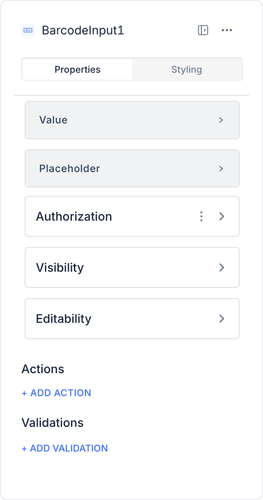
2.1. Barcode Input Element Properties
You can configure the following settings from the Properties panel:
Value: Displays the current value of the Barcode Input element. This field is automatically updated when the user scans a barcode or enters it manually.
Placeholder: Displays a temporary text used to indicate the field where the user must enter the barcode. This text is visible when no barcode has been scanned or when the field is empty. For example, you can add instructional text such as “Scan the barcode” or “Enter the barcode”.
By following this guide, you can effectively use the Barcode Input element in your application.
2.2. Actions That Can Be Added to the Barcode Input Element
The Barcode Input element allows actions to be added via events that can be triggered when the user scans a barcode or makes a manual entry. When the element is selected, the following triggers can be used in the ADD ACTION field:
onChange: Triggered when the barcode value changes. Runs when the barcode is scanned or when the user manually edits the value. Usage examples: Retrieving product information, filtering lists, auto-filling form fields.
onPressEnter: Triggered when the user scans a barcode or manually enters a value and presses the Enter key. Usage examples: Starting a search, redirecting to a product details page, performing a registration check.
onBlur: Triggers when the Barcode Input field loses focus (when the user exits the input). Usage examples: Validating the entered barcode, displaying warnings for missing or incorrect barcodes.
Form or process triggering scenarios: Workflows can be initiated by connecting Managed DB, REST API, or UI Control actions through these events.
Filtering and data refresh: When a barcode is scanned, the data source of the linked table, list, or grid elements can be reloaded.
Quick action scenarios: Used especially in warehouse, inventory, and sales screens for the flow: scan barcode → press Enter → complete action.
3. How to Use the Barcode Input Element?
In this section, we will cover the end-to-end use of the Barcode Input element with an example scenario using a market application.
Scenario: Scanning Product Barcodes in a Market Application
In a market application, cashiers use the Barcode Input element to add products to the cart quickly and accurately. When the barcode is scanned, the product information is automatically retrieved by the system and displayed on the screen.
In the scenario:
The barcode value is obtained via Barcode Input.
SQL Action returns the product corresponding to the barcode.
The product name, price, and stock information are displayed on the screen.
The user can add the product to the cart.
Step 1 - Creating a Data Source
Creating a table in the DataSources module:
Go to the Datasources module.
Then go to the Tables tab.
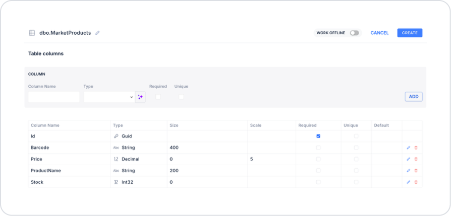
Create a new table named “MarketProducts”.
The table structure to be set up is as follows:
Important Field names:
ProductName: Holds the name information of the product scanned by the barcode reader that is displayed on the screen.
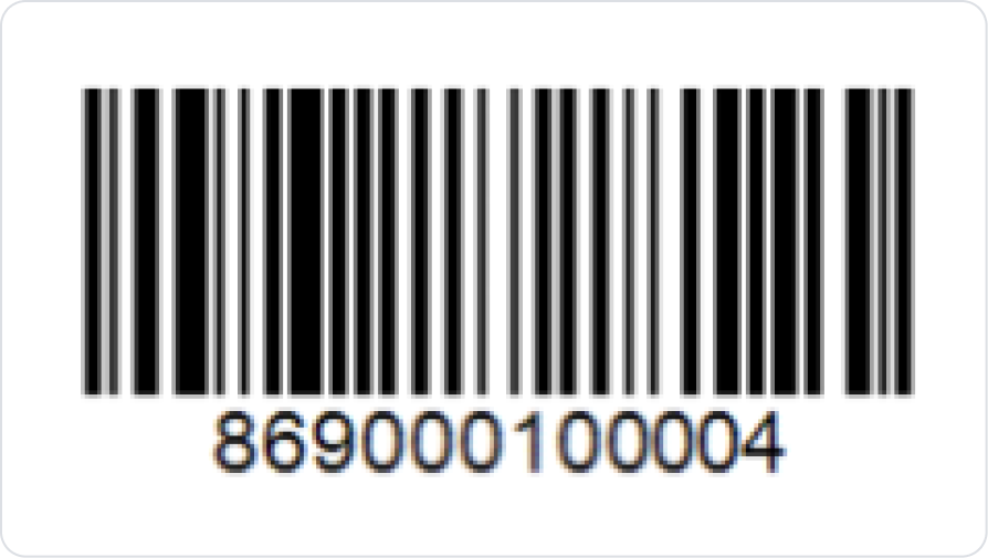
Barcode: Stores the Code 128 format barcode value for the product and is matched with the data scanned by the Barcode Reader.
Price: Stores the product's sales price information and is used in cart calculations.
Stock: Shows the current stock quantity of the product and enables stock control during sales.
Step 2 - Defining the Necessary Actions
To display and save data in the interface:
Two actions will be used in this scenario.
Add a new action from the Actions > New SQL Action tab in the Datasources module.
Action that Retrieves Data (InsertMarketProducts): To test the application with sample data, add the following SQL action and press the TEST button.
When applying, delete the MarketProducts part, rewrite MarketProducts, and press Enter. This will add the correct schema name before the table name. You will also use the schema name in the following action.
Action that Retrieves Products by Scanned Barcode (GetMarketProductsByBarcode):
SELECT
ProductName,
Price,
Stock
FROM dbo.MarketProducts
WHERE Barcode = @Barcode;
When applying, delete the MarketProducts section, retype MarketProducts, and press Enter. This will add the correct schema name before the table name. You will also use the schema name in the following action.
Step 3 – Adding Elements to the Home Page and Linking Actions
Open the UI Design module.
Drag and drop the Elements > Display > Label element onto the page.
Update the Label content to Label > Properties > Value > “Scan Product”.
Set the Label text style to Label > Styling > Text > Style > Heading 2.
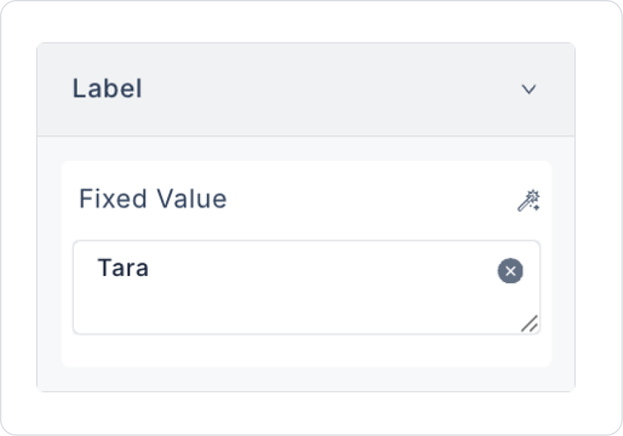
Add another Elements > Display > Label element below it.
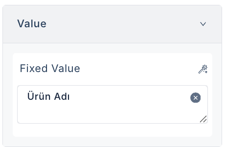
Update the text content to Label > Properties > Value > “Product Name”.
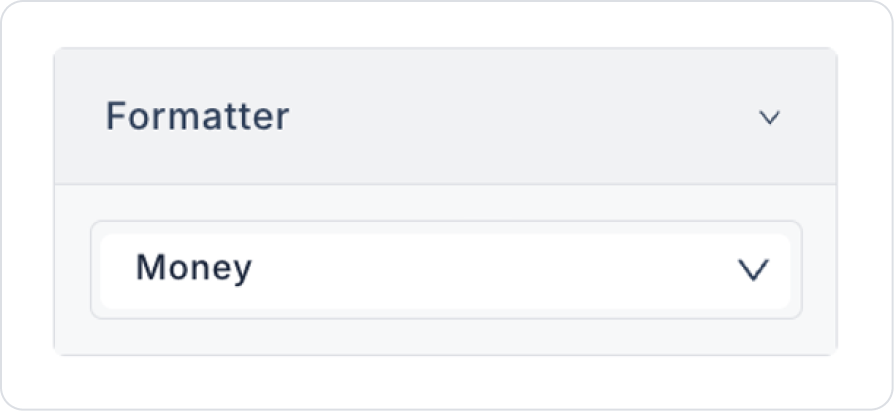
Add another Elements > Display > Label element below it.
Select the label text format as Label > Properties > Formatter > Money.
Drag and drop an Elements > Input > Barcode Input element onto the page below the text.
Drag and drop an Elements > Navigation > Button element below.
Update the Button text to Button > Properties > Label > “Scan”.
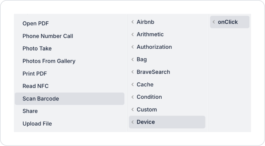
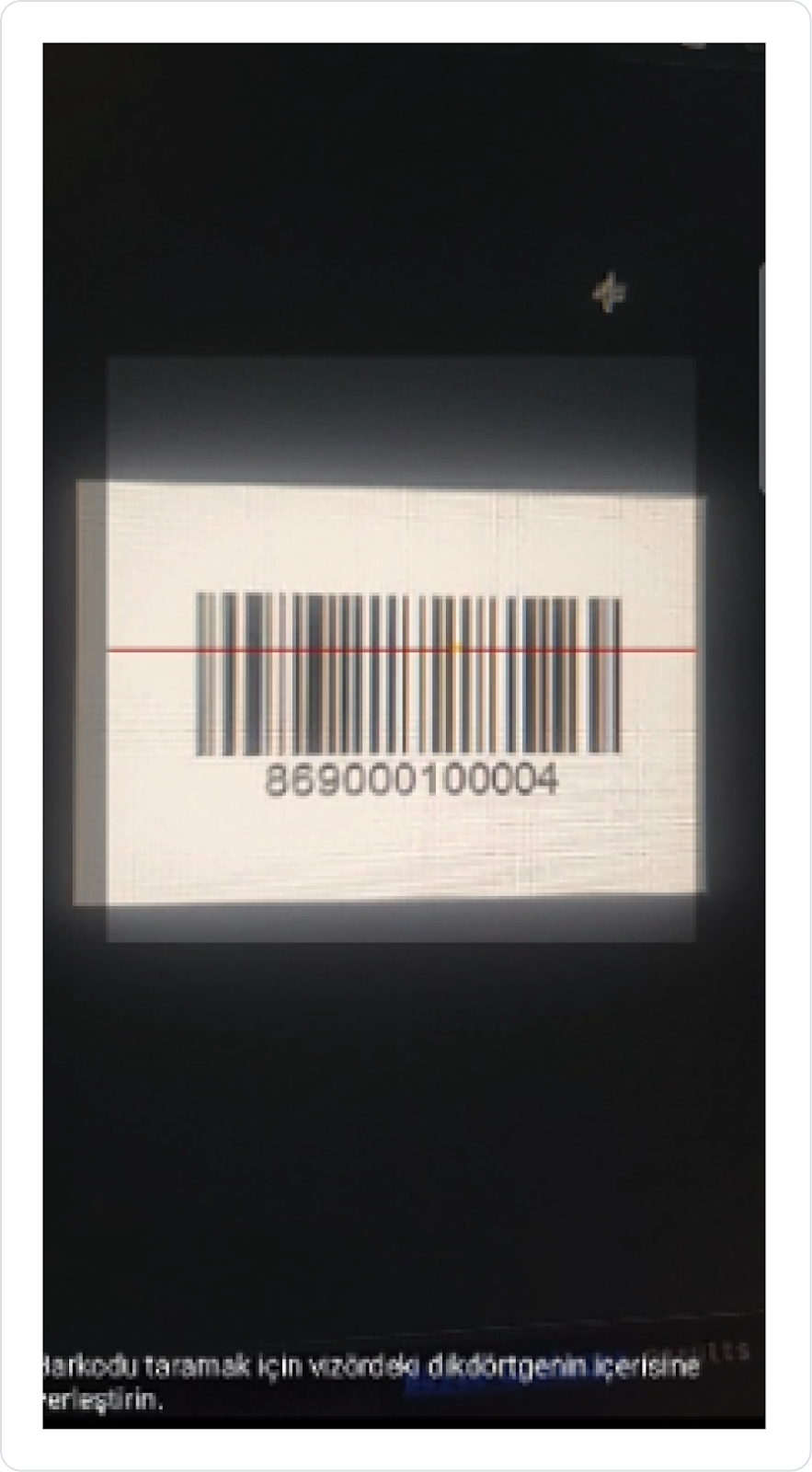
Add an action to the Button element: Button > Properties > Add Action > onClick > Device > Scan Barcode.
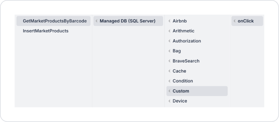
Add another action to the Button element: Add Action > Custom > Managed DB > GetMarketProductsByBarcode.
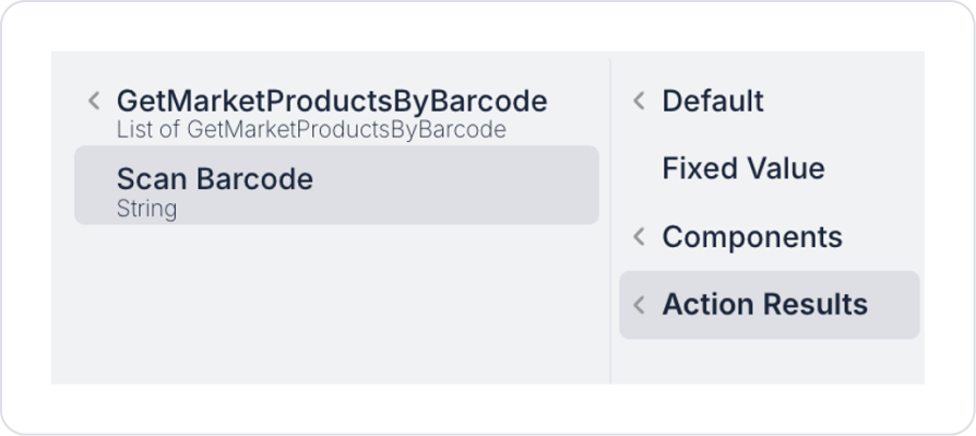
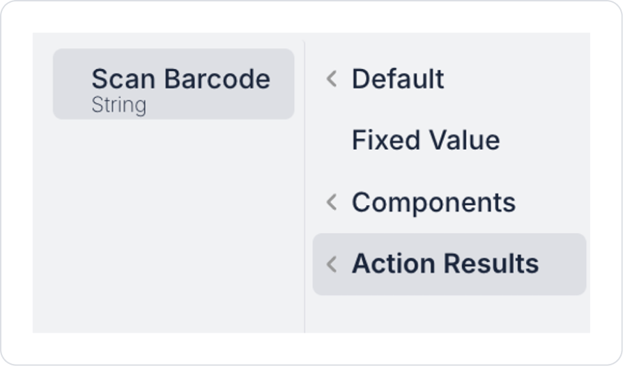
Define the Action Results > Scan Barcode field for the Barcode parameter of the GetMarketProductsByBarcode action.
Click on the Barcode Input element and link the Action Results > Scan Barcode action to BarcodeInput > Properties > Value.
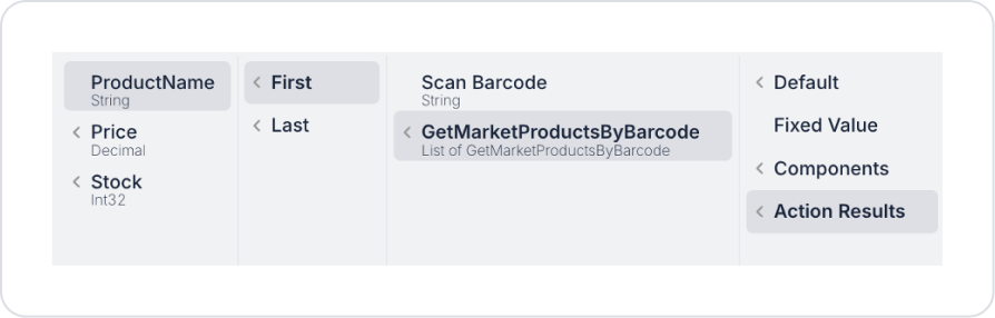
Define the Label > Properties > Value > Action Results > GetMarketProductsByBarcode > First > ProductName definition for the product name Label element.
After defining, add “Product Name” to the Design Placeholder field created under the Value field.
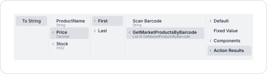
For pricing, define Label > Properties > Value > Action Results > GetMarketProductsByBarcode > First > Price > To String in the price Label element.
After defining, add “0.00” to the Design Placeholder field created under the Value field.
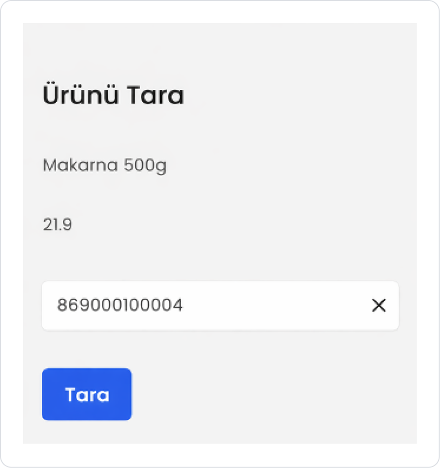
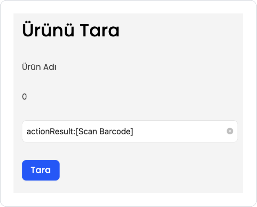
The final page structure should be as follows.
Preview
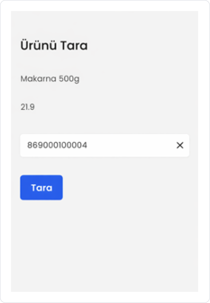
When the application is tested, clicking the Scan button opens the barcode scanning screen. When the user scans the barcode for the relevant product, the barcode value is automatically retrieved via the Barcode Input element.
The name and price information of the product corresponding to the scanned barcode is retrieved by the system and displayed on the screen. At the same time, the scanned barcode number is displayed in a trackable manner on the Barcode Input field.
4. Common Properties
Some fields on the Barcode Input element are commonly used in all UI elements. Therefore, detailed explanations of the following properties are provided in the relevant general guide pages:
Use the Barcode Input element as scan-focused as possible. If manual entry is allowed, add a Placeholder text to guide the user.
Run automatic actions using the onChange trigger after the barcode scanning process. This way, the user does not have to press an extra button.
In scenarios that require validation, apply additional controls with the onPressEnter or onBlur triggers. This method allows you to catch incorrect barcode entries at an early stage.
If data is to be retrieved with the barcode value (product, stock, order, etc.), speed up the user experience by automatically filling in table or form fields as a result of the action.
6. Limitations
The Barcode Input element only works with manual input in environments without camera or scanner support.
Automatic scanning behavior may vary depending on the device and scanner used.


