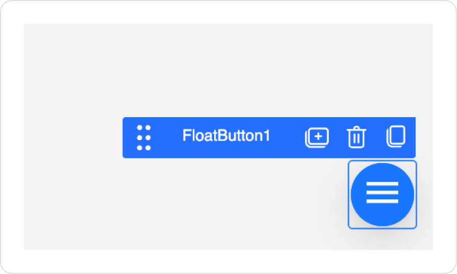
FloatButton is an action button supported only in web applications on the Kuika platform that can be positioned in fixed corners of the screen. It maintains its position even when the page is scrolled, providing the user with an always-accessible action point.
It is typically preferred for scenarios such as navigation actions, adding records, quick actions, or opening FloatPanel. Its minimal structure allows important actions to be highlighted without cluttering the interface.
The FloatButton element is only supported in web applications.
1.1. Common Usage Scenarios
Opening FloatPanel: Makes detail, filter, or quick action panels accessible from anywhere on the screen.
Quick navigation: Used to direct the user to a specific page or form with a single click.
Action shortcut: Presents frequently used actions (save, send, start, etc.) in a permanently visible location.
Scroll-independent action: On long pages, allows the user to access the action regardless of where they are on the page.
Minimal CTA (Call to Action): Used to highlight an important action without cluttering the interface.
2. Key Features
Fixed position: FloatButton is fixed to a specified corner of the screen and remains in place even when the page is scrolled.
Single action-focused use: It is typically used to trigger a single, clear action (adding a record, opening a panel, redirecting, etc.).
OnClick trigger support: Defined actions can be executed when the user clicks the button.
FloatPanel integration: It is frequently used in scenarios where clicking opens a FloatPanel, enabling quick interaction.
Navigation and shortcut: Provides users with the ability to perform quick actions on long screens.
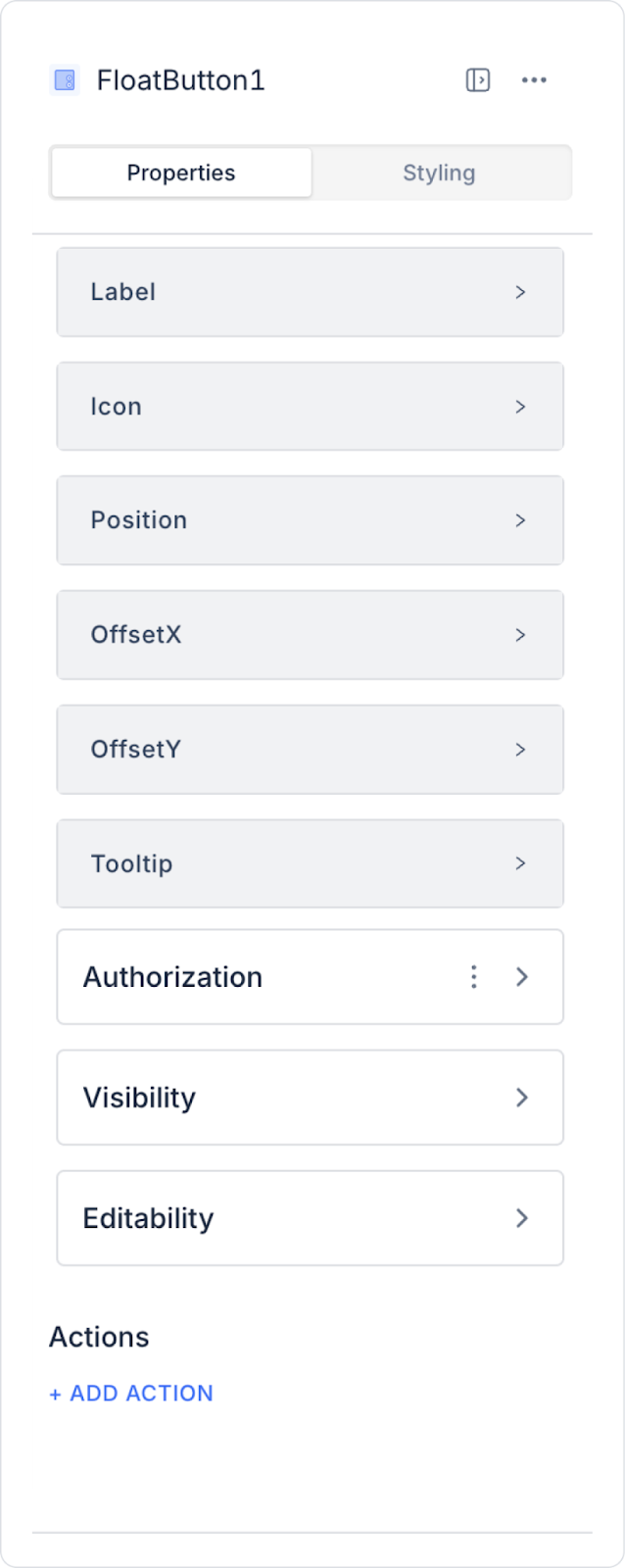
2.1.Float Button Properties
Label: Specifies the text to be displayed on the button.
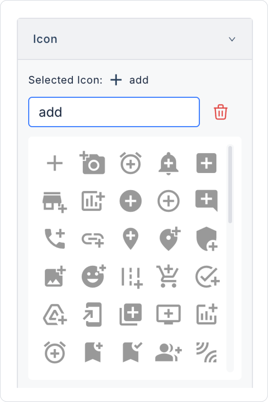
Icon: Allows you to select the icon that will accompany the button.
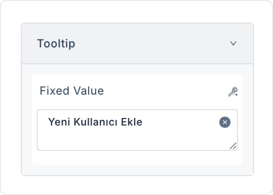
Tooltip: Explanation to be displayed when the user hovers over the button.
Position: Determines where the button will be fixed on the screen:
top left: Fixed to the top left corner.
top right: Fixed to the top right corner.
bottom left: Fixed to the bottom left corner.
bottom right: Fixed to the bottom right corner.
offsetX: Specifies how much space the button will leave horizontally (from the right or left) (in px).
offsetY: Specifies how much space the button will leave vertically (from the bottom or top) (in px).
offsetX and offsetY values are used to set the distance from the edge according to the selected position. For example:
When bottom right is selected:
offsetX: space from the right edge
offsetY: space from the bottom edge
When top left is selected:
offsetX: space from the left edge
offsetY: space from the top edge
2.1.1. Using FloatButton with FloatPanel
FloatButton is typically used to trigger a FloatPanel.
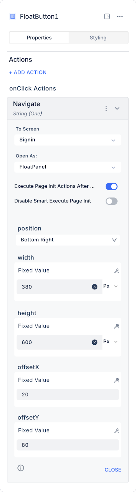
FloatPanel is opened with the Navigate action, which is defined as follows:
+ADD ACTION →onClick→Navigate action is assigned.
FloatPanel is selected as the target panel type.
FloatPanel is used as an alternative to Drawer and Modal components.
Usage Scenarios
“+” button to add a new record
Open help or support panel
Call feedback or comment form
Open additional settings or actions
2.2. Actions That Can Be Added to Elements
The FloatButton element is a UI element that directly manages user interaction through actions. When the element is selected, the +ADD ACTION field in the Properties panel becomes active and the following trigger can be used:
onClick
Triggered when the user clicks on the FloatButton. The basic purpose of the FloatButton is to execute actions through this trigger.
Usage scenarios:
Adding a new record (Create / Add Record)
Redirecting to another page (Navigate)
Opening or closing a FloatPanel
Triggering a Modal / Popup
Resetting or submitting a form
Running an API or SQL action
Creating an in-page quick action (shortcut)
Since the FloatButton is designed to trigger a single, clear user action, it does not support any triggers other than onClick. All interaction scenarios are managed through this trigger.
3. How to Use the Float Button Element?
In this section, we will cover the end-to-end use of the Float Button element through example scenarios.
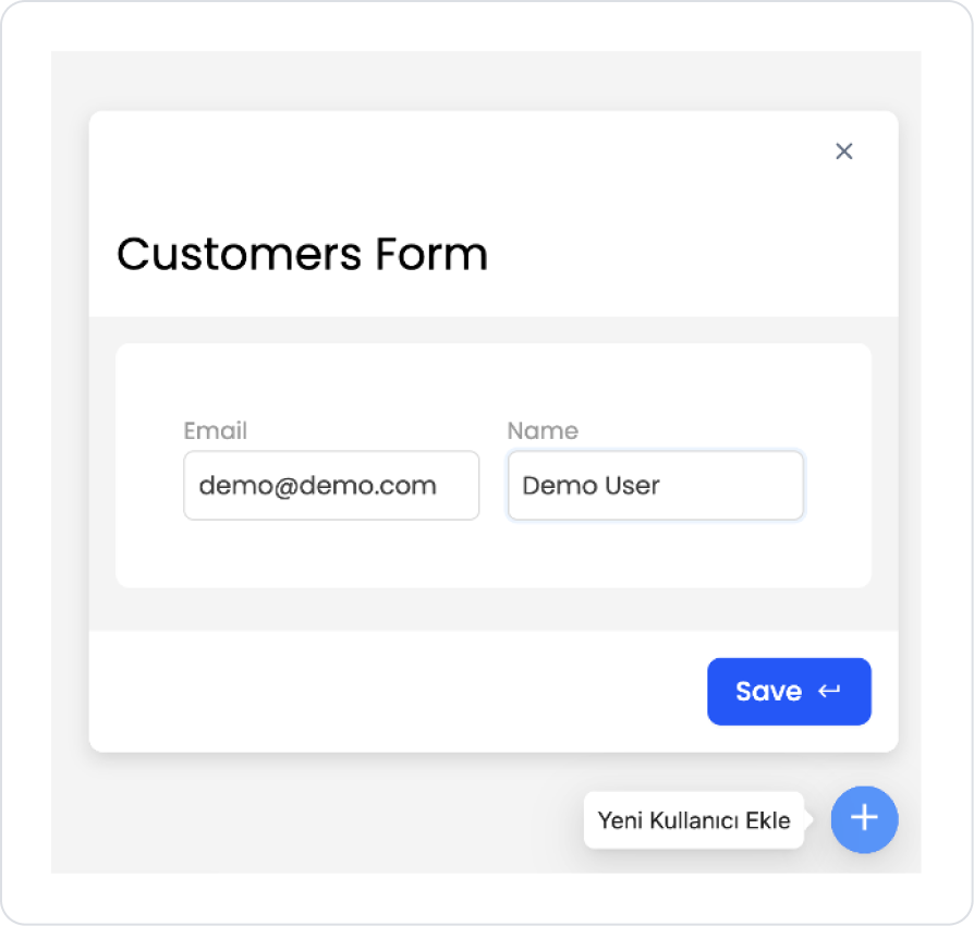
Scenario: Adding a New Customer with Floating Button (Opening a Form on Float Panel)
In an application, Floating Button and Float Panel are used together so that users can quickly add new records without leaving the page. In this scenario, the New Customer Add form is displayed in a Float Panel that opens on the page when the “+” Floating Button in the lower right corner of the screen containing the customer list is clicked.
In the scenario:
Existing customer records are displayed in a table/list on the application's Customers page.
A Floating Button (+) is positioned in the lower right corner of the page, where it is always accessible.
When the user clicks the Floating Button, a Float Panel opens without leaving the screen, and the “Add New Customer” form is displayed within the panel.
Within the Float Panel, the user is asked to fill in the Name and Email fields (the ID is automatically generated by the system).
When the user clicks the Save button, a new customer record is created; if the operation is successful, the panel closes and the customer list is updated to show the new record on the screen.
If the user decides not to proceed, they can close the Float Panel with Cancel / Close; this allows them to remain on the same screen without disrupting the page flow.
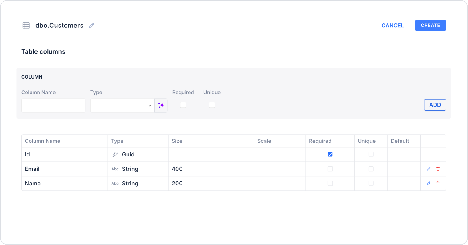
Step 1 - Creating a Data Source
Creating a table in the DataSources module:
Go to the Datasources module.
Then go to the Tables tab.
Create a new table named “Customers”.
The table structure to be set up is as follows:
Important Field names:
Email: Holds the customer's email address.
Name: Represents the customer's visible name (first name–last name or company name).
Step 2 - Adding the Float Panel Page
Initially on the home page:
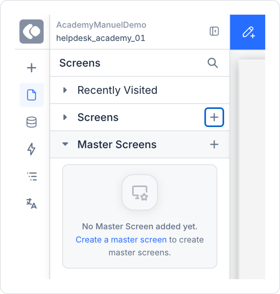
Click Create New Screen in the Screens area on the left side panel.
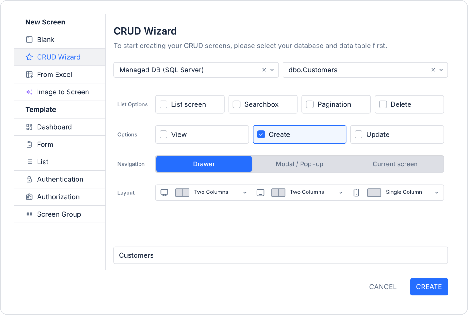
Select the CRUD Wizard area from the screen that opens and create the user creation screen as ready by making the following definitions.
The newly created page will be located under Screens. Click on the created page to open it. Delete the column on the right side of the page.
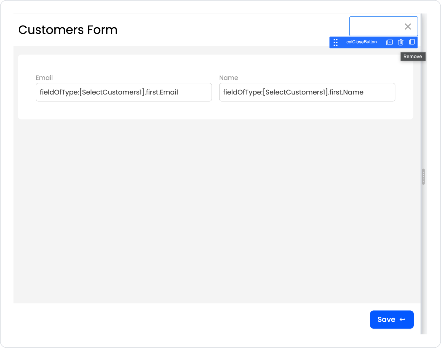
The expected page layout should be as follows.
Step 3 - Adding the Float Button Element and Editing the Style
Starting from the home page:
Open the UI Design module.
From the left side panel, drag and drop the Elements > Navigation > FloatButton element onto the page.
Set the Float Button icon to FloatButton > Properties > Icon > ‘add’.
Define the description text as FloatButton > Properties > Tooltip > “Add New User”.
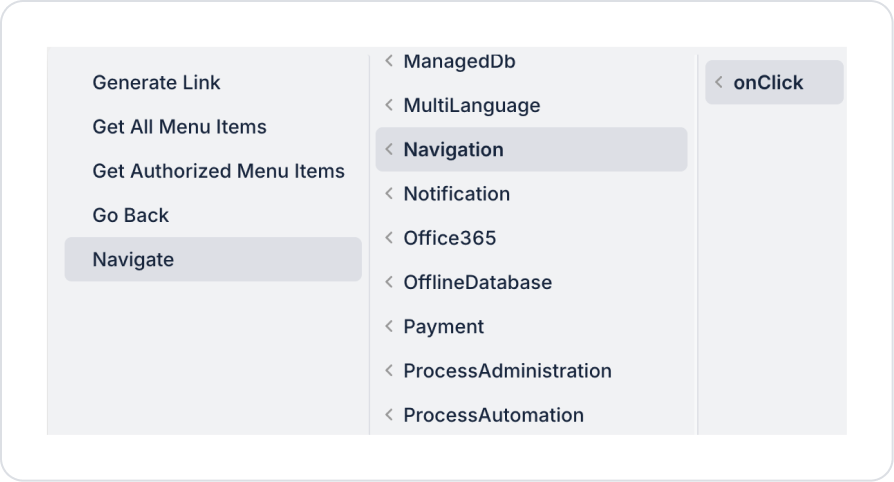
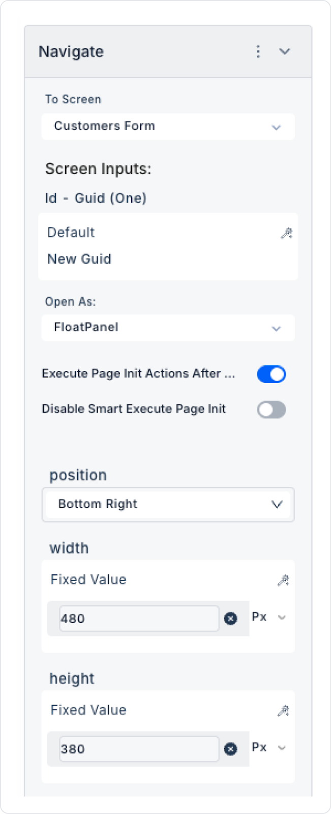
Add an action to the Float Button element to navigate to the page: FloatButton > Properties > Add Action > onClick > Navigation > Navigate.
Define the fields of the added Navigate action as follows: To Screen > Customers Form, Screen Inputs > Id > Default > New Guid, Open As > Float Panel, Weight > 480 px, and Height > 380 px.
Preview
When the user hovers over the Floating Button (+) in the lower right corner of the page, the button is visually highlighted, clearly indicating that the action to add a new record is always accessible. When the user clicks the button, a Float Panel titled Customers Form opens on the screen without leaving the current page.
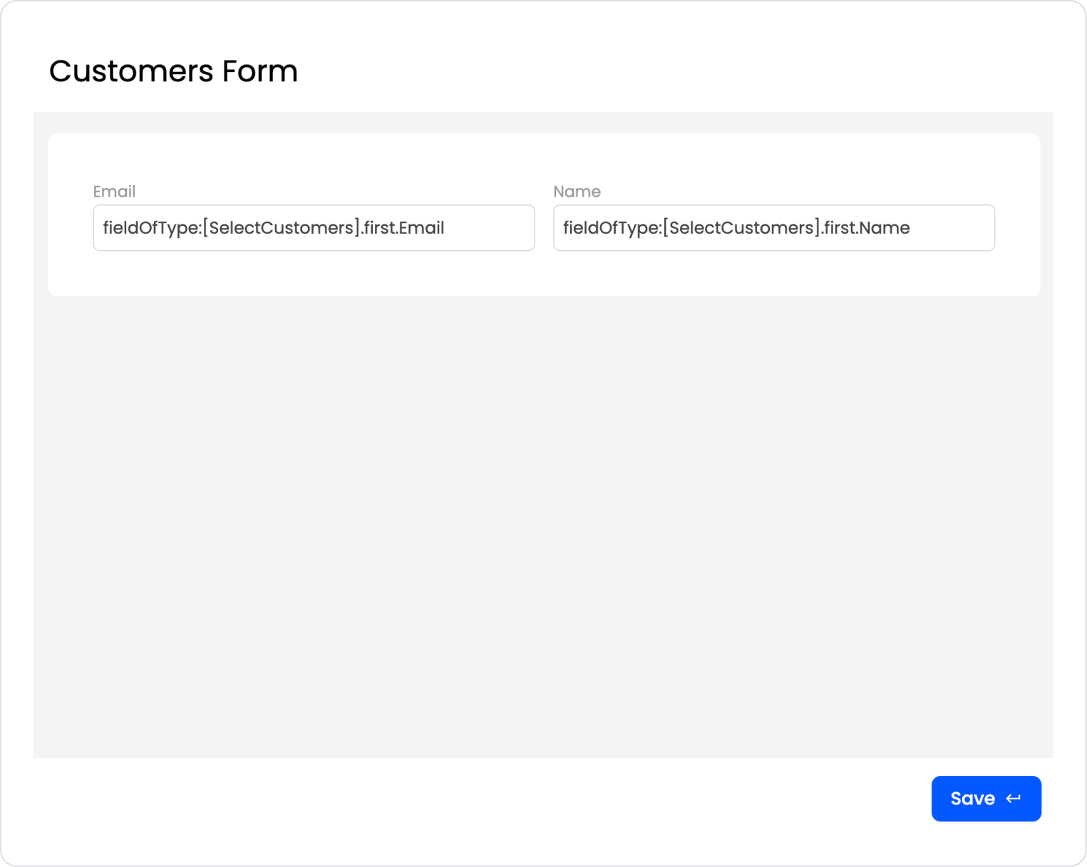
When the Float Panel opens, the active work area is highlighted, directing the user's focus to the form. The Email and Name fields are presented in a simple and organized layout within the panel; the user can quickly enter their information. The panel can be closed at any time using the close (X) icon in the top right corner.
When the user clicks the Save button, the entered information is saved and the process is successfully completed. This structure enables fast data entry without disrupting the page flow and provides an interactive, modern, and user-friendly experience with the combination of a floating button and float panel.
4. Common Properties
Some areas on the Float Button element are common to all UI elements. Therefore, detailed explanations of the following properties can be found in the relevant general guide pages:
Use FloatButton for a single, clear action. Triggering multiple complex operations via the same button can negatively impact the user experience.
Since it is always visible on the screen, prefer it for the most frequently used or most critical operations (e.g., “Add New Record,” “Quick Action,” “Help”).
When used to open a FloatPanel or Modal, ensure that the closing flow is also easy and visible for the user.
6. Limitations
Not suitable for data display. FloatButton is designed solely for triggering actions.
In responsive designs, it may overlap some content on small screen resolutions; therefore, the design preview must be checked.


