Kuika's MD Viewer element is used to display content written in Markdown format in a formatted and readable manner within the application interface. Markdown is a practical markup language that allows you to quickly create many textual formats such as headings, bold–italic text styles, code blocks, quotes, numbered and bulleted lists.
The MD Viewer element is supported in web and mobile applications.
1.1. Common Use Cases
Displaying documentation and user guides: It can be used to present technical documents, API descriptions, module introductions, or in-app help content in a formatted manner.
Listing blog or announcement content: Blog posts, news announcements, or informational texts prepared with Markdown can be easily displayed in web applications.
Publishing release notes: Texts containing version changes, new features, and bug fixes can be written in Markdown format.
Displaying training materials and content management system (CMS) outputs: Provides a structured text presentation for training platforms, e-learning content, or module descriptions.
Frequently Asked Questions (FAQ) sections: You can display question-and-answer formats in an organized manner thanks to list and heading structures.
Displaying dynamic content in Markdown format: Markdown texts received via REST API, database, or action can be displayed to the user in rich format.
Code examples and technical explanations: Suitable for technical content containing code blocks, quotes, and highlight areas.
2. Key Features
Markdown support: Supports all basic Markdown syntax, such as headings, lists, bold/italic text, links, tables, quotes, and code blocks.
Display static or dynamic content: Static Markdown text written into the MD Viewer can be displayed, as well as dynamic Markdown text from REST API, Managed DB, or Action output.
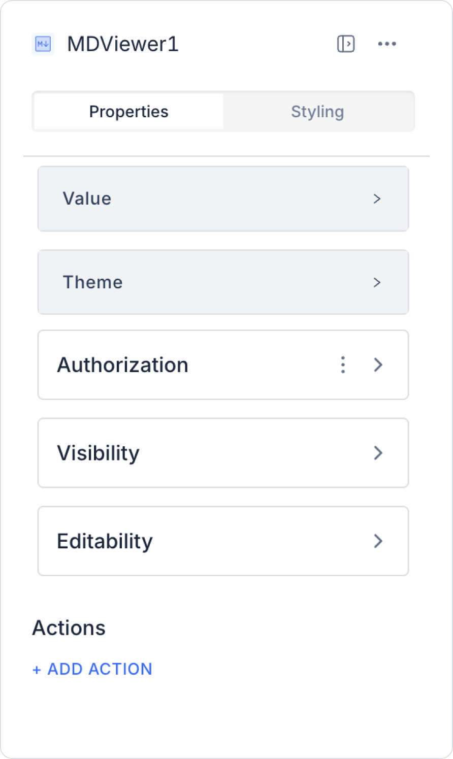
2.1. MD Viewer Element Properties
You can configure the properties of the MD Viewer element from the Properties panel on the right side.
Value: You can write static text for the MD Viewer element, or you can dynamically display the content of an Input element or a value obtained as a result of an action using the Symbol Picker.
Theme: Since the MD Viewer element supports Markdown formatting, you can add various formatting to your text, such as headings, lists, bold/italic text.
Since the MD Viewer element supports Markdown format, you can add various formatting options to your text, such as headings, lists, bold and italic text. This feature makes your content more organized and readable.
2.2. Actions That Can Be Added to the MD Viewer Element
The MD Viewer element supports a single trigger that can detect content changes: onChange. This trigger is used to execute actions when the element's content is dynamically updated. Since the user does not edit directly on the MD Viewer, the trigger only activates when the content changes.
onChange
This trigger runs when the MD Viewer's content changes.
Usage scenarios:
Triggering updates when dynamic Markdown text from another element changes
Creating a log entry when the MD Viewer content is updated
Running additional actions when new Markdown output from a REST API or Managed DB is loaded
Sending a notification to the user when content is updated
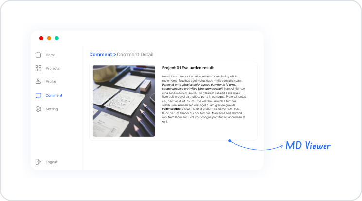
3. How to Use the MD Viewer Element?
In this section, we will cover the end-to-end dynamic use of the MD Viewer element through an example scenario.
In a project or content management application, the explanations, evaluations, or documentation content displayed to the user is not static. Content is dynamically retrieved from a database or service and presented to the user in a structured format.
In this scenario, project evaluation content is stored in Markdown format and displayed on screen using the MD Viewer element.
When the user enters the relevant screen:
Content is dynamically retrieved from the backend,
Markdown format is preserved,
Headings, lists, and highlights are automatically rendered.
This structure allows content to be updated, managed, and presented in a readable format.
In the scenario:
Markdown content is dynamically retrieved from the data source.
When the page opens, the relevant action is triggered.
MD Viewer directly displays the action output.
The same structure can be reused on different pages.
Step 1 - Defining Actions Required for Dynamic Use
To display data in the interface:
You need to define an action.
Add a new action from the Actions > New SQL Action tab in the Datasources module.
Action Adding Sample Data (GetUserInfo):
SELECT
N'
# Project Evaluation
This document provides a summary evaluation of the current status of the project.
## General Status
- ✅ Basic functions completed
- ⏳ Integration process ongoing
- ⚠️ Performance tests are being planned
## Technical Notes
- The API structure was designed to be **scalable**
- Error management was provided with centralized logging
- The code structure was supported with documentation
> **Note:** This content may be dynamically updated as the process progresses.
' AS MarkdownContent;
Step 2 – Adding Elements to the Home Page
Open the UI Design module.
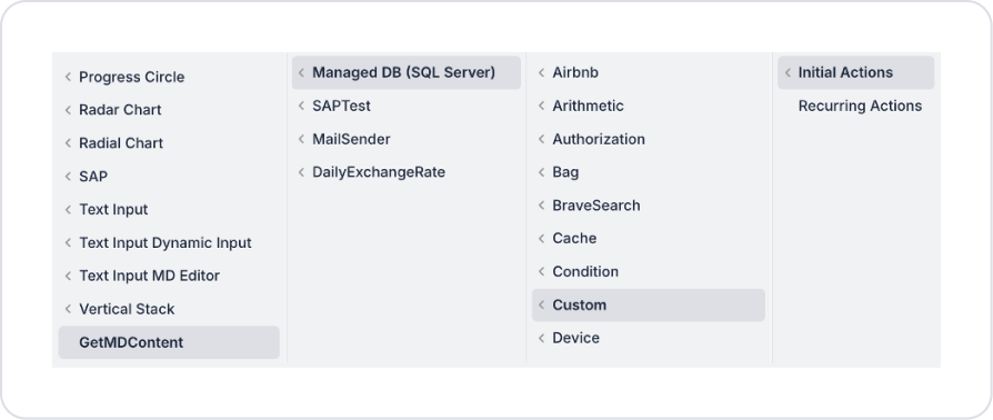
Add the Initial Actions > Custom > Managed Db > GetMDContent action to the page using the ADD ACTION button.
Add the Initial Action > Custom > Managed DB > GetProjectEvaluationMarkdown action.
Drag and drop the Elements > Display > MD Viewer element onto the page from the left panel.
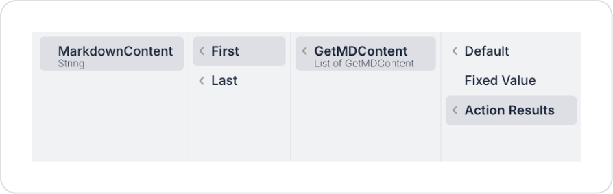
Define the data to be displayed in MD Viewer as MDViewer > Properties > Value > Action Results > GetMDContent > First > MarkdownContent.
The view theme can be customized according to your design preferences. In this scenario, the MDViewer > Properties > Theme field is set to Dark.
Preview
When the application is tested, the project evaluation content is displayed in a neat and readable manner on the MD Viewer element with a dark theme. Headings, subheadings, bullet points, and highlights are automatically rendered while preserving the Markdown format. When the user enters the screen, the project status, technical notes, and warning information are presented in a single documentation flow and are instantly reflected on the screen when the content is updated.
4. Common Properties
Some fields on the MD Viewer element are used commonly across all UI elements. Therefore, detailed explanations of the following properties can be found in the relevant general guide pages:
Keep the Markdown structure clean and organized. Using structures such as headings, lists, bold/italic text correctly makes the MD Viewer output more readable.
Properly manage the onChange trigger in dynamic content. If the MD Viewer content is updated by another action, use a control mechanism to prevent the onChange trigger from running unnecessarily.
6. Limitations
Action triggering is limited. MD Viewer only supports the onChange trigger; there are no onClick or similar interaction triggers.


