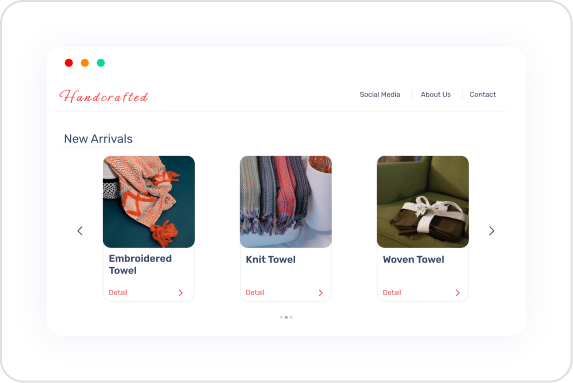
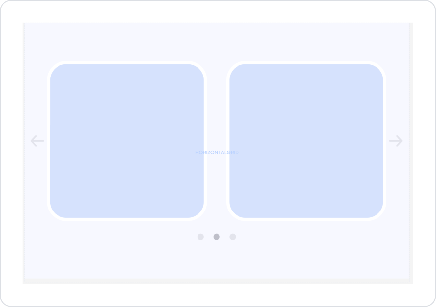
The Horizontal Grid element is a user-friendly layout element that allows you to list your content in a horizontal arrangement. Users can navigate between items by swiping left or right, providing a smooth experience, especially for wide horizontal listings. This structure provides an ideal solution for categories, product cards, short info boxes, banner strips, or any content that requires horizontal scrolling.
Thanks to its flexible structure, Horizontal Grid scales correctly on both web and mobile devices, combining the horizontal scrolling experience users are accustomed to with a modern design. It provides ease of use in visually-heavy applications and allows you to present more content in a compact way by saving screen space.
The Horizontal Grid element is supported in web and mobile applications.
1.1. Common Use Cases
Creating horizontal product lists. Used in e-commerce applications to present products belonging to a specific category in a horizontally scrollable manner.
Displaying banners or campaign areas. Announcements, advertisements, or campaign visuals can be presented impressively with horizontal scrolling.
Listing portfolio or gallery content. In visually-heavy work, horizontal flow allows users to quickly scan content.
Card-based short information areas (info cards). For example, training modules, content series, or recommended content can be displayed in a horizontal grid structure.
2. Key Features
Flexible card placement. Content can be organized in a card structure; different UI elements can be added to the grid to achieve the desired look.
Responsive design compatibility. The horizontal flow structure automatically adapts to both mobile and web screens. Card sizes are aligned according to screen width.
Dynamic data binding support. Records received via datasource or actions are automatically sorted within the horizontal grid.
Horizontal grid structure. Optimizes horizontal placement when multiple elements need to fit on the screen; content that does not fit on the screen is displayed by scrolling.
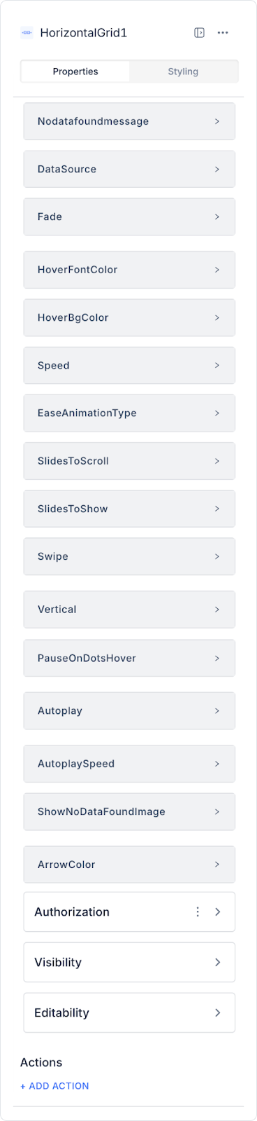
2.1. Horizontal Grid Element Properties
When you select the Horizontal Grid element, you can configure slide behaviors, empty data states, scrolling settings, and visual interactions in the Properties area in the right panel.
All properties are explained in detail below:
Data and Empty State Settings
Datasource: Specifies the source of the data to be listed in the Horizontal Grid. Data coming from the Datasource or action is automatically applied to the cards in the grid.
No Data Found Message: Defines the message to be shown to the user when the data source is empty. E.g.: “No content found to display.”
Show No Data Found Image: Allows you to select a custom image to be displayed when there is no data. Can be used to improve the empty screen experience.
Transition and Slide Behavior Settings
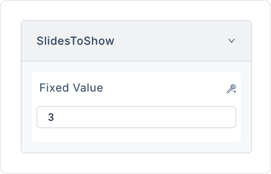
Slide To Show: Specifies the number of slides (cards) to be displayed on the screen at the same time. E.g.: 3 → 3 cards appear side by side on the screen.
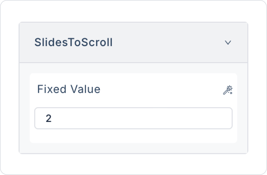
Slide To Scroll: Sets how many cards will scroll with each swipe. E.g.: 1 → 1 card advances with each swipe.
Fade: Enables the transition effect to be performed with a fade animation during horizontal swiping.
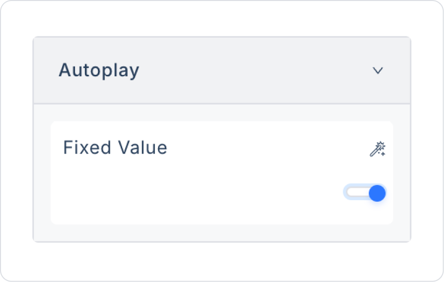
Autoplay: Enables slides to advance automatically without user interaction.
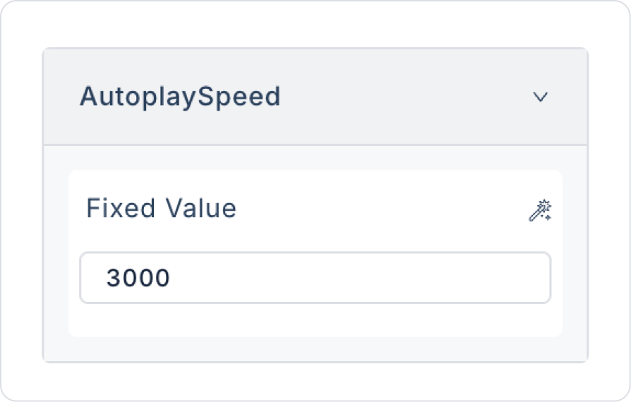
Autoplay Speed: Sets the automatic slide transition speed in milliseconds. E.g.: 2000 = one transition every 2 seconds.
Pause On Dots Hover: Stops the slide transition when hovering over navigation dots.
Vertical: Displays the grid structure as a vertical slide flow instead of horizontal.
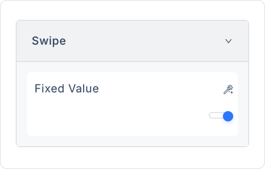
Swipe: Enables swiping with finger gestures on touch devices. This is a critical setting for the mobile experience.
Show Page Indicator: Displays a numerical indicator (e.g., 1 / 4) in the lower right corner of the Horizontal Grid, showing the total number of cards and which card group the user is in.
It provides the user with information such as “which page am I on?” especially in mobile applications.
Since the indicator takes up additional space, its compatibility with the current design should be checked.
Hover Interaction Settings
Hover Font Color: Changes the text color when the user hovers over the slide.
Hover Bg Color: Changes the background color when the user hovers over the slide.
These two features are especially used to highlight cards.
Visual Control Settings
Arrow Color: Determines the color of the arrow icons used to transition between slides. Can be customized for theme compatibility.
2.2. Actions That Can Be Added to Elements
Since the Horizontal Grid element is a horizontally scrollable content listing structure, it does not support adding any actions or defining triggers.
Therefore:
onClick,
onChange,
or any other action cannot be added to the Horizontal Grid element.
User interactions are managed not directly on the Horizontal Grid, but through panels, buttons, images, text, or custom UI elements added to the grid.
If an action needs to be triggered when the user selects a card, this action must be linked to the relevant elements within the Horizontal Grid.
3. How to Use the Horizontal Grid Element?
In this section, we will cover the end-to-end use of the Horizontal Grid element through example scenarios.
Scenario: Displaying Similar Products on Sale
In an e-commerce application, the similar products on sale area is used on the product detail page to highlight products similar to the one the user is interested in and offered as part of a campaign. This area allows users to quickly discover alternative products at discounted prices, increasing the likelihood of purchase.
Users can scroll horizontally through the promotional product cards to explore similar models and easily compare discounted products. This structure increases the visibility of promotional opportunities while providing an effective experience that directs users to make purchases.
In the scenario:
Within the promotional similar products area, each product card is structured to display the product image, product name, campaign information, and discounted price.
The product name and campaign label are located at the top of the card, while the product image is highlighted in the middle section. At the bottom of the card, the discounted price information is presented to the user in a clear and eye-catching manner.
This structure allows users to review similar products on sale at a glance, easily spot the advantageous prices, and make their purchasing decisions faster.
Step 1 - Creating the Data Source
Creating a table in the DataSources module:
Go to the Datasources module.
Then go to the Tables tab.
Create a new table named “BaseProduct”.
The table structure to be set up is as follows:
When adding the Price column, set it to Decimal data type with Decimal Scale > 2.
Important Field names:
ProductName: Holds the product name information. It is the main text displayed to the user in the gallery or card structure and allows them to quickly understand what the product is.
ImageUrl: Contains the URL information for the product image. The main image displayed in the product gallery or list screens is loaded through this field.
Price: Represents the product's selling price. It is displayed to the user along with the decimal price information and is used in product comparisons.
StockStatus: Indicates the stock status of the product (e.g., In Stock, Limited Stock, Out of Stock). This is an informative field that guides the user's purchasing decision.
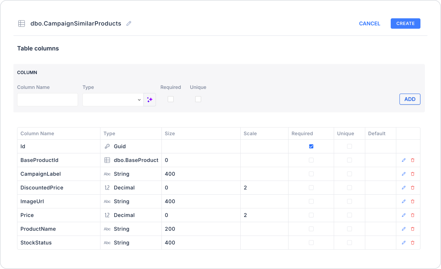
Create a new table named “CampaignSimilarProducts”.
The table structure to be set up is as follows:
When adding the Price and DiscountedPrice columns, set them to Decimal data type with Decimal Scale > 2. Enter the BaseProduct table name in the BaseProductId type field.
Important Field Names:
BaseProductId: Indicates which main product the similar product in the campaign is linked to. Ensures that the correct similar products are listed on the product details page.
ProductName: Holds the name information of the product included in the campaign. This is the main text displayed to the user in the card or gallery structure.
ImageUrl: Contains the URL information of the product image. Ensures that promotional products are visually highlighted.
Price: Represents the product's pre-campaign sale price. Used as a reference to understand the discount rate.
DiscountedPrice: Holds the sale price after the discount applied under the campaign. Used to show the user the advantageous price.
CampaignLabel: Contains a short informative label for the campaign (e.g., 15% Off, 10% Off in Cart). Increases campaign awareness.
StockStatus: Indicates the stock status of the product (e.g., In Stock, Limited Stock, Out of Stock). This is an informative field that guides the user's purchasing decision.
Step 2 - Defining the Necessary Actions
To display and add data in the interface:
You need to define three actions.
Add a new action from the Actions > New SQL Action tab in the Datasources module.
Action that Adds Sample Data (InsertProductsData): To test the application with sample data, add the following SQL action and press the TEST button.
DECLARE @BaseProductId UNIQUEIDENTIFIER = NEWID();
-- Add the base product (BaseProduct)
INSERT INTO BaseProduct
(Id, ProductName, Imageurl, Price, StockStatus)
VALUES
(
@BaseProductId,
‘Men's Sports Shoes’,
‘https://images.pexels.com/photos/19090/pexels-photo.jpg’,
3299.90,
‘In Stock’
);
-- Add similar products on sale
INSERT INTO CampaignSimilarProducts
(Id, BaseProductId, ProductName, ImageUrl, StockStatus, CampaignLabel, Price, DiscountedPrice)
VALUES
(NEWID(), @BaseProductId, N'Running Shoes',
‘https://images.pexels.com/photos/1598505/pexels-photo-1598505.jpeg’,
N'Limited Stock', N'Year-End 15%', 3899.90, 3314.92),
(NEWID(), @BaseProductId, N'Casual Shoes',
‘https://images.pexels.com/photos/1537671/pexels-photo-1537671.jpeg’,
N'In Stock', N'10% Off in Cart', 2199.50, 1979.55),
(NEWID(), @BaseProductId, N'Outdoor Shoes',
‘https://images.pexels.com/photos/2048548/pexels-photo-2048548.jpeg’,
N'Out of Stock', N'Flash Sale 12%', 3599.95, 3167.96),
(NEWID(), @BaseProductId, N'Street Style Shoes',
‘https://images.pexels.com/photos/1456706/pexels-photo-1456706.jpeg’,
N'In Stock', N'Special 20%', 2499.90, 1999.92),
(NEWID(), @BaseProductId, N'Lightweight Sports Shoes',
'https://images. pexels.com/photos/1537671/pexels-photo-1537671.jpeg',N'Limited Stock', N'Weekend 10%', 2899.50, 2609.55);
When applying, delete the BaseProduct and CampaignSimilarProducts sections next to Insert into, rewrite them, and press Enter. This will add the correct schema name before the table name.
Action Providing the Base Product (GetBaseProduct):
SELECT TOP 1 * FROM BaseProduct;
When applying, delete the BaseProduct section, rewrite BaseProduct, and press Enter. This will add the correct schema name before the table name.
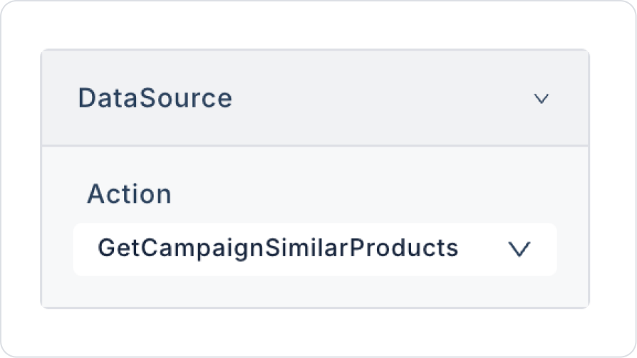
Action Providing Similar Campaign Products (GetCampaignSimilarProducts):
SELECT * FROM CampaignSimilarProducts WHERE BaseProductId = @BaseProductId;
When applying, delete the CampaignSimilarProducts part, retype CampaignSimilarProducts, and press Enter. This will add the correct schema name before the table name.
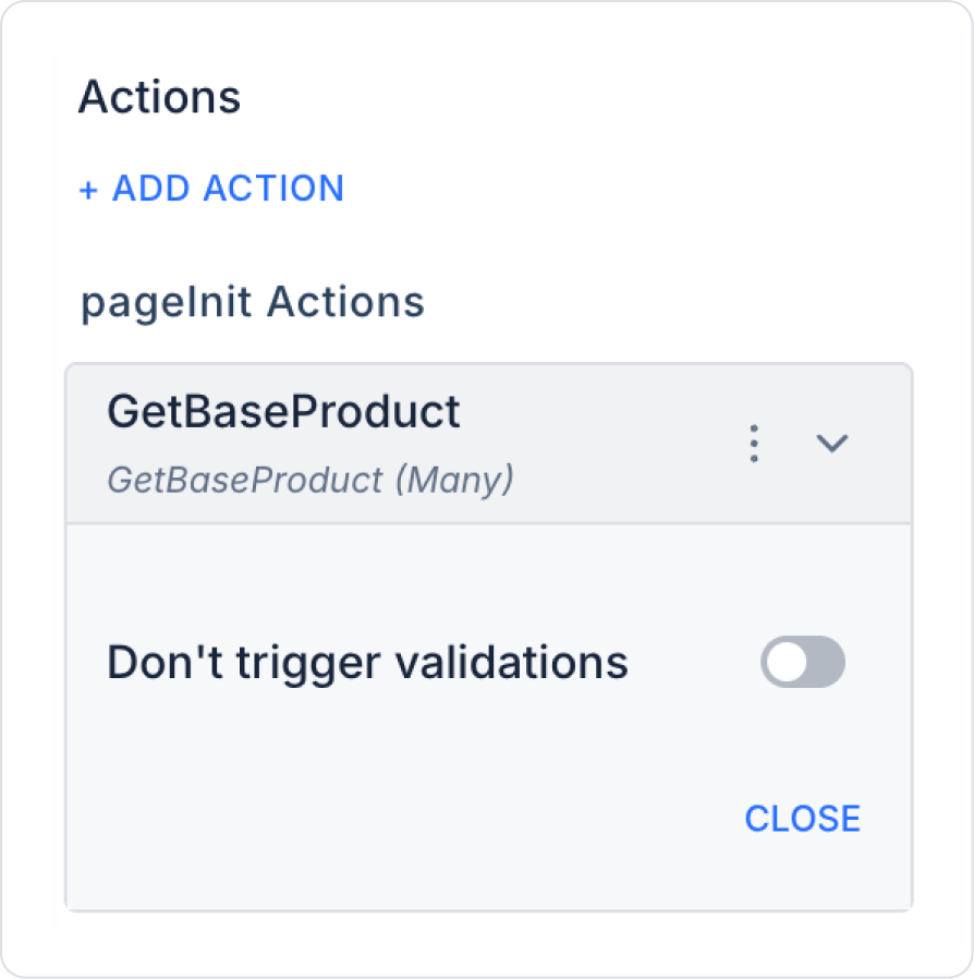
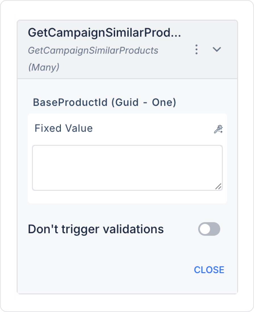
Step 3 - Adding Initial Action
Initially on the home page:
Open the UI Design module.
On the page, add the Add Action > Initial Action > Custom > Managed Db > GetBaseProduct action.
On the page, add the Add Action > Initial Action > Custom > Managed Db > GetCampaignSimilarProducts action.
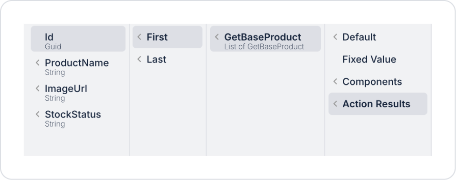
Define the Action Result > GetBaseProduct > First > Id in the BaseProductId field.
Step 4 - Adding Elements and Editing Styles
Drag and drop the Elements > Container > Panel element onto the page from the left side panel.
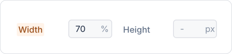
Set the Panel element size to Panel > Styling > Layout > Width > 70%.
Set the background color to Panel > Styling > Fill > Style > White Background.
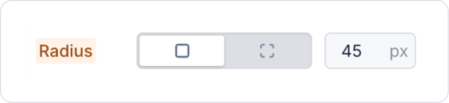
Set the borders to Panel > Styling > Border > Radius > 45 px.
Using the breadcrumb menu at the bottom, click on the Col field containing the panel element.
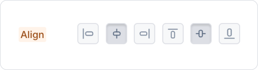
In the Col element, set Col > Styling > Align > Center vertically and horizontally.
Drag and drop the Elements > Container > Row element into the panel.
In the Row element, set Row > Properties > Desktop>two windows.
Select the Col area on the left side within the Row. From the Col > Styling > Layout > Align section, set the verticalalignment to Center and the horizontalalignment to Left.
Select the Col field on the right. From the Col > Styling > Layout > Align section, set the vertical alignment to Center and the horizontal alignment to Right.
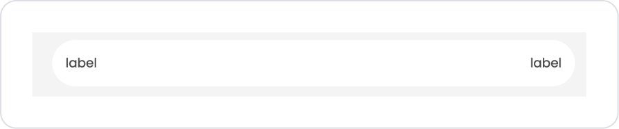
Drag and drop the Elements > Display > Label element into both Col fields.
In the Label element on the right, set Label > Styling > Text > Style > Heading 6.
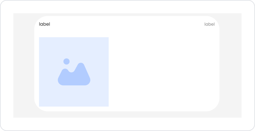
Drag and drop the Elements > Display > Image element into the Panel below the text.
Click on the empty space next to the Image element and go to the Col field. Col > Styling > Layout > Align > Centerbothvertically and horizontally.
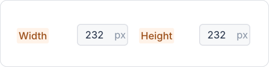
Click on the Image element. Set its dimensions by setting the Image > Styling > Layout > Width and Height fields to 232 px and 232 px respectively.
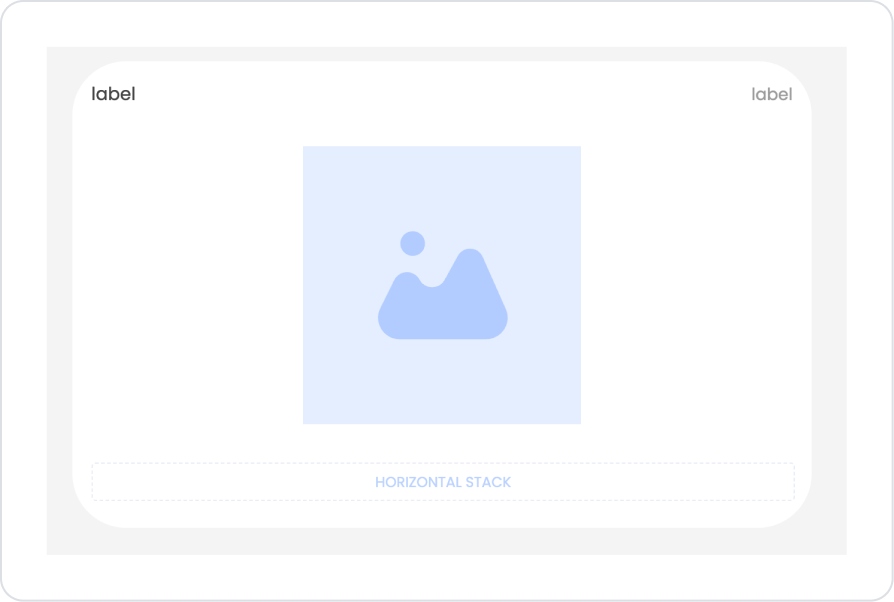
Below the Image element, drag and drop the Elements > Container > Row element into the Panel element.
In the Row element, set Row > Properties > Desktop>a window.
Click on the Col field within the Row. From the Col > Styling > Layout > Align section, set the vertical alignment to Center and the horizontal alignment to Right.
Drag and drop the Elements > Container > HorizontalStack element into the Col.
Add label elements to the Horizontal Stack. Delete the default 100 px values in the Label > Styling > Layout > Width fields within the label elements.
Add the Elements > Data > HorizontalGrid element to the page.
Add the HorizontalGrid > Properties > Datasource > GetCampaignSimilarProducts action within the Horizontal Grid.
Define the number of products to change as HorizontalGrid > Properties > SlidesToScroll > 2.
Define the number of products to display as HorizontalGrid > Properties > SlidesToShow > 3.
Set HorizontalGrid > Properties > Swipe > On to change by swiping.
For automatic progression, set HorizontalGrid > Properties > Autoplay > On.
Define the progression speed as HorizontalGrid > Properties > AutoplaySpeed >3000.
To align the Horizontal Grid content, set HorizontalGrid > Styling > Layout > Align > Center vertically and horizontally.
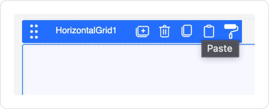
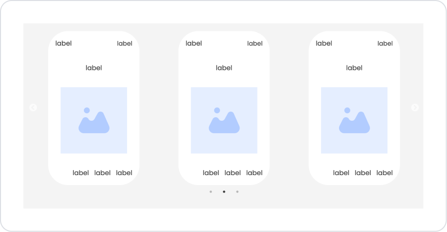
To copy the Panel element group we prepared for the main product, click on the empty space on the right side of the panel and press the third option, “Copy,” from the options that appear.
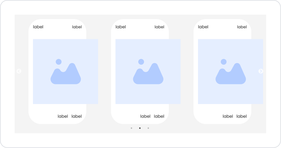
Click on the Horizontal Grid element. Press Paste from the options that appear.
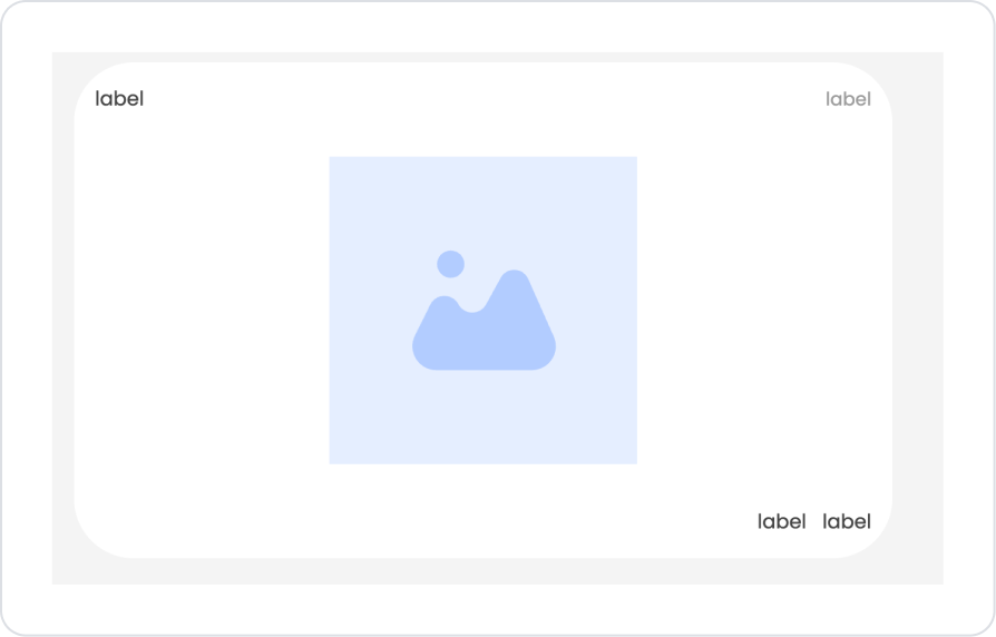
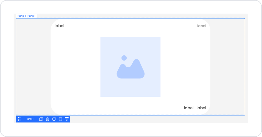
After pasting, the expected image is as follows.
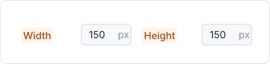
Click on the Image element and correct the overflows. Set Image > Styling > Layout > Width and Height > 150 px.
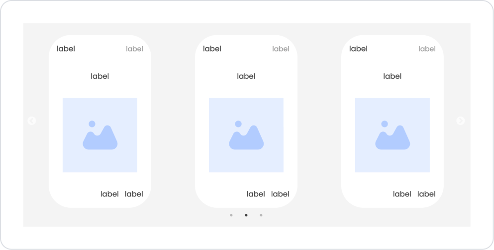
Drag and drop the Elements > Display > Label element onto the Image element.
Click on the empty space next to the Label element. Then, following the steps Col > Styling > Layout > Align, set the center alignment both vertically and horizontally, as in the other steps.
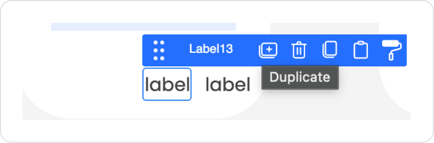
Click on the initial Label element in the lower section and press the Duplicate option from the options that appear.
The expected structure in the final state is as follows.
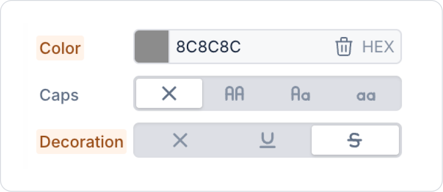
Click on the first Label Element in the lower section. In the Label > Styling > Text area, set the Color and Decoration fields as shown below.
4. Common Properties
Some fields on the Horizontal Grid element are used commonly across all UI elements. Therefore, detailed explanations of the following properties can be found in the relevant general guide pages:
Use consistent card sizes. Using cards with different heights and widths within the Horizontal Grid can disrupt the layout. Prefer standard dimensions whenever possible.
Configure slide transition settings based on user experience. Setting options like Autoplay and Autoplay Speed too fast can annoy users.
Be sure to keep the Swipe feature active for mobile use. It should be left on as it is a critical feature for the horizontal scrolling experience on mobile devices.
Choose Slide To Show and Slide To Scroll values wisely. For example, Slide To Show = 4 / Slide To Scroll = 3 provides smooth navigation.
Keep hover effects simple. Settings such as Hover Font Color and Hover Bg Color should not be excessive, especially on highly visual screens.
Manage empty data situations well. Inform users correctly using the No Data Found Message and Show No Data Found Image features.
6. Limitations
The Horizontal Grid element does not support actions. User interactions are managed through the components within it, not directly through the Horizontal Grid.
Responsive behavior depends on card sizes. Very wide cards may cause alignment issues on small screens.
Fade and Vertical settings may not be compatible with all designs. Vertical slides or fade transitions may be incompatible on some graphics-intensive screens.


