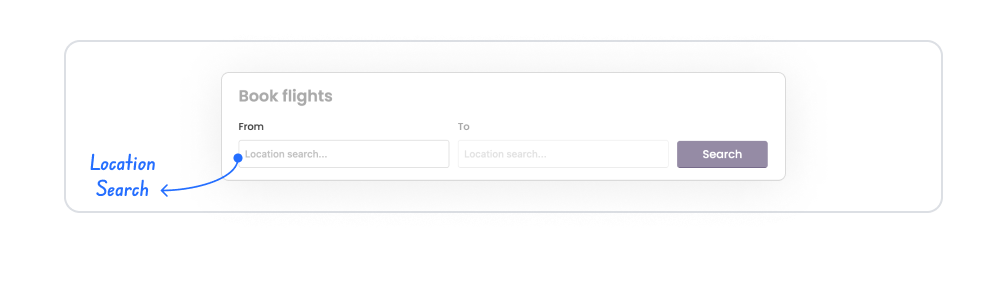
The Location Search element is a text-based location search component that allows users to search for a location by entering an address or place name within the application and selecting that location. As the user types, matching locations are listed, and the desired location can be easily selected.
The Location Search element enables users to find a location without requiring map interaction. It offers a fast and user-friendly solution, particularly in scenarios where searches must be performed using an address, city, neighborhood, or venue name.
It can be used in conjunction with the Location Picker or independently; this supports both search-based and map-based selection scenarios.
The Location Search element is supported in both web and mobile applications.
1.1. Common Use Cases
Location search by address or place name
Delivery address or service area selection
Quick location search before opening the map
Filtering by city, district, or venue
Address definition in user profile
2. Key Features
Text-based location search: Users can search for locations by entering an address, city, neighborhood, or venue name.
Dynamic suggestion list: Locations matching the entered text are automatically listed.
Fast and user-friendly selection: Users can select a location from the search results with a single click.
Structure that improves location accuracy: Incorrect address entries are reduced thanks to predefined and verified place names.
Compatibility with Location Picker: The location selected after the search is displayed on the map, allowing for detailed editing.
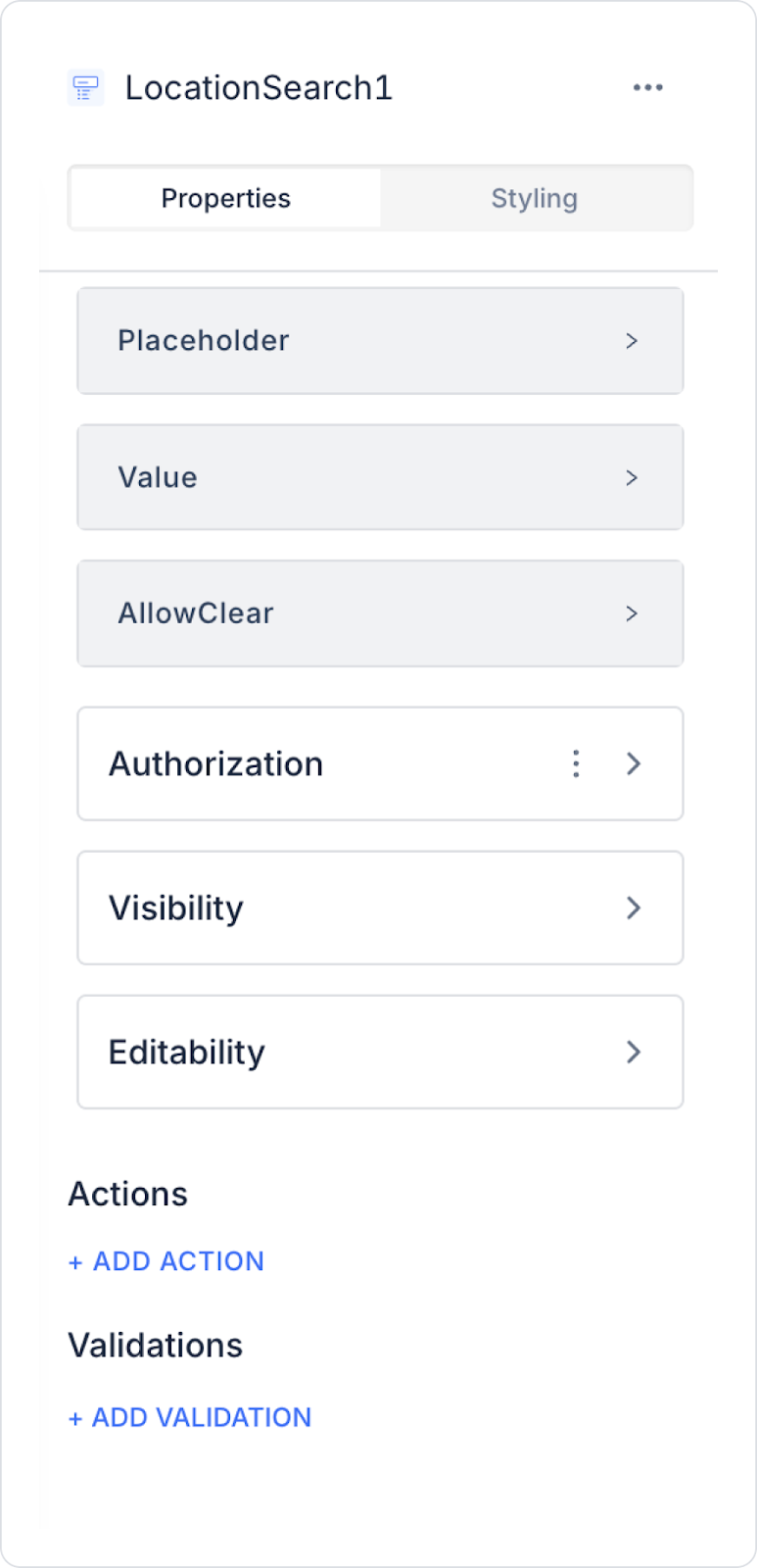
2.1. Location Search Element Properties
Value: You can add a static value or dynamically display the content of another element or the result of an action using the Symbol Picker.
Placeholder: The placeholder text displayed when the user has not entered any data.
Allow Clear: Adds a Clear (X) icon on the right side to allow the entered data to be cleared with a single click.
2.2. Actions That Can Be Added to the Element
The Location Search element supports triggering event-based actions based on the user selecting a location from the search results. Actions are not tied to the element itself but to the event triggered when the user selects a location.
Actions for the Location Search element can be defined via the following event through the Properties > Add Action section.
Supported Action Trigger
onSelectPlace: Triggered when the user selects a location (place) from the search results list.
Use cases:
Save the selected location (address / place information / coordinates) to a state or variable
Automatically populate form fields based on the selection (e.g., address, city/county, ZIP code, etc.)
Update the Location Picker or map component based on the selected location
Trigger location-based filtering or listing operations
Save or validate address information by triggering an API or workflow
Example scenario: When the user selects “Karşıyaka, İzmir” in a delivery address search, the selected location information is saved to the state, and the address fields are automatically filled in.
Basic Rules Regarding Actions
The Location Search element executes actions event-based; onSelectPlace is triggered only when the user selects a location.
Multiple actions can be defined for the same onSelectPlace event.
If API calls or validation processes are used after selection, performance impact should be considered.
The Location Search element provides a fast and user-friendly experience when used with actions, particularly in scenarios involving address selection, determining a delivery location, and initiating location-based processes.
3. How to Use the Location Search Element?
In this section, we will cover the end-to-end usage of the Location Search element through an example scenario.
Scenario: Location Search and Display on Map
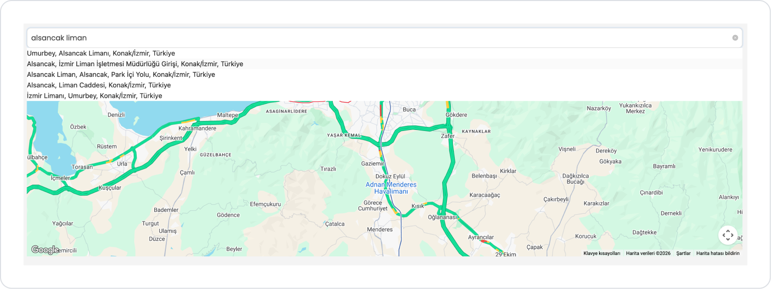
The user uses the Location Search element to quickly find a specific address or location. With this element, the user can type the location they want to search for, and the system displays a list of location suggestions matching the entered text.
In the Scenario:
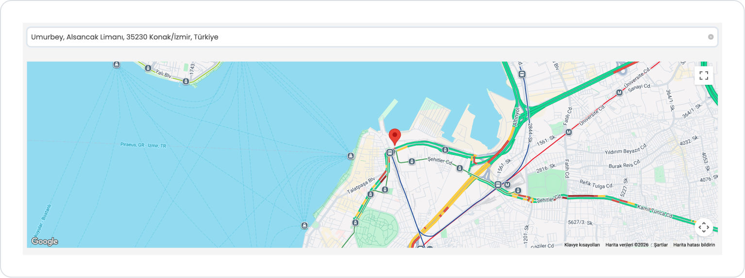
A Location Search element is located at the top of the screen. When the user enters an address, city, or specific location name into the search field, the system lists suitable location suggestions. When the user selects a location from the list, the address information for the selected location is displayed on the screen.
Additionally, a Location Picker element is included on the page to display the selected location on the map. The address information selected via Location Search is directed to the relevant point on the map using the Location Picker and displayed with a location marker. Using the Location Picker is not mandatory. It is used to display the search result on the map.
This structure allows users to perform text-based location searches and visually inspect the selected location on the map. This enables address search and location verification processes to be carried out more quickly and in a user-friendly manner.
Step 1 - Adding the Location Search Element and Defining Text Translations
Start on the homepage:
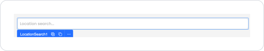
Drag and drop the Elements > Select Input > LocationSearch element onto the page.
To display the searched location on the map, add the Elements > Select Input > LocationPicker element.
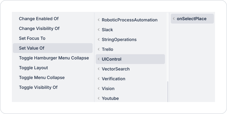
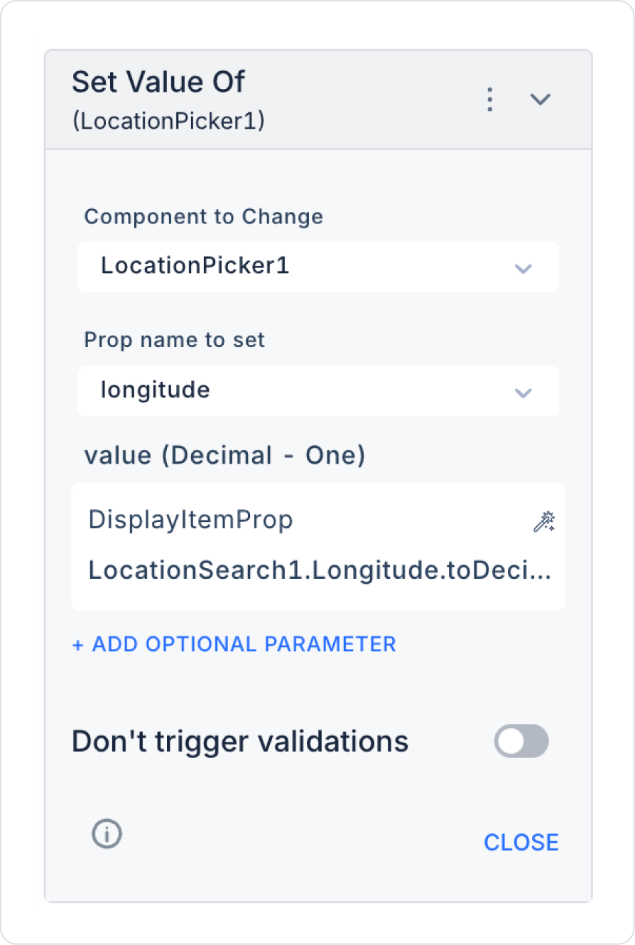
To mark the selected location on the map after the search, add the LocationSearch > Properties > onSelectPlace > UIControl > Set Value Of action.
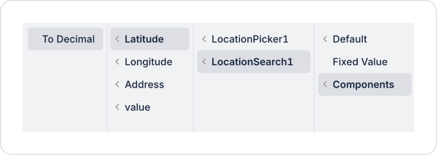
Within the Set Value Of action, configure the following: Component to Change > LocationPicker1, Prop name to set > latitude, and value > Components > LocationSearch > Latitude > To Decimal.
Within the Set Value Of action, configure the following: Component to Change > LocationPicker1, Prop name to set > longitude, and value > Components > LocationSearch > Longitude > To Decimal.
Preview:
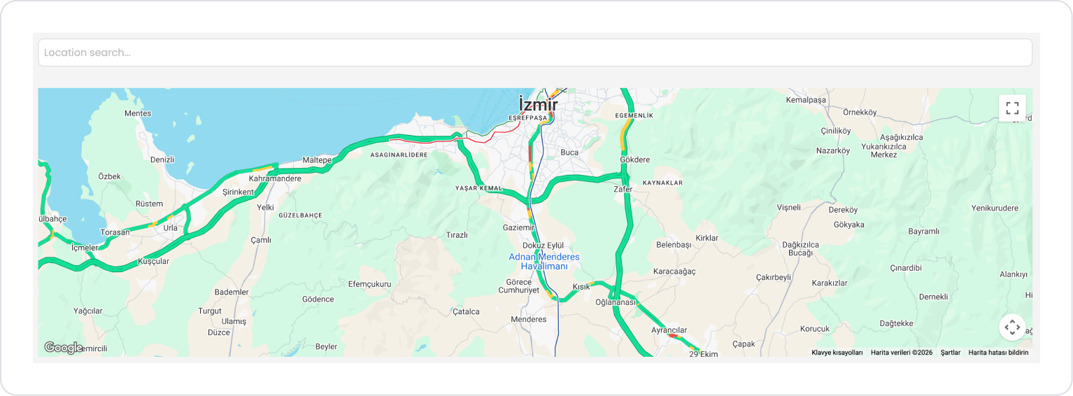
When the page opens, the Location Search field appears empty, and the map area below it loads with the default location. At this stage, the user can enter an address, place name, or location information into the search field. Based on the entered text, the system displays a list of suitable location suggestions.
When the user enters a location into the search field, the system lists address suggestions for the relevant locations. When the user selects a location from the list, the address information for the selected location is displayed in the Location Search field, and the search process is completed.
After the location is selected, the location corresponding to the selected address information is marked on the map within the Location Picker element. The map automatically zooms in on the relevant location, and the user can visually inspect the selected location on the map using the location marker.
4. Common Properties
Some fields on the Location Search element are shared across all UI elements. Therefore, detailed descriptions of the following properties can be found in the relevant general guide pages:
Support the search field with a placeholder. Phrases like “Enter an address or place name” clarify what the user should do.
Use the onSelectPlace event as the primary trigger. Executing actions related to location selection via this event provides a more controlled flow.
Consider using it with the Location Picker. Verifying the location on the map or making fine-tuning adjustments after the search improves the user experience.
Autofill address fields. Automatically updating address components (state, county, ZIP code, etc.) based on the selected location reduces the margin of error.
6. Limitations
The Location Search element depends on map and address services; it may not work in situations where service access is unavailable.
Actions can only be triggered via the onSelectPlace event.
It is not sufficient on its own for manual, free-form address entry; additional input fields may be required.


