The Multi Select element is an advanced selection element that allows users to select multiple options simultaneously from a list. Users can create combinations by checking the options that suit their needs and view the selected items visually highlighted.
The Multi Select element enhances the user experience in form, filtering, and settings scenarios that require multiple selections. Clearly displaying the selected values allows users to easily verify their choices.
The Multi Select element is supported in both web and mobile applications.
1.1. Common Use Cases
Selecting multiple categories or tags
Defining multiple criteria in filtering and search screens
Selecting user interests or competencies
Managing multiple options in settings and preference screens
Surveys and forms requiring multiple answers
2. Key Features
Multi-select support: Users can select multiple options from a list simultaneously.
Dynamic list and data source support: Options can be created from static lists or dynamic data sources.
Quick add and remove experience: Users can add or remove selected items with a single click.
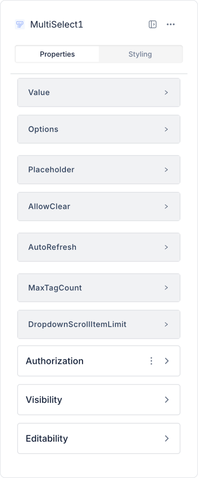
2.1. Multi-Select Element Features
Value: You can add a static value or dynamically display the content of another element or the result of an action using the Symbol Picker.
Options: This is the section where the data table to be displayed in the dropdown list is connected.
Placeholder: This is the placeholder text visible when the user has not entered any data.
Allow Clear: Adds a Clear (X) icon on the right side to allow the entered data to be cleared with a single click.
Auto Refresh: Ensures results are updated immediately when selections are changed. When the switch is active, changes in selections are automatically reflected.
Max Tag Count: Determines the maximum number of tags to be displayed on the screen when multiple selections are made.
Dropdown Scroll Item Limit: Sets the maximum number of items to be displayed simultaneously in the dropdown list; when the limit is exceeded, the list continues via scrolling.
2.2. Actions That Can Be Added to the Element
The Multi Select element supports the definition of event-based actions based on the multiple selections made by users. Actions are not tied to the element itself but are linked to events triggered by user interactions.
Actions for the Multi Select element can be added via the following events through the Properties > Add Action section.
Supported Action Triggers
onSelect: Triggered when the user selects an item from the dropdown list.
Usage purposes:
Adding the selected item to a state or variable
Updating linked fields or filters
Making additional fields visible based on the selection
onChange: Triggered whenever the list of selected items changes (addition or removal).
Usage purposes:
Writing all selected values to the state in bulk
Performing multi-filter or list update operations
Triggering calculations or conditional flows
Example scenario: When the user selects multiple categories, the product list is instantly filtered based on the selected categories.
onSearch: Triggered when the user performs a search in the Multi Select field.
Usage purposes:
Dynamically filter the option list based on the entered text
Updating results by searching via the API
Enabling high-performance search in large datasets
onBlur: Triggered when the user loses focus from the Multi Select field.
Usage purposes:
Running validation after selection is complete
Displaying a warning if the field is left blank
Basic Rules Regarding Actions
The Multi Select element can trigger actions via multiple events.
Multiple actions can be defined for the same event.
The onChange event is used as the primary trigger in multi-select scenarios.
When working with large datasets, the performance of actions tied to the onSearch event should be considered.
The Multi Select element offers a flexible and powerful user experience, especially when used with actions in multi-filtering, tagging, and preference management scenarios.
3. How to Use the Multi Select Element?
In this section, we will cover the end-to-end usage of the Multi Select element through an example scenario.
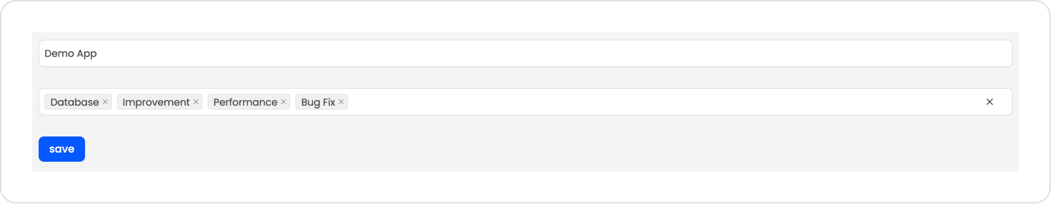
Scenario: Project Tag Selection
When creating a project or task, the user uses the Multi Select element to specify relevant topics. Thanks to Multi Select, the user can add multiple tags to a project.
In the scenario:
A MultiSelect field appears on the screen, and the user can select tags for the project through this field. When the user selects one or more tags from the list, the selected values are displayed within the field as tags.
If desired, the user can remove selected tags using the close (x) icon within the field or add new tags.
The selected tags are saved along with the project record and can be used later to filter, categorize, or report on projects.
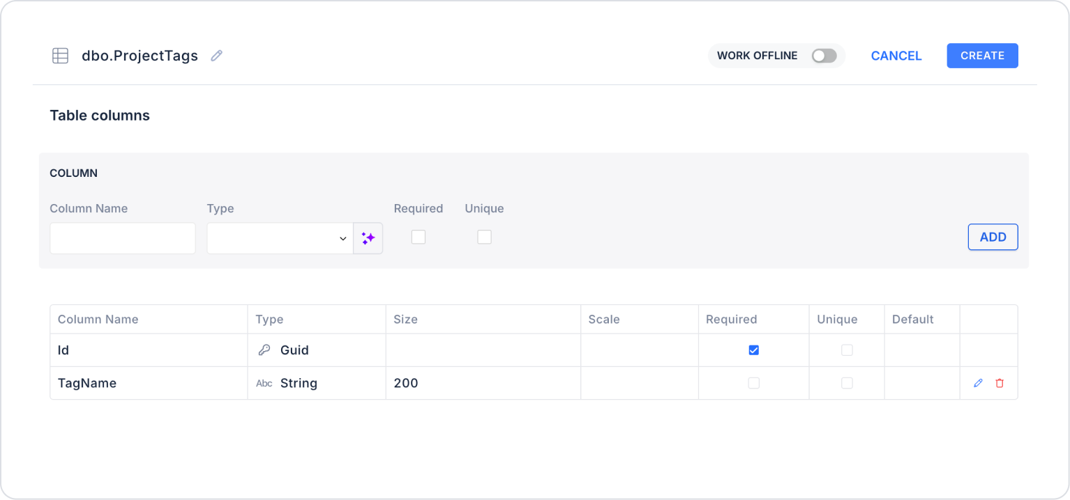
Step 1 - Creating a Data Source
Creating a table in the DataSources module:
Go to the DataSources module.
Then go to the Tables tab.
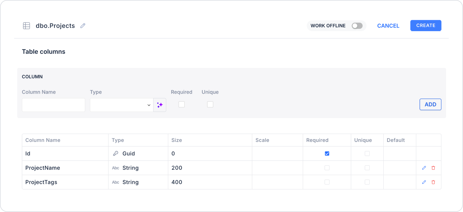
Create a new table named “ProjectTags”.
The required table structure is as follows:
Important Field Names:
TagName: Represents the tag name that can be used in projects. It creates the options presented to the user within the MultiSelect element, and the user can select one or more of these tags to associate with the project.
Create a new table named “Projects”.
The required table structure is as follows:
Important Field Names:
ProjectName: Represents the name of the project. It enables the identification of projects created or managed by the user and is displayed when projects are listed within the application.
ProjectTags: Represents the tag information associated with the project. It is used to store references to tags selected via the MultiSelect element or to display the relationship between the relevant project and the tags.
Step 2 - Defining the Required Action
To display data on the interface:
You need to define three sample actions.
Add a new action from the Actions > New SQL Action tab within the Datasources module.
Action to Add Sample Data (InsertProjectTags): To test the application with sample data, add the following SQL action and click the TEST button.
When executing, delete the “ProjectTags” part, type “ProjectTags” again, and press Enter. This will ensure the correct schema name is prepended to the table name.
Action to List Tags (GetProjectTags):
SELECT * FROM ProjectTags;
When applying, delete the “ProjectTags” section, type “ProjectTags” again, and press Enter. This will ensure the correct schema name is prepended to the table name.
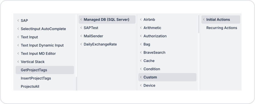
Step 3 - Adding an Initial Action
Initially on the homepage:
To display tags within the MultiSelect, add the Add Action > Initial Action > Custom > Managed DB > GetProjectTags action.
Step 4 - Adding the MultiSelect Element and Defining the Action
On the home page:
From the left sidebar, drag and drop the Elements > Text Input > TextInput element onto the page to add the project name.
From the left-hand panel, drag and drop the Elements > Select Input > MultiSelect element onto the page to add the project name.
Define the tags within the MultiSelect as MultiSelect > Properties > Options > Action GetProjectTags, Field to display > TagName, and Field to Use as Key > Id.
To clear the tags after selection, set MultiSelect > Properties > AllowClear > On.
Below that, drag and drop the Elements > Navigation > Button element from the left-hand panel onto the page.
Set the button text to Button > Properties > Label > “Save”.
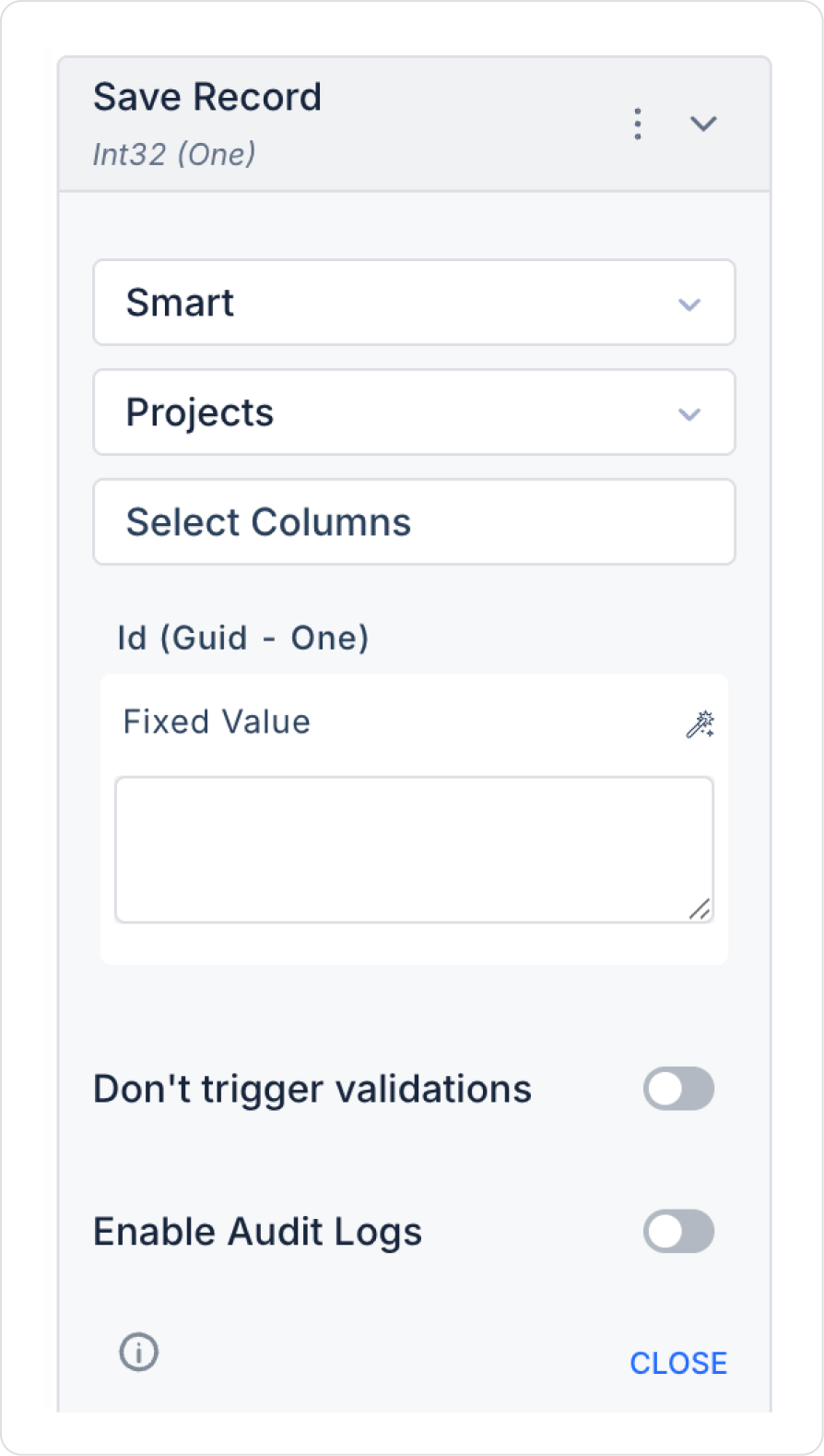
For the save operation, add the Button > Properties > Add Action > onClick > ManagedDB > Save Record action.
In the Save Record action, select the Select Table > Projects table.
In the Select Columns field, select all columns.
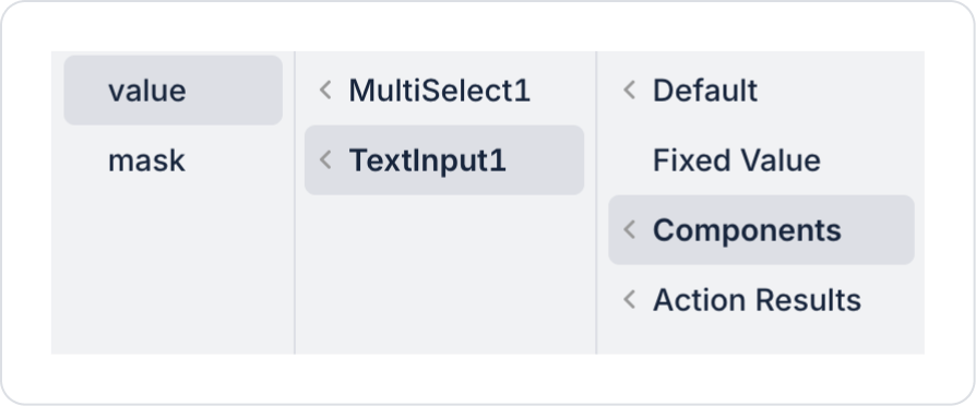
In the ProjectName field, define Components > TextInput > Value.
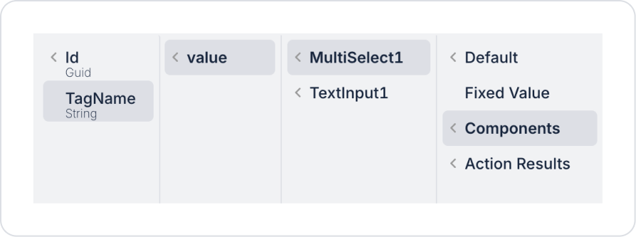
In the ProjectTags field, define Components > MultiSelect > .
This field can also be populated based on the ID (Id) information, depending on your usage needs. The resulting values will be returned as a single comma-separated string. For example: id1,id2,id3 or tagname1, tagname2, tagname3.
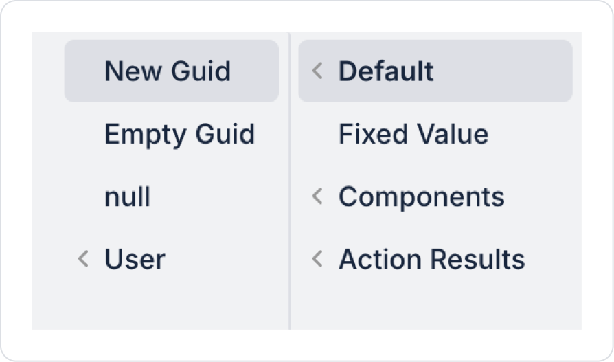
Set the Id field to Default > New Guid.
Preview:
In this example, the MultiSelect element is used to allow users to add multiple tags to a project. After the user enters the project name in the relevant field, they can select tags associated with the project via the MultiSelect field. The selected tags are displayed as tags within the field, and the user can remove these selections or add new tags if desired.
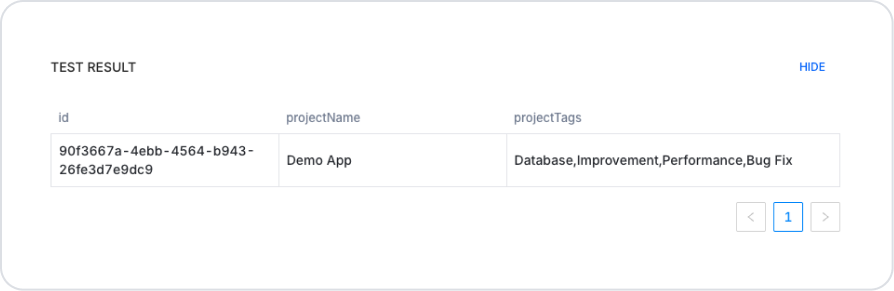
When the user clicks the Save button, the project name and selected tag information are saved. The saved data is displayed in the Test Result section below. This section shows the Id, Project Name, and Project Tags—a comma-separated list of the selected tags—for the project record. This allows the user to easily review how the created project and selected tags are stored in the system. The image below shows an example of how the saved data is stored in the system.
4. Common Properties
Some fields on the Multi Select element are used in common across all UI elements. Therefore, detailed descriptions of the following properties are available on the relevant general guide pages:
Use it in scenarios requiring multiple selections. If the user needs to select multiple options, the Multi Select should be preferred; the Radio Button is recommended for single selections.
Reduce visual clutter by using the Max Tag Count setting. Limiting the number of tags displayed on the screen when many selections are made ensures a clean appearance.
Use the onChange event as the primary trigger. Attach the actions that need to run when selections are added or removed to this event.
Optimize the onSearch event for large datasets. Take precautions such as debounce or a minimum character count for API-based searches.
Consider the “Allow Clear” feature for user experience. The ability to clear all selections with a single click is particularly useful in filtering scenarios.
6. Limitations
The Multi Select element is not suitable for scenarios that require a single selection.
Actions can only be triggered through supported events (onSelect, onChange, onSearch, onBlur).


