The Line Chart element provides an effective way to visually analyze your data over time. By connecting data points with lines, increases, decreases, fluctuations, and long-term trends can be easily observed. It is an ideal chart type for time series data, performance analysis, user behavior tracking, and trend reporting.
The Line Chart element is supported in both web and mobile applications.
1.1. Common Use Cases
Analyzing data trends over time (e.g., daily, weekly, monthly, or yearly changes)
Tracking performance metrics (e.g., system response times, daily active user counts, transaction volume)
Comparing multiple data series (e.g., performance of different departments, products, or categories)
Performing trend analysis (e.g., identifying periods of increase/decrease, examining seasonal changes)
Monitoring financial data (e.g., revenue/expense fluctuations, index changes, exchange rate movements)
Visualize product, user, or transaction-based time series data
2. Key Features
Visualization of time series data with lines. Trends can be clearly seen thanks to the connection between data points.
Multiple data series can be displayed on the same graph. Can be used to compare different categories or sources on a single graph.
Easy interpretation of trends, increases, and decreases. Provides quick analysis of metrics such as system load, sales volume, and traffic changes.
Customizable X (time) and Y (value) axes. Date formats, category labels, and axis value scales can be adjusted.
Ability to customize visual settings such as color, line thickness, point style, and opacity.
Dynamically load chart data from the data source. The chart can be updated in real time with data received through actions.
Full compatibility with SQL, REST API, or Managed DB actions.
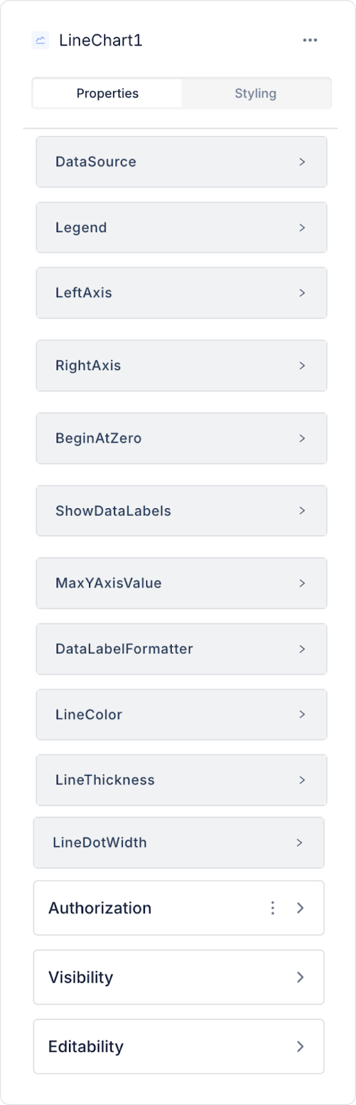
2.1. Element Properties
When you select the Line Chart element, you can define the chart data sources, tooltip configurations, line appearance settings, and axis configurations in detail via the Properties panel on the right. All settings are explained below.
Datasource
Datasource Action: This action fetches the data to be displayed in the chart. Data loading occurs when this action is executed.
When no action is linked to the Datasource, the following data field settings are not visible.
Data Field Mappings
Data Label: The title of the chart's main data set. It is displayed in the Legend and tooltips.
Tooltip Custom Title Data Label: Defines the data field to be displayed as the title in the tooltip. It determines the title that appears when the user hovers over a data point.
Tooltip Custom Content Data Label: Specifies the field to be displayed as an explanation or additional data in the tooltip content.
Multi Tooltip Content Fields: Allows you to display multiple data fields simultaneously in the tooltip. Ideal for detailed analysis in multiple data sets.
Data Field: The field to which the main data series is linked. The line is created based on these data points.
Data Bg Color: Specifies the line or point color for the main data series. Hex format color values are supported.
Second Data Field: Used to display a second data series in the chart. Suitable for comparing different categories in multiple line charts.
Second Data Bg Color: Specifies the line or point color for the second data series.
Third Data Field: Used to add a third data series. Can be used in multiple trend analyses.
Third Data Bg Color: Specifies the line/point color for the third data series.
Legend
Legend Position: Specifies where the legend will appear on the chart. Options:
Top
Bottom
Right
Left
Axis Settings
Left Axis (Y-axis): Controls whether Y-axis values are displayed.
Right Axis (X-axis): Determines the visibility of category/date values on the X-axis.
Value and Start Settings
Begin At Zero: Ensures that the Y-axis starts at zero. Recommended especially for charts without positive–negative data.
Max Y Axis Value: Allows you to manually set the upper limit of the Y axis. Used to control chart scaling.
Data Label Settings
Show Data Labels: Enables labels to appear on data points.
Data Label Formatter: Determines the format of labels. Formats such as currency, percentage, and decimal are supported.
Data Label Position: Specifies the position of data labels around the data point. Used to prevent labels from overlapping in dense charts or to make the design more readable. Supported positions:
Top: Labels are displayed above the data point.
Center: Labels are displayed directly above (centered) the data point.
Bottom: Labels are displayed below the data point.
Line View Settings
Line Color: Specifies the line color. Different colors can be selected for each data series.
Line Thickness: Adjusts the line thickness.
Line Dot Width: Specifies the width of the data points (dots) on the line. It can be increased or decreased depending on the data density.
2.2. Actions That Can Be Added to Elements
Since the Line Chart element is a passive chart component for data visualization, it does not have the ability to trigger actions with user interaction. Therefore, when the element is selected, the ADD ACTION button is not visible, and a trigger specific to the Line Chart cannot be added.
The action structure of the Line Chart works as follows:
User clicks, point selections, or hovering over the line on the Line Chart do not trigger actions.
Graph updating occurs by externally triggering the Datasource Action to which the Line Chart is connected.
User-interactive scenarios (e.g., “user selects date, chart changes”) are managed by defining actions on elements such as Button, Radio Group, not directly on the Line Chart.
The Line Chart only represents the data; it does not initiate operations internally.
Actions cannot be added to the Line Chart. All updates and user interactions are managed through other UI elements that trigger the chart's data source.
3. How to Use the Line Chart Element
In this section, we will cover the end-to-end use of the Line Chart element through an example scenario.
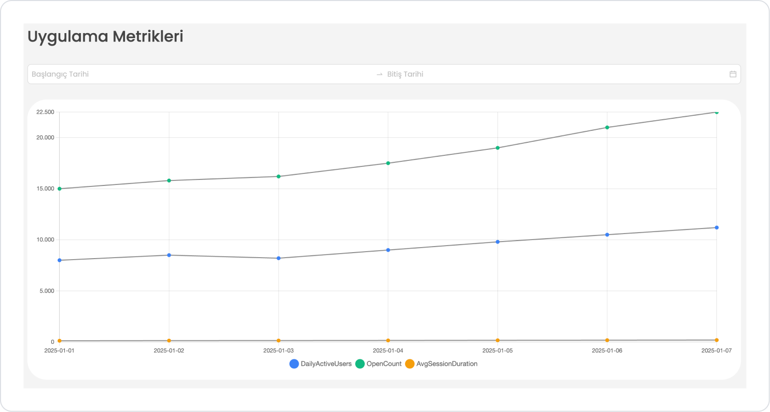
Scenario: Mobile Application Performance Tracking
The Line Chart is used to track the daily usage statistics of a mobile application.
In the scenario:
Daily active users
Application open count
will be displayed as two separate data series on the Line Chart.
The user can filter on SQL by selecting the start and end dates, and the chart will only show usage data for that date range.
For example:
Daily Active Users (DAU)
January 1 → 8,000 users
January 2 → 8,500 users
January 3 → 8,200 users
Daily App Open Count
January 1 → 15,000 opens
January 2 → 15,800 opens
January 3 → 16,200 opens
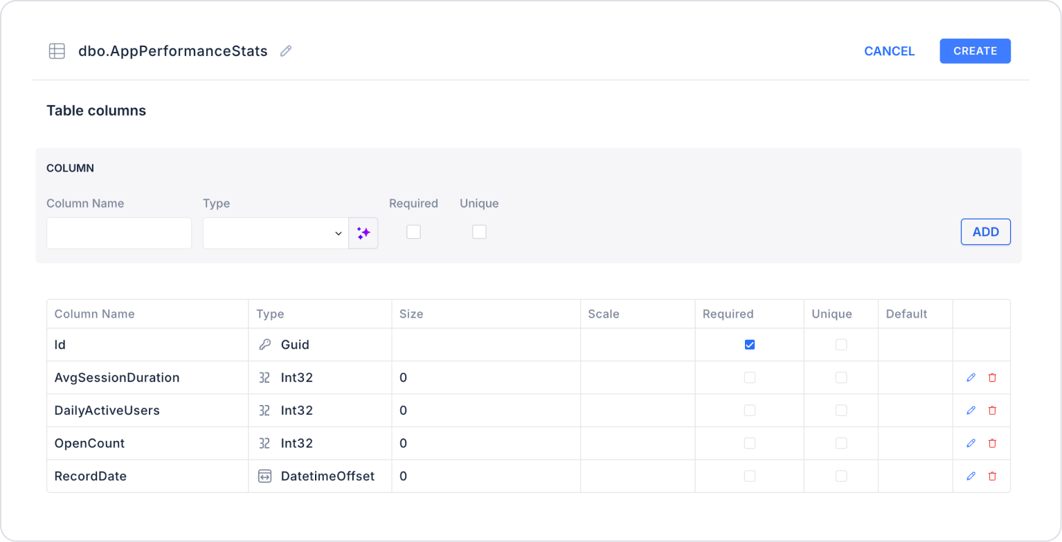
Step 1 - Creating a Data Source
Creating a table in the DataSources module:
Go to the Datasources module.
Then go to the Tables tab.
Create a new table named “AppPerformanceStats”.
The table structure to be set up is as follows:
Important Field Names:
DailyActiveUsers: Represents the total number of users who actively used the application on the relevant day.
RecordDate: Indicates the date to which the records belong. This is the date used on the time axis of the Line Chart.
OpenCount: Indicates how many times the application was opened on the relevant day. It represents user interaction intensity.
AvgSessionDuration: Represents the average session duration (in seconds) that users spend in the application. It is used to evaluate the quality of use.
Step 2 - Defining the Necessary Actions
To display and add data in the interface:
You need to define two actions.
Add a new action from the Actions > New SQL Action tab in the Datasources module.
Action Adding Sample Data (AppPerformanceStats): Add the following SQL action to test the application with sample data and press the TEST button.
When applying, delete the AppPerformanceStats part, rewrite AppPerformanceStats, and press Enter. This will add the correct schema name before the table name.
Action that Provides and Filters Data (GetAppPerformanceStats):
SELECT
FORMAT(RecordDate, ‘yyyy-MM-dd’) AS RecordDate,
DailyActiveUsers,
OpenCount,
AvgSessionDuration,
Id,
-- Line Chart Colors
‘#3B82F6’ AS DailyActiveUsersColor,
‘#10B981’ AS OpenCountColor,
‘#F59E0B’ AS AvgSessionDurationColor
FROM AppPerformanceStats
WHERE
(@StartDate IS NULL OR @StartDate = ‘’ OR
@EndDate IS NULL OR @EndDate = ‘’ OR
(RecordDate >= @StartDate AND RecordDate <= @EndDate))
ORDER BY RecordDate;
When applying, delete the AppPerformanceStats part, rewrite AppPerformanceStats, and press Enter. This will add the correct schema name before the table name.
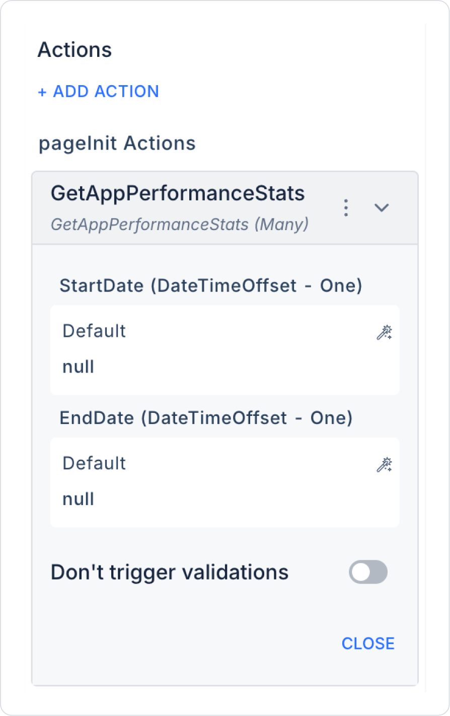
Step 3 - Add Initial Action
Open the UI Design module.
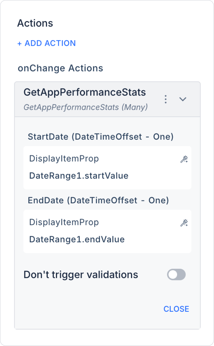
Add the Initial Actions > Custom > Managed Db > GetAppPerformanceStats action to the page using the ADD ACTION button.
Within the action, select GetMonthlySalesByRange > StartDate > Default > null and GetMonthlySalesByRange > EndDate > Default > null.
Step 4 - Adding Elements
Drag and drop the Elements > Display > Label element from the left panel onto the page.
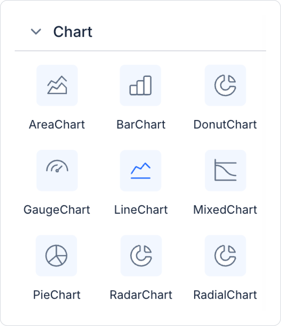
Then add the Elements > Chart > LineChart element from the left panel to the page.
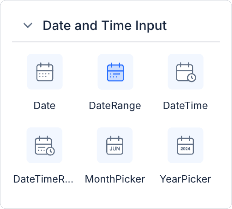
Add the Elements > Date and Time Input > DateRange element from the left panel to the page.
Step 5 - Configuring Element Settings
Add the text “Application Metrics” to the Label > Properties > Value field.
Set the font of the Label field to Label> Styling > Text > Style > Heading 2.
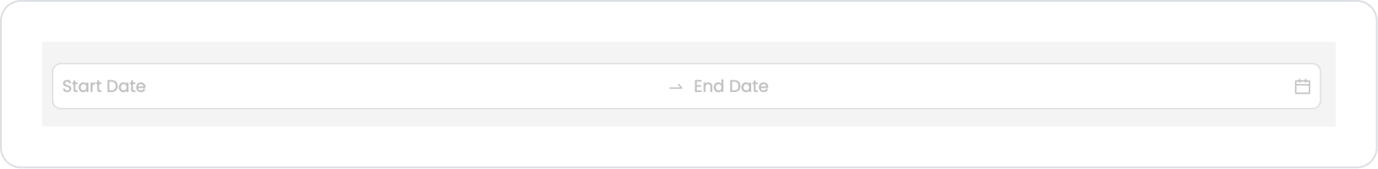
Add the text “Start Date” and “End Date” to the DateRange > Properties > StartDatePlaceholder and EndDatePlaceholder fields.
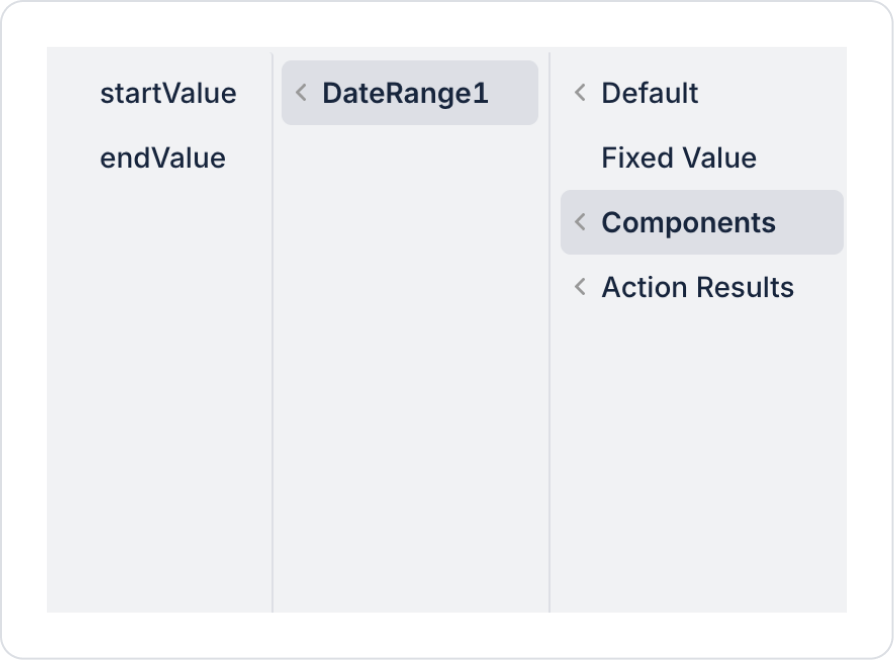
Within the action, define the StartDate and EndDate fields as GetAppPerformanceStats > StartDate > Components > DateRange1 > startValue and endValue.
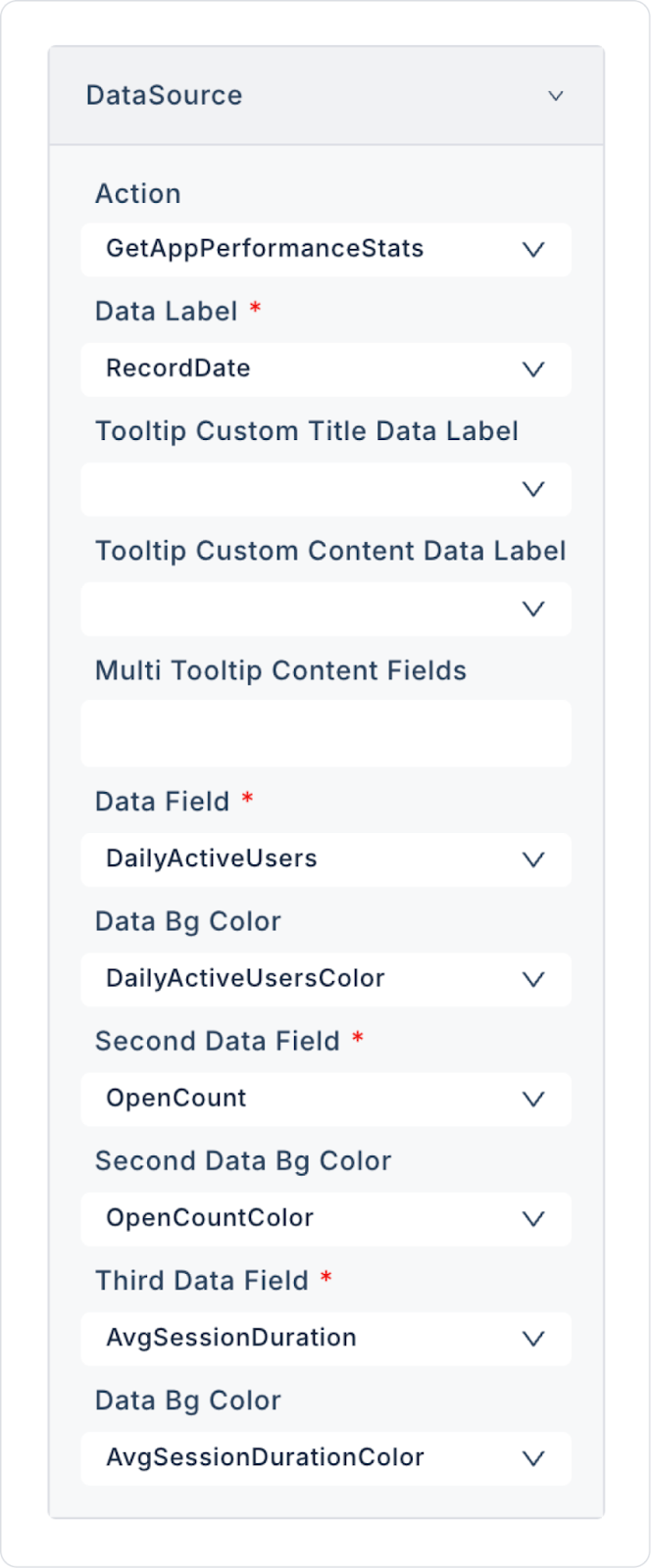
Add the Action > GetAppPerformanceStats action to the LineChart > Properties > DataSource to provide data to the Line Chart. Make the following definitions:
Preview:
When the application is tested, it can be observed that the daily active user and open count data for the selected date range are fully reflected on the Line Chart.
4. Common Properties
Some fields on the Line Chart element are common to all UI elements. Therefore, detailed explanations of the following properties can be found in the relevant general guide pages:


