Gauge Chart element provides an effective way to visually represent the position of a value within a specified target range. It typically works with a gauge panel designed in a half-circle or full-circle shape and a pointer structure. It can be used to easily understand the current level of a performance indicator, the rate of achievement of a target, or the current status of a measurement. It is commonly preferred in scenarios such as KPI tracking, success rate, capacity utilization, and measurement value monitoring.
The Gauge Chart element is supported in both web and mobile applications.
Monitor the current level of a performance metric (e.g., production capacity, success rate, occupancy level)
Visualize real-time measurements (e.g., temperature, speed, score, system load)
Displaying status within a specific value range (e.g., low–medium–high risk levels)
Presenting how much of a metric has been completed on KPI dashboards
Using it as an instant status indicator on operational dashboards (e.g., active user percentage, machine status, task completion rate)
2. Key Features
Visually display the position of a value within a specified range
Present metrics such as target, actual value, and percentage progress at a glance
Dynamic indicator structure with maximum value (Max) and current value (Value) definitions
Customizable color ranges (e.g., different colors for low–medium–high performance levels)
Optional hiding or displaying of percentage display
Ability to update the needle in real time or with action-based data
Simple and understandable design suitable for performance indicators and KPI panels
Full compatibility with SQL, REST API, or Managed DB actions
Consistent appearance support in both web and mobile applications
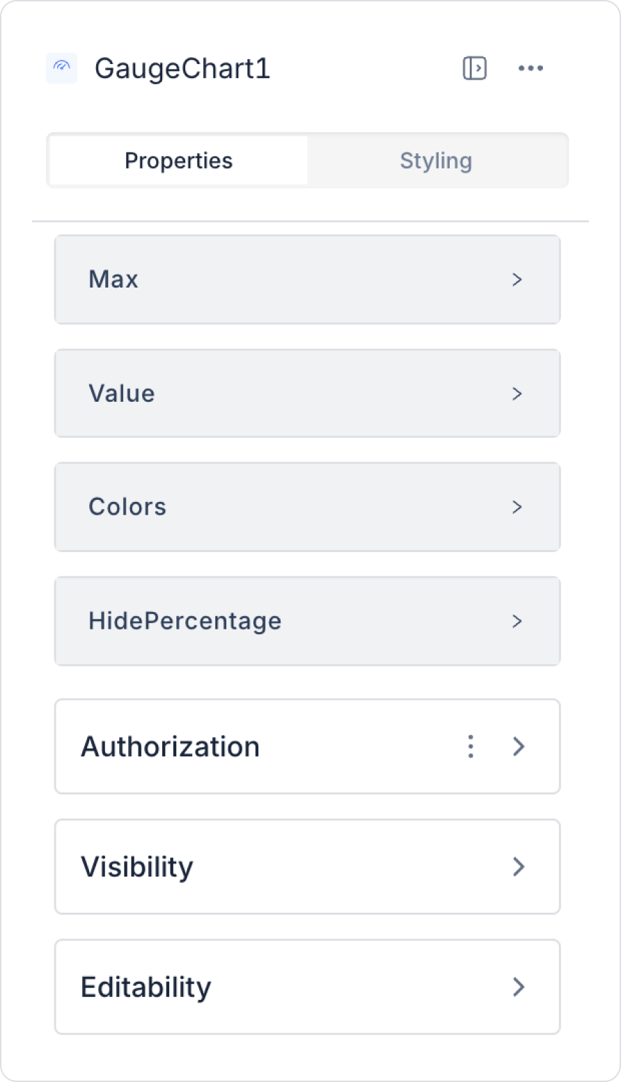
2.1. Element Settings (Properties)
When you select the Gauge Chart element, you can configure the target values, current value, color areas, and gauge appearance in detail via the Properties panel on the right. All settings are explained below.
Value and Range Settings
Max: Defines the maximum value to be used in the gauge panel. It indicates the highest level the measurement can reach and is the basic parameter that determines the pointer's range of movement.
Value: This is the value you want to display on the gauge at any given moment. The pointer's position is updated according to this value. Metrics such as KPI value, success rate, and capacity utilization are linked to this field.
Color Settings
Colors: Defines the color palette to be used on the gauge. Different colors can be defined for different ranges to more clearly express low–medium–high states. For example:
Red for low performance
Yellow for medium level
Green for high performance
Visual Display Settings
Hide Percentage: Determines whether the percentage value is displayed on the graph.
On: Percentage values are not displayed; only the pointer and color areas are visible.
Off: Both the value and its percentage equivalent are displayed to the user.
2.2. Actions That Can Be Added to Elements
Since the Gauge Chart element is a passive indicator component for data visualization, it does not have the ability to trigger actions through user interaction. Therefore, when the element is selected, the ADD ACTION button is not visible, and a trigger specific to the Gauge Chart cannot be added.
The Gauge Chart's action structure works as follows:
The Gauge Chart does not trigger actions with user clicks or interactions on the needle. (Triggers such as onClick are not supported.)
To update the gauge value, the action associated with the Gauge Chart must be triggered externally.
User-dependent scenarios (e.g., “user selects filter, gauge value changes”) are managed by adding actions to other UI elements such as Button, Switch, not through the Gauge Chart.
The Gauge Chart only represents data; it does not initiate any actions on its own.
Actions cannot be defined on the Gauge Chart; all update operations are performed by assigning actions to other elements that trigger the gauge's data source, not to the gauge itself.
3. How to Use the Gauge Chart Element?
In this section, we will cover the end-to-end use of the Gauge Chart element through an example scenario.
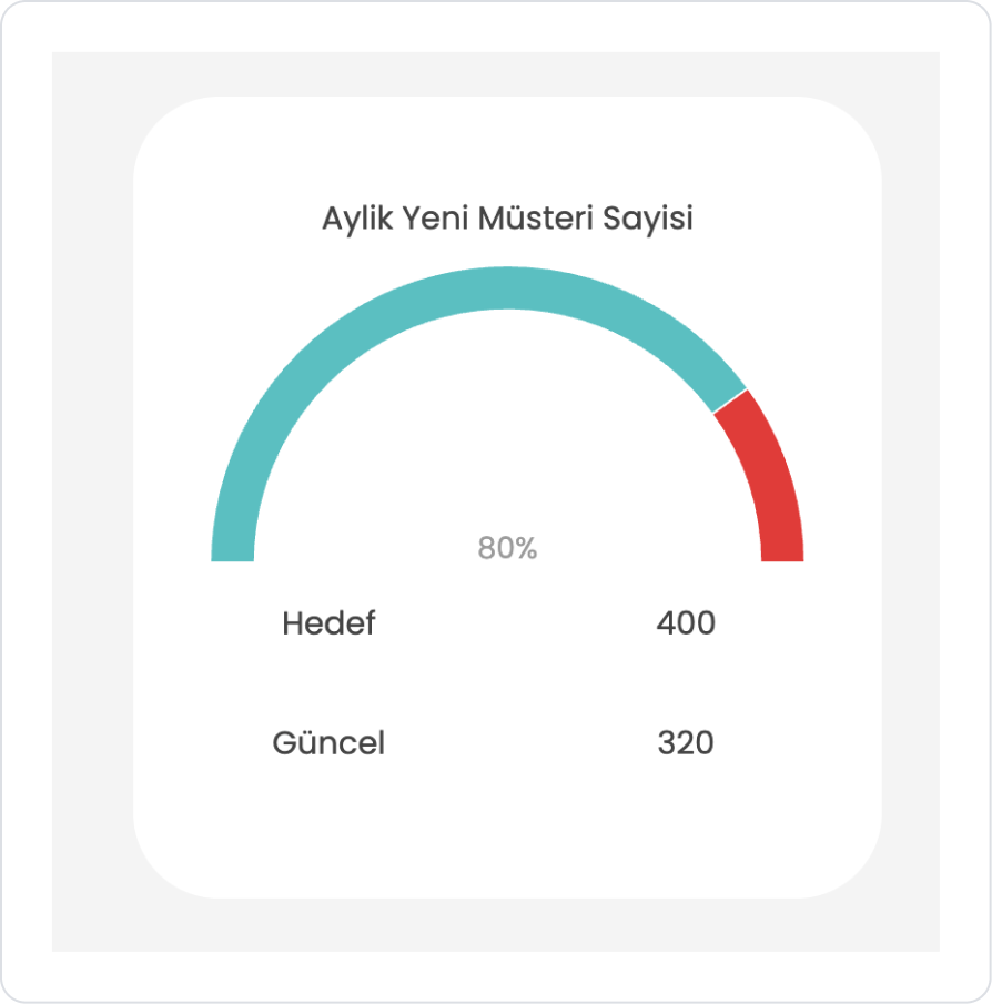
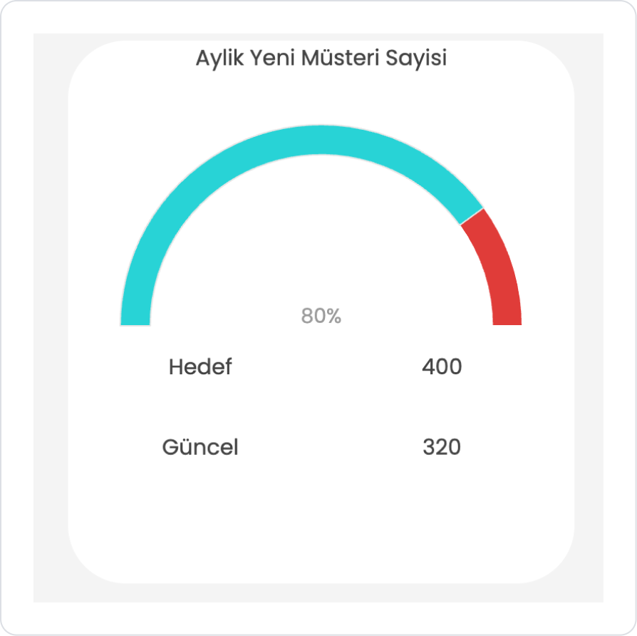
Scenario: Monthly New Customer Count Tracking
In a sales management application, the user is shown the number of new customers acquired within a given month and the target number of customers set for that month. Thanks to the structure of the Gauge element, the difference between the actual value and the target can be quickly seen in a single gauge.
In the scenario:
The New Customer Count (CurrentValue) and Target New Customer Count (TargetValue) values for each month will be displayed on the Gauge.
The gauge indicates how close the actual value is to the target using color and fill percentage.
The user can view the relevant KPI value based on the selected month or filter.
This makes it easy to analyze how close the company is to its target customer acquisition.
For example:
January → New Customers: 320, Target: 400 = 410 / 400 → 102%
February → New Customers: 290, Target: 400 = 320 / 400 → 80%
March → New Customers: 410, Target: 400 = 290 / 400 → 72%
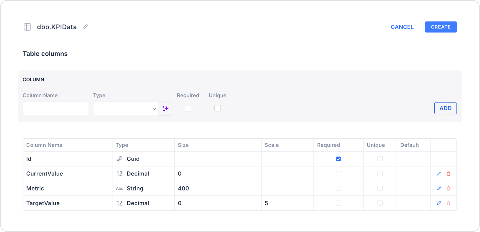
Step 1 - Creating a Data Source
Creating a table in the DataSources module:
Go to the Datasources module.
Then go to the Tables tab.
Create a new table named “KPIData”.
The table structure to be set up is as follows:
Important Field names:
CurrentValue: Represents the current realized value of the relevant KPI.
Metric: Specifies which metric the KPI belongs to (e.g., “Monthly Sales,” “Number of Visitors,” “Conversion Rate”).
TargetValue: Represents the target value set for the KPI.
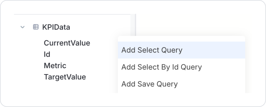
Step 2 - Defining the Necessary Actions
To display and add data in the interface:
You need to define two actions.
Add a new action from the Actions > New SQL Action tab in the Datasources module.
Action Adding Sample Data (InsertKPIData): To test the application with sample data, add the following SQL action and press the TEST button.
INSERT INTO KPIData (Id, Metric, CurrentValue, TargetValue)
VALUES
-- New Customer Count KPI
(NEWID(), ‘Monthly New Customer Count’, 320, 400)
When implementing, delete the KPIData part, rewrite KPIData, and press Enter. This will add the correct schema name before the table name.
Action that Provides and Filters Data (GetKPIData):
SELECT * FROM KPIData;
In the SQL Action field, you can also add a ready-made select query via the three dots next to the KPIData table if you wish.
When applying, delete the KPIData section, retype KPIData, and press Enter. This will add the correct schema name before the table name.
Step 3 - Add Initial Action
Open the UI Design module.
Add the Initial Actions > Custom > Managed Db > GetKPIData action to the page using the ADD ACTION button.
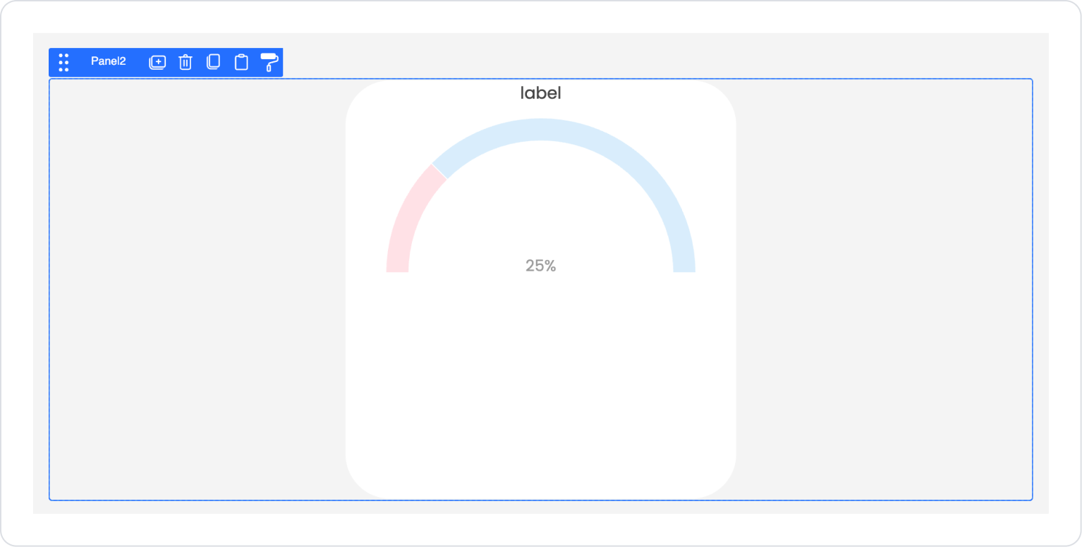
Step 4 - Element Placement and Style Settings
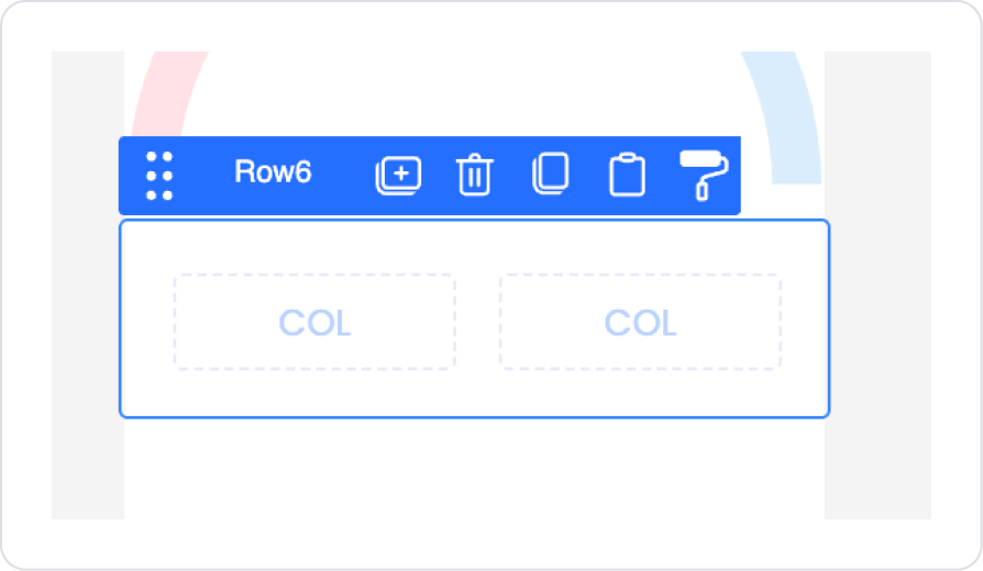
Drag and drop the Elements > Container > Row element from the left panel onto the page.
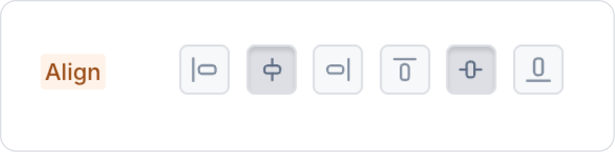
In the Col field within Row, center it vertically and horizontally in the Col > Styling > Layout > Align field.
Drag and drop the Elements > Container > Panel element from the left panel into Col.
Define the size of the Panel element as Col > Styling > Layout > Width and Height (350,375) px.
Set the background of the Panel element to Col > Styling > Fill > White Background.
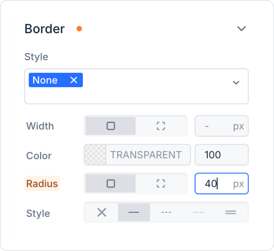
Set the borders of the panel to Col > Styling > Style > Border > Radius > 40 px.
Drag and drop the Elements > Container > Vertical Stack element from the left panel into the Panel.
Add the Elements > Display > Label element to the Vertical Stack.
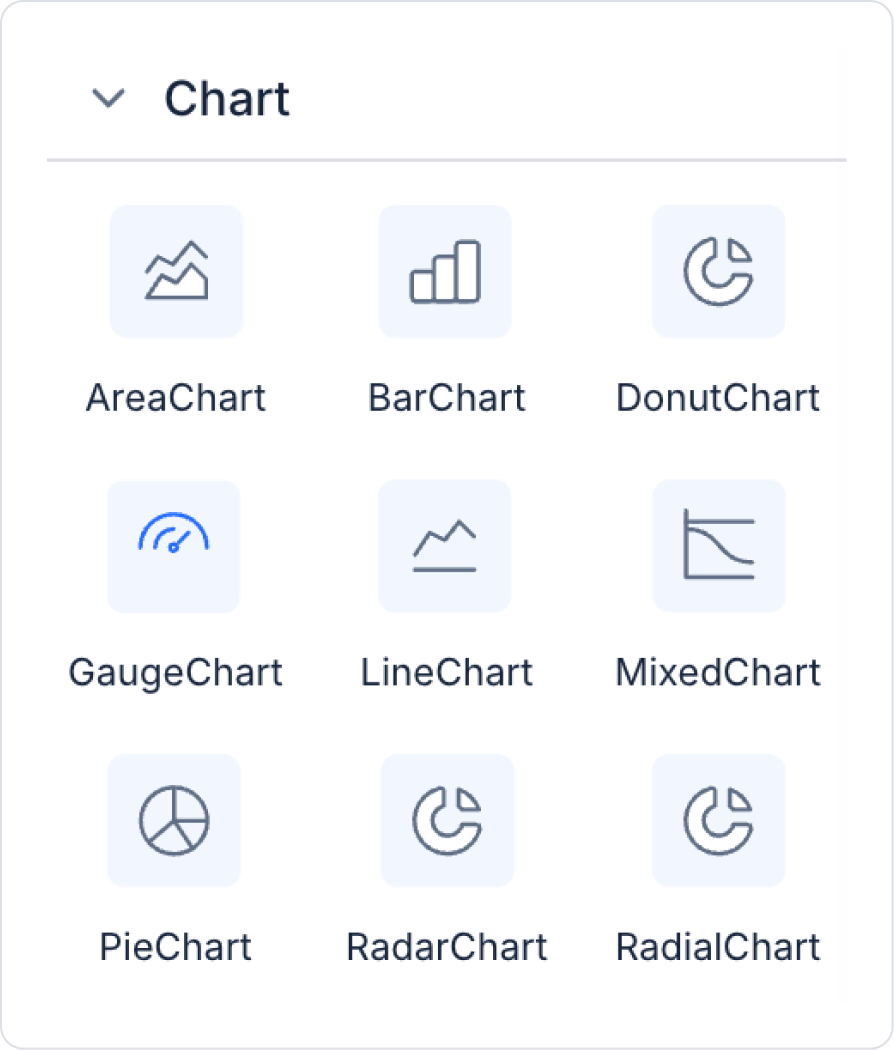
Add the Elements > Chart > GaugeChart element from the left panel to the Vertical Stack.
Add the Elements > Container > Row element from the left panel to the Panel and select Row > Properties > Desktop > 2.
Center the Col >Styling > Layout > Align horizontally and vertically.
Drag and drop the Elements > Display > Label element into both Col elements.
Copy the created Row element using the first option, Duplicate.
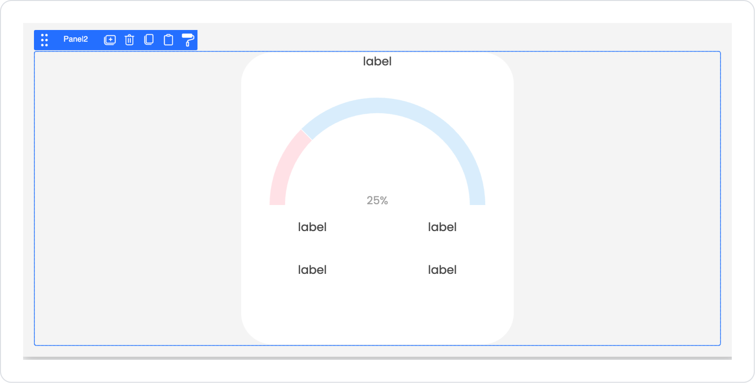
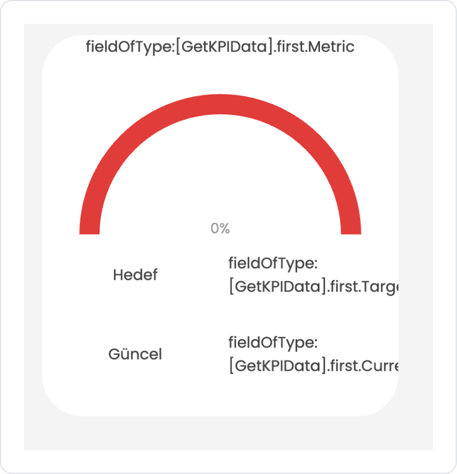
The expected result after all steps is as follows.
Step 5 - Configuring Element Settings
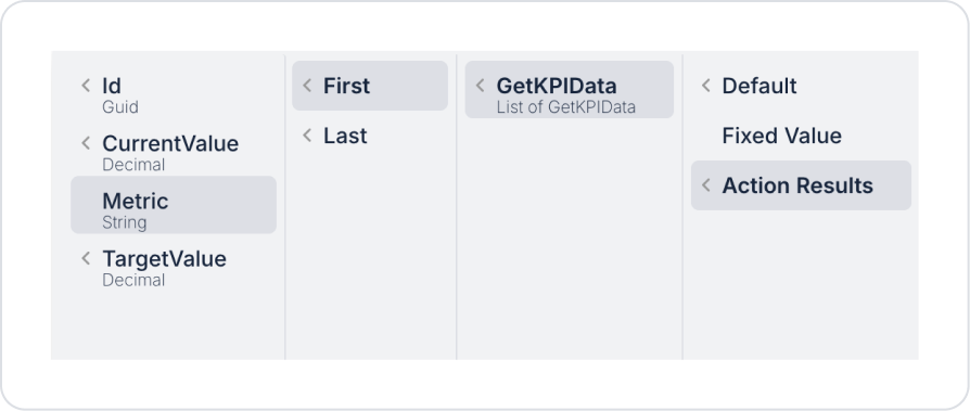
Add the header information as Label > Properties > Value > Action Result > GetKPIData > First > Metric.
Add the GaugeChart > Properties > Max > Action Result > GetKPIData > First > TargetValue value to the Gauge Chart.
Similarly, add the GaugeChart > Properties > Value > Action Result > GetKPIData > First > CurrentValue value.
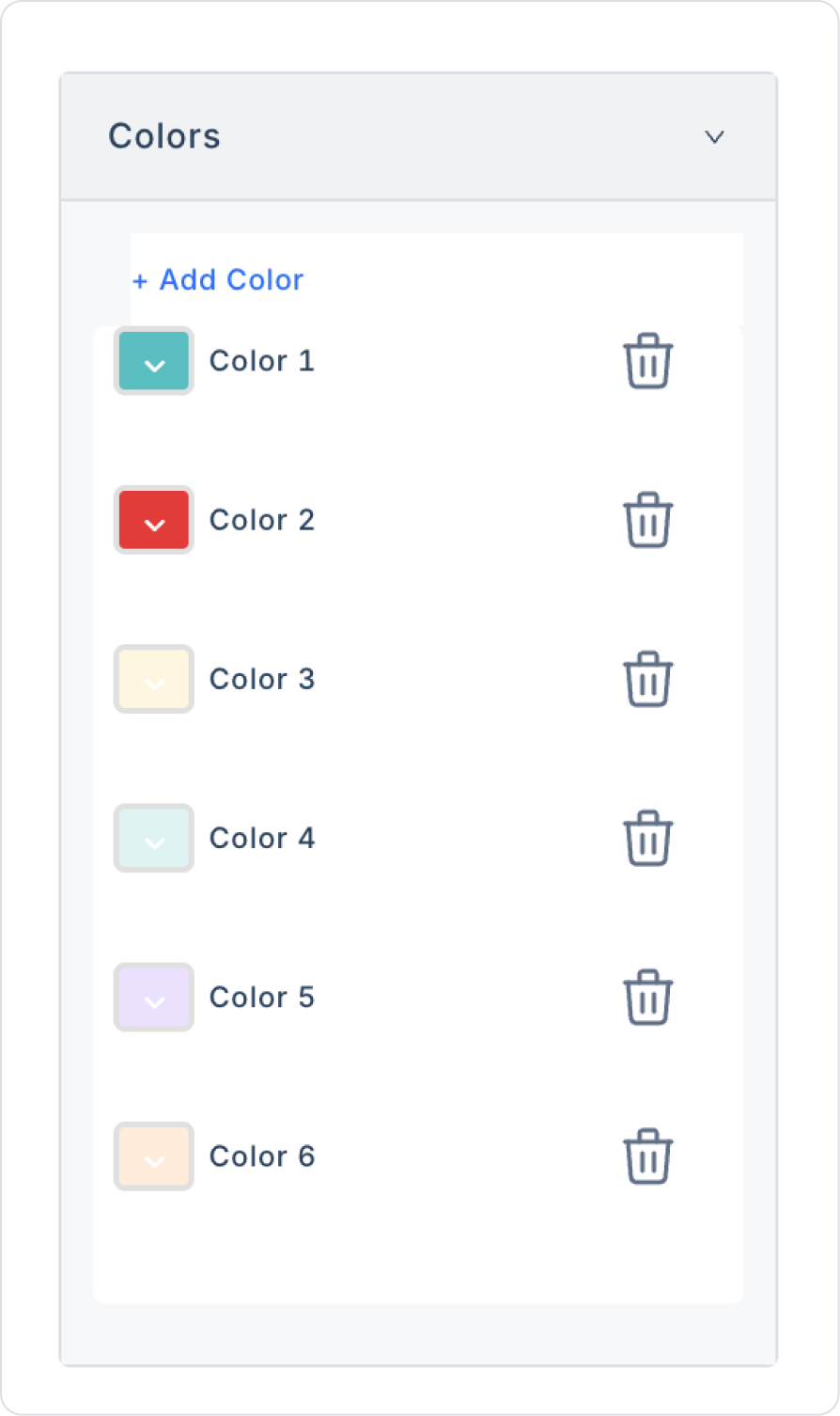
From the GaugeChart > Properties > Colors section, select Blue for Color 1 and Red for Color 2.
For the labels in the first column of the Row, set the Label > Properties > Value fields to “Target” and “Current” respectively.
For the labels in the second column, follow the path Label > Properties > Value > Action Result > GetKPIData > First and define the values as TargetValue > To String and CurrentValue > To String respectively.
Preview:
When the application is tested, the data for the monthly new customer targets is displayed on the Gauge Chart.
4. Common Properties
Some fields on the Gauge Chart element are used in common across all UI elements. Therefore, detailed explanations of the following properties can be found in the relevant general guide pages:
The following recommendations should be considered to create more readable and meaningful indicators with Gauge Chart:
Set realistic and consistent max values. Maximum values that are too high or too low reduce the impact of the gauge.
Configure color ranges meaningfully.
Red → low performance
Yellow → medium performance
Green → high performance A standard scale like this enhances the user experience.
Use the Hide Percentage setting according to the design. Hiding percentage information provides a cleaner look in designs with high slice or needle density.
6. Limitations
The following limitations should be considered when working with the Gauge Chart element:
Actions cannot be triggered by user interaction. Clicking, hovering, or selecting the needle does not produce any action.
Graph values are not updated without defining a datasource. Even if the Max and Value fields are entered manually, an action is required for dynamic data loading.
Gauge Chart displays a single data point; it does not support multiple data series.
Hiding the percentage display (Hide Percentage) may result in information gaps for the user. Therefore, it should be used carefully according to the design.


