The Mixed Chart element allows you to visualize different data types simultaneously by combining multiple chart types within a single structure. It enables the use of chart types such as bar, line, and area together on the same chart. This feature is highly effective for comparing both categorical and time series data, presenting trends and distributions simultaneously. It makes complex data sets more readable and helps users analyze relationships between data points through a single chart.
The Mixed Chart element is supported in both web and mobile applications.
1.1. Common Use Cases
Compare multiple data types on the same chart (e.g., show sales volume with a bar chart and sales trend with a line chart)
Combine categorical and time series data in a single view
Analyze both total values and trends simultaneously (e.g., monthly total sales + sales trend line)
Presenting different data scales on a single chart (e.g., bar chart based on units + line chart based on ratios)
Showing distribution and trend simultaneously (e.g., income distribution as bars, income growth rate as a line)
Improving the readability of complex data sets. Displaying multiple metrics in one place reduces dashboard clutter.
2. Key Features
Support for combining multiple chart types in a single chart. Different chart types such as Bar, Line, and Area can be used in the same view.
Ability to display different data types on the same axis or separate axes. Numerical values can be presented with bar charts, while ratio or trend data can be presented with line charts.
Ability to visualize multiple data series simultaneously. Can be used to analyze complex data sets through a single chart.
Customizable X (category/time) and Y (value) axes
Ability to define separate colors, line styles, bar thickness, and opacity for each data series
Ability to display multiple data series in tooltips. When the user hovers over the chart, all relevant data series are displayed together.
Dynamically loading chart data from the data source. Can be updated instantly with data from SQL, REST API, or Managed DB actions.
Advantage of presenting complex data in a simple view on dashboards
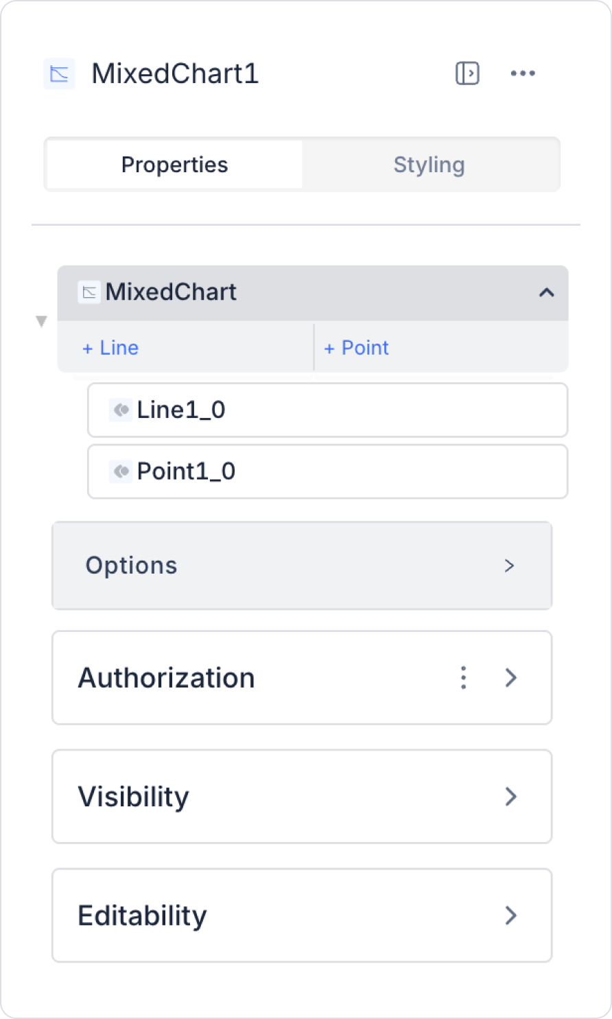
2.1. Element Settings (Properties)
When you select the Mixed Chart element, you can configure the chart data sources, bar/line/point type configurations, tooltip settings, and visual adjustments in detail via the Properties panel on the right. All of the following settings are explained point by point.
2.1.1. General Chart Settings – Options
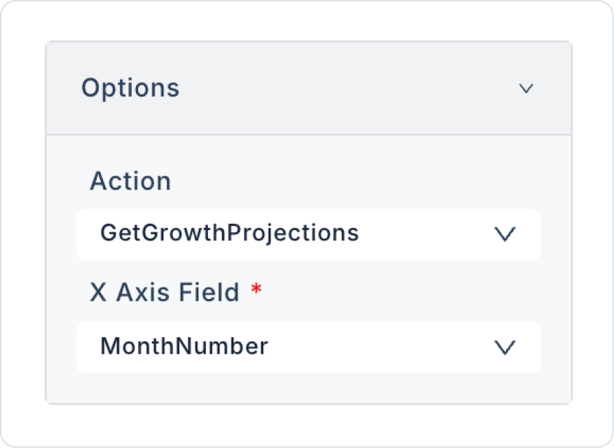
Actions
Specifies the SQL actions that load all data series to be displayed in the chart.
You can add multiple actions and link them to different chart types (bar, line, point).
X Axis Field
Specifies the category or date values to be displayed on the X axis.
All chart types reference this axis field.
Axis Value Field
Defines the basic value set to be displayed on the Y-axis.
In bar or line series, the vertical axis is drawn according to this field.
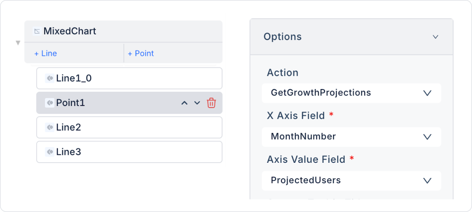
2.1.2 Mixed Chart – Point Properties
This section contains the settings for data series displayed as points in the Mixed Chart.
Options → Action
Defines which action will load the data series to be displayed as points.
X Axis Field
Specifies which value the point data corresponds to on the X axis.
Axis Value Field
Specifies which field the value or description on the point will be taken from.
Custom Tooltip Line
Defines the custom line information to be displayed in the tooltip. (e.g., description, sub-information, additional text)
Custom Tooltip Value
Specifies the custom value to be displayed in the tooltip. (e.g., numerical value or percentage of the point)
Color
Specifies the color of the point. Different colors can be defined for each point series.
2.1.3 Mixed Chart – Line Properties
This section contains settings for data series used as lines in the Mixed Chart.
Options → Actions
Defines the SQL actions used to load the line data series.
X Axis Value Field
Specifies which value on the X axis corresponds to the points on the line.
(e.g., date, category)
Axis Value Field
Defines the values of the line series. The height of the line is created based on this data.
Custom Tooltip Title
Defines the custom title to be displayed on the tooltip. (e.g., “Revenue,” “Unit Count,” “Trend Value”)
Custom Tooltip Value
Specifies the custom value to be displayed in the tooltip. It appears when the user hovers over a point on the line.
Color
Sets the line color. A different color can be selected for each line series.
Label
Defines the label for the line series. This label appears in the legend.
Dash Spacing
Specifies the amount of space between lines in dashed line mode.
Dash Length
Defines the length of the dashed lines.
Line Width
Adjusts the line thickness. Thicker line → emphasized trend. Thinner line → suitable for light visualization.
2.2 Actions That Can Be Added to Elements
Since the Mixed Chart element is a passive component focused on data visualization, it does not support triggering actions through user interaction. Therefore, when Mixed Chart is selected, the ADD ACTION button is not displayed, and no special trigger can be added to the chart.
The action structure of Mixed Chart works according to the following principles:
User clicks, bar/line/point interactions, or hover actions on Mixed Chart do not trigger actions.
Graph updating occurs through external triggering of the Datasource / Actions list associated with Mixed Chart.
Scenarios requiring chart changes based on user selections (e.g., “filter report by year,” “change category”) are managed by adding actions via elements such as Button, Radio Group.
The Mixed Chart only displays data; it does not initiate any actions.
Actions cannot be added to the Mixed Chart element; all data updates and user interactions are managed by actions defined outside the chart.
3. How to Use the Mixed Chart Element?
In this section, we will cover the end-to-end use of the Mixed Chart element through an example scenario.
Scenario: User Growth Projection Analysis
Mixed Chart is used to track the monthly user growth of a mobile application.
In the scenario:
Actual number of users (Actual Users)
Estimated number of users (Projected Users)
Optimistic growth scenario (Optimistic Users)
For example (Monthly Growth Data):
Actual Number of Users (Actual Users)
Month 0 → 120 users
Month 3 → 160 users
Month 6 → 190 users
Projected Users
Month 0 → 130 users
Month 3 → 170 users
Month 6 → 200 users
Optimistic Users
Month 0 → 140 users
Month 3 → 180 users
Month 6 → 215 users
Step 1 - Creating a Data Source
Creating a table in the DataSources module:
Go to the Datasources module.
Then go to the Tables tab.
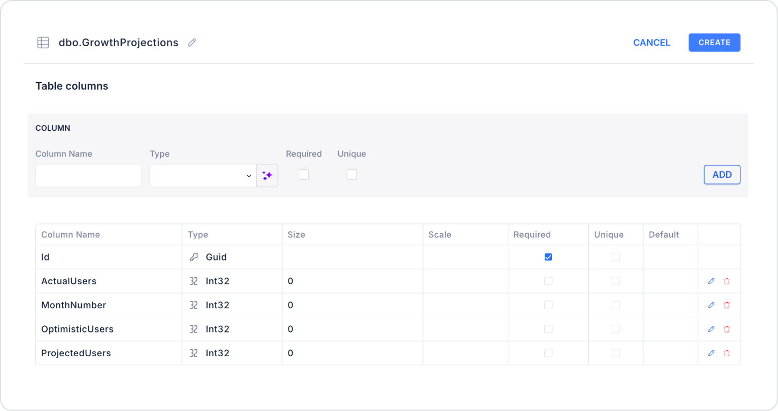
Create a new table named “GrowthProjections”.
The table structure to be set up is as follows:
Important Field Names:
MonthNumber: Indicates the number of months since the application went live. Used as the time axis on the chart.
ActualUsers: Represents the total number of users who actually used the application during the relevant period. Represents the main actual data series on the chart.
ProjectedUsers: Shows the number of users calculated as a result of mathematical modeling or growth projections. Used for future forecasting analysis.
OptimisticUsers: Represents the estimated number of users based on an optimistic growth scenario. Used to examine the potential maximum growth curve.
Step 2 - Defining the Required Actions
To display and add data in the interface:
You need to define two actions.
Add a new action from the Actions > New SQL Action tab in the Datasources module.
Action Adding Sample Data (InsertGrowthProjections):
Add the following SQL action to test the application with sample data and press the TEST button.
When applying, delete the GrowthProjections section, rewrite GrowthProjections, and press Enter. This will add the correct schema name before the table name.
Action that Provides and Filters Data (GetGrowthProjections):
SELECT
MonthNumber,
ActualUsers,
ProjectedUsers,
OptimisticUsers,
Id
FROM dbo.GrowthProjections
ORDER BY MonthNumber;
When applying, delete the GrowthProjections section, retype GrowthProjections, and press Enter. This will add the correct schema name before the table name.
Step 3 - Adding an Initial Action
Open the UI Design module.
Add the Initial Actions > Custom > Managed Db > GetGrowthProjections action to the page using the ADD ACTION button.
Step 4 - Add Elements
Drag and drop the Label element from the left panel to the page.
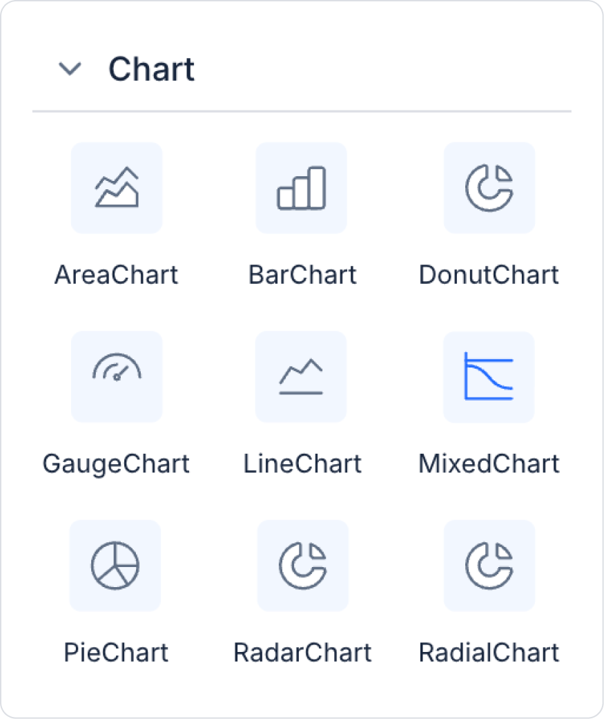
Add the Mixed Chart element from the left panel to the page.
Step 5 - Configuring Element Settings
Add the text “User Growth Trends” to the Label > Properties > Value field.
Set the font of the Label field to Label> Styling > Text > Style > Heading 2.
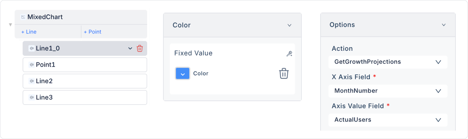
Add two new Line and one Point to Mixed Chart > Properties.
Add the MixedChart > Properties > Options >Action > GetGrowthProjections action to the Mixed Chart to provide the data. Make the following definitions:
For the firstLine in Mixed Chart > Properties, make the following definitions in the Options field:
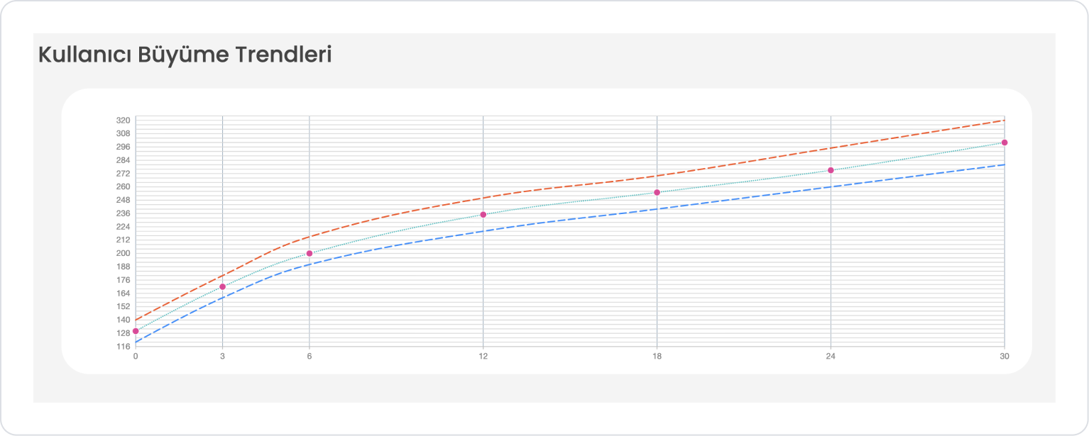
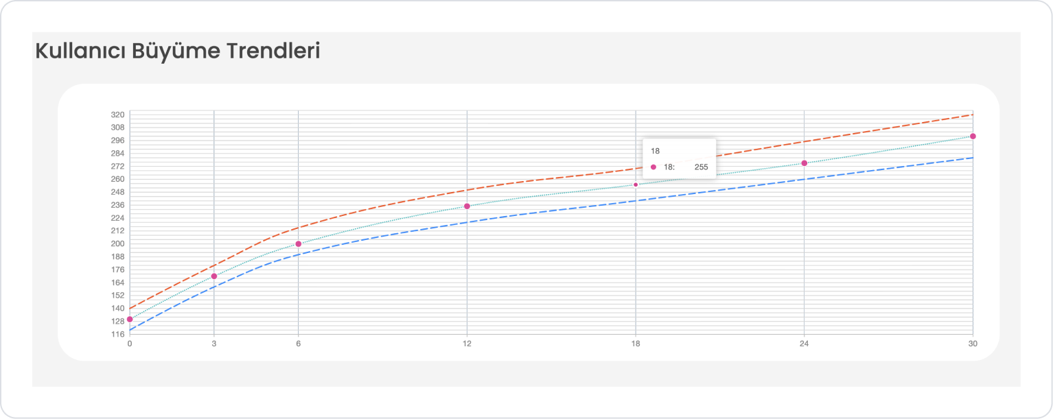
Set the Color field in the First Line to blue (448EF7).
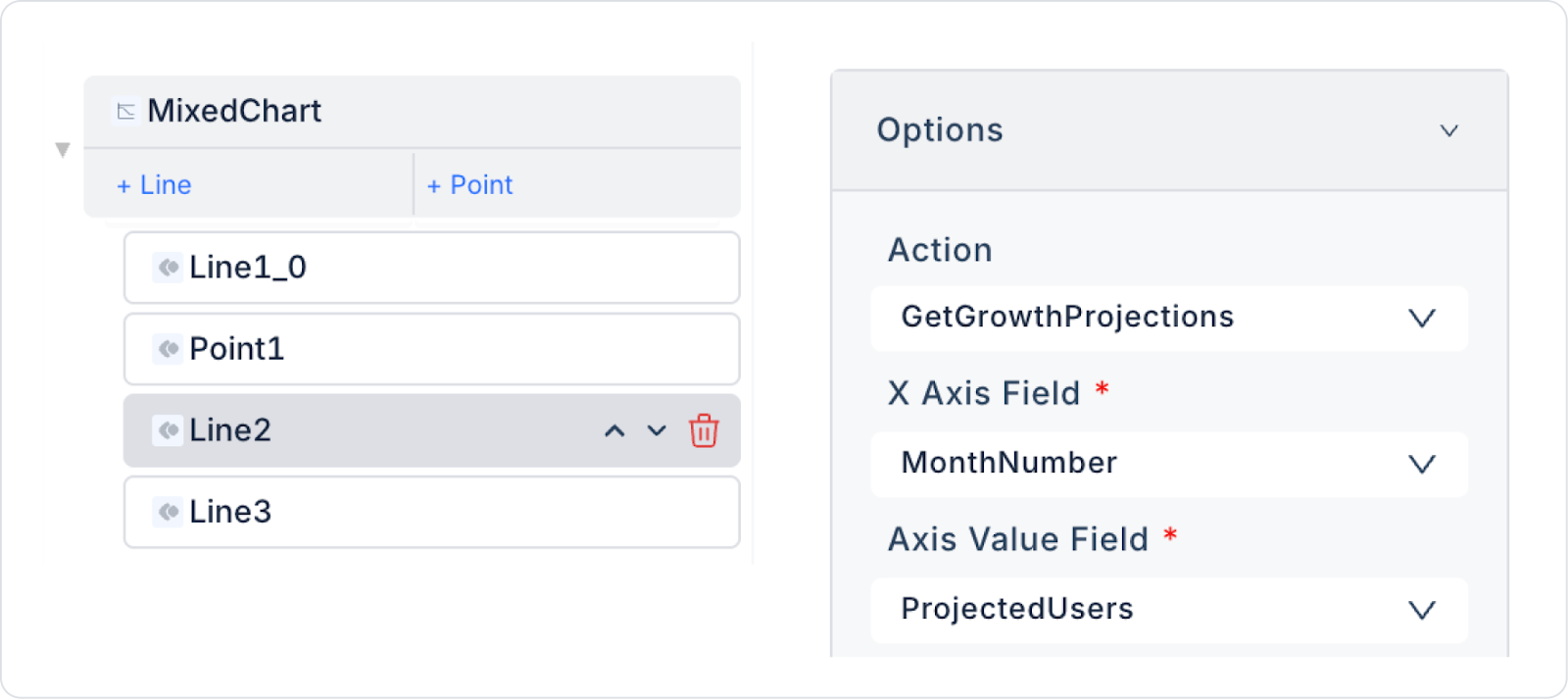
SecondLine: Make the following definitions in a similar manner.
Second Line: Set the Color field to turquoise (5ABFC1).
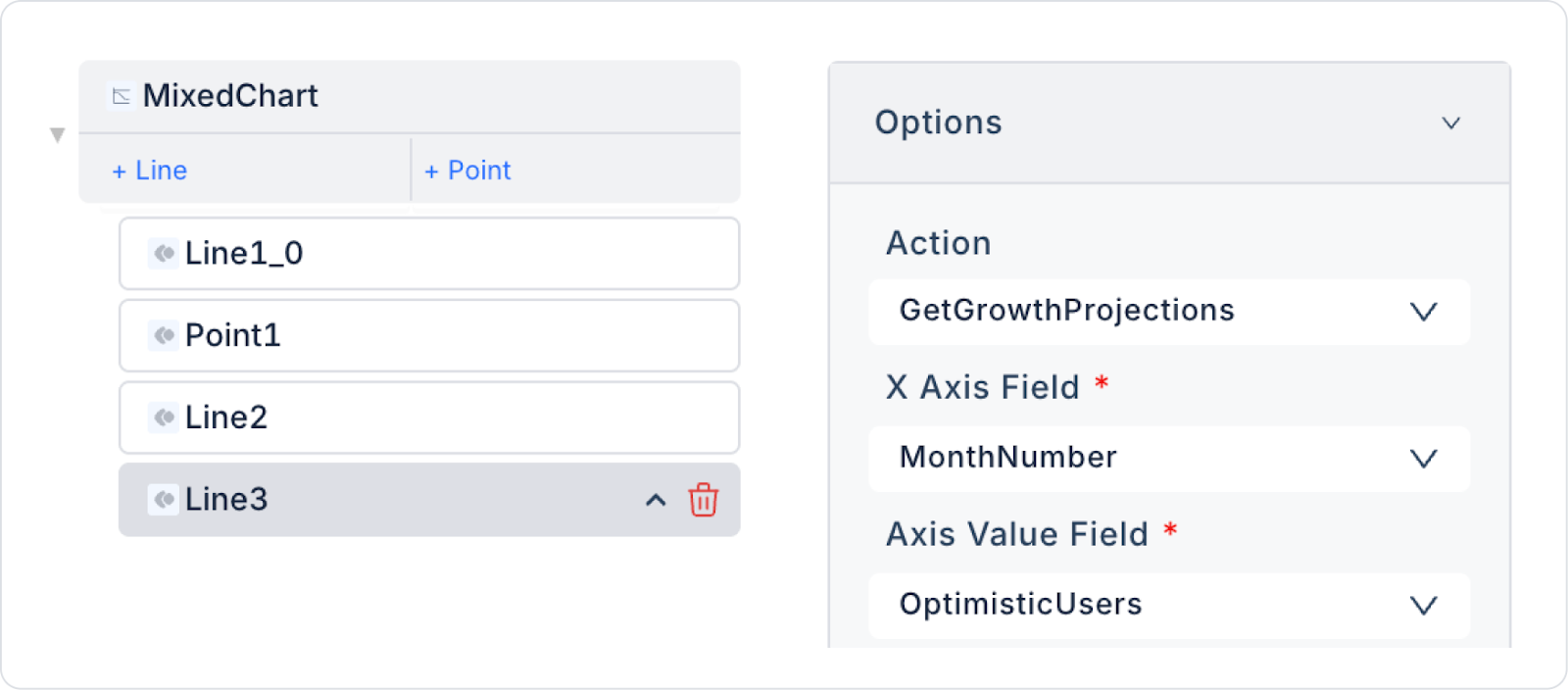
Third Line: Make the following definitions in a similar manner.
Third Line: Set the Color field to orange (E76033).
Make the following definition for Point as well:
Finally, set the Color field in Point to pink (D84293).
Preview:
When the application is tested, it is observed that the data for the actual, estimated, and optimistic user numbers in the selected month range are displayed correctly on the Mixed Chart.
4. Common Properties (Properties)
Some fields on the Mixed Chart element are common to all UI elements. Therefore, detailed descriptions of the following properties can be found in the relevant general guide pages:
The Mixed Chart provides powerful analysis when configured correctly, as it accommodates multiple data series and chart types in the same structure. For best results, pay attention to the following recommendations:
Match bar and line types logically. Displaying total values with bars and trends or ratios with lines is the most accurate approach.
Ensure that the data on the X-axis is consistent and orderly. If categories or dates are not sorted, bar/line/point structures may not align correctly.
Avoid using too many data series. Using more than 3 line + 3 bar charts simultaneously can make the chart confusing.
6. Limitations
The following limitations should be considered when using the Mixed Chart element:
It does not trigger actions with user interaction. Clicking on a bar, line, or point does not initiate an action.
When using multiple data sources, all actions must have a parallel data structure. If the values on the X-axis are incompatible, the charts will not align.
Unformatted or incorrect data types can cause drawing errors. Non-numeric fields in particular produce errors on the Y-axis.
Excessively large data sets can cause performance issues. Too many bar + line + point combinations increase browser rendering time.
Dash settings (dash) only apply to line series; they cannot be applied to bars and points.
When using multiple Y-axes, all data series must be correctly linked to the appropriate axis; otherwise, values will be misrepresented.


