The Color Picker element is a visual input element that allows users to easily and quickly select a color from a color palette. Users can specify the desired color value by selecting from the available color options.
The Color Picker element is used in scenarios that require visual decisions, such as design customizations, theme settings, labeling, status highlighting, and color-based preferences. Thanks to its visual feedback, users can see the selected color immediately, enabling them to make more informed choices.
The Color Picker element is supported only in web applications.
1.1. Common Use Cases
Theme and interface color settings
Label, category, or status color coding
Color selection for graphics and visual components
User-specific design and personalization screens
Color-based filtering or marking scenarios
2. Key Features
Selection via visual color palette: Users can intuitively select colors using the provided color palette.
Instant color preview: The selected color is displayed to the user in real time, providing visual feedback.
Working with standard color values: The selected color value can be configured for use within the application.
2.1. Color Picker Element Features
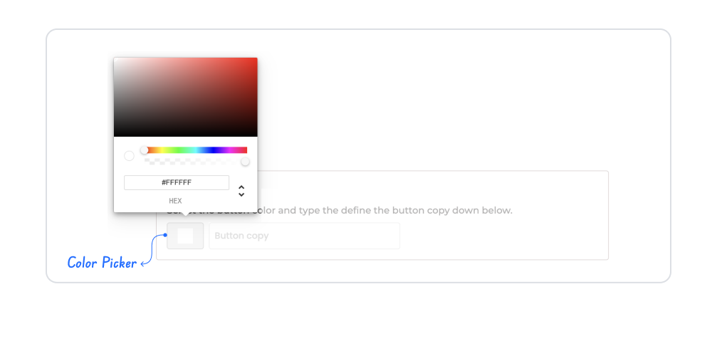
Color Palette View: You can make selections from the color spectrum or palette.
Manual Color Input: Users can manually enter color codes (e.g., #FF5733).
Hue and Opacity Selection: You can adjust hue and opacity settings.
Format Support: Supports various formats such as HEX, RGB, RGBA, and HSL.
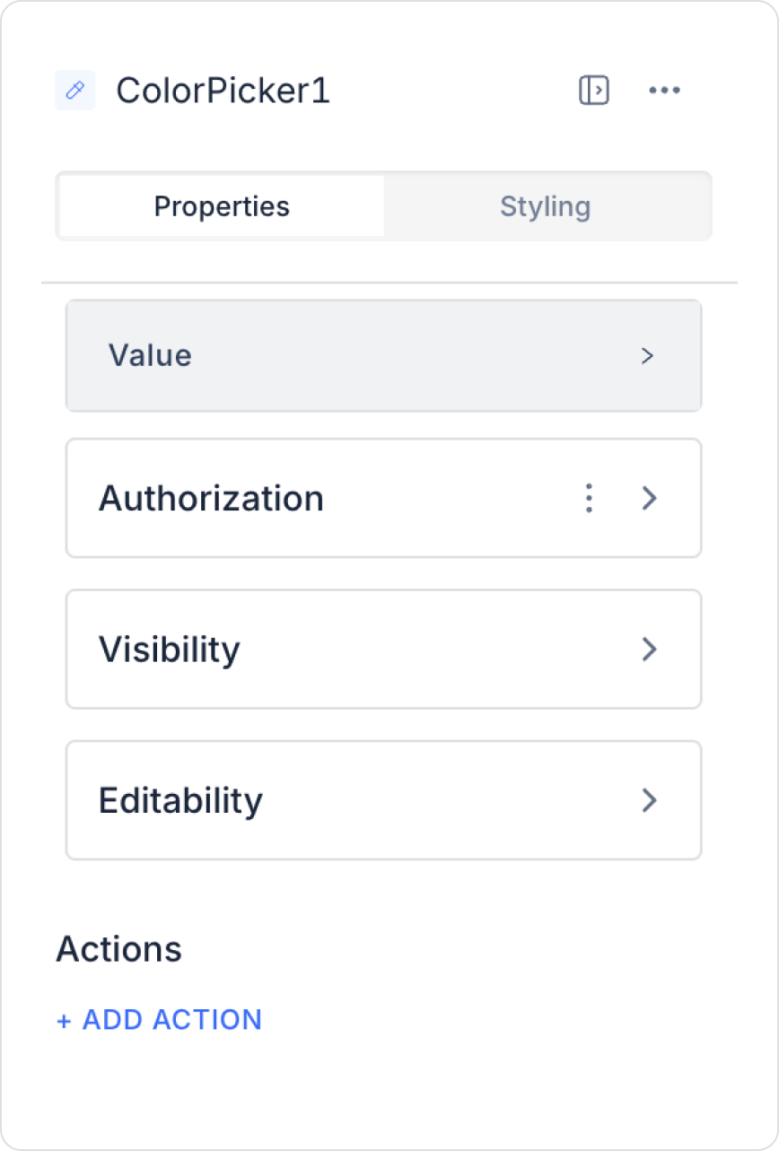
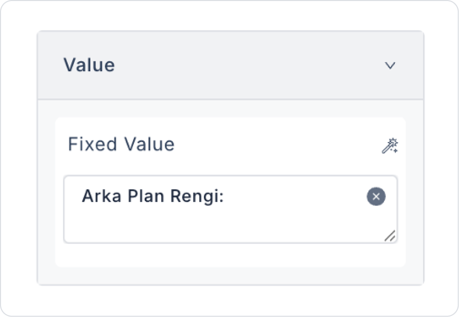
Value: You can add a static value or dynamically display the content of another element or the result of an action using the Symbol Picker.
2.2. Actions That Can Be Added to the Element
The Color Picker element supports triggering event-based actions based on the color selected by the user. Actions are not tied to the element itself but to the event triggered when the color selection changes.
Actions for the Color Picker element can be defined via the following event through the Properties > Add Action section.
Supported Action Triggers
onChange: Triggered every time the user changes the selected color via the Color Picker.
Use cases:
Update theme or interface colors in real-time
Change visual elements (buttons, cards, graphics, etc.) based on the selected color
Trigger color-based filtering or tagging operations
To save color information via the API or workflow
Example scenario: When the user changes the theme color, the application’s button and header colors are updated instantly.
Basic Rules Regarding Actions
The Color Picker element can trigger actions only via the onChange event.
The onChange event runs every time the color selection changes.
Multiple actions can be defined for the same onChange event.
The Color Picker element offers a powerful and intuitive user experience, especially when used with actions in theme management and visual customization scenarios.
3. How to Use the Color Picker Element?
In this section, we will cover the end-to-end usage of the Color Picker element using an example scenario.
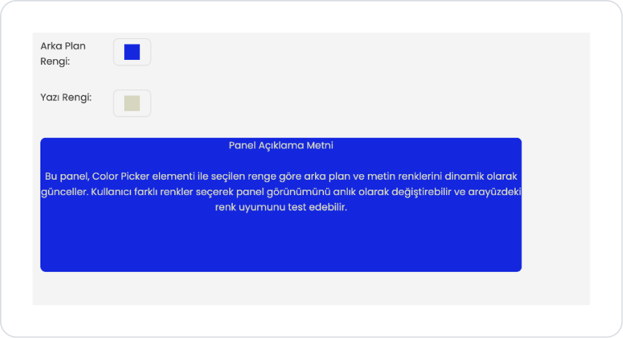
Scenario: Dynamically Updating Panel Colors
The user uses the Color Picker element to customize the appearance of the panel displayed on the interface. The color selected via the Color Picker dynamically updates the panel’s background color and the color of the text within the panel. This allows the user to see the effect of the selected color on the interface in real time.
In the scenario:
At the top of the screen, there are two Color Picker elements labeled Background Color and Text Color. When the user selects a color from the Background Color field, the background color of the Panel element on the page is updated according to the selected value.
Similarly, when the user selects a color from the Text Color field, the colors of the title and description text within the panel are also dynamically changed according to the selected value. This allows the user to easily customize the interface appearance by setting the panel’s background and text colors separately.
A title and description text are included within the panel to display sample content to the user.
Step 1 - Adding the Color Picker Element and Defining the Action
Start on the homepage:
Drag and drop the Elements > Container > HorizontalStack element from the left sidebar onto the page.
Drag and drop the Elements > Display > Label element into the HorizontalStack.
Update the text to Label > Properties > Value > “Background Color:”.
Drag and drop the Elements > Select Input > ColorPicker element into the Horizontal Stack next to the Label.
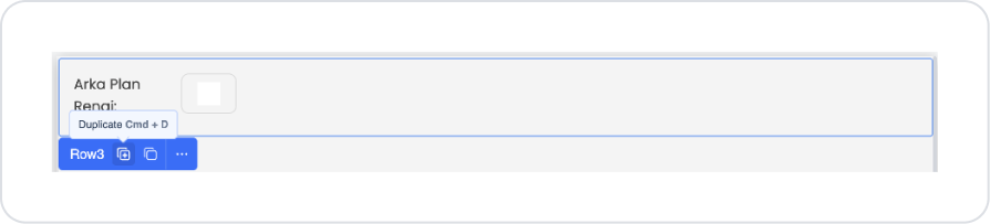
Select the outermost Row element and click the Duplicate option.
Update the Label > Value field on the duplicate to Text Color:
Drag and drop the Elements > Container > Panel element onto the page.
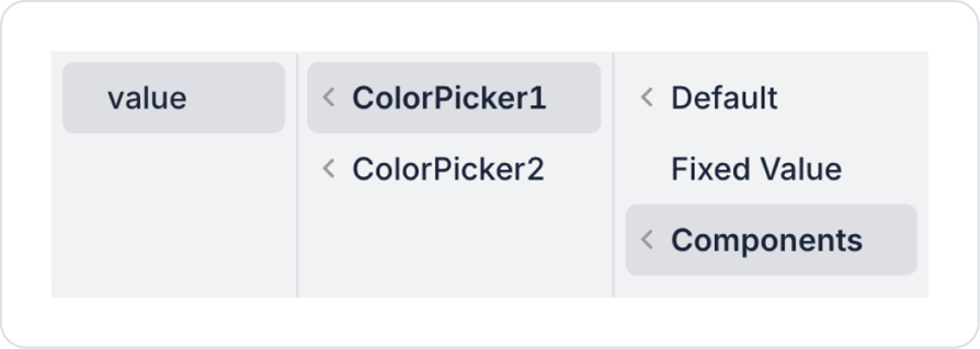
To dynamically change the background color, configure the Panel > Properties > DynamicBackgroundColor > Components > ColorPicker1 > value setting.
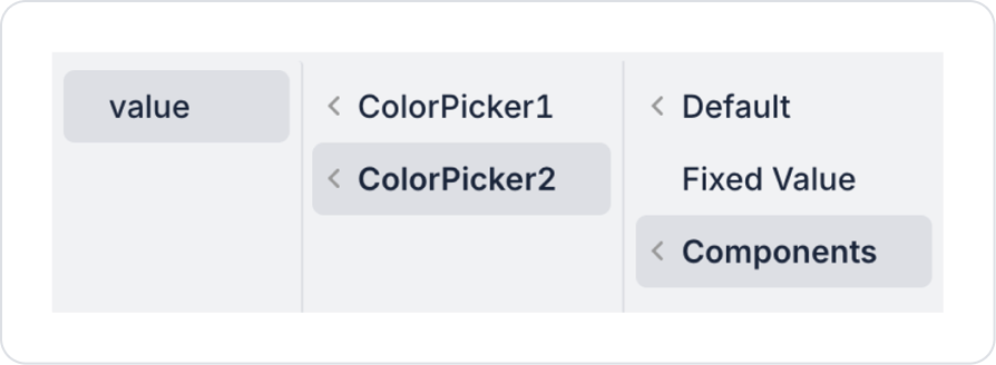
To dynamically change the text color, configure the Panel > Properties > DynamicFontColor > Components > ColorPicker2 > value setting.
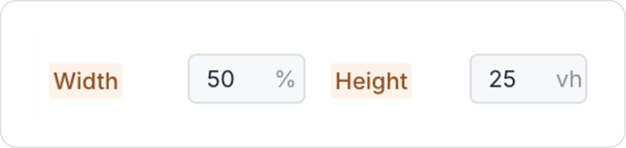
Set the Panel element’s dimensions to Styling > Layout > Style > Width > 50% and Height > 25 vh.
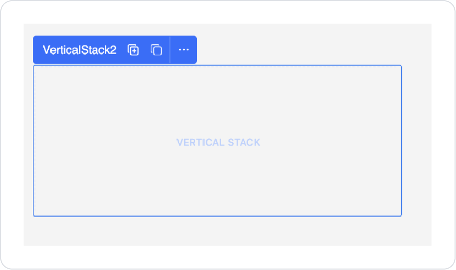
Drag and drop the Elements > Container > VerticalStack element into the Panel.
Align it to the center in the VerticalStack > Styling > Layout > Align section.
Drag and drop two Elements > Display > Label elements into the Vertical Stack.
Center-align the Label elements in the Styling > Layout > Align section.
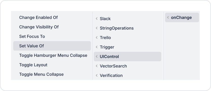
To update the background color when a color is selected in the Color Picker element, add the ColorPicker1 > Properties > onChange > Set Value Of action.
In Set Value Of, select Panel1 as the component to be updated and Components > ColorPicker1 > value as the value.
To update the text color when a color is selected in the Color Picker element, add the ColorPicker2 > Properties > onChange > Set Value Of action.
In Set Value Of, select Panel1 as the component to be updated and Components > ColorPicker2 > value as the value.
Preview:
In this example, Color Picker elements are used to customize the appearance of the panel in the user interface. Using the Background Color and Text Color selection fields at the top of the screen, the user can separately specify the panel’s background color and the color of the text within the panel.
When the user selects a color, the panel’s background and the title and description text within the panel are updated instantly based on the selected values. This allows the user to easily personalize the panel’s appearance by experimenting with different color combinations.
4. Common Properties
Some fields on the Color Picker element are shared across all UI elements. Therefore, detailed descriptions of the following properties can be found in the relevant general guide pages:
Visually highlight the selected color. A color preview or the immediate display of the selected color within the application enhances user awareness.
Use the onChange event with caution for performance reasons. Since it triggers every time the color changes, care must be taken when binding intensive visual updates to this event.
Choose the default color assignment thoughtfully. To avoid guiding the user, it is recommended that a default color not be pre-selected unless necessary.
6. Limitations
The Color Picker element is supported only in web applications.
Actions can be triggered only via the onChange event.


