Kuika's Countup element dynamically increases numerical values from a specific starting point to a target value in the user interface. It is particularly used to impressively present statistical information, success metrics, user numbers, sales figures, or metrics that need to be visually emphasized.
Countup increases the number over a specified period with a smooth animation. It provides a powerful visual effect to capture users' attention and emphasize the importance of the information.
The Countup element is only supported in web applications.
1.1. Common Use Cases
Dashboard metrics: Displaying instantaneously increasing values such as total users, total sales, or number of active orders.
Statistical presentations: A/B test results, success rates, report summaries.
Campaign performance screens: Number of views, number of clicks, conversion rates.
Event counters: Number of participants, total visits, in-app gains.
Integration with progress indicators: Countup's animated data increase enhances the impact of visualization.
Marketing pages: Eye-catching increase animations such as “1,000,000+ users”.
2. Key Features
Animated display of numerical increase from a specific starting value to a target value.
Helps the data to be perceived in a more understandable and impressive way by drawing the user's attention to the numerical change.
2.1 Countup Element Properties
Unlike many other UI elements, the Countup element does not offer a customizable Properties panel. Therefore, settings such as the starting value, ending value, and animation duration are managed manually within the code or through dynamic data binding. This structure keeps the element simple and performance-focused.
The basic features offered by Countup are as follows:
Animated Numerical Increase: Creates a visual increase animation from the start value you specify to the target value.
Dashboard Compatible Use: Can be used to highlight KPIs, statistics, performance values, or general metrics.
Easy Integration: Can be used by dynamically binding values to elements added to it, such as Label.
2.2. Actions That Can Be Added to the Countup Element
Since the Countup element only provides a visual numerical increase animation, it does not support actions triggered by any user interaction. Therefore, when you select the element, the ADD ACTION button is not visible, and no Countup-specific event can be added.
Important points regarding Countup's action structure:
There is no trigger based on user interaction. Countup does not generate click/focus events like a button, table, or form field.
The animation can be indirectly triggered by an external action. For example: A new value received after a query runs automatically refreshes the Countup animation. However, this triggering occurs not through Countup, but through the element to which the data is bound.
3. How to Use the Countup Element?
In this section, we will cover the end-to-end use of the Countup element through an example scenario.
Scenario: Visualization of Application Statistics
In an exam application, the goal is to present the exam duration in a more impressive way. In the scenario:
The Countup element starts working automatically as soon as it is placed on the screen.
The number starts at 0 and increases upwards with animation.
It is not linked to any data source or action.
It provides a purely visual effect.
Step 1 – Adding the Countup Element in the UI Design Module
Open the UI Design module.
Select the screen where the Countup animation will be displayed (e.g., Home Page / Dashboard).
Go to the Elements section in the left panel and drag and drop the Elements > Container > VerticalStack element onto the page.
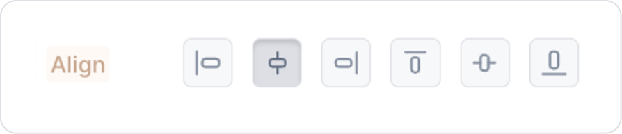
Set the Vertical Stack element to VerticalStack > Styling > Layout > Align > Center Horizontally.
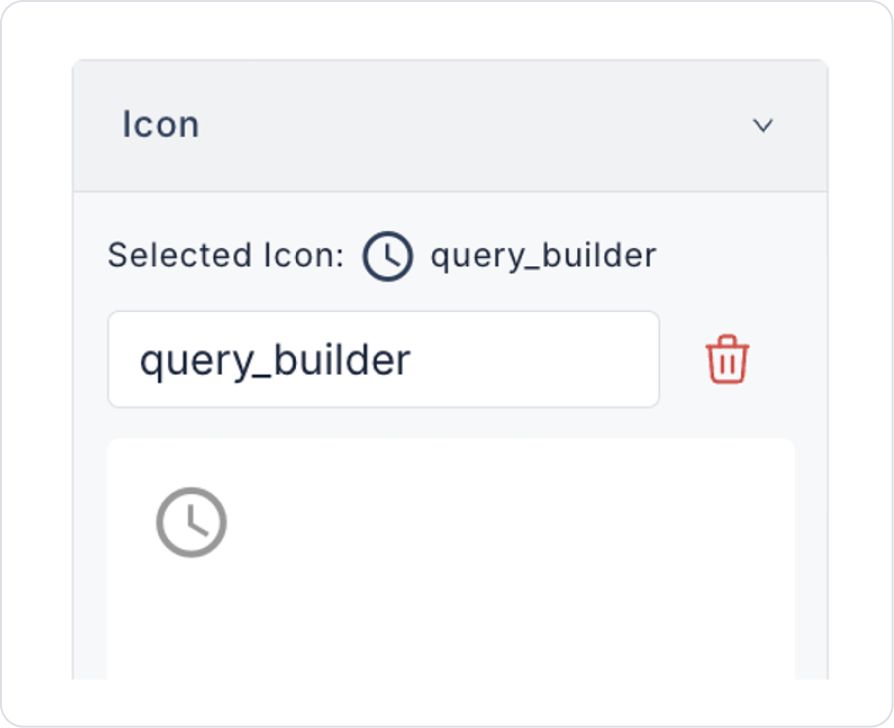
Drag and drop the Elements > Display > Icon element into the Vertical Stack.
Set the icon shape to Icon > Properties > Icon > “query_builder”.
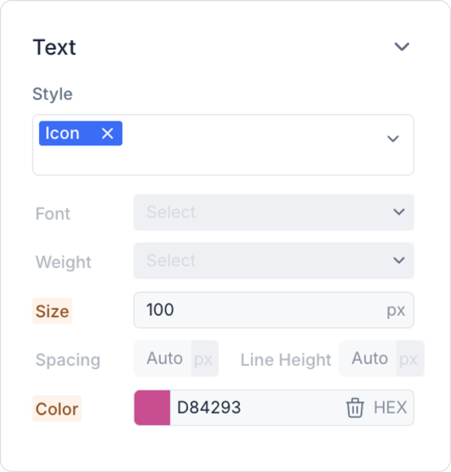
Set the icon size to Icon > Styling > Text > Size > 100 px.
Set the icon color to Icon > Styling > Text > Color > HEX > D84293.
Drag and drop the Elements > Display> Countup element into the Vertical Stack.
The Countup element starts working automatically as soon as it is added to the page.
Step 2 – Countup Usage Behavior
By default, the Countup element displays an increased animation starting from 0.
The animation is automatically triggered when the page loads.
There is no need to define any pageInit Action, SQL Action, or C# Action.
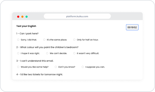
Preview
When the application is tested, the Countup element animation automatically starts when the user enters the exam screen. The value increases with the 0 to increment animation and provides the user with a dynamic visualization.
4. Common Properties
Some fields on the Countup element are common to all UI elements. Therefore, detailed descriptions of the following properties can be found in the relevant general guide pages:
Use Countup for KPIs or metrics you want to highlight. For example: it can be used for quick-read information such as total visitors, number of sales, success rate, number of completed tasks.
6. Limitations
The Countup element does not support actions. The ADD ACTION button is invisible, and Countup does not have any OnClick/OnChange triggers.
Designed for the web environment. The Countup element is only supported in web applications; it does not work in mobile applications.


