The Horizontal Stack element is a layout-focused UI element used to align multiple components horizontally in the user interface. It is particularly useful for placing form fields side by side, grouping small information boxes, or providing the user with a more compact view.
The element makes the page layout more consistent and readable by controlling the order, spacing, alignment, and width behavior of the components within it.
This structure allows designers and developers to easily create many interface layouts, such as grids, card-based horizontal content, and icon + text combinations.
The Horizontal Stack element is supported in both web and mobile applications.
1.1. Common Use Cases
Placing form fields side by side. For example: “First Name – Last Name,” “Start Date – End Date,” “City – District.”
Arrange short info boxes horizontally. For example: Displaying small data such as “Age,” “Gender,” “Department” in a single row.
Create icon + text combinations. For example: Displaying a number next to a notification icon or designing icon buttons.
Place short button groups side by side. (Pairs of action buttons such as Save – Cancel, Filter – Clear)
Create horizontal information sections on summary view cards.
2. Key Features
Horizontal alignment support. Aligns all UI elements added to it side by side in a single line.
Spacing management. Horizontal spacing between elements can be easily adjusted, making the layout more readable.
Alignment control. Content can be aligned left, center, or right; vertical alignment (top, center, bottom) is also supported.
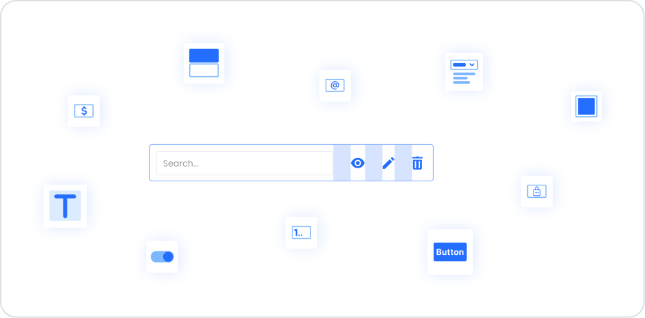
Functions as a container layout element. Horizontal Stack acts as a container. All UI elements such as Text, Input, Button, Icon, and Image can be added to it.
Design simplicity and layout consistency. It provides a reusable structure without disrupting the layout for groups of data or elements that need to be displayed side by side.
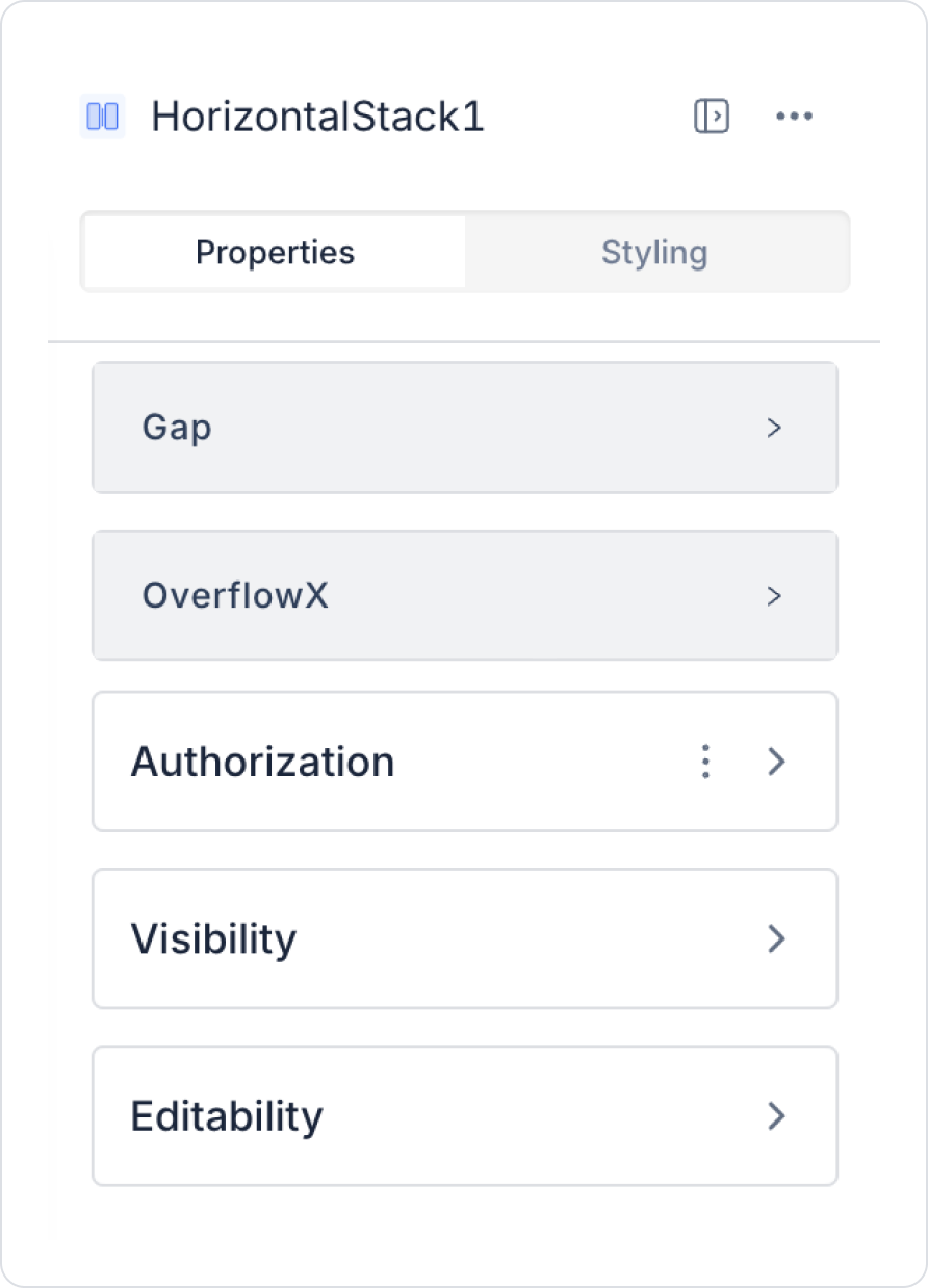
2.1. Element Properties
When you select the Horizontal Stack element, you can configure settings that control horizontal layout and content behavior via the Properties panel on the right.
All settings are explained below:
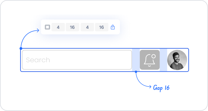
Gap (Spacing Setting)
Gap: Determines the horizontal spacing between elements within the Horizontal Stack.
Default spacing value: 12 px
It can be increased or decreased to create a tighter or wider layout. This setting directly affects readability, especially in designs where form fields or short information boxes are arranged side by side.
OverflowX (Horizontal Overflow Behavior)
When there is too much content in a horizontal layout, the Stack content may overflow. The OverflowX setting determines how overflowing content is displayed.
Hidden: Content overflowing on the horizontal axis is hidden. This setting prevents unnecessary overflow to ensure a clean look; however, content is truncated.
Auto: If content overflows, a horizontal scroll bar is automatically displayed. It is used in situations where long lists of elements need to be viewed by scrolling in a single line. For example, it can be used for multiple buttons, quick filter options, or icon lists.
2.2 Actions That Can Be Added to Elements
Since the Horizontal Stack element is a layout component, it does not support assigning actions to itself. Therefore, when the element is selected, the ADD ACTION button is not visible, and a trigger cannot be added directly to the Horizontal Stack.
Key points regarding action behavior:
Actions cannot be added to the Horizontal Stack.
Functionality is provided by actions added to the UI elements (Button, Icon, Text, etc.) placed inside the Stack.
The Stack only acts as a container; user interaction is managed by child elements.
The Horizontal Stack itself does not trigger any actions; functionality depends entirely on the elements added to it.
3. How to Use the Horizontal Stack Element
In this section, we will cover the end-to-end use of the Horizontal Stack element through example scenarios.
Scenario: Creating a Profile Information Card
In a social media or corporate application, users' profile information is usually presented in an organized and readable structure. Horizontal Stack provides an ideal structure for aligning multiple components on the same line. In this scenario, a Profile Card is created that displays the user's profile photo and basic information side by side.
Scenario:
On a user profile screen, the profile photo is to be displayed on the left, and the first name, last name, and title information on the right.
Horizontal Stack allows these components to be placed on a single line with a neat appearance.
Step 1 - Creating the Data Source
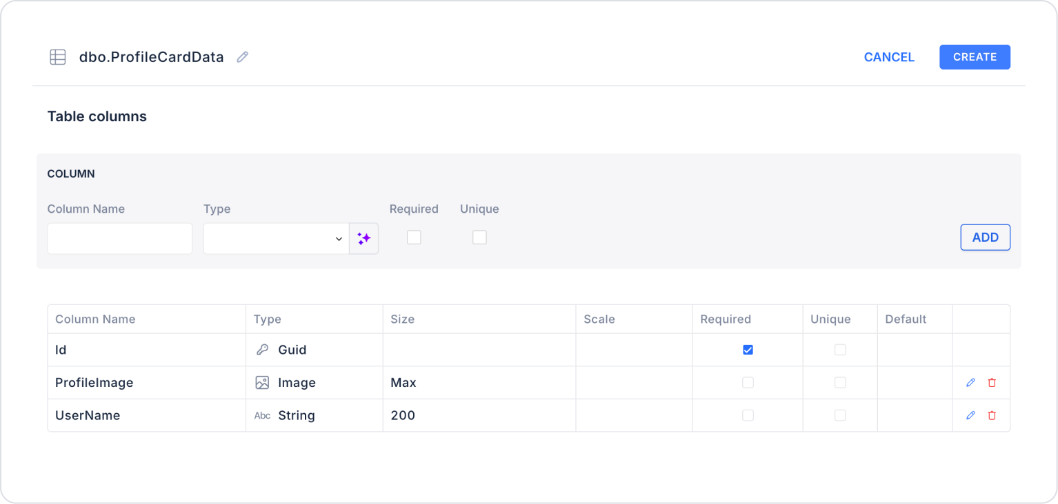
Creating a table in the DataSources module:
Go to the Datasources module.
Then go to the Tables tab.
Create a new table named “ProfileCardData”.
The table structure to be set up is as follows:
Important Field names:
ProfileImage: Holds the user's profile image in Image type.
UserName: Holds the registered user's username information.
Step 2 - Defining the Necessary Actions
To display and add data in the interface:
You need to define two actions.
Add a new action from the Actions > New SQL Action tab in the Datasources module.
Action that Adds Sample Data (InsertProfileCardData): To test the application with sample data, add the following SQL action and press the TEST button.
The profile photo has been added to the database in base64 format.
When applying, delete the ProfileCardData section, rewrite ProfileCardData, and press enter. This will add the correct schema name before the table name.
Action that Provides and Filters Data (GetProfileCardData):
SELECT TOP 1 * FROM ProfileCardData;
Since a demo user is used in the example scenario, a structure linked to the logged-in user or user ID has not been used. If you wish, we can adapt the scenario to real user information.
When applying, delete the ProfileCardData section, rewrite ProfileCardData, and press Enter. This will add the correct schema name before the table name.
Step 3 - Adding Elements and Editing Styles
Initially on the home page:
Open the UI Design module.
From the left side panel, drag and drop the Elements > Container > Row element onto the page.
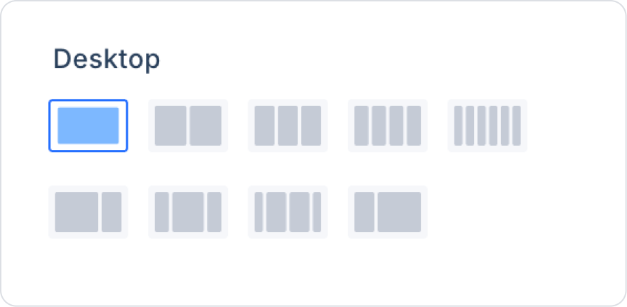
Within Row, set the Row > Properties > Desktop field as a column.
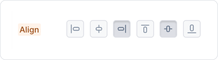
Click on the Col field inside the Row and align the column to the right and center it vertically from the Col > Styling > Layout > Align field.
From the left side panel, drag and drop the Elements > Container > Panel element into the Col.
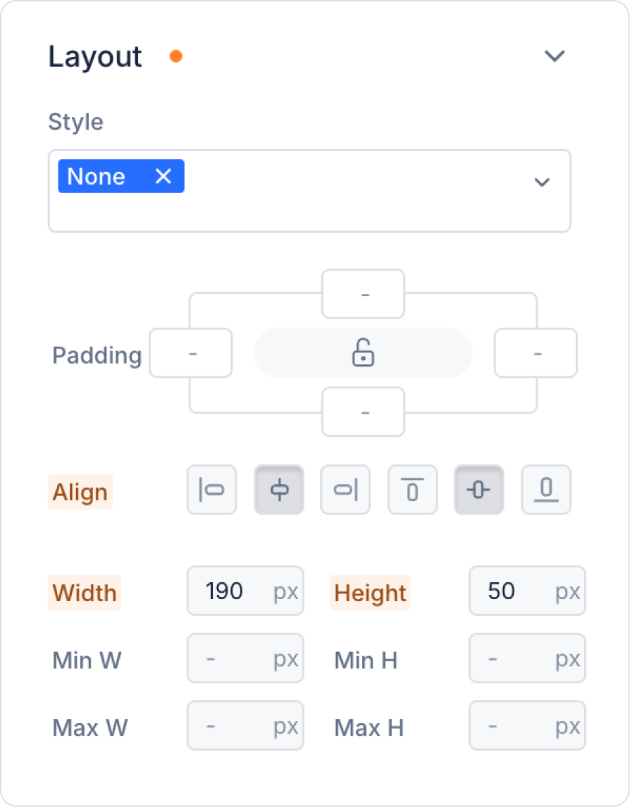
In the Panel element, make the following definitions in the Panel > Styling > Layout field.
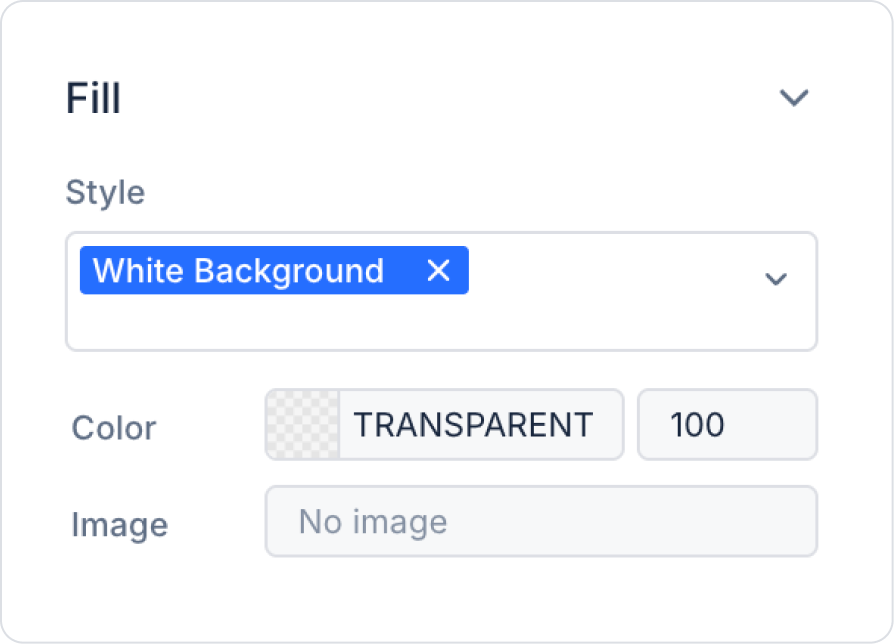
Select the background color as Panel > Styling > Fill > White Background.
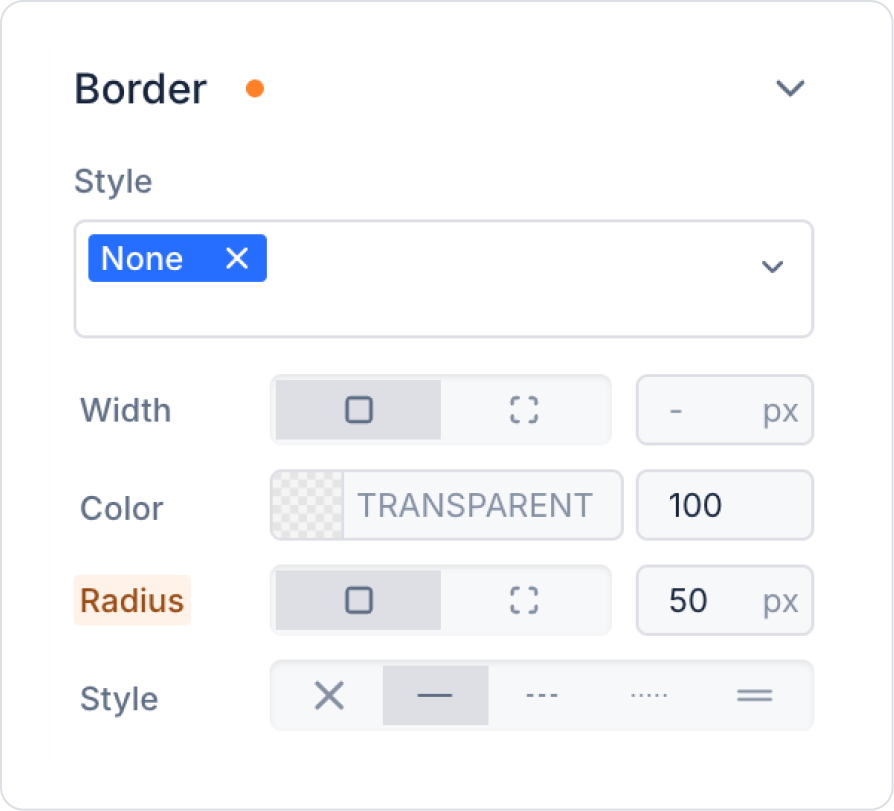
Set the borders to 50 px in the Panel > Styling > Border > Radius field.
Add the Elements > Container > HorizontalStack element to the Panel element.
Center the Horizontal Stack vertically in the HorizontalStack > Styling > Layout > Align field.
Horizontal alignment cannot be performed within the Horizontal Stack.
Add the Elements > Display > Image element to the Horizontal Stack.
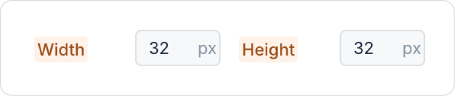
Within the Image, set the Image > Styling > Layout > Width and Height fields to 32 px.
Add the Elements > Display > Label element next to the Image.
In the Label element, set the 100 px value in Label > Styling > Layout > Width to 0 px.
Add the Elements > Display > Icon element next to the Label.
Step 4 - Defining the User Retrieval Action
Define the Add Action > Initial Action > Custom > Managed DB > GetProfileCardData action on the page.
Step 5 - Configuring Element Settings
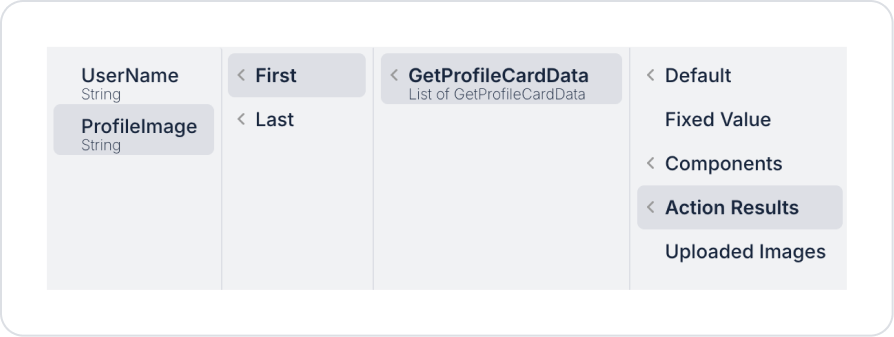
In the Image element, we define the profile picture from the Image > Properties > Value > Action Results > GetProfileCardData > First > ProfileImage field.
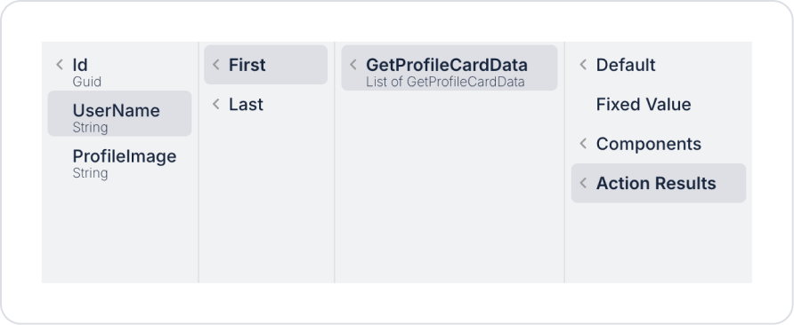
In the Label element, we define the user name from the Label > Properties > Value > GetProfileCardData > First > UserName field.
Preview:
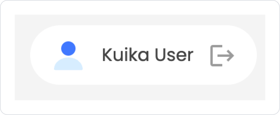
When the application is tested, it is seen that the elements placed side by side using Horizontal Stack correctly create the user profile card demo.
4. Common Properties
Some fields on the Horizontal Stack element are used in common across all UI elements. Therefore, detailed explanations of the following properties are provided in the relevant general guide pages:
Align elements at regular intervals. Do not compromise the integrity of the design by setting the Gap value too low or too high.
Optimize for mobile and web. If there are too many elements, overflow may occur on mobile; OverflowX → auto may be preferred.
Prefer Horizontal Stack for areas that need to be displayed side by side. It provides an ideal layout, especially for form fields or small information boxes.
Manage padding and margins with Container when necessary. Horizontal Stack only affects the horizontal layout; using Container is recommended for surrounding margins.
6. Limitations
Actions cannot be added independently. Horizontal Stack only provides layout; it does not include interaction.
Excessively long content may disrupt the Stack layout. If the OverflowX setting is not configured correctly, content may be cut off or lost.
It only provides horizontal layout; Vertical Stack should be used for vertical layout.


