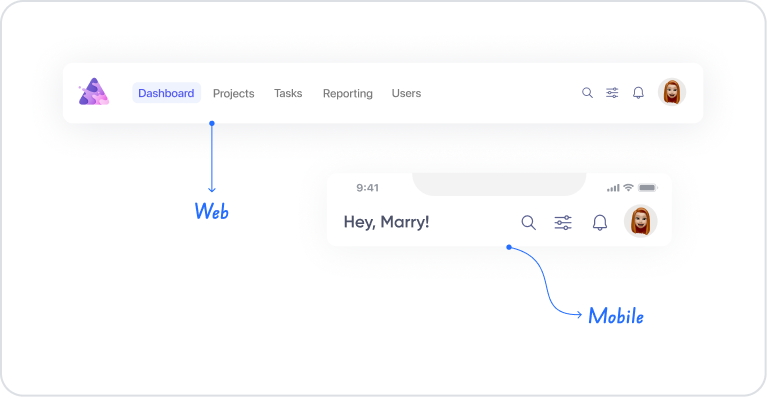
The header element is a structural interface element located at the top of an application screen that presents the user with the purpose of the page, its title, and important action points. Important elements such as the logo, title, menu buttons, search field, notification icons, or user-specific quick access buttons are usually placed in this area. Thanks to its vertical hierarchy, users can easily identify the page they are on and quickly access the top-level navigation options they need.
The header also ensures the overall consistency of the application's appearance; brand identity, color scheme, and typography elements can be strongly emphasized in this area. It works responsively on mobile and web screens and adapts to different device sizes.
The header element is supported in both web and mobile applications.
1.1. Common Use Cases
Display the page title. Allows the user to quickly identify the screen they are on (e.g., “Dashboard,” “Profile,” “Orders”).
To highlight the logo or brand identity. The company logo or project name of the application can be placed within the Header.
To provide top-level navigation. It is ideal for navigation elements such as menu icons, hamburger menu, back button, and home button.
To provide quick access to user actions. Access points such as notifications, profile menu, settings, and help can be placed on the Header.
Add a search bar. Especially in content-heavy applications, using the search field in the header saves space.
Place action buttons. Actions such as “Save,” “Add,” “Filter,” and “Edit” can be triggered directly from the header.
Create a fixed top menu in mobile applications. Suitable for back buttons and quick action buttons (Add, Search, QR Scan, etc.).
Provide hierarchy and order across the page. Provides a clean and consistent visual structure that lets the user know where they are.
2. Key Features
Fixed positioning at the top of the page. The header is positioned at the top of the screen and can maintain its structure even if the user scrolls the page. This enables quick navigation, especially in mobile applications.
Flexible content area. The header can contain a logo, title, button, icon, search bar, text, or custom UI elements.
Creating a regular hierarchy. The header clarifies the page architecture and improves the user experience by separating the screen title from other content.
Fully customizable appearance. All visual settings, such as background color, text color, typography, height, alignment, and spacing management, can be flexibly adjusted.
Functional use with action buttons. Actions added to the buttons within the header provide the user with quick processing capabilities (e.g., “New,” “Save,” “Back”).
Responsive structure support. Automatically adapts to both web and mobile screen sizes.
Provides ease of navigation. Menu icons, back buttons, or general application navigation buttons can be easily positioned within the header.
2.1. Element Properties
Since the Header element functions as a layout component, it does not have its own Properties panel. The Header is an upper section area shaped by other UI elements added to it.
Therefore:
The Header itself does not have any modifiable properties.
Visual settings such as background color, text color, alignment, or spacing (padding/margin) are controlled through the Text, Icon, or Button elements added to the Header.
The general structure of the Header is created by the layout, order, alignment, and properties of the elements added to it.
The Header acts like a container, and all styles/formatting are managed through its child elements.
The Header does not have independent Properties settings; all configurations are made through the UI elements placed inside it.
2.2 Actions That Can Be Added to Elements
Since the Header element is a layout component, it does not support adding actions (ADD ACTION) directly to itself.
The action panel is not displayed when the Header is selected, and a trigger cannot be assigned directly to the Header.
Therefore:
No action can be assigned to the Header itself.
Actions are added to elements such as Button, Icon, Text added to the Header to manage user interactions.
All behaviors such as navigation, registration processes, and opening modals are triggered through elements within the Header.
The Header only functions as a container top section; functionality is provided through child elements.
Actions cannot be added to the Header; all functional behaviors are managed by the actions of the elements placed within the Header.
3. How to Use the Header Element?
In this section, we will cover the end-to-end use of the Header element through example scenarios.
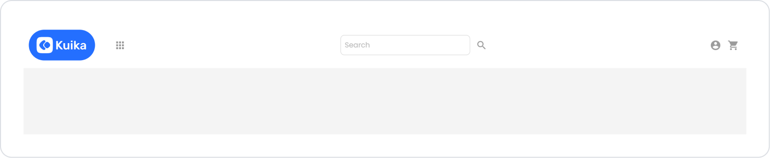
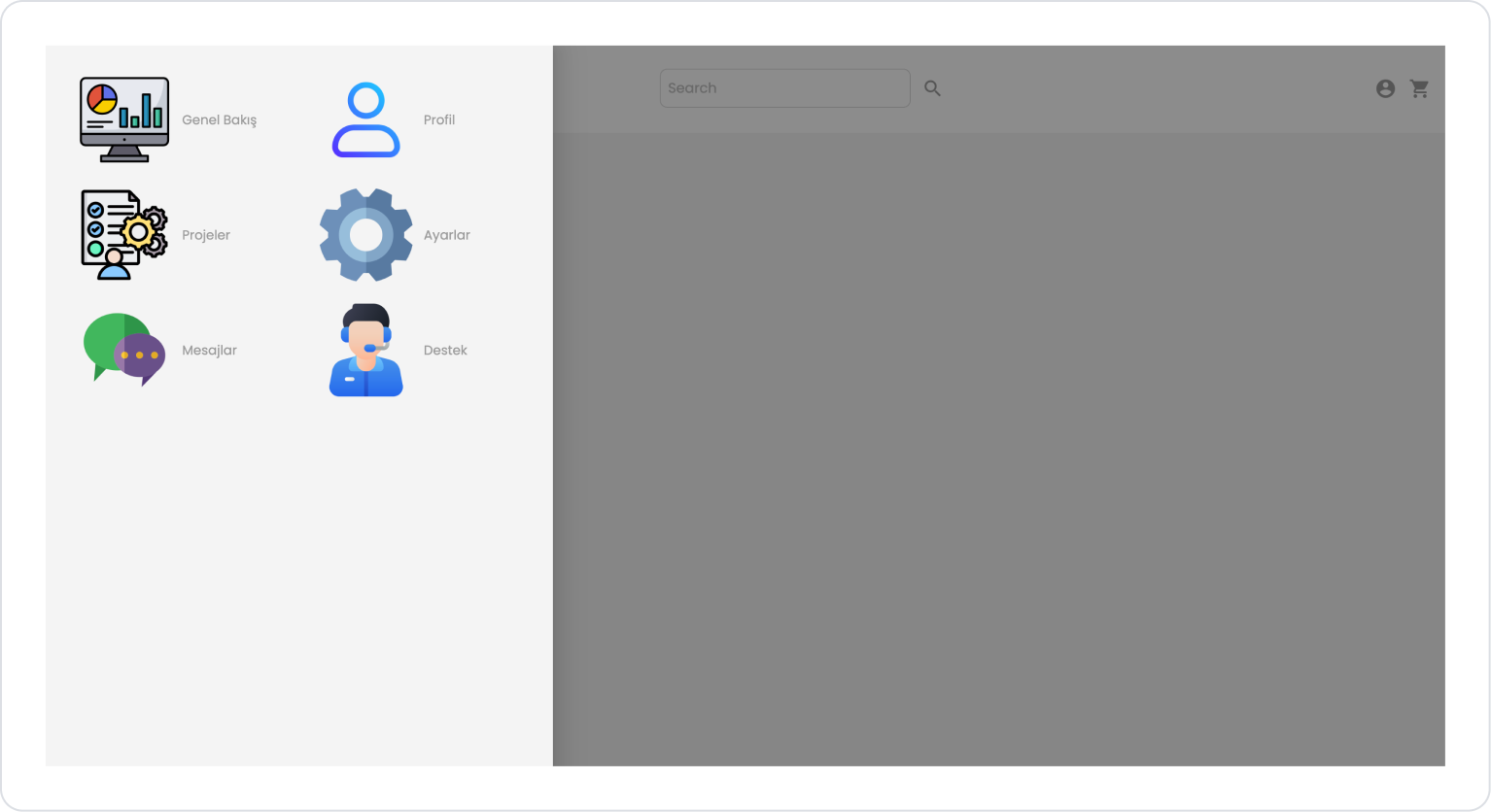
Scenario: Header Navigation Area
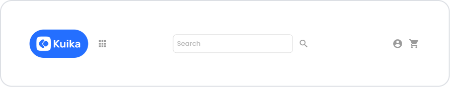
In an application, users utilize the Header area located in the top menu while navigating within the platform. The Header element provides a structure that enables quick access to the application's primary navigation elements.
In the scenario:
The user can return to the home page via the logo on the left.
The grid (menu) icon provides quick access to pages or modules within the application.
The search field in the middle section can be used to filter or search for content.
The user account screen can be accessed via the profile icon on the right.
The shopping cart icon can be used to navigate to the purchase or payment processes.
Step 1 - Adding Elements and Editing Styles
Initially on the home page:
Open the UI Design module.
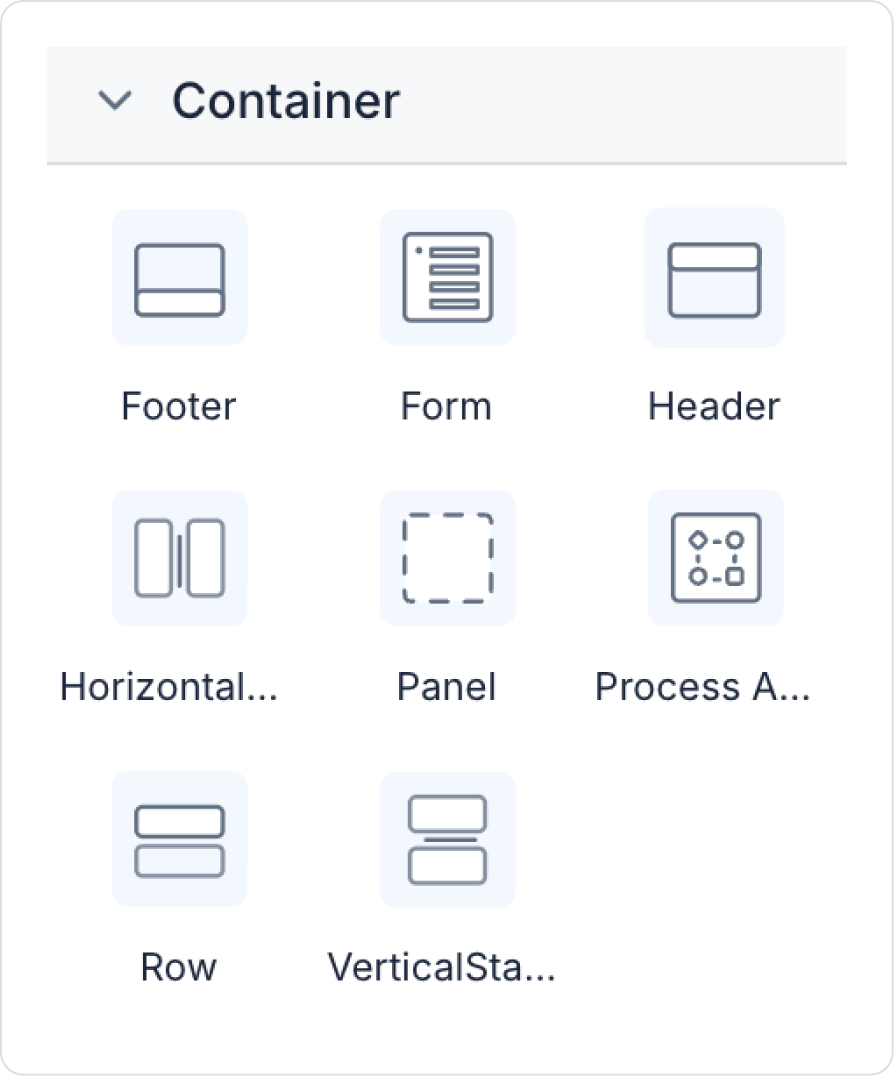
From the left side panel, drag and drop the Elements > Container > Header element onto the page. It will be added automatically when clicked.
Drag and drop the Elements > Container > Row element into the header.
In the Row, select 3 columns in the Row > Properties > Desktop area.
In the Row > Properties > Customize area, adjust the column sizes by dragging the double line to the right as shown below.
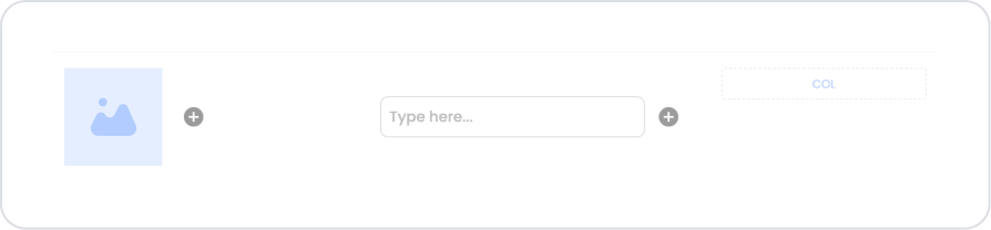
Drag and drop the Elements > Container > HorizontalStack element into the first column.
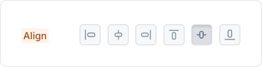
Center the Horizontal Stack vertically in Styling > Layout > Align.
Note: Horizontal Stack does not allow you to center horizontally.
Add the Elements > Display > Image element to the Horizontal Stack.
Add the Elements > Display > Icon element next to the Image.
Center the middle column vertically and horizontally in the Col >Styling > Layout > Align area.
Add the Elements > Container > Horizontal Stack element to the middle column.
Center the Horizontal Stack vertically using Styling > Layout > Align.
Add the Elements > Text Input > TextInput element to the Horizontal Stack.
Set the Text Input element size to TextInput > Styling > Layout > Width > 270.
Center the third column vertically and align it to the right horizontally using the Col >Styling > Layout > Align field.
Add the Elements > Container > Horizontal Stack element to the column and center it vertically using Styling > Layout > Align.
Drag and drop two Elements > Display > Icon elements into the Horizontal Stack.
Step 2 - Configure the elements.
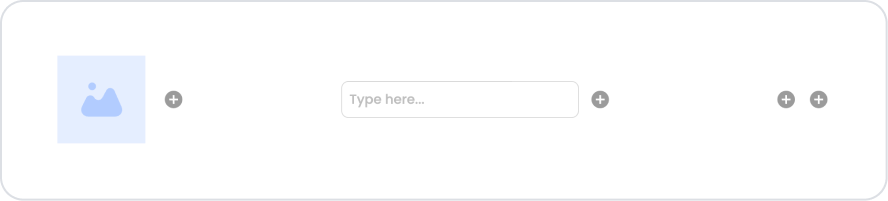
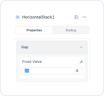
Set the Horizontal Stack > Properties > Gap value in the first column to 20.
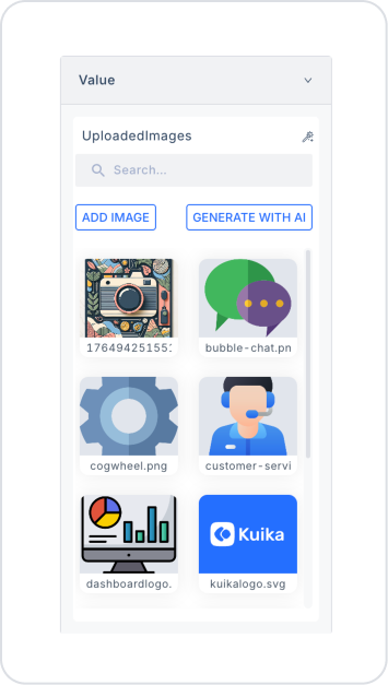
In the Image element, you can upload your desired logo from Image > Properties > Value > Uploaded Images > Add Image.
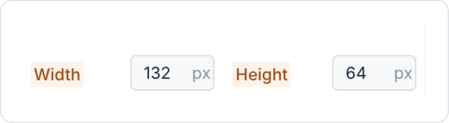
In the Image, set Image > Properties > ImageFit > Fill.
In the Image > Styling > Layout area, set Width 132, Height 64.
In the icon element in the first column, select the Icon > Properties > Icon > apps icon.
In the text input element in the middle column, define ‘Search’ in the TextInput > Properties > Placeholder field.
In the icon element in the second column, select the search icon in Icon > Properties > Icon.
In the icons in the third column, select the ‘account_circle’ and ‘shopping_cart’ icons in the Icon > Properties > Icon fields, respectively.
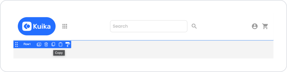
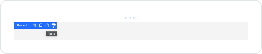
Your header design is now ready on the UI. To use this structure on other pages, click the ‘Copy’ button, which is the third option in the Row element, to transfer it to the page you want.
On the page you want to transfer it to, click on the Header area and click the third option, the ‘Paste’ button, to quickly duplicate the same design.
Step 3 - List Applications Action (Optional)
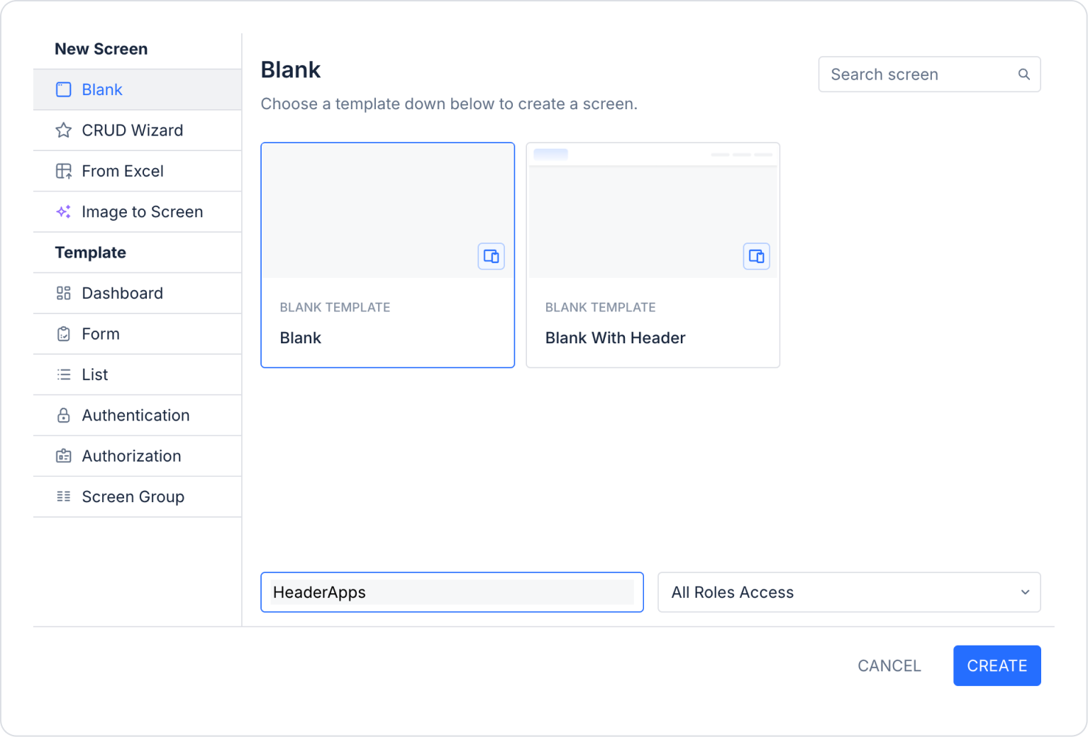
In the UI Design screen, go to the Screens area from the side panel and create a new page.
In the screen that opens, name the page ‘HeaderApps’.
Add the Elements > Container > Row element to the new page and select 2 windows from the Row > Properties > Desktop area.
Align the Row > Styling > Layout > Align areas to the right for the left column, to the left for the right column, and vertically for both columns.
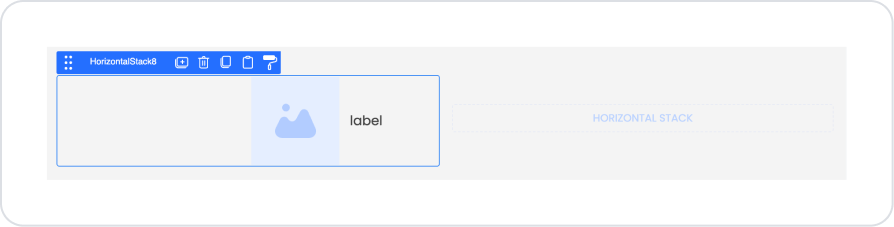
Add the Elements > Container > HorizontalStack element to the columns.
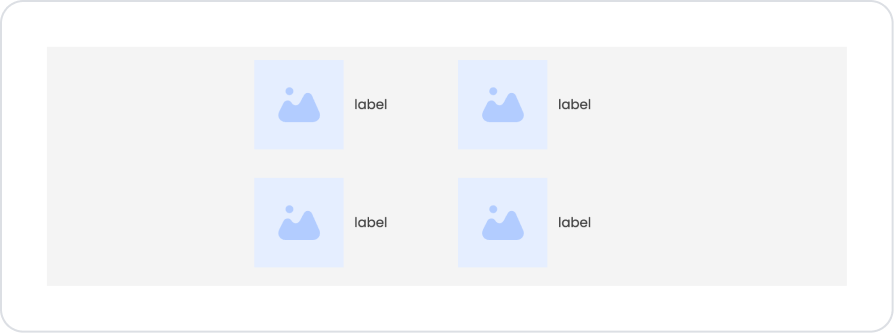
Drag and drop the Elements > Display > Image and Elements > Display > Label elements into the Horizontal Stack.
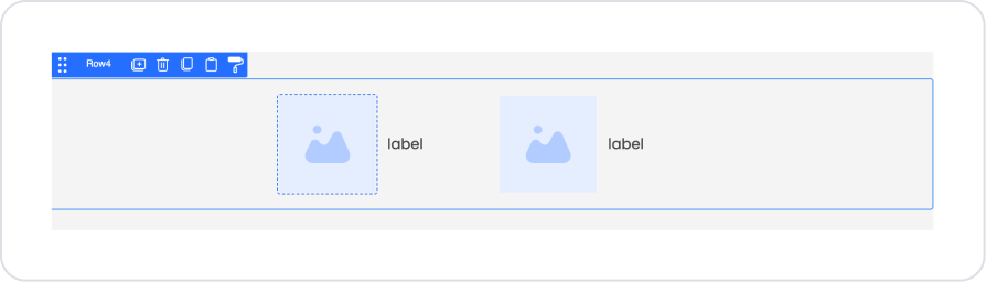
Similarly, drag and drop the Image and Label elements into the right column.
Select the Row area and click the ‘Duplicate’ button to easily create the same structure.
After duplicating, the page content should look like this:
You can upload the images you want to add to the Image element by following the path Image > Properties > Value > Uploaded Images and selecting the ‘Add Image’ option, as shown in Step 3.2.
You can define the application names within the Label as Overview, Projects, Profile, and Settings in Label > Properties > Value.
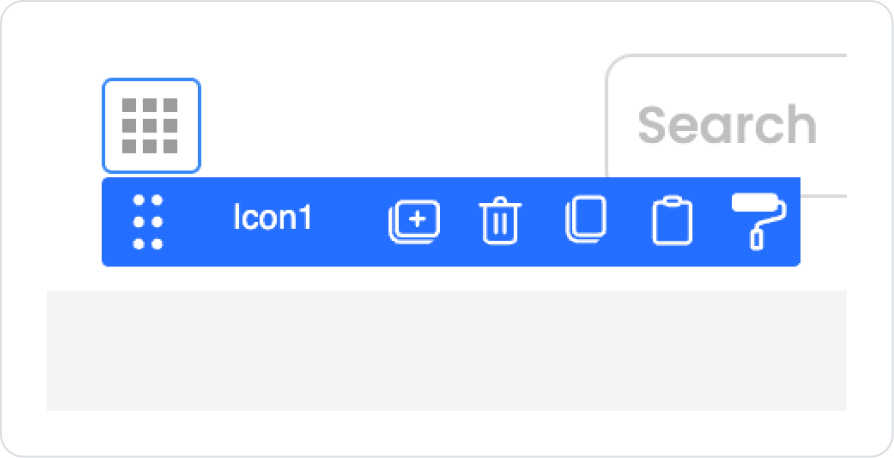
Return to the home page where the Header was created on the UI Design page and click on the Icon element.
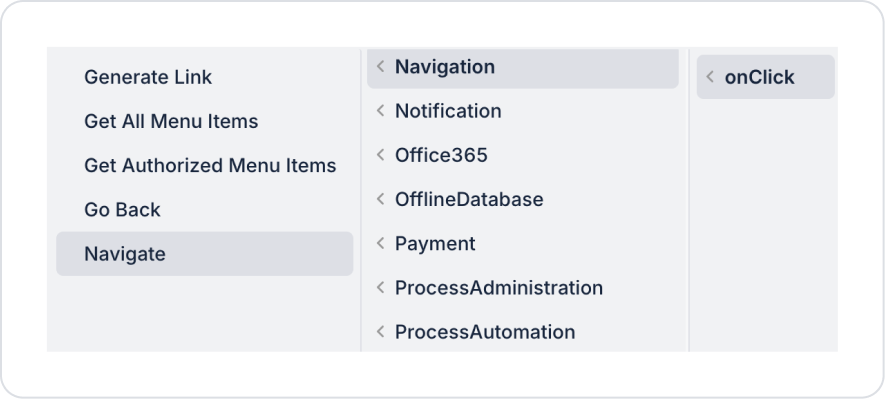
Define the navigation action within the Icon as Icon > Properties > Add Action > onClick > Navigation > Navigate.
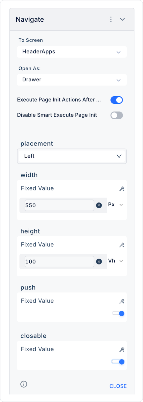
Finally, make the following definitions within the Navigate action.
Preview:
When the application is tested, searches can be performed via the Header element and redirection to the relevant pages can be performed. In the current scenario, direct redirection is provided via the Header to the ‘Apps’ area next to the Kuika logo.
4. Common Properties
Some fields on the Header element are used commonly across all UI elements. Therefore, detailed explanations of the following properties are provided in the relevant general guide pages:
Keep the Header simple and meaningful. Too many buttons or unnecessary content can confuse the user.
Keep the Header height to a minimum on mobile devices. A Header that covers too much of the screen impairs the mobile user experience.
Consider using a combination of icons and short text. It is important that icons on navigation buttons are understandable.
Ensure consistency when aligning elements within the Header. Choose one of the left, center, or right alignment options and use the same approach throughout the application.
Place frequently used actions, such as the Back button, in the header. This speeds up the user flow.
6. Limitations
The header itself does not have a Properties panel. Visual or structural adjustments can only be made to elements added to the header.
Actions cannot be added to the header. All actions are triggered via buttons or icons within it.


