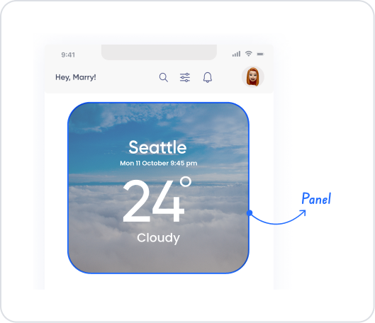
The panel element is a fundamental layout element used to organize, separate, and highlight content in a structured manner within the user interface. It creates a specific area on the page, allowing users to focus on particular blocks of information. The panel can be enhanced with visual adjustments such as background color, border, shadow, and padding, and can be used in many scenarios such as card structures, info boxes, form sections, summary areas, or list headers.
The Panel element is frequently used in page design to create more organized, professional, and readable interfaces. Functional components can be created by adding text, icons, buttons, input fields, tables, or other UI elements to it.
The Panel element is supported in web and mobile applications.
1.1. Common Usage Scenarios
Creating information cards. For example: user information, summary statistics, alert boxes, profile cards.
Dividing form fields into sections. Grouping specific fields within a panel to improve the user experience in large forms.
Creating specific blocks in the page layout. Can be used for regular blocks such as dashboard cards and list header fields.
Grouping content. Providing a more readable structure by gathering related information under a single panel.
Creating compact information areas in mobile interfaces.
Combine buttons, text, and icons. For example: action boxes, quick access panels.
2. Basic Features
Works as a container layout element. Text, icons, buttons, inputs, lists, tables, and all other UI elements can be placed inside a panel. It groups all this content together.
Visual style customizations The appearance of the Panel can be completely personalized with visual settings such as background color, border, border radius, shadow, and padding.
Making the content layout readable. The Panel divides the dense information on the page into sections, allowing users to focus on the relevant area.
Responsive design compatible with mobile and web. The Panel provides a consistent layout across all screen sizes and offers compact card structures on mobile devices.
Create information blocks with group logic. It provides a more organized hierarchy by gathering related information under a single Panel.
2.1 Element Properties
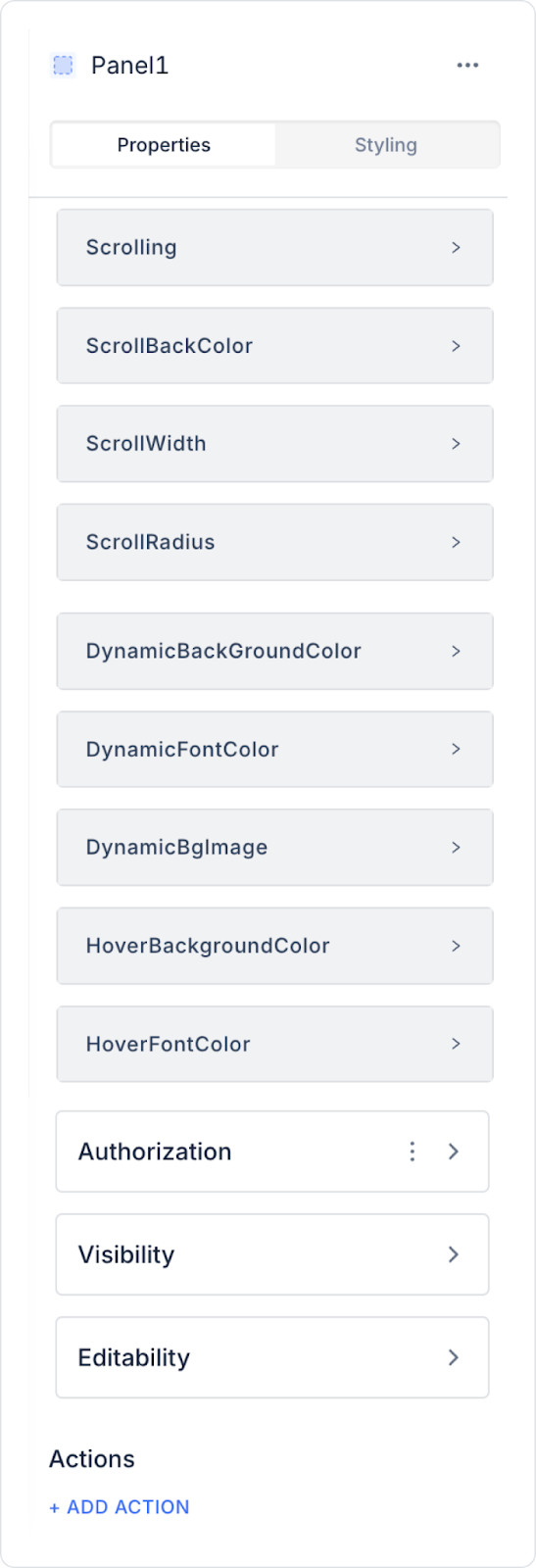
When you select the Panel element, you can configure the Panel's visual structure, behavior, and dynamic properties via the Properties panel on the right. All of the following properties are explained in detail:
Scrolling
Determines how the Panel behaves when its content overflows.
Hidden: Even if the Panel content overflows, the scroll bar is not displayed and the overflowing content is hidden. Provides a clean look, but very large content may be cut off.
Vertical: If the content overflows vertically, a vertical scroll bar is automatically displayed. Used for long text, lists, or form fields.
Horizontal: If the content overflows horizontally, a horizontal scroll bar is displayed. Suitable for wide horizontal elements or icon lists.
Auto: Scrollbars appear automatically when needed for both horizontal and vertical scrolling.
Scroll Back Color / Width / Radius
Used to customize the appearance of the scrollbar.
Scroll Back Color: Sets the scrollbar background color. Provides a visually consistent look with theme colors.
Scroll Back Width: Adjusts the thickness of the scrollbar. You can create thinner (minimal) or wider (accessibility-focused) scrollbar designs.
Scroll Back Radius: Determines the corner softening value of the scrollbar. A high radius value provides a rounder scrollbar design.
Dynamic Background Color
Enables the panel's background color to automatically change based on information from the data table.
For example: If Status = “Approved,” a green background can be displayed; if Status = “Pending,” a yellow background can be displayed.
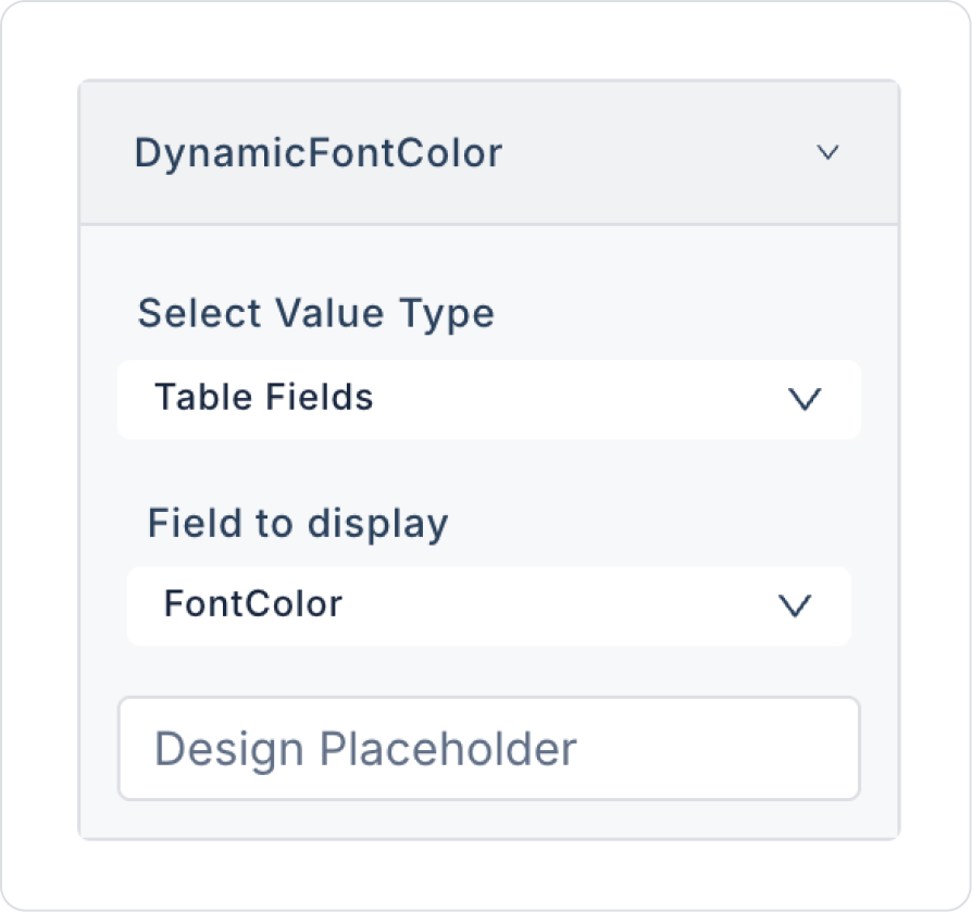
Dynamic Font Color
Dynamically sets the font color of text within the panel based on values from the database.
For example: Critical warnings can be displayed in red, informational messages in gray.
Dynamic Background Image
You can automatically add an image from the database to the panel's background.
It is often used for profile cards, product cards, or banner areas.
Hover Background Color
It allows the background color to change when the user hovers over the panel.
It improves the user experience for interactive card structures or list elements.
Hover Font Color
Changes the color of the text inside the panel when hovered over.
It increases readability, especially for option lists, action cards, or clickable areas.
2.2. Actions That Can Be Added to Elements
The panel element is not only an editing component but also a UI element that can trigger actions based on user interactions. When the panel is selected, the following trigger can be used via the ADD ACTION button on the right:
onClick
This action is triggered when the user clicks on the Panel. By making the Panel clickable, you can create interactive areas in both card structures and information blocks.
Frequently Used onClick Scenarios:
Redirecting to a detail page (e.g., if the panel is a user card → go to the “UserDetail” screen)
Opening a modal or pop-up (e.g., if the panel is a product card → open “ProductInfoModal”)
Running a data query or filter (e.g., if the panel is a category box → list relevant products)
Transitioning to a form filling screen (e.g., opening the form screen when clicking on an application card)
Loading dynamic content (e.g., if the panel is a report box → triggering an action that updates the graph)
3. How to Use the Panel Element?
In this section, we will cover the end-to-end use of the Panel element through example scenarios.
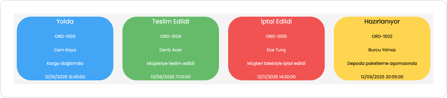
Scenario: Creating Wholesaler Distribution Status Cards
In a wholesaler or distribution management application, it is important to show the status of daily orders to the user quickly and in a visually understandable way. The Panel element creates a separate status card for each order, providing a visually rich display.
In this scenario, each order's status, code, customer name, description, and update time are displayed in a single Panel, with the Panel's background color dynamically changing according to the relevant order status.
In the scenario:
Panel cards with separate colors are created for order statuses such as “Pending,” “Preparing,” “On the Way,” “Delivered,” and “Canceled.”
Thanks to dynamic color fields, the user can easily distinguish the progress status of orders at a glance.
Step 1 - Creating the Data Source
Creating tables in the DataSources module:
Go to the Datasources module.
Then go to the Tables tab.
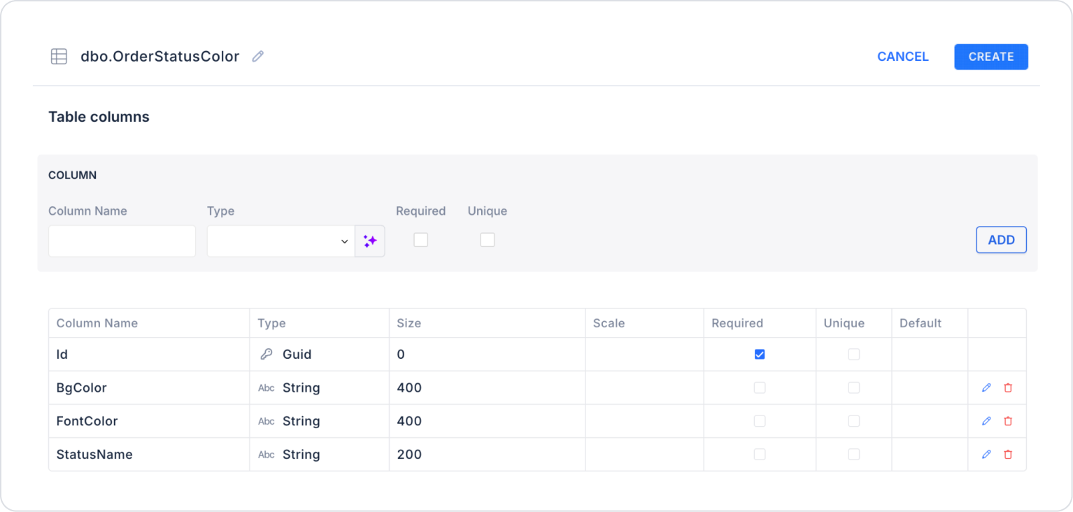
Create a new table named “OrderStatusColor”.
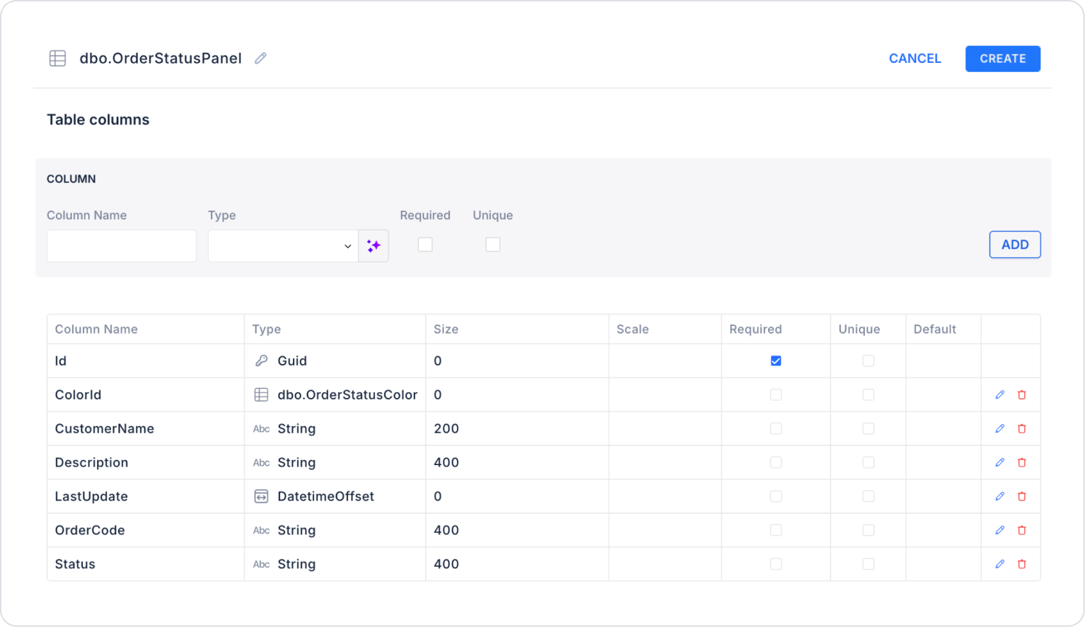
The table structure to be set up is as follows:
Important Field names:
StatusName: Represents the name of the order status. E.g.: Pending, Preparing, On the Way, Delivered, Cancelled.
BgColor: Defines the panel background color for the relevant order status. Stored in HEX format.
FontColor: Determines the color of the text on the panel.
Create another new table named “OrderStatusPanel”.
The table structure to be set up is as follows:
When adding the ColorId column, simply select OrderStatusColor in the Type field.
Important Field Names:
OrderCode: Holds the unique code information for the order. Ensures that the order number is displayed on the card.
CustomerName: Contains the first and last name of the customer placing the order.
Status: Indicates the current status of the order. E.g.: Pending, Being Prepared, On the Way, Delivered, Cancelled.
Description: Holds a short description or process information about the order status. Used as detailed text within the panel.
LastUpdate: The date and time the order status was last updated. Displayed at the bottom of the card.
ColorId: An ID linked to the color table (OrderStatusColor) that determines the background and text color to be used in the panel based on the order status.
Step 2 - Defining the Necessary Actions
To display and add data in the interface:
You need to define two actions.
Add a new action from the Actions > New SQL Action tab in the Datasources module.
Action that Adds Sample Data (InsertProfileCardData): To test the application with sample data, add the following SQL action and press the TEST button.
While applying, delete the OrderStatusColor and OrderStatusPanel sections, rewrite OrderStatusColor and OrderStatusPanel, and press enter. This will add the correct schema name before the table name.
Action Providing Data (GetOrderStatusPanel):
SELECT
p.Id,
p.OrderCode,
p.CustomerName,
p.Status,
p.Description,
p.LastUpdate,
c.BgColor,
c.FontColor
FROM OrderStatusPanel p
LEFT JOIN OrderStatusColor c
ON p.Status = c.StatusName;
When implementing, delete the OrderStatusColor and OrderStatusPanel parts, then type OrderStatusColor and OrderStatusPanel again and press Enter. This will add the correct schema name before the table name.
Step 3 - Adding Initial Action
Open the UI Design module.
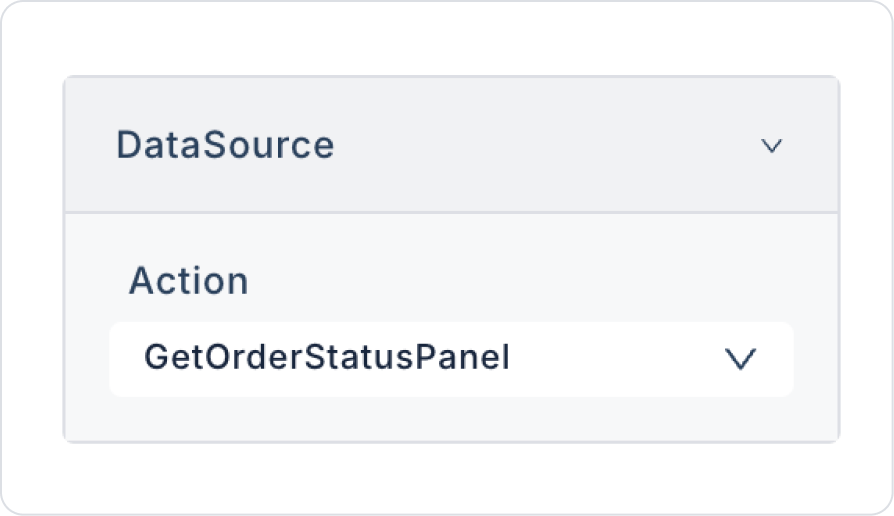
Add the Initial Actions > Custom > Managed Db > GetOrderStatusPanel action to the page using the ADD ACTION button.
Step 4 - Adding Elements and Editing Styles
Initially on the home page:
Open the UI Design module.
Drag and drop the Elements > Data > GalleryView element onto the page from the left side panel.
Drag and drop the Elements > Container > Row element into the Gallery View.
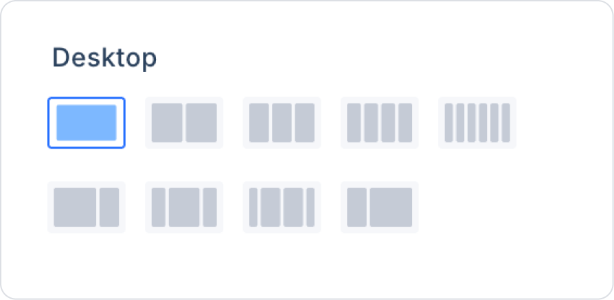
In the Row, set the Row > Properties > Desktop field as a column.
Add the Elements > Container > Panel element to the Row.
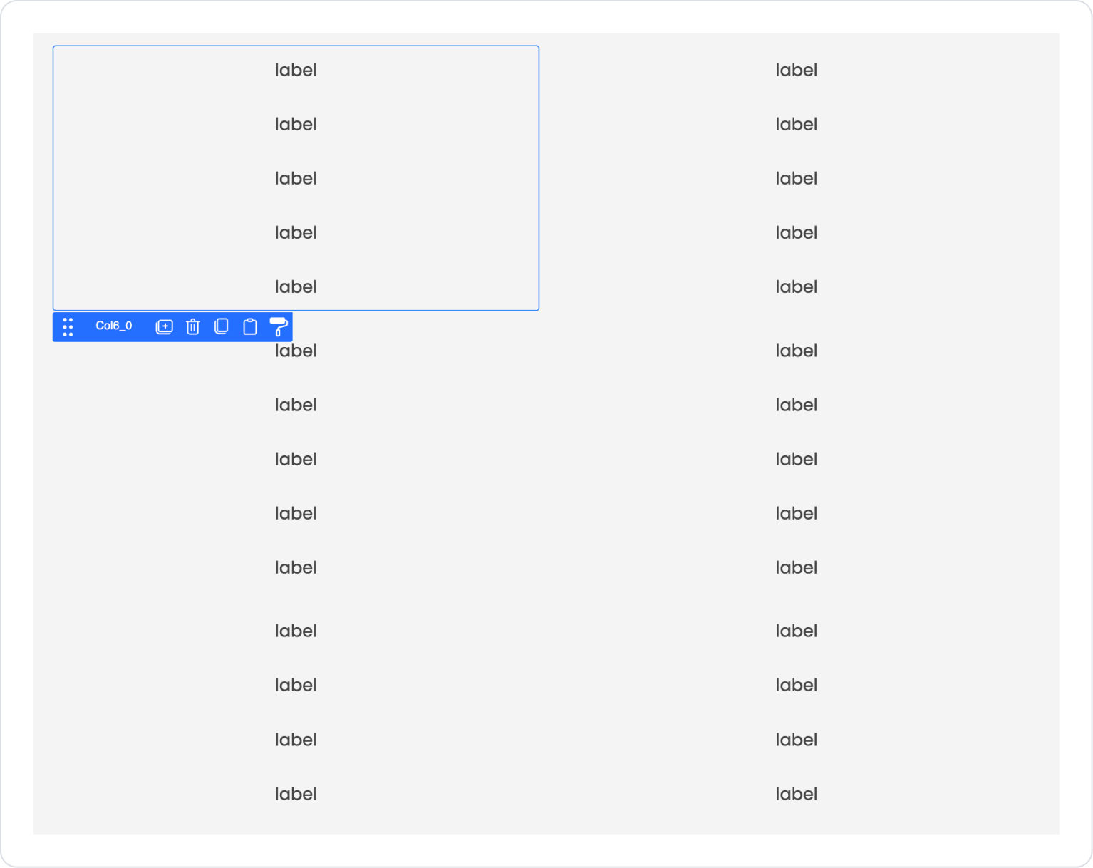
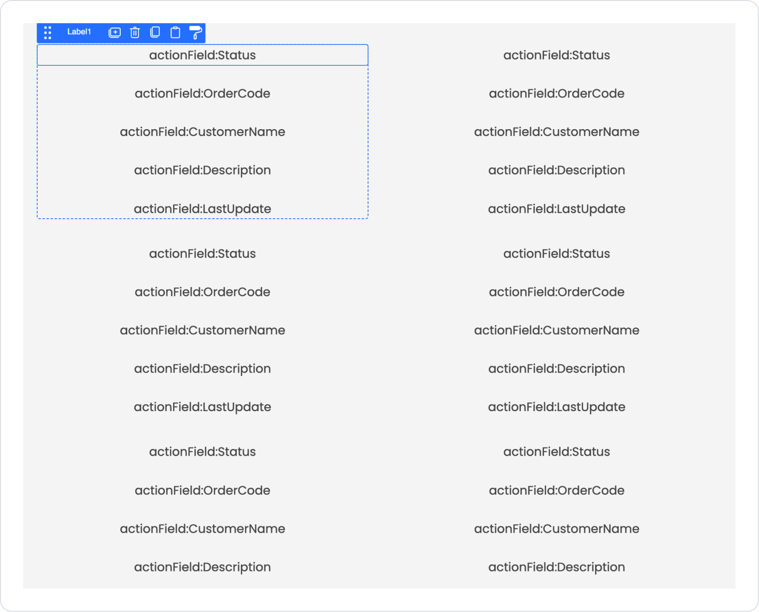
Drag and drop the Elements > Container > VerticalStack element into the Panel element.
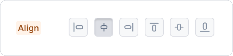
Center the Vertical Stack element vertically from the VerticalStack > Styling > Layout > Align field.
Click on the Vertical Stack element and click five times on the Elements > Display > Label element from the left side panel to create five labels one below the other.
Step 5 - Configuring Element Settings
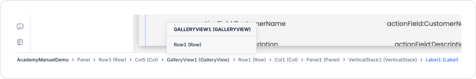
You can access the desired element via the BreadCrumb at the bottom of the page. Click on the first Labelelement and navigate to the GalleryViewelement via the BreadCrumb.
In the GalleryView element, select the GetOrderStatusPanel action in the GalleryView > Properties > Datasource field.
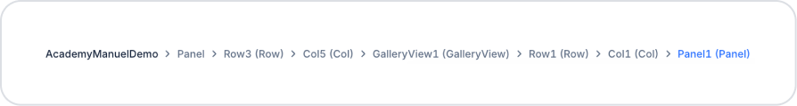
Click on one of the Label elements and click on the Panel element via the BreadCrumb.
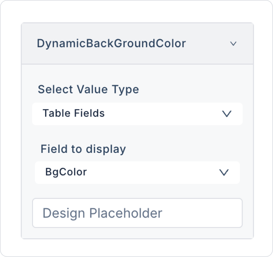
In the Panel element, define the BgColor in the Panel > Properties > DynamicBackGroundColor field.
In the Panel element, define FontColor in the Panel > Properties > DynamicFontColor field.
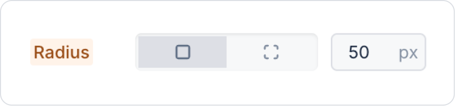
Define 50 px in the Panel > Styling > Border > Radius field on the edges of the Panel element.
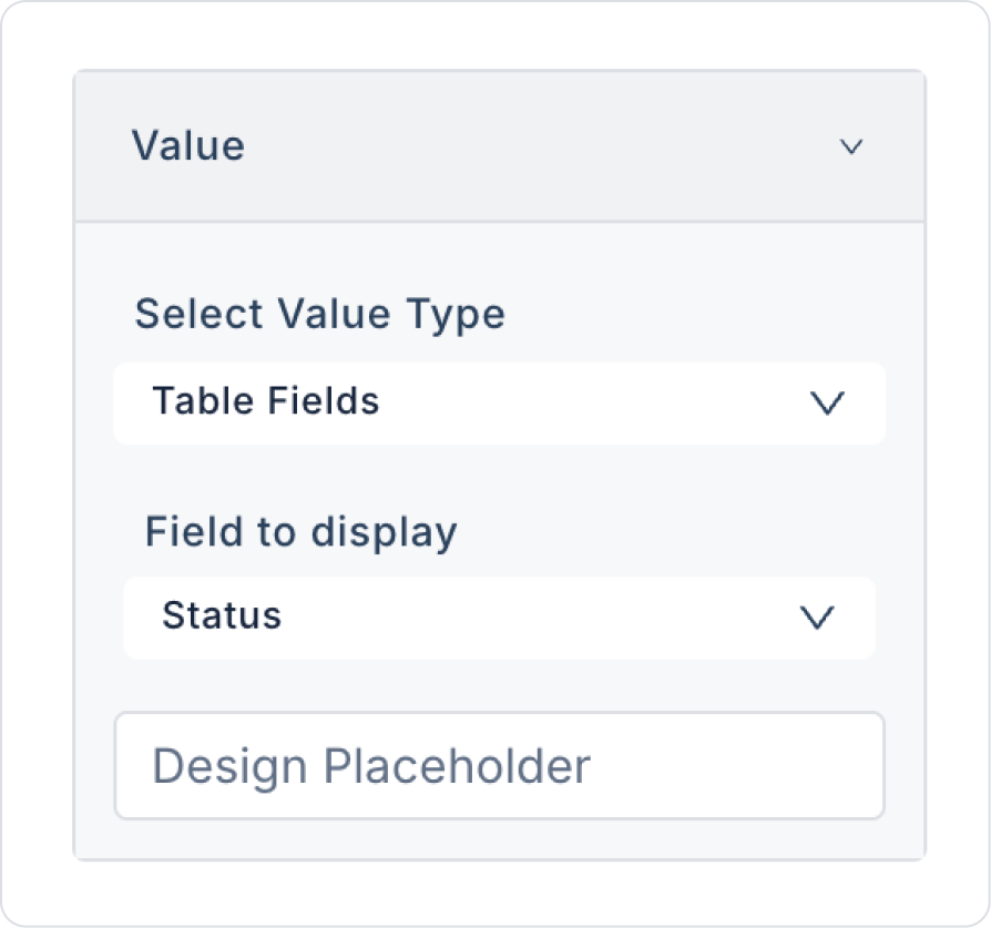
Click on the first Label element and define Status in the Label > Properties > Value > Field to display the field.
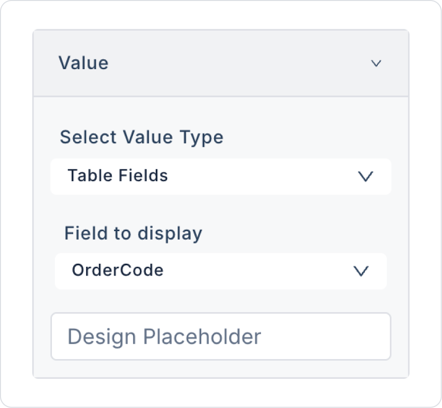
Similarly, define OrderCode in the second Label element.
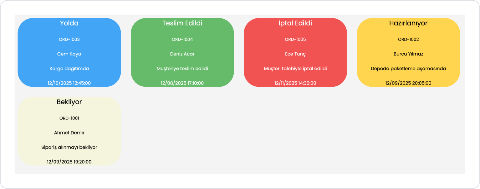
Similarly, define the CustomerName, Description, and LastUpdate fields in the third, fourth, and fifth Label elements, respectively. After the definitions, the expected result is as shown in the image below.
Preview:
When the application is tested, the Panel element is used with Gallery View to list all distribution records as cards.
Each panel is automatically formatted with a dynamic background color, text color, and information fields according to the order status. This makes it easy to visually distinguish statuses such as In Transit, Preparing, Delivered, Cancelled, and Pending, providing the user with a more readable distribution tracking screen.
4. Common Properties
Some fields on the panel element are used commonly across all UI elements. Therefore, detailed explanations of the following properties can be found in the relevant general guide pages:
Use the onClick action when using the Panel like a “card”. Making the Panel clickable, especially in structures such as profile cards, product cards, and dashboard boxes, speeds up the user flow.
Keep the Panel content simple and focused. Placing too much information or elements reduces the readability of the card.
Select scroll settings appropriate for the content. Choose Vertical Scroll for long lists or text-heavy panels, and Horizontal Scroll for wide content.
Choose padding and spacing settings carefully. Very narrow gaps create a cramped look, while excessively wide padding can cause the Panel to grow unnecessarily.
6. Limitations
The Panel supports a single onClick action. For more advanced interactions, multiple elements should be placed inside the Panel and their actions used.
The Panel's responsive behavior is entirely dependent on the layout of its inner elements. The Panel itself does not provide mobile compatibility; child elements must be compatible.


