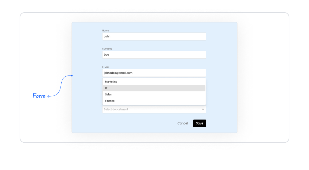
The form element is one of the basic UI elements that allows you to quickly and flexibly perform data collection, editing, and display operations in your applications. With its open structure for user interaction, it combines text inputs, selection fields, date fields, counters, switches, and many other form elements under a single structure. With the form element, you can:
Edit a database record linked from the Data Sources module,
Create completely new forms from scratch,
Send data received from the user to SQL, REST API, or Managed DB actions,
Design well-organized and readable form interfaces optimized for mobile and web.
The form element is the cornerstone of data entry processes within the application and presents complex operations with a simple user experience.
The form element is supported in both mobile and web applications.
1.1. Common Use Cases
Collecting data from users (e.g., registration form, profile information, application form, contact form)
Editing database records. Updating a record linked from the Data Sources module via a form.
Collecting operational process inputs (e.g., work order creation, maintenance report, customer feedback)
Creating fast entry screens optimized for mobile applications
Sending data to REST API or SQL actions. Transferring data to the backend with the form submit process.
Create dynamic form structures using conditional field display (e.g., opening new fields when “Yes” is selected).
Regularly collect data from users in sales, CRM, human resources, and operations modules.
2. Key Features
Advanced form element structure. You can use all form fields, such as Text Input, Select Box, Switch, Checkbox, and Number Input, under a single element.
Full compatibility with Data Sources. You can automatically populate a database record when the form loads and update it with the form submit action.
Create forms from scratch. You can build a completely new form structure using only raw data received from the user, without connecting to a Data Source.
Dynamic field management. With Visibility Rules, you can automatically show or hide form fields based on user selections.
Validation support. Validations such as required field checks, format validation, and number and date range checks can be configured for each form element.
Layout optimized for mobile and web. Thanks to its responsive design, it provides a seamless form experience on different screen sizes.
Grid structure for organized form design. You can arrange the fields within the form in a 1, 2, or multi-column structure.
Error message and information message support. You can display user errors in a meaningful way and provide feedback related to form operations.
2.1. Element Properties
When you drag and drop a form element onto the screen or select an existing form, you can create and edit the form structure using the Properties panel on the right. The most basic settings for a form element are the configurations made through the Create / Edit Form modal.
2.1.1. Anatomy of the Create Form Modal
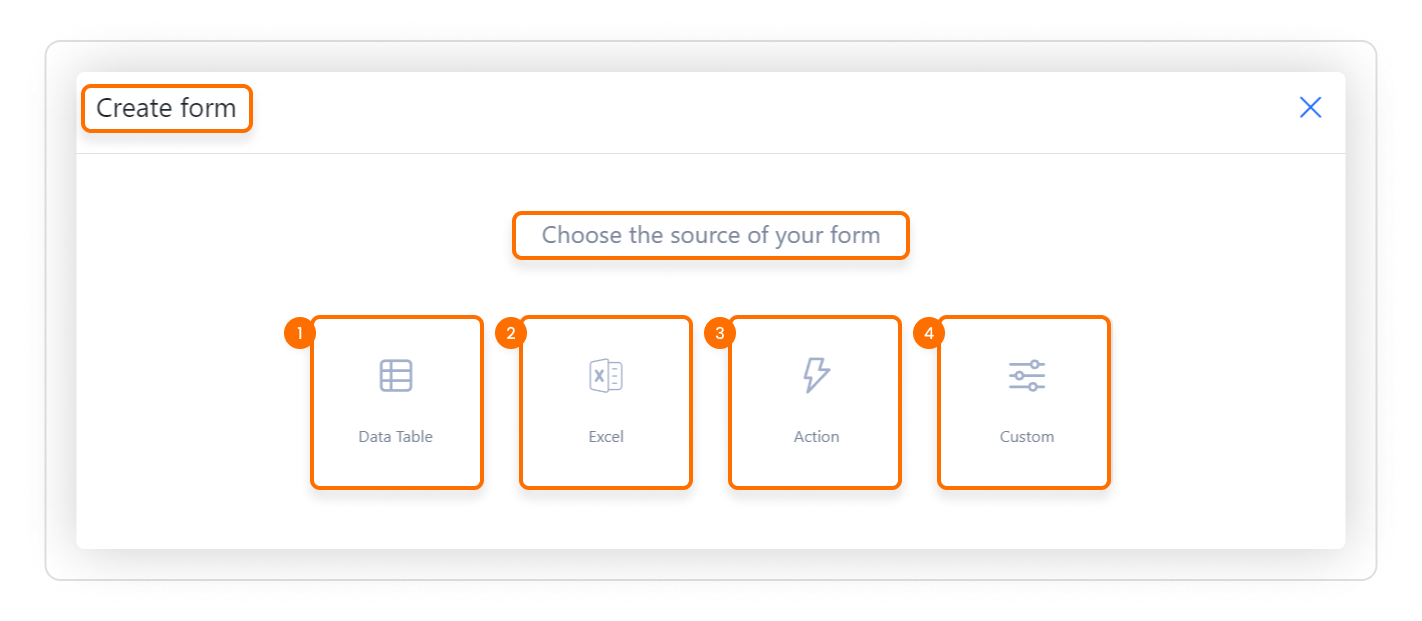
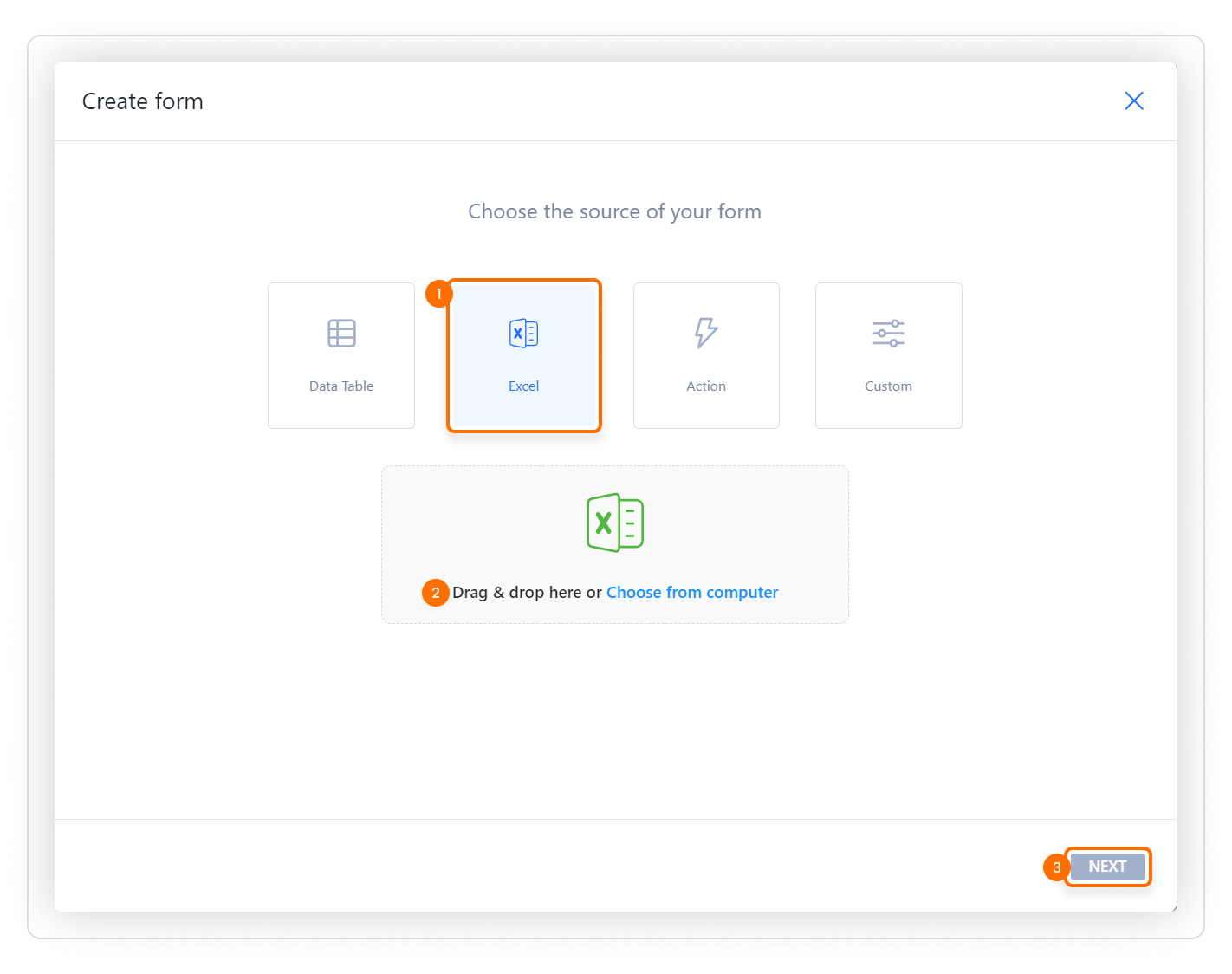
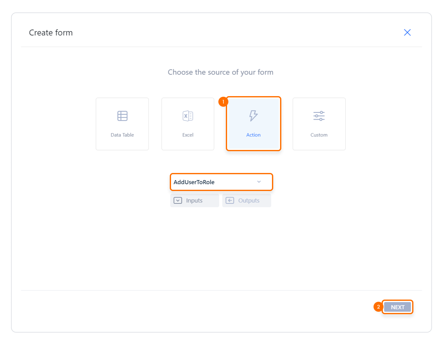
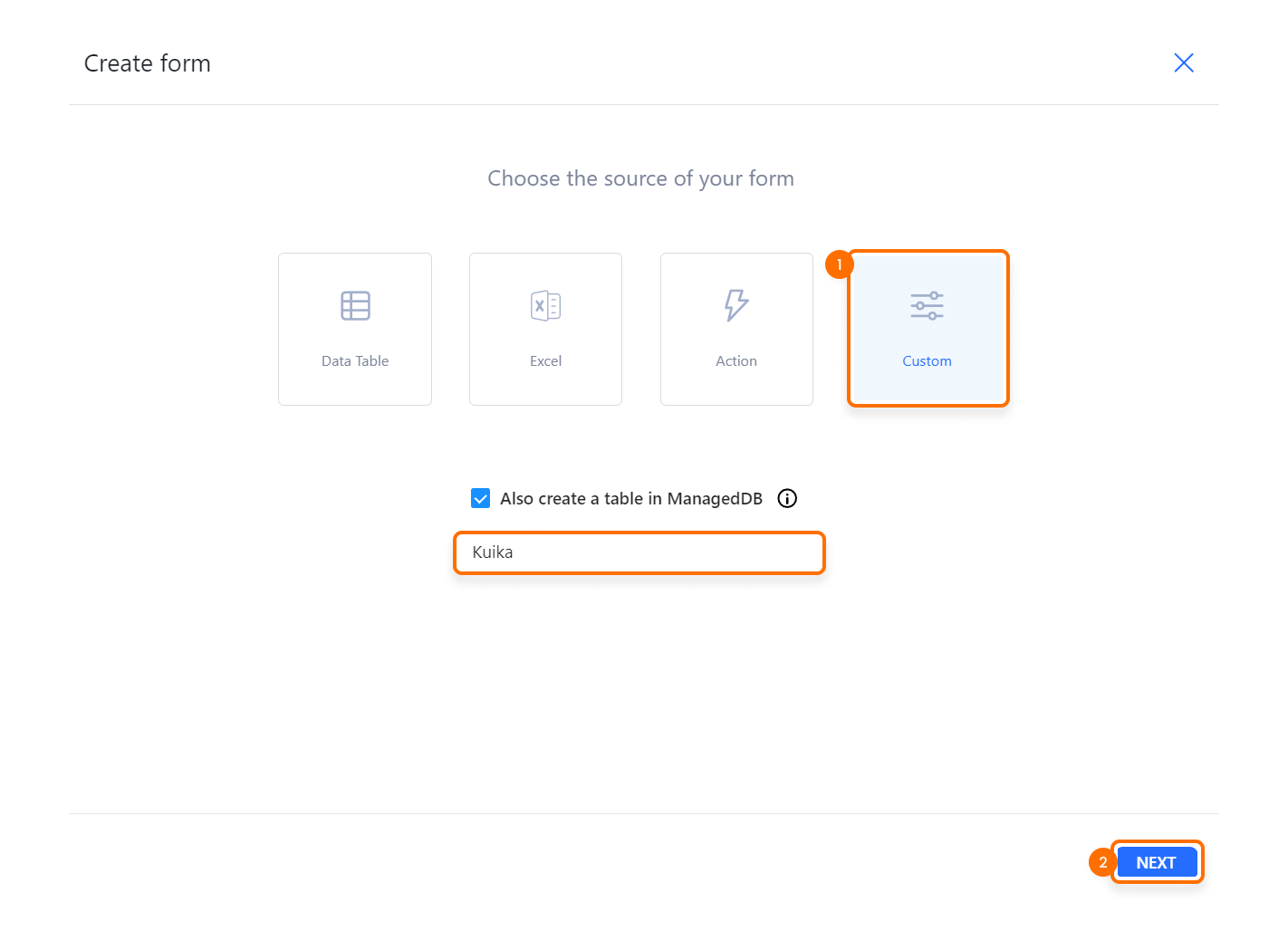
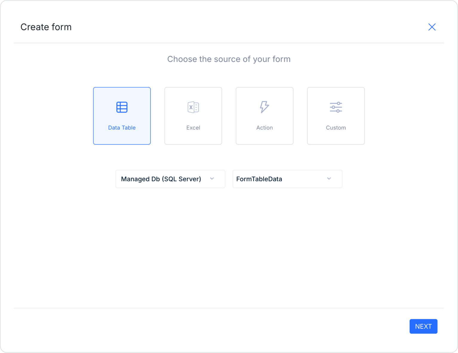
When you first drop a form element onto the screen, the Create Form modal opens. This modal allows you to define the form's data source and the basic structure of the form fields.
Data Source Selection
First, you need to select which data source the form you are creating will be linked to:
Data Table (1): Allows you to create a form linked to a data table in your Data Sources module.
Form fields are quickly created based on existing table fields.
Ideal for record insertion/update scenarios.
Excel (2): Allows you to design a form using columns from a ready-made Excel file.
Excel columns are converted into form fields.
Particularly suitable for preparing forms with static/semi-static data from external sources.
(i) The form element supports “.xls/.xlsx” formats as Excel data files.)
Action (3): Allows you to create form fields using the parameters of an action defined in your application.
The Inputs fields of the action are used for data entry,
while the Outputs fields are used to display the data stored in the form.
For example, the parameters of the AddUserToRole action can be converted into form fields.
Custom (4): Allows you to create form structures that are completely customized to your needs, without being tied to any data source.
Optionally, you can also create a table linked to the form structure with the “Also create a table in ManagedDB” option.
After selecting the data source, click NEXT to proceed to the form details screen.
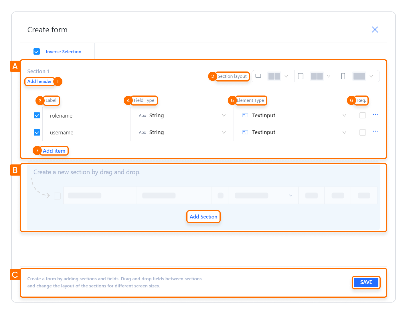
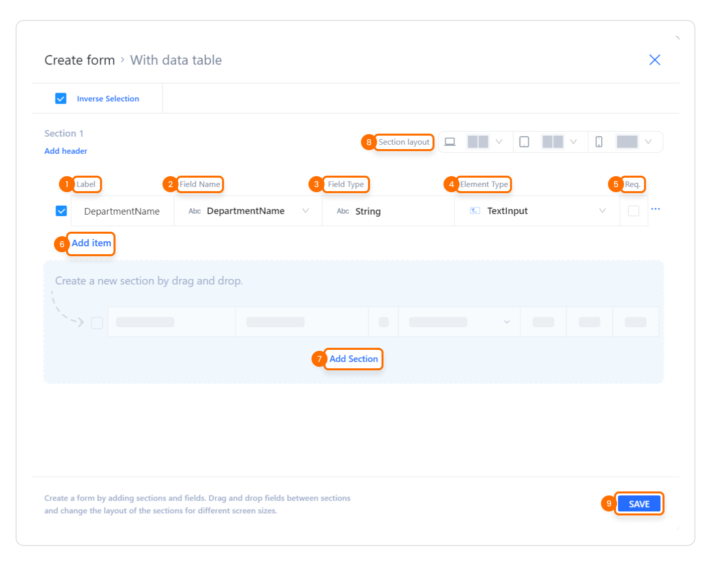
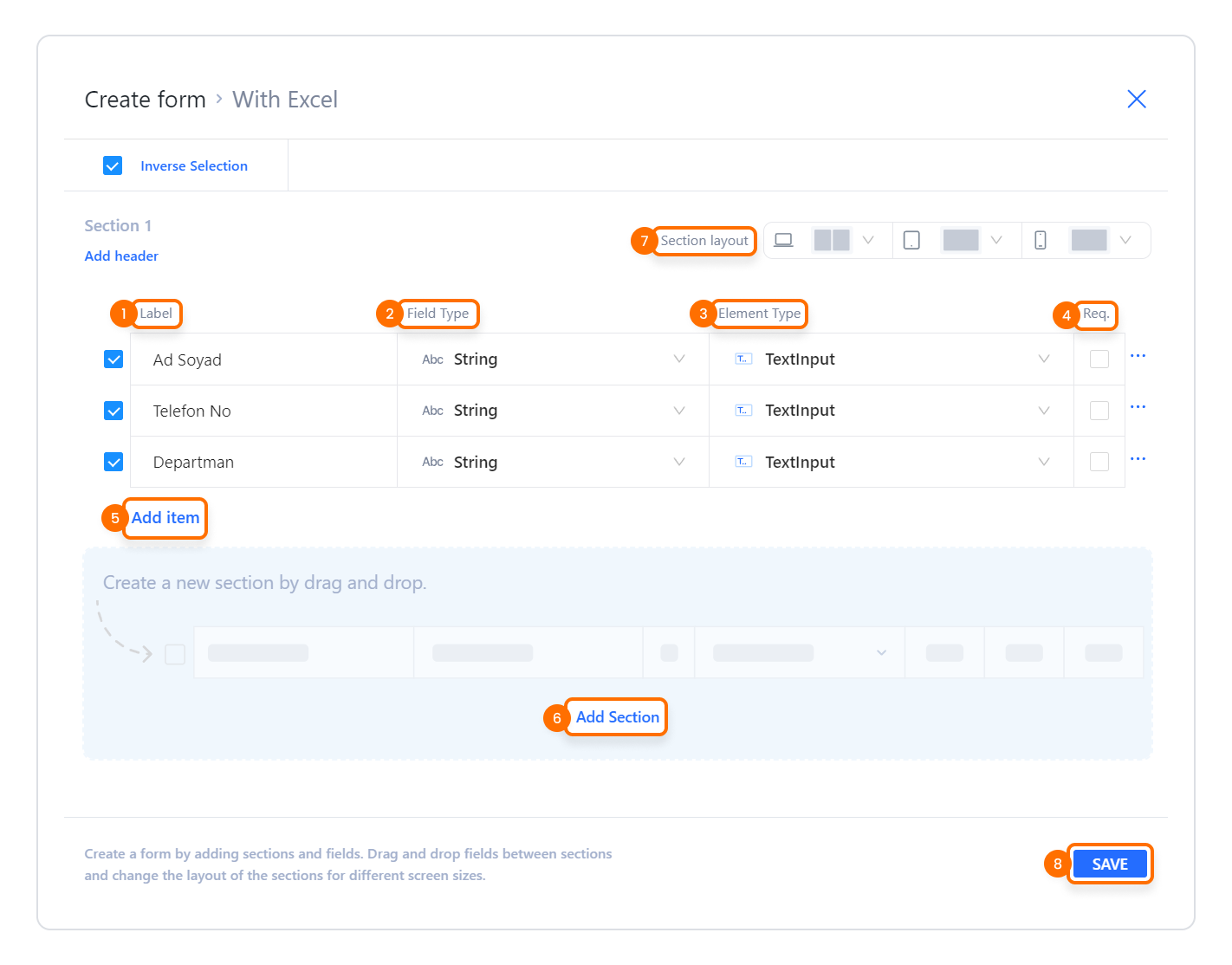
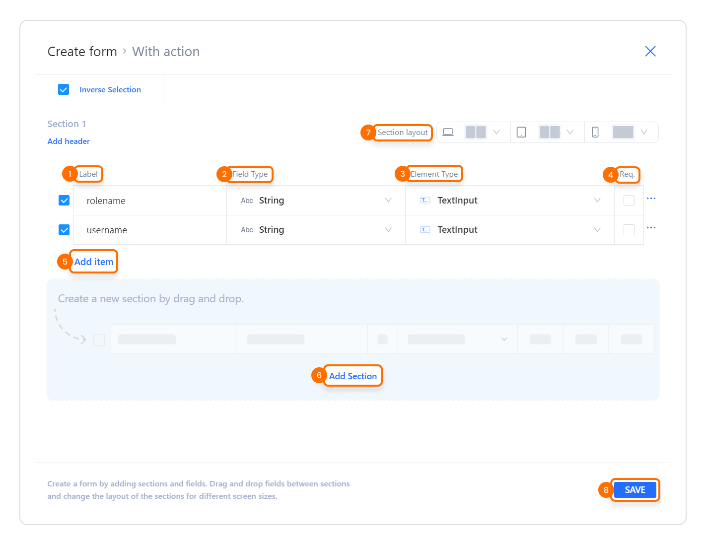
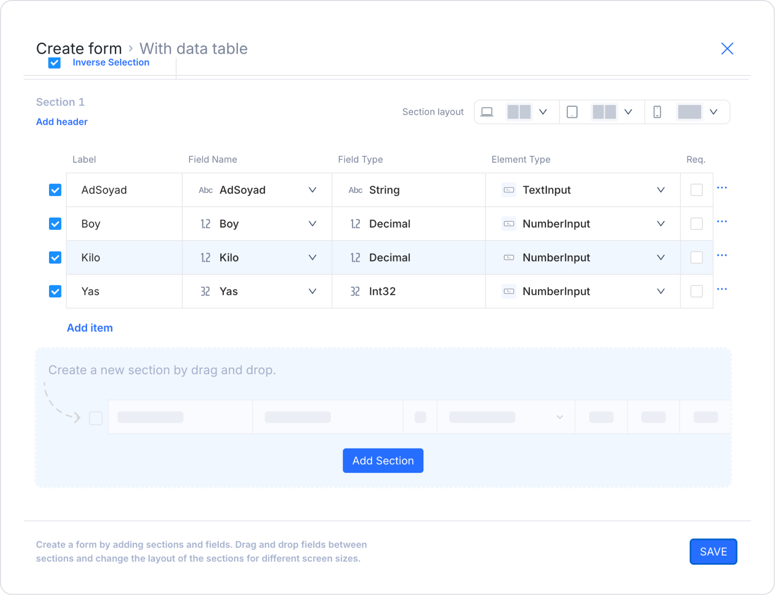
2.1.2. Adding Fields and Sections to the Form
The Create Form modal provides a detailed structure where you can manage the column/field structure of the form.
Field Addition Section
In this section, you can arrange the fields that will appear on the form line by line:
Add Header (1): Allows you to add a header to the form section. For example: “User Information,” “Address Information.”
Section Layout (2): Determines how the form will appear on different devices.
Single column
Two columns
Different column layouts can be selected.
Label (3): The name of the form field that will be displayed to the user. E.g.: “First Name Last Name,” “Phone Number,” “roleName.”
Field Name (in some source types): The name of the form field in the data source. For example, table column name or action parameter name.
Field Type (4): Defines the data type of the variable. E.g.: string, int, date, etc.
Element Type (5): Determines which form element will display the field. E.g.: textInput, selectBox, switch.
Req / Required (6): Determines whether the field is required.
Active → This field cannot be left blank.
Activate the “Required” field for every input that must be required.
Add item (7): Used to add a new row/field to the form.
B. Add Section: Allows you to add a new section to divide the form into sections. For example: separate blocks such as “Personal Information” and “Contact Information”.
C. SAVE: Saves all changes made to the form and creates the form structure on the screen.
Tab Order
The order in which fields are navigated using the keyboard can be customized by assigning tab order numbers to the fields within a form. The tab order determines which field the focus moves to when the user presses the Tab key.
Each form field is assigned a sequential number starting from 1.
When navigating with the Tab key, focus moves from the lowest number to the highest.
If multiple fields are assigned the same number, the navigation order is determined by the DOM order.
Example:
When the Last Name field is assigned 1, the Email field 2, and the First Name field 3, the focus moves to the Last Name field when the user first presses the Tab key; subsequent presses of the Tab key move the focus to the Email and First Name fields in sequence.
2.1.3. Form Creation Summary Flows Based on Data Source
The Create Form modal works similarly for each data source, but the input steps differ:
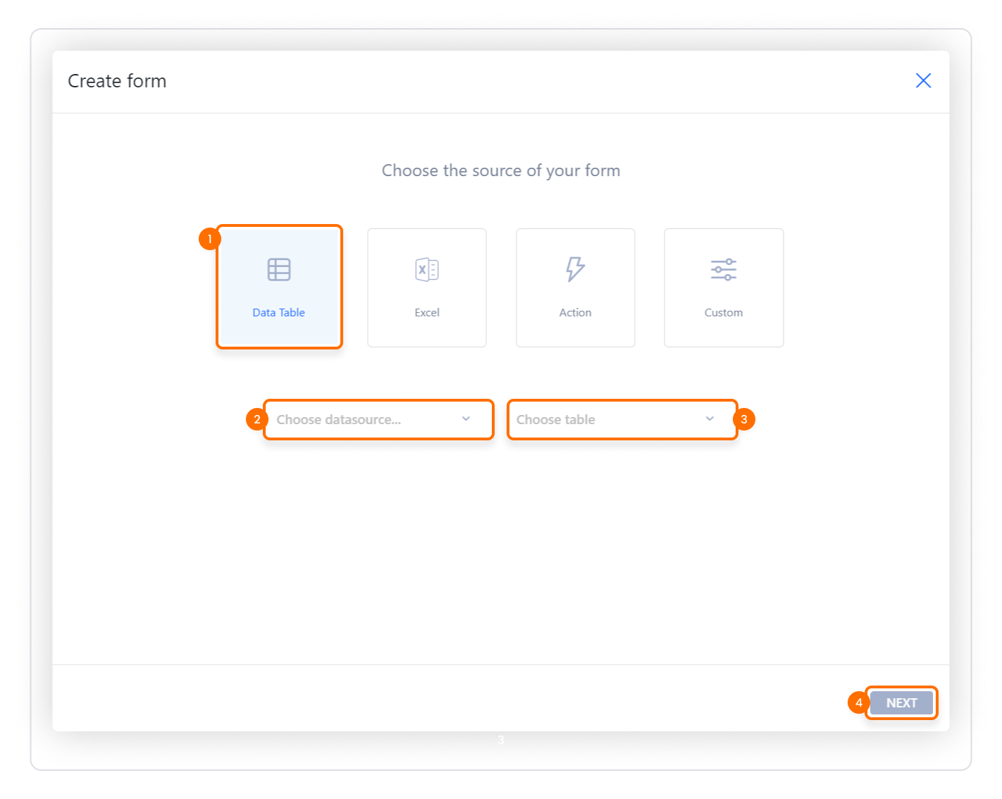
Creating a Form with Data Table:
Drag the form element onto the screen, select Data Table (1).
Select the data source (2) and table (3) → NEXT (4).
In the table that opens, edit the Label, Field Name, Field Type, Element Type, Required fields.
If necessary, add a new row with Add item or a new section with Add Section.
Set the number of columns in the Section layout field.
Create the form with SAVE.
Creating a Form with Excel:
Drop the form element onto the screen and select Excel (1).
Choose from computer (2) to select your Excel file → NEXT (3).
In the table generated based on the Excel columns, edit the Label, Field Type, Element Type, Required fields.
Use Add item / Add Section if necessary.
Define the layout with Section layout and save with SAVE.
Creating a Form with Action:
Drag the form element onto the screen, select Action (1).
Select an action from the list that opens → NEXT (2).
Form fields are created according to the Inputs/Outputs fields of the action.
Update the Label, Field Type, Element Type, Required values as needed.
Complete the layout with Add item / Add Section and Section layout.
Save the form with SAVE.
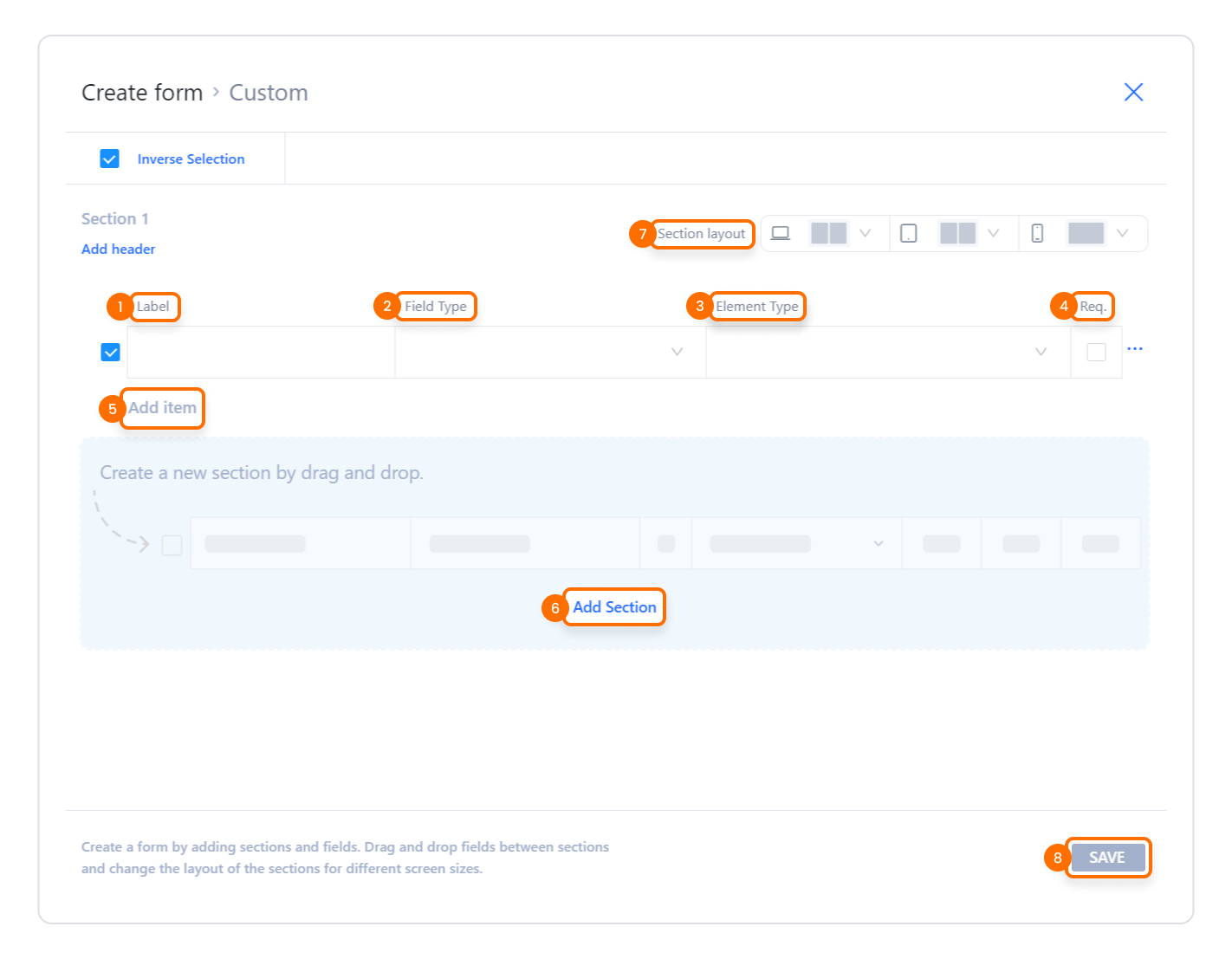
Creating a Form with Custom:
Drag the form element onto the screen, select Custom (1) → NEXT (2).
(Optional) By checking “Also create a table in ManagedDB”, you can also create a table linked to the form structure.
Define the Label, Field Type, Element Type, Required fields yourself in the table that opens.
Expand the form with Add item / Add Section, and set the layout with Section layout.
Save the form structure with SAVE.
2.1.4. Editing the Form
To update the structure of an existing form:
Open the project you are working on.
Go to the screen where the form element is located.
Click the Edit Form button in the Properties panel on the right.
Rearrange the form fields, sections, Required fields, and Section layout settings in the modal that opens.
Use the SAVE button to save your changes.
2.1.5. Detaching Form Elements
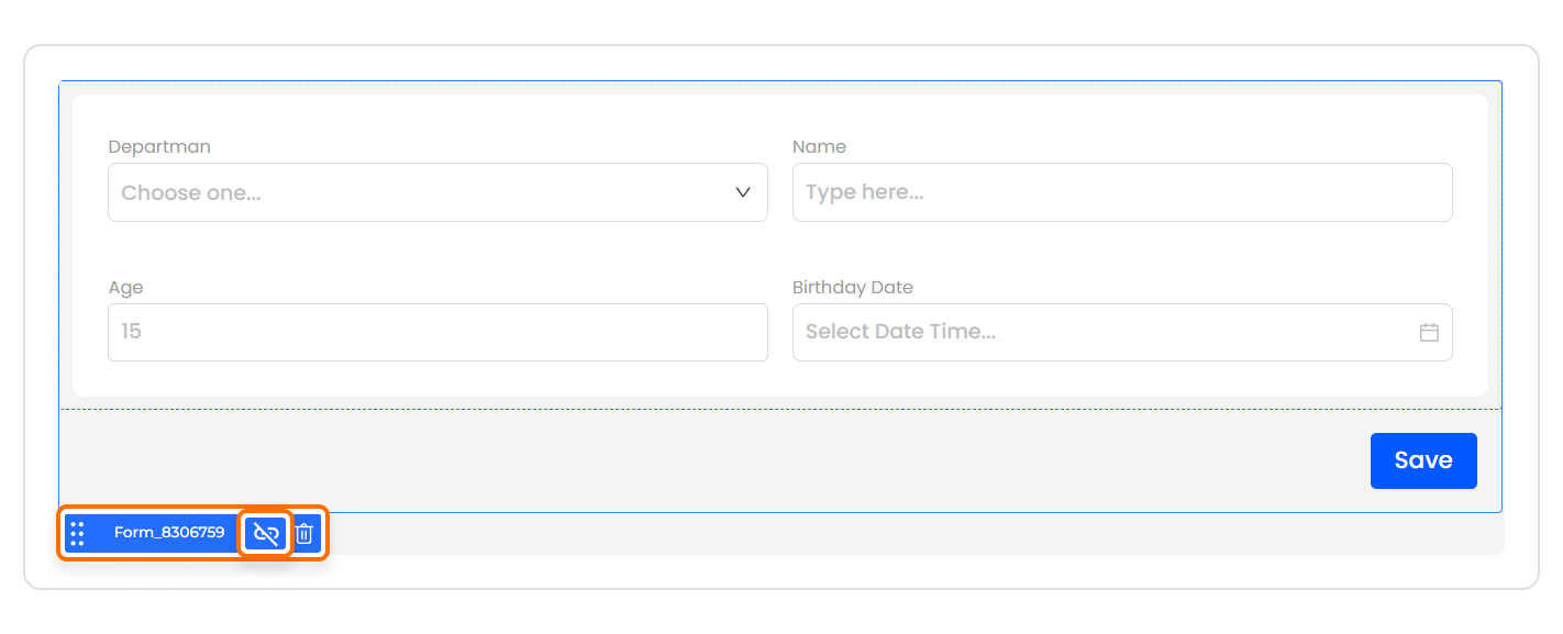
Form elements can be made independent of the main form structure when necessary:
Detach separates the fields in the form from the form logic and converts them into individual independent UI elements.
To detach form elements:
Open the project you are working on.
Click the Detach icon that appears when you hover over the form element.
All fields within the form become independent elements; you can now move, resize, or use them in different locations.
Important:
If you Detach a form created with the Create Form modal, you will not be able to edit that form again via the Create/Edit Form modal.
The Detach operation is undesirable. Therefore, it is recommended that you apply the Detach operation only after you are sure that the form structure is final.
Understood — then let's prepare a correctly formatted section that clearly states that actions cannot be added to the Form element, as is the case with other UI elements.
2.2. Actions That Can Be Added to Elements
Since the Form element has a structure created with the Create Form modal, it does not support adding actions (ADD ACTION) directly to itself. When the Form is selected, the ADD ACTION button is not visible in the right panel, and a trigger cannot be assigned directly to the Form element.
Key points regarding the behavior of the Form element:
Actions cannot be added to the Form itself.
Data submission, validation, or registration processes are managed by actions added to the buttons within the Form. For example:
Adding an SQL → Insert/Update operation to the “Save” button
Calling a REST API to the “Send” button
Dynamic field management (show/hide), Change triggers, and other operations are performed with actions added to the form fields or buttons within the form, not to the Form element itself.
The Form only serves as a draft and container; the actual functionality is on the buttons and fields.
Actions cannot be assigned directly to the form element. All functional operations are performed with actions added to the Button, Iconelements within the form or to external UI elements.
2.2.1. Tab Order
The order in which fields are navigated using the keyboard can be customized by assigning tab order numbers to the fields within a form. The tab order determines which field the focus moves to when the user presses the Tab key.
Each form field is assigned a sequential number starting from 1.
When navigating with the Tab key, focus moves from the lowest number to the highest.
If multiple fields are assigned the same number, the navigation order is determined by the DOM order.
Example:
When the Last Name field is assigned 1, the Email field 2, and the First Name field 3, the focus moves to the Last Name field when the user first presses the Tab key; subsequent presses of the Tab key move the focus to the Email and First Name fields in sequence.
3. How to Use the Form Element?
In this section, we will cover the end-to-end use of the form element through example scenarios.
Scenario: Creating a Registration Form
In an event application, users use information entry screens to register for new events. The Form element provides quick access that allows you to directly create the application's basic registration fields.
In the scenario:
The data to be registered is obtained.
The data is saved to the table by clicking the button.
Step 1 - Creating the Data Source
Creating a table in the DataSources module:
Go to the DataSources module.
Then go to the Tables tab.
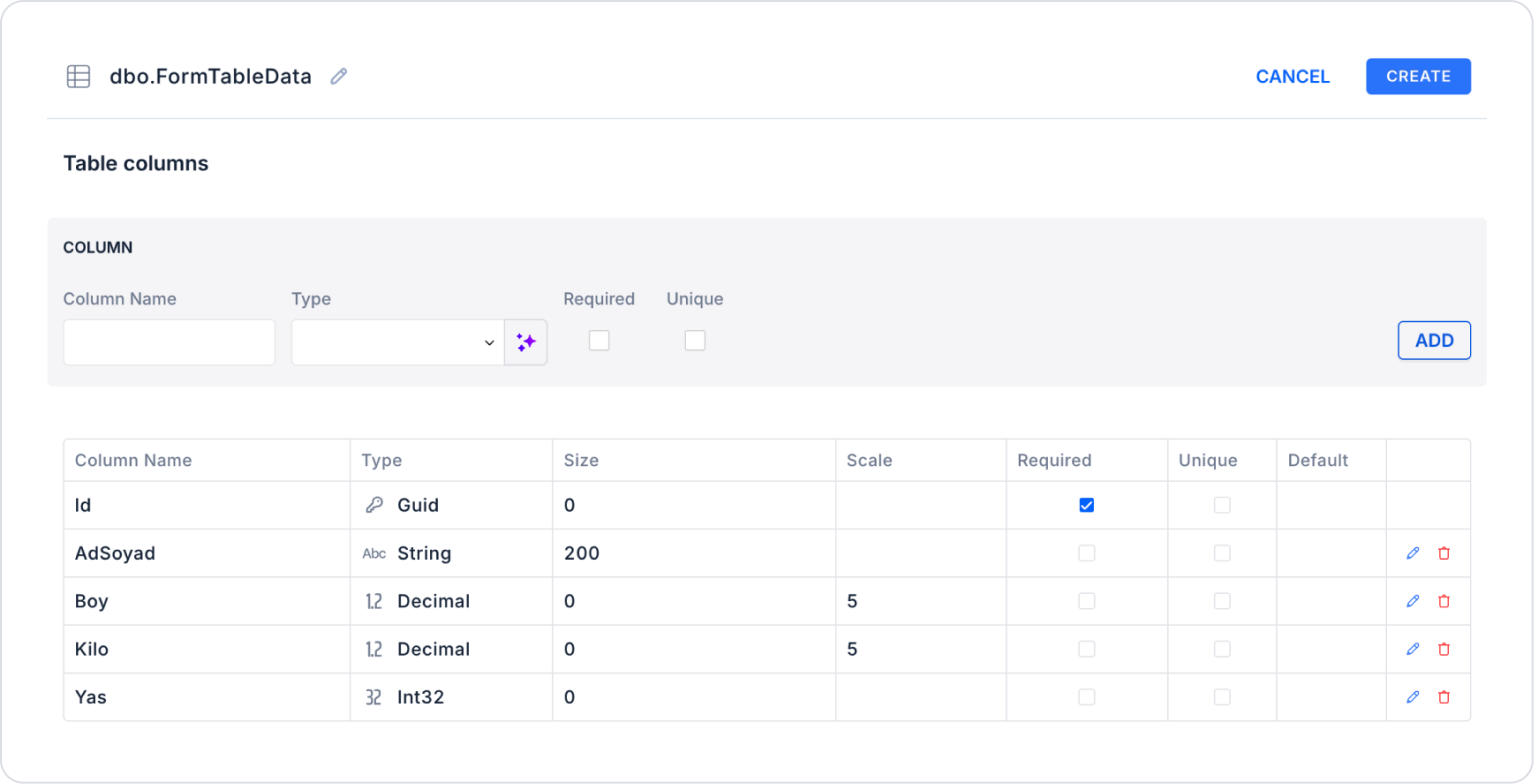
Create a new table named “FormTableData”.
The table structure to be set up is as follows:
Important Field names:
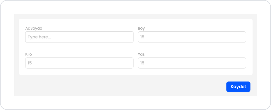
FirstNameLastName: Represents the first and last name of the person being evaluated.
Height: Represents the height of the person entered in the form.
Weight: Indicates the person's weight.
Age: Represents the person's age.
Step 2 - Adding Elements and Editing Styles
Initially on the home page:
Open the UI Design module.
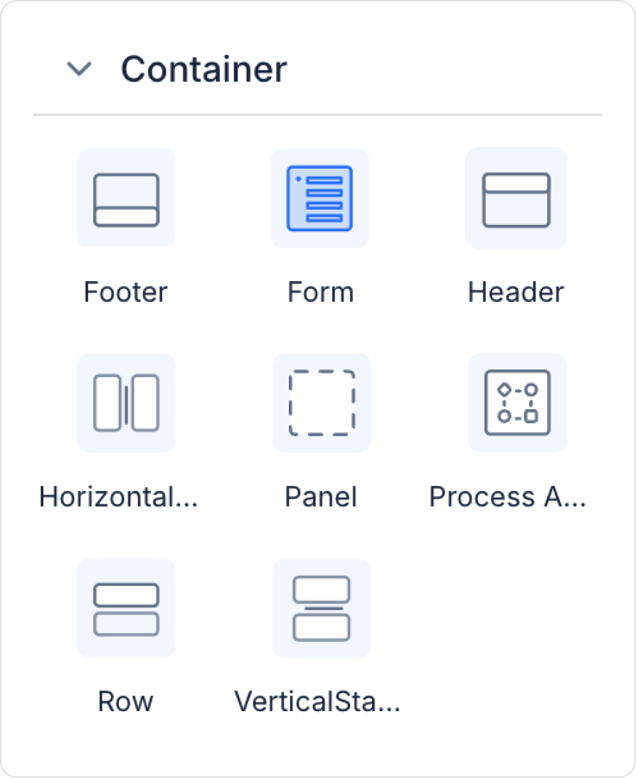
From the left side panel, drag and drop the Elements > Container > Form element onto the page.
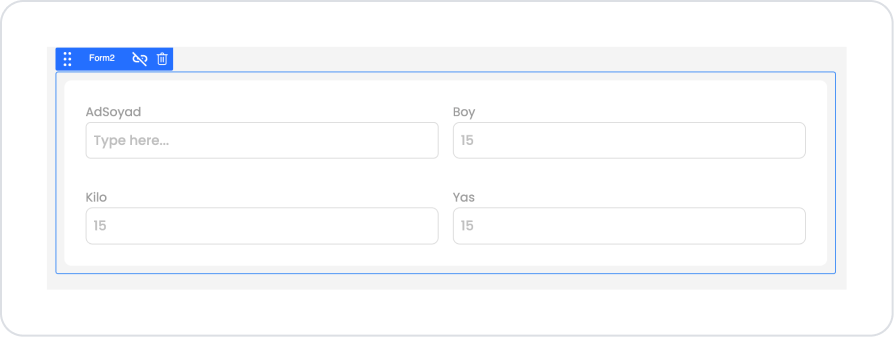
On the screen that opens, select the Data Table field and define Choose datasource > Managed DB and Choose table > FormTableData.
On the newly opened screen, all fields are automatically selected. Click the Save button without making any changes.
After saving, the form structure will appear as follows.
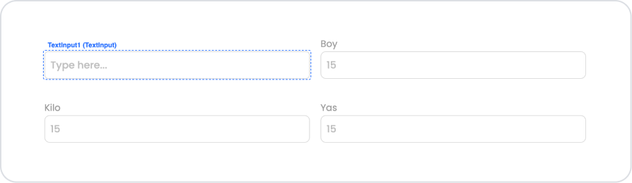
Drag and drop the Elements > Navigation > Button element onto the form below the form.
Click on the Col field where the button is located and enter the Col > Styling > Align section to select “center” for vertical alignment and “right” for horizontal alignment.
Drag and drop the Elements > Display > Icon element from the left side panel into each Col.
Step 3 - Adding the Ready to Save Action
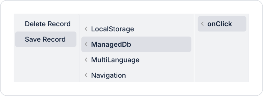
Within the added button:
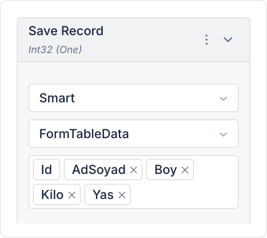
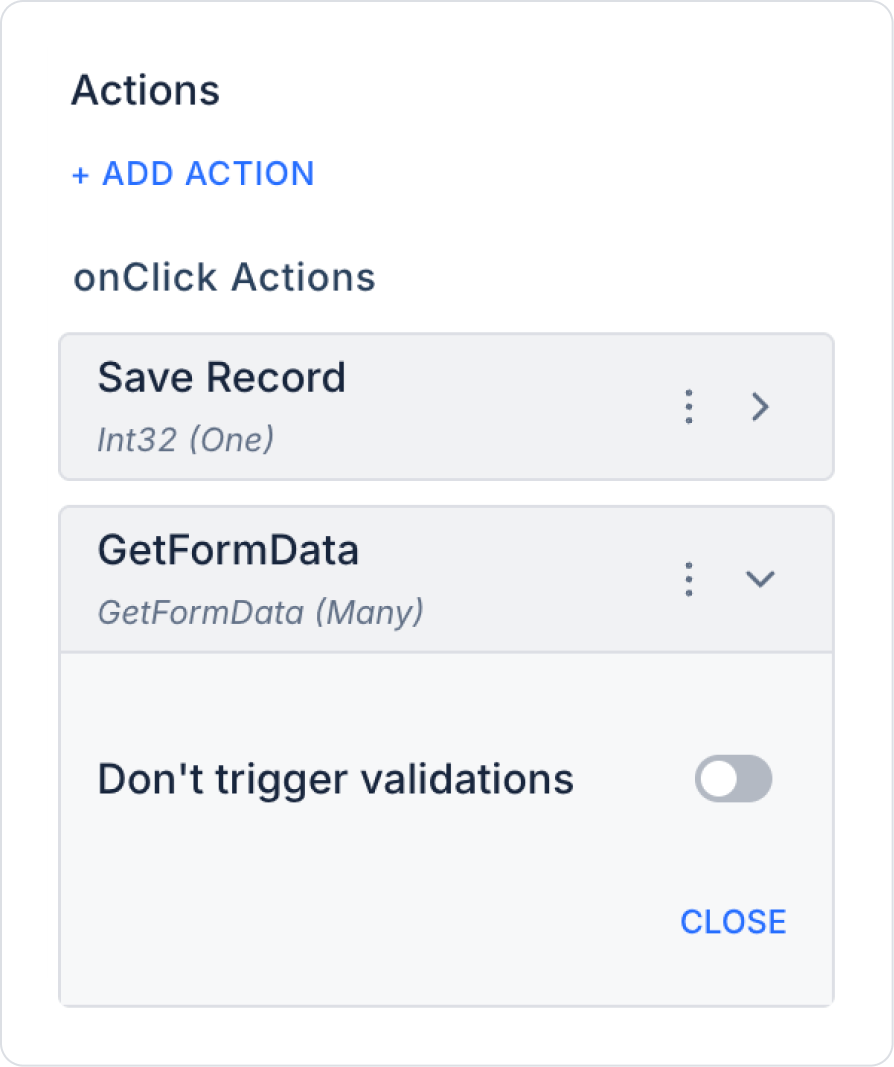
Add the ready-made action Button > Properties > Add Action > onClick > ManagedDb > Save Record to the Button element.
In the Save Record action, select the FormTableData table. Select all fields in the Select Columns field that opens and make the following definition.
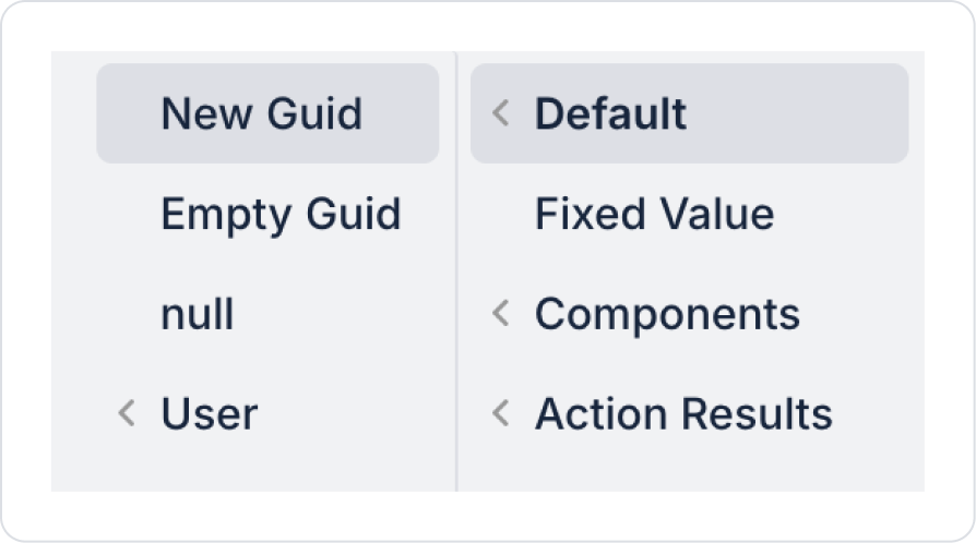
Since new data is added to the Id field, do not define it as Default > New Guid.
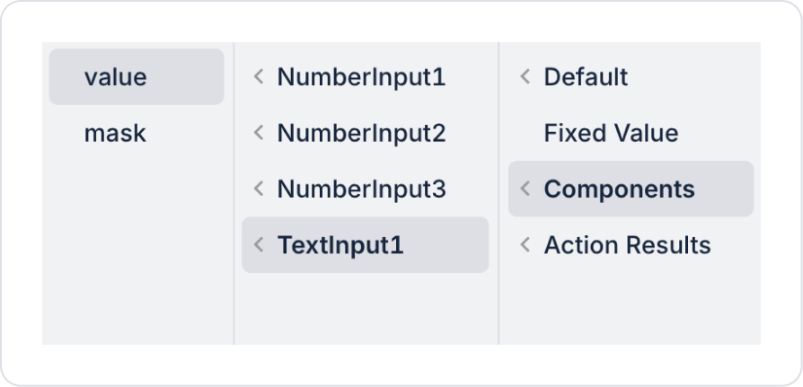
Go to the FirstNameLastName field on the form and look at the element name. Link the relevant element name to the FirstNameLastName field in Save Record as shown below.
Similarly, add the Height, Weight, and Age fields to Components > NumberInput > Value according to their element names.
The expected screen will be as follows:
Step 4 - Displaying Added Data (Optional)
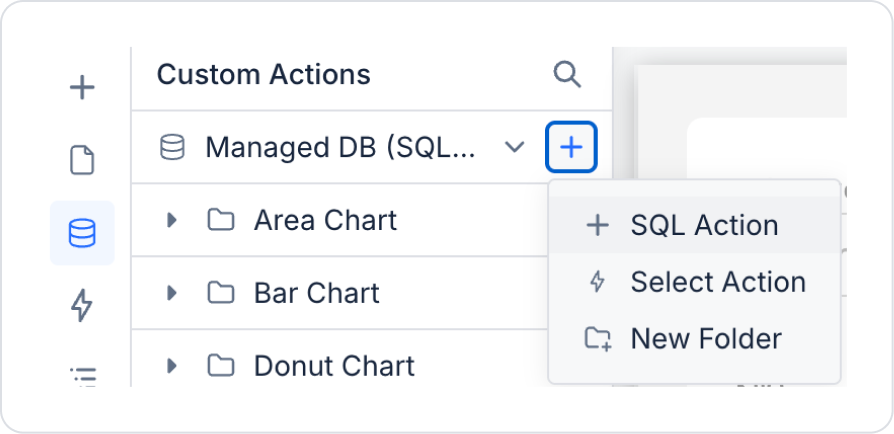
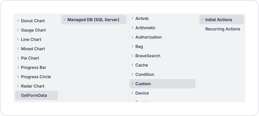
In the UI Design screen, go to the Custom Actions area from the side panel and click on Sql Action to create a new action.
Add the following sql query to the SQL EDITOR area that opens with the name GetFormData.
SELECT * FROM FormTableData;
When applying, delete the FormTableData part, rewrite it as FormTableData, and press Enter. This will add the correct schema name before the table name.
Add the action to the Button by going to Button > Properties > Add Action > onClick > Custom > Managed DB > GetFormData.
Similarly, add the Add Action > Initial Action > Custom > Managed DB > GetFormData action to the Page Init field on the page.
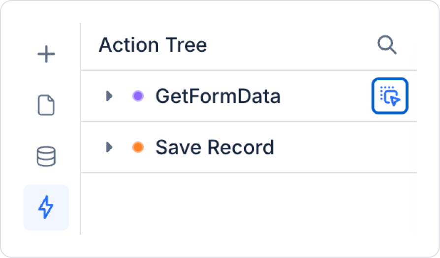
Drag the GetFormData action from the Action Tree field on the left side panel and drop it on the screen.
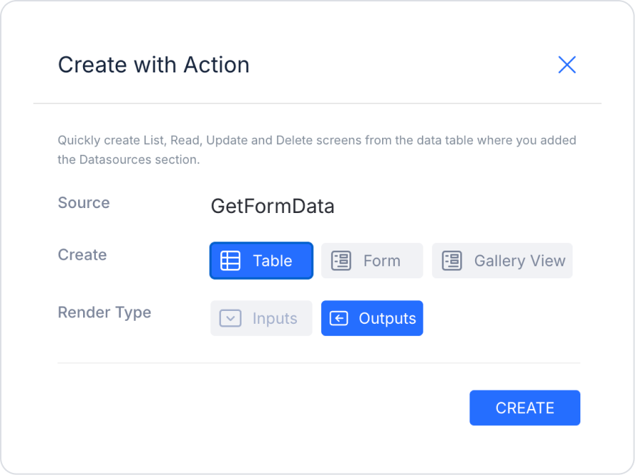
Finally, select the “Table” and “Outputs” fields and create the table element as predefined.
The screen where the table is added will look like this:
Preview:
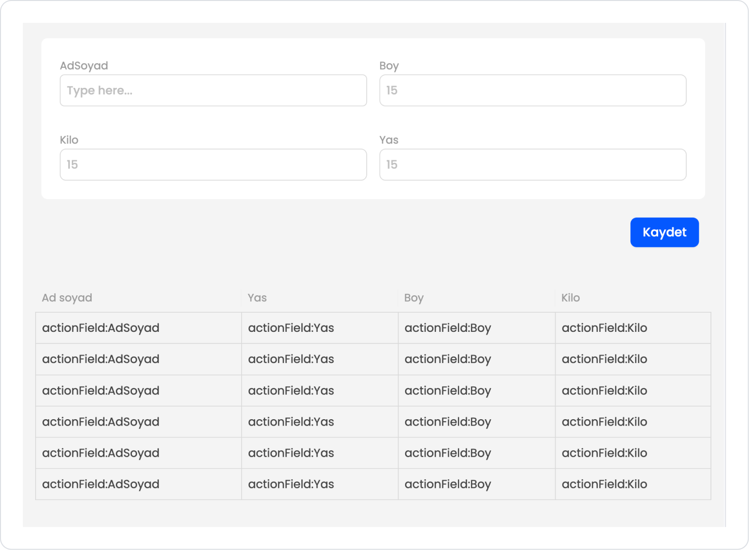
When the application is tested, the data is successfully saved to the database when the Form elements are filled in and saved. With the optional fields also used, the saved data is shown in the example table below.
4. Common Properties
Some fields on the Form element are commonly used in all UI elements. Therefore, detailed explanations of the following properties are provided in the relevant general guide pages:
Organize form fields into logical groups. Using Add Section to divide the form into meaningful sections greatly improves the user experience.
Use Required fields wisely. Required fields should be limited to only truly necessary information. Unnecessary use of Required negatively impacts the user flow.
Consider the user experience when selecting Element Type.
Date Time for dates
Select Box for options
Text Area for long text
Checkbox / Switch for confirmation states
should be preferred.
Consider adding explanations and help text to form fields. This makes it clearer to the user what information they need to fill in.
In forms sourced from Excel and Data Tables, edit the column names. Automatically generated Labels may not always be user-friendly.
Complete form edits via the Create/Edit Form modal. Do not detach the form before it is stable, as the detach operation cannot be undone.
Add descriptive icons and colors to buttons within the form. For example, highlighting “Save,” “Cancel,” and “Submit” buttons with color and icons improves the user experience.
6. Restrictions
Actions cannot be added to form elements. All functionality is provided through buttons or other elements within the form.
Structures created with the Create Form modal cannot be restored after being detached. Once the detach operation is performed, the Create/Edit Form screen can no longer be used.
Form sources are limited to only 4 types: Data Table, Excel, Action, Custom.
Fields within the form are automatically created based on the data source; manual editing may be required in some scenarios.


