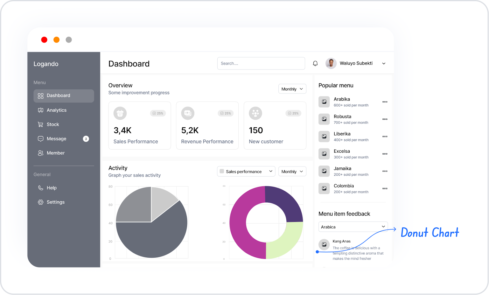
The Donut Chart element provides an effective way to visually represent the proportions of categorical data within a total. By leaving the inner part of the circular chart structure empty, the percentage distribution of each category becomes more readable. It is frequently preferred in scenarios such as market share analyses, budget distributions, usage rates, and percentage data comparisons.
The Donut Chart element is supported in both web and mobile applications.
1.1. Common Use Cases
Displaying category percentages within the total (e.g., market share distribution, percentage of budget items)
Visualizing the percentage distribution of users, products, or transaction groups (e.g., customer segments, sales categories)
Presenting preference percentages in survey or voting results
Analyzing resource usage rates (e.g., storage usage, time or labor distribution)
Quickly show how much share one category has compared to others (e.g., best-selling product group, most preferred service type)
2. Key Features
Visualization of categorical data in a circular structure with percentage ratios
Automatic calculation of each slice's share of the total
Ability to customize visual settings such as color, opacity, slice thickness, and inner gap ratio
Ability to work with single or multiple data sets (e.g., percentage distribution of different segments)
Tooltip support allowing users to see detailed percentage or numerical values for each category
Legend support for naming categories
Dynamic loading of chart data from the data source
Full compatibility with SQL, REST API, or Managed DB actions
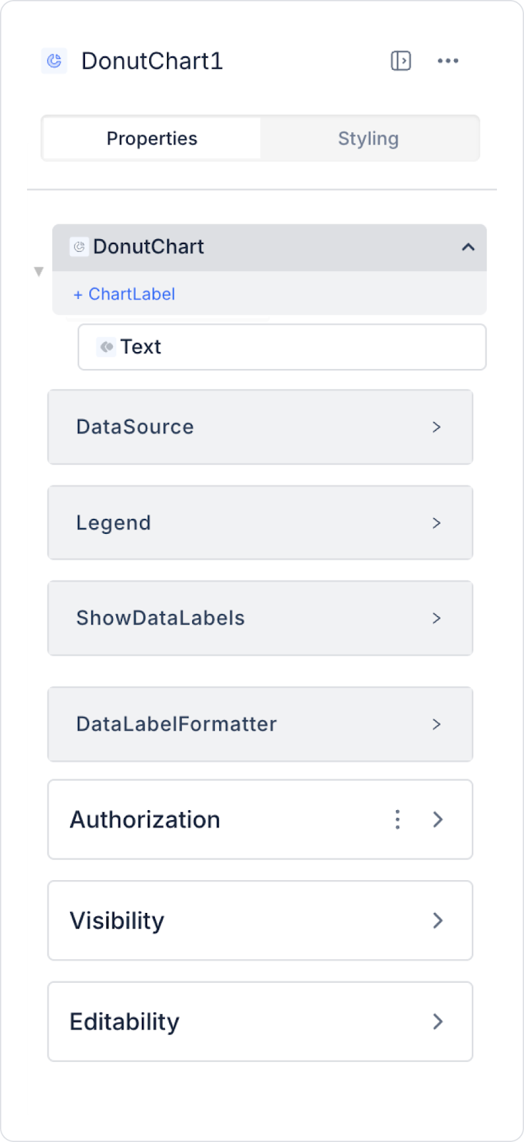
2.1 Element Settings (Properties)
When you select the Donut Chart element, you can define the chart data fields, tooltip configurations, color settings, and slice appearance in detail via the Properties panel on the right. All of the following settings are explained item by item.
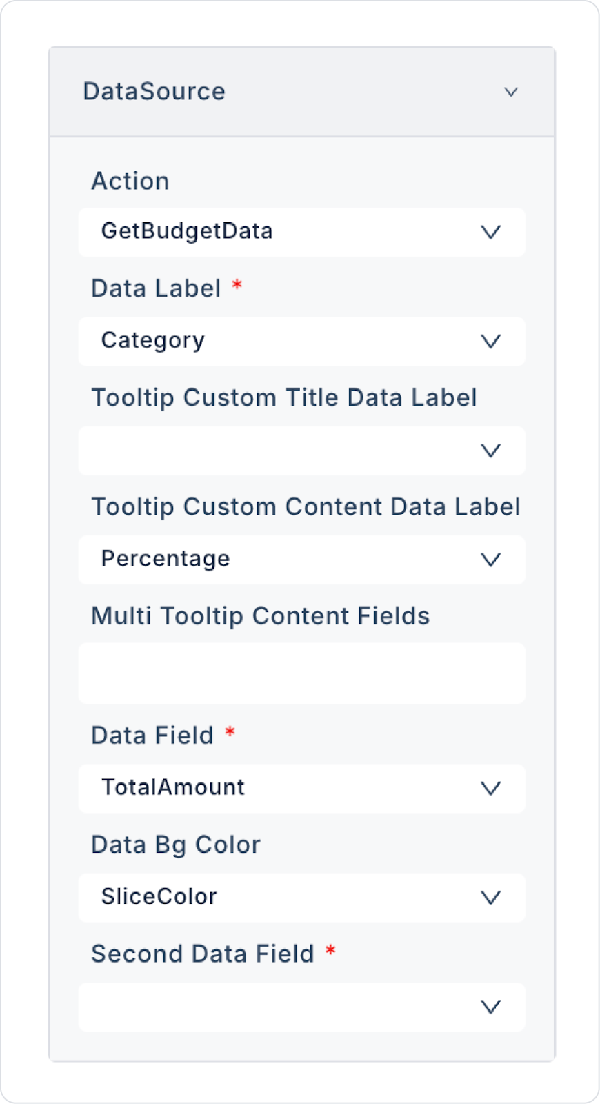
Datasource
Datasource Action: This action fetches the data to be displayed on the chart. The data is loaded into the Donut Chart when this action is executed.
If no action is linked to the Datasource, the following data settings will not be displayed.
Data Field Mappings
Data Label: This is the main data label to be displayed on the chart. It is displayed as the title in the Legend and tooltips.
Tooltip Custom Title Data Label: The data field to be displayed as the title in the tooltip. It determines the title that appears when the user hovers over the slice.
Tooltip Custom Content Data Label: The data label that will appear as explanatory content in the tooltip. It is used to display numerical values, percentages, or explanations.
Multi Tooltip Content Fields: Allows you to display multiple data fields in a single tooltip. Ideal for presenting detailed percentage or numerical information.
Data Field: The field to which the main data series is linked. The size of each slice is calculated based on this data.
Data Bg Color: Determines the slice fill color of the main data series. Hex format color values are supported (e.g., #ff6384).
Second Data Field: Used to define a second data series on the chart. Suitable for creating multiple donut rings.
Second Data Bg Color: Determines the color value for the second data series.
Third Data Field: Used to add a third data series. Preferred for advanced charts with multiple donut rings.
Third Data Bg Color: Specifies the slice color for the third data series.
Legend
Legend Settings: Allows you to specify whether the legend is displayed, its position, and how category labels are displayed. Users can also hide or show slices.
Data Label Settings
Show Data Labels: Displays data labels on each slice. Labels can show percentage or numerical values.
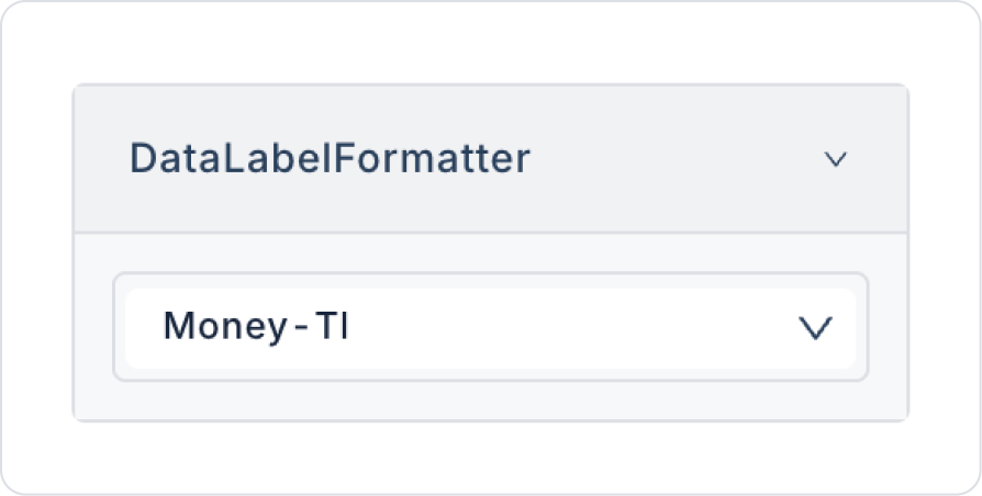
Data Label Formatter: Determines the format of data labels. Supported indicators are percentage, number, or custom formats.
2.2. Actions That Can Be Added to Elements
Since the Donut Chart element is a passive chart component focused on data visualization, it does not have the ability to trigger actions with user interaction. When the element is selected, the ADD ACTION button is not displayed, and no trigger specific to the Donut Chart can be added.
The following points explain the action structure of the Donut Chart:
The Donut Chart does not trigger actions with user clicks, slice selections, or hover interactions. (Actions such as onClick are not supported.)
To update the chart, the Datasource Action linked to the Donut Chart must be triggered externally.
Scenarios requiring user interaction (e.g., “user selects category, chart updates”) are managed by defining actions through other elements such as Button, Radio Group, etc., not through the Donut Chart.
The Donut Chart only represents the data; it does not initiate any actions within itself.
Actions cannot be defined on the Donut Chart element. All user interaction and data refresh operations are performed by assigning actions to other UI elements linked to the chart's data source, not to the chart itself.
3. How to Use the Donut Chart Element?
In this section, we will cover the end-to-end use of the Donut Chart element through an example scenario.
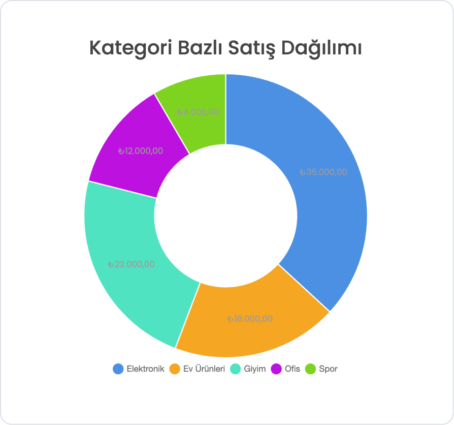
Scenario: Category-Based Sales Distribution Analysis
In a sales tracking application, the total sales amount for different product categories is presented to the user visually. Thanks to the Donut Chart, the percentage share of each category within the total can be easily compared.
In the scenario:
The Total Sales Amount is calculated for each category.
On the Donut Chart, categories are displayed as proportional slices based on their total sales amounts.
Each slice visually presents the user with the share and amount information of the relevant category within the total sales.
For example:
Electronics → 35,000₺ (36.84%)
Clothing → 22,000₺ (23.16%)
Home Products → 18,000₺ (18.95%)
Office → 12,000₺ (12.63%)
Sports → 8,000₺ (8.42%)
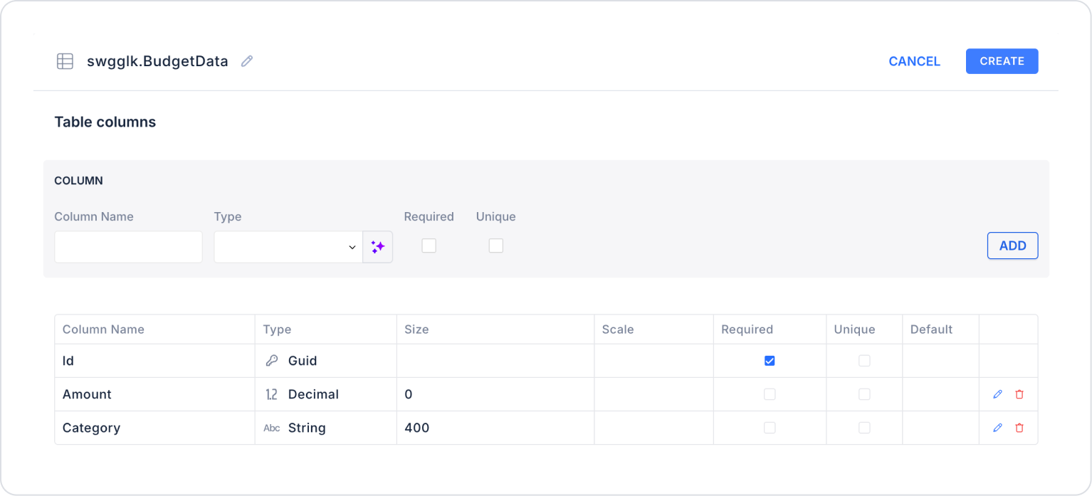
Step 1 - Creating a Data Source
Creating a table in the DataSources module:
Go to the Datasources module.
Then go to the Tables tab.
Create a new table named “BudgetData”.
The table structure to be set up is as follows:
Important Field Names:
Category: Specifies the category name to which the budget record belongs (e.g., Electronics, Clothing, Sports).
Amount: Represents the total budget or expenditure amount for the relevant category.
Step 2 - Defining the Necessary Actions
To display and add data in the interface:
You need to define two actions.
Add a new action from the Actions > New SQL Action tab within the Datasources module.
Action Adding Sample Data (InsertBudgetData):
To test the application with sample data, add the following SQL action and press the TEST button.
When applying, delete the BudgetData part, rewrite BudgetData, and press Enter. This will add the correct schema name before the table name.
Action that Provides Data and Calculates Percentages (GetBudgetData):
SELECT
d.Category,
SUM(d.Amount) AS TotalAmount,
-- Percentage distribution
CAST(
(SUM(d.Amount) * 100.0) / t.GrandTotal
AS DECIMAL(5,2)
) AS Percentage,
-- Colors
CASE d.Category
WHEN ‘Electronics’ THEN ‘#4A90E2’
WHEN ‘Clothing’ THEN ‘#50E3C2’
WHEN ‘Home Products’ THEN ‘#F5A623’
WHEN ‘Office’ THEN ‘#BD10E0’
WHEN ‘Sports’ THEN ‘#7ED321’
ELSE ‘#CCCCCC’
END AS SliceColor
FROM BudgetData d
CROSS JOIN (
SELECT SUM(Amount) AS GrandTotal
FROM BudgetData)
t
GROUP BY d.Category, t.GrandTotal
ORDER BY d.Category;
When applying, delete the BudgetData parts, rewrite BudgetData, and press Enter. This will add the correct schema name before the table name.
Step 3 - Add Initial Action
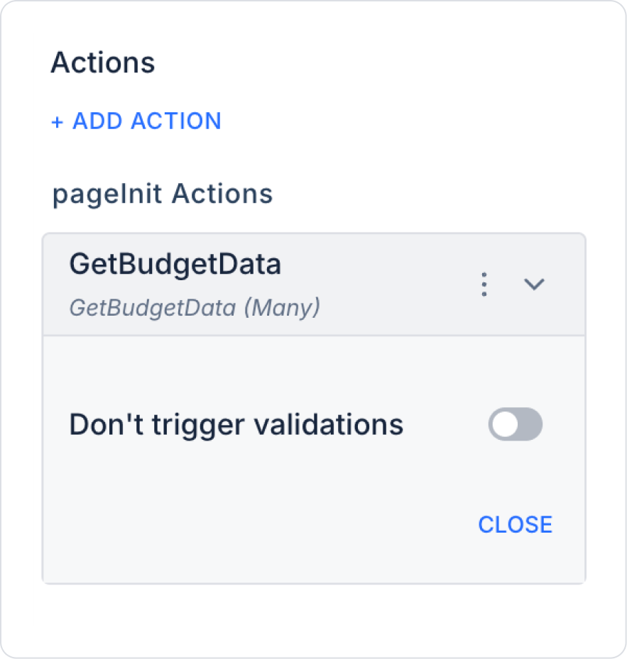
Open the UI Design module.
Add the Initial Actions > Custom > Managed Db > GetBudgetData action to the page using the ADD ACTION button.
Step 4 - Add Elements
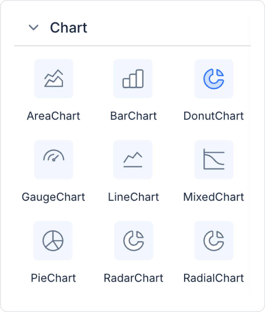
Drag and drop the Elements > Display > Label element from the left panel onto the page.
Then, from the left panel, add the Elements > Chart > DonutChart element to the page.
Step 5 - Configuring Element Settings
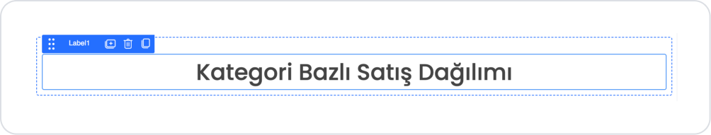
Add the text “Category-Based Sales Distribution” to the Label > Properties > Value field.
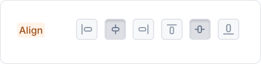
Select the col area outside the Label field and center the element vertically and horizontally from the Col> Styling > Layout > Align option.
Set the Donut Chart size to “500 px” from DonutChart > Styling > Layout > Height.
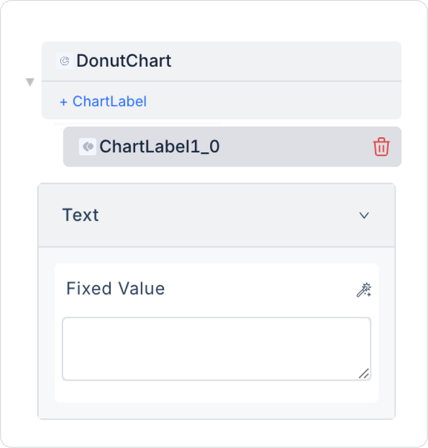
Delete the text in the center of the Donut Chart by clicking DonutChart > Properties > ChartLabel and deleting the text field.
Add the DonutChart > Properties > DataSource >Action > GetBudgetData action to provide data to the Area Chart. Make the following definitions:
Enable the DonutChart > Properties > ShowDataLabels option to display labels.
Select the format type DonutChart > Properties > DataLabelFormatter “Money-Tl”.
Preview:
When the application is tested using the Preview button in the upper right corner, you can see that the total sales amounts by category are displayed as proportional slices on the Donut Chart. You can easily filter the visibility of each category by clicking on the Legend field below the chart.
4. Common Properties
Some fields on the Donut Chart element are common to all UI elements. Therefore, detailed descriptions of the following properties are available in the relevant general guide pages:
To create a better user experience and more readable charts when using Donut Chart, the following recommendations should be considered:
Limit the number of categories. Too many slices can make the chart complex and unreadable. For charts with more than 8–10 categories, it is recommended to choose a different chart type.
Use contrasting colors. Choose distinct, contrasting colors for each slice so they can be easily distinguished.
Keep tooltip content descriptive. When a user hovers over a slice, they should clearly see the percentage and numerical values.
Use data labels (Show Data Labels) carefully. In charts with many slices, labels may overlap; in this case, displaying the labels in a tooltip gives better results.
Make the use of a legend mandatory. The legend is critical for understanding the colors of the slices in a Donut Chart.
6. Limitations
The following limitations should be considered when working with the Donut Chart element:
Donut Chart does not trigger actions with user interaction. Clicking, selecting, hovering, etc. on a slice does not execute any action.
The chart will not be drawn without a defined datasource. Data Field and other data mapping fields will not be visible without a Datasource.
Adding too much content to the tooltip may cause display issues on small screens.
If slice colors are not set manually, the system will use the default color palette. Some colors in the default palette may be similar to each other.


