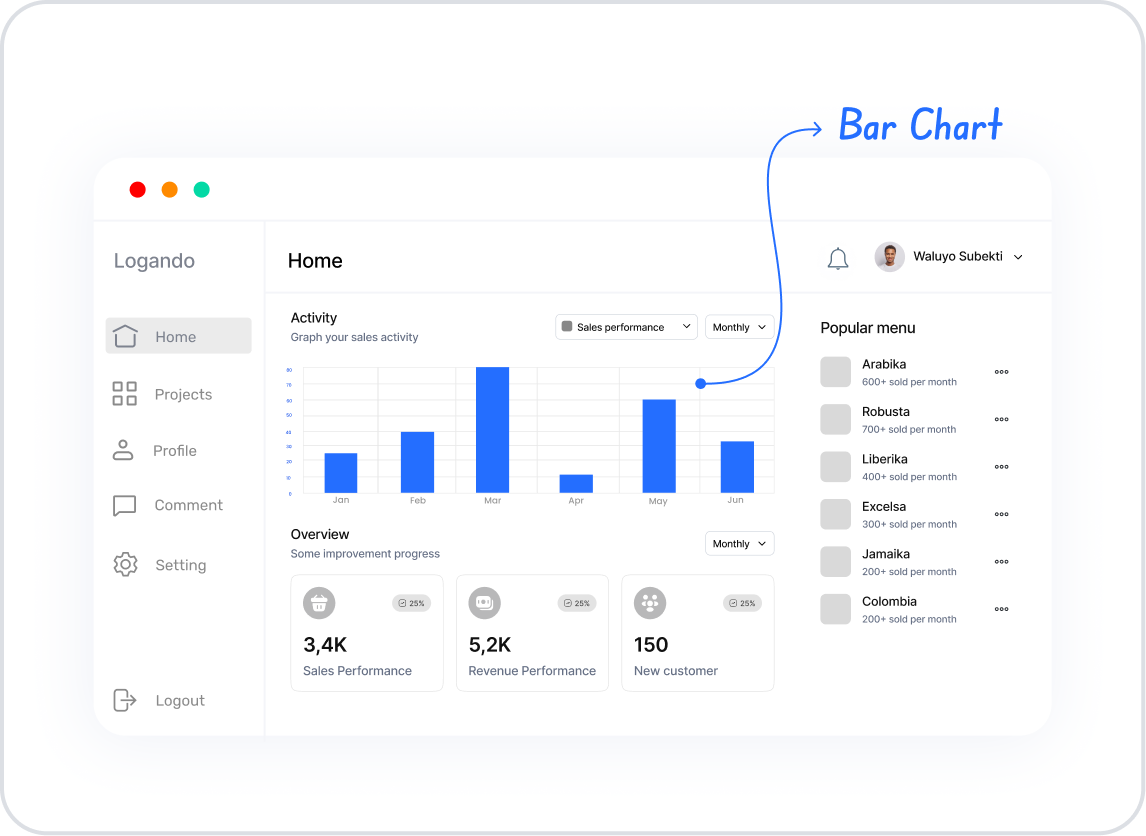
The Bar Chart element provides an effective and understandable way to compare categorical data. Thanks to the bars representing each category, users can easily compare the quantity or total differences between different groups. It is frequently preferred in sales analyses, evaluation of survey results, performance comparisons, and all categorical data visualization scenarios.
The Bar Chart element is supported in both web and mobile applications.
1.1. Common Use Cases
Compare values across different categories (e.g., product-based sales, department performance, store comparisons)
Visualize survey or poll results (e.g., preference distribution, satisfaction scores)
Identifying the highest or lowest values in categorical data sets
Showing quantitative differences between products, services, or user groups
2. Key Features
Visualization of categorical data in bars
Ability to compare multiple data sets side-by-side or stacked on the same chart
Support for horizontal or vertical bar views
Customizable X (category) and Y (value) axes
Ability to adjust visual settings such as color, bar thickness, spacing, and opacity
Dynamic loading of chart data from the data source
Full compatibility with SQL, REST API, or Managed DB actions
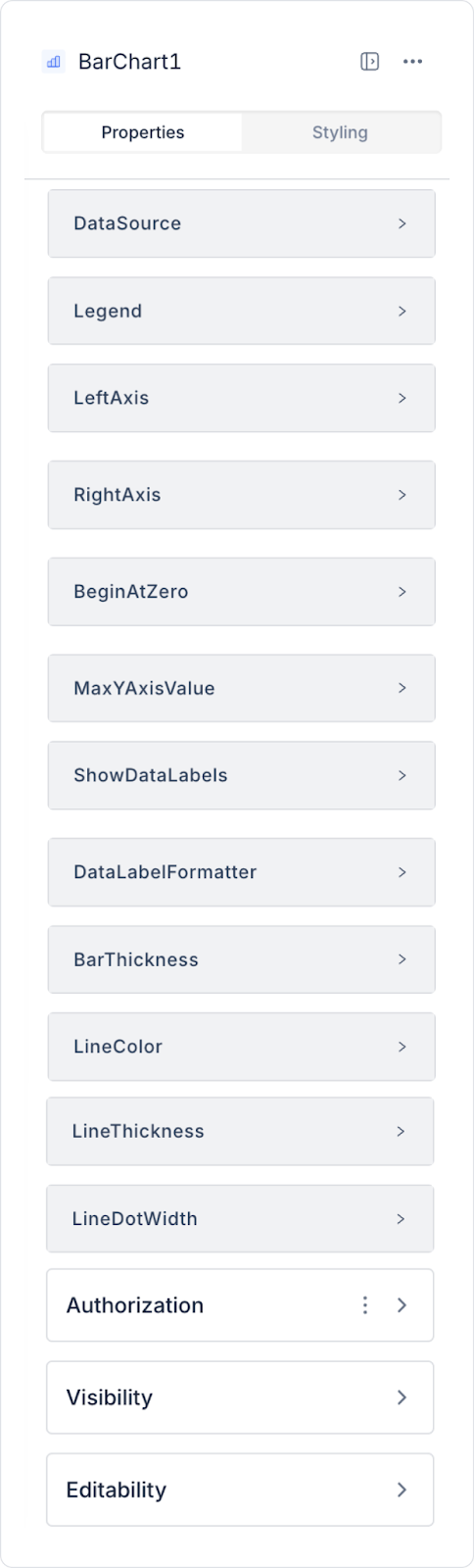
2.1. Element Properties
When you select the Bar Chart element, you can define the chart data fields, tooltip configurations, axis settings, and all visual properties related to the bar view in detail via the Properties panel on the right. All of the following settings are explained item by item.
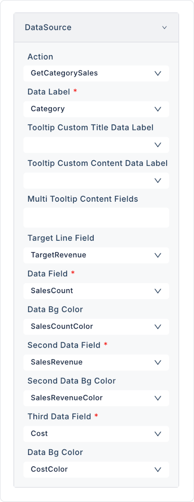
Datasource
Datasource Action: This action fetches the data to be displayed on the Bar Chart. The data is loaded into the chart when this action runs.
If no action is linked to the Datasource, the following data mapping fields will not be displayed.
Data Field Mappings
Data Label: This is the title of the main data set to be displayed in the chart. This title appears in the legend and tooltips. By default, the column name from the data source is used; however, you can customize the series name displayed in the legend and tooltips by entering a fixed (static) text instead of the column name.
Tooltip Custom Title Data Label: Specifies the data label to be displayed as the title in the tooltip. Controls the title visible when the user hovers over the bars.
Tooltip Custom Content Data Label: The data label that will appear as an explanation in the tooltip content. Used for additional information, explanatory notes, or sub-values.
Multi Tooltip Content Fields: Allows you to display multiple data fields within a single tooltip. Used to present detailed data in charts with multiple bars.
Target Line Field: The data field used to display a target line in the chart. Reference lines such as sales targets or KPI limits are defined with this field.
Data Field: The field to which the main data series is linked. The height of the bars in the chart is created based on this data.
Data Bg Color: Sets the bar fill color for the main data series. Hex format is supported (e.g., #007bff).
Column: The color is dynamically retrieved from a column in the data source (e.g., SalesCountColor).
Custom: A fixed (static) Hex value is entered using the color picker, and this color is applied to all bars in the series.
The Second Data Bg Color and Third Data Bg Color fields also support the same Column/Custom structure.
Second Data Field: Used to display a second data series on the chart. Suitable for side-by-side (grouped bar) or stacked (stacked bar) comparisons.
Second Data Bg Color: The fill color of the second data series' bars.
Third Data Field: Used to add a third data series. Especially useful for three-category comparisons.
Third Data Bg Color: Determines the bar color of the third data series.
Stacked: This option displays bars representing multiple data series within the same category (Data Field, Second Data Field, Third Data Field, etc.) stacked on top of each other rather than side by side. When this feature is enabled, all series under the relevant category are combined and displayed on a single bar; when disabled, the series are displayed as separate bars (grouped bars) next to each other. It is particularly useful in scenarios where you want to compare parts of a whole (e.g., product breakdown within total sales) at a glance.
Legend
Legend Position: Determines where the legend appears on the chart. Options:
Top
Bottom
Right
Left
Axis Settings
Left Axis: Determines whether Y-axis values are displayed. Controls such as value units and minimum–maximum settings are made in this area.
Right Axis (X-axis): Controls the visibility of category or value fields on the X-axis.
Start and Value Limits
Begin At Zero: Ensures that chart values start at zero. It is often recommended to keep this option enabled for accurate comparisons.
Max Y Axis Value: Allows you to manually set the upper limit of the Y axis. Used to create fixed-scale charts.
Data Label Settings
Show Data Labels: Ensures that data labels are written on each bar. Increases the visibility of values directly on the chart.
Data Label Formatter: Sets the format of the data labels. Supported formats:
Money
Money TI
Percent
Fractional-2
Fractional-5
Locale-Based Number Formatting: Numbers displayed in Y-axis values and tooltip content are automatically formatted according to the application’s active language. For example, in Turkish, a period (.) is used as the thousands separator and a comma (,) as the decimal separator (e.g., 24.568.011), while in English, a comma is used as the thousands separator and a period as the decimal separator (e.g., 24,568,011). This formatting requires no additional configuration and is applied consistently across the Y-axis and the tooltip.
Bar and Line Visual Settings
Bar Thickness: Sets the thickness of the chart bars. Can be adjusted for a fuller or tighter appearance.
Line Color: Sets the color of the line (e.g., Target Line).
Line Thickness: Sets the line thickness.
Line Dot Width: Sets the width of the dot markers on the line (dot size). Used especially to highlight trend points.
2.2. Actions That Can Be Added to Elements
The Bar Chart element is a passive visualization component that does not have the ability to trigger actions through user interaction. Therefore, when the element is selected, the ADD ACTION button is not displayed, and no trigger specific to the Bar Chart can be added.
The following points explain the action structure of the Bar Chart:
User clicks, bar selections, or hover actions on the Bar Chart do not trigger an action.
To refresh or redraw the graph, the Datasource Action associated with the Bar Chart must be triggered externally.
User-interactive scenarios (e.g., “user selects category, graph updates”) are managed not directly through the Bar Chart, but through other elements such as RadioGroup, Button, etc.
The Bar Chart only visually represents the data; it does not initiate any actions itself.
No actions can be defined on the Bar Chart element.
All process flows are managed by assigning actions to UI elements linked to the chart's data source, not to the chart itself.
3. How to Use the Bar Chart Element?
In this section, we will cover the end-to-end use of the Bar Chart element through an example scenario.
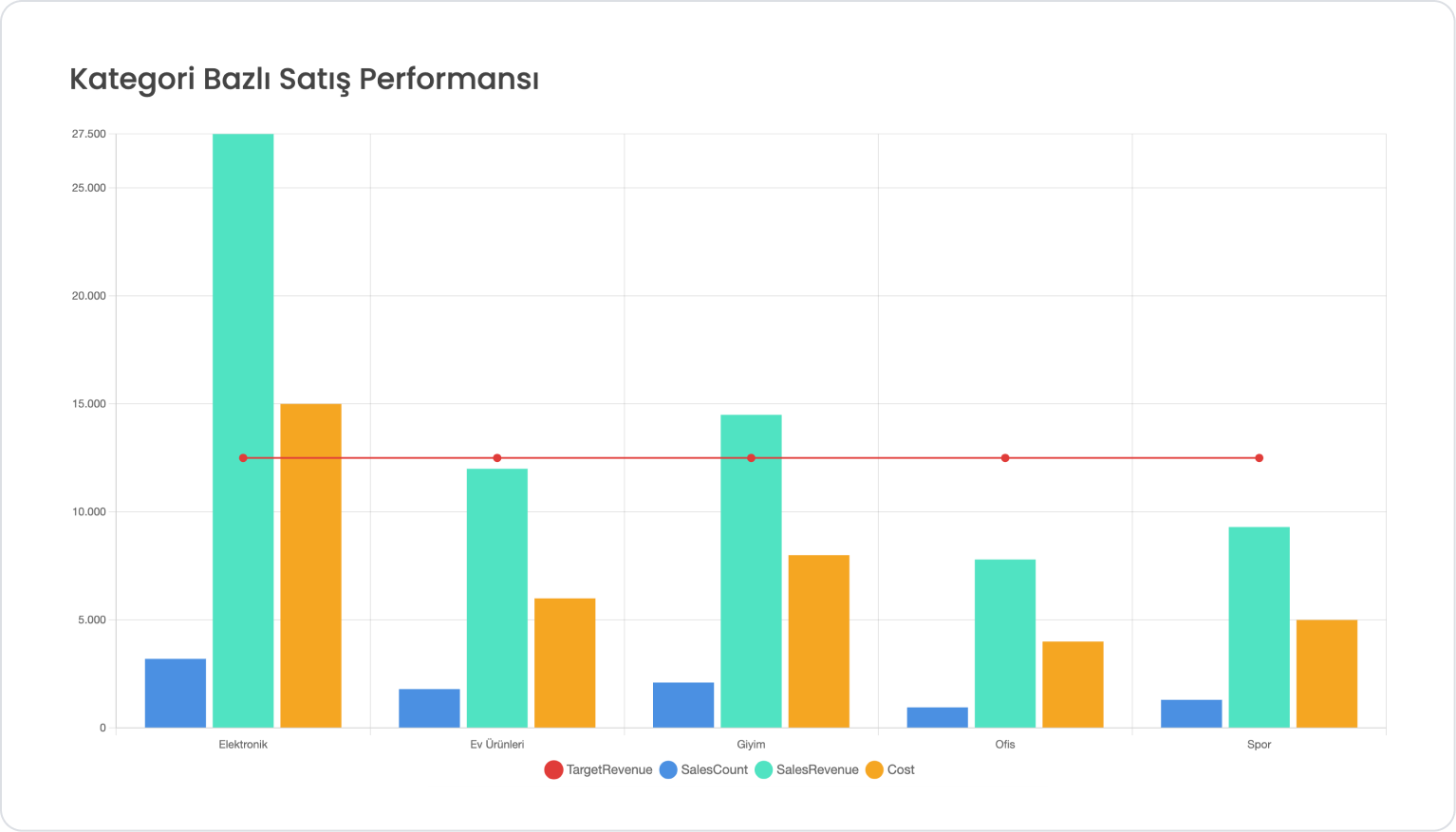
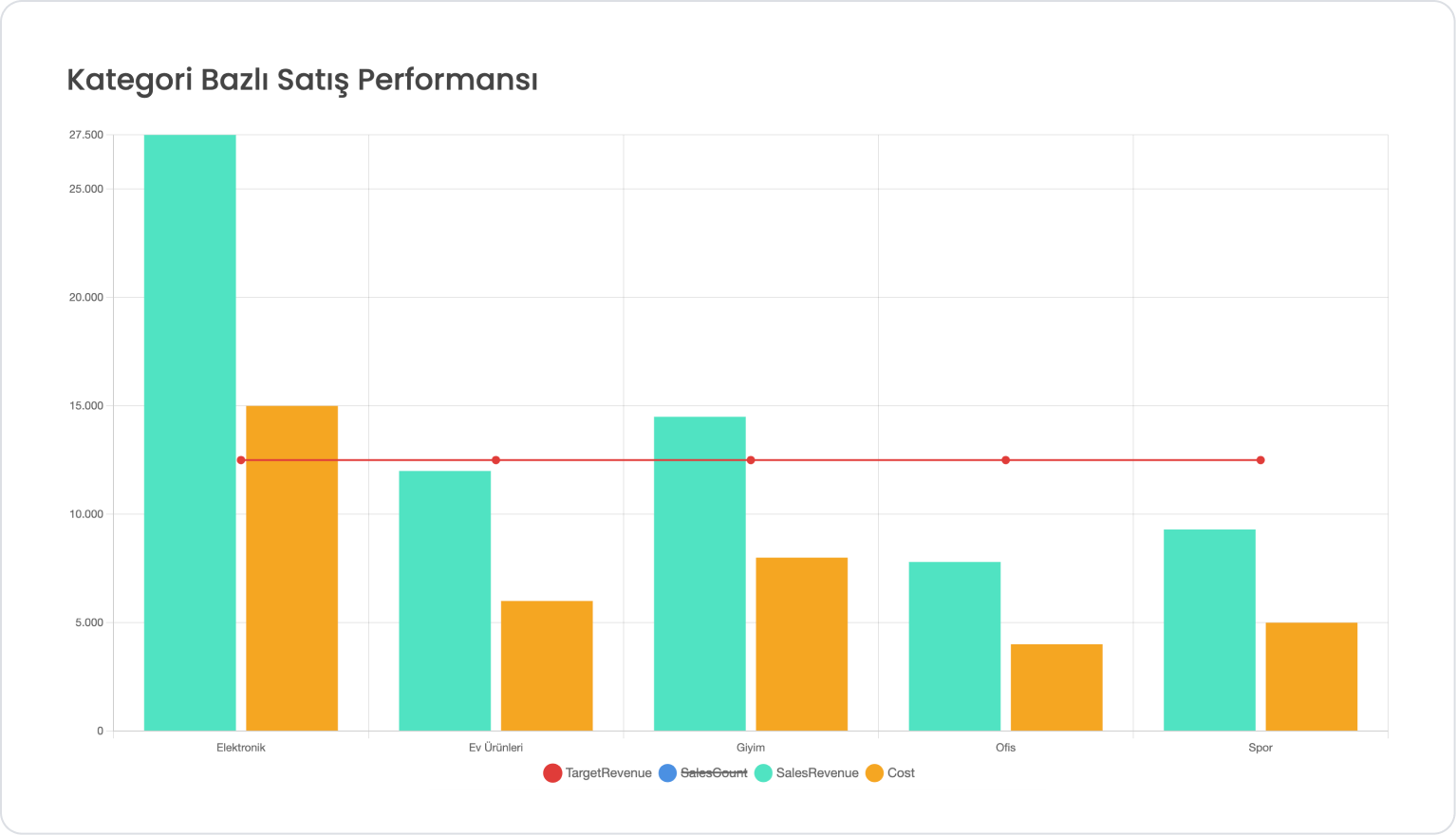
In a sales management application, the user is shown sales count, sales revenue, and cost information for different product categories.
This data is displayed as multiple series on the Bar Chart, allowing the user to easily compare sales performance across categories.
In the scenario:
will be displayed as three separate data series on the Bar Chart. A different color is used for each series within the chart to make category comparisons more readable.
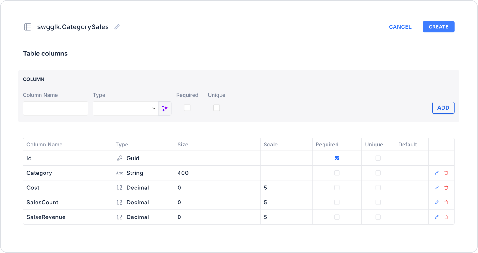
When applying, deleteCategorySales, rewriteCategorySales, and press Enter. This will add the correct schema name before the table name.
Action Providing Data (GetCategorySales):
SELECT
Category,
SalesCount,
SalesRevenue,
Cost,
‘#4A90E2’ AS SalesCountColor,
‘#50E3C2’ AS SalesRevenueColor,
‘#F5A623’ AS CostColor,
CAST(12500 AS DECIMAL(18,2)) AS TargetRevenue
FROM CategorySales
ORDER BY Category;
When applying, delete the GetCategorySales part, rewrite GetCategorySales, and press Enter. This will add the correct schema name before the table name.
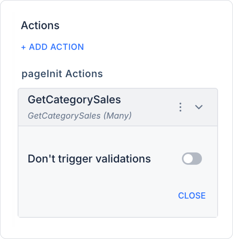
Step 3 - Adding Initial Action
Open the UI Design module.
Add the Initial Actions > Custom > Managed Db > GetCategorySales action to the page using the ADD ACTION button.
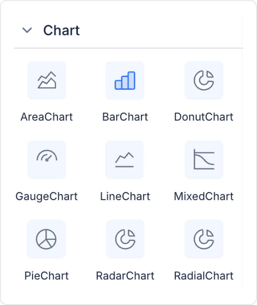
Step 4 - Adding Elements
Drag and drop the Elements > Display > Label element onto the page from the left panel.
Then add the Elements > Chart > BarChart element to the page from the left panel.
Step 5 - Configuring Element Settings
Add the text “Category-Based Sales Performance” to the
Label > Properties > Value field.
Set the font of the Label field to Label> Styling > Text > Style > Heading 2.
Add the Action > GetCategorySales action to BarChart > Properties > DataSource to provide data to the Bar Chart. Make the following definitions:
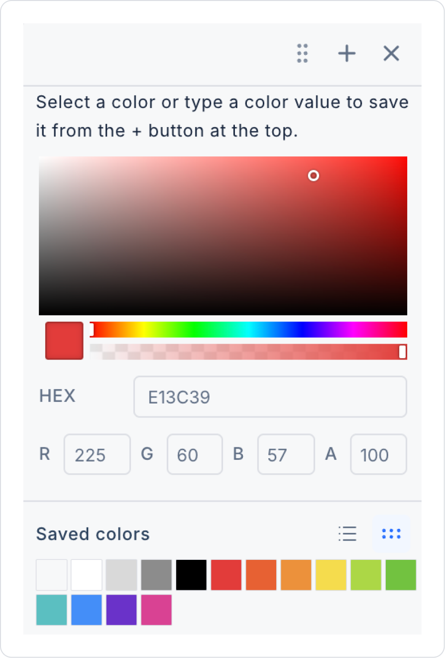
Enter “E13C39” as the line color in the HEX field in BarChart > Properties > LineColor and close.
Preview:
When the application is tested using the Preview button in the upper right corner, you can see the target revenue, sales quantity, sales revenue, and cost values compared on the Bar Chart based on categories. You can easily filter the visibility of each data series by clicking on the Legend field below the chart.
4. Common Properties
Some fields on the Bar Chart element are common to all UI elements. Therefore, detailed explanations of the following properties can be found in the relevant general guide pages:
When using Bar Charts, it is recommended to consider the following best practices:
Organize your categorical data into regular and meaningful groups. Very long category lists can cause bars to become crowded and reduce readability.
If you are using multiple data series, choose contrasting colors. Color differentiation significantly improves readability, especially in grouped or stacked bar charts.
Adjust the bar thickness according to the data density. Thick bars are more useful when there is little data, while thin bars are more useful when there is a lot of data.
Keep tooltip content clear and descriptive. The information displayed when the user hovers over the chart should be simple and understandable.
Use the correct formats on the axes. Currency, percentage, or decimal formats help users understand the data more quickly.
Manually set the maximum Y-axis value (Max Y Axis Value) when necessary. This allows you to produce standard charts with the same scale for comparison across different pages.
6. Limitations
The following limitations should be considered when working with the Bar Chart element:
Bar Chart does not support actions triggered by user interaction. Clicking, selecting, or hovering actions cannot be performed on the chart.
The chart will not be displayed without a defined Datasource. Data Field and other data fields will not be active if they are not linked to a Datasource.
Incorrect or missing data types may corrupt the chart drawing. Non-numeric values may cause errors or chart corruption on the Y-axis.


