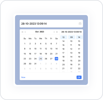
The Date Time element is an advanced input element that allows users to select both date and time information from the same interface. It functions as a combination of a date picker and a time picker, ensuring accurate and consistent data entry for time-sensitive operations.
This element allows users to manually enter date and time information or select it from a drop-down date-time interface. Furthermore, when two Date Time elements are used together, the Disable Before Time feature ensures that only valid options are active in the end date-time field. This ensures consistency between start and end times and prevents incorrect selections.
The Date Time element plays a critical role in appointment systems, delivery scheduling, event start-end logging, and all processes requiring a timestamp. It offers a user-friendly, intuitive selection experience on both web and mobile devices.
The Date Time element is supported in web and mobile applications.
1.1. Common Use Cases
Processes requiring simultaneous date and time selection. For example: creating appointments, scheduling meetings, timing service requests.
Time-based reservation processes. Hotel check-in/check-out times, transportation reservations, delivery time slot selection.
Scenarios where start and end times need to be verified. For example: event start/end times, work start–end records.
Flows requiring time constraints. Scenarios where options before the start time must be disabled using Disable Before Time (e.g., return time cannot be earlier than the start time).
Delivery and operations planning processes. Courier delivery times, maintenance and repair services, field team time planning.
Forms requiring real-time data from the user. For example: appointment registration, meeting creation, templates requesting date and time information for reporting.
2. Key Features
Combining date and time selections into a single element. The user can select both the date and time through the same element. This provides ideal usage for time-sensitive operations.
Manual entry or interactive selection support. The user can enter the date and time manually or select them from the date–time picker interface. This allows for both fast and controlled entry.
Ensure time consistency with Disable Before Time. When two Date Time elements are used together, only valid time options are enabled in the end date-time field. For example:
Start: June 10, 14:00
The end field will no longer allow selection of times before 14:00.
This feature prevents incorrect data entry in processes such as reservations, appointments, and logistics.
Dynamic value support. A dynamic start or default value can be assigned to the Date Time element via the Symbol Picker. For example: “Current date-time,” “user-selected value,” “calculated time,” etc.
Keyboard navigation support (Tab navigation). You can use the Tab key to move sequentially between the date and time selection fields (day, month, year, hour, minute, etc.) within the Date Time element.
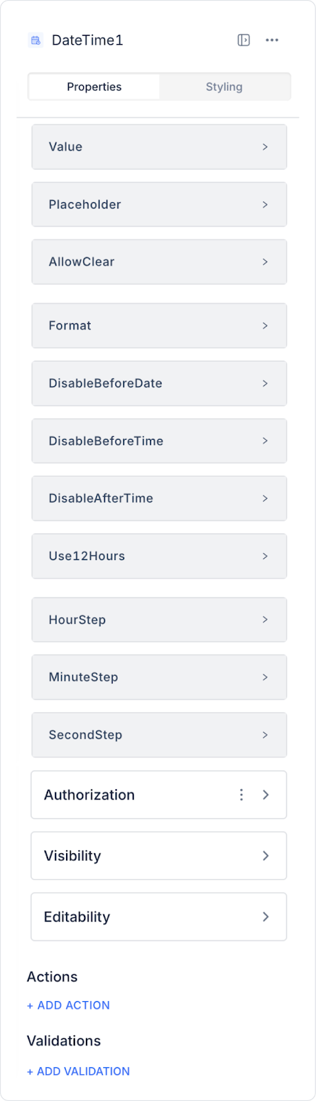
2.1. Element Settings (Properties)
All settings for the Date Time element are configured via the Properties panel on the right. Each feature is explained in detail below:
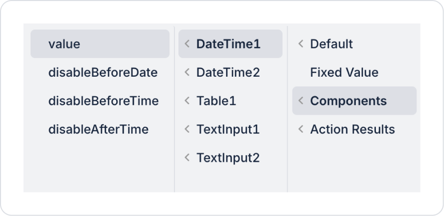
Value: You can specify a static date-time value or assign dynamic values using the Symbol Picker.
Placeholder: You can add a placeholder text to guide the user in entering the date and time information. For example, “Select Date and Time”. The placeholder is displayed when the Date Time element's value is empty.
Allow Clear: Allows the user to clear the selected date and time with a single click. Entries can be reset using the Delete (X) icon that appears in the right corner.
Format: Determines how date and time data is displayed. You can select the following formats from the drop-down menu in the Properties panel:
yyyy MM dd hh mm:
Year - Month - Day - Hour - Minute
Example: 2025.04.24 / 15:30
dd MM yyyy hh mm:
Day - Month - Year - Hour - Minute
Example: 24.04.2025/ 15:30
dd MM yyyy hh mm ss:
Day - Month - Year - Hour - Minute - Second
Example: 24.04.2025 / 15:30:45
hh mm:
Hour and Minute
Example: 15/30
mm ss:
Minute and Second
Example: 30:45
hh mm ss:
Hour - Minute - Second
Example: 15:30:45
yyyy-MM-DD HH:mm:ss:
Full date and time in ISO format
Example: 2025-04-24 15:30:45
DD-MM-YYYY HH:mm:ss:
European date and time format
Example: 24-04-2025 15:30:45
HH:mm:
Hour and Minute (24-hour format)
Example: 15:30
Hh:mm:ss:
Hour - Minute - Second (12-hour format, AM/PM)
Example: 03:30:45 PM
Mm:ss:
Minute and Second
Example: 15:45
Disable Before Date: Prevents dates before a specific date from being selected. You can set a static date or use dynamic values. This feature is used to set restrictions for future dates.
Disable Before Time: Prevents time intervals before a specific time from being selected.
Disable After Time: Prevents time intervals after a specific time from being selected.
Use 12 Hours: Determines whether the time is displayed in 12-hour (AM/PM) or 24-hour format.
Hour Step: Determines the increments in which the user can advance when selecting hours. For example, selections can be made every half hour instead of every hour.
Minute Step: Determines the increments in which the user can advance when selecting minutes. For example, for processes such as vehicle delivery, selections can be made every 30 minutes.
Second Step: Determines the intervals at which the user can advance when selecting seconds.
Return Display Value(web only): Determines whether the date-time value selected by the user will be returned in a formatted manner (as it appears on the screen) or as a raw value. Not available on mobile.
2.2. Actions That Can Be Added to Elements
The Date Time element supports the onChange action, which is triggered when the user selects a date or time. This action runs automatically when a new value is entered into the element and triggers other actions.
After selecting the Date Time element, you can add an action using the ADD ACTION → onChange option in the right panel.
The action behavior of Date Time is explained in detail below:
onChange
Runs when the user makes a change in the date or time field. This trigger is used to synchronize time-sensitive operations or update other elements.
Usage Scenarios
Filter a list or table based on the selected date → E.g.: “Show records created after this date and time.”
Restrict the end element when the start date and time is selected → Works effectively with Disable Before Time.
Trigger form validations → “Show a warning if the time is not valid.”
Automatically perform operations such as price calculation or duration calculation → E.g.: Calculate the amount based on the rental period.
Re-run API or database queries → E.g.: “Retrieve available appointments based on this time.”
Dynamically update values in other elements (Label, Text, SelectBox, etc.).
Technical Behavior of onChange
Triggered when the user selects a new date-time.
Old and new values are automatically passed to the action (accessible via Symbol Picker).
Synchronous changes can be made in the interface (hide, show, validate).
3. How to Use the Date Time Element?
In this section, we will cover the end-to-end use of the Date Time element through example scenarios.
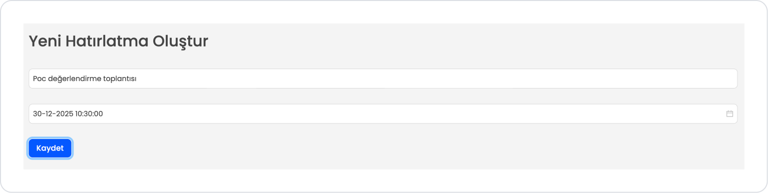
Scenario: Creating a Reminder
In a reminder or daily note application, users want to record a short description for a specific date. The Date Time element is used in this scenario to select which day the note belongs to.
In the scenario:
Users can easily track their date-based records on a single screen.
Thanks to the Date Time element, time and date information is obtained accurately and without errors.
With a simple form + list structure, entry and viewing operations are completed on a single page.
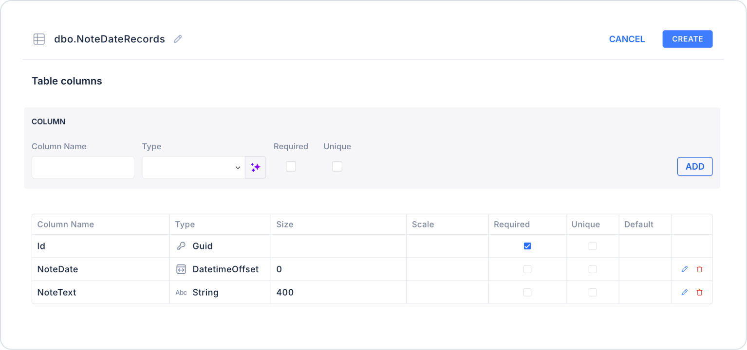
Step 1 - Creating the Data Source
Creating a table in the DataSources module:
Go to the Datasources module.
Then go to the Tables tab.
Create a new table named “NoteDateRecords”.
The table structure to be set up is as follows:
Important Field Names:
NoteText: Holds the note or short description entered by the user. In a list or table structure, it displays the content of the record to the user in a readable format.
NoteDate: Represents the date information associated with the note. This field, selected via the Date element, indicates which day the record belongs to and enables date-based tracking.
Step 2 - Define the Necessary Actions
To display and save data in the interface:
Three actions will be used in this scenario.
The Save Record ready-made system action provided by Kuika is used for record operations.
The data listing process is performed through a custom action created with predefined SQL queries.
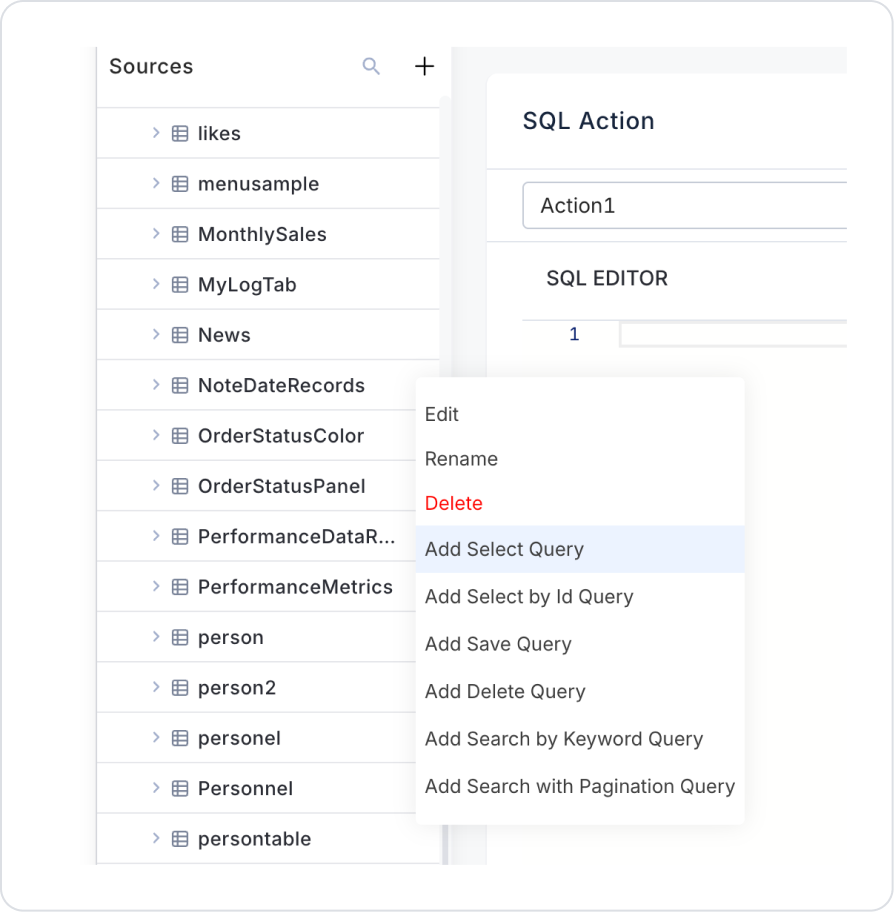
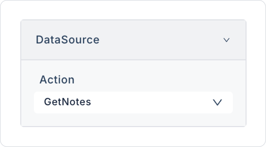
Add a new action from the Actions > New SQL Action tab in the Datasources module.
Action Listing Sample Data (GetNotes): The Select action is provided ready-made under the NoteDateRecords table in the left panel of the SQL Action section. Click the Add Select Query option to automatically generate the query. Name the created action GetNotes and save it.
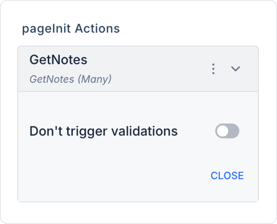
Step 3 - Add Initial Action
Initially on the home page:
Open the UI Design module.
Add the Add Action > Initial Action > Custom > Managed Db > GetNotes action to the page.
Step 4 - Add Element and Edit Style
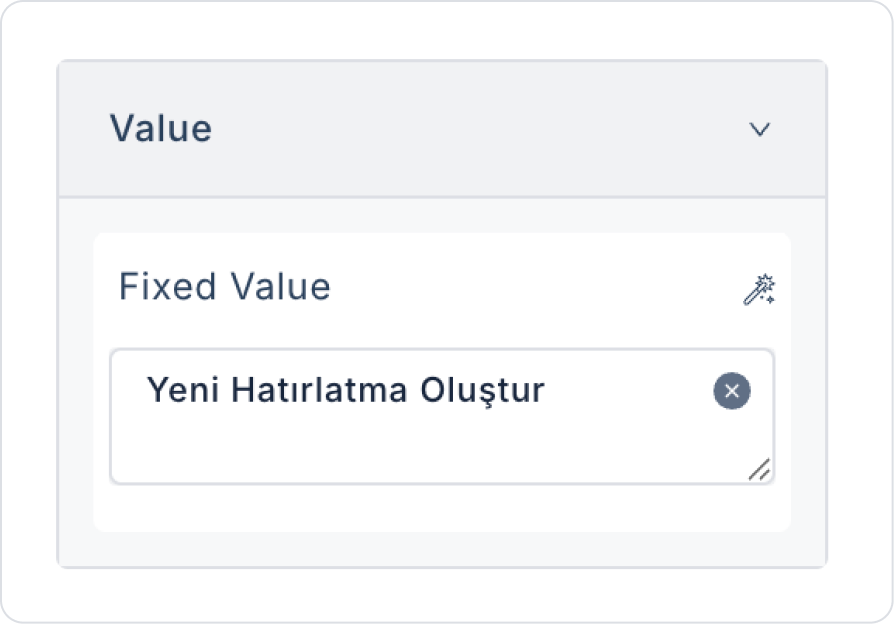
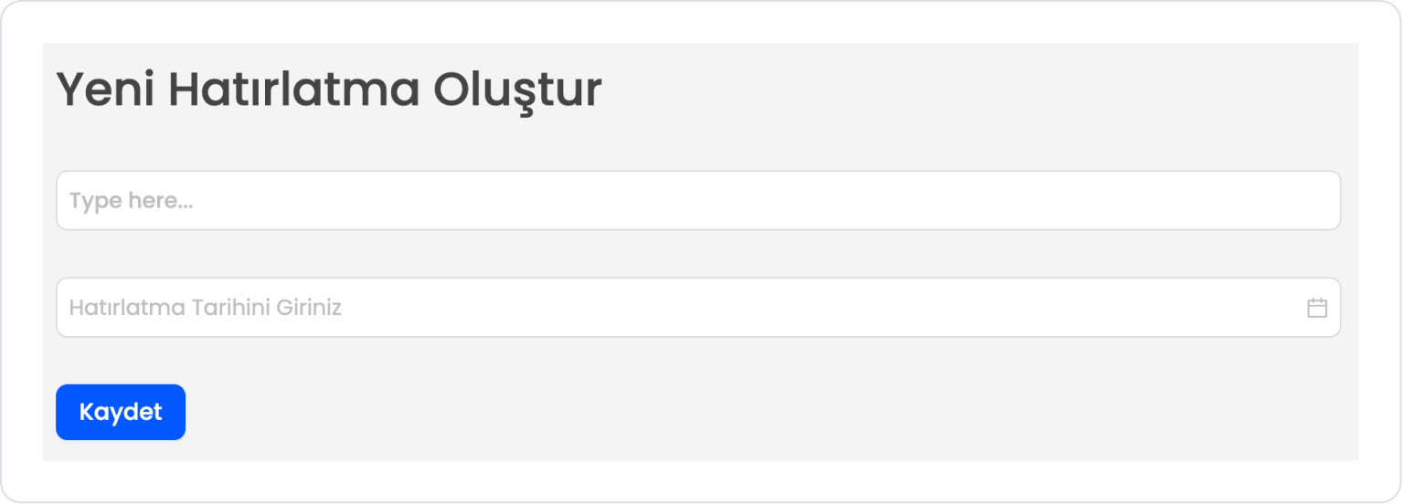
Drag and drop the Elements > Display > Label element onto the page.
Enter “Create New Reminder” in the Label > Properties > Value field.
Set the text style to Label > Styling > Text > Heading 2.
Drag and drop the Elements > Text Input > TextInput element under the Label element.
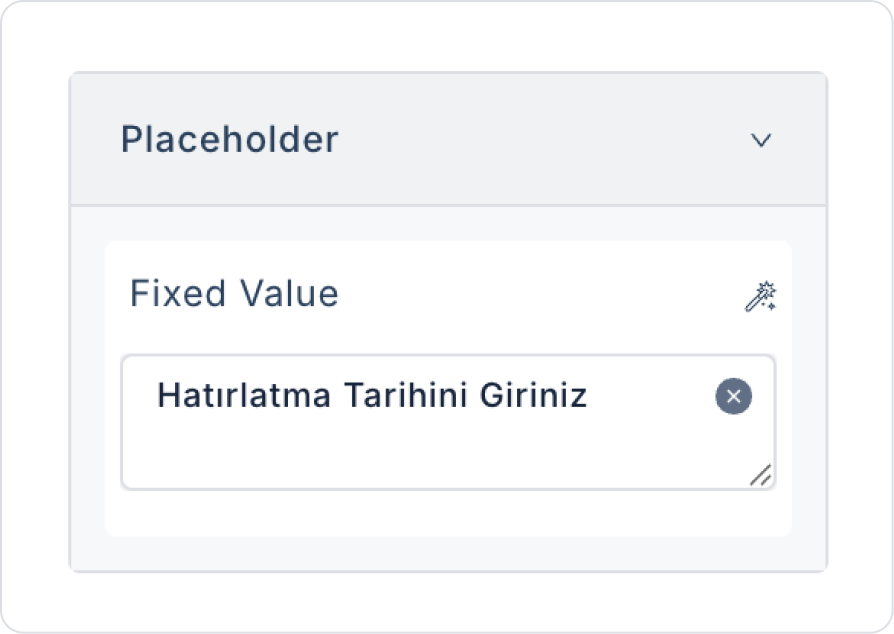
Drag and drop the Elements > Date and Time Input > DateTime element below the Text Input element.
In the Date element, add “Enter Reminder Date and Time” in DateTime > Properties > PlaceHolder.
To prevent past dates from being added, set DateTime > Properties > DisableBeforeDate > Default > Now.
Drag and drop the Elements > Navigation > Button element under the Date element to save the entries.
Add “Save” to the Button > Properties > Label field for the button text.
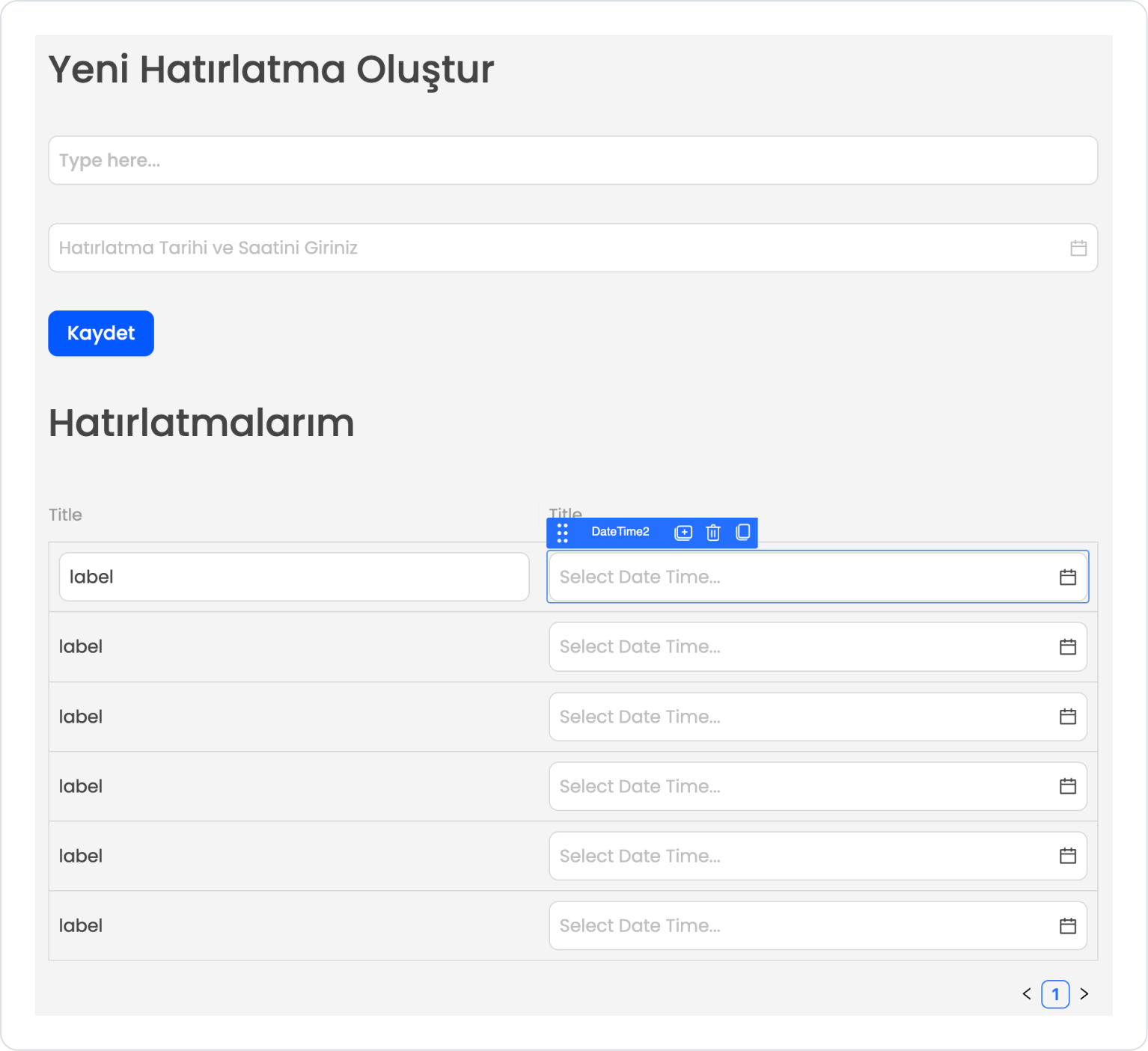
Add the Elements > Display > Label element under the Button element.
Enter “My Reminders” in the Label > Properties > Value field for the text.
Set the text style to Label > Styling > Text > Heading 2.
To dynamically display reminders, drag and drop the Elements > Data > Table element.
In the Table element, define the Table > Properties > DataSource > GetNotes action.
Drag and drop the Elements > Date and Time Input > DateTime element into the Table Column.
Step 5 - Configuring Element Settings
Connecting the initial action added to the page to the elements and adding the save action:
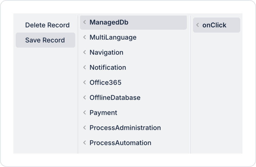
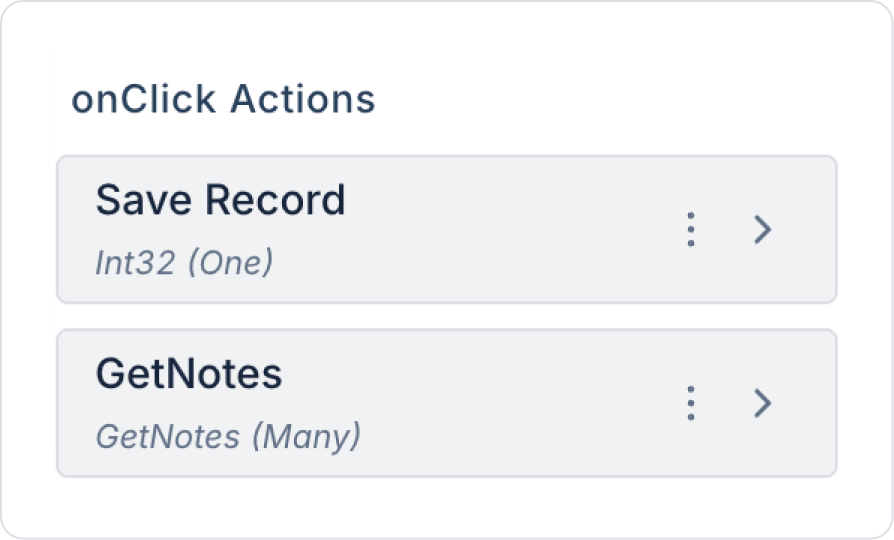
Click on the Button element. Click on the Button > Add Action > onClick > ManagedDb > Save Record action.
Define the Save Record NoteDate parameter as Components > Date1 > value.
Set the NoteText parameter as Components > TextInput1 > value.
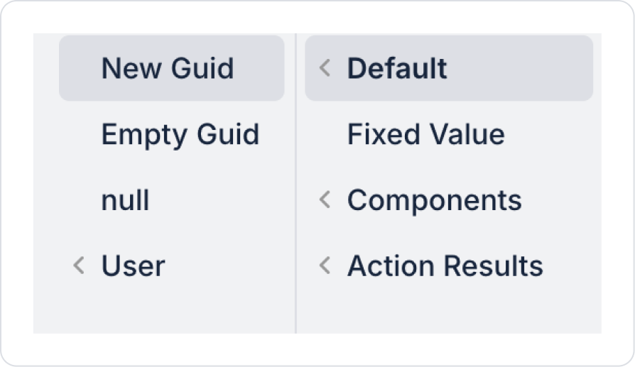
Define the Id field as Default > New Guid.
Add the Button > onClick > Custom > Managed DB > GetNotes action to update the list after saving.
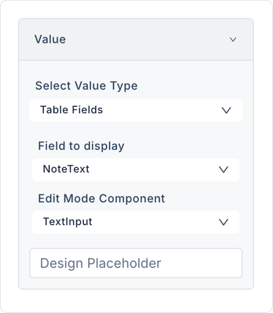
Click on the Label element within the Table element. Define Label > Properties > Value > Field to display as > NoteText.
Click on the Date element. Set DateTime > Properties > Value > Field to display > NoteDate.
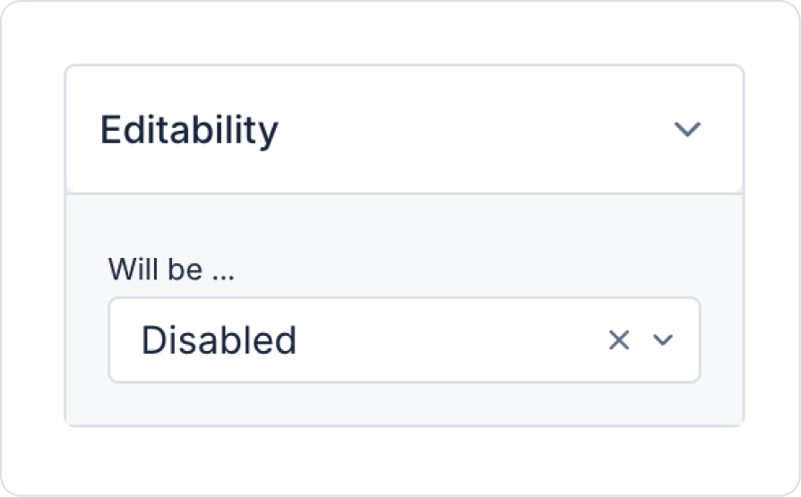
To make the reminder time in the table read-only, set DateTime > Properties > Editability > Disabled.
Preview:
When the application is tested, the user creates a record by entering the reminder description in the Text Input field and the reminder date and time in the Date Time field.
The saved reminder is listed in the table on a single page. Previously added reminders are also displayed in the same table, allowing easy tracking of past records.
4. Common Properties
Some fields on the Date Time element are used in common across all UI elements. Therefore, detailed descriptions of the following properties are provided in the relevant general guide pages:
Always store date and time values in datetime format. Incorrect data types (string, number, etc.) can cause errors in API or Managed DB processes.
Be sure to configure the Disable Before Time feature correctly. This prevents return times from falling into the past, especially in start-end scenarios. Example: The appointment end time cannot be before the start time.
Perform mandatory field checks. Warn the user about empty values in processes where date and time selection is required.
Use the onChange action in time-sensitive calculations. Example: “Calculate the time between these two dates and times.”
Define the time format consistently throughout the application. E.g.: 24-hour format (HH:mm) or 12-hour format (AM/PM).
6. Limitations
The Date Time element may appear differently in mobile and web applications. Some visual differences may occur because the built-in date-time picker is used on mobile.
Date-time values sent in the wrong format may cause errors in actions. (E.g., “2025-10-21 5pm” should be replaced with “2025-10-21 17:00:00”).
The Date Time element is only for date and time selection; it does not include a range structure. If range selection is required, the Date Range element should be used.


