Kuika's Countdown element is a timer element used to count down a specific time interval. It is used within the application to clearly and visually indicate critical times to the user, such as an upcoming event, campaign end date, delivery time, or exam start time. Countdown is often preferred to attract users' attention, create a sense of urgency, and facilitate time management.
The Countdown element is supported in web and mobile applications.
1.1. Common Use Cases
Displaying Campaign or Discount Duration: Used in e-commerce applications to show the time remaining until a campaign ends, encouraging users to make a purchase decision faster.
Event/Webinar Start Timer: Clearly shows users how much time is left until the start of an event, training session, or live broadcast.
Delivery/Shipping Time Tracking: Ideal for showing the time remaining until order, shipment, or project delivery dates. Users can instantly track the approaching delivery time.
Exam, Application, or Registration Processes: Used to show the time remaining until the closing of an application form, the start of an exam, or a final deadline.
In-Game or In-App Timers: Performs a countdown function in timed mechanics such as task duration or reward duration.
System Maintenance Notification: Informs the user by showing the time remaining until the start of scheduled maintenance work.
Stock Replenishment or Flash Sale Start: Can be used to create a countdown until a product stock replenishment or the start of a short-term “flash sale.”
2. Key Features
Target Time Definition: The end time of the countdown to be displayed to the user can be set dynamically or statically. For example; a campaign end date, delivery date, or event start time.
Automatic Countdown Mechanism: The countdown element automatically updates itself every second until the specified target time, providing the user with a live countdown.
Dynamic Data Support: The target time can be linked to an action result, user input, or database field via the Symbol Picker. This makes the countdown completely dynamic.
Special Message or Change When Time Expires: When the time is up, a special message can be displayed to the user, or it can be used in conjunction with another UI element to manage situations such as “Time is up.”
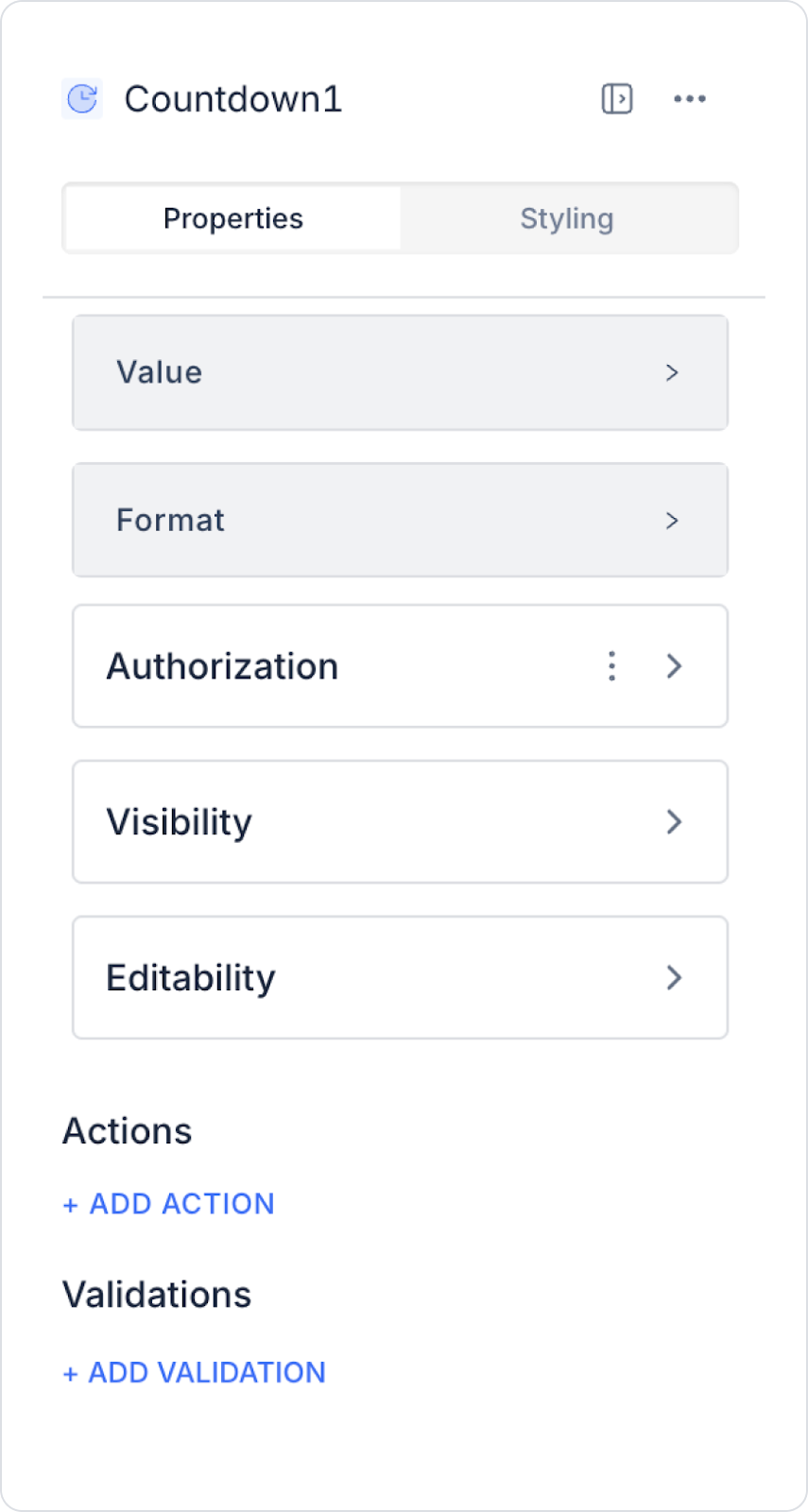
2.1. Countdown Element Properties
You can configure the properties of the Countdown element from the Properties panel on the right side.
Value: Specifies the start time of the countdown in seconds. You can enter a static value or assign a dynamic value using the Symbol Picker.
Format: Determines how the countdown is displayed. The Formatter option displays the data according to one of the following standard formats:
These hour, minute, and second formats provide a standard structure for accurately displaying the countdown. You can select the appropriate format based on your application's needs.
2.2. Actions That Can Be Added to Elements
The Countdown element supports two different triggers (events) depending on the countdown process. These triggers allow you to execute actions while the countdown is in progress or when the time is up. Actions can be added via the ADD ACTION button in the right panel when the element is selected.
onChange
This action is triggered whenever the value changes during the countdown. This event can be used in scenarios that require updates every second.
Possible use cases:
Displaying the remaining time in a different format on a Label element whenever the countdown changes
Updating an element such as a Progress Bar according to the countdown time
To give a warning at a certain threshold value (e.g., 10 seconds remaining) while the countdown is ongoing
To create dynamic animations or color changes on the UI as the time decreases
onFinish
This action is triggered when the countdown is completely finished (when it reaches 00:00:00). It is the most frequently used event in all timer-based workflows.
Possible use cases:
Open a modal/popup when the time is up
Automatically redirect the user to another page
Automatically start a process (e.g., lock the form, end the exam, log out)
Make an API call when the end time is reached (e.g., campaign end notification)
Disable/enable buttons or inputs
3. How to Use the Countdown Element?
In this section, we will cover the end-to-end use of the Countdown element through an example scenario.
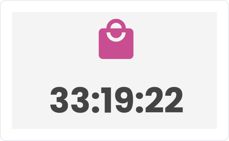
Scenario: Campaign Countdown
In an e-commerce application, displaying the start time of a discount campaign to the user supports purchasing behavior. When the user enters the product details page, they see the time remaining until the start of the campaign in real time.
In the scenario:
The campaign start time is retrieved from the database.
The remaining time is calculated in seconds.
The Countdown element displays this value as a live countdown.
When the time reaches zero, the campaign screen can be updated or the process can be triggered.
Thanks to this structure, the user instantly tracks the information “33:1:22 left until the end of the campaign” and makes their purchase decision faster.
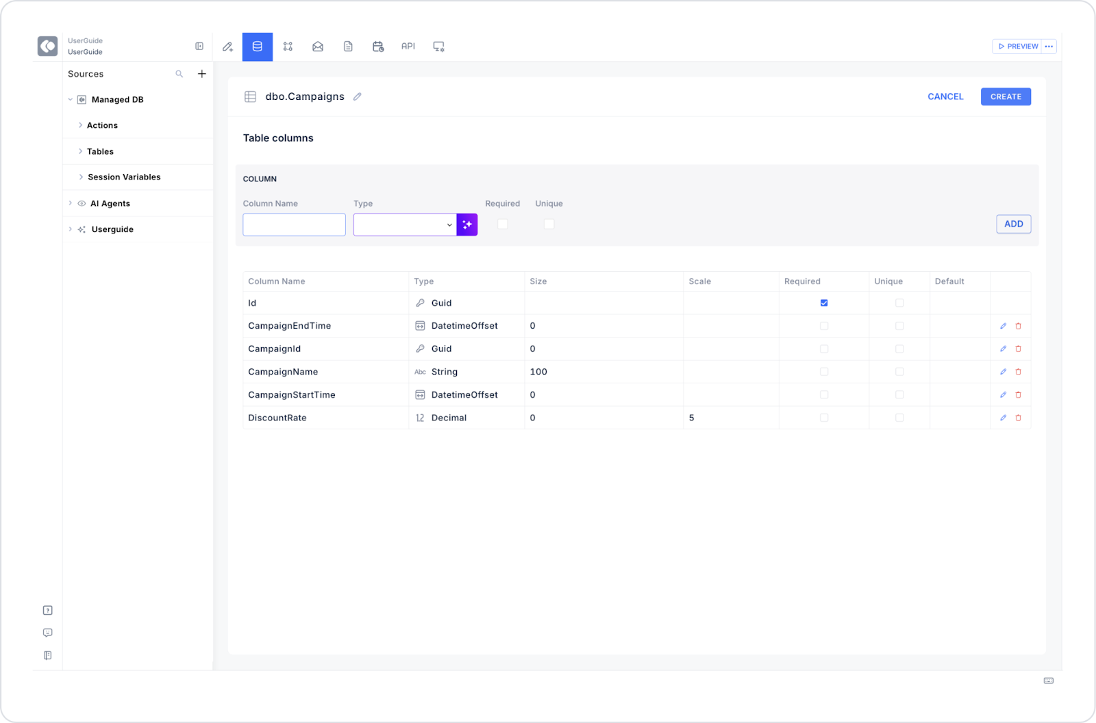
Step 1 – Creating a Data Source for Dynamic Use
Creating a table in the DataSources module:
Go to the Datasources module.
Then go to the Tables tab.
Click the + icon next to the Tables heading.
Create a new table named “Campaigns”.
The table structure to be set up is as follows:
Important field names:
CampaignId: The main reference ID that represents the campaign across the system.
CampaignName: The name of the campaign displayed to the user.
CampaignStartTime: Indicates the date and time the campaign became active.
CampaignEndTime: Specifies the date and time the campaign ended.
DiscountRate: Represents the discount rate applied within the campaign.
Step 2 - Defining Actions Required for Dynamic Use
To display and add data in the interface:
You need to define three actions.
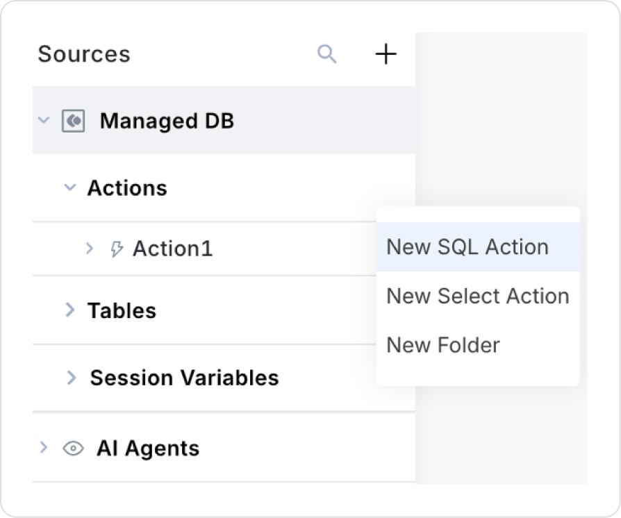
Add a new action from the Actions > New SQL Action tab in the Datasources module.
Action Adding Sample Data (InsertCampaigns): To test the application with sample data, add the following SQL action and press the TEST button.
When applying, delete the Campaigns section, rewrite Campaigns, and press enter. This will add the correct schema name before the table name.
Action Adding Sample Data (GetCampaigns):
SELECT
    Id,
    CampaignName,
    DATEDIFF(SECOND, GETDATE(), CampaignEndTime) AS RemainingSeconds
FROM Campaigns
WHERE CampaignEndTime > GETDATE();
When applying, delete the Campaigns section, type Campaigns again, and press enter. This will add the correct schema name before the table name.
Step 3 – Adding a Main Page Element (Countdown)
Open the UI Design module.
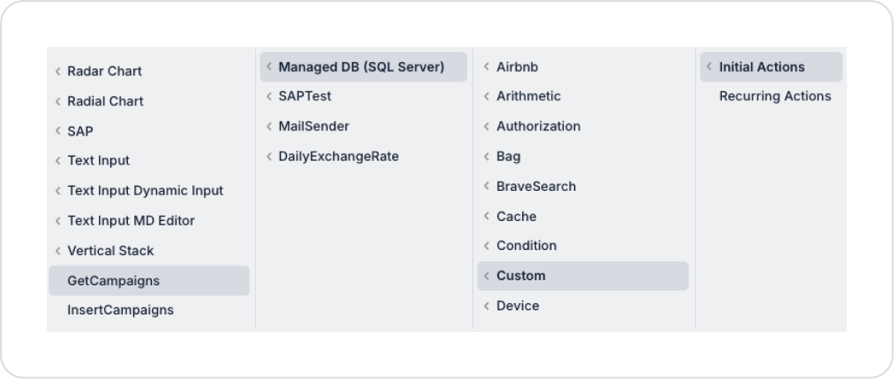
Add the Initial Actions > Custom > Managed Db > GetCampaigns action to the page using the ADD ACTION button.
Go to the Elements section in the left panel and drag and drop the Elements > Container > VerticalStack element onto the page.
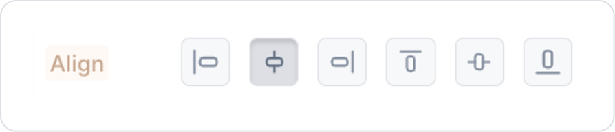
Set the Vertical Stack element to VerticalStack > Styling > Layout > Align > Center Horizontally.
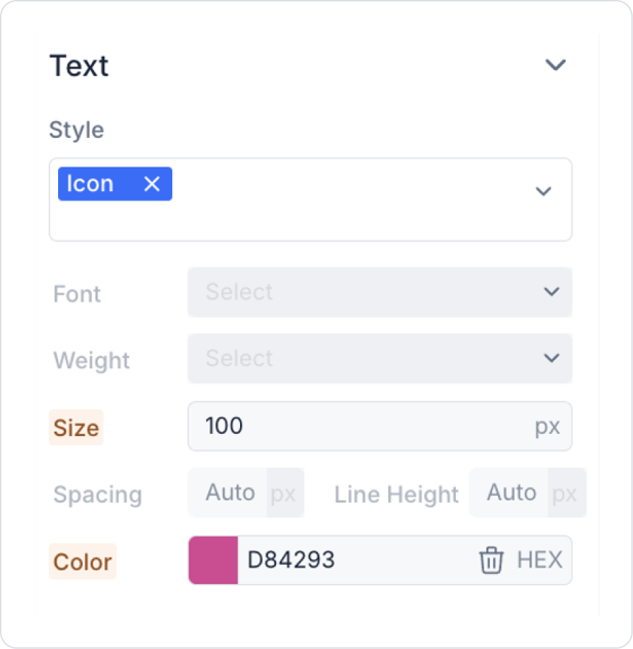
Drag and drop the Elements > Display > Icon element into the Vertical Stack.
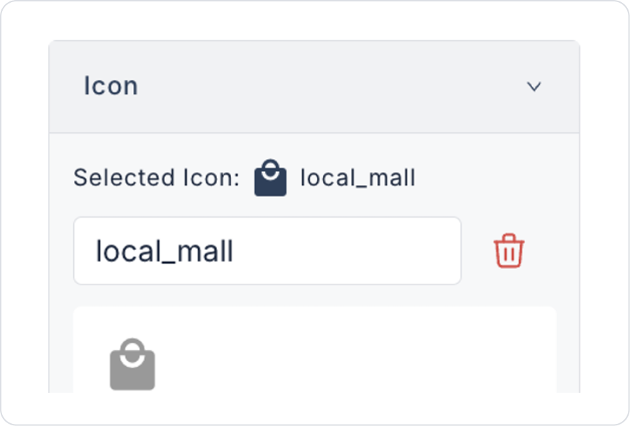
Set the icon shape to Icon > Properties > Icon > “local_mall”.
Set the icon size to Icon > Styling > Text > Size > 100 px.
Set the icon color to Icon > Styling > Text > Color > HEX > D84293.
Drag and drop the Elements > Display > Countdown element into the Vertical Stack below the icon.
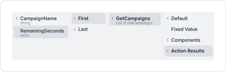
Set the Countdown > Properties > Value > Action Result > GetCampaigns > First > RemainingSeconds definition for the countdown in seconds.
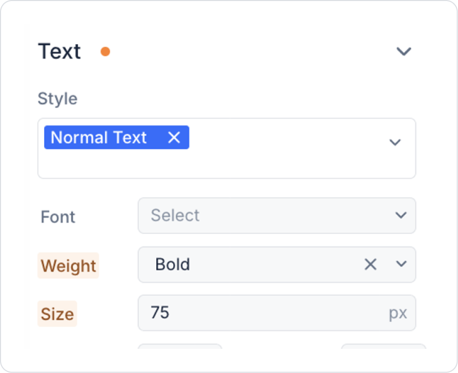
Set the text weight to Countdown > Styling > Text > Weight > Bold.
Set the text size to Countdown > Styling > Text > Size > 75 px.
Preview
When the application is tested, the time remaining until the end of the active campaign is displayed on the Countdown element in a countdown format in hours:minutes:seconds. As the campaign period progresses, the counter automatically decreases, and when the time is up, the countdown resets to zero, clearly indicating to the user that the campaign has ended.
4. Common Properties
Some fields on the Countdown element are used commonly across all UI elements. Therefore, detailed descriptions of the following properties can be found in the relevant general guide pages:
Always provide the countdown time in the correct format. Countdown only supports the HH:MM:SS format, so different formats (e.g., minutes-seconds) may cause incorrect display.
Use the Symbol Picker to manage the time dynamically. For example, you can connect the “remaining time” information from the API directly to Countdown.
Be sure to use the onFinish event. Actions to be performed when the time is up (page redirection, popup opening, form submission) should be managed with the onFinish action.
If UI updates are required as the time decreases, use onChange. For example:
Turn the countdown red in the last 10 seconds
Filling a Progress Bar element according to the time
6. Limitations
The time format is limited. The supported format is HH:MM:SS; data in different formats will not be displayed or will cause an error.
The countdown is one-way. That is, time counting in the increasing direction (count-up) cannot be done. It only works backwards.


