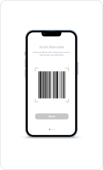
Kuika's Barcode Renderer element is a specialized visualization element used to create and display barcodes in your applications. It supports fast scanning and automation processes by converting data such as product, inventory, order, or identity information into barcode format. Users can easily scan the barcode with any device camera or barcode reader to instantly access the relevant information.
The Barcode Renderer element is only supported in web applications.
1.1. Common Use Cases
Product Management and Inventory Tracking: Simplify physical inventory management processes by displaying product ID or SKU information in barcode format within the system.
Order and Shipping Systems: Display order numbers as barcodes for fast processing via barcode scanning.
Ticketing and Access Control: Present event tickets, coupons, or passes in barcode format.
User or Product Identification: Provide quick access by displaying unique ID values as barcodes.
Invoicing and Document Processing: Speed up archiving and verification processes by barcoding document numbers.
Automation Scenarios: Processes or record matching processes automatically triggered by barcode scanning.
2. Key Features
Dynamic Barcode Generation: The barcode value can be linked to action results, input values, or table fields via the Symbol Picker. This allows a unique barcode to be created for each user or record.
Support for Different Barcode Formats: Multiple common barcode types such as Code128, EAN, and UPC are supported according to the application's needs.
Easy Integration: Can be quickly used in different interfaces such as product detail pages, order screens, inventory management, or user cards.
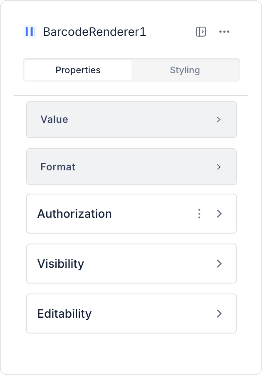
2.1. Barcode Renderer Element Properties
You can configure the properties of the Barcode Renderer element from the Properties panel on the right side.
Value: You can add a static value or dynamically retrieve a state, the content of an Input element, or a value associated with an action result via the Symbol Picker tool.
Format: You can specify the barcode format from options that comply with global standards. Using the Formatter drop-down menu in the Properties panel, you can select one of the following formats:
EAN13: A 13-digit barcode code used for international product identification.
UPC: A universal product code commonly used in North America.
EAN8: An 8-digit barcode format that carries less information.
EAN5: A 5-digit barcode code used for special labeling.
Code128A, Code128B, Code128C: High-density barcode formats that represent different character sets.
Code39: A low-density barcode format. It can contain letters, numbers, and special characters.
ITF14: A 14-digit barcode ideal for cartons and logistics processes.
MSI, MSI10, MSI11, MSI1010, MSI1110: Modulus barcodes processed with mods such as 10 and 11.
Pharmacode: A special barcode format used to identify drug packaging.
Codebar: A preferred barcode format for fast scanning operations.
The Barcode Renderer element allows users to quickly communicate and identify product information within the application.
2.2. Actions That Can Be Added to Elements
The Barcode Renderer element is a passive element used only to display barcodes. Therefore, it does not create a trigger based on user interaction, and actions cannot be added directly to the element. When Barcode Renderer is selected, the ADD ACTION button is not visible.
The following points explain the element's action structure:
The Barcode Renderer does not respond to interactions such as user clicks, hovering, or selection.
Actions cannot be linked to the element to change the barcode's content; instead, the barcode value should be updated with results from actions triggered by other elements outside the element.
The barcode is automatically regenerated or updated when the data linked to the Value field changes.
In scenarios requiring user interaction (e.g., “update the barcode when the button is pressed”), actions are defined in other elements such as Button and Icon.
The Barcode Renderer only displays the data provided to it; it cannot trigger actions internally or initiate any processes.
3. How to Use the Barcode Renderer Element?
In this section, we will cover the end-to-end dynamic use of the Barcode Renderer element through an example product detail scenario.
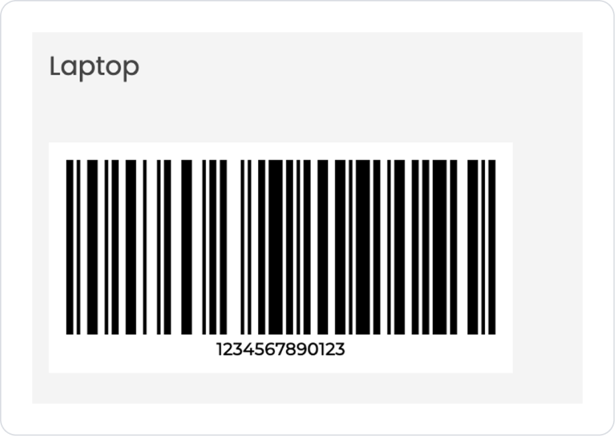
Scenario: Dynamic Barcode Display on the Product Details Screen
In an e-commerce or inventory management application, each product's barcode value is stored in the database. When the user enters the product details screen, the barcode associated with the product is dynamically generated and displayed on the screen.
In this scenario:
The barcode value information is retrieved from the data source.
By default, it is generated in Code 128 format.
Optionally, the barcode format (EAN13, EAN8, etc.) can be manually specified.
The barcode is automatically rendered when the page opens.
Thanks to this structure, barcodes can be reused for each product and managed centrally.
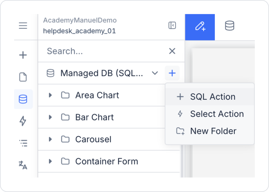
Step 1 – Creating the Sample Data Action
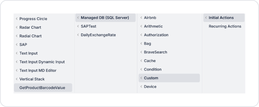
Open the UI Design module.
Create a new SQL Action from the Custom Actions area in the left side panel.
Add the following SQL query to the area in the editor and set the Action name to GetProductBarcodeValue.
SELECT
    '1234567890123' AS BarcodeValue,
    'Laptop' AS ProductName;
Step 2 – Add Initial Action
From the Screens area in the left side panel, go to the page where the element will be added.
Add the Add Action > Initial Action > Custom > Managed DB > GetProductBarcodeValue action to the page.
Step 3 – Add and Connect the Barcode Renderer Element to the Page
Drag and drop the Elements > Display > Label element onto the page.
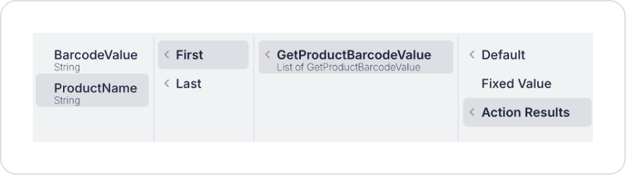
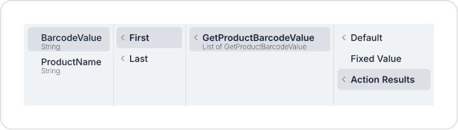
Set the text to Label > Properties > Value > Action Result > GetProductBarcodeValue > First > BarcodeName
Drag and drop the Elements > Display > BarcodeRenderer element onto the page.
Define the value to be written in the barcode field as BarcodeRenderer > Properties > Value > Action Result > GetProductBarcodeValue > First > BarcodeValue.
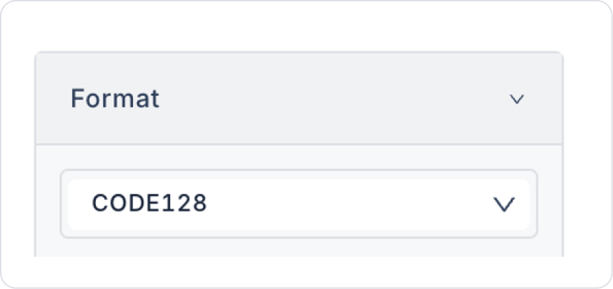
In the current scenario, we will use Code 128 as the defaultBarcode Format. Optionally, you can use EAN13, EAN8, etc. formats.
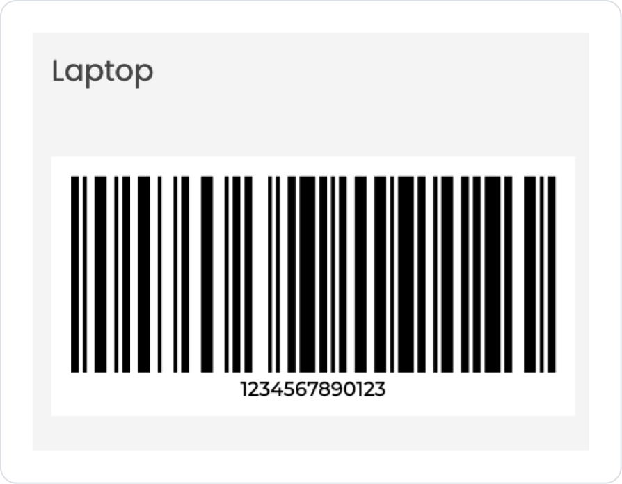
Preview
When the application is tested, a barcode image in Code 128 format is automatically generated and displayed on the screen for the selected product/record in the Barcode Renderer field. Below the barcode, the corresponding numerical value (e.g., 1234567890123) is also displayed as readable text, facilitating verification.
This structure allows the user to quickly view the barcode for the relevant record on a single screen; since both the visual barcode and the value information are presented together, it provides a practical and user-friendly experience for processes such as checking, printing, or labeling.
4. Common Properties
Some fields on the Barcode Renderer element are common to all UI elements. Therefore, detailed descriptions of the following properties can be found in the relevant general guide pages:
Select the correct barcode type. Use the most appropriate barcode type from the supported types for your purpose, such as product, stock, wristband, ticket, or QR-like structures.
Pay attention to the data format. Most barcode types have specific character restrictions. For example, some types only accept numeric (number) input. Incorrect formatting may prevent the barcode from being displayed.
Link the barcode value to dynamic data. Sending values such as stock codes, order numbers, or user IDs dynamically via Datasource or Symbol Picker makes the barcode meaningful.
6. Limitations
Barcode Renderer is only supported in web applications. It cannot be displayed in mobile applications.
Supported barcode types are limited. Not every barcode type can be created; rendering is only possible in formats supported by Kuika.
Data format errors prevent the barcode from being displayed. For example, if a value containing letters is sent when the barcode type expects numeric data, the barcode will not be rendered.
The barcode cannot be created if the Value field is empty. A value must be assigned for the barcode to be displayed.


