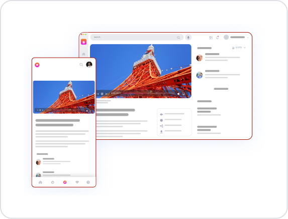
Kuika's Video Player element is an interactive media player that allows you to integrate video content into your applications. It provides all the essential features necessary for users to play, pause, control the volume, and use the progress bar. The Video Player can be used in situations where informational and educational content needs to be conveyed directly to the user.
The Video Player element is supported in both web and mobile applications.
1.1. Common Use Cases
Educational and Instructional Content: It meets the need for video playback in situations where in-app training videos, course content, or process explanations are required.
Product Presentations and Advertising Videos: It can be used to show short introductory videos about how a product works or campaign content.
User Guides and Tutorials: Video-based explanations can be provided to show how to use a feature of the application.
Internal Company Communication or Information: Video broadcasting can be used for corporate announcements, event recordings, or internal communication messages.
Entertainment, Promotion, and Content Streaming: It allows videos in blog, news, interview, or story formats to be delivered directly to the user.
2. Key Features
Video Source Definition: You can play videos via URL or from media files stored within the application.
Playback Controls: Users can start, pause, replay the video, and move forward or backward in the video using the time bar.
Audio Controls: Basic audio management is supported, such as adjusting the volume, muting, and unmuting.
Supports video data in base64 format in Android and iOS applications.
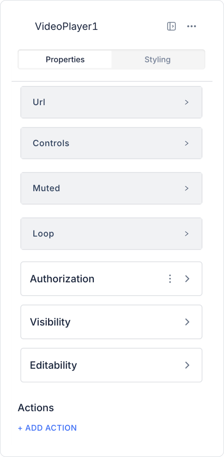
2.1. Video Player Element Properties
You can configure the properties of the Video Player element from the Properties panel on the right side:
URL:
Fixed Value: You can play the relevant video by adding a static URL address.
Symbol Picker: Used to add a dynamic URL. For example, you can display the URL entered in a Text Input element or the URL obtained as a result of an action.
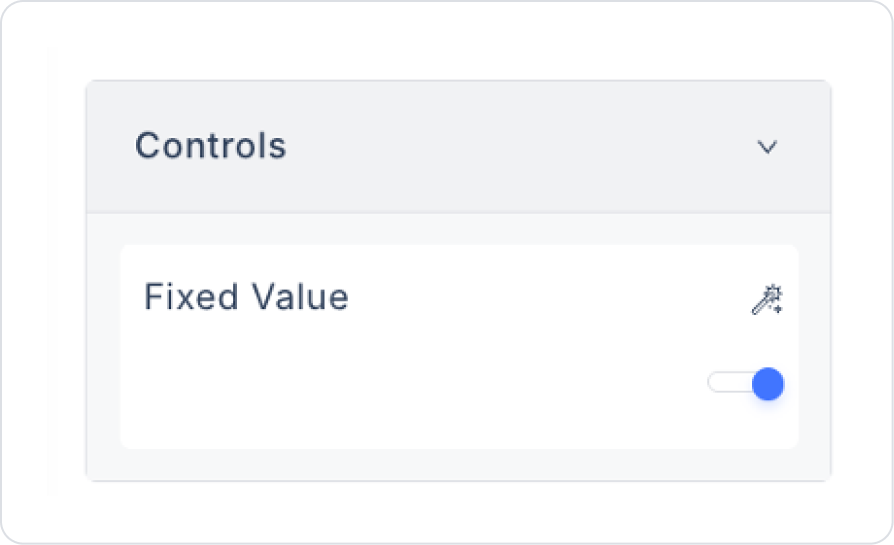
Controls: Determines whether the user can see controls such as play, pause, or mute. You can hide the controls completely or show only specific buttons.
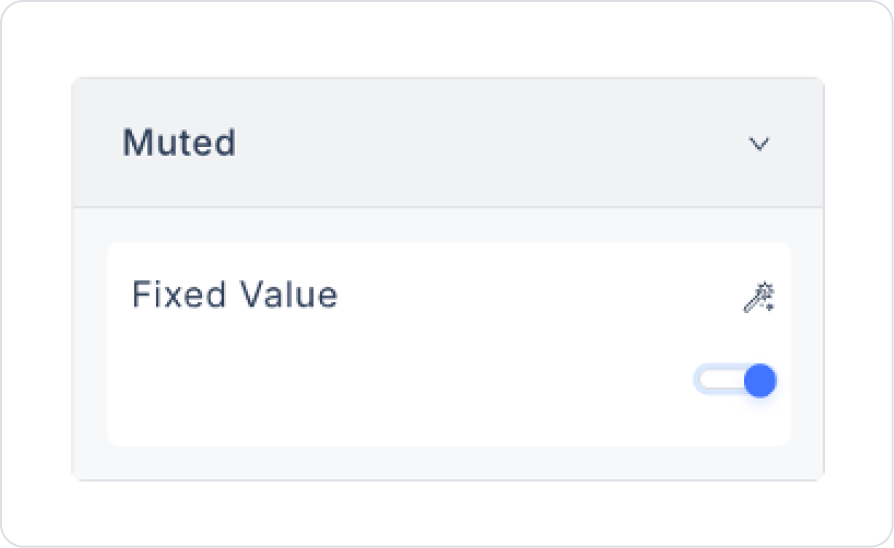
Muted: Ensures the video opens silently (muted) when the page loads. The user can unmute it if desired. This is especially useful in autoplay scenarios.
Loop: Makes the video play automatically again when it ends. The video repeats until the user stops it or the screen closes.
Base64 Support (Mobile): In Android and iOS applications, video data transmitted in base64 format can be played directly through the Video Player. This feature is particularly useful in scenarios where binary video data is returned from the backend.
2.2. Actions That Can Be Added to the Video Player Element
The Video Player element supports triggering actions based on user interaction. When the element is selected, the following trigger can be added via the ADD ACTION button:
onClick
Runs when the user clicks on the Video Player element. This trigger is used for actions that are not directly related to video playback but are based on user interaction.
Use Cases:
Open a confirmation screen or information message before playing the video
Create a log entry when the user clicks on the video
Collect video viewing statistics (e.g., “User clicked to start the video”)
Change the visibility of another element or open a popup
Request permission from the user before playing the video (e.g., data usage, content approval)
3. How to Use the Video Player Element?
In this section, we will cover the end-to-end use of the Video Player element through a scenario.
Scenario: Playing Educational Content with the Video Player
In an educational application, users should be able to watch the video related to the training when they enter the training details page. The URL information for the video content, playback behaviors (such as silent start, repeat playback), and title information are determined by the system.
In the scenario:
When the page opens, the video for the relevant training course loads automatically.
The user can use the play and pause controls as well as the volume up and down controls.
Depending on the defined settings, the video can be started silently or played in loop mode.
Step 1 – Creating the Sample Data Action
Open the UI Design module.
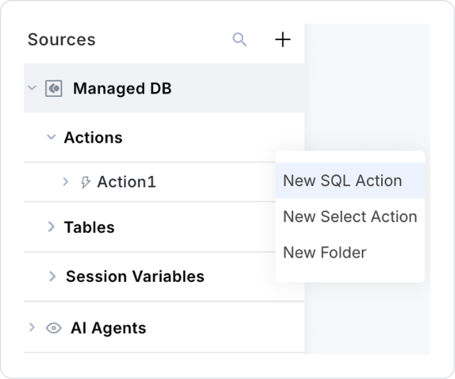
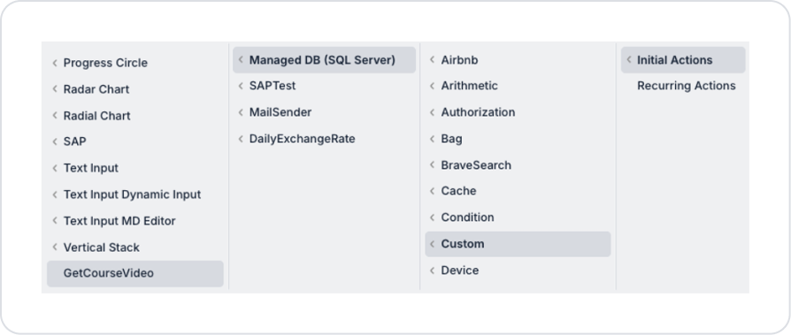
Create a new SQL Action from the Custom Actions area in the left side panel.
Set the action name to GetCourseVideo.
SELECT *
FROM (
VALUES
(
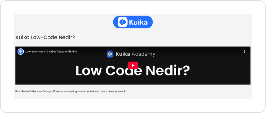
N'What is Kuika Low-Code?‘,
N'https://www.youtube.com/watch?v=FbqXiDg9Xi4’,N'This video briefly explains what the Kuika Low-Code platform is and its basic purpose.')
) AS VideoContent(Title, VideoUrl, Description);
Add the GetCourseVideo action to the home page as Add Action > Initial Action.
Step 2 – Add Home Page Element
Open the UI Design module.
Drag and drop the Elements > Display > Image element onto the page.
Add and select the logo to be added to the Image element from the Image > Properties > Value > Uploaded Images field.
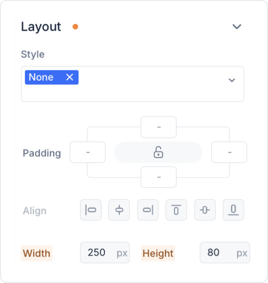
Make the following adjustments in the Image > Styling > Layout field for the sizing position of the Image element.
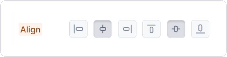
Click on the empty space next to the Image. When clicked, set it to Col > Styling > Layout > Align > Center Vertically and Horizontally.
For the title, drag and drop the Elements > Display > Label element onto the page.
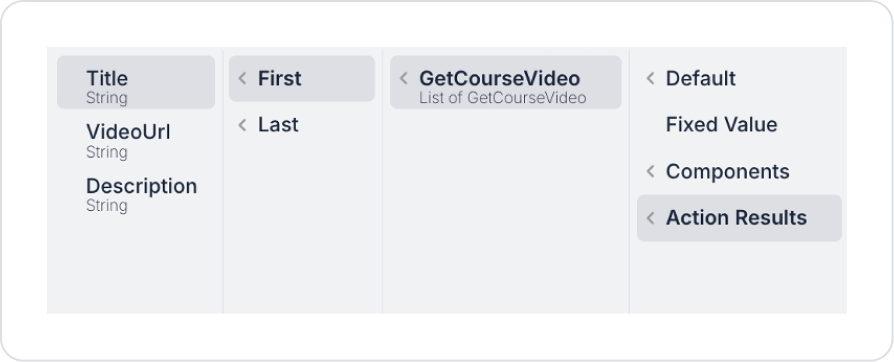
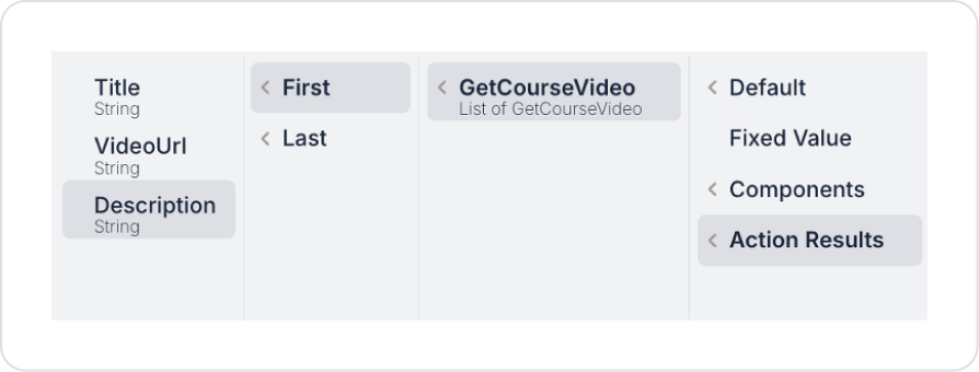
Set the title text to Label > Properties > Value > Action Results > GetCourseVideo > First > Title.
Set the text style to Label > Styling > Text > Style > Heading 2.
From the left panel, drag and drop the Elements > Display > Video Player element onto the screen.
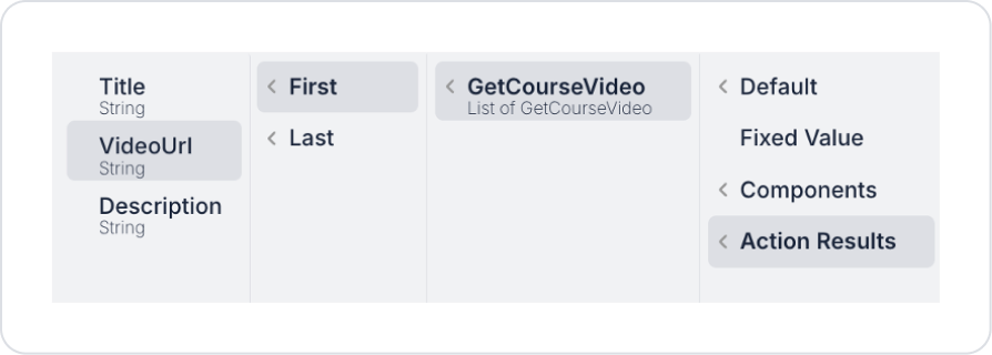
Set the video URL to be played as VideoPlayer > Properties > Url > Action Results > GetCourseVideo > First > VideoUrl.
When the video screen opens, set VideoPlayer > Properties > Controls> Open so that the user can perform actions such as pausing the video, increasing/decreasing the volume, and changing the playback speed.
To start the video silently, set VideoPlayer > Properties > Muted> On.
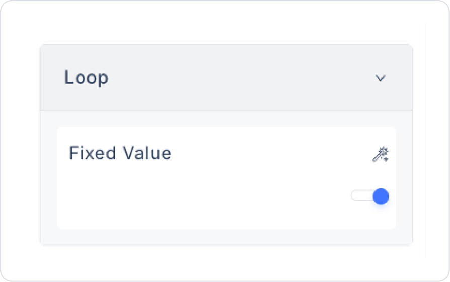
To have the video automatically restart when it ends, set VideoPlayer > Properties > Loop> On.
Finally, drag and drop the Elements > Display > Label element onto the page.
Define the Label > Properties > Value > Action Results > GetCourseVideo > First > Description field to display the video description.
Preview
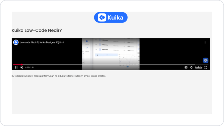
When the application is tested, the video content for the relevant training is displayed via the Video Player element under the heading “What is Kuika Low-Code?” on the training details screen. The video is automatically ready when the page loads, and the user can watch the content using basic video controls such as play, pause, mute/unmute, fast forward, and full screen.
A short informational text about the training content is displayed in the description field below the Video Player. This area provides the user with a brief explanation of what the Kuika Low-Code platform is and its basic purpose.
4. Common Properties
Some areas on the Video Player element are common to all UI elements. Therefore, detailed explanations of the following properties can be found in the relevant general guide pages:
Optimize video files. Large videos can slow down page loading; use compressed MP4 format whenever possible.
Configure video controls with the user in mind. If the user should pause, rewind, fast-forward, or go full screen, ensure the controls are active.
Dynamically link video sources. Especially for frequently changing content such as educational content, campaigns, or media galleries, linking the video URL to an action or database via the Symbol Picker increases manageability.
6. Limitations
There are no action triggers other than onClick (e.g., onPlay, onPause, onEnd are not supported).
The Video Player element only plays content; video editing or trimming functions are not supported.


