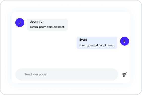
The Chat element is an interactive communication component that adds real-time messaging capabilities to your application. It enables users to exchange instant messages with each other or with the system, providing a fast, fluid, and dynamic communication experience.
The Chat element is used in scenarios such as customer support systems, social interaction areas, internal team communication screens, and user feedback mechanisms. Managing the processes of sending, receiving, and viewing messages under a single structure enhances in-app interaction.
The Chat element is supported in both web and mobile applications.
1.1. Common Use Cases
Live support and customer service chats
One-on-one or group messaging between users
Comment and chat sections on social platforms
In-app support bots or assistants
Internal team communication and feedback screens
2. Key Features
Real-time messaging support: Messages are sent instantly and delivered to the recipient in real time.
Distinction between sent and received messages: User messages and recipient messages are visually distinguished.
Dynamic data and state integration: Message content can be managed via state, data source, or action outputs.
Structure managing user interactions: Interactions such as sending, reading, and detecting new messages are supported.
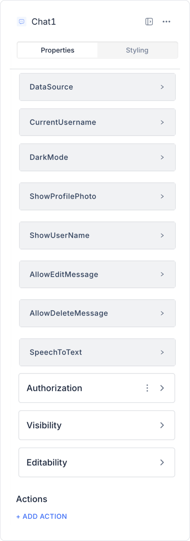
2.1. Chat Element Features
Datasource: You can select the data source where the message history will be displayed.
Current User Name: Displays the current user information on the screen where the chat element is used.
Dark Mode: When the switch is enabled, you can view the chat element in dark mode.
Show Profile Photo: You can enable the switch to display users’ profile photos.
Show User Name: You can enable the switch to display user names.
Allow Edit Message: Allows the user to edit all their messages.
Allow Delete Message: Allows the user to delete all their messages.
Speech To Text: Enables the user to type messages by speaking into the microphone. Voice input is converted to text using the device’s microphone and browser permissions.
2.2. Real-Time Messaging Integration with the Chat Element
This example scenario involves designing a Chat screen where app users can message customer support representatives in real time.
2.2.1. Data Source Preparation
You can store the message history for the Chat element by quickly adding a new table to the data source using Kuika. Follow these steps:
Go to the Datasources module.
Click the + icon next to the Tables heading in the left panel.
Select the New Table option from the dropdown menu.
Create a New Table screen, give the table a name (e.g., chatHistory) and click the Next button.
Enter the required column information:
Column Name: ID
Type: Guid
Required: ✔️
Unique: ❌
Column Name: message – Message content
Type: String
Required: ❌
Unique: ❌
Column Name: userDisplayName – Sender’s display name
Column Name: messageCreatedAt – Message creation time
Type: DateTimeOffset
Required: ❌
Unique: ❌
Column Name: messageModifiedAt – Message update time
Type: DateTimeOffset
Required: ❌
Unique: ❌
Column Name: username – User’s system username
Type: String (200)
Required: ❌
Unique: ❌
Data Source Filtering:
Only relevant users should be able to view messages.
Example filter:
WHERE username = loggedInUser.username
After entering each column, click the ADD button.
After adding all columns, click the CREATE button to create the table.
This data source will be selected as the “Datasource” in the Chat element.
2.2.2. Adding the Chat Element
Go to the UI Design module.
Select the Special > Chat element from the left panel.
Drag and drop it onto the screen:
If dropped into a Column: Only the Chat element is added.
If dropped into an empty area: It automatically comes with a Row element.
2.2.3. Chat Element Settings
Datasource
Select the chatHistory created above.
The message history is retrieved from here.
Current User Name
The logged-in user’s name is linked (e.g., loggedInUser.name).
This is required to identify the sender in the chat.
Dark Mode
Set to On/Off.
Enhances the user experience for users who prefer a dark theme.
Show Profile Photo
Enable this option.
The profile photo is displayed in message bubbles using the avatar field.
Show User Name
Enabled.
In chats with different participants, it’s easy to tell who wrote what.
Allow Edit Message (Available only in web apps.)
Enabled.
The user can edit all their messages (e.g., to correct typos).
Allow Delete Message (Available only in web apps.)
Enabled.
The user can delete all their messages (e.g., to remove messages sent by mistake).
Text To Speech (Available only in mobile apps.)
Allows messages to be read aloud.
Improves accessibility for users with visual impairments and provides voice interaction on mobile devices.
2.2.4. Action Definition
Loading Messages When the Page Loads
To automatically load past messages when the chat screen opens, a page-specific Page Init action must be defined. This allows the Chat element to retrieve data from the data source (e.g., the chatHistory table) and automatically display the chat history.
Steps to Add a PageInit Action:
Select the page where the Chat screen is located.
From the right panel, select the +ADD ACTION → pageInit → Managed DB → Get Record action.
Action Name: getChatHistory
Table: chatHistory
Filtering can be applied if necessary (e.g., messages belonging only to logged-in users).
The data obtained from this action is used in the Chat element’s Data Source setting.
This process ensures that the most up-to-date message history is automatically loaded whenever the user opens the chat screen.
Message Sending
To allow users to send messages on the chat screen, an action must be created. This action is typically linked to the “Send” button and saves the user’s message to the data source (the chatHistory table).
Steps to Add the Save Record Action:
In the UI Design module, add a Button (e.g., “Send”) next to or below the Chat element.
Select the button and in the Properties panel:
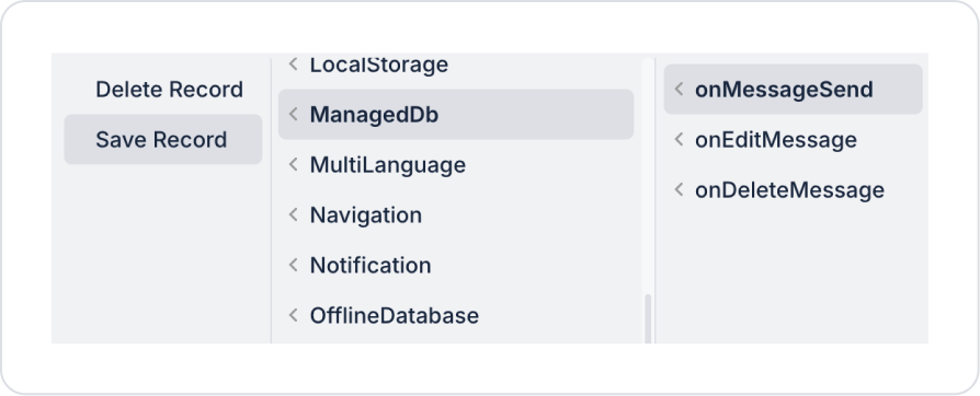
From the + ADD ACTION menu,
select onMessageSend → Managed DB → Save Record.
Select the Insert mode for the Save Record Action Mode:
This mode adds a new record to the table.
If a record with the same Id already exists, an error is returned; therefore, the Id is typically not sent in new messages or is automatically generated.
Table Selection: chatHistory table
Table Columns and Values:
message: Chat1.message.text
userDisplayName: loggedInUser.name
avatar: loggedInUser.photo
username: loggedInUser.username
messageCreatedAt: Now ()
Custom Actions:
If additional control or processing is required during message sending, custom actions can be created and attached when the onMessageSend event is triggered, as shown below:
getUserChat → A custom Get Record action can be defined to retrieve the user’s information. It operates based on the username column.
chatHistoryADD → A custom Insert Record action can be created to save the new message with all its columns.
getChatHistory → A custom Refresh Chat action can be defined to refresh the page. It must be executed after Edit/Send/Delete operations. Otherwise, messages will not be updated in real-time. Alternatively, this functionality can be achieved by configuring the Save Record action in Update mode based on the messageCreatedAt column.
Message Update
When a user edits a message, the corresponding record is updated based on the ID.
Steps:
Select the Chat1 component.
From the right panel, select +ADD ACTION → onEditMessage → Managed DB → Save Record action.
chatHistorySAVE → A custom Update Record action can be created specifically for the message column during the update process.
getChatHistory → A custom Refresh Chat action can be defined to update the chat after editing a message. Alternatively, the Save Record action can be triggered via messageCreatedAt in Update mode.
Deleting a Message
When the user clicks the “delete” icon next to the message, the message is completely removed from the system.
Steps:
Select the Chat1 component.
From the right panel: +ADD ACTION → onDeleteMessage → Managed DB → Delete Record
deleteChatMessage → A custom Delete Record action can be created based on the id column.
getChatHistory → A custom Refresh Chat action can be defined to ensure the chat is updated immediately after deletion. Otherwise, the deleted message will remain visible. This requirement can also be addressed using the Save Record action in Update mode via messageCreatedAt.
2.2.5. Chat Element Usage Flow
User side:
Log in to the application.
Navigates to the Chat screen.
The message history loads automatically.
Writes and sends a new message.
Their name and profile photo (if available) appear next to the sent message.
Can edit or delete their last message.
Support agent side:
Uses a separate Chat screen that monitors the same message table.
Sends a message to the user.
All communication is displayed in real-time via the same data source.
2.2. Actions That Can Be Added to the Element
The Chat element supports the definition of event-based actions based on user interactions such as sending, editing, and deleting messages. Actions are not tied to the Chat element itself but are linked to events triggered by user interactions.
Actions for the Chat element can be added via the Properties > Add Action section using the following events.
Supported Action Triggers
onMessageSend: Triggered when a user sends a new message.
Use cases:
Save the sent message to state or a data source
To forward the message to the backend or an API
To update the real-time chat stream
To trigger an automated response (bot) or a notification
Example scenario: When a user sends a message in the support screen, the message is saved to the backend and immediately forwarded to the recipient.
onEditMessage: Triggered when a user edits a message they previously sent.
Usage purposes:
Update the content of the edited message
Synchronize the message history
Display a notification to the user after the update
Example scenario: When a user edits a message containing a typo, the message is updated and displayed in its new form in the chat stream.
onDeleteMessage: Triggered when a user deletes a message.
Usage purposes:
Remove the message from the data source
Render the chat stream again
Log or audit the deletion process
Example scenario: When a user deletes a message they sent, the message is removed from the chat screen and deleted on the backend.
Basic Rules Regarding Actions
The Chat element can trigger actions through multiple events.
Multiple actions can be defined for the same event.
Message-based operations are typically used in conjunction with dynamic data and state management.
If the AllowEditMessage property is disabled, onEditMessage will not be triggered.
The Chat element offers a powerful and flexible structure when used with actions, particularly in applications requiring real-time communication and interaction management.
3. How to Use the Chat Element?
In this section, we will cover the end-to-end usage of the Chat element through an example scenario.
Scenario: User-to-User Messaging Application
In this example, a simple chat screen has been created where users who log in to the application can message each other using the Chat element. The user enters text into the message field and sends the message using the Send button, and the messages are displayed in the list in real time.
In the scenario:
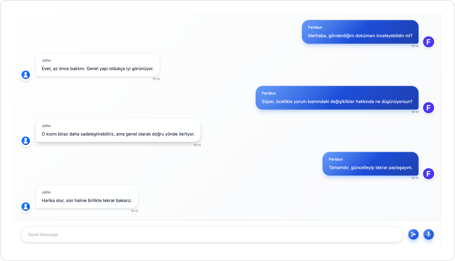
Whether messages are displayed on the right or left side is determined by comparing the Username and CurrentUsername fields. Messages belonging to the user are displayed on the right, while messages from other users are displayed on the left.
Users can edit or delete the messages they have sent. After these actions, the list is updated, and the conversation flow is maintained.
Step 1 - Creating a Data Source
Creating a table in the DataSources module:
Go to the DataSources module.
Then go to the Tables tab.
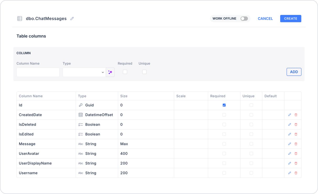
Create a new table named “ChatMessages”.
The required table structure is as follows:
Important Field Names:
Id: The message’s unique identifier (Used as MessageId)
Message: Message content
UserDisplayName: The user’s display name
Username: The user’s system username (used for left/right differentiation)
UserAvatar: The user’s avatar image
CreatedDate: The date the message was sent
IsEdited: Whether the message has been edited
IsDeleted: The message's deletion status (for soft delete)
Step 2 - Defining the Required Action
To display data on the interface:
You need to define two sample actions.
Add a new action from the Actions > New SQL Action tab within the Datasources module.
Action to Retrieve User Information (GetUser):
SELECT UserName, ProfilePhotoUrl FROM KUser WHERE UserName = @CurrentUserName
When applying, delete the“KUser” part, type “KUser” again, and press Enter. This will ensure the correct schema name is prepended to the table name.
Action to Retrieve Message History (GetChatMessages):
SELECT * FROM ChatMessages WHERE IsDeleted = 0 ORDER BY createdDate ASC
When applying this, delete the “ChatMessages” part, type “ChatMessages” again, and press Enter. This will add the correct schema name before the table name.
Step 3 - Adding an Initial Action
On the homepage initially:
To display the currently uploaded files in the list, add the Add Action > Initial Action > Custom > Managed DB > GetUser action.
To refresh the page with messages at startup and during idle intervals, add a Recurring Action to the page.
For the update upon page load, set triggerOnPageInit to > Active, and define the refresh interval as Interval > 3 seconds.
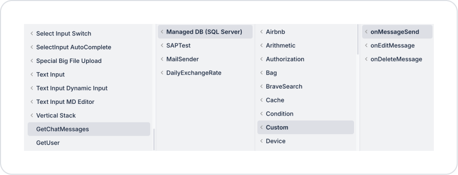
Add the Add Action > Custom > Managed DB > GetChatMessages action to the Recurring Action.
Step 4 - Adding the Chat Element and Defining Actions
Initially on the homepage:
Drag and drop the Elements > Special > Chat element onto the page from the left sidebar.
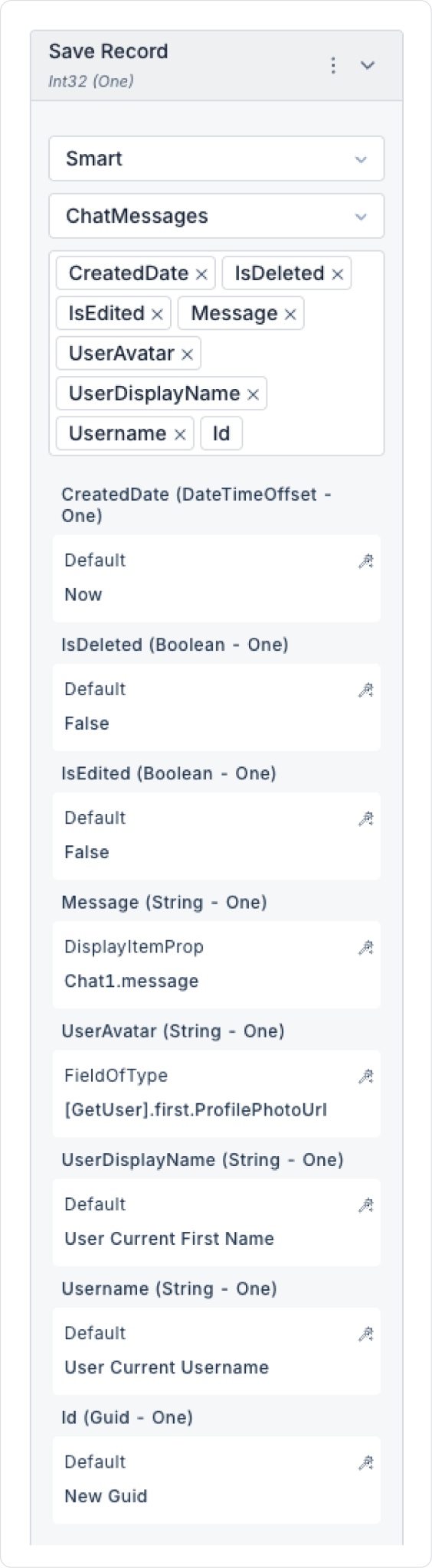
Add the Chat > Properties > onMessageSend > ManagedDb > Save Record action for message sending.
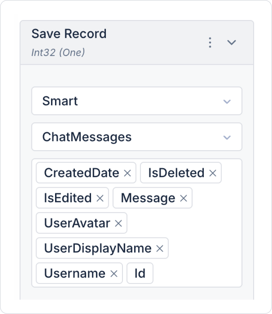
Within the Save Record action, select Select Table > ChatMessages and define the fields as follows.
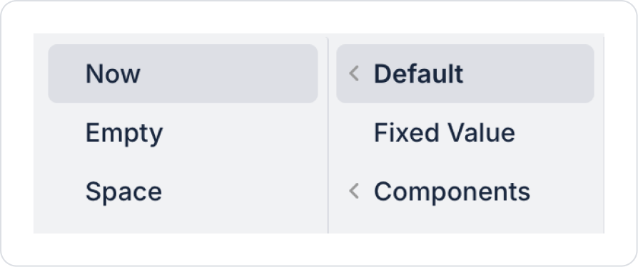
Set the CreatedDate field to Default > Now.
Leave the IsDeleted field disabled.
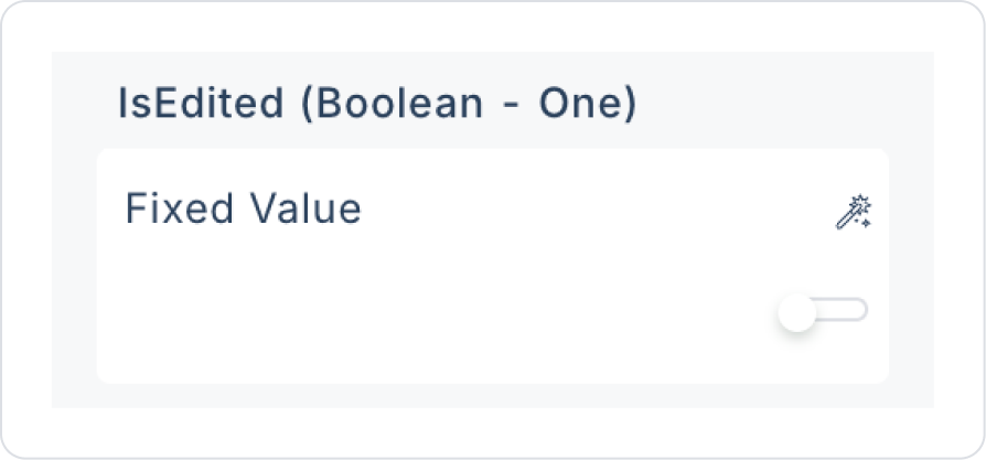
Leave the IsEdited field disabled.
To retrieve the Message field from the element, define Components > Chat > message.
Connect the action that retrieves user information to the UserAvatar field: Action Results > GetUser > First > ProfilePhotoUrl
Set the UserDisplayName field to Default > User > Current First Name to display the current user’s first name.
Set the Username field to Default > User > Current Username.
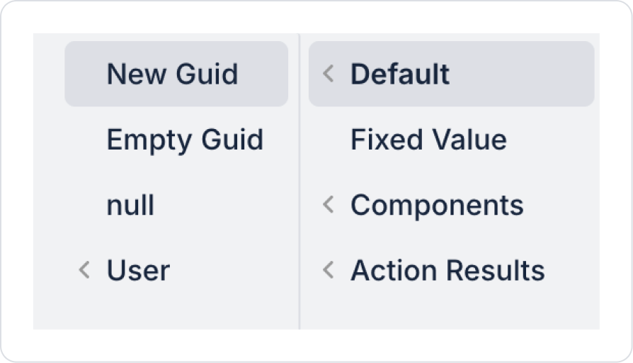
Set the Id field to Default > New Guid.
As a result of these configurations, Save Record will appear as follows.
To update messages after saving, add the Chat >onMessageSend > Custom > Managed DB > GetChatMessages action.
For convenience during the editing process, copy the Save Record action.
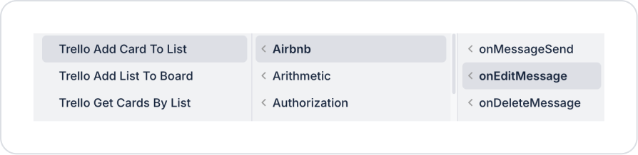
Add any action from the Add Action > onEditMessage field to the Chat element, then click the Paste option on the added action as shown below.
In the newly copied Save Record action, remove the CreatedDate field to ensure the creation date does not change when the message is edited.
Enable the IsEdited field.
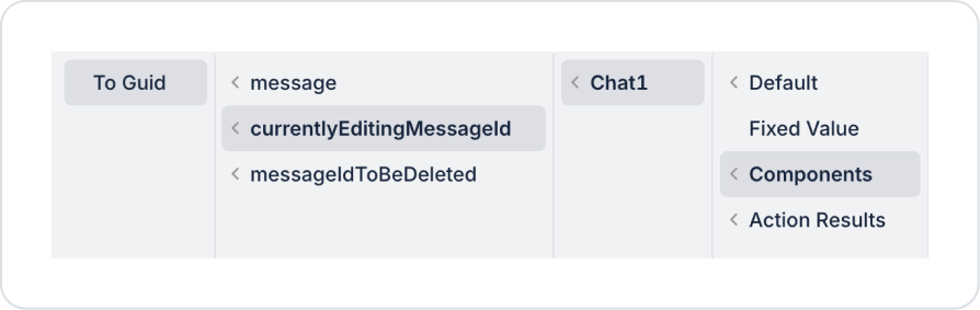
Define the Id field for the message being edited using Components > Chat > currentlyEditingMessageId > To Guid.
To update messages after content updates, add the Chat >onEditMessage > Custom > Managed DB > GetChatMessages action.
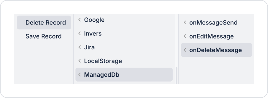
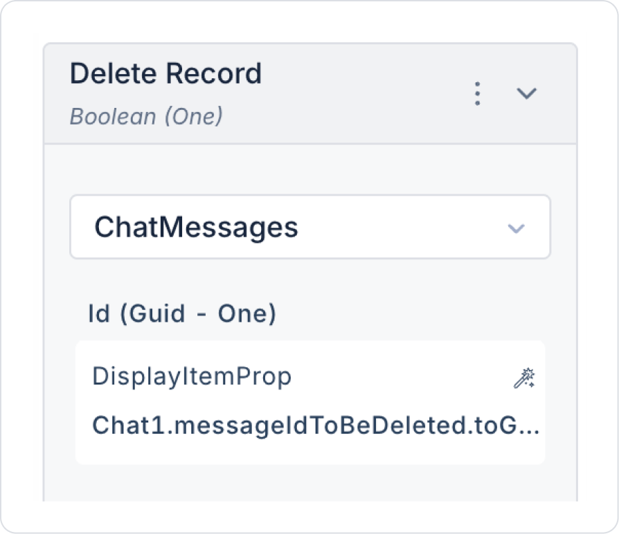
To delete a message, add the Chat > onDeleteMessage > ManagedDb > Delete Record action.
For soft delete, you can use Save Record to set the IsDeleted field to True and proceed via filters. The current action performs the filtering process. All you need to do is configure the Save Record setup.
In Delete Record, define Select Table > ChatMessages and Id > Components > Chat > MessageToBeDeleted > To Guid.
To update messages after content updates, add the Chat >onDeleteMessage > Custom > Managed DB > GetChatMessages action.
In the final state, the action definitions on the Chat element should be as follows.
Preview:
With the Chat element, users can message each other and follow the conversation flow from a single screen. Sent messages are listed in real time, with the user’s messages displayed on the right and other users’ messages on the left. Each message is displayed along with the user name, avatar information, and send time. Users can send messages, view existing messages, and easily follow the chat flow through this interface.
Feridun:
John:
4. Common Properties
Some fields on the Chat element are shared across all UI elements. Therefore, detailed descriptions of the following properties can be found in the relevant general guide pages:


