The divider element is an auxiliary UI element used to visually separate content areas within an application interface and provide a clear structure to the page content. By creating a visual boundary between content sections, it helps users scan the page more easily and understand sections more quickly.
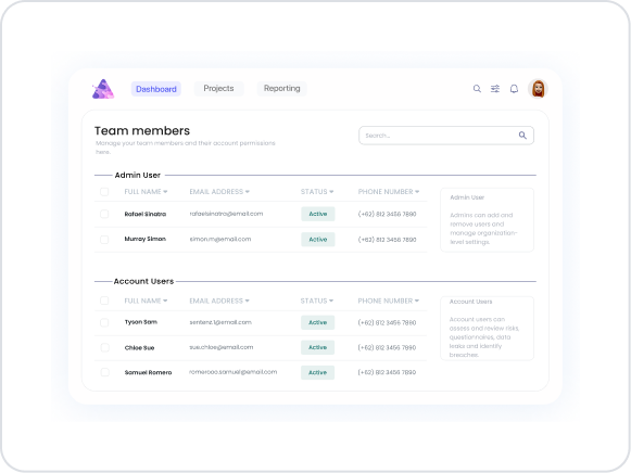
The Divider element is used to establish hierarchy and structure in pages containing forms, list structures, settings screens, and long content. It does not provide functional interaction; it serves a purely visual and organizational role.
The Divider element is supported only in web applications.
1.1. Common Use Cases
Visually separating form fields
Separating sections in list or card layouts
Highlighting group headers in settings screens
Organizing content blocks on long pages
Improving page flow and readability
2. Key Features
Provides visual separation: Creates a clear boundary between content blocks, making sections easily distinguishable.
Passive (non-interactive) structure: It does not include user interaction, data entry, or action-triggering functionality.
Flexible layout usage It can be easily used in forms, lists, cards, and general page layouts.
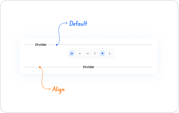
Style customization supports Visual settings such as line color, thickness, and spacing (margin/padding) can be adjusted via the Styling panel.
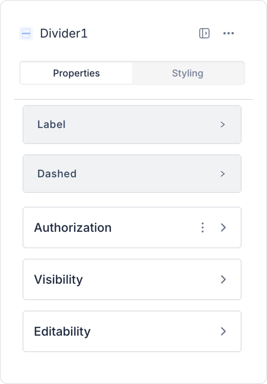
2.1. Divider Element Properties
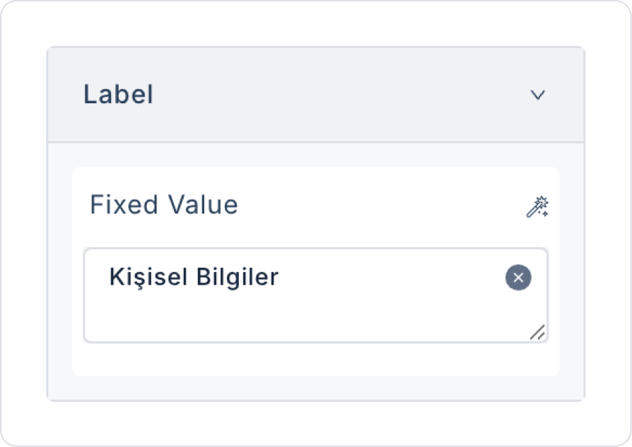
Label: The Divider can be used as a simple line or can include text. You can add a static value to the Label field or bind a dynamic value via the Symbol Picker.
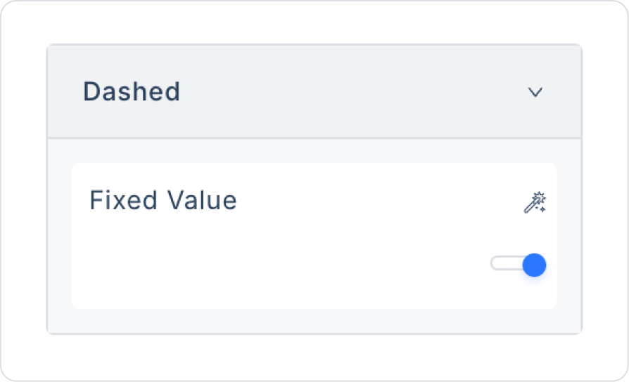
Dashed: You can select the Divider line type from predefined options (e.g., solid or dashed line).
2.2. Actions That Can Be Added to the Element
Since the Divider element is solely a visual and layout-based UI element, it does not support adding actions (Add Action). It has no functionality for user interaction, data input, or triggering events.
Therefore:
You cannot assign onClick, onChange, or similar events to the Divider element.
The Add Action field does not appear in the right-hand Properties panel.
The Divider cannot trigger any workflow, state update, or API call.
The element has a completely passive (non-interactive) structure.
The Divider element is used solely to visually separate content, clarify page layout, and reinforce design hierarchy. For scenarios requiring functionality, Button, Icon, or other interactive elements should be preferred over the Divider.
3. How to Use the Divider Element?
In this section, we will cover the end-to-end usage of the Divider element through an example scenario.
Scenario: Using the Divider
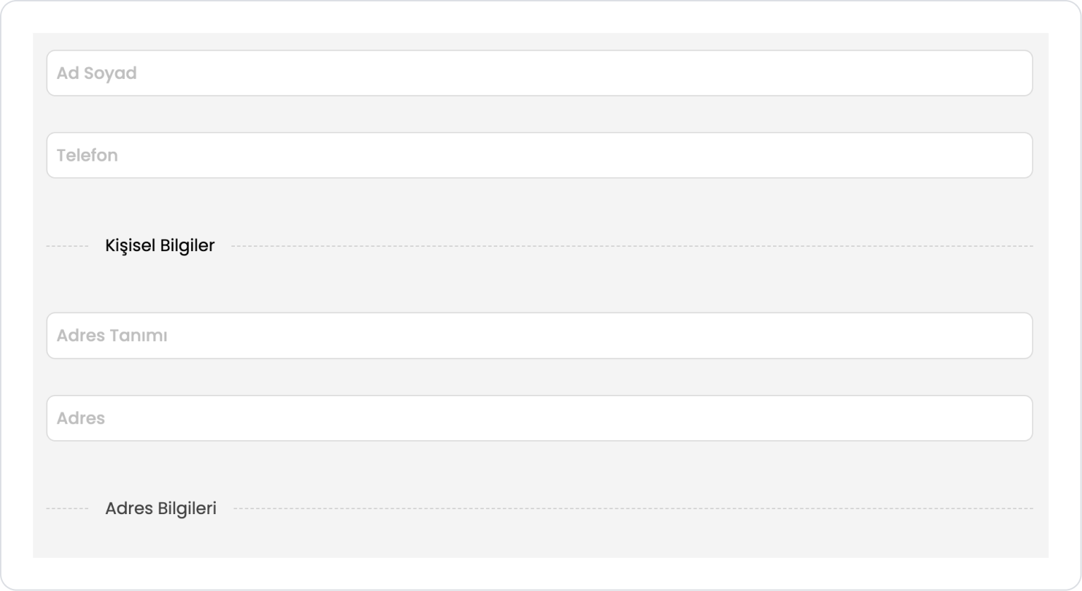
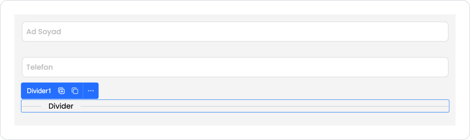
In this scenario, the Divider element is used to separate fields within a form into meaningful groups. User information and address information have been separated under the headings “Personal Information” and “Address Information,” ensuring the form is more organized and readable.
Step 1 - Adding the Divider Element
Start on the home page:
Drag and drop two Elements > Text Input > TextInput elements from the left sidebar onto the page.
From the left sidebar, drag and drop the Elements > Special > Divider element onto the page.
Name the Divider element Divider > Properties > Label > “Personal Information”.
Set the line style to Divider > Properties > Dashed > Light.
Drag and drop two more Elements > Text Input > TextInput elements onto the page below the Divider.
Drag and drop the Elements > Special > Divider element onto the page.
Name the Divider element Divider > Properties > Label > “Address Information”.
Set the line style to Divider > Properties > Dashed > Open.
Preview:
The Divider element separates form fields with a label and dashed line, making the content more organized and readable.
4. Common Properties
Some fields on the Divider element are shared across all UI elements. Therefore, detailed descriptions of the following properties can be found in the relevant general guide pages:
Use it to clearly separate content groups. It creates meaningful separations, especially in form sections, list groups, and settings screens.
Avoid unnecessary use. Frequent use of Dividers can disrupt page flow and create visual clutter.
Consider using spacing. A more balanced appearance can be achieved by adjusting margins and padding before and after the Divider.
Choose colors and thickness that align with the design language. The Divider should create separation without distracting; overly dominant colors are not recommended.
Consider using them with headings. When used above or below section headings, they reinforce the content hierarchy.
6. Limitations
The Divider element does not include user interaction; it is a passive visual element.
It does not support actions, events, or data binding.
It is not suitable for dynamic behaviors or conditional layouts.
Visual customizations are limited to the Styling panel.


