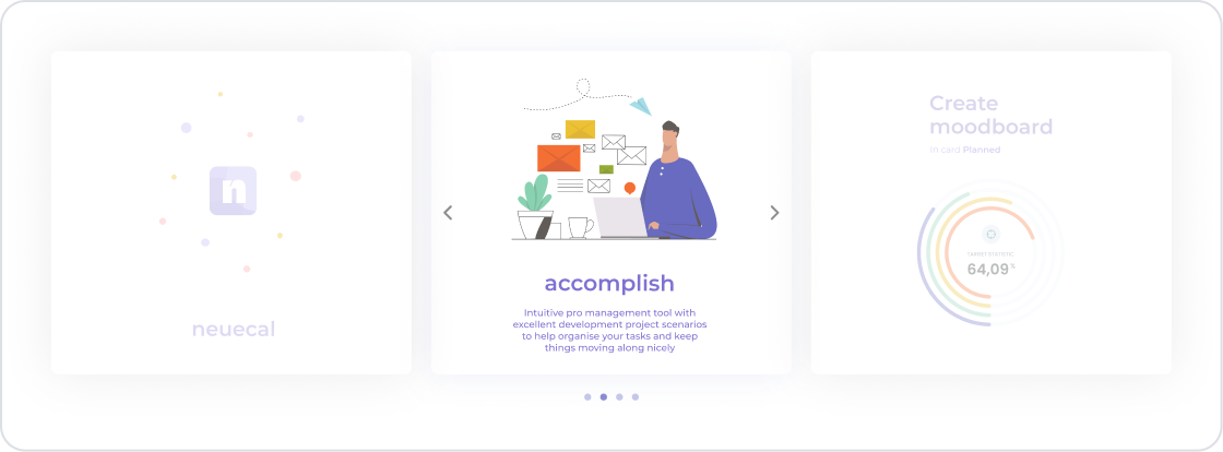
The carousel element is an interactive UI element that allows users to view images or content in a cyclical structure. Users can switch between slides using arrow buttons or by tapping/swiping. It can be used to display multiple items sequentially, such as individual images, text content, or product presentations.
The Carousel offers a powerful visual experience, especially in designs such as product showcases, campaign slides, portfolio galleries, advertising banners, story streams, or featured content modules. It also allows users to navigate easily in applications with high content density by making efficient use of page space.
The carousel element is supported in web and mobile applications.
1.1. Common Use Cases
Product promotion. Used to present multiple product images or product details to users in slides.
Displaying campaigns or banners. Ideal for cyclically displaying marketing campaigns, announcements, or promotional content.
Creating a photo gallery. Used to create a photo gallery or portfolio area in visually-heavy applications.
Displaying blog, news, or content slides. Featured content, recently added articles, or announcements can be effectively presented using a slide structure.
Displaying references or user reviews. Enriches the user experience by creating testimonial/review slides.
Displaying training or onboarding flows. Suitable for displaying step-by-step training content with visual explanations.
2. Key Features
Content Display with Slide Structure. Users can view multiple pieces of content in slides and easily navigate forward and backward.
Support for Both Visual and Textual Content. Images, text, buttons, or other UI elements can be added to the carousel.
Auto Play Support. Slides can be set to transition automatically at specified intervals.
Dynamic Content Binding. Carousel content can be automatically generated using data from data sources or actions.
Responsive Design Compatible. Content automatically scales to ensure correct display on mobile and web screens.
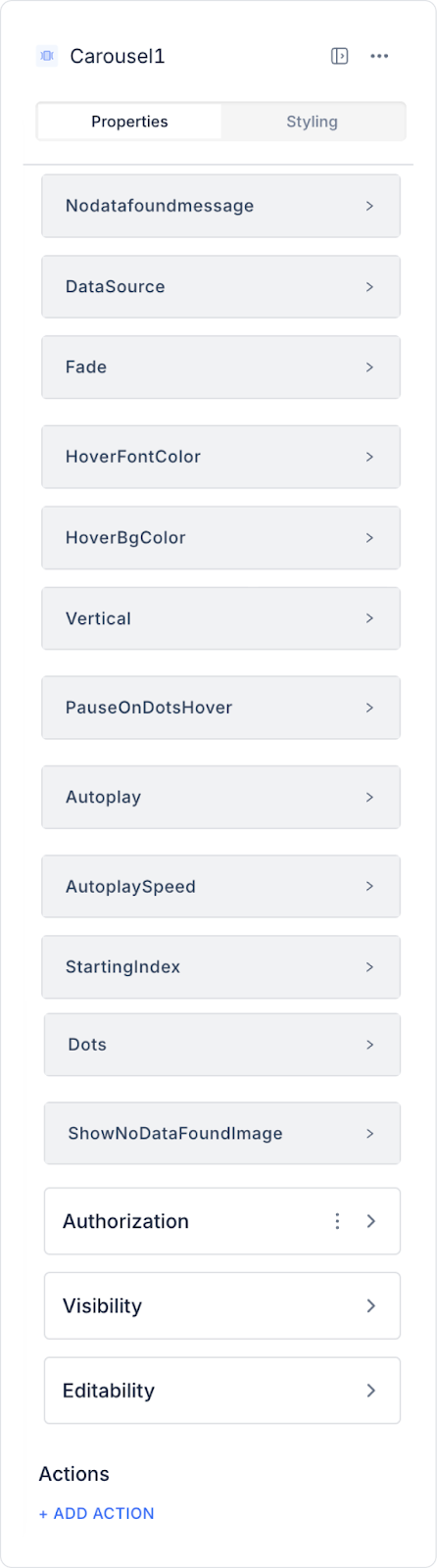
2.1. Carousel Element Properties
When you select the carousel element, content management, transition settings, and visual behaviors can be easily configured via the Properties panel on the right. All of the following properties are explained in detail:
Data and Message Settings
Data Source: Specifies the source of the data to be displayed in the carousel. Data obtained from the data source or actions is automatically applied to the slides.
No Data Found Message: Defines the message to be displayed when no records are found in the data source.
Show No Data Found Image: Allows you to specify a custom image to be displayed when no data is found.
Transition and Animation Settings
Fade: Enables slide transitions with a fade effect.
Autoplay: Enables the Carousel to automatically transition slides without user interaction.
Autoplay Speed: Specifies the automatic transition speed in milliseconds. E.g., 2000 = a slide change every 2 seconds.
Starting Index: Defines the sequence number of the slide to be displayed when the carousel is first loaded.
Vertical: Makes slides move vertically instead of horizontally.
User Interaction Settings
Pause On Dots Hover: Makes autoplay pause when the user hovers over the navigation dots.
Dots: Turns the visibility of the navigation dots below the slides on or off.
Show Page Indicator: Displays a numerical indicator (e.g., 2 / 5) in the bottom-right corner of the carousel, showing the total number of slides and which slide the user is currently on. It is primarily used in mobile applications to provide the user with position information.
Hover Settings
Hover Font Color: Changes the text color when the user hovers over a slide.
Hover Bg Color: Changes the background color when the user hovers over a slide.
2.2. Actions That Can Be Added to Elements
The Carousel element allows you to trigger actions based on user interactions. Select the element and use the following triggers from the ADD ACTION section in the right panel:
onClick: Triggers when the user clicks on any slide in the Carousel. Used to initiate an action or open a detail screen when clicking on a slide.
Usage scenarios:
Redirecting to the product or content detail page linked to the slide
Opening a pop-up
Sending the ID of the clicked slide as a parameter to another action
Filtering a list based on the selected slide
onChange: Triggered when the user switches between slides or when the Carousel automatically changes slides. This trigger allows you to perform actions based on the active slide being displayed.
Usage scenarios:
Updating the description text when the active slide changes
Dynamically changing other elements (e.g., Panel, Text, Image) based on the selected slide
Query data based on the active slide ID
Record slide viewing behavior for an analytics or log system
3. How to Use the Carousel Element?
In this section, we will cover the end-to-end use of the Carousel element through example scenarios.
Scenario: Campaign Promotion Area
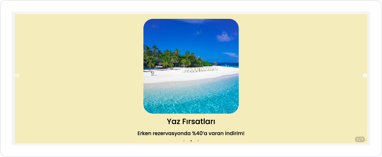
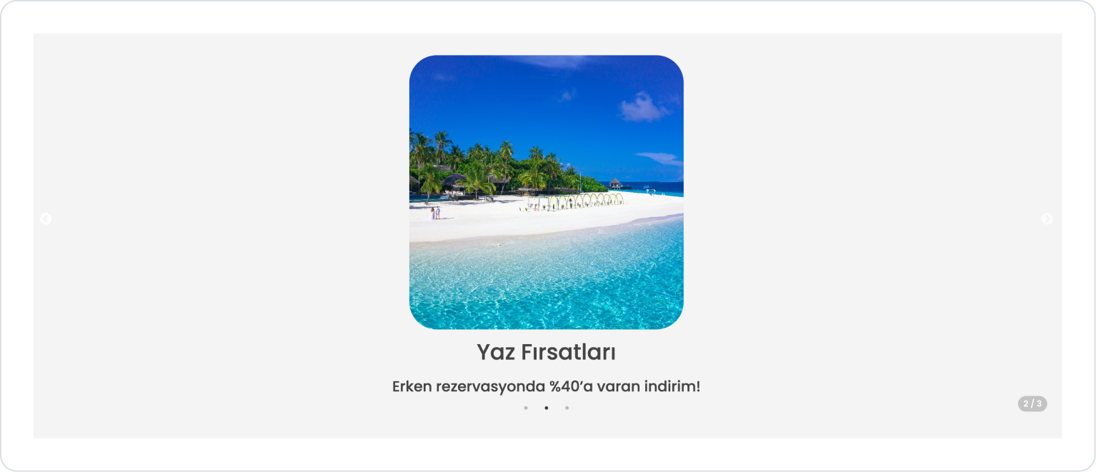
In a vacation booking application, the Carousel element is used to display current campaigns to the user in a stylish and eye-catching way on the home page. The Carousel presents high-resolution campaign images, titles, and short descriptions in sequential slides.
The user can manually switch between slides, or when the auto-switch feature is enabled, campaigns change automatically at specific intervals.
This structure attracts users' attention by promoting vacation opportunities in a visually rich way and facilitates the booking decision.
In the scenario:
Each campaign slide on the Carousel is structured to present the campaign image, headline, short description, and detailed information in an organized manner.
The campaign image appears at the top of the slide, followed by the campaign title, a short promotional message immediately below, and the detailed description at the bottom.
The carousel element allows manual or automatic switching between slides to enhance the user experience. This enables campaign information to be presented in a simple, fluid, and visually rich manner within a single area.
Step 1 - Creating a Data Source
Creating a table in the DataSources module:
Go to the Datasources module.
Then go to the Tables tab.
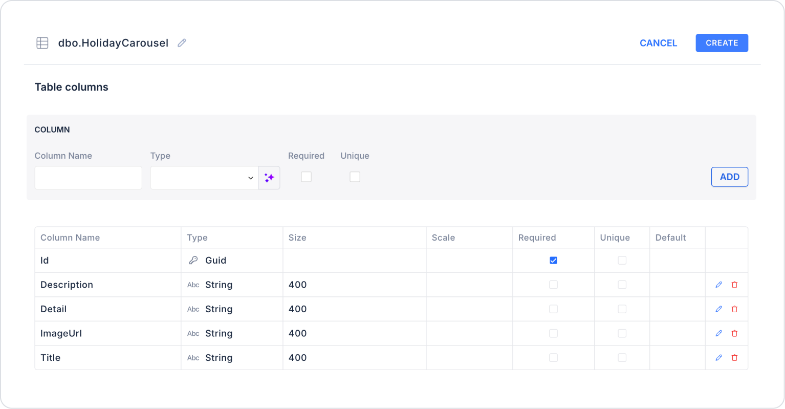
Create a new table named “HolidayCarousel”.
The table structure to be set up is as follows:
Important Field Names:
Title: Holds the title information of the campaign to be displayed on the carousel. This is the text that first catches the user's attention.
Description: This field stores a short description or key message about the campaign. It is displayed immediately below the title.
Detail: This field contains a more detailed description of the campaign. It is used to provide additional information to the user.
ImageUrl: Contains the URL of the image to be displayed in the carousel slide. The main image used in the campaign promotion is uploaded from this field.
Step 2 - Defining the Necessary Actions
To display and add data in the interface:
You need to define two actions.
Add a new action from the Actions > New SQL Action tab in the Datasources module.
Action that Adds Sample Data (InsertHolidayCarousel): Add the following SQL action to test the application with sample data and press the TEST button.
INSERT INTO HolidayCarousel (Id, Title, Description, Detail, ImageUrl)
VALUES
(NEWID(),
N'Summer Deals',
N'Up to 40% discount for early booking!',
N'Early booking deals at selected hotels await you during the summer season. Book your spot now for a vacation filled with beach, pool, and nature activities.‘,
'https://images.pexels.com/photos/3319711/pexels-photo-3319711.jpeg’),(NEWID(),
Winter Vacation Packages',
Stay 3 nights, pay for 2 at ski hotels!',
Enjoy winter! Unforgettable vacation opportunity with free equipment support, spa access, and special family packages at ski resorts.‘,
'https://images.pexels.com/photos/20529386/pexels-photo-20529386.jpeg’),
(NEWID(),
‘Weekend Getaways’,
‘Special weekend rates at city hotels!’,
'Special weekend packages for those who want to get away from their busy work schedule and take a short vacation. Offering a comfortable and economical experience in city hotels.‘,
'https://images.pexels.com/photos/35130337/pexels-photo-35130337.jpeg’);
When applying, delete the HolidayCarousel part, rewrite HolidayCarousel, and press Enter. This will add the correct schema name in front of the table name.
Action that Provides and Filters Data (GetCarouselDetail):
SELECT * FROM HolidayCarousel WHERE Id = @Id;
When applying, delete the HolidayCarousel part, retype HolidayCarousel, and press Enter. This will add the correct schema name before the table name.
Action Providing All Data (GetHolidayCarousel):
SELECT * FROM HolidayCarousel;
When applying, delete the HolidayCarousel part, retype HolidayCarousel, and press Enter. This will add the correct schema name before the table name.
Step 3 - Adding an Initial Action
Initially on the home page:
Open the UI Design module.
Add the Add Action > Initial Action > Custom > Managed Db > GetHolidayCarousel action to the page.
Step 4 - Adding an Element and Editing the Style
Drag and drop the Elements > Data > Carousel element onto the page from the left side panel.
Within the Carousel element, connect the GetHolidayCarousel action to the Carousel > Properties > DataSource field.
For the background color when hovering, set the following definition in the Carousel > Properties > HoverBgColor field.
Enable the Carousel > Properties > AutoPlay field for automatic playback.
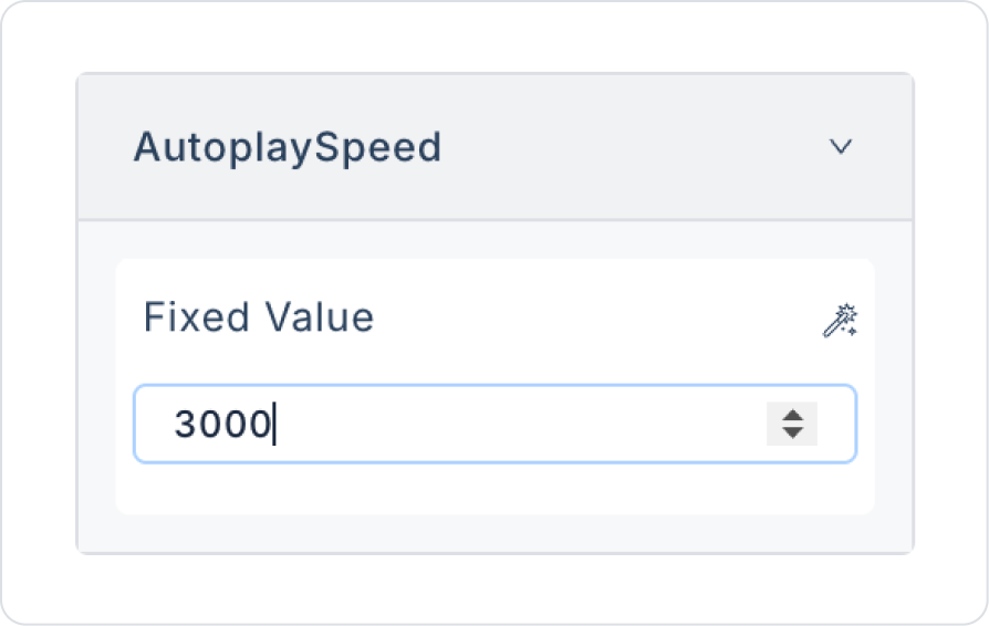
Set the playback speed to Carousel > Properties > AutoPlaySpeed > 3000.
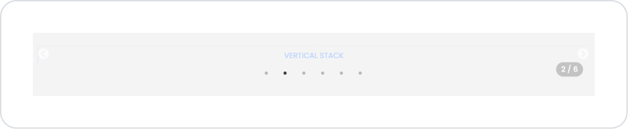
To display pages, enable the Carousel > Properties > ShowPageIndicator field.
Drag and drop the Elements > Container > VerticalStack element into the Carousel element.
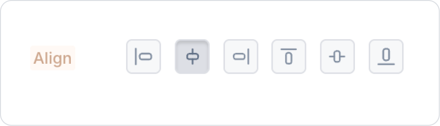
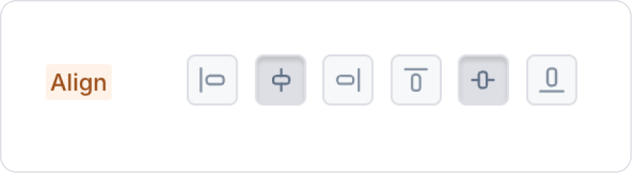
In the Vertical Stack element, center it vertically using the VerticalStack > Styling > Layout > Align field.
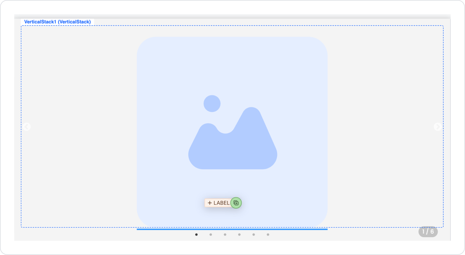
Drag and drop the Elements > Display > Image element into the Vertical Stack.
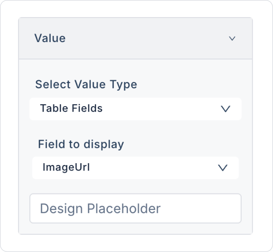
In Image, define ImageUrl in the Image > Properties > Value field.
To resize the Image element, define the Image > Styling > Layout > Width and Height fields as 400 px.
Drag and drop the Elements > Display > Label element under the Image element.
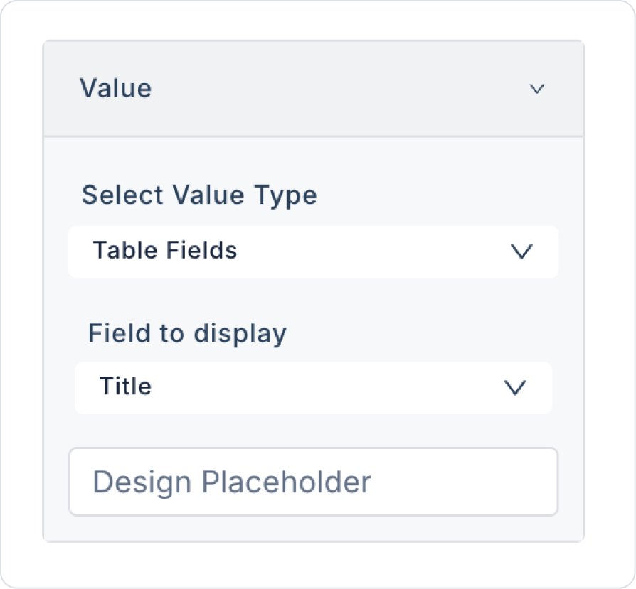
In the Label element, select Title in the Label > Properties > Value field.
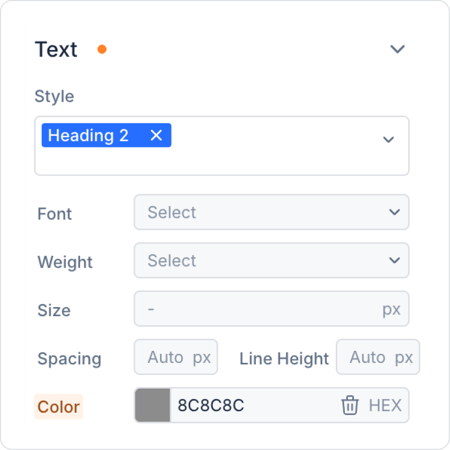
Set the Label appearance to Label > Styling > Text > Style > Heading 2.
Set the Label color to Label > Styling > Text > Color > HEX > 8C8C8C.
Clone the Label element using the Duplicate button, the first option.
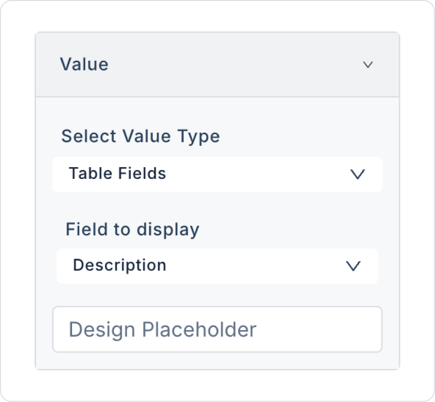
Click on the cloned Label element and select Description in the Label > Properties > Value field.
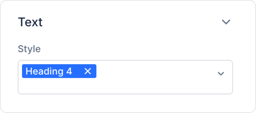
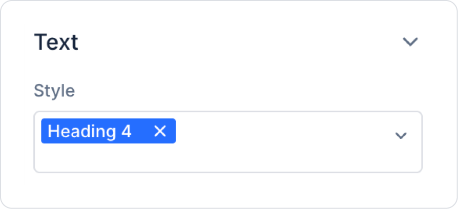
Change the Label appearance to Label > Styling > Text > Style > Heading 4.
The final result should look like the following on the main page.
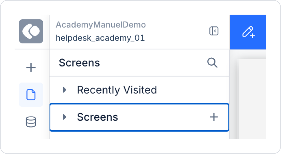
Step 5 - Creating the Detail View Page
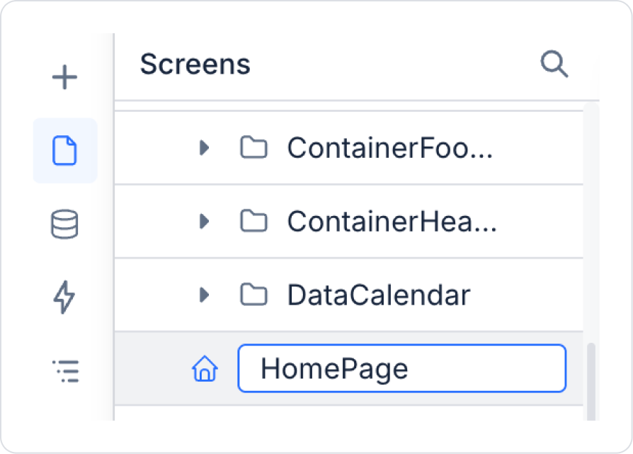
In the UI Design module, create a new page named ‘CarouselDetail’ from the Screens area in the left side panel.
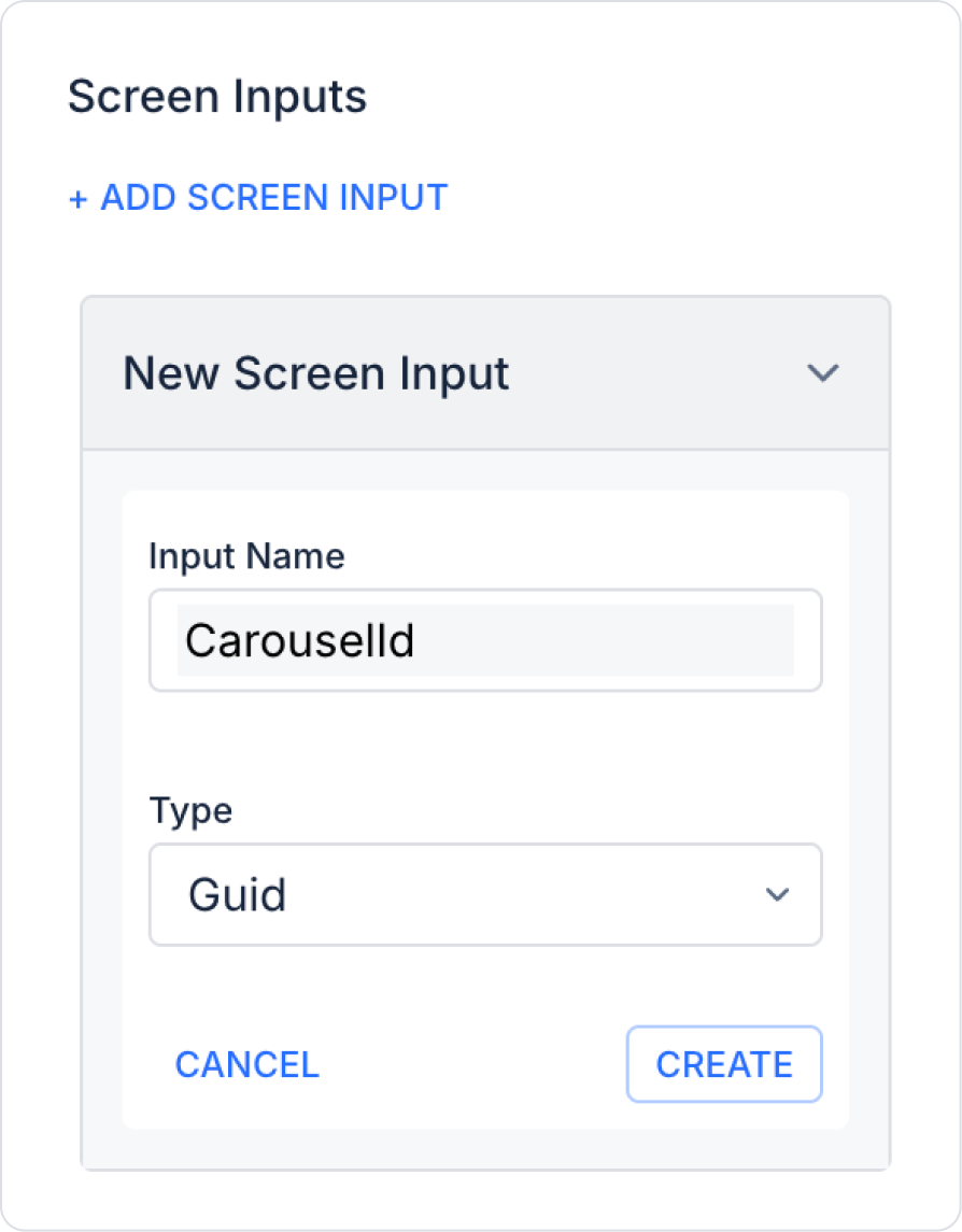
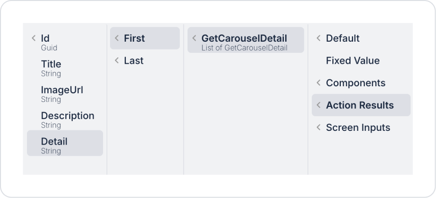
Add a screen input named ‘CarouselId’ of type ‘Guid’ to the newly created page in the ScreenInput > Add Screen Input field.
Add a pageInit Action named Add Action > Initial Action > Custom > Managed DB > GetCarouselDetail to the page.
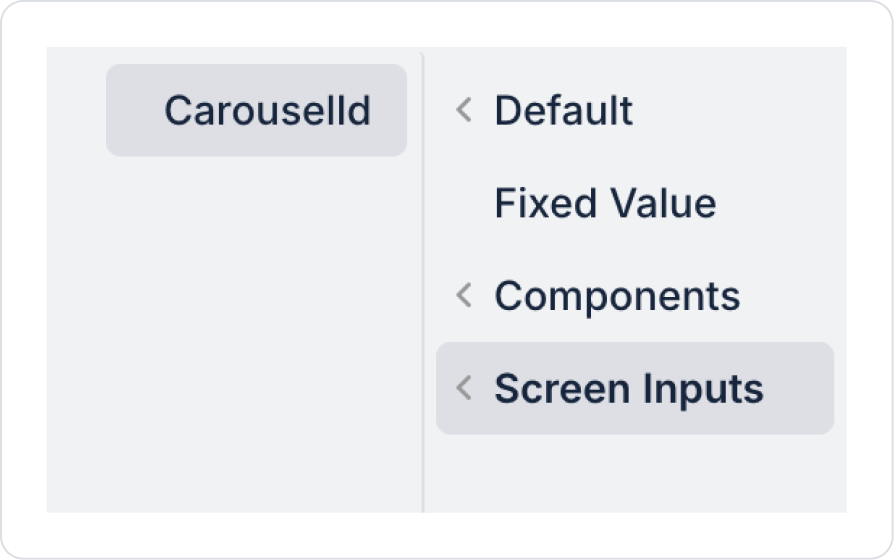
Define the CarouselId screen input id information within the GetCarouselDetail action.
Drag and drop the Elements > Container > Panel element onto the page.
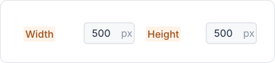
In the Panel element, set the Width and Height fields under Panel > Styling > Layout to 500 px.
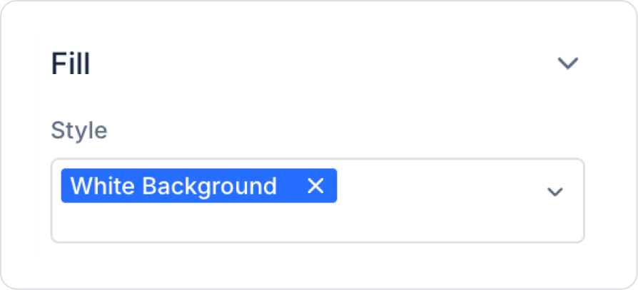
For the background color, set the Style field under Panel > Styling > Fill to White Background.
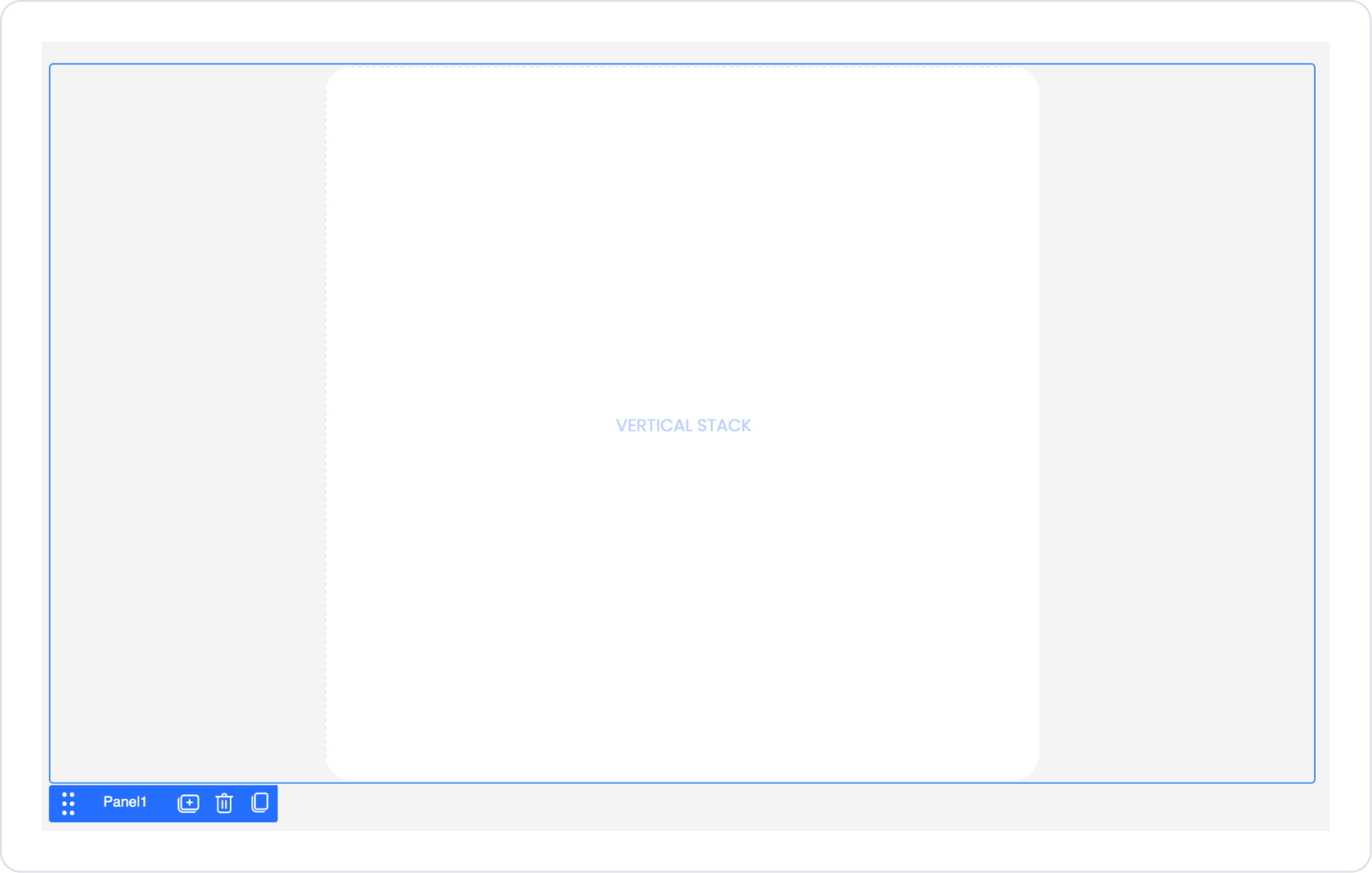
Drag and drop the Elements > Container > VerticalStack element onto the Panel.
To leave space on the vertical stack, set the top padding in VerticalStack > Styling > Layout > Padding to 10.
Drag and drop the Elements > Display > Image element into the Vertical Stack.
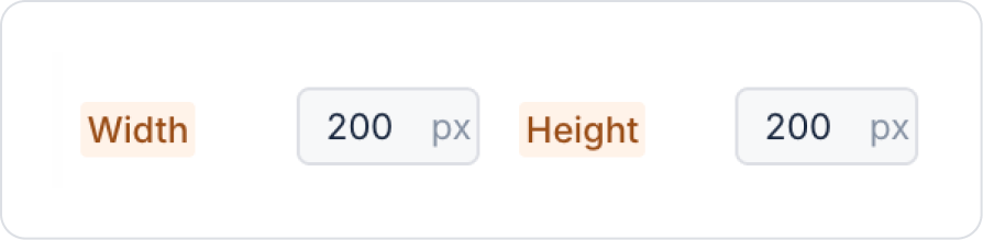
In the Image element, set the Image > Styling > Layout > Width and Height fields to 200 px.
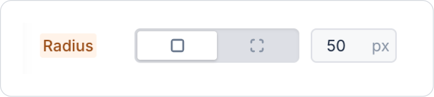
To adjust the edges, set Image > Styling > Border > Radius > 50 px.
Drag and drop the Elements > Display > Label element into the Vertical Stack element below the Image.
In the Label element, center it horizontally and vertically in the Label > Styling > Layout > Align field.
Set the text style to Label > Styling > Text > Style > Heading 4.
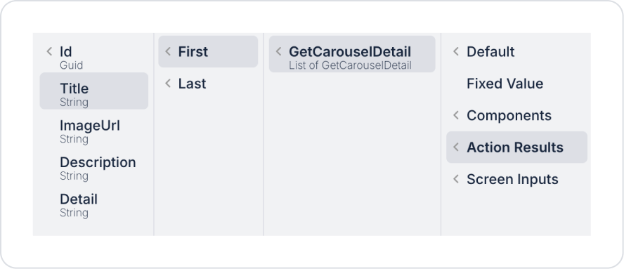
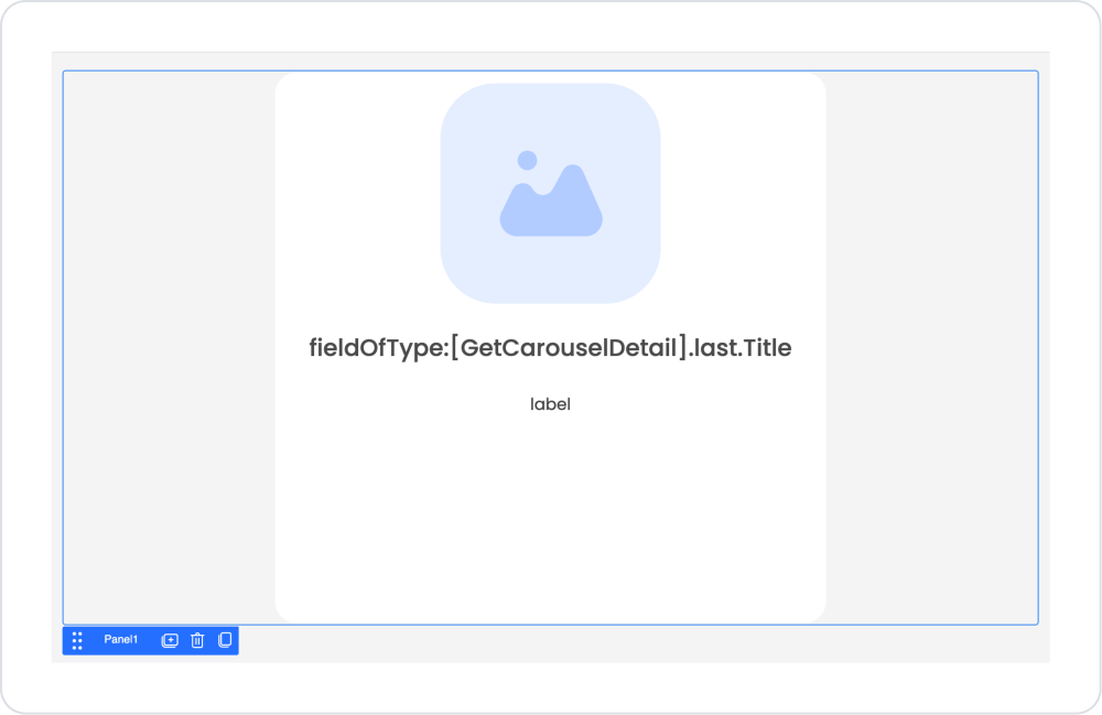
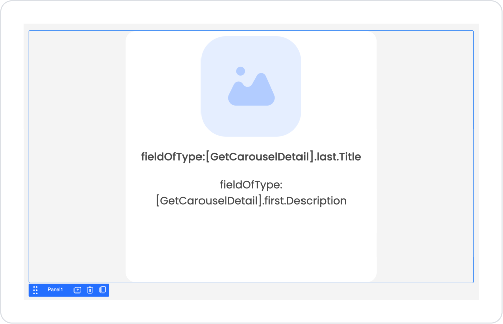
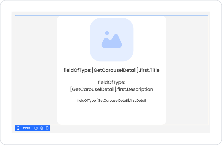
In the Label element, define the Label > Properties > Value> Action Result > GetCarouselDetail > First > Title information.
Following the same steps, add a second Elements > Display > Label below the label element.
Label > Styling > Layout > Align, center the element vertically and horizontally.
Set the label text style to Label > Styling > Text > Style > Heading 5.
In the Label element, define the Label > Properties > Value> Action Result > GetCarouselDetail > First > Description information.
Finally, add the third label element using the same steps and center it vertically and horizontally.
In the Label element, define Label > Properties > Value > Action Result > GetCarouselDetail > First > Detail.
The expected page structure in the final state is as follows.
Step 6 - Linking the Main Page to the Detail Page
In the UI Design module, navigate to the ‘HomePage’ main page where you use the Carousel from the Pages area in the left side panel.
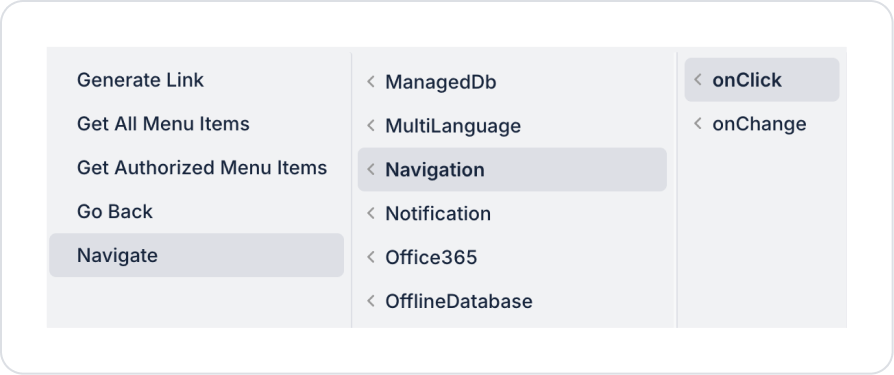
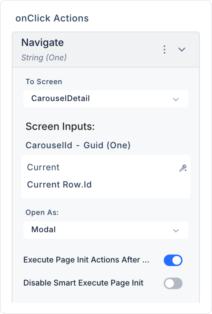
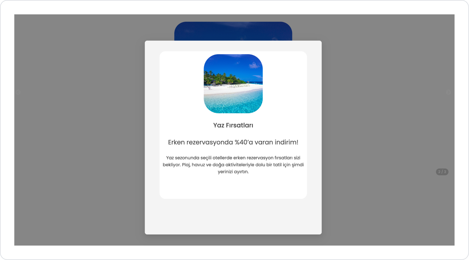
Click on the Image element and add the Image > Add Action > onClick > Navigation > Navigate action.
Within the Navigate action, set CarouselDetail in the To Screen field, Current > Id in the Screen Inputs field, and Modal in the Open As field.
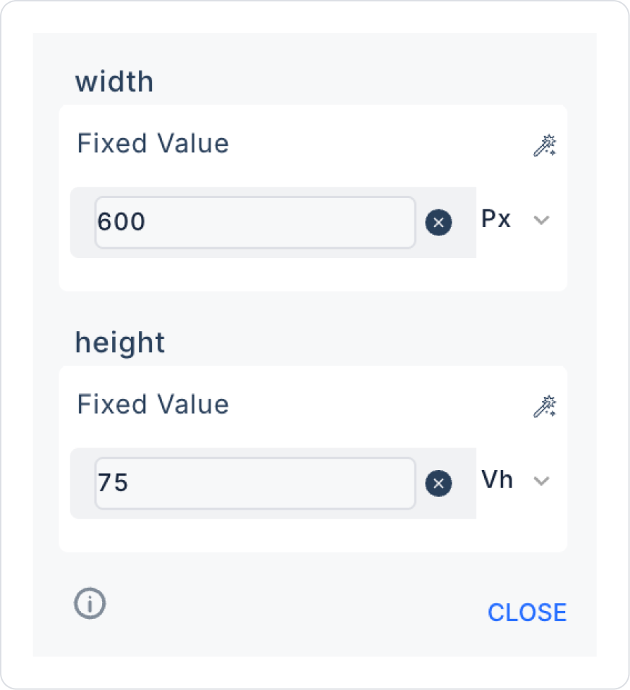
In the Navigate action, set the Width field at the bottom to 600 px and the Height field to 75 Vh.
Preview:
When the application is tested, the campaign card presented within the Carousel structure is displayed. The top section of the card displays the campaign image, while the campaign title and short description text are neatly positioned below.
When the user clicks on the image on the card, a popup screen opens with details about the selected campaign. This screen displays the campaign image, title, and description text in a larger area, allowing for a more detailed and readable review of the content.
4. Common Properties
Some fields on the Carousel element are used commonly across all UI elements. Therefore, detailed explanations of the following properties can be found in the relevant general guide pages:
Optimize images. Large images reduce performance. Prefer WebP or compressed JPEG.
Set the autoplay speed to suit the user experience. Very fast transitions are distracting; very slow transitions can bore the user. (2000–4000 ms is ideal.)
In vertical use, pay attention to content height. Long content may be cropped during vertical scrolling; check your slide dimensions.
Decide on dot visibility based on the number of content items. If there are too many slides, the dots area may appear crowded; hiding them may be more appropriate.
Use contrasting hover effects. Use HoverFontColor and HoverBgColor to highlight content.
6. Limitations
Carousel content appears empty without a data source. Slides cannot be created if the Data Source is not defined.
Autoplay may pause on mobile devices when the user scrolls. Depending on mobile browser behavior, autoplay may pause occasionally.
The fade effect may not be ideal for all slide layouts. On slides with a lot of text, fade transitions can make the text difficult to read.


