The Area Chart element provides an effective way to visually represent changes and trends in data over time. It is recommended for comparing differences between multiple data sets and displaying cumulative values over a specific time period. It is commonly used in financial reporting, sales performance analysis, and all data visualization scenarios involving time series.
The Area Chart element is supported in both web and mobile applications.
1.1 Common Use Cases
Analyzing data trends over time (e.g., daily, weekly, monthly changes)
Comparing multiple data sets (e.g., sales channels, department performance)
Displaying total or cumulative values over a specific period
Tracking revenue–expense trends in financial reporting
Visualizing product, user, or transaction-based time series data
2. Key Features
Visualization of time series data with area fill
Ability to compare multiple data sets on the same chart
Ability to display values as total or cumulative
Customizable X (time) and Y (value) axes
Adjustment of visual settings such as color, opacity, line style, and area fill
Dynamic loading of chart data from the data source
Full compatibility with SQL, REST API, or Managed DB actions
2.1. Area Chart Element Settings (Properties)
When you select the Area Chart element, you can configure the source of the chart data, axis configurations, tooltip settings, and visual adjustments in detail via the Properties panel on the right. All of the following settings are explained point by point.
Datasource
Datasource Action: This action brings the data to be displayed on the Area Chart. The data is loaded when this action is executed.
When no action is linked to the Datasource, no data field mapping settings are visible.
Data Field Mappings
Data Label: This is the title representing the main data series in the chart. This label is displayed as the title in the Legend (explanation box) and tooltips.
Tooltip Custom Title Data Label: The title displayed in the tooltip area when the user hovers over the chart. You can display the general description of the data set here.
Tooltip Custom Content Data Label: The explanatory data field displayed in the tooltip content. Additional information, sub-values, or data descriptions are linked to this field.
Multi Tooltip Content Fields: Allows you to display multiple data fields simultaneously within the tooltip. This is particularly important for multiple data comparisons.
Data Field: The area where the main data series is located. The filled area of the Area Chart is created based on this data.
Data Bg Color: Specifies the area fill color to be used for the main data series. The color value is defined in Hex format (e.g., #007bff).
Second Data Field: Used to display a second data series on the chart. Two different metrics, such as sales, revenue, and expenses, can be compared here.
Second Data Bg Color: Specifies the area fill color for the second data series.
Third Data Field: The area where a third data series is linked. Used in multi-data set analyses (e.g., comparing three departments).
Third Data Bg Color: Specifies the fill color for the third data series.
Legend
Legend Position: Specifies where the data will be listed. Options:
Top
Bottom
Right
Left
Axis Settings
Left Axis: Determines whether values on the Y-axis are displayed. Settings such as unit of measurement display and minimum–maximum adjustments are made here.
Right Axis: Controls the display of values on the X-axis. Can be customized for time, category, or text-based values.
Start and Appearance Settings
Begin At Zero: Determines whether the graph should start at zero. Can be left on to make financial or statistical graphs more understandable.
Data Label Settings
Show Data Labels: Allows you to place labels on data points. Increases the visibility of values on the graph.
Data Label Formatter: Determines the format in which data labels are displayed. Supported formats:
Money (Currency format)
Money TI (Currency format with thousands separator/TL abbreviation)
Percent (Percentage)
Fractional-2 (2 decimal places)
Fractional-5 (5 decimal places)
Styling
Styling Panel Colors: Colors specified in the styling panel can be applied as background colors in chart previews. This setting is used to make the overall appearance of the chart fit the design.
2.2. Actions That Can Be Added to the Area Chart Element
The Area Chart element is a passive element focused on data visualization and therefore does not support actions triggered directly by user interaction. Therefore, the ADD ACTION button is not visible when the element is selected, and no trigger specific to the Area Chart can be added.
The following points explain the action structure of the Area Chart:
The Area Chart does not execute actions when the user clicks or interacts with the chart.
To refresh or update the graph, the Datasource Action associated with the Area Chart must be triggered externally.
In scenarios requiring user interaction (e.g., “the graph changes when the user makes a selection”), actions are triggered via other elements such as buttons, radio groups, etc.
The Area Chart only visually displays the results in the data source; it does not initiate any actions itself.
Actions cannot be defined on the Area Chart element; all updates to be made on the chart are managed through actions triggered via external elements.
3. How to Use the Area Chart Element?
In this section, we will discuss the end-to-end use of the Area Chart element through an example scenario.
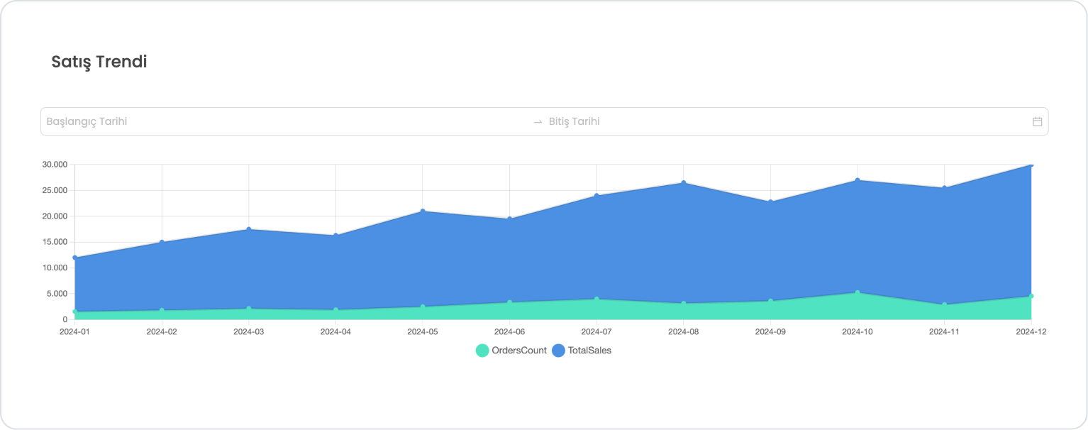
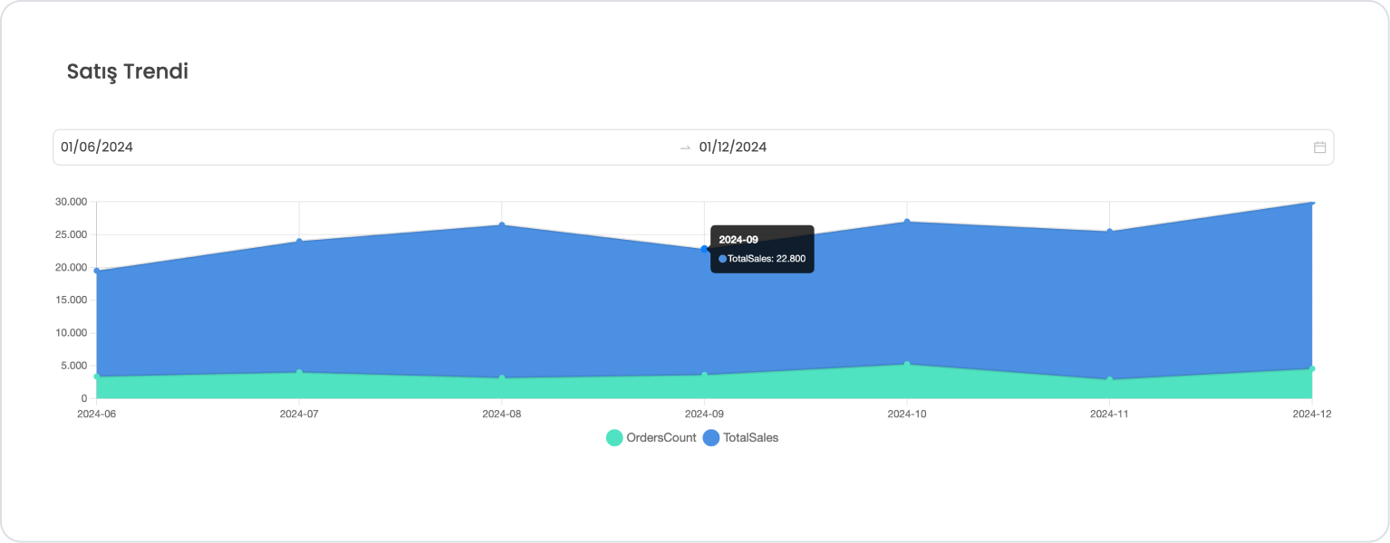
Scenario: Monthly Sales Trend Analysis
In a sales tracking application, the user is shown the monthly total sales amount and monthly order count for a specific date range. By selecting the start and end dates, the user can view filtered sales trends on the chart.
In the scenario:
The monthly sales amount and monthly order count will be displayed as two separate data series on the Area Chart.
Start and end dates will be filtered via SQL according to the user's selection, and the chart will only show the relevant months.
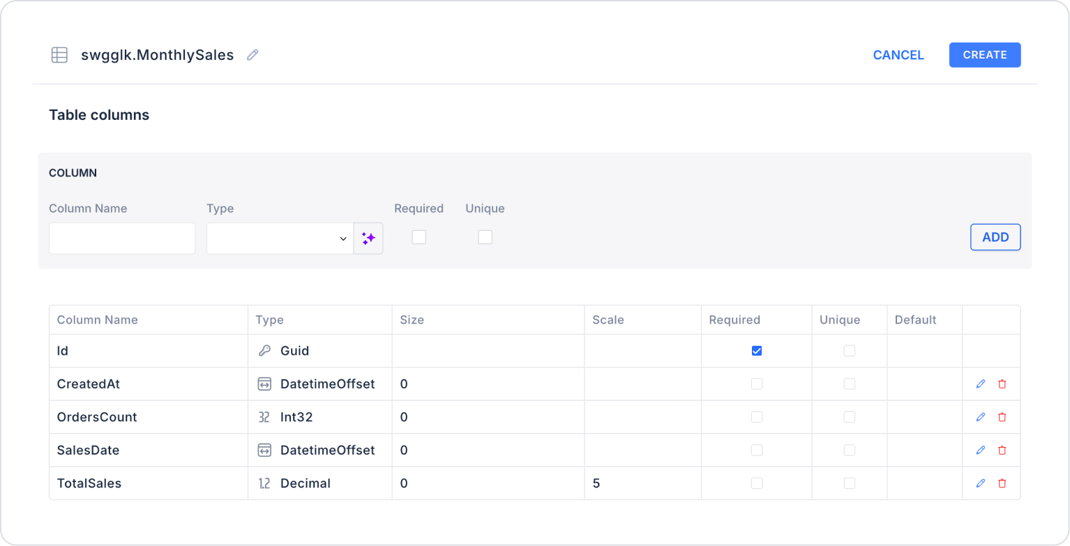
When applying, delete the MonthlySales part, rewrite MonthlySales, and press Enter. This will add the correct schema name before the table name.
Action that Provides and Filters Data (GetMonthlySalesByRange):
SELECT
FORMAT(SalesDate, ‘yyyy-MM’) AS SalesMonthLabel,
TotalSales,
OrdersCount,
-- Color for TotalSales
‘#4A90E2’ AS TotalSalesColor,
-- Color for OrdersCount
‘#50E3C2’ AS OrdersCountColor
-- When the start and end dates are left blank, all data is listed; when these fields are filled in, only records for the selected date range are retrieved.
FROM MonthlySales
WHERE
( @StartDate IS NULL OR SalesDate >= CAST(@StartDate AS date) )
AND
( @EndDate IS NULL OR SalesDate <= CAST(@EndDate AS date) )
ORDER BY SalesDate;
When applying, deletethe MonthlySales part, rewrite MonthlySales, and press Enter. This will add the correct schema name before the table name.
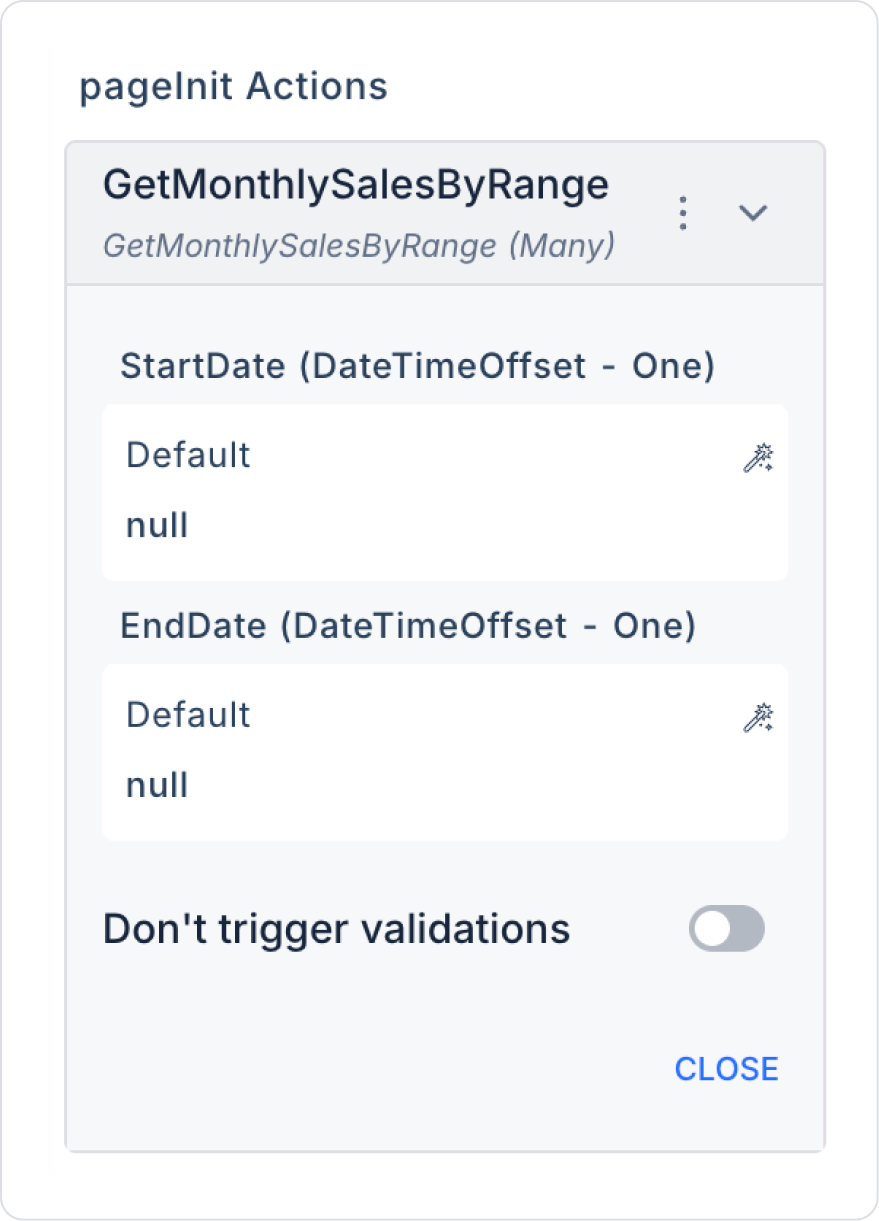
Step 3 - Adding Initial Action
Open the UI Design module.
Add the Initial Actions > Custom > Managed Db > GetMonthlySalesByRange action to the page using the ADD ACTION button on the right side.
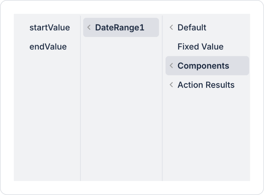
Within the action, select GetMonthlySalesByRange > StartDate > Default > null and GetMonthlySalesByRange > EndDate > Default > null.
Step 4 - Adding Elements
Drag and drop the Elements > Display > Label element onto the page from the left panel.
Then add the Elements > Chart > AreaChart element to the page from the left panel.
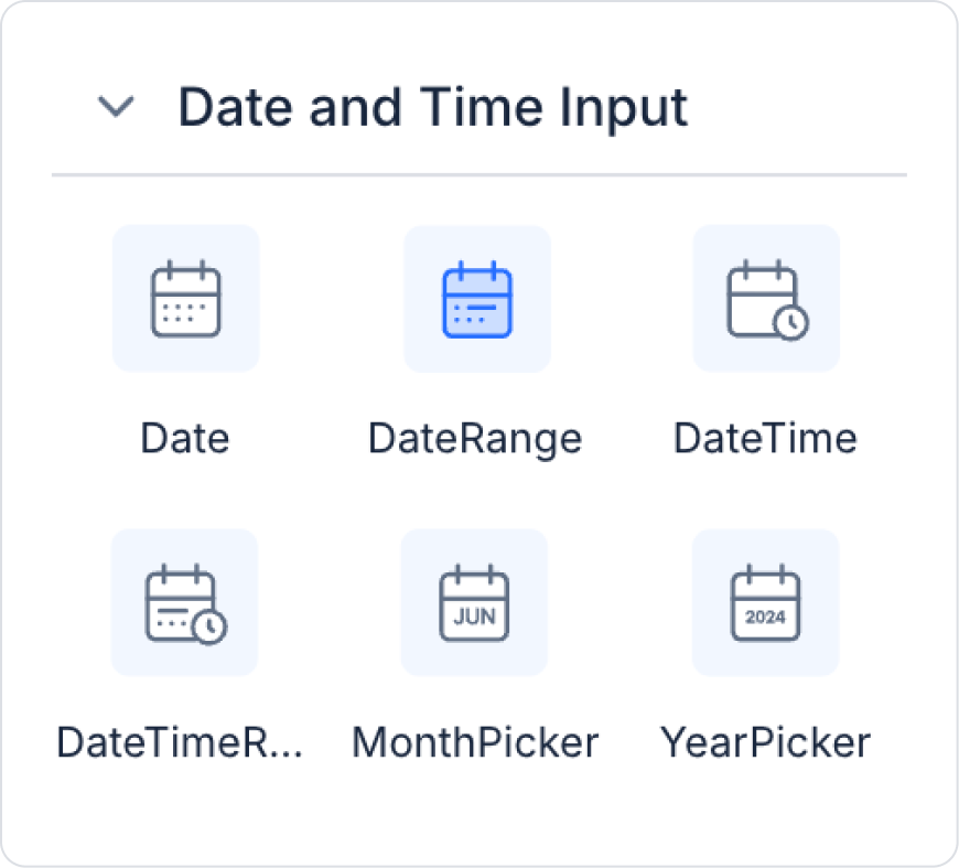
Then add the Elements > Date and Time Input > DateRange element to the page from the left panel.
Step 5 - Configuring Element Settings
Add the text “Sales Trend” to the Label > Properties > Value field.
Set the font of the Label field to Label> Styling > Text > Style > Heading 2.
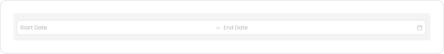
Add the text “Start Date” and “End Date” to the DateRange > Properties > StartDatePlaceholder and EndDatePlaceholder fields.
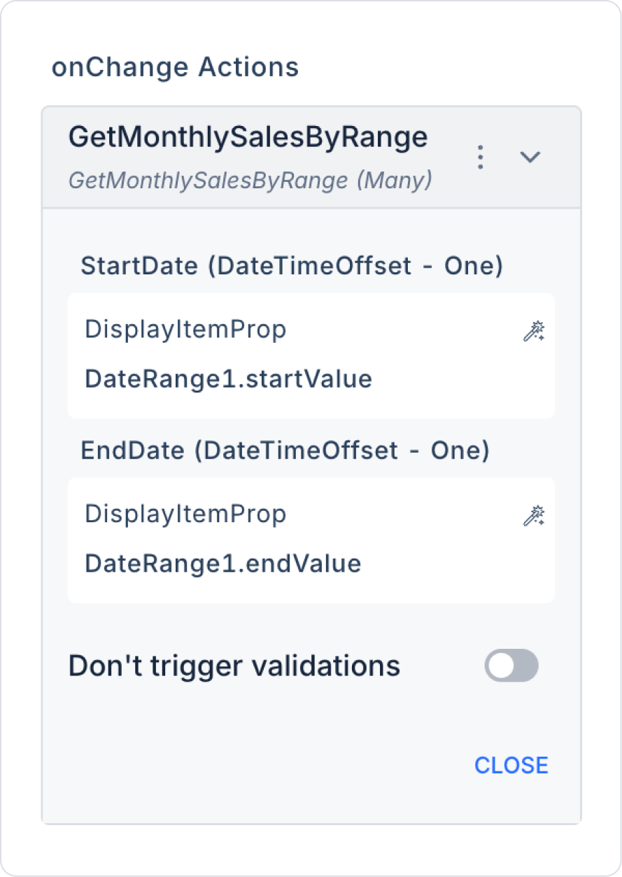
Within the action, define the StartDate and EndDate fields as GetMonthlySalesByRange > StartDate > Components > DateRange1 > startValue and endValue.
Add the Action > GetMonthlySalesByRange action to AreaChart > Properties > DataSource to provide data to the Area Chart. Make the following definitions:
Preview:
When the application is tested using the Preview button in the upper right corner, the data for the selected 7-month date range is displayed on the Area Chart.
4. Common Properties
Some fields on the Area Chart element are common to all UI elements. Therefore, detailed explanations of the following properties can be found in the relevant general guide pages:
When using the Area Chart, the following recommendations should be considered:
Your time series data must be ordered. Unordered data can cause breaks in the chart or incorrect area filling.
Configure tooltip areas with meaningful labels. Users should see simple and descriptive information when they hover over the chart.
Prefer area fill colors with low opacity. Intense color usage reduces the chart's readability; light tones yield better results.
Ensure that axis values are formatted correctly. Money, Percent, or Fractional formats significantly improve chart interpretability.
6. Limitations
When using the Area Chart element, the following limitations must be considered:
Area Chart does not support triggering actions with user interaction. Actions such as onClick cannot be executed directly from the chart.
The chart will not display without a defined data source. The Data Field, Second Data Field, or Tooltip fields will not appear if the data source is not connected.
Incomplete or incorrectly formatted data may corrupt the chart. The date format (yyyy-MM-dd or datetime) must be correct, especially for time series.


