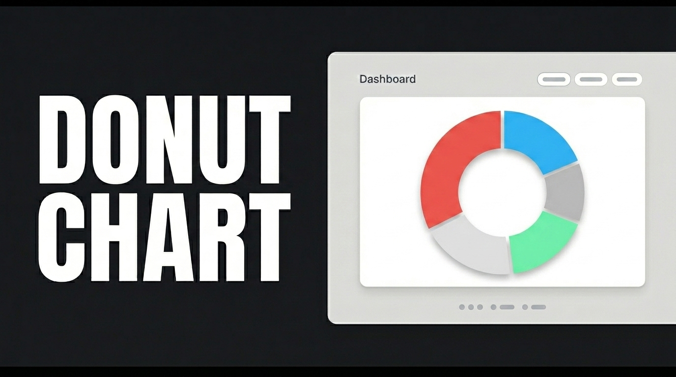
A pie chart is used to show the proportional share of categorical data within a total; it is similar to a donut chart but follows the classic pie chart format without a center hole.
A pie chart—the best way to visualize the share of categorical data within a total—can be used in many areas, from market share analysis to budget allocations.
To get started, create the table as shown on the screen. Then, from the Actions pane, add the InsertCategorySalesStats action using New SQL Action; prefix CategorySalesStats with “dbo.” and click the Test button. Repeat the same steps for the “GetCategorySalesStats” action.
Switch to the UI Design module and add the ‘GetCategorySalesStats’ action as the Initial Action from the “Add Action” section. Drag a Label and a Pie Chart element onto the page. Type your title into the Label element and set it to “Heading 2” in the Style field of the Styling panel. Click on the Pie Chart and connect the DataSource Action from the Properties panel; then define the Data Label, Data Field, Data Background Color, Second Data Field, and Second Data Background Color fields in that order.
When you click the Preview button, you’ll see a simple yet impressive analysis screen showing the proportional distribution of your data.