The Chart category provides powerful tools for visualizing data.
The Chart category provides powerful tools for visualizing data. The Mixed Chart, Radial Chart, Area Chart, Donut, Gauge, Line, Pie, Bar, Progress Bar and Progress Circle elements in this category are designed to help users easily understand and interpret complex data sets.
Mixed Chart shows different types of data in a comparative way by presenting multiple chart types together.
Radial Chart and Donut present proportional relationships in circular formats,
The Area Chart shows data changes as areas over time, which is effective for visualizing trends.
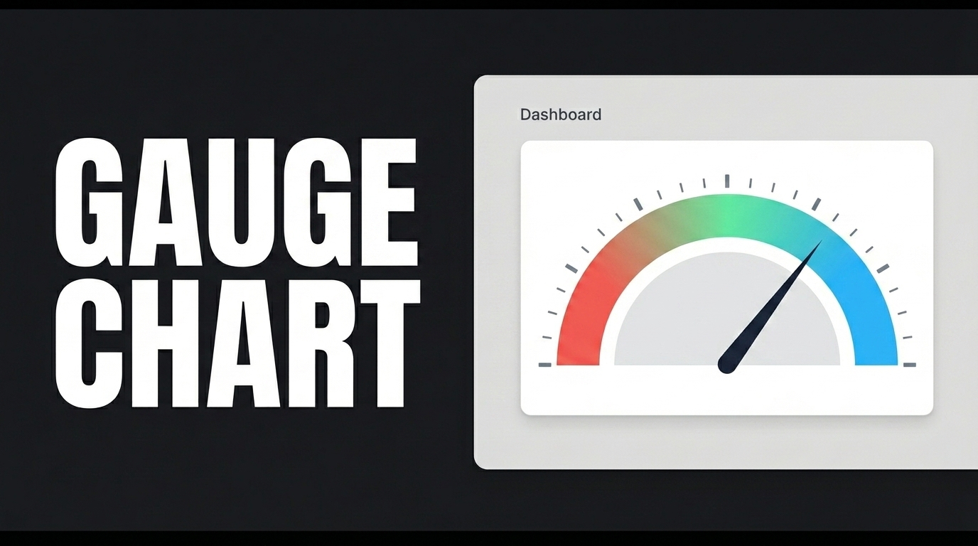
Gauge indicates the measurement of a specific value,
Line Chart is used to highlight changes over time.
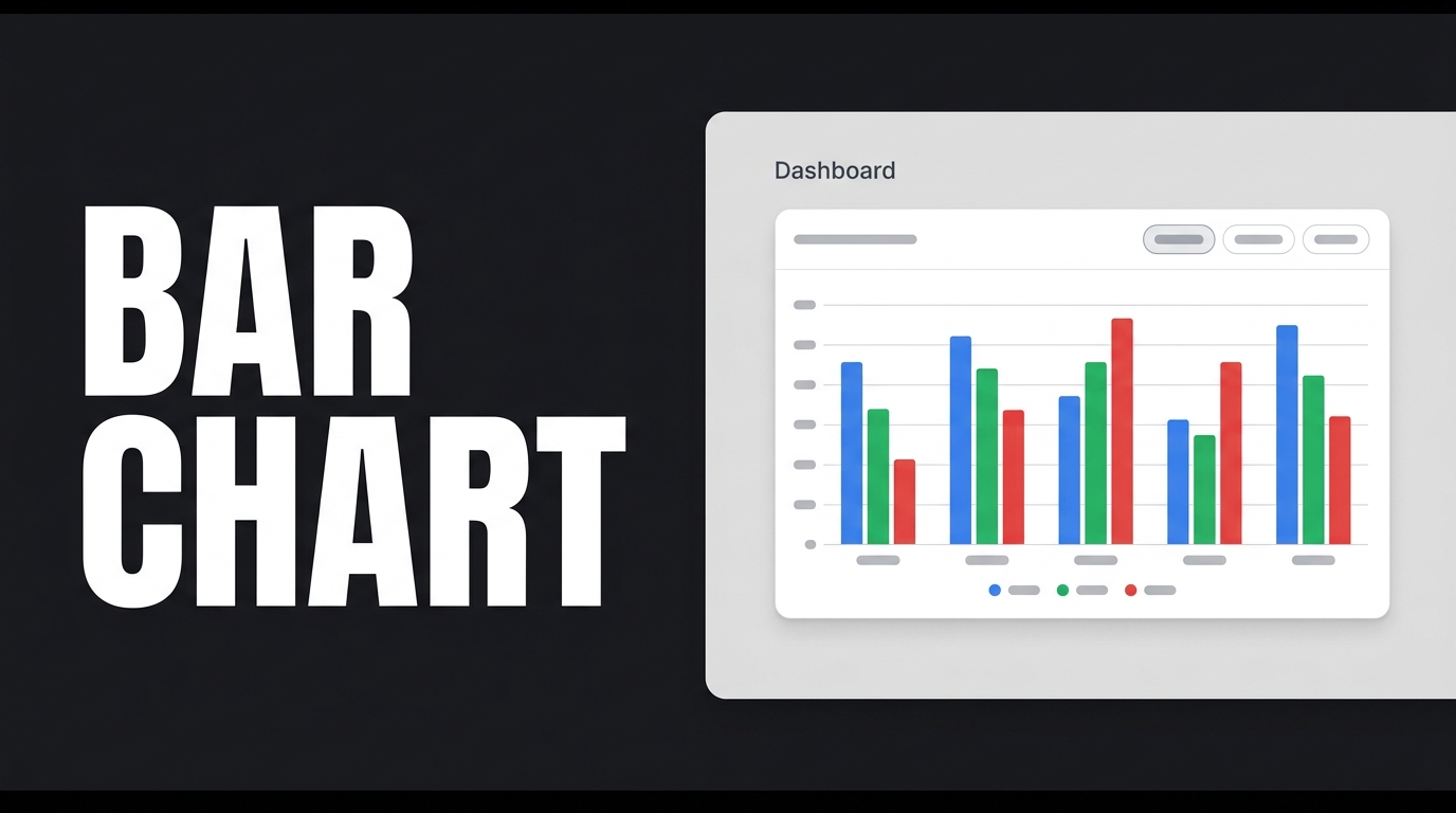
While Pie Chart shows proportional distributions, Bar Chart is effective in comparing categorical data.
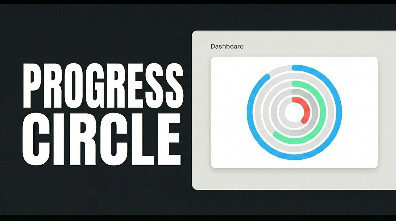
Progress Bar and Progress Circle visually represent the progress of a process or activity, giving users a clear way to understand how far along the process is.
These elements provide a variety of visualization options to the application end-users to facilitate data-driven decisions or to be displayed in the report detail. Each chart type serves a specific data narrative need and helps app end-users quickly understand the data. These visualizations enrich the user experience and are a key element in creating compelling and meaningful interfaces.