This scenario includes two different menu controls:
Collapse Menu: When the menu is collapsed, icons appear and the content area expands. The menu can be toggled between expanded and collapsed states.
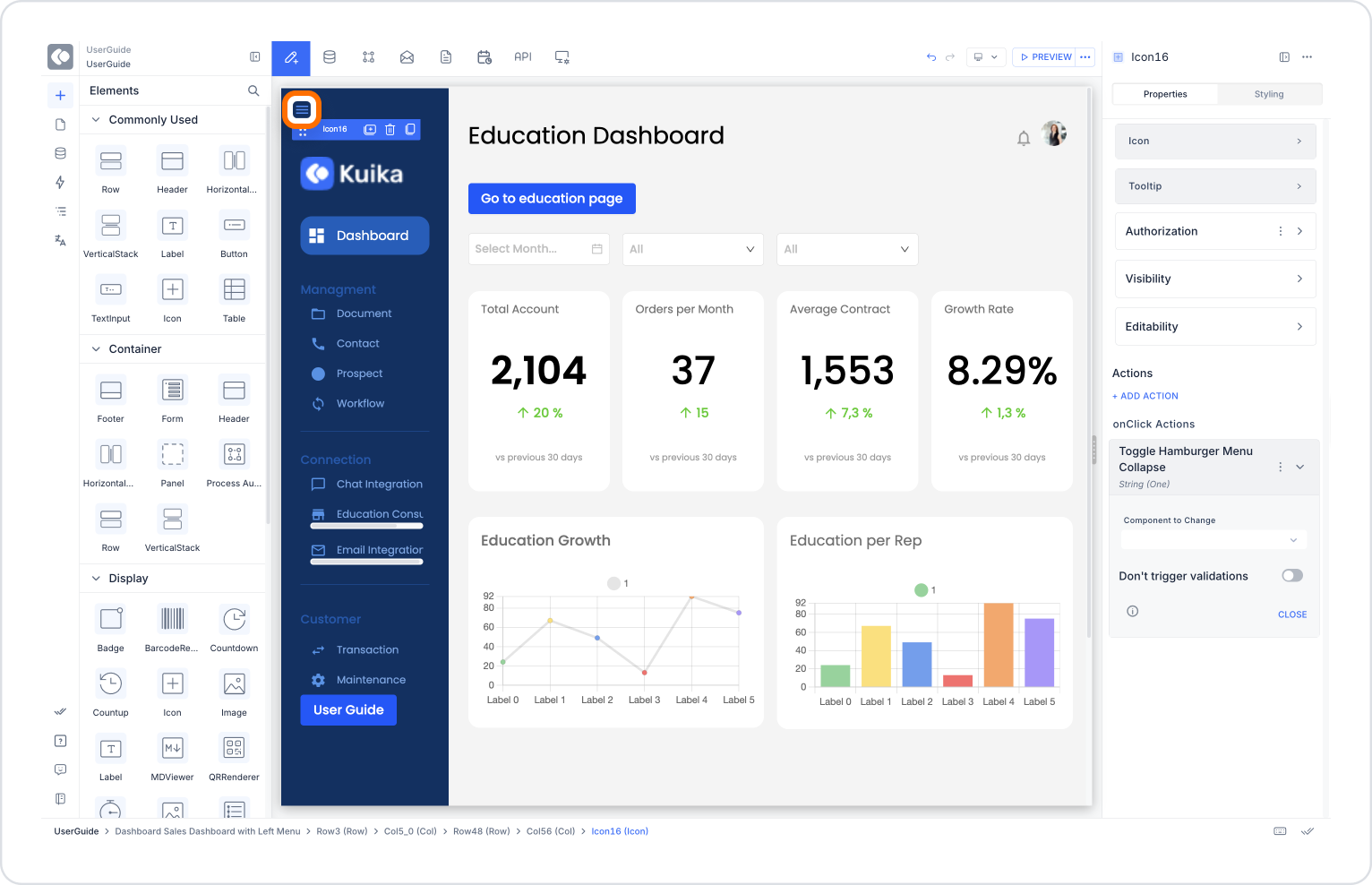
Hamburger Collapse Menu: The menu is completely collapsed, and only a small ☰ (hamburger) icon appears in the top-left corner. The menu can be reopened by tapping this icon.
Scenario: Fully Open/Close Menu with Hamburger Menu
Mobile users should be able to fully open or close the menu by clicking the ☰ icon in the top left corner of the screen.
Application Steps:
Place an Icon element on the UI screen.
Icon: Hamburger (☰)
Define the following action for the icon:
OnClick → UI Control → Toggle Hamburger Collapse Menu
Component to Change: hamburgerMenu
With this structure, users can completely close the menu to get a wider content area.
Additional Scenario: Collapsing the Menu (Collapse Menu)
Users can use a separate button to collapse the menu (show only the icons) while the menu is open.
Application Steps:
Place a button or icon element on the UI screen.
Assign the following action to this element:
OnClick → UI Control → Toggle Collapse Menu
Component to Change: sidebarMenu
This allows users to save space by collapsing the menu instead of closing it completely.