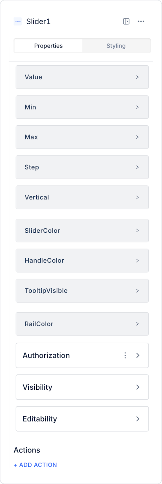
You can configure the following settings in the Properties panel:
Value: You can set a static value or dynamically display a value of a status, the content of an input element or the result of an action via the Symbol Picker.
Max: Sets the maximum value that can be selected on the slider (e.g. range 0-100 for volume control).
Min: Sets the lowest value that can be selected on the slider (e.g. starting from 0 to the maximum value for the price range).
Step: Determines how much the value changes with each movement of the slider (e.g. when set to 5, only values such as 5, 10, 15 can be selected).
Vertical: Allows the slider to be displayed horizontally (default) or vertically.
Slider Color: You can set the color of the slider.
Handle Color: Sets the color of the handle on the slider.
Tooltip Visible: Allows the selected value to be displayed above the slider handle.
Rail Color: You can set the rail color of the slider. The rail is the line along which the slider moves. It can be customized for aesthetic appearance and usability.
By following this guide, you can use the Slider element effectively in your application.