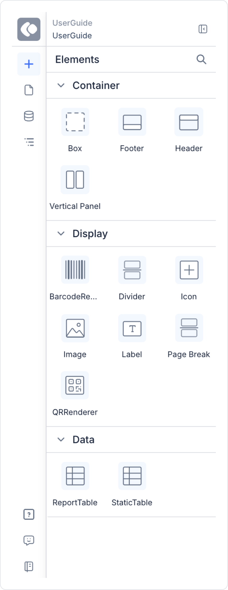
The Elements Panel on the left side of the canvas contains all the elements used to create the report content.
Header & Footer
Automatically adds page headers and footers.
If there is insufficient space when an element is dragged into it, the area automatically expands.
The QR Renderer and Barcode Renderer cannot be dragged into these areas.
Height and border settings can be adjusted.
In dynamic reports:
If the report is split into multiple pages
Header appears only on the first page
Footer appears only on the last page.
It is treated as Report Header within the system.
Page Header & Page Footer
Used to create page-based repeating header and footer areas.
Used to add content that repeats on every page when a report is split into multiple pages.
Labels, images, icons, and other supported elements can be dragged into it.
The height can automatically expand if the space is insufficient.
Height and border settings can be adjusted.
Box
Width, height, x, and y values can be adjusted.
Fill color and border settings can be configured.
Any desired element can be dragged into it.
If the added content does not fit, the Box area automatically expands.
Label
Used to add text.
Text direction can be adjusted.
Support for Vertical WritingMode (right-to-left and left-to-right) is available.
By selecting Current Page via the Symbol Picker, a dynamic page number can be added.
By selecting Total Pages via the Symbol Picker, the total number of pages in the report can be displayed dynamically.
The Border feature is available for the Label element. With the Border feature, the border color, thickness, and appearance can be adjusted.
Rich Text support: Formatting options such as color and size can be applied to label content using formatting tags. Fixed or manually entered text formatted in this way is displayed with the same formatting (rich text) in both the preview on the Canvas and the generated PDF output.
Icon & Image
Images and icons can be added.
Size, color, and position settings can be adjusted.
Vertical Panel
Used to create a fixed vertical panel.
Can be positioned by dragging.
Background color and border can be adjusted.
Multiple Vertical Panels can be added.
QR Renderer & Barcode Renderer
After entering a value, width and height can be adjusted.
Used for data-driven visualization.
Divider
Adds a divider.
Y-position, color, and border settings can be adjusted.
Solid or dashed styles can be applied.
Page Break
Used to add a page break.
For example, to create two pages of A4 (297 mm) size:
A Page Break can be added with Y = 297 on the ruler.
The Y value can also be manually entered as 297 in the Layout section.
Report Table
Report Table is used for dynamic data display.
To use the Report Table:
First, the Get Report Base64 action must be added.
Then, the Print PDF or Download PDF action must be added.
Features:
It is dynamic.
Multiple Labels can be added to a single column.
The Element Direction property allows you to select horizontal or vertical orientation.
Element gap can be adjusted.
Fill color and border properties are supported.
Static Table
Static Table offers a fixed table structure similar to Excel.
Labels can be dragged into it for x–y based positioning.
The border is adjustable.
Per column:
Colspan
Rowspan properties are supported.
Table Operations
From the Table Operations section at the bottom:
Rows can be added above or below.
Columns can be added to the right or left.
Column content can be cleared.
Cells can be merged (Merge).
During the Merge operation:
Colspan and Rowspan are automatically applied.
When multiple cells are selected, the number of selected columns is automatically reflected in the Colspan field.