
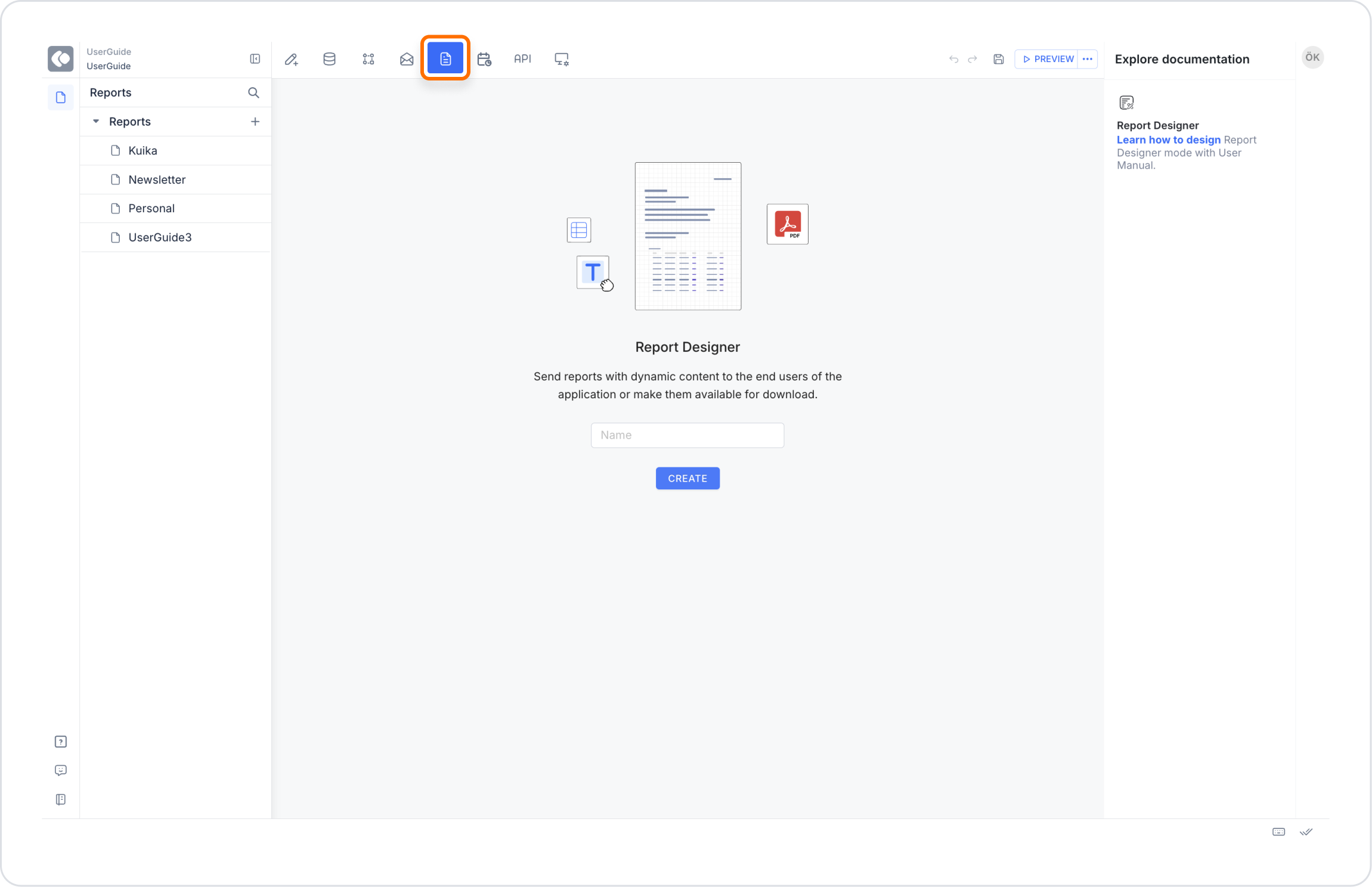
Kuika's Report Designer module is used for creating, editing and visualizing reports in your applications. With this module, you can compile information from different data sources, prepare user-friendly reports and publish them within the application. In this course, you will learn how to design reports, visualize data and customize report outputs through the Report Designer module.
To create a new report:
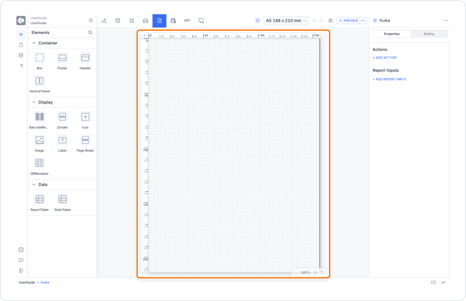
The Canvas is the main area where report design takes place. Thanks to the “Free Position” feature, you can drag and drop elements to any location on the page.
On the Canvas:
Canvas Area Structure (Band Structure)
Report areas on the Canvas are organized using a band structure. These bands are displayed on the left side of the Canvas and can be selected by clicking.
Available bands:
Thanks to this structure:
Isometric (Grid Paper) Design Mode
Canvas defaults to the isometric (grid paper) view. With this mode:
Rulers and Dimensioning
The blue rulers on the Canvas simplify alignment and dimensioning tasks.
Additionally, alignment can be further simplified by adding guide lines via the ruler.
Page Margins (Padding)
Page margins can be customized. In dotted design mode, padding areas are displayed without dots, visually separating the content area.
Paper Size
The Paper Size field in the Header section includes the following options:
The width and height can be manually adjusted using the resizing icon. These settings ensure the report appears correctly in both digital and printed outputs.
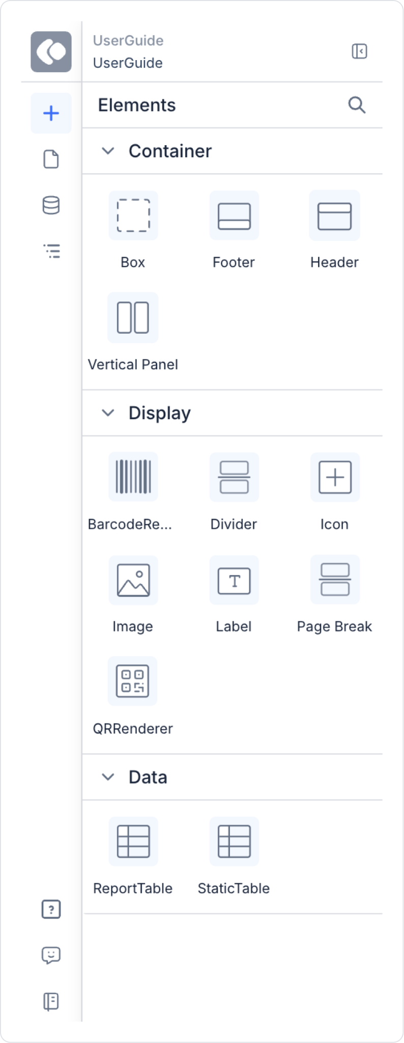
The Elements Panel on the left side of the canvas contains all the elements used to create the report content.
Header & Footer
Page Header & Page Footer
Used to create page-based repeating header and footer areas.
Box
Label
Icon & Image
Vertical Panel
QR Renderer & Barcode Renderer
Divider
Page Break
Report Table
Report Table is used for dynamic data display.
To use the Report Table:
Features:
Static Table
Static Table offers a fixed table structure similar to Excel.
Table Operations
From the Table Operations section at the bottom:
During the Merge operation:
Reports Panel is the main screen where all reports in the application are listed and managed.

Properties Panel offers different settings depending on the selected element:
Different settings are available on a per-element basis:
The Watermark field is used to add a watermark to the report. Watermarks are typically used for:
Watermark settings are configured via the Properties panel while the Screen is selected.
The Report Parameters section allows you to manage the parametric values used within the report. When values are entered in the text of elements such as Labels in the format @parameter, these parameters are automatically detected and displayed in the Report Parameters section of the Properties panel while the Screen is selected.
For example:
In this usage:
Creating Parameters
To create a parametric value:
Parameter Value Sources
Each parameter can retrieve values from different sources.
Supported value types:
This structure enables dynamic data display within the report.
Using Parameters in the Report
Values assigned to parameters are automatically displayed within the relevant Label or element when the report is generated.
For example: Label value: My name is @name @surname
Parameter values:
Report output: My name is John Doe
Parameter Visibility
The Report Parameters panel is displayed only when parametric values are used in the report.
If no @parameter is used in the report, this section is not visible.
The Styling Panel allows you to make visual adjustments.
Styling Panel helps you give your reports a professional look.
Report Designer enables you to create reports that are both data-driven and professionally presented, featuring free positioning, advanced sizing, dynamic table structures, and visual customization options. With this module, you can design effective, flexible, and print-ready reports for your applications.

