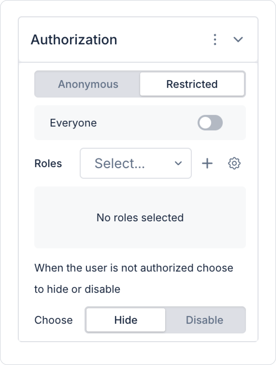
Authorization settings can be configured at both the screen and element levels.
Authorization Options
Anonymous: Users can access without logging in. Used for pre-login screens and publicly available content.
Restricted: Only logged-in users can access. This is the default and recommended authorization option.
When Restricted is selected, the following settings are available:
Everyone: All logged-in users can access.
Roles: Only selected roles can access. Multiple roles can be defined.
Unauthorized User Behavior
You can determine how the element will behave for unauthorized users:
Hide: The element is not displayed to the user at all.
Disable: The element is visible but inactive; user interaction is prevented.
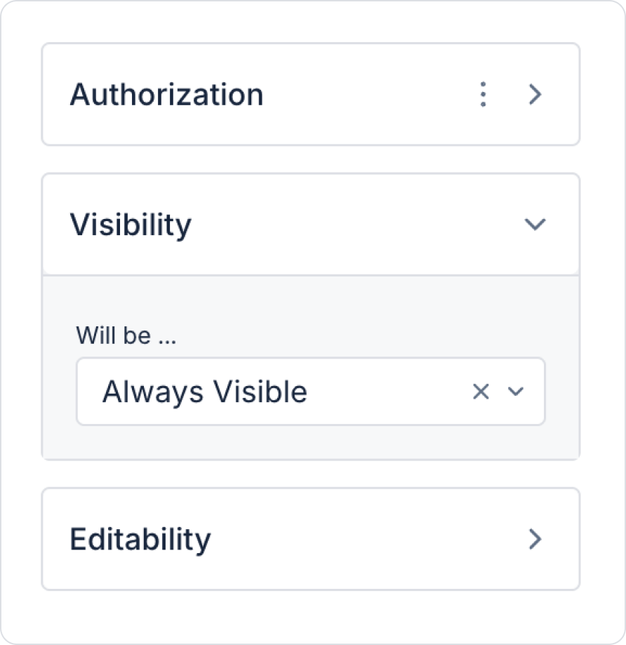
2. Visibility
Determines the visibility of screens or elements.
Visibility options:
Always Visible: Always visible.
Hidden: The element or screen is hidden.
Sometimes Visible: Visible when a specific condition is met.
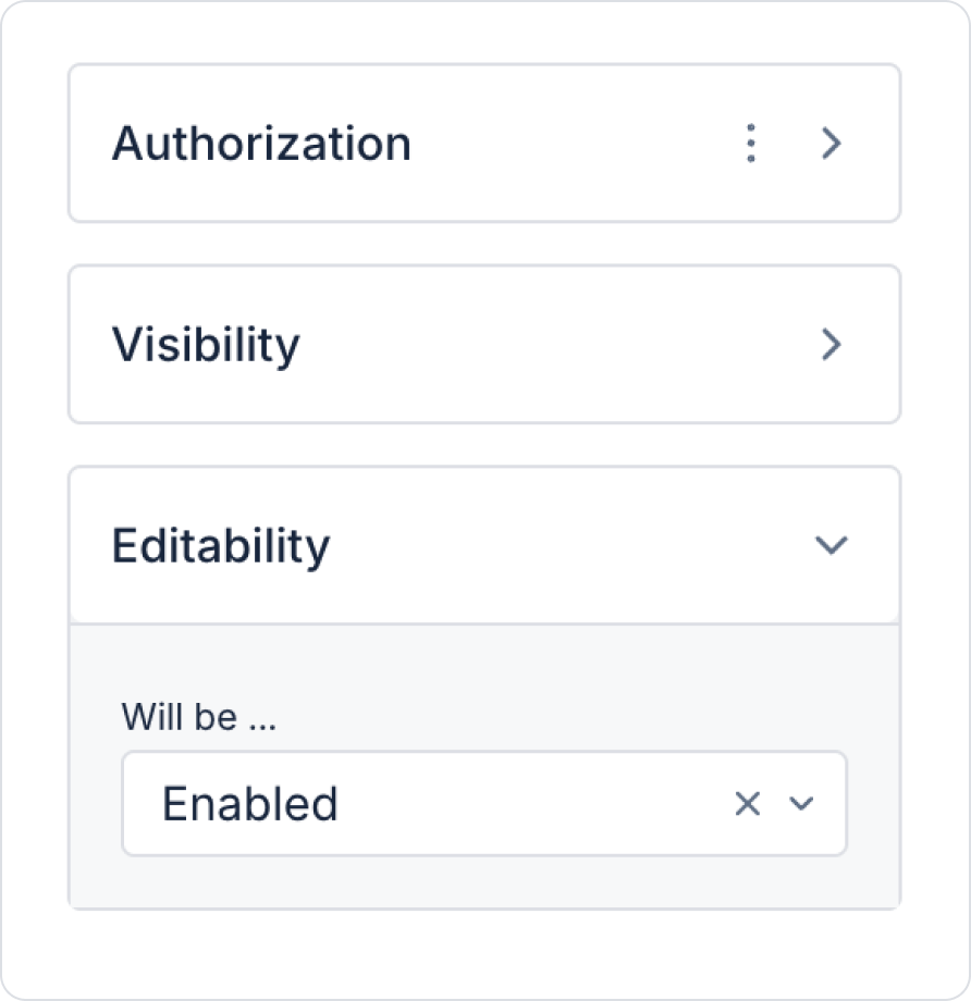
3. Editability
Editability determines whether an element can be edited by the user. Even if the element is visible, it can be kept inactive thanks to this setting. Editability settings are only applied at the element level. Conditions can be defined based on role, state, value, action output, or process steps.
Editability Options
Enabled: The element can always be edited.
Disabled: The element is always inactive, and user interaction is prevented.
Sometimes Enabled: The element is only active when certain conditions are met. Conditions can also be defined nested using multiple groups.
Conditional Editability Structures: When the Sometimes Enabled option is used, the element's activity is linked to conditions. These conditions can be defined using the following groups:
AND Group: The element becomes active when all defined conditions are met.
OR Group: The element becomes active when at least one of the defined conditions is met.
5. Actions
Actions can be defined for an element or screen.
System Actions:
Arithmetic, Authorization, Condition, Device, Export, Geolocation, Local Storage, Multi Language, Navigation, Notification, Payment, UI Control, Process Administration, Process Automation, Trigger, String Operations.
Custom Actions: You can also use SQL actions you have created yourself.
To add an action, click the +ADD ACTION button in the Properties panel.
Properties Panel and UI Design
Master Page: Used to manage common components.
UnManaged Step Screen: When active, projects and steps created in the Workflow are listed.
Screen Redirects: You can select the start screen and configure navigation settings.
Using this panel, you can make your design process faster, more organized, and more user-friendly.