Log in to the Kuika platform and open the project you want to work on.
Go to the UI Design module.
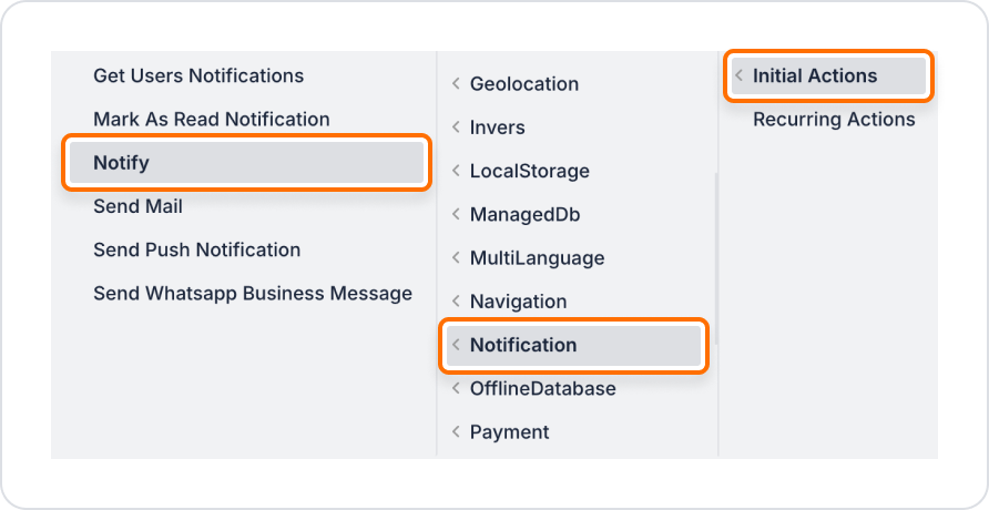
Select the component that will trigger the notification.
Click the + ADD ACTION button in the Properties panel.
+ ADD ACTION menu, add the Notification > Notify action according to the desired trigger event (Initial Actions, OnClick, OnBlur, etc.).
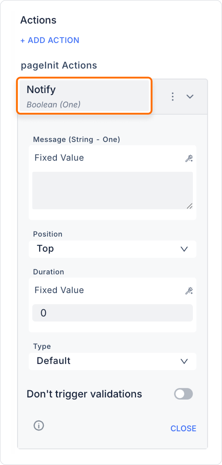
Required and Optional Parameters
Message (String): The text of the notification to be displayed. Example: ‘The process was completed successfully!’
Type: The type of notification. Options: Default, Info, Success, Warning, Danger, Custom. This parameter is typically used to determine the visual style (colour, icon, tone) of the notification and aims to intuitively convey the importance of the message to the user.
The following Style settings are only valid when the Type value is ‘Custom’. For other types (Default, Info, Success, Warning, Danger), the system default visual styles are applied and these fields are ignored. By selecting the Custom type, design details such as the notification colour and font size can be customised by the developer.
Text Colour (String – optional): Notification text colour. Example: ‘#FFFFFF’
Font Size (String – optional): Notification text size.
Example: “14px” or ‘1em’
Position: Specifies which corner of the screen the notification will appear in. Options: Top Left, Top Right, Top Centre, Bottom Left, Bottom Right, Bottom Centre, Centre
Duration (Integer – optional): Specifies how many seconds the notification will remain on the screen. Example: 5 (5 seconds)
All parameters can be linked to Action Result, Method Input, Current, Screen Input, Fixed or Component sources via the Symbol Picker.