Notify

Notify

Notify action is used to display instant notification messages to the user after a specific action or user interaction. It is typically preferred to provide quick feedback in cases such as successful actions, errors, system alerts, or situations that require informing the user.

When this action is triggered, the duration for which the notification will be displayed on the screen and its visual characteristics are determined by the Notify Action Settings configuration defined in the application. These settings, defined in the Kuika Configuration Manager module, allow different durations to be assigned for successful operations, warnings, errors, or information messages. In addition, style properties such as background colour, text colour, and font size can also be managed through this configuration for Custom notifications. This ensures that all notifications displayed to the user provide a consistent experience, both functionally and visually.

Technical Features

  • Supports success, warning, information, error, and custom notification types.
  • The position where the notification will be displayed on the screen can be selected (e.g. top right, bottom left).
  • The duration for which the notification will remain on the screen can be adjusted.
  • Visual details such as background colour, text colour and font size can be customised.
  • Works on web and mobile applications.
Notify Action Application Steps
  • Log in to the Kuika platform and open the project you want to work on.
  • Go to the UI Design module.
  • Select the component that will trigger the notification.
  • Click the + ADD ACTION button in the Properties panel.
  • + ADD ACTION menu, add the Notification > Notify action according to the desired trigger event (Initial Actions, OnClick, OnBlur, etc.).

Required and Optional Parameters

  • Message (String): The text of the notification to be displayed. Example: ‘The process was completed successfully!’
  • Type: The type of notification. Options: Default, Info, Success, Warning, Danger, Custom. This parameter is typically used to determine the visual style (colour, icon, tone) of the notification and aims to intuitively convey the importance of the message to the user.
  • The following Style settings are only valid when the Type value is ‘Custom’. For other types (Default, Info, Success, Warning, Danger), the system default visual styles are applied and these fields are ignored. By selecting the Custom type, design details such as the notification colour and font size can be customised by the developer.
    • Background Colour (String – optional): Notification background colour. Example: ‘#FF5733’
    • Text Colour (String – optional): Notification text colour. Example: ‘#FFFFFF’
    • Font Size (String – optional): Notification text size.
    • Example: “14px” or ‘1em’
  • Position: Specifies which corner of the screen the notification will appear in. Options: Top Left, Top Right, Top Centre, Bottom Left, Bottom Right, Bottom Centre, Centre
  • Duration (Integer – optional): Specifies how many seconds the notification will remain on the screen. Example: 5 (5 seconds)

All parameters can be linked to Action Result, Method Input, Current, Screen Input, Fixed or Component sources via the Symbol Picker.

Usage Scenario: Notification After Form Submission

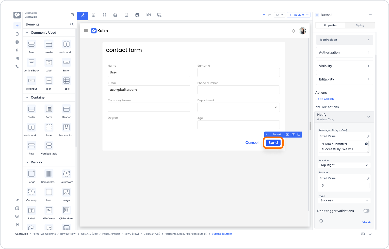
When a user fills out and submits a contact form, a Notify notification indicating that the process has been successfully completed is displayed. This allows the user to immediately know that the form has been submitted without any problems.

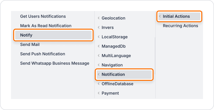
Adding a Notify Action to the Form Button

  • Enter the UI Design module.
  • Add the Button component to the form from the Elements panel on the left side.
  • In the Properties panel, enter ‘Submit’ in the Label field.
  • Select the button and add the + ADD ACTION → OnClick → Notification → Notify action.

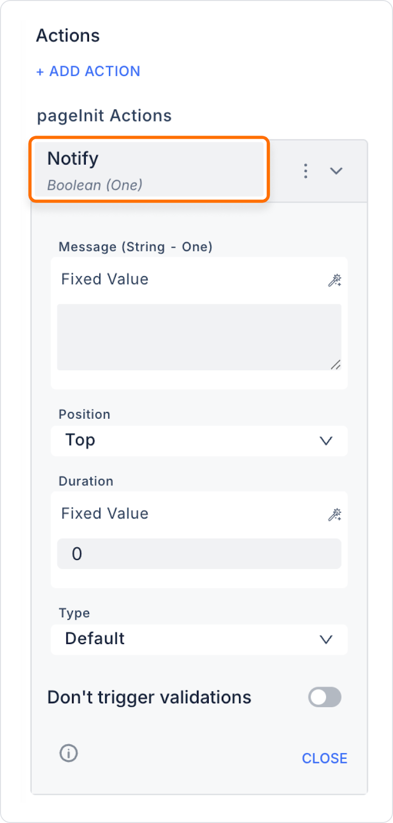
Configuring the Notify Action

  • Message: The form has been successfully submitted! We will contact you as soon as possible.
  • Type: Success
  • Position: Top Right
  • Duration: 5

With this configuration, the user will see a green notification message in the top right corner of the screen that lasts for 5 seconds. This way, they will know that the form has been sent and will not need to repeat the process.

Notify Action Advanced Customizations
  • Dynamic Messages: User name, transaction result, etc. data can be dynamically integrated into the notification message.
  • Custom Style Usage: The visual structure of the notification can be customised by adjusting the background colour, text colour, and font size.
  • Multiple Notify Actions: The notification process can be enriched by displaying multiple notifications at the same time.
  • Conditional Display: Notifications can be displayed only under certain conditions using structures such as If Then Else.

Technical Risks and Precautions

  • Repeated Notifications: If the same notification is triggered continuously, it may annoy the user. Control structures should be added.
  • Privacy: If the notification content contains personal data, the privacy and security of the data must be ensured.
  • Appropriate Duration: If the notification duration is too short, it may not be noticed; if it is too long, it may disrupt the user experience.

Notify action improves the quality of in-app interaction by providing instant and visual feedback to the user. Thanks to its customisable structure, it is an effective solution for providing intuitive information about the in-app flow to the user.

Other Related Content

No items found.

Glossary

No items found.

Alt Başlıklar