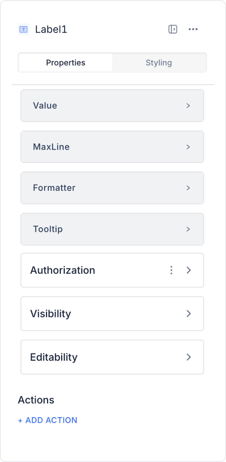
You can configure the properties of the Label element from the Properties panel on the right side.
Value: This is the field where you can type static text. Using Symbol Picker, you can dynamically display the value of another element or the result of an action.
Maxline: Allows the content to be displayed up to a certain number of lines, regardless of the text length.
Formatter: Used to format or organize the displayed content in a specific way. You can select from the following options in the Properties panel dropdown:
money: Displays the amount of money with 2 decimal places. (Example: 27.99)
money-var-1: Displays the amount of money without decimals. (Example: 28)
money-4-decimal: Displays the amount of money with 4 decimal places. (Example: 27.9999)
money-tl: Displays the amount of money with the Turkish Lira symbol. (Example: 27.99 ₺)
phone: Formats the phone number as (999) 999-9999.
percent: Adds the percent symbol and represents the value as a percentage. (Example: %25)
fractional-2: Displays a number with 2 decimal places. (Example: 3.14)
fractional-5: Displays a number with 5 decimal places. (Example: 3.14159)
datetime: Displays date and time in DD/MM/YYYY HH:mm:ss format. (Example: 20/10/2023 14:30:45)
date: Displays date in DD/MM/YYYY format. (Example: 20/10/2023)
date-var-1: Displays date in DD:MM:YYYY format. (Example: 20:10:2023)
short-date: Displays date in a short format. (Example: Oct 20)
time: Displays time in HH:mm:ss format. (Example: 14:30:45)
time-ago: Displays how much time has passed since a specific date and time. (Example: 2 days ago)
Tooltip: Specifies the description text that appears when the user hovers over a Label element. For example, hovering over an "Email Address ‘ label may display a description such as ’Please enter a valid email address ”.
The Label element used in Android applications now supports not only bold but also other font weight styles. This provides more flexible and customisable text style options.
The Label element allows users to quickly and clearly recognize information in an application. It also contributes to making your app look more organized and professional by presenting different types of data in a specific format.