There are many elements in the Content tab in the email template creation interface. You can add the elements in the Content tab to the template with drag and drop.
Columns Element Settings
Drag and drop the Columns element onto the template screen.
You can customize the Columns element from the fields below:
Columns: Allows you to place different sections of your email template side by side, creating a more dynamic and organized layout.
Column Properties: Allows you to customize the appearance and layout of the columns.
Row Properties: Allows you to customize the layout and style of the rows in the email design. It also allows you to add images to the rows.
Responsive Design: It allows your template to be displayed in a compatible way on different devices, screen sizes and resolutions. There are Desktop and Mobile viewing options in the interface to create a responsive design.
Heading Element Settings
Drag and drop the Heading element onto the template screen.
You can customize the Heading element from the fields below:
Text: This is the area where you can customize the header text you will use in the email content.
Links: When a URL is added to the header text, it allows you to customize the URL link.
General: This is the area where you can adjust the width and height of the header.
Responsive Design: It ensures that your template is displayed harmoniously on different devices, screen sizes and resolutions. There are Desktop and Mobile viewing options in the interface to create a responsive design.
Text Element Settings
Drag and drop the Text element onto the template screen.
You can customize the Text element from the fields below:
Text: This is the field where you can write and customize the text you will use in the e-mail content.
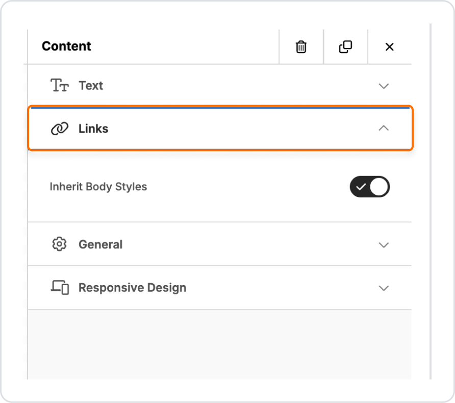
Links: When a URL is added to the text field, it allows you to customize the URL link.
General: This is the area where you can adjust the width and height of the text field.
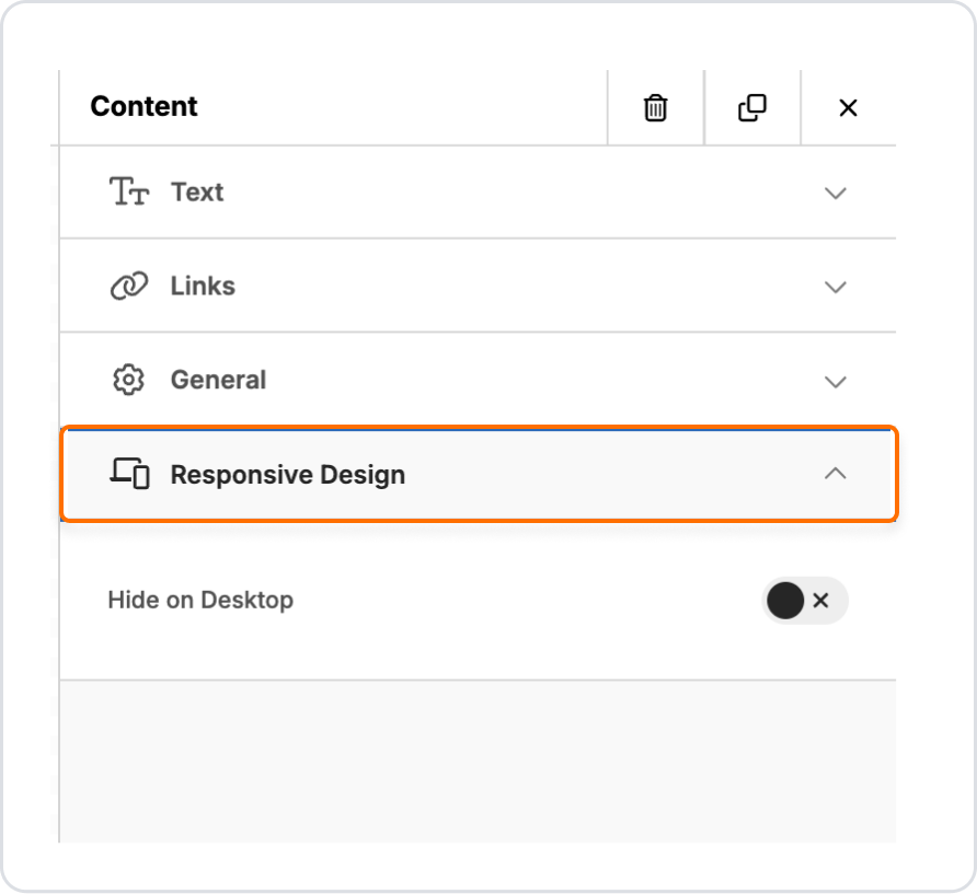
Responsive Design: It allows your template to be displayed harmoniously on different devices, screen sizes and resolutions. There are Desktop and Mobile viewing options in the interface to create a responsive design.
Button Element Settings
Drag and drop the Button element onto the template screen.
You can customize the Button element from the fields below:
Action: You can add an action for the Button element and specify the action to be taken when the button is clicked. You can use these options:some text
Open Website: Allows you to enter the URL of the website that will be opened when the button is clicked.
Send Email: Allows you to specify the text of the email to be sent when the button is clicked.
Call Phone Number: Allows you to enter the phone number to call when the button is clicked.
Button Options: This is the area where you can customize the button you will use in the e-mail content.
Spacing: This is the area where you can set the internal and external spacing of the button element.
General: This is the area where you can adjust the width and height of the button area.
Responsive Design: It ensures that your template is displayed harmoniously on different devices, screen sizes and resolutions. There are Desktop and Mobile viewing options in the interface to create a responsive design.
Divider Element Settings
Drag and drop the Divider element onto the template screen.
You can customize the Divider element from the fields below:
Line: Allows you to customize the appearance and style of the divider line.
General: This is where you can adjust the width and height of the Divider area.
Responsive Design: It allows your template to be displayed in a compatible way on different devices, screen sizes and resolutions. There are Desktop and Mobile viewing options in the interface to create a responsive design.
Image Element Settings
Drag and drop the Image element onto the template screen.
You can customize the Image element from the fields below:
Image: This is the area where you can customize the image you will use in the email content.
Action: You can add an action for the Image element and specify the action to be taken when you click on the image. You can use these options:some text
Open Website: Allows you to enter the URL of the website that will be opened when you click on the image.
Send Email: Allows you to specify the text of the email that will be sent when you click on the image.
Call Phone Number: Allows you to enter the phone number to call when you click on the image.
General: This is the area where you can adjust the width and height of the image area.
Responsive Design: Allows your template to be displayed harmoniously on different devices, screen sizes and resolutions. There are Desktop and Mobile viewing options in the interface to create a responsive design.
Menu Element Settings
Drag and drop the Menu element onto the template screen.
You can customize the Menu element from the fields below:
Menu Items: This is where you can add menu options or links.
Styles: This is the area where you can customize the menu you will use in the email content.
General: This is where you can adjust the width and height of the menu area.
Responsive Design: It ensures that your template is displayed harmoniously on different devices, screen sizes and resolutions. There are Desktop and Mobile viewing options in the interface to create a responsive design.
HTML Element Settings
Drag and drop the HTML element onto the template screen.
You can customize the HTML element from the fields below:
HTML: You can customize your email design by adding custom HTML codes.
General: You can adjust the width and height of the HTML area.
Responsive Design: Ensures that your template displays responsively on different devices, screen sizes and resolutions. There are Desktop and Mobile viewing options in the interface to create a responsive design.
Social Element Settings
Drag and drop the Social element onto the template screen.
You can customize the Social element from the fields below:
Icon: When customizing the Social element, you can select or change the icon here. For example, you can use social media icons such as Facebook, Twitter, Instagram, etc.
General: This is where you can adjust the width and height of the Social area.
Responsive Design: It ensures that your template is displayed harmoniously on different devices, screen sizes and resolutions. There are Desktop and Mobile viewing options in the interface to create a responsive design.
Blocks Tab
The Blocks tab in the email template creation interface provides a variety of block structures for page layout. To add block structures to the email template you are creating, simply drag and drop the desired element into the templating area. By hovering over the columns in the block structure you added, you can add the element to these columns.
Body Tab
From the Body tab you can customize the following fields:
General: This is the area where you can customize the general email structure.
Email Settings: This is where you will write the summary text that appears immediately after the subject line in the email inbox.
Links: This is the area where you can customize the link to the email template that allows it to redirect to websites.


