Kuika's Row element is used to arrange user interface elements in a horizontal row. This element allows you to align different components on a single line and control the spacing between them. It is frequently used in form structures, card designs, and dashboard layouts.
The Row element is supported in both web and mobile applications.
Areas of Use
Arranging form fields side by side,
Displaying dashboard cards in a horizontal row,
Creating table headers,
Aligning images, icons, and text on a single line, etc.
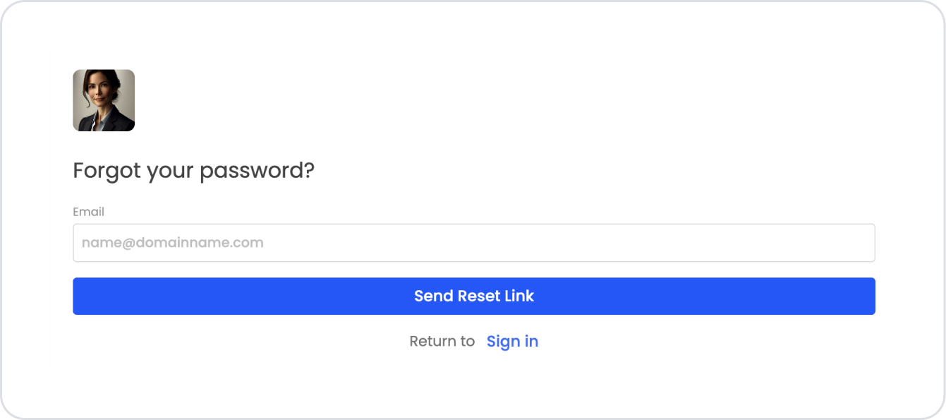
Password Reset Form Use Case
When a user forgets their password while logging in, the password reset screen is used.
The screen only asks the user for their email address.
The user enters their email address in the Text Input field.
When the “Send Reset Link” button is pressed, the system sends a password reset link to the user's email address.
There is a “Return to Sign in” link at the bottom; the user can return to the login screen.
Using Features in a Scenario Context
Row & Column
The form structure is organized within the Row element.
Row is divided into 24 columns to provide a responsive view on different devices.
Text Input (Email)
The user's email address is obtained.
It can be marked as a Required field; if left blank, it cannot be submitted.
Button (Send Reset Link)
When clicked, it triggers the “SendResetLink” action defined in the system.
An email is sent to the user.
Navigation Link (Return to Sign in)
It redirects the user back to the login screen.
A Label + Link combination is used within the UI.
Web, Tablet, Mobile Layout
Desktop: The email field and button are easily visible in the wide screen layout.
Tablet: Elements within the row are displayed in narrower columns.
Mobile: Elements are stacked vertically → Email input at the top, button in the middle, link at the bottom.
When the Scenario Step is Complete
When the user enters their email address and clicks the “Send Reset Link” button, the system sends the reset link.
When the screen size is reduced, all fields are automatically stacked vertically.
The user can return to the login screen using the “Sign in” link if they wish.
Restrictions
Header and Footer elements cannot be added inside a Row.
Using too many columns may look cluttered on small screens.
Tips and Best Practices
Test the column layout separately for each device type.
Use Gap and Padding settings to ensure sufficient spacing between elements.


