User Manual

Panel Usage Scenario

Panel Usage Scenario

Kuika's Panel element is used to group and organize content in the user interface. The panel keeps UI elements together, allowing users to focus on a specific section. It is ideal for dynamic backgrounds, card structures, page layouts, and information boxes.

The Panel element is supported in both web and mobile applications.

Areas of Use

  • Creating card structures on the Dashboard,
  • Displaying profile information in boxes,
  • Preparing information panels with dynamic backgrounds,
  • Separating form fields into groups,
  • Organizing lists or table summary fields, etc.

Using Dynamic Background in Panel

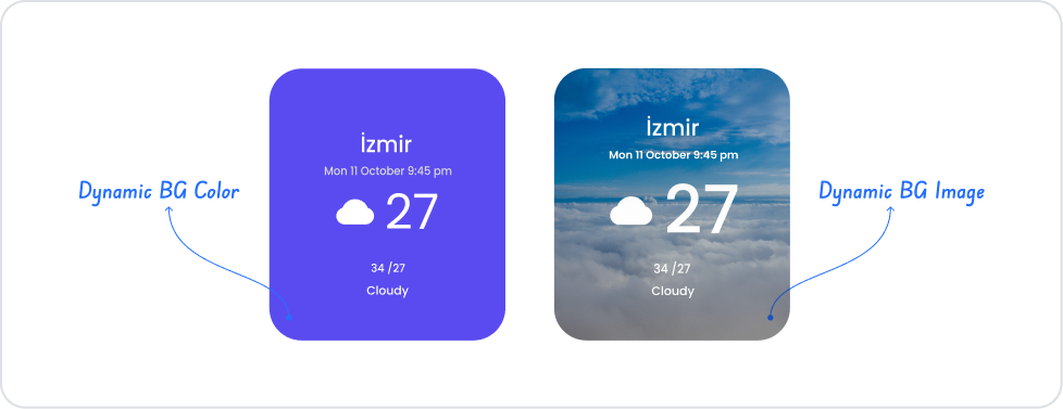
1. Dynamic Background Color

Steps:

  • Open your project on the Kuika platform.
  • In the UI Design module → drag and drop a Panel element onto the screen.
  • After selecting the panel, go to the Properties panel on the right.
  • Find the Dynamic Background Color field.
  • Here, select a data field using the Symbol Picker. (e.g., WeatherType, StockStatus)
  • Define color mappings:
    • Sunny → #FFD700 (yellow)
    • Cloudy → #6f42c1 (purple)
    • Rainy → #6c757d (gray)
  • The Panel's background color automatically changes based on the value coming from the data source.

2. Dynamic Background Image

Steps:

  • Again, select a Panel element.
  • In the Properties panel → find the Dynamic Background Image field.
  • In this field, select the image URL from the data source. (e.g., WeatherImageUrl, UserProfilePhoto)
  • Add the appropriate image links to the data table.

3. Dynamic Font Color (Optional)

  • Similarly, you can link the text color to the data using the Dynamic Font Color field.
  • Example:
    • Positive → Green
    • Negative → Red

4. Hover Settings

  • You can specify which colors will change when hovering over the Panel using the Hover Background Color and Hover Font Color fields.
  • Dynamic Background Color → You assign a color code based on the data.
  • Dynamic Background Image → You assign an image URL based on the data.
  • When used together, the Dashboard becomes much more interactive and visual.

Using Features in a Scenario Context

  • Scrolling
    • Description: Determines whether the panel content is scrollable.
    • Options: Hidden, Vertical, Auto, Horizontal
    • Example: Place a long list inside the panel and enable Vertical scroll.
  • Scroll Back Color / Width / Radius
    • Description: Adjust the color, width, and corner radius of the scroll bar.
  • Dynamic Background Color
    • Description: Dynamically change the background color based on information from the data source.
    • Example: The background turns red when stock is low.
  • Dynamic Font Color
    • Description: Set the text color in the panel based on the data.
    • Example: Positive value → green, negative value → red.
  • Dynamic Background Image
    • Description: Place images linked to the data table in the background.
    • Example: The person's profile photo in the user profile panel.
  • Hover Background Color / Hover Font Color
    • Description: Change the background and text color when the cursor hovers over it.
    • Example: When hovered over, the panel turns from gray to blue.

When the Scenario Step is Complete

  • Three separate Panels appear on the Dashboard screen.
  • The background color of each panel changes dynamically according to the content status.
  • When the user hovers over it with the mouse, the panel becomes highlighted.
  • When the content is long, the scroll bar comes into play.

Limitations

  • Using too many dynamic backgrounds can affect performance.
  • Panel designs that are too wide may overflow on mobile screens.

Tips and Best Practices

  • Create visual contrast by differentiating panels with different background colors.
  • Only enable scroll features when necessary.
  • Align panels in dashboard designs using Grid Layout.
  • Add interactive experiences with hover effects.
No items found.

Other Related Content

No items found.

Glossary

No items found.

Alt Başlıklar