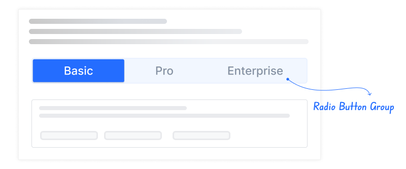
The Radio Button Group element is a button-based selection element that allows users to select only a single option from a group of options. The options are presented under the same group, and when one option is selected, the selection of the other options is automatically deselected.
The Radio Button Group provides users with a fast, intuitive, and controlled selection experience in scenarios where options are clear and limited. Thanks to the button layout, users can view all options at once and make decisions by comparing them.
The Radio Button Group element is supported in web and mobile applications.
1.1. Common Use Cases
Form fields requiring a single selection
Groups of options such as gender, status, or delivery type
Selecting between alternatives on settings screens
Survey and evaluation questions (single-answer)
Specifying a single criterion in filtering scenarios
2. Key Features
Single-select support: The user can select only one option at a time; when a new selection is made, the previous selection is automatically deselected.
Support for static and dynamic options: Options can be defined statically or generated dynamically via data sources.
Instant visual feedback: Selected and unselected states are clearly distinguished visually.
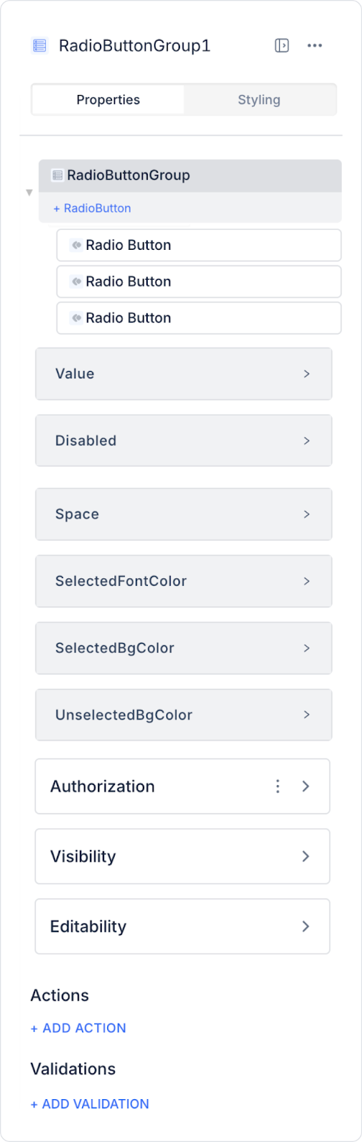
2.1. Radio Button Group Element Properties
Value: You can add a static value or use the Symbol Picker to dynamically display the content of another element or the result of an action.
Disabled: Disables the Radio Button Group. When active, selections cannot be made by clicking the buttons.
Space: You can set the spacing between options (in px). The default value is 0.
Selected Font Color: Sets the color of the text inside the selected button.
Selected Bg Color: Sets the background color of the selected button.
Unselected Bg Color: Sets the background color of unselected buttons.
2.2. Actions That Can Be Added to the Element
The Radio Button Group element supports triggering event-based actions based on the user’s single selection. Actions are not tied to the element itself but to the event triggered when the user changes their selection.
Actions for the Radio Button Group element can be defined via the following event through the Properties > Add Action section.
Supported Action Trigger
onChange: Triggered when the user changes the option within the Radio Button Group.
Usage scenarios:
Save the selected value to a state or variable
Toggle the visibility of fields based on the selection
Updating the form flow or steps
Triggering filtering or sorting operations
Saving the selection by making an API or workflow call
Example scenario: When the user selects a different option in the “Delivery Type” field, the address or delivery time fields are dynamically updated based on the selection.
Basic Rules Regarding Actions
The Radio Button Group element can trigger actions only via the onChange event.
The onChange event fires with every selection change.
Multiple actions can be defined for the same onChange event.
Thanks to its single-selection structure, action flows are more predictable and controlled.
The Radio Button Group element provides a clear and user-friendly experience when used with actions, particularly in scenarios involving form steps, setting selections, and single-criterion filtering.
3. How to Use the Radio Button Group Element?
In this section, we will cover the end-to-end usage of the Radio Button Group element using an example scenario.
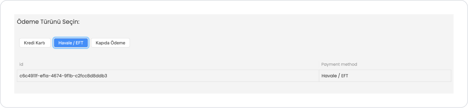
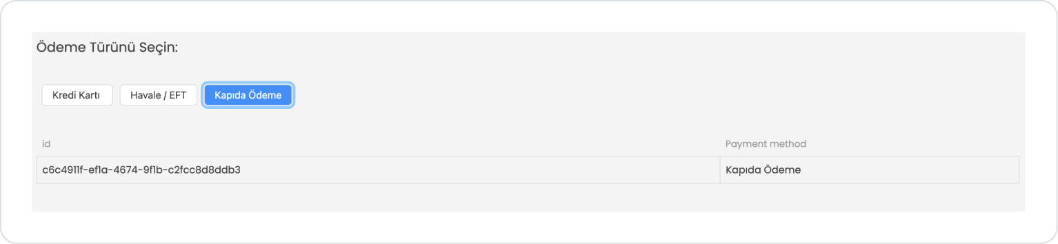
Scenario: Payment Method Selection
The user uses the Radio Button Group element to select their preferred payment method while completing an order. Thanks to the Radio Button Group, the user can select only one option from the listed choices.
In the scenario:
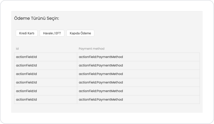
A Radio Button Group representing different payment options appears on the screen. The user selects the payment method that suits them from the following options:
Credit Card
Bank Transfer / EFT
Cash on Delivery
When the user selects an option, the other options automatically become inactive, and only the selected payment method remains active. This allows the user to easily determine which payment method they wish to use to complete the order.
This structure enables users to make quick and clear selections in situations where they must choose a single option from multiple choices.
Step 1 - Creating a Data Source
Creating a table in the DataSources module:
Go to the DataSources module.
Then go to the Tables tab.
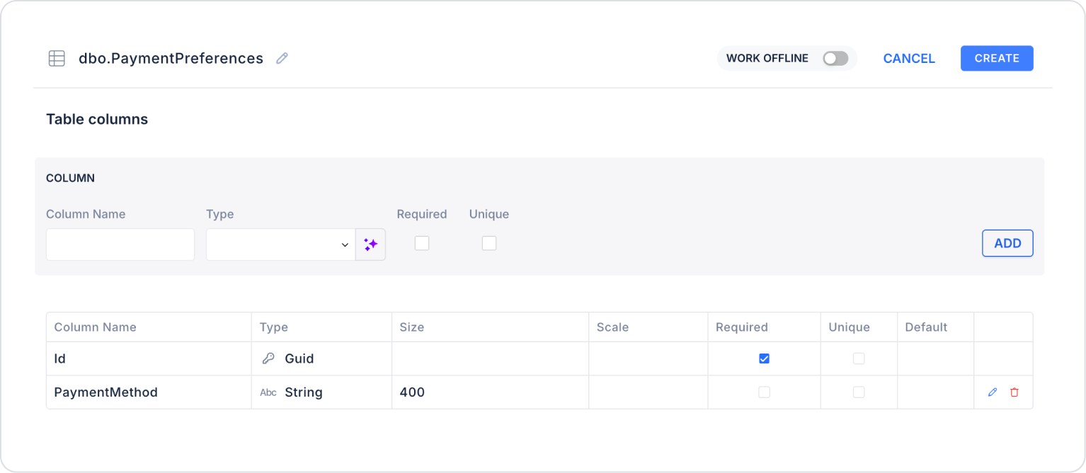
Create a new table named “PaymentPreferences”.
The table structure to be created is as follows:
Important Field names:
Id: Represents the user who selected the payment method. Records are created or updated based on the Current User ID.
PaymentMethod: Stores the payment method selected by the user (Credit Card, Bank Transfer/EFT, Cash on Delivery, etc.)
Step 2 - Defining the Required Action
To display the data on the interface:
You must define an example action.
Add a new action via the Actions > New SQL Action tab within the Datasources module.
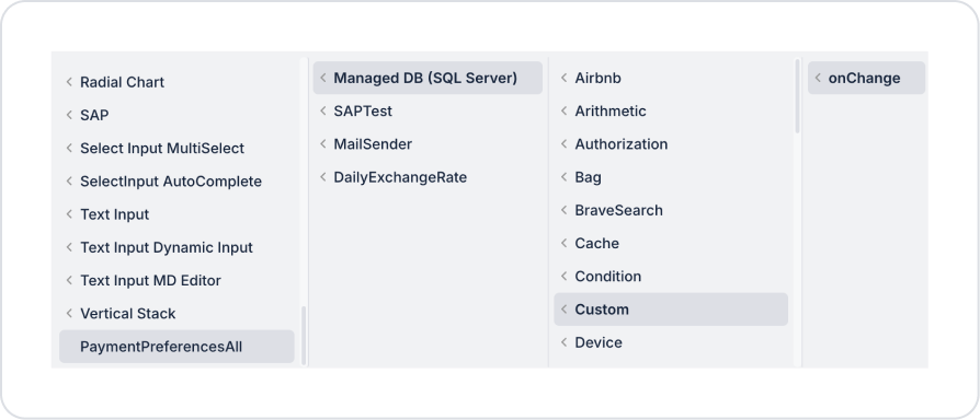
Action Listing Tags (PaymentPreferencesAll):
SELECT * FROM PaymentPreferences
When applying, delete the “PaymentPreferences” part, type “PaymentPreferences” again, and press Enter. This will ensure the correct schema name is prepended to the table name.
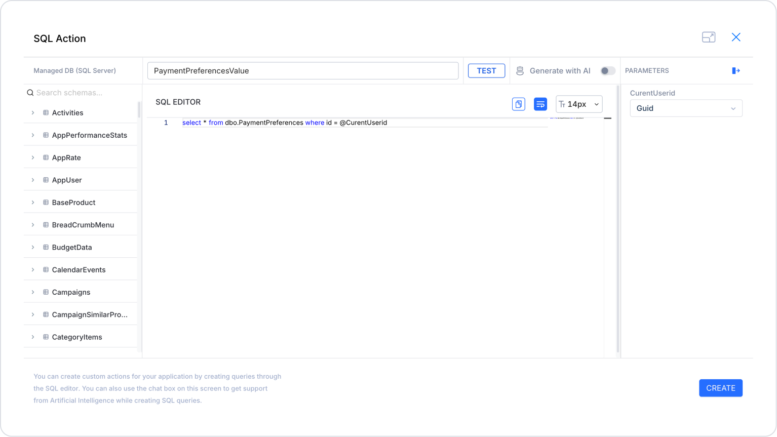
Action to Retrieve the Initial Preference (PaymentPreferencesValue):
SELECT * FROM PaymentPreferences WHERE id = @CurrentUserid
When applying, delete the “PaymentPreferences” part, type “PaymentPreferences” again, and press Enter. This will ensure the correct schema name is prepended to the table name. Set the CurrentUserid parameter type to Guid.
Step 3 - Adding an Initial Action
On the home page at startup:
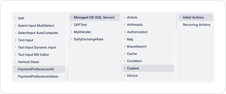
To observe the save and update operations of Radio Button preferences on the selection screen, add the Add Action > Initial Action > Custom > Managed DB > PaymentPreferencesAll action.
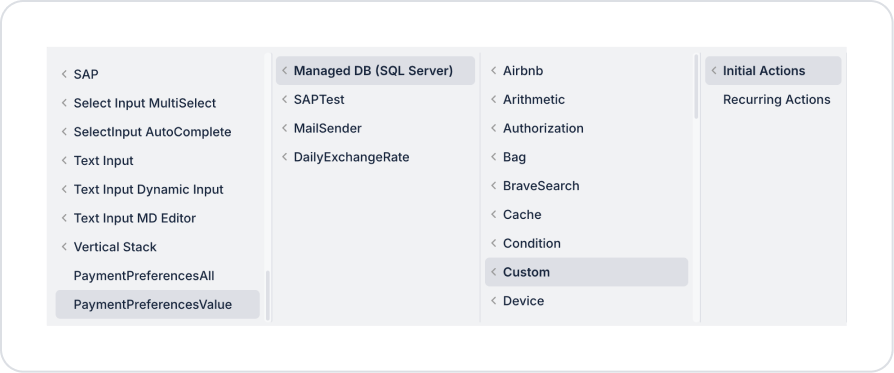
To ensure the preference is selected by default on the opening screen, add the Add Action > Initial Action > Custom > Managed DB > PaymentPreferencesValue action.
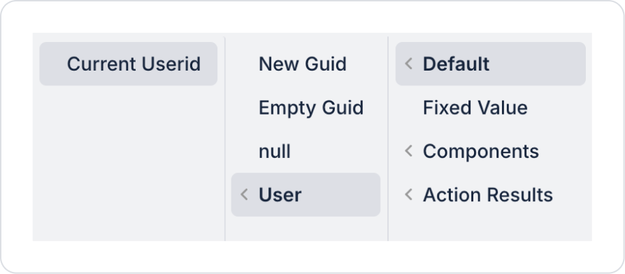
Within the PaymentPreferencesValue action, define CurrentUserid > Default > User > Current Userid.
Step 4 - Adding the Radio Button Group Element and Defining Actions
Initially on the homepage:
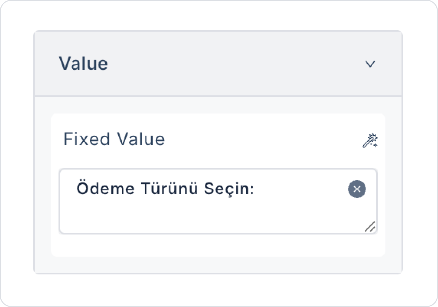
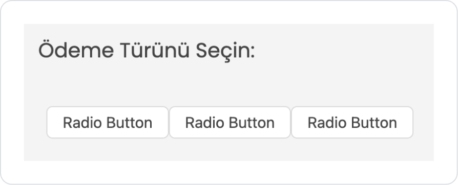
Drag and drop the Elements > Display > Label element from the left sidebar onto the page to specify the field name.
Set the text to Label > Properties > Value > “Select Payment Type:”.
Drag and drop the Elements > Select Input > RadioButtonGroup element below it.
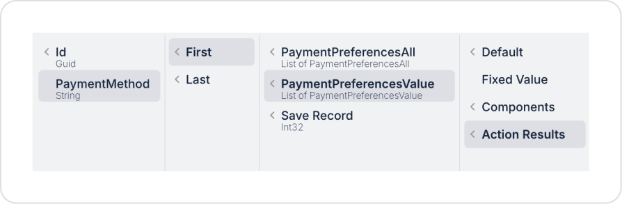
To display the selected value upon opening, set RadioButtonGroup > Properties > Value > Action Results > PaymentPreferencesValue > First > PaymentMethod.
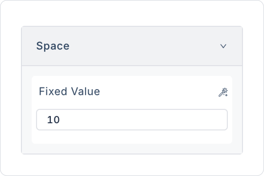
Set the spacing between buttons to RadioButtonGroup > Properties > Space > 10.
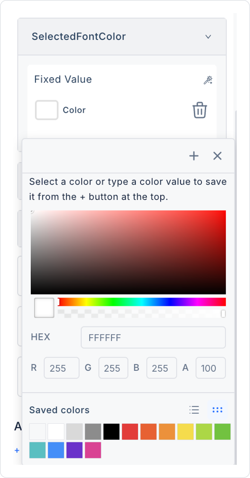
Set the selected font color to RadioButtonGroup > Properties > SelectedFontColor > White.
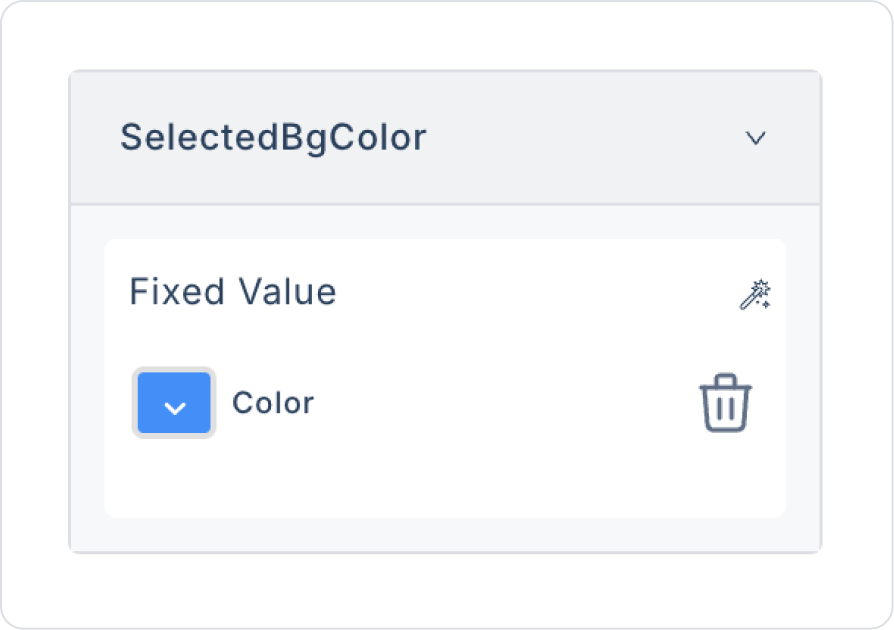
Similarly, set the background color of the selected button to RadioButtonGroup > Properties > SelectedBgColor > Blue
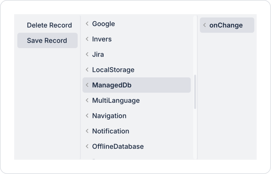
Add the RadioButtonGroup > Properties > onChange > ManagedDb > Save Record action to save the record after the payment method selection.
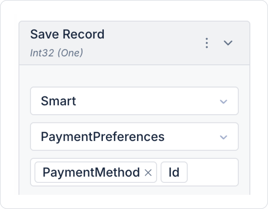
In the Save Record action, select the Select Table > PaymentPreferences table and choose PaymentMethod in the Columns field.
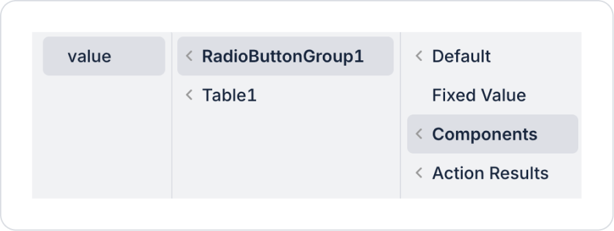
Set the PaymentMethod field to Components > RadioButtonGroup > value.
Set the Id field to Default > User > Current Userid.
To update the selection on the screen after the preference is made, add the RadioButtonGroup > Properties > Add Action > onChange > Custom > Managed DB > PaymentPreferencesAll action.
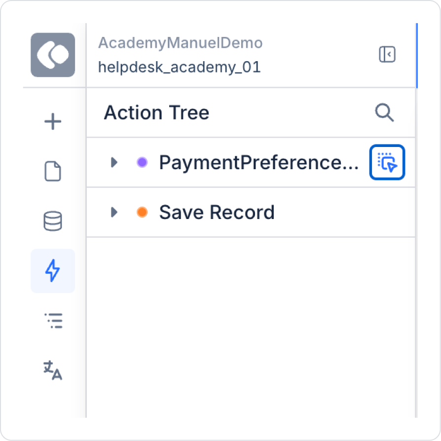
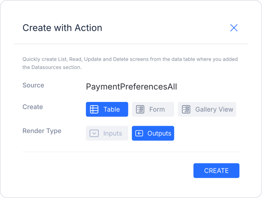
To display the selections on the screen, click the Action Tree area in the left-hand panel and drag the PaymentPreferencesAll action from the icon next to it onto the page.
In the opened screen, make the following definitions.
In the final state, the screen should look like this.
Preview:
In this example, the Radio Button Group element is used to allow users to select a single payment method. The user selects only one option from Credit Card, Bank Transfer / EFT, and Cash on Delivery. The selected value is saved as the user’s payment preference.
In the structure, the Id field represents the user’s record ID. This allows the system to create a new record if none exists for the user; if a record already exists, it updates the existing record based on the selected payment method. This ensures that a single, up-to-date payment preference is stored for each user.
After a selection is made, the results are displayed in the pre-formatted table in the lower section. This table shows the record ID and the selected Payment Method. When the user selects a different payment method, the record is updated in real-time, and the changes can be observed immediately in the table.
4. Common Properties
Some fields on the Radio Button Group element are shared across all UI elements. Therefore, detailed descriptions of the following properties are available on the relevant general guide pages:
Use this in scenarios requiring a single selection. A Radio Button Group should be used when the user can select only one option; Checkbox or Multi Select is recommended for multiple selections.
Write option texts clearly and concisely. Button labels should be clear enough to allow users to make quick decisions.
Use the onChange event as the primary trigger. Actions related to the selection (showing/hiding fields, form flow) should be managed through this event.
6. Limitations
Not suitable for scenarios with a large number of options; in such cases, Select or Auto Complete should be preferred.
Actions can only be triggered via the onChange event.


