The Radial Chart element allows you to visualize multidimensional data on a circular plane using slices, levels, and percentage values. It is particularly useful for displaying performance indicators, category-based scores, or percentage distributions.
The Radial Chart element is only supported in web applications.
Areas of Use
Compare employee performance scores,
Display category-based percentage distributions,
Visualize KPI metrics,
Display percentage-based distribution of product features, etc.
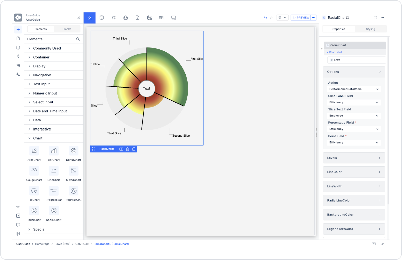
Example Use Case: Performance Indicators
A company wants to evaluate the overall performance of its employees through percentage distributions. For example: Efficiency, Quality, Punctuality, Teamwork, Innovation criteria are measured in percentages and visualized on a Radial Chart.
This allows you to see at a glance which areas employees are stronger in and which areas they need to improve.
Connecting the Data Source
Go to the Datasources module.
Click the + icon next to the Tables heading and name the table PerformanceDataRadial.