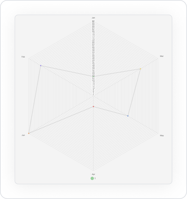
The Radar Chart element allows you to easily compare categories by visualizing multidimensional data on circular axes. It is ideal for performance evaluations, competency analyses, or comparing multiple metrics simultaneously.
The Radar Chart element is only supported in web applications.
Areas of Use
Evaluating employee competencies by category,
Comparing departmental performance,
Analyzing KPI metrics in multiple dimensions,
Comparing product features with competitors, etc.
Competency Analysis Use Case
A company wants to measure its employees' performance across 5 different criteria: Communication, Problem Solving, Leadership, Technical Knowledge, Teamwork. The Radar Chart is used to visualize each employee's score on these criteria. Users can easily compare their own scores with the average values.
Connecting the Data Source
Go to the Datasources module.
Click the + icon next to the Tables heading and name the table PerformansDataRadar.