The Pie Chart element allows you to visually analyze the proportion of each category within the total by displaying categorical data in slices within a circular structure. The size of each slice represents the weight of the data it represents, providing effective visualization for scenarios such as market share, budget distribution, or percentage data comparisons. The Pie Chart helps users quickly understand data distribution and is particularly preferred for simple, summary analyses.
The Pie Chart element is supported in both web and mobile applications.
1.1. Common Use Cases
Show category ratios within the total (e.g., market share distribution, percentage of budget items)
Analyze the percentage distribution of users, products, or transaction groups (e.g., customer segments, sales categories)
Visualizing preference percentages in survey and voting results
Showing resource usage ratios (e.g., time, budget, departmental workload distribution)
Identifying the largest or smallest categories relative to the total data. Enables quick understanding of the segment with the largest share.
2. Key Features
Displaying categorical data in slices within a circular chart structure. Each slice shows the share of the category it represents within the total.
Slices are automatically drawn according to percentage calculations. Users can quickly interpret the ratios.
Multiple data fields can be displayed in a tooltip. Both percentage and numerical values can be presented simultaneously.
Customizable visual settings such as color, opacity, slice order, and slice separator lines.
Ability to work with single or multiple data sets (e.g., percentage distribution of different segments).
Display of category names outside the chart with legend support.
Dynamic loading of chart data from the data source. Fully compatible with SQL, REST API, and Managed DB actions.
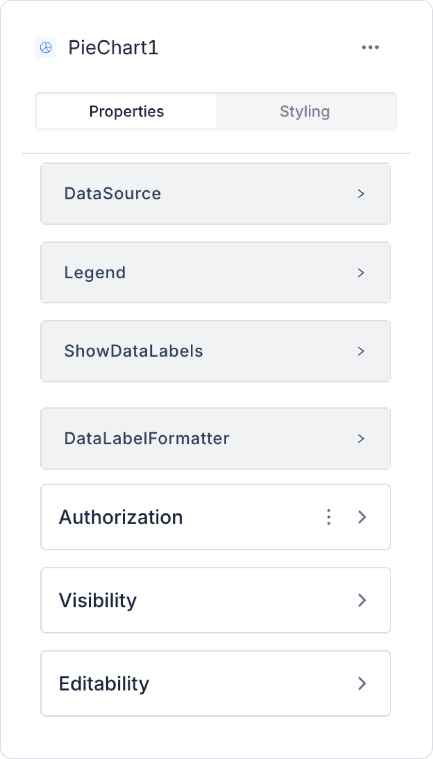
2.1 Element Settings (Properties)
When you select the Pie Chart element, you can configure data sources, tooltip configurations, slice colors, and label appearance settings in detail via the Properties panel on the right. All settings are explained item by item below.
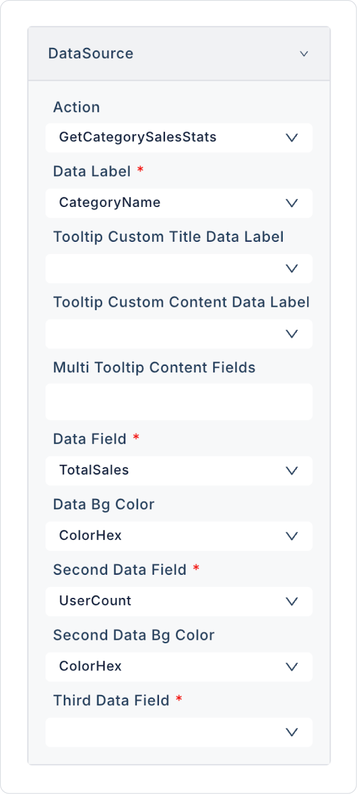
Datasource
Datasource Action: Specifies the action from which the data to be displayed on the Pie Chart comes. Data loading occurs when this action is executed.
If no action is added to the Datasource, the data mapping fields will not be visible.
Data Field Mappings
Data Label: Specifies the category label to be displayed in the chart. This title is displayed in the Legend and tooltips.
Tooltip Custom Title Data Label: Defines the data field to be displayed as the title on the tooltip. This title appears when the user hovers over a slice.
Tooltip Custom Content Data Label: Specifies the additional field to be displayed as explanatory data within the tooltip. It can be used for numerical values, explanations, or sub-information.
Multi Tooltip Content Fields: Allows you to display multiple data fields within a single tooltip.
Data Field: The main data field that determines the size of each slice. The larger the value, the wider the slice area.
Data Bg Color: Determines the color value of the main data series. It is possible to manually define colors for each category.
Second Data Field: Used to define a second data series on the Pie Chart.
Second Data Bg Color: Determines the slice color to be used for the second data series.
Third Data Field: Used to add a third data series to the pie structure.
Third Data Bg Color: Determines the slice color for the third data series.
Legend
Legend Settings: The legend displays which category the data belongs to. By clicking on a category in the DataSource field, the corresponding slice can be hidden or shown in the chart.
Data Label Settings
Show Data Labels: Enables labels to appear on each slice. Used to display percentage or number-based information directly on the chart.
Data Label Formatter: Formats the labels on the slices. E.g., percentage, currency, decimal format, etc.
Data Structure (SQL Example)
For the Pie Chart to work correctly, each value field must be associated with a label (category) field. The following SQL example shows a suitable data structure:
SELECT ‘Category A’ AS category, 45 AS value
UNION ALL SELECT ‘Category B’, 30UNION ALL SELECT ‘Category C’, 15UNION ALL SELECT ‘Category D’, 10;
2.2 Actions That Can Be Added to Elements
The Pie Chart element is a passive chart component for data visualization. Therefore, when Pie Chart is selected, the ADD ACTION button is not visible, and no special trigger can be added to the chart.
The action structure is based on the following principles:
User clicks, slice selections, or hover interactions on the Pie Chart do not trigger actions.
Graph updates occur when the Datasource Action linked to the Pie Chart is triggered externally.
If the graph needs to be changed based on user selections (e.g., year, category selection), these operations are managed by adding actions to other UI elements such as Button, Radio Group.
The Pie Chart only represents the data; it does not initiate any actions internally.
Actions cannot be defined on the Pie Chart; chart updates and user interactions are managed through other UI elements that trigger the data source.
3. How to Use the Pie Chart Element?
In this section, we will cover the end-to-end use of the Pie Chart element through an example scenario.
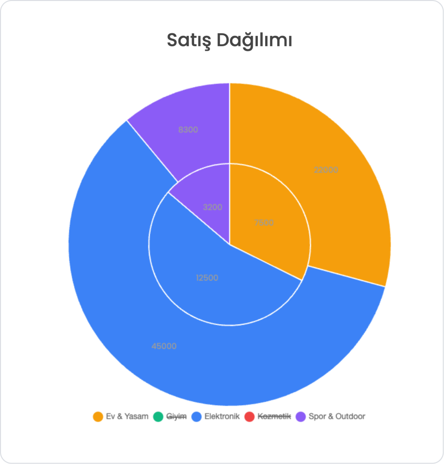
Scenario: Sales Distribution by Product Category
In an e-commerce application, a Pie Chart is used to track which product categories account for what share of total sales during a specific period.
In the scenario:
Product category (CategoryName)
Total sales amount for the category (TotalSales)
Number of users interacting with the category (UserCount)
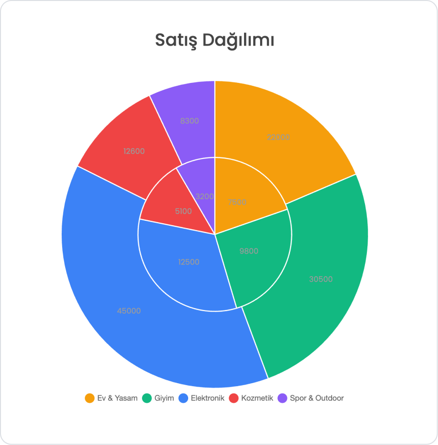
The Pie Chart will display the distribution based on categories. When the user selects a sales period, the chart will only display category sales for that period.
For example (Monthly Sales Distribution Data):
Electronics Category (CategoryName: Electronics)
Total Sales → 45,000 ₺
Number of Users → 12,500 users
Clothing Category (CategoryName: Clothing)
Total Sales → 30,500 ₺
Number of Users → 9,800 users
Home & Living Category (CategoryName: Home & Living)
Total Sales → 22,000 ₺
Number of Users → 7,500 users
Step 1 - Creating a Data Source
Creating a table in the DataSources module:
Go to the Datasources module.
Then go to the Tables tab.
Create a new table named “CategorySalesStats”.
The table structure to be set up is as follows:
Important Field names:
CategoryName: Indicates the product category to which the sales belong. It creates the label for each slice on the Pie Chart and shows the user which category the sales distribution belongs to.
TotalSales: Indicates the total sales amount for the relevant category. It is the value field of the Pie Chart and is the basic metric that determines the percentage of each category slice.
Step 2 - Defining the Necessary Actions
To display and add data in the interface:
You need to define two actions.
Add a new action from the Actions > New SQL Action tab in the Datasources module.
Action that Adds Sample Data (InsertCategorySalesStats): Add the following SQL action to test the application with sample data and press the TEST button.
When applying, delete the CategorySalesStats part, rewrite CategorySalesStats, and press Enter. This will add the correct schema name before the table name.
Action that Provides and Filters Data (GetCategorySalesStats):
SELECT
CategoryName,
TotalSales,
UserCount,
ColorHex
FROM CategorySalesStats;
When applying, delete the CategorySalesStats part, retype CategorySalesStats, and press Enter. This will add the correct schema name before the table name.
Step 3 - Adding the Initial Action
Open the UI Design module.
Add the Initial Actions > Custom > Managed Db > GetCategorySalesStats action to the page using the ADD ACTION button.
Step 4 - Adding Elements
Drag and drop the Elements > Display > Label element onto the page from the left panel.
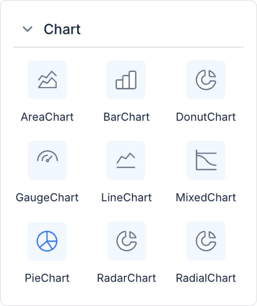
Then add the Elements > Chart > Pie Chart element to the page from the left panel.
Step 5 - Configuring Element Settings
Add the text “Sales Distribution” to the Label > Properties > Value field.
Set the font of the Label field to Label> Styling > Text > Style > Heading 2.
Add the Action > GetCategorySalesStats action to PieChart > Properties > DataSource to provide data to the Pie Chart. Make the following definitions:
Preview:
When the application is tested, it can be observed that the total sales amounts of the product categories for the selected period are displayed with the correct ratios on the Pie Chart. You can easily filter the visibility of each category by clicking on the Legend field below the chart.
4. Common Properties
Some fields on the Pie Chart element are common to all UI elements. Therefore, detailed explanations of the following properties can be found in the relevant general guide pages:
When using Pie Charts, the following recommendations should be considered for higher readability and more accurate data presentation:
Keep the number of categories limited. Too many categories cause the slices to appear excessively thin and reduce readability.
Choose contrasting colors. Slices should be easily distinguishable from each other; using similar tones makes the chart look cluttered.
Use the Data Labels setting with caution. When there are too many slices, labels may overlap; in this case, displaying them only with tooltips is more effective.
Ensure accuracy between slice size and labels. Make sure the total of the percentage values is 100%.
6. Limitations
When working with the Pie Chart element, the following limitations should be considered:
Actions cannot be triggered by user interaction. Clicking on or hovering over a slice does not execute an action.
The chart will not be displayed without a defined datasource. Data Field and other data mapping fields will not become active.
Pie Chart only fully supports a single data series; Donut Chart or Mixed Chart are more suitable for multiple data series structures.


